Archive

Archive for April, 2012

30 Beautiful Typographic T-Shirts

April 19th, 2012 No comments

Some type tees depend on a pithy phrase to make them interesting, in a simple boring font. Some t-shirt designers go above and beyond to enhance the message with beautiful typography. We’re going to take a closer look at those t-shirts.

30 Typographically Awesome T-Shirts

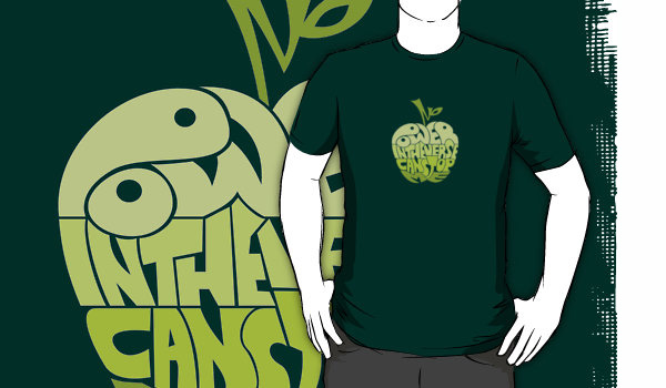
1. No Power in the Verse Can Stop Me t-shirt by RobotrobotROBOT – this apple doesn’t have anything to do with the beautiful and popular computers. This typographic illustration is referencing a scene from a cult TV show Firefly.

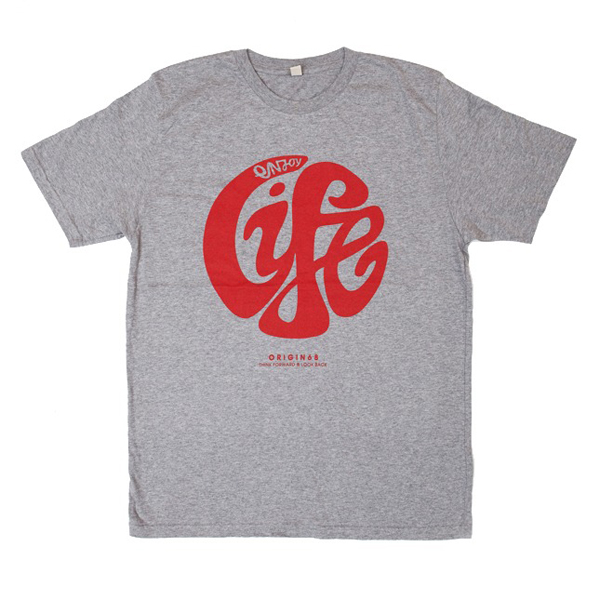
2. Enjoy Life By Origin 68 – There are so many ways to enjoy life. Whether you enjoying your life through art, conversations, long walks or nature, this shirt helps remind all of us to enjoy some nice typography while we live our lives.
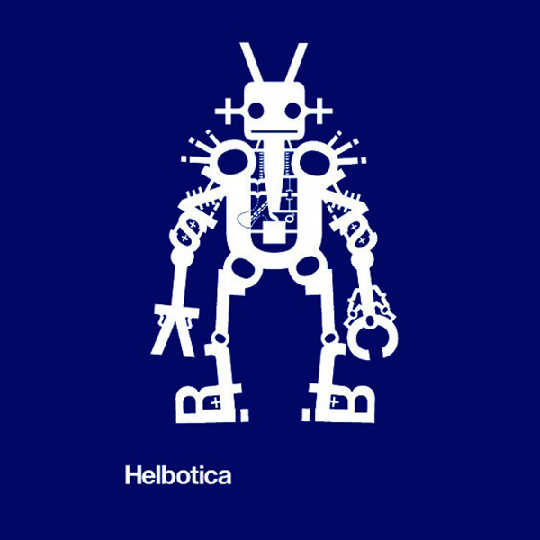
3. Helbotica by Chop Shop Store – This is one in a series of illustrations utilizing everyone’s favorite font, Helvetica.
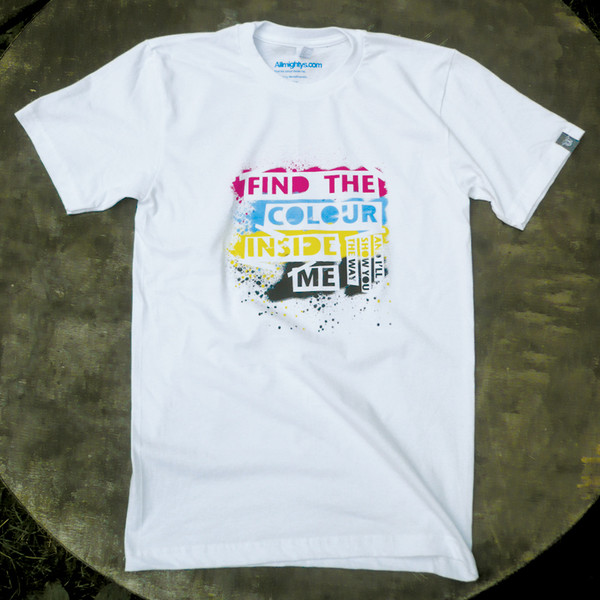
4. Find the Color Inside Me by Allmightys – Fun use of color and negative space, creating an appealing t-shirt design.
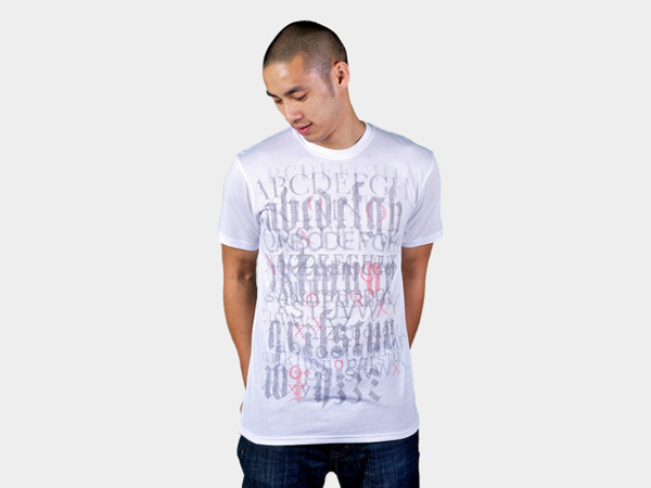
5. XOXOXO by Jublin, on Designed by Humans – Great mixture of typefaces to make up this patterned t-shirt.
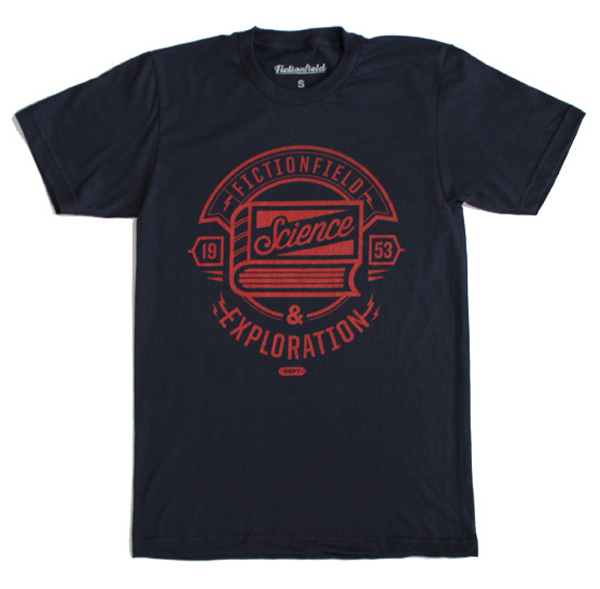
6. Science and Exploration t-shirt from Fictionfield – This shirt is meant to encourage self education, if you never stop learning you’ll always be on an adventure!
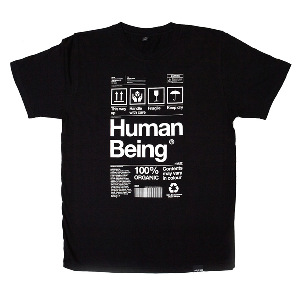
7. Human Being packaging t-shirt by Origin68 – If humans cam in packaging, like almost everything else, it might look something like this.
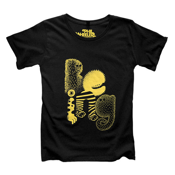
8. Being t-shirt by Pweye – What kind of a being are you?
9. Anything Unrelated to Elephants it Irrelephant by Snorg Tees – clever word play t-shirt featuring a playful typeface and an equally playful elephant.

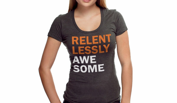
10. Relentlessly Awesome by Headline Shirts – a bold text with a bold statement.
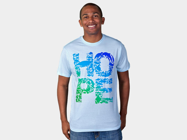
11. There’s Still Hope from Designed by Humans – If you find hope and piece from sea creatures, you’ll find comfort in this shirt.
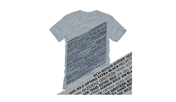
12. Sans Serif from Turnnocturnal – an exhausted and beautiful list of sans serifs font, perfect for any designer or typeface enthusiast.
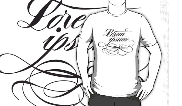
13. Lorem Ipsum from Redbubble – love yourself some filler text? This script front t-shirt celebrate the nonsense words we use as place holders.
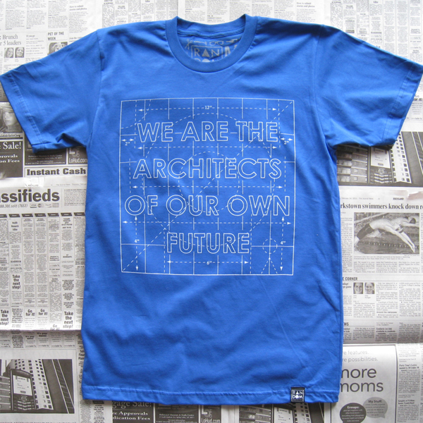
14. We are Architects of Our Future from Random Objects – the blue print t-shirt and block text really illustrates the message of this shirt.
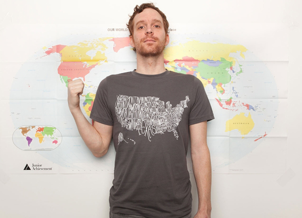
15. United Shirt of America t-shirt from Threadless – for those who love handwritten type and geography.
16. Sports t-shirt from Threadless – for all you avid sportball fans.

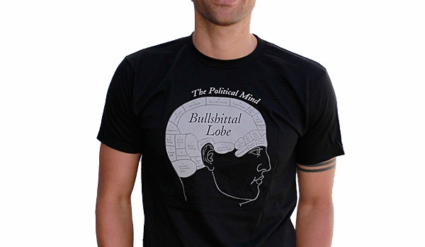
17. The Political Mind from Headline Shirts – tired of the political rhetoric surrounding the presidential race? It’s a scientific fact that politicians can’t really help it, most of their brain is taken up by the bullshittal lobe.
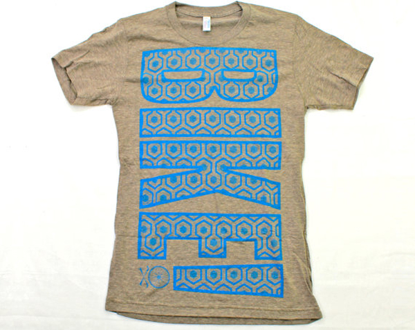
18. Bike t-shirt from Dark Cycle Clothing – a great shirt for the strong and enthusiastic cycling enthusiasts.
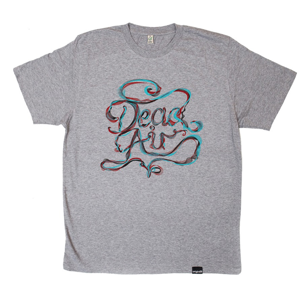
19. Dead Air from Origin68 – Pretty hand drawn letters.
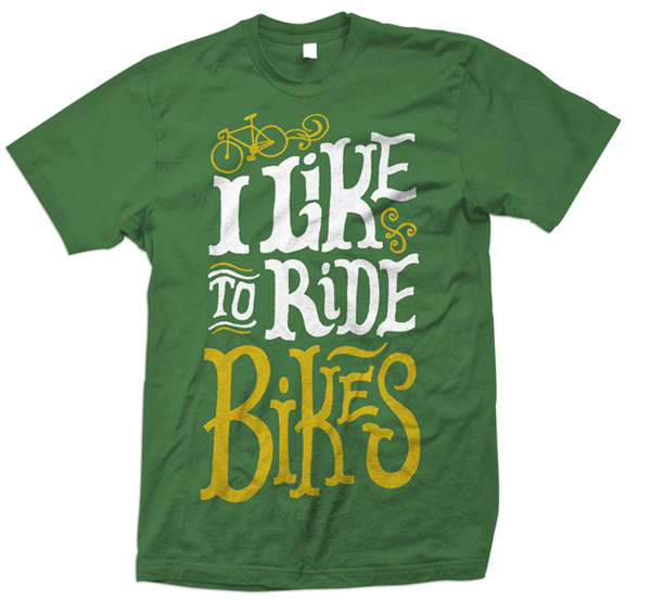
20. I like to Ride Bikes from Print Brigade – if you like to ride let it be known.
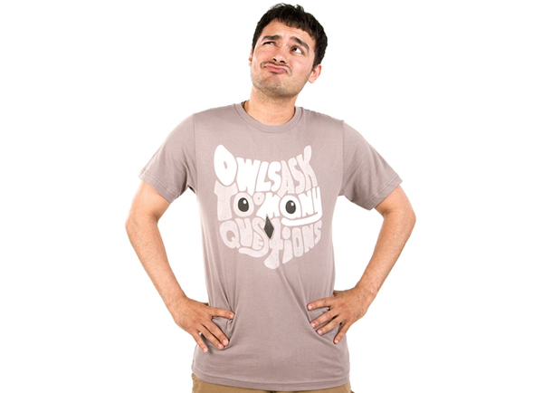
21. Owls Ask Too Many Questions from Threadless – it’s so annoying, those darn owls always asking “who?”
22. Saltwater by Allmightys – Cool type, depressing message.
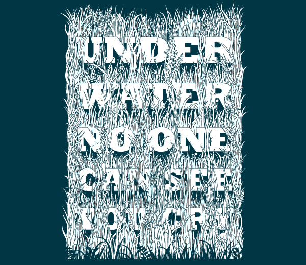
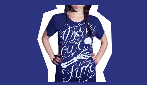
23. This is our time from Deathshed – a perfect shirt to wear while treasure hunting with your friends.
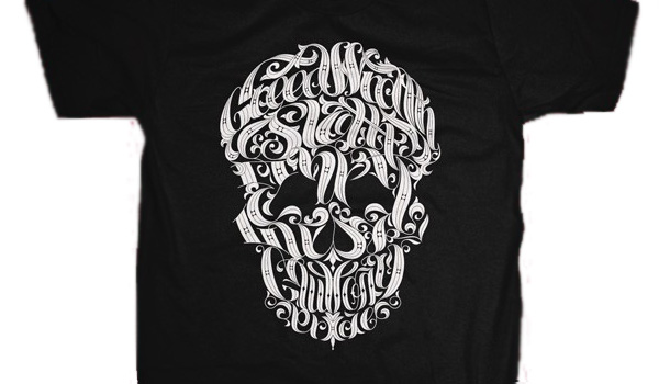
24. Seven Deadly Sins from Chopshop Store – beware the seven deadly sins, keep track of them in this beautifully rendered skill tee.
25. URL Link from Threadless – It’s a link link.
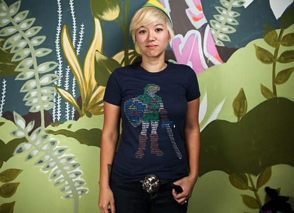
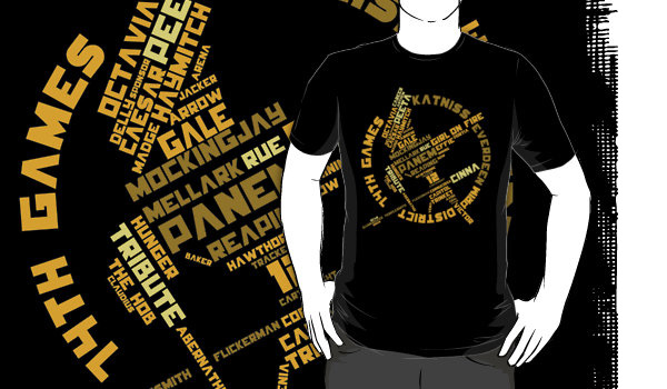
26. Mockingword from Redbubble by Pixhunter – let’s play a word association game; i’ll say Hunger Games and you take whatever you think of and put in the shape of the Mockingjay. Hunger Games.
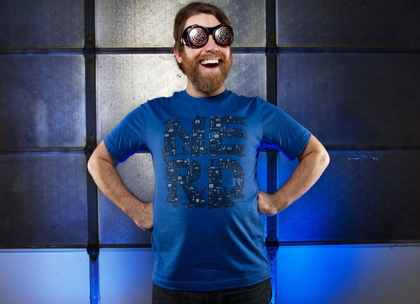
27. NERD HQ from Theadless – The core of nerdom, looks a little something like this.
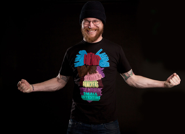
28. Donor from Threadless – In case you forget where your organs are.
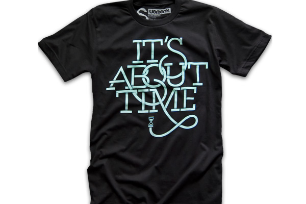
29. It’s About Time from Ugmonk – interesting type treatment and a vintage computer icon.
30. Sleep When I’m Dead from Insomniac – beautiful text for those who don’t sleep.

The post 30 Beautiful Typographic T-Shirts appeared first on Visual Swirl Design Resources.
Categories: Designing, Others Tags:

Successful Strategy for Integrating Web and Print Design

April 11th, 2012 No comments

Today’s marketplace demands that designers be versatile enough to create an integrated print and web media campaign. This is easier said than done, however, as the differences between designing for these two media are extensive, however, and each presents its own challenges and opportunities.

Designers that are able to successfully navigate these differences and create a unified marketing strategy are highly valued. Here are some tips for how to overcome the disparities and integrate your print and web designs:

Challenges of Bringing the Two Media Together

Though they share some basic principles, designing for print media and designing for the web are two entirely different tasks. Knowing the standards for each will allow your work to be easily translated from one into the other.

In print media, designers usually have more exact control over the appearance of the final product. When creating custom business cards, for example, the designer need only worry about the finished product appearing in one size. The same is not true for web design, however. There are several standard monitor sizes, not to mention mobile devices, and designers must create fluid layouts that will work for all of these displays (and possibly more).

In addition, the design of the will always be viewed as “complete”—no scrolling or sliding is necessary to take in the entire concept. Contrast this with web media, where “big” designs require careful planning and modification to bring off.

For itself, web design offers some benefits that print media cannot match. Web designers have the freedom to take advantage of some incredible techniques that are hard to replicate via digital printing: gradients, small details, and movement in design, for example.

One thing that both print and web designers have in common is color selection—digital printing can often render colors differently than the designer had envisioned, while web designers must be cautious about how different monitors and displays will produce colors.

Successful Integration

The differences between the two media, then, are challenging, but not impossible, to overcome. No matter which medium you begin working in, you must keep the challenges of the other in mind in order to bring them together. Print designers must work within the restrictions of file and image size for digital media, for example, while web designers must keep in mind that subtle details that are easy to bring off on the web may be lost to the printer.

This is important primarily because of branding and brand recognition—your clients’ audience must be able to connect successfully with the colors and images used in both media and recognize them as coming from the same organization. It’s important, then to keep your clients’ specific strategies in mind as you create your designs.

More Tips for Integration

Apart from creating a design that works in both media, there are some other things to keep in mind as you create both that can help create a better unification between the two media. As you work with marketers and designers on both sides of the design aisle, make sure to use cross-promotions and teasers that promise to “enhance” the users’ experience. The website should offer more to the users’ print experience and vice versa.

You should also be sure to mention the other medium with the other—include URLs in offline ads and flyers, for example, or use the website to promote a special direct mailer.

With a solid understanding of the tips and techniques involved in both types of design, you will be able to create designs that are sending the same message no matter the medium.

What are your tips for integrating web and print media? What successes have you had in unifying the two?

Images by ollily and Sergiu Bacioiu 

The post Successful Strategy for Integrating Web and Print Design appeared first on Visual Swirl Design Resources.
Categories: Designing, Others Tags:

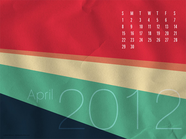
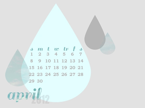
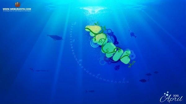
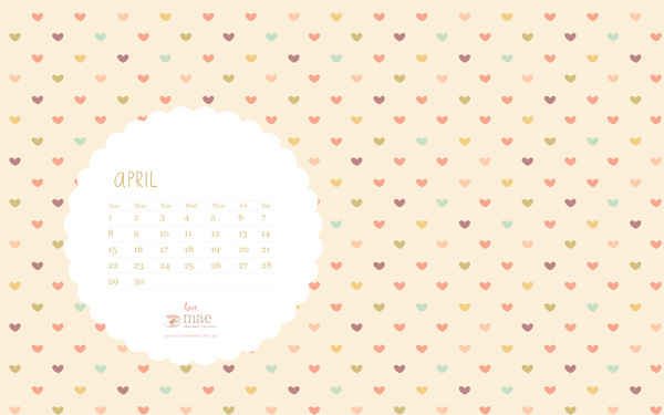
Desktop Wallpaper Calendars: April 2012

April 2nd, 2012 No comments

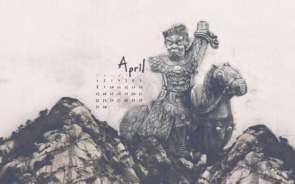
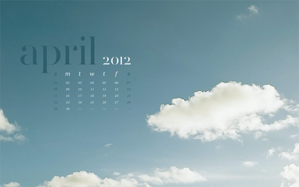
No April Fools joke today. Instead let me present a roundup of Desktop Wallpaper Calendars for April 2012. With spring in full swing, I’ve gathered several beautiful desktop wallpapers featuring April 2012 calendars. Freshen up your desktop and check back next month for a brand new calendar update.  Feel free to share these with your friends and email me if you ever would like your calendar featured in a similar roundup.

6 Beautiful Desktop Wallpaper Calendars for March 2012

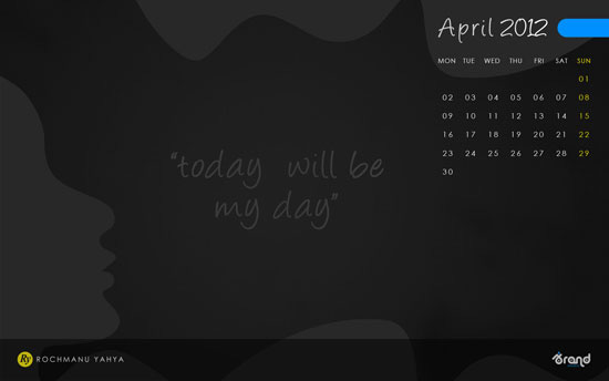
Wallpaper by Ibrandstudio

Wallpaper by Paper Leaf

Wallpaper by MonkeyMan504

Wallpaper by Shrimp Salad Circus

Wallpaper by Webgranth

Wallpaper by Studio of Mae

Wallpaper by Kriegs

The post Desktop Wallpaper Calendars: April 2012 appeared first on Visual Swirl Design Resources.
Categories: Designing, Others Tags: