While all the design industry collects assumptions about what’s to come or is brainstorming fresh solutions to make predictions about the future of website design, we are going to take a look back, trying to get the most out of the previous year. Although “past is in the past”, however, when it comes to website design, nothing disappears without a trace. As a rule, plenty of tools, resources and viable stuff that were quite popular and pretty helpful last year, will remain sought after in the next, providing almost the same scope of benefit as before. What’s more, as practice shows, not every trend is a fad. The more consistent, strong and pervasive ones, such as Flat style still run the show and won’t go anywhere. Instead, they are bound to mature and take a more sophisticated form. Whatever there’ll be, having a bunch of professionally crafted templates that comply with current requirements and meet trends won’t hurt.

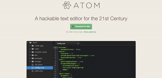
Atom is a relatively new cross-platform open source HTML editor. According to its developers, Atom is a “hackable text editor for the 21st century”. We will test if there is any truth in this statement. Atom and Sublime Text 2 have, at first sight, a great deal in common; however, Atom’s high customizability is explicitly promoted. This article shows whether the editor really is so special and if so, what makes it stand out from the rest. Is it probably even THE editor of the 21st century or just another copy-cat?

This article covers some of the latest infographics on hot topics of the new year. We will have a look at current trends in 2015 – not only in web design, but also digital branding and social marketing that are equally important if you want to be prepared for the future. One of the infographics gives some tips on how to protect yourself from hackers; however, these tips are only a foundation on which to build further. Enjoy the following five infographics; there is certainly something for everyone.

I’ll frankly admit it. I hadn’t heard about PrestaShop before. Though this endeavor got started in 2007 already and even won prices for Best Open-source Business Application in 2010 and 2011, it managed to fly under my radar for all these years. Which is a pity, because had I known PrestaShop earlier, I wouldn’t have broken my wings trying to make a row of competitors work to my satisfaction. But as we all know, it’s never too late. Let me show you that creating an online store in 2015 has never been easier. Learn from my example and look at PrestaShop now, not in a few years. Here’s what makes it stand out from the crowd…

If you are a web developer, keeping your finger on the pulse of time is vital to help you stay on top of things. Read a lot, try a lot, dismiss a lot and keep a lot. We call such an approach professional. There are trends that you wouldn’t expect to win through that still do and others who seem no-brainers at first, but lose in the longer run. Whichever way things turn out to be, keeping oneself updated is the entering wedge on your way to success. The following article introduces you to a brand-new interactive website by the guys of TemplateMonster, covering the evolution of the web from back in 2004 to the latest trends of 2015. Besides providing vital information, this interactive project is a best practice example in itself…

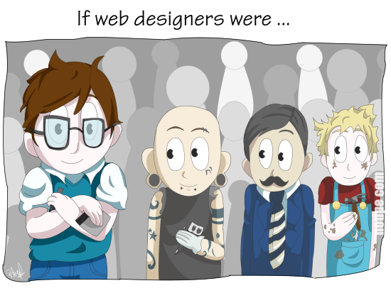
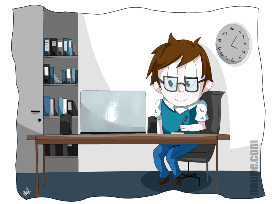
People working in the web design and development industry need to become thick-skinned over the years if they intend to survive long term. I am in this business since web design got invented in the early Nineties, and I sure know what I’m talking about when it comes to the hidden secrets of client communication. My remedy these days is laughing. I refuse to get angry anymore. Instead, I make fun of the situations that only a few years ago made me want to hire a professional killer. There are quite a few people out there who are only still alive for the fact I couldn’t afford to pay one. Nah, just joking. As making fun of it all is the healthiest way to cope with it, we decided to start a new cartoon series titled “If Web Designers Were” here at Noupe. This is part two. Hope you enjoy it…

Besides crafting unique content for our ever-growing readership, we share loads more content through our social channels on a daily basis. Once a week we curate the best of these links to highlight great content further and to make our shares available to all those readers who refuse to partake in social networks, which as we all know is not the dumbest of ideas. Anyway, who am I to judge? Have it your own way. These are our Links of the Week 4 of 2015…

As a web designer, you must be well aware of how even a minuscule designing mistake can result in the failure of your website. One of the ways of avoiding the various pitfalls related to website design is using the right set of tools. The idea is to use such tools to simplify some of the more time consuming tasks related to web design and ensuring that you get them absolutely right. There are plenty of web design tools available on the market and you will be hard-pressed to choose the right one for your needs. This article aims to make your job a bit simpler. It’s a curated list of 8 tools that can help you get the most out of your web design process.

The MVC framework Ember.js, which is gaining more and more popularity, combines best practices from different frameworks and programming languages. It is a mighty tool with a pretty steep learning curve. Today we want to take a closer look at the beginnings of Ember.js, its current status, and future development.

Web workers wonder where web design is heading in 2015, as it is also subject to a trend – which is not a bad thing. Otherwise, the internet would still look like in its beginnings in the 1990s. This is surely not what we want, is it? So, what is the trend for 2015? Let us have a look into the crystal ball and see what the future holds.


