Everyone loves the stupidity spilled out on sites like Clients From Hell and stories of designers telling off large companies that “invite” them to participate in crowdsourcing contests and the like. Unfortunately, if all clients were that stupid and sleazy, there would be no reason to keep working in the creative field. Now, I’m not saying the entries on websites, or self-generated stories of professional heroism are fake, although there are those who claim they are figments of creative writing, but what goes on in the real world? What are experienced, working creatives saying to clients who make incredible faux pas when it comes to working with designers?

The times of gloss and 3D effects are over – at least for now. The trend in web design goes towards minimalism which is also reflected in the style of buttons. The hot so-called ghost buttons fit perfectly with the reserved look of modern websites based on flat design or even more trendy material design. Ghost buttons basically consist only of a very thin outline with some text in it. They can hardly be created more basic – at least, if you want them to be recognized as what they are.

Your website has been online for quite a while now, but you are, however, not happy with its ranking? You are asking yourself what you can do to rank on the first page rather than the second one? Or how to get from the bottom of page 1 to the top? This is not as difficult as you may think. All you need to do is follow some quick tips and implement them as good as possible. Then your ranking will improve almost by itself. We will show you five simple tips to boost your website.

Rukzuk out of Konstanz, Germany has come on the site-building scene and wants a piece of the ever-growing pie. To that end, Rukzuk doesn’t aim directly at individuals who want to build their own website. Instead, Rukzuk seeks to make a name for itself as a serious tool for professional web designers. Competition in this segment is certainly scarcer, but it exists nevertheless. We’ve put Rukzuk under the microscope.

TeslaThemes is one of the better-known providers of WordPress Premium Themes. They are not the biggest, and they don’t have the largest themes collection. Instead, they have a clear focus and craft all their themes carefully and thoroughly along the latest standards. All their themes are based on their own Tesla Framework. This framework is all about simple customization; very user-friendly. Today we teamed up with TeslaThemes to give away three one-year subscriptions of their Standard Plan. Comment to win…

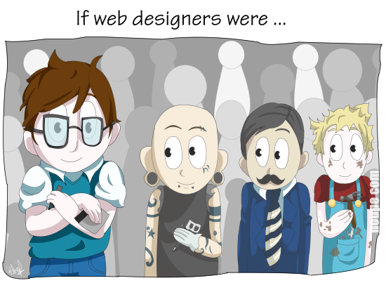
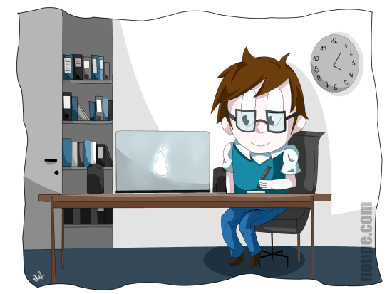
People working in the web design and development industry need to become thick-skinned over the years if they intend to survive long term. I am in this business since web design got invented in the early Nineties, and I sure know what I’m talking about when it comes to the hidden secrets of client communication. My remedy these days is laughing. I refuse to get angry anymore. Instead, I make fun of the situations that only a few years ago made me want to hire a professional killer. There are quite a few people out there who are only still alive for the fact I couldn’t afford to pay one. Nah, just joking. As making fun of it all is the healthiest way to cope with it, we decided to start a new cartoon series titled “If Web Designers Were” here at Noupe. This is part three. Hope you enjoy it…

Besides crafting unique content for our ever-growing readership, we share loads more content through our social channels on a daily basis. Once a week we curate the best of these links to highlight great content further and to make our shares available to all those readers who refuse to partake in social networks, which as we all know is not the dumbest of ideas. Anyway, who am I to judge? Have it your own way. These are our Links of the Week 5 of 2015…

While all the design industry collects assumptions about what’s to come or is brainstorming fresh solutions to make predictions about the future of website design, we are going to take a look back, trying to get the most out of the previous year. Although “past is in the past”, however, when it comes to website design, nothing disappears without a trace. As a rule, plenty of tools, resources and viable stuff that were quite popular and pretty helpful last year, will remain sought after in the next, providing almost the same scope of benefit as before. What’s more, as practice shows, not every trend is a fad. The more consistent, strong and pervasive ones, such as Flat style still run the show and won’t go anywhere. Instead, they are bound to mature and take a more sophisticated form. Whatever there’ll be, having a bunch of professionally crafted templates that comply with current requirements and meet trends won’t hurt.


