People working in the web design and development industry need to become thick-skinned over the years if they intend to survive long term. I am in this business since web design got invented in the early Nineties, and I sure know what I’m talking about when it comes to the hidden secrets of client communication. My remedy these days is laughing. I refuse to get angry anymore. Instead, I make fun of the situations that only a few years ago made me want to hire a professional killer. There are quite a few people out there who are only still alive for the fact I couldn’t afford to pay one. Nah, just joking. As making fun of it all is the healthiest way to cope with it, we decided to start a new cartoon series titled “If Web Designers Were” here at Noupe. This is part eight. Hope you enjoy it… If Web Designers Were Butchers Clients always tend to stretch their orders to ultimately get more out than they put in. Paying little, getting lots is a wide-spread philosophy these days. Designers have to cope with that. The only way to actually secure yourself from delivering too much work […]
* You might also be interested in the following articles:
If you want to develop a successful blog or website, there is nothing more important than getting and retaining the loyalty of your readers. If a visitor comes to your website and never comes by again, something went terribly wrong. In that case, you need to act. The preferred scenario is that every visitor becomes a regular – a fan, if you will. Someone who visits your website time and again. How can this scenario be realized? Today, we analyze the answers to this question so that you will turn your former one-time visitors into regular clients. Simple, Clear-cut and Thought-through Web Design Web design has a huge influence on visitors and can contribute decisively to the question of turning them into returning customers – or not. Good web design is clear and relies on a simple structure so that the visitor can immediately orient him/herself. A comprehensible navigation is important, contact forms need to be within easy reach and a sitemap should be in existence so that the visitor can access an overview of all subpages of your website. The right color scheme is another key to your success. The colors should not only correspond to each other, but […]
* You might also be interested in the following articles:
Nowadays, a website can not possibly be fast enough. Particularly because loading speed now constitutes a ranking factor for Google, optimizing the performance is a major task. There are a number of performance drags. One of the bigger ones is the often popular “share button” of the big social networks. These usually load a considerable amount of JavaScript from their home servers, thus bloating the website unnecessarily. More often than we would care for, the buttons “hang” because the required code cannot be loaded from the server as fast as necessary. This can delay the loading of your whole page significantly. There are alternatives, however. In this article, we will show you how you integrate WordPress and Social Media. We will create share buttons for the most important social networks as static elements and add them to your WordPress-powered website without using JavaScript. Static Share Buttons in Two Variants Today, we present you the buttons in two variants, one with and one without counter. Moreover, we also show you the easiest way of including these buttons in your WordPress theme. For that, we create a WordPress function, which is then implemented into the functions.php of the WordPress theme concerned. That […]
* You might also be interested in the following articles:

Websites don’t exist forever. Through the years I have seen a number of websites that continuously grew bigger and more popular, while others started to decay. Today, the latter are not relevant anymore. Several blogs I have read haven’t been provided with fresh articles for years. This is the natural evolution of the web. Owners of websites are quick to abandon websites that are not cost-effective any more, or simply as they want to or have to invest their time in other projects. Personal aspects also influence whether a website is continued or not. Think of factors such as work, children, marriage. Moreover, websites are again and again bought by big corporations, which in the aftermath more often than not only provide the bare necessities to keep them alive.

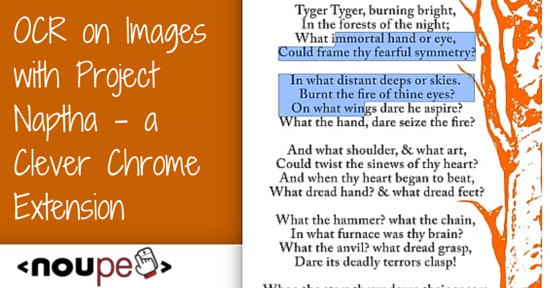
You rarely come across bitmap-based image formats like JPG or PNG that have longer texts in them. However, titles and additional information in images are quite common. Often you’ll find longer texts in screenshots. This text information can’t be highlighted and read by your browser, however. The Chrome extension Project Naptha allows you to highlight and read texts thanks to its built-in OCR. And there are even more functions which make this extension so useful.

This one is for all the web designers, developers and all the other people who like to build themselves a nice web site. Inky Deals has curated a massive bundle in two flavors. The smaller one consists of 60 Premium WordPress themes, HTML5 and Bootstrap templates, and much more for 49 dollars. And the larger one consists of even more of the same goodness for 79 dollars. No matter which one you choose, the discount is around 98 percent.

Schema.org is a joint project by Google, Microsoft, and Yahoo to structure and markup the content of websites in a way that it can easily be recognized and indexed by search engines. This principle makes work easier for webmasters as they can concentrate on one single method and take as much advantage as possible of it. Furthermore, Schema.org is also very important for SEO. Google uses generated rich snippets according to Schema.org. These are bound to increase clicks and visits because of the visually more striking search results. Google doesn’t use rich snippets as a ranking factor (yet). Now read on to learn about using rich snippets in WordPress…

This is one – err – three for our readers. We teamed up with 8theme to give three of our readers the chance to win one copy of WooPress each. WooPress is a recently launched premium WordPress theme bringing together WordPress and WooCommerce. WooPress was created by Themeforest’s Power Elite Author 8theme. Interested in winning? Securing your chance is easy, just read on…

Responsive websites have become standard. More and more people switch from their desktop devices to mobile clients like smartphones and tablets to consume websites. If you don’t want to fall behind and lose valuable visitors, it’s about time to optimize your website for mobile view. Such a website provides a good and accessible navigation on mobile devices. Practically speaking, mobile navigation is one of the most important elements in responsive design, so be sure to invest adequate time.

The great popularity of WordPress stems in large parts from its almost unlimited expandability with plugins. No matter what you want to create with WordPress, with almost absolute certainty a plugin for it already exists. However, it is not easy to find the proper one out of the 35.959 currently listed plugins. This problem tends to intensify when it comes to niche plugins that offer solutions for uncommon problems and are not too well-known. For that reason we came up with 10 new and highly interesting plugins that are not known to everybody yet.
![Cartoon: If Web Designers Were … [#001] Cartoon: If Web Designers Were … [#001]](http://www.noupe.com/wp-content/plugins/contextual-related-posts/timthumb/timthumb.php?src=http%3A%2F%2Fwww.noupe.com%2Fwp-content%2Fuploads%2F2015%2F01%2Fcartoon-series-standardimage_noupe.png&w=250&h=200&zc=1&q=75)
![Cartoon: If Web Designers Were Sculptors… [006] Cartoon: If Web Designers Were Sculptors… [006]](http://www.noupe.com/wp-content/plugins/contextual-related-posts/timthumb/timthumb.php?src=http%3A%2F%2Fwww.noupe.com%2Fwp-content%2Fuploads%2F2015%2F02%2Fnoupe_cartoon_teaser_220215.png&w=250&h=200&zc=1&q=75)


