An Exhaustive Guide on Creating Responsive Website Using HTML5 & CSS3
Over the recent years, it has been observed that people are preferring mobile phones over desktop computers for browsing the Internet. Building a website that looks perfect and functions appropriately on multiple hand-held gadgets has become the most-trusted method of gaining an edge over your competitors. It is responsive design which plays a vital role in creation of sites that can be accessed smoothly on a variety of devices with different screen sizes and resolutions.
HTML5 and CSS3 have emerged as two of the most applauded web technologies for creating responsive designs that can easily adapt to contemporary mobile browsers and devices. While on the one hand, HTML5 is used for writing the structure of web design, CSS3, on the other hand it offers you the convenience of styling the created web design.
Creating a basic Responsive Website skeleton using HTML5 and CSS3
Well, there are two methods of creating a responsive design. I’ve explained both the methods below:
Method No.1- Using your own coding technique
As the very first method, you can create a responsive design using your own code as shown below:
Output:
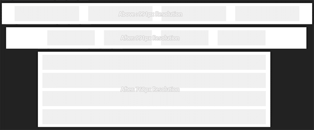
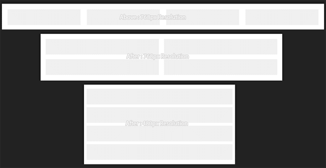
As per the above method, you can simply specify the height and width of the device that will be used for viewing the web pages incorporated within the website.
Method No.2- Using Bootstrap framework
As a much better approach compared to the one discussed above, you can create a responsive design using an existing CSS framework like Bootstrap. You can start by writing a basic HTML5 Markup using CSS3 framework as shown below:
Output:

As an attempt to make your website design accessible across mobile devices with different screens and resolutions, you need to add the viewport meta tag. This will define how the website design will be displayed on a particular device.
If you observe the above code carefully, you’ll find that the width has been defined to “device-width” which is equivalent to the device’s width. Also, the value of initial scale has been set to “1” for adding a touch-zooming effect to the web page. On proceeding ahead in the code snippet, you’ll find that each page comprises of three basic elements viz:
