Archive

Archive for August, 2015

20 Best-Designed Software Landing Pages

August 29th, 2015 No comments
00-landing-page-designs

Branding is closely related to marketing and website design is a huge aspect of digital marketing. Desktop software especially needs a great website because most people make their purchases online.

I’ve collected this set of websites & landing pages featuring quality designs made for selling software applications. If you plan to release your own software online it’ll definitely need a great-looking website. Follow along with these examples to pick up on trends worth integrating into your own design work.

Adobe After Effects

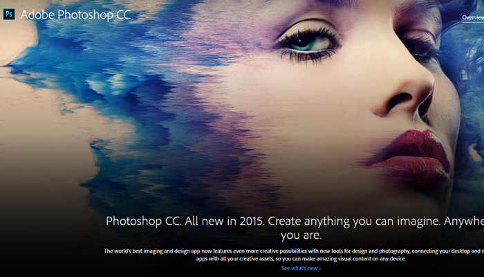
Adobe Photoshop

ps photoshop cc website

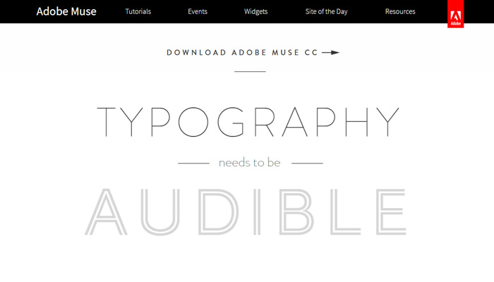
Adobe Muse

animation parallax muse website

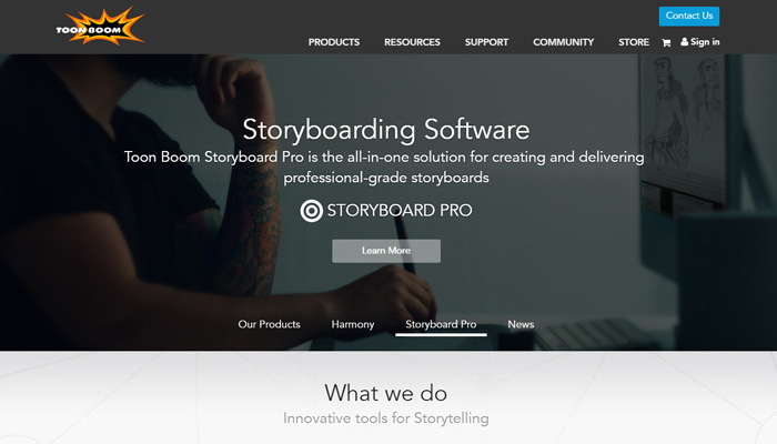
Toon Boom

toonboom studios storyboard

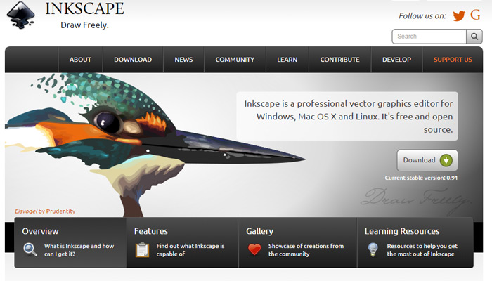
Inkscape

inkscape vector software

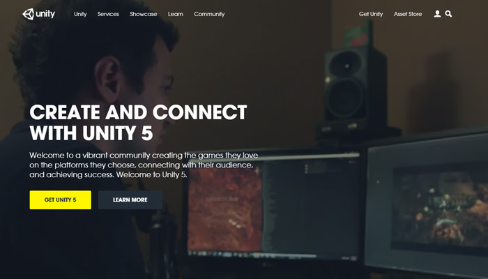
Unity

unity 3d website

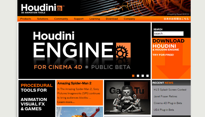
Houdini

houdini 3d software homepage

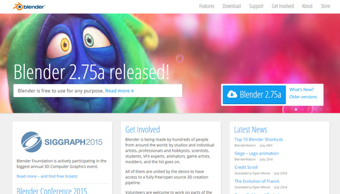
Blender

blender 3d homepage design

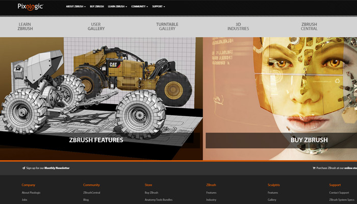
ZBrush

zbrush texture render software

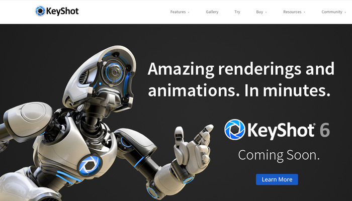
KeyShot

keyshot 3d software website

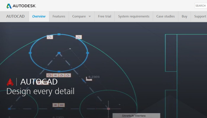
AutoCAD

autodesk autocad website

Firefox

mozilla firefox website

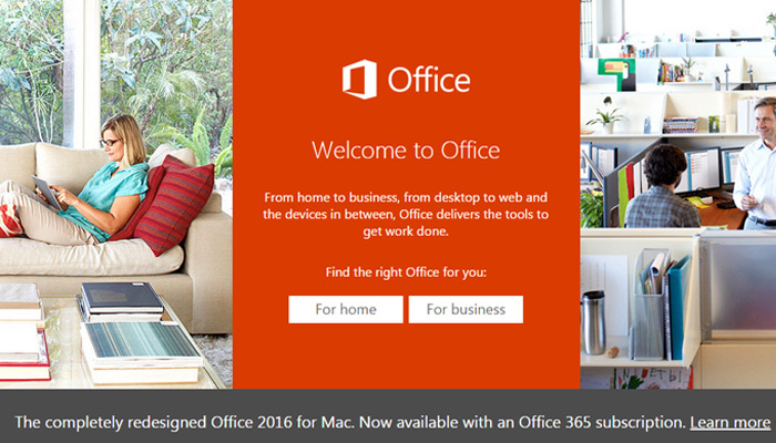
Microsoft Office

ms microsoft office homepage

Acronis

acronis backup software website

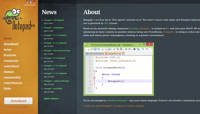
Notepad++

notepad++ software website

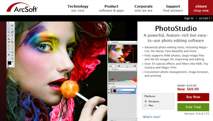
ArcSoft

arcsoft studio software page

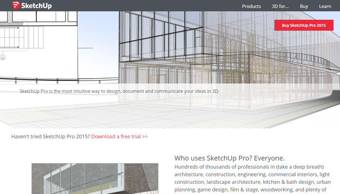
SketchUp Pro

sketch up software website

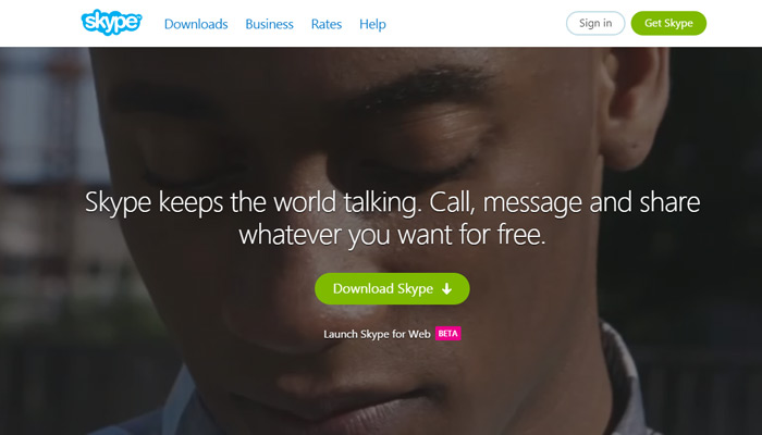
Skype

skype software chat homepage

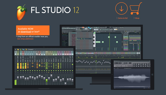
FL Studio

fruity loops studio homepage

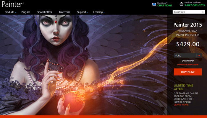
Corel Painter

corel painter software website

Read More at 20 Best-Designed Software Landing Pages

Categories: Others Tags:

Comics of the week #302

August 29th, 2015 No comments

Every week we feature a set of comics created exclusively for WDD.

The content revolves around web design, blogging and funny situations that we encounter in our daily lives as designers.

These great cartoons are created by Jerry King, an award-winning cartoonist who’s one of the most published, prolific and versatile cartoonists in the world today.

So for a few moments, take a break from your daily routine, have a laugh and enjoy these funny cartoons.

Feel free to leave your comments and suggestions below as well as any related stories of your own…

Not that concerned

TMI

No cookies

Can you relate to these situations? Please share your funny stories and comments below…

150 Retro, Vintage Vector Illustrations – only $9!

Source

Categories: Others Tags:

Six Tips for Chrome DevTools

August 28th, 2015 No comments

The following is a guest post by Umar Hansa. Umar has a newsletter I’m a fan of and graciously offered to write this guest post in that style. I’ll let him introduce himself.

Hey, I’m Umar. I like to share web development related tips on Twitter (@umaar) and also through Dev Tips which is a newsletter of developer tips in the form of gifs. Right now, it’s all primarily Chrome DevTools related. Before we get started, thank you to CSS-Tricks for letting me contribute to a community I’ve always been very fond of.

This post will cover six popular tips for Chrome DevTools. You may have seen some of these before, but hopefully if you have they’ll act as a refresher for what you can do during your Inspect Element journey.

DOM Search by CSS Selector

This is a handy trick to quickly find the DOM nodes you need. In the Elements Panel, press Cmd + F (Ctrl + F on Windows) to open the search box. You can search using the following:

  • CSS Selector: this is the cool one and what the tip is about. Find all of the anchor tags without an href attribute value using a[href=''], or traverse your way through the DOM thanks to live updating of your search result.
  • String: for example, a piece of a text in a paragraph element.
  • XPath: maybe not the most popular, but worth knowing it’s there.

Media Query Inspector

This tip assumes you already know about Device Mode.

Your stylesheets can register media queries. When in Device Mode, such media queries display in the Media Query Inspector. The width of the coloured media query bars align with the viewport ruler.

  • You can click a segment within the media query bar to trigger that media query — this in turn sets the viewport dimensions.
  • You can hover over a segment to see a tooltip with the exact rule.
  • You can right click on a segment within the bar and select Reveal in Source Code. This takes you to the point in the source code where the media query is defined.

Copy a Response

While in the Network Panel, you can right click on a resource and select Copy response to get the contents into your clipboard. In addition to that, you can head on over to the Sources Panel and drag and drop a resource onto your code editor. This embeds the contents of that file into the editor.

Copy as cURL

While in the Network Panel, you can right click on a resource and select Copy as cURL. DevTools puts a terminal-friendly command in your clipboard, along with the original request headers. This way, you can be sure the request you make is as close to the original as possible.

Inline JS Values

Debugging JavaScript in DevTools has improved a lot recently. You can now pause at a breakpoint and receive visual feedback for the current state of variable values. These inline values will typically reveal near function arguments.

The on/off switch for this feature is in Settings > General > Sources > “Display variable values inline while debugging”.

Network Filmstrip (sneak peek!)

To finish up, I thought I’d show a possible upcoming feature which I think is really cool. A feature so cool in fact, that it needs its own warning.

This is an experimental DevTools feature. Experimental features can break, change, or vanish so please keep this in mind.

If you have used WebPageTest before, this filmstrip feature may look familiar to you. It shows you screenshots of page rendering, and is valuable for understanding what your users may see.

In the recording of CSS-Tricks, we notice:

  • The page renders initially without text due to the font not being ready.
  • Secondary content, like the ads/sponsor loads after the primary content loads.
  • Because time data is shown, a particular screenshot can be matched with the time it took to reach that point and we can see primary content is visible in less than a second.

This isn’t enabled by default, but a quick search will show you how to enable DevTools hidden experiments. But keep in mind the warning above!

Conclusion

I know, this has all been very Chrome-centric. Firefox DevTools has also been adding some excellent features, however.

Thank you for reading. If you like these sorts of tips, you can subscribe to Dev Tips or follow me on Twitter.


Six Tips for Chrome DevTools is a post from CSS-Tricks

Categories: Others Tags:

Stop defending design, start presenting solutions

August 28th, 2015 No comments

If you do any client work, you understand that success or failure depends on meeting expectations; one of the hardest things to do. There are some rules you can follow to ensure that your presentations are engaging, and well-received.

1) Make sure no one is late to the party

If someone is going to have an opinion, make sure they are involved from the start of the project. That way, any ideas, concerns, or revisions late in the process made by people who aren’t stakeholders can’t potentially hold up the project.

This is huge, but it happens again and again. Clients will show designs to the marketers, IT professionals, the CEO, the stock guys, etc. and all of them will want to give their two cents. If you present conceptual work like site-maps, style tiles, and wire frames early in the process, you will get feedback early. Make sure everyone sees the work.

If you can collect the names and contact info of all the stakeholders early in the process you can make sure that you send all conceptual work and finished comps to all parties at the same time.

And make feedback mandatory, even if the only feedback is “I like it.”

2) Present face-to-face

There’s no way that you can convey every little detail about why you designed something the way you did to a client through an email. Don’t try it. If you do that, they have no clue how or why you designed something. This will put you on the defensive right away. Now, before you’ve had the chance to explain your idea, the mailroom delivery boy is going to tell his boss the design is too boxy, or that the colors suck.

Avoid being put on the defensive by arranging a meeting where you can get anyone with an opinion in a room to present your design to them. You can debate any questions face to face rather than back and forth in an email thread.

3) Saying “no” a lot sounds very negative

When you don’t get a face to face to present your design you run the risk of saying “no” a lot which makes it seem like you are unwilling to compromise. This is their project and while they’re paying you to design them a better product, they expect to be a part of the team.

Through presentation, you can hear the client’s suggestion and explain why it may not work, and eventually you can think of an appropriate solution, together. The project will turn out better in the end because you will have something that reflects the business and the client, as well as something that communicates to the users the design was made for.

4) Be honest, compromise, and avoid group think

Talk like a professional. If the client is wrong, they want you to tell them they’re wrong, but explain why. If the client is persistent, make sure you have analytics or facts to back your position.

Presenting is part selling and part consulting. If the client offers opinions that will not work but are adamant about doing it, try to reach a compromise. Offer an idea that meets somewhere in the middle and the client will respect that, even if they still want their idea implemented.

Stand your ground in the face of group think. If something is morally or ethically wrong, make your opinion known. Don’t let them tarnish their own brand by failing to speak up. Tell them exactly why their ideas are bad from an ethical standpoint, but always be respectful.

5) Shields up

If you fail to present your work properly, you’d better be ready to do a lot of stuff you think is wrong. Your client, with all of the project’s stakeholders, have been discussing the comp you sent them for two weeks and they have a lot of ideas. This is the point where you get pages of revisions to a design, or worse, an outright rejection. If you find yourself in this position make sure that you take a deep breath and call the client.

Arrange a sit down so you can hash out all of the ideas and concerns they had and explain why their concerns are unwarranted or why their ideas aren’t suitable. While you’re on the defensive, you can’t really present much of the previous design, because the client’s ideas will keep being brought up.

Bad ideas left to fester are like flies at a picnic, they leave you alone for a little while, then land on your apple pie.

6) Think through every detail

If you can’t explain an aspect of your design, and you get put on the defensive, you might as well not even talk.

At that point the client will have thought through their bad idea more than you’ve thought through the design. This is sort of like talking to someone and having them tell you that your zipper is down: it’s kind of embarrassing, and makes you look bad.

7) Don’t argue

Whether you’re presenting design or defending design, you should never argue with your client over work they’re paying you for.

Arguing doesn’t accomplish anything, it won’t sway opinions, and it definitely won’t lead to compromise. When you’re presenting work it is much easier to avoid confrontation because you are explaining the conclusions you’ve come to based on research and your experience.

It’s hard to argue over research and experience. Again always have analytics and numbers to back up your work.

8) Confirm

If you are on the defensive, and are able to get a face to face with the client to go over your design, make sure you confirm what was discussed so that everyone is on the same page. If you don’t, someone is going to be really mad their bouncing, talking paper clip didn’t make it onto the website.

Confirm via email once you get back to the office. It’s important that you have a paper trail.

Conclusion

Get out in front of any potential communication issues and present all of your work to your clients. If you present you will manage everyone’s expectations better, which will lead to a happy project and a more fulfilling experience.

Featured image, presentation image via Shutterstock.

150 Retro, Vintage Vector Illustrations – only $9!

Source

Categories: Others Tags:

Deal of the Week: 150+ Vintage Logos at a Vintage Price

August 28th, 2015 No comments

One thing’s for certain, designers can never have enough logos! And that’s the topic this week’s Deal of the Week handles perfectly. Following you’ll find more than 150 new vintage logos, badges and labels to add to your collection. All are 100% vectors and include AI, PSD and EPS files, so you can edit, customize and resize any of them to your liking. Executive Summary or TLDR Beef up your logo library with this fabulous bundle of 150+ professional logos! This high-quality collection includes vintage logos, badges, labels and crests to help you create the perfect deliverables for your clients! All logos are easy to edit and customize using layered AI, PSD and EPS files. With 100% vectors, there’s no worry at all about quality issues when you scale these images up or down in size. Fonts used in all logs are based on free fonts, available for personal use. Whether you whip up an elegant logo or a grunge-type badge, this collection is spot-on perfect for T-shirts, labels, prints, websites, illustrations and more. Mix and match these logos to create all sorts of unique results! This is What You’ll Get Pricing: Normally, this graphic bundle sells for $62, but […]

Categories: Others Tags:

Web Development Reading List #101

August 28th, 2015 No comments

What’s happening in the industry? What important techniques have emerged recently? What about new case studies, insights, techniques and tools? Our dear friend Anselm Hannemann is keeping track of everything in the web development reading list so you don’t have to. The reaction on the first post last week was quite overwhelming, so we moved from a bi-monthly frequency to a weekly frequency (for now). — Ed.

UI Mechanics of a Date Picker

Welcome back to the Web Development Reading List (WDRL) for this week. Instead of the previously announced biweekly schedule here on Smashing Magazine, I will post it in sync with the original WDRL; so, expect content to appear weekly here from now on.

The post Web Development Reading List #101 appeared first on Smashing Magazine.

Categories: Others Tags:

15 Code Snippets for Timelines

August 27th, 2015 No comments

Remember all those personal portfolios that present an artist in a unique and eye-pleasing manner. Those that breathe with modernity and originality, instantly capture the attention and make you stay. Well, today we are going to replenish your toolkit with some excellent, fast and clean code snippets that spice up your personal portfolio with one of the integral elements of such projects: a dynamic and captivating timeline. Actually, if you delve into any of these projects you will see that there is nothing supernatural or extraordinary. The majority has the same basic 4/5-page structure and standard information hierarchy (including bio, services, portfolio, and contacts). What does actually make a difference is an individual and creative approach to every section. As a rule, it implies improving each integral part through some latest techniques and tricks in order to make it look interesting, captivating and even entertaining. Dynamic pie charts that demonstrate skills, fully illustrated contact forms, reinvented Google maps with extra features, animated scrollbars, responsive timelines are the most popular options. They greatly contribute to the general feeling as well as create a long-lasting first impression that is so vital in a struggle for potential customers. The great thing is that with some basic knowledge of HTML/CSS/JS you can also […]

Categories: Others Tags:

How We Designed And Built Our First Apple Watch App

August 27th, 2015 No comments

One sunny morning in the summer of 2014, I was sitting in a café having just finished an hour-long call with my remote team. Scheduling that call had been a messy exercise: we live in different time zones and it was hard to find a time that worked for everyone. I wanted to make dealing with time zone differences less painful.

How We Designed And Built Our First Apple Watch App

I had some free time on my hands, so I pulled my notebook out and started playing around with an iWatch app idea. Yeah, you read that right?—?2014 and iWatch, before a watch had ever been announced.

The post How We Designed And Built Our First Apple Watch App appeared first on Smashing Magazine.

Categories: Others Tags:

30+ impactful black and white websites

August 27th, 2015 No comments

Color is one of the most significant elements of any design. It creates emotion, guides us through an interface, and reinforces a brand.

It’s rare that you find a truly black and white design, more often monochrome designs are dark gray, or off-white. But the effect is the same. Color is literally how we see the world — different light particles being absorbed, or emitted, give us a picture of our surroundings. So when color is missing, we start to see the world differently: textures and shapes become more apparent, and the world seems perceptibly slower. Black and white designs play on this alternate view of the world. When used well, a monochrome palette can be warm, reassuring, dramatic, and bold.

Mostly white design is minimal and restrained. Mostly black design is strong and assertive. Both ends of the spectrum are confident and positive.

Ironically, the biggest impact black and white designs have is on color. When the stage is entirely tonal, introducing a bright color almost sears it into our retinas. Adding a touch of color to an otherwise monochrome design is a powerful statement, as we’ll see…

Melanie Daveid

Ólafur Arnalds

Laure Boutmy

Code and Theory

Elite Model Management

Scheltens & Abbenes

Elbow

Flavien Guilbaud

B14

A-P & Co

Jeremy Pierre

Kurokawa Wonderland

4 1/2

Werkstatt

The Post Family

Tangent GC

Sandberg Instituut

Transistor Design

Praesens

Studio Blackburn

Yes

Dave Clark Design

Analytische Grafik

Cat Garcia Photography

Intropik

Holding Still

Pauline Osmont

Park Tavern

Rumba

Topsafe

Live Area

Pal Zileri

WXG

Folch

150 Retro, Vintage Vector Illustrations – only $9!

Source

Categories: Others Tags:

Code the Town! Investing in the next generation of programmers in Austin, TX

August 27th, 2015 No comments
Code the Town

Austin, TX is a hot-bed for technology. You can find a user group for just about any technology and purpose meeting almost any day of the week.

And now, there is a group that intersects with giving back to the community and helping the next generation of programmers. Code the Town is a group that does just that. Clear Measure, and other companies, are sponsors of the group. The official description is:

“This is a group for anyone interested in volunteering to teach Hour of Code https://hourofcode.com/us in the Austin and surrounding area school districts. The goal is to get community volunteers to give the age appropriate Hour of Code to every student at every grade level. We want to have our own community prepare students for a technology-based workforce. We also want to build a community of professionals and students that have a passion for coding and teaching. We want to begin the Hour of Code in the high schools first. High school students would then be prepared to teach the younger students. Once this group has momentum, it will be able to form motivated teams and use software projects done for local non-profit organizations to not only reinvest in our community but also to help our youth gain experience in software engineering. Whether you are a student, parent, educator, or software professional, please join our Meet Up! This will be fun! And it will have a profound impact on the next generation.”

The long term vision is to create a sustainable community of professionals, educators, parents, and students that continually gives back to local community organizations through computers and technology while continually pulling the next generation of students into computer programming.
It all starts with some volunteers to teach students the basics of computer programming. In the 1990s, the web changed the world. Now, we have hand-held smartphones and other devices (TVs, bathroom scales, etc) that are connected to computer systems via the internet. In the next decade, almost every machine will be connected to computer systems, and robotics will be a merging between mechanical engineering and computer science. Those who know how to write computer code will have a big advantage in the workforce where the divide between those who build/create and those who service what is created might get bigger than it already has.
BlocklyCode the Town will focus on introducing students to computer programming and then pull them together with their parents, their teachers, and willing community professionals to work on real software projects for local non-profits. In this fashion, everyone gets something. Everyone gives something, and everyone benefits. If you are interested in this vision, please come to the first meeting of Code the Town by signing up for the Meetup group.

Categories: Others, Programming Tags: