Archive

Archive for September, 2015

Free Webfont Testing for your Web Projects

September 30th, 2015 No comments
00-featured-webfont-test

With hundreds of web fonts available for free use, designers are constantly searching around for the best option. Comparison shopping is easy when the price is free!

Web design is largely based on typography and the typeface plays a big role. So how can you tell when individual typefaces look good together? Is there any simple method of comparing ideas before drafting a full mockup?

Actually Webfont Test was launched for this exact reason. You can easily compare any Google Fonts or system fonts to see how they stack up at different sizes, alignments, and styles.

If you own the rights to any local fonts you can also upload those directly to the webapp for testing. This in theory allows you to test any font against anything you like!

The app is completely free and offers a tremendous number of fonts to choose from. You can look at each typeface on a grid to look over the smallest minutiae, or study how it looks in block paragraphs.

If you’re a Google Chrome user then check out the Webfont Test extension. It’s also completely free and runs natively in your browser.

Best of all the webapp is completely open source on GitHub if you want to checkout the code or make alterations. But even novice designers/developers can learn a lot by comparing & contrasting font choices before diving into a new project.

Read More at Free Webfont Testing for your Web Projects

Categories: Designing, Others Tags:

New Version Control Tool for Designers

September 30th, 2015 No comments
00-version-control-mac-folio-app

Web developers and programmers have been using version control for years. Git and Subversion are two major projects with the former leading to its own community GitHub.com.

But what about designers? People who craft pixel-perfect mockups would love to have some version control as well.

This is technically possible via Git but it’s rather convoluted. Thankfully a new OS X app named Folio offers the perfect solution.

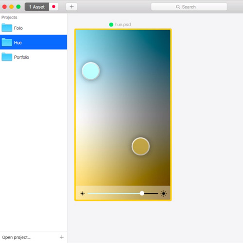
Folio offers a GUI-based method of version control for design files. These can be anything from PSDs, AIs, or even Sketch files.

The app is built on top of Git with full version control features, but it’s geared more visually towards designers. It keeps a full history of all saved versions and allows you to revert back(or forward) as you please.

Each version also has a small visual preview which can help pinpoint the exact one you’re looking for.

The Folio waterfall display is also a unique part of the GUI. It’s meant to be simpler from a visual standpoint where all directories, including sub-directories, are visual from the same hierarchy.

If you’re interested download the free trial and give it a spin. If you like Folio you can always purchase the full version which runs on Mac OS X Yosemite(10.10) or later.

Read More at New Version Control Tool for Designers

Categories: Designing, Others Tags:

Responsive Web Design: Where Do We Go From Here?

September 30th, 2015 No comments

I had the great pleasure of delivering the closing keynote at Responsive Day Out 3: The Final Breakpoint. Held in Brighton, UK on 19 June 2015, the conference is a gathering of designers and developers sharing their workflow strategies, techniques, and experiences with responsive web design.Here’s what I had to say. „Today has provided an amazing tour of the world of responsive design. We’ve seen how to level-up our workflows and processes. We’ve learned new ways to improve the accessibility of our products. We’ve grappled with modern CSS and HTML capabilities that help us embrace the hugely variable display sizes that swirl and whirl around us. We’ve explored the future of modular code and browsers’ capacity for working without network connectivity. And we’ve even taken a trip into the possible future of where the web might go. We’ve come a long way since Ethan’s article, fluid grids, flexible media, and media queries. Those three tenets sowed a seed that has grown and flourished as we have come to better understand the implications of device proliferation. We’ve seen that the web is capable of going anywhere and doing pretty much anything. I would argue that “Responsive Web Design” was the first article that really […]

Categories: Others Tags:

Ways We Work: Stories & Interviews from Talented People at Great Companies

September 30th, 2015 No comments
00-interviews-ways-we-work

It’s always fascinating to read about the different journeys and pathways that people have walked. In the tech world there are millions of stories from developers, designers, marketers, and founders from all over the globe.

Some of the most intriguing pieces are often personal interviews offering anecdotes and genuine advice. A new online publication has dedicated their entire content strategy to publishing about amazing people who do incredible work on the web.

It’s called Ways We Work and places a direct focus on the people behind the companies. You’ll find interviews from all areas of the digital world full of some incredible takeaways.

Topics include brand subjects like design at Facebook along with personal interviews like Shaun Tollerton from ustwo.

Plus you can search through collections which are like categories for the site. Browse through designers or general creators to read what they all have to say about their journeys so far.

Ways We Work is perhaps the greatest collection of personal knowledge for all areas of digital creation. No matter what you do or aspire to do, this site has advice for you.

Visit the homepage or some of the collections to search through posts and get lost in a world of honest yet poignant experiences.

Read More at Ways We Work: Stories & Interviews from Talented People at Great Companies

Categories: Designing, Others Tags:

Lenovo LaVie Z HZ550 Laptop Review

September 30th, 2015 No comments
00-featured-lavie-z-laptop

The Lenovo LaVie Z HZ550 super light laptop was first unveiled by its manufacturer at CES 2015. At the time, this very light but amazingly powerful notebook broke records for being the lightest device of its kind at just 1.87lbs (or 0.87kg).

And aside from being incredibly light, the LaVie Z is one very powerful laptop with a great set of ports and connections to boot.

While more expensive than many other laptops and arguably more expensive than a few better models like the Dell XPS 13 or the Asus Zenbook UX305, the LaVie still delivers plenty of value and is a definite contender for being amongst the best Ultrabooks on the market.

Note: There is also a 360 Tablet/laptop version of the LaVie available from Lenovo. Same general specs but with a screen that can turn 360 degrees and offers touch functionality. This review is NOT of the 360, but the LaVie Z.
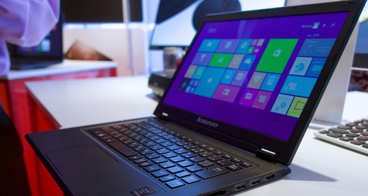
Lenovo Lavie Z HZ550 photo review

The Good

Let’s start with the single most obvious aspect of the LaVie: its weight.

This little machine is so light that you’d think you’re simply holding an empty shell when you first pick it up. This means a great deal of comfort in transporting this laptop around wherever you need to go, particularly if you’re travelling light.

The LaVie Z essentially makes the MacBook Air from Apple look like a 2.69lb rock.

Part of this dramatic weight reduction has also been achieved by a very innovative body design. While the LaVie Z feels as if it’s made out of some light and flimsy plastic, it’s actually been clad over in a much tougher magnesium/lithium alloy body. Much lighter than even the aluminum construction of many other high-end ultra-light laptops.

Part of the LaVie’s high cost is definitely the case courtesy of this very same interesting alloy body.

However, despite that light weight design, the LaVie Z is no slouch in the computing and connectivity department. It features a very decent new fifth-generation Intel Core i7 processor and comes packed with 8GB of RAM along with a 256GB SSD.

You can also look forward to several solid connectivity options on the LaVie with HDMI, dual USB 3.0, and micro SD ports.

The Bad

The LaVie Z is first and foremost rather expensive. This is its biggest disappointment.

While we certainly couldn’t expect a laptop with this kind of design and processing power to be built for a budget-minded consumer, the price tag of $1,599 is definitely on the high side.

And for that price the 256GB SSD memory is weak. Sure, it’s SSD and thus far superior to an HDD but you’ll definitely need a large external drive for storing your serious files and media.

While the quad HD display of the LaVie is excellent and with a superb pixel density, it also likely contributes to this laptop’s rather mediocre battery life of just over 3.5 hours.

Lenovo should have aimed for at least a respectable 4.5 to 5 hours.

Finally we have to mention the annoying NEC-made Japanese keyboard Lenovo decided to install on the LaVie Z. If you’re going to sell on the western market, it’s probably a good idea to give buyers what they’re used to in terms of raw functionality.

The miniature space bar, tiny Alt, Insert, Delete and Control keys and the pointless Forward Space button all take some uncomfortable adjustments.

Specs

Type: Ultrabook laptop

Screen size: 13.3 inches

Aspect ratio: 16:9

Resolution: WQHD (2560 x 1440)

Included OS: Windows 8.1

Battery life: 3.5 hours

Processor: Intel Core i7-5500U Processor( 2.40GHz 1600MHz 4MB)

RAM: 8GB LPDDR3

Weight: 1.87 lbs

Storage (Hard drive): 256GB SSD

GPU (Video card): Intel® HD Graphic 5500

Connectivity: 902.11ac WiFi, Bluetooth 4.0, 2 x USB 3.0 ports, 1 x HDMI 1.4, microSD reader, Headphone/microphone jack

Display & Design

The LaVie is one very light piece of work. So light in fact that it tends to feel a bit flimsy, though it’s actually quite robust with its metal body.

In terms of overall look, the muted black body of the LaVie Z is not much of a stylish machine, though its extreme thinness and minimalist design add a certain touch of elegance.

The metal body helps to resist frequent scratches, smudges, and fingerprint marks. Though some will certainly appear after a few months of regular use, cheaper plastic laptops on the market would look far worse after the same amount of time.

As for the display, the LaVie Z offers a wonderfully crisp 13.3 inch Quad HD resolution of 2560 x 1440 pixels with an LED anti-glare screen design that’s one of the best you’re likely to see on the market. And with that many pixels packed into such a small 13.3 inch screen, the LaVie Z also offers superb pixel density that will leave you straining to glimpse pixelation no matter how closely you look.

Colors are sharp and vibrantly rendered with excellent consistency. The brightness of the display is also superb, along with its off-center viewing clarity.

Performance & Connections

The LaVie Z from Lenovo is in fact quite a solid performer across the board.

Its weak battery power is a serious deficient at just 3.5 hours. In terms of CPU power, the Core i7 chip from Intel delivers plenty and is considered to be one of the best on the current market – particularly for a laptop.

As for the GPU, it’s a modest Intel HD 5500 that can manage very smooth visual rendering and light HD gaming.

Other reviewers have tested the LaVie Z with 3DMark’s Fire Strike testing and came up with a very respectable 754 point result.

Final Opinion

In my final opinion the Lenovo LaVie Z is a very solid performer whose extremely low weight and performance for that weight will certainly impress friends who use it. However, the small display and tricky Japanese keyboard design present a couple physical flaws.

The battery life is something Lenovo should have really worked to improve given other impressive performance specs in this model.

If it were just a bit less expensive, the LaVie Z would definitely be a worthwhile purchase.

Positives

  • Powerful Intel Core i7 CPU
  • Excellent display quality
  • Robust metal-clad design
  • Fantastically light
  • Superb Quad HD resolution

Negatives

  • Uncomfortable keyboard design
  • Overly small display
  • Feels flimsy
  • Very weak battery life

Read More at Lenovo LaVie Z HZ550 Laptop Review

Categories: Designing, Others Tags:

Design Disruptors: A Documentary of the Design World at Major Tech Companies

September 30th, 2015 No comments
00-design-disruptors-preview

We live in an era where design is prevalent and technology is a rapidly growing sector of the private workforce. Yet there’s a shocking absence of quality documentaries that peek into the design world.

The team at InVision has worked diligently to create a new documentary named Design Disruptors. It looks at 15 different tech corporations with combined values of $1 trillion to gauge their opinion on product design and user experience design.

Companies featured in the documentary include Twitter, Facebook, MailChimp, Netflix, Dropbox, and so many more.

Here’s a description from the film’s official website:

The 21st century has seen massive change in the world of business. Traditional industries have been shaken to their foundations by startups that seem to spring up out of nowhere.

How are they doing it? With design.

In Design Disruptors, you’ll meet top designers at the world’s smartest companies, and discover how design has become the new language of business.

As of now there is no official release date but you can sign up to be notified on the official Design Disruptors webpage.

But you can get a sneak peek of the film with InVision’s 2-minute preview trailer on YouTube.

Read More at Design Disruptors: A Documentary of the Design World at Major Tech Companies

Categories: Designing, Others Tags:

Google Maps App released for Apple Watch

September 30th, 2015 No comments
00-featured-google-maps-route

Just recently Google announced a brand new application for the Apple Watch – Google Maps for watchOS.

This is meant to bring directions and location search right to your Apple Watch. TechCrunch wrote about this release:

Through an update to the Google Maps iOS app on the iTunes App Store, Google has quietly rolled out an Apple Watch version of its popular (and, even among Apple fans, often preferred) mapping application.

The new Watch app offers a simpler version of Google Maps compared to what’s available on smartphones, as it’s designed to work more as a companion app to the richer, more feature-rich smartphone counterpart.

You can quickly enter specific routes to travel or predefined destinations regardless of your location. The smaller screen obviously plays a factor here, but Google Maps for watchOS has been designed to run more efficiently in the limited space.

This is a turning sign for Google as we can see their development team taking things a little more seriously.

Where this will lead over the next few months is anyone’s guess. But for now anyone with an Apple Watch can rely on it as their primary GPS to get anywhere, anytime.

Read More at Google Maps App released for Apple Watch

Categories: Designing, Others Tags:

Color Hunt is Social Sharing for Color Palettes

September 30th, 2015 No comments
00-featured-color-hunt-logo

The dizzying array of web-based color pickers can leave any designer at a loss for words. With so many free tools at your disposal it seems creativity is never at an end for growth.

An incredible webapp named Color Hunt adds another drop into the bucket of online color tools.

But Color Hunt is different than traditional pickers. The site is meant to be a social community of color lovers who share their favorite color palettes online for free. There are no accounts required so you can submit a brand new palette for free and let the community vote.

The front page is full of the most recently popular colors organized by submission date. New palettes are submitted every day and they’re curated by the site’s creator Gal Shir. There’s a seemingly endless library of palettes to browse through with some incredible results.

You can sort popular choices by the past week or even by all time to find the highest-rated palettes on the entire site. This is the perfect place to visit for color inspiration for any creative project.

To keep up with realtime releases & site updates follow Color Hunt on Facebook or on Twitter @colorhunters.

Read More at Color Hunt is Social Sharing for Color Palettes

Categories: Designing, Others Tags:

Dribbble Shots in every New Tab for Chrome and Firefox

September 30th, 2015 No comments
00-featured-dribbble-new-tab

An invite-only network of designers carries with it a certain weight of prestige. Dribbble is perhaps one of the more well-known portfolio sites with an incredible roster of designers.

It offers an inspirational look at the live pulse of the design world. Popular shots are voted on by users and these tend to draw the most attention.

Dribbble New Tab is a browser extension for Google Chrome and Firefox that brings these popular shots right to your desktop. It connects into the Dribbble API to pull out the latest popular shots in every new tab you open.

This is a fun and creative way to stay on top of Dribbble and the latest high-quality posts on their site. I’ve been using Dribbble for over 3 years and continue to visit the site almost every day. There’s no end to the quality work and the number of invited designers has been growing rapidly.

If you install the extension you’ll be given the option to change up which shots are displayed in your new tab. Unregistered Dribbble users can see popular & recent shots.

But if you have an account you can also display shots from the people you follow, your own shots, or shots in your “liked” history.

Dribbble New Tab is a versatile and fun way to spruce up your browsing experience. It currently works for both Chrome & Firefox with many hoping for an Opera extension soon.

You can install for free and never miss a beat on the Dribbble courtyard.

Read More at Dribbble Shots in every New Tab for Chrome and Firefox

Categories: Designing, Others Tags:

Desktop Wallpaper Calendars: October 2015

September 30th, 2015 No comments

We always try our best to cater for fresh inspiration and well, we have found a very effective way to do so: desktop wallpapers that are a little more distinctive than the usual crowd. Since seven years, we challenge the design community to participate in our wallpaper mission and each month designers and artists from across the globe enthusiastically contribute their work to it. The result is a unique mix of ideas and styles, eye candy that is bound to cater for new idea sparks.

Desktop Wallpaper Calendars: October 2015

We are very thankful to everyone who took the challenge and shared their designs with us this month. This post features desktop wallpapers for October 2015. Both versions with and without a calendar can be downloaded for free. Time to brush up your desktop!

The post Desktop Wallpaper Calendars: October 2015 appeared first on Smashing Magazine.

Categories: Others Tags: