Borrowing Sketch Styles from Similar Layers
Shared Styles, Text Styles, and Symbols in Sketch App bare a striking resemblance to the way that we use CSS classes in web design. They let us reuse sets of already-defined styles in an effort to save a few seconds in our workflow.
But there is one flaw in this concept that I find to be the most annoying thing: the variable.
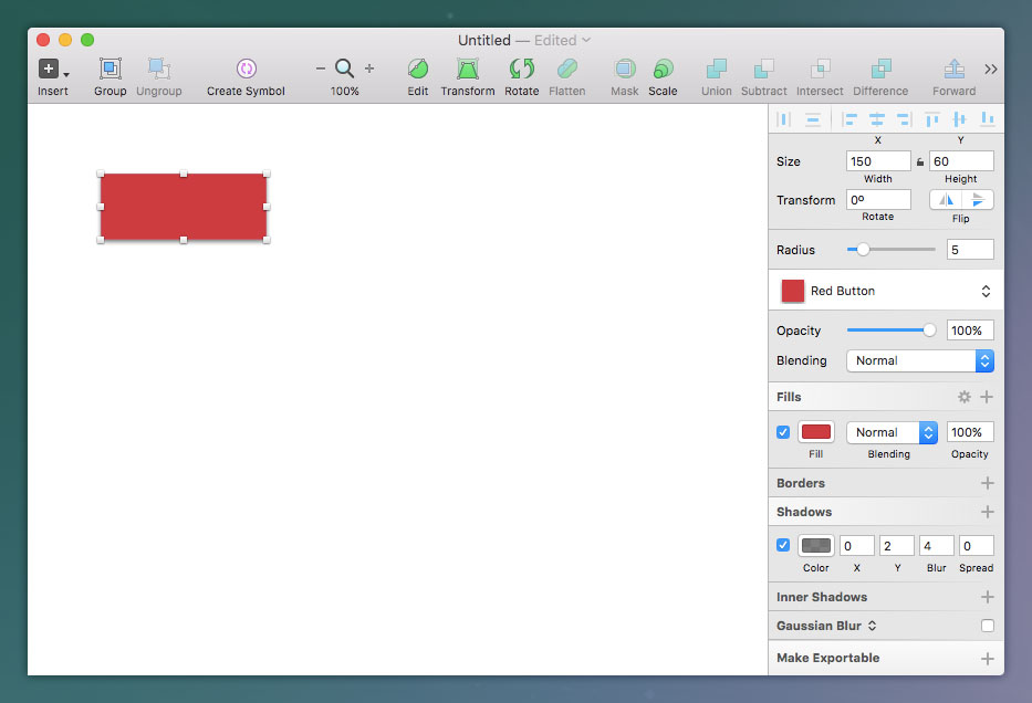
Let’s say that you’ve designed a button in Sketch App. It’s red with rounded corners and a slight shadow. You convert this to a Shared Style because you’ll need to use this button numerous times throughout the website design.
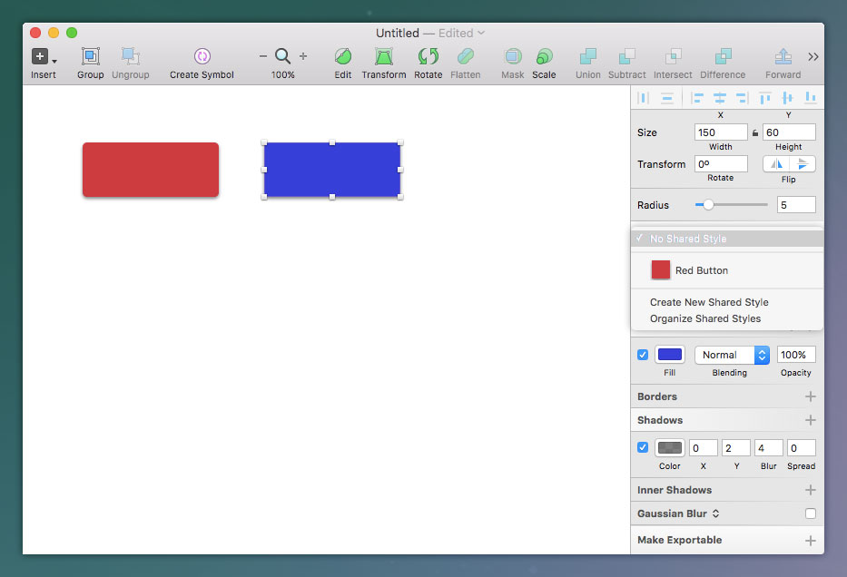
Later on you decide that you need a blue button as well. Knowing that you can’t reuse the shared style because that button is red, you start to recreate the button’s styles from scratch – a workflow that often becomes very dull over time.
The only variable is the fill colour.

So here’s what you do.
You add the shared style anyway, where in this case your blank shape would now be a red button, and then you remove it instantly. Your shape will retain the styles of the red button but it will no longer be tied to the “Red Button” shared style.
You’re now free to change the background colour and even add a completely new shared style to it – for example “Blue Button”.

And this is how we borrow styles from similar Sketch layers in order to create styles that are near-identical. Very handy if you’re copying styles many times over!
Read More at Borrowing Sketch Styles from Similar Layers
