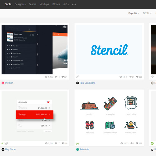
Dribbble releases larger Display Options for Shots
The Dribbble team in Salem, Massachusetts just recently published an option for bigger shot thumbnails. As of right now this option is visible from the top-right menu on all pages from tags, searches, and profile views.
Typical Dribbble thumbnail shots have always been rather small to accommodate smaller screens. But those with larger monitors(especially retinas) have a whole lot more space to work with.
This new update offers brimming new thumbnails in a larger grid which can be oscillated at will.
There are 4 options: the default thumbnail size with info, a larger size with info, or the default/larger sizes without info.
It seems Dribbble has been rockin’ updates as of late, with a recent push for modal window previews of shot details. This increased thumbnail option should please designers who have been looking for larger previews without having to click for expansive details.
One of the designers/developers at Dribbble Adam Darowski recently published a shot detailing this change with a .gif and some screenshots.
Feel free to let us know your thoughts in the comments or contact Dribbble directly to share your feedback on this new feature.
Read More at Dribbble releases larger Display Options for Shots
