Mobile App Design Review: Wildcard
In this post we’re gonna take a look at Wildcard, a completely free news & entertainment application.
Wildcard prides itself on providing a visually stunning platform that allows users to easily sift through engaging content. Throughout this article I’ll discuss different areas of the application that has helped make it so popular among users.
Curated Stories
Bill Gates may have written his “Content is King” essay in 1996, but there is no doubt this concept still holds true today. Especially with technology people are always in search of the best content. This is a need that Wildcard has set out to fulfill.

Above is a screenshot of the application’s home screen.
By looking at this image you’ll notice a white circle in the right-middle of the screen with the number three inside of it. This number indicates the number of stories that Wildcard has curated for a user on a similar topic; In this case, the topic is Elon Musk building a new transportation system. Wildcard will load three different cards related to this story.
I’ve included a screenshot of how Wildcard displays these cards below.

You will see that each card also has the same white circle. With the help of this button, Wildcard aims to expose users to a seemingly endless amount of content.
It also shows the application’s focus on providing constant information that the user will find intriguing.
Easy To Use
If you haven’t realized yet, Wildcard is an extremely user friendly application.
When browsing through related cards the application displays a small overview of the article, as well as the title of a card. When viewing a specific card Wildcard will display the content using their own card layout.
If instead you really like how a particular website composes their material you can revert back to the original style.
Wildcard > Mobile Web Views

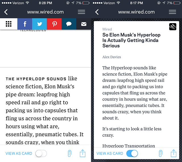
Above is a side-by-side comparison of the card view and the mobile view of an article from Wired.com.
While scrolling through the web view my finger would sometimes slide the page, and expose content that I did not wish to see. It also displayed bulky social media links at the top of the article.
When displayed as a card however, the article is optimized for mobile viewing. Wildcard was designed with a minimalist approach.
It styles the content in a way that is most favorable to readers. In turn the app does a great job of eliminating unnecessary distractions, allowing the user to focus solely on content.
The use of cards is one of the many eye-catching features of Wildcard. As users navigate through the app they’re subjected to smooth transitions that truly add to the experience of using Wildcard.
Manage Your Cards

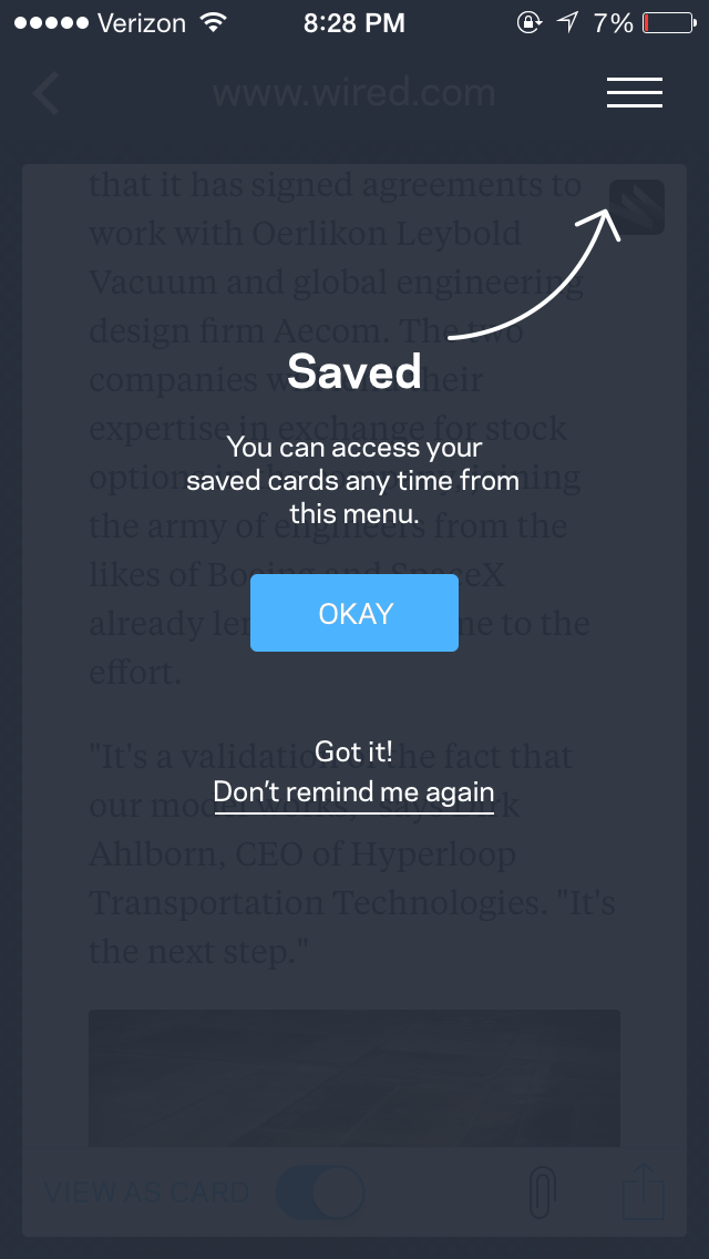
Wildcard allows users to manage a system of cards if they do not have time to read it, or if they simply wish to save a card for a later date.
As I said throughout this article, the developers of Wildcard want to ensure that you’re always exposed to content geared towards your interest. They’ve made the process of saving cards as easy as hitting the paper clip in the bottom part of the screen.
In addition to saving cards, Wildcard also displays solid functionality when dealing with offline capabilities. It makes any card saved by a user accessible without an internet connection!
Now you can read on the go at any place, any time.
Conclusion
And that wraps up my review of Wildcard for iOS. If you’re someone who is interested in application development, I definitely recommend checking it out. You can get a first hand look at how Wildcard has gained popularity by crafting a rock-solid experience for the user.
You can download Wildcard completely free from the app store and try it out for yourself.
Read More at Mobile App Design Review: Wildcard
