User Interface Design Techniques for Mobile Web Applications
Having developed smaller projects using Objective-C/iOS I learned there are many benefits and drawbacks to native applications. HTML5 mobile web apps provide a quicker all-around experience for any mobile device – and even regular desktop monitors. This means you don’t need approval from a marketplace or app store and you can publish online right away.
There are certainly some drawbacks, namely that you can’t access default libraries found in the Android/iOS SDKs. But if your application can work better running on a website then you should consider the possibilities. In this article I hope to present tips for new designers who may wish to attempt building their own HTML/CSS/JS web application from scratch.
Simplicity vs. Aesthetics
There are so many common web applications online, but not many have been structured for mobile support. You have to weigh the necessities of logos, icons, background textures, and other assets which may require more HTTP requests. Mobile users are not always on wifi so the waiting time could be longer than a visitor is willing to stick around.
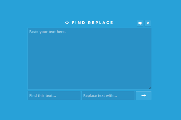
I like this little find & replace webapp on CodePen because it defines what a simplistic interface may look like. The form itself is not responsive, but it is small enough that anyone should be able to use it. Before designing your webapp think about which components are absolutely necessary for it to function properly.
Then go over your mockup and consider which areas might be improved upon, and how to do so. Try looking at other native Android/iOS applications to pinpoint trends from other experienced developers. The process of replicating an effect to the web can take a lot of work – but stick to your guns and you may be surprised at what can be accomplished.
Compact Nav Menus
Page navigation is a key piece to any mobile website or webapp. But one crucially important idea you need to keep in mind revolves around screen real estate. Mobile smartphones do not have the luxurious displays that you find on tablets or laptops. You need to create navigation menus which can expand when appropriate, but also contract and even hide links to avoid clutter.
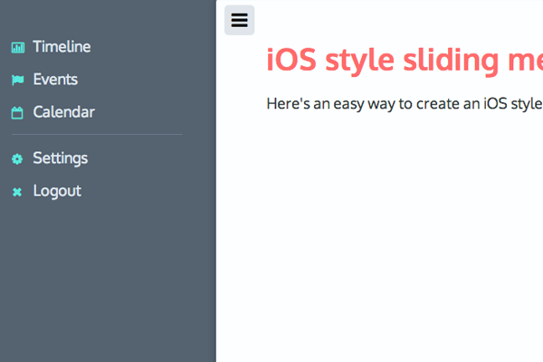
Here’s a fantastic example of the iOS-style sliding menu which has become wildly popular in recent years. Mobile iOS applications often hide links off to the side so they can be opened and closed at will. This gives more control to the user so they are interacting with links only at times when they actually need to navigate the site.
Other solutions include fixed-top dropdown menus or even stationary links at the bottom of the page. It all depends how your webapp is structured and if you even need multiple pages.
UI Design Patterns
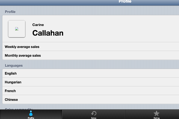
Working towards a native look and feel will take a bit of practice. Common UI design patterns include top title bars, icon-based tab bars, large buttons and pre-formatted tables. Have a look at this CodePen entry playing with the Kendo UI.
I’ve built simpler mobile webapps running entirely on CSS3 gradients and media queries. It’s pretty simple to mimic design ideas from native applications by taking screenshots and matching the colors in your CSS file. And the benefit of running a responsive layout means you only need one primary design – as opposed to native apps which require both vertical and horizontal views.
Apple’s iOS is a great framework that runs on top of a well-recognized interface. But you may also prefer the flat design styles on Windows phones and in many Android applications. Toy around with various applications on your smartphone and do some research into what you like and what you don’t like.
Write down a list if that helps you remember ideas. Consider how each user would navigate through your application and how you could simplify this process with more recognizable page elements.
Mobile Frameworks
If you want that real native app UI design style then try starting with a basic framework. Many web developers have put out free open source frameworks that you can build upon and even contribute towards. Most designers are familiar with Bootstrap which is a personal favorite of mine. The components are well-received from everyone and it can behave exactly like a typical mobile-responsive website(or webapp).
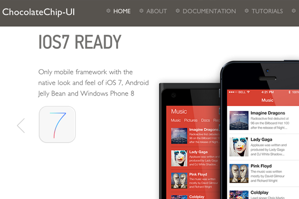
One of the newer projects I stumbled onto is called Chocolate Chip UI. This open source project allows developers to create websites using a design like iOS 7, Android Jelly Bean, or Windows Phone 8. Components are easy to setup much like Bootstrap except they are built to render more like a mobile web application.
This is a big step forward as greater layers of abstraction provide quicker turnaround time on new projects. If you have a small webapp idea it could take you less than a week to get it working and launched online. If you’d rather create your own UI with HTML5/CSS3 that is always a possibility, but greater customization will require more time in the development phase.
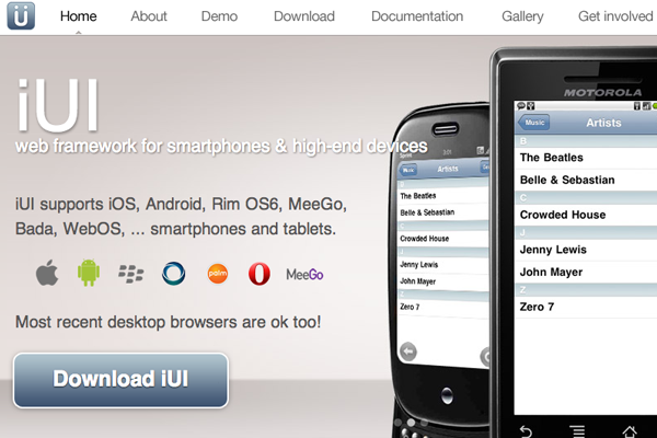
Another framework you’ll want to remember is called iUI, specifically geared towards mobile websites and webapps. These components are built to match so you can design interfaces for iOS, Android, Blackberry, really anything you’d like. iUI is quite advanced with multi-column navigation and more detailed JavaScript effects.
Take a peek at the live demo to see how this framework behaves on a mobile viewport. Naturally you can allow these webapps to expand out wider for tablets or large monitors. The purpose is greater support within a wider audience all over the planet.
Related Articles
- “Mobifying” Your HTML5 Site
- Full-height app layouts in CSS
- Mobile Website vs. Native App vs. Mobile Web App
- Building Mobile Web Apps the Right Way: Tips and Techniques
- How to create a webapp that looks like a native iOS7 app
Closing
Mobile web trends are evolving faster than one could keep up with. There are so many new ideas worth testing and even though many will be cast aside, designers are always willing to push the envelope further. This article should get you started thinking about mobile web applications, user interface design, and possibly brainstorming your own webapp ideas.
Read More at User Interface Design Techniques for Mobile Web Applications
