Archive

Archive for September, 2015

Smoothslides Responsive jQuery Slideshow with Animations

September 23rd, 2015 No comments
00-smoothslides-featured

With so many options for jQuery slideshows it can be tough to know where to start. But since there are so many options, there really is no right or wrong answer. Each project comes with its own set of requirements and that are best complimented with certain plugins.

Smoothslides is a brand new slider on the market & 100% free open source. It was created by Kevin Thornbloom and has since garnered plenty of attention from developers.

Much like other similar jQuery plugins, Smoothslides is really easy to setup. Documentation is super easy to understand with plenty of room for additional functions.

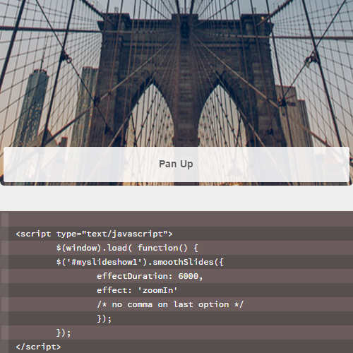
Optional parameters include image captions, auto-play settings, pagination buttons & custom easing effects. Smoothslides offers knowledgeable developers a chance to get under the hood and really write their own unique custom settings – but it also functions very well straight out of the box.

To see it in action take a peek at the live demo page. This also includes code snippets to help you get this setup & running on your own website.

If you’d want to contribute or pull down a copy of Smoothslides you can visit the official GitHub repo. Also be sure to check out the Smoothslides demo page for a setup guide & advanced custom options.

Read More at Smoothslides Responsive jQuery Slideshow with Animations
Categories: Designing, Others Tags:

Introducing Launch: A New Free “Coming Soon” WordPress Theme

September 23rd, 2015 No comments
featured-launch-wp-theme

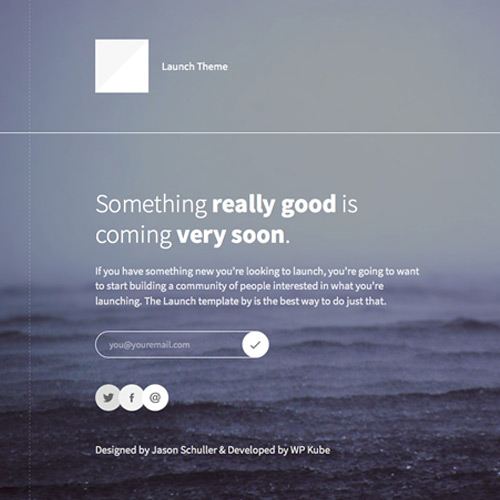
Recently the folks at WP Kube launched a free “coming soon” WordPress theme.

Named Launch, this theme is what you would use to act as a placeholder as you gear up for the launch of your next project or website.

In simple terms, Launch is a no-nonsense single-page WordPress theme meant to help you build a community and generate interest about your upcoming venture. Yes it is fully responsive, easy to configure and features a modern design and layout.

Launch was designed by Jason Schuller, though the development part has been taken care of in-house by WP Kube.

Launch integrates well with MailChimp. You just need your API key to access the MailChimp list, and then you can start collecting subscribers. Plus, there is also a nifty progress bar that can be updated, as you draw closer to the actual launch of your project or website.

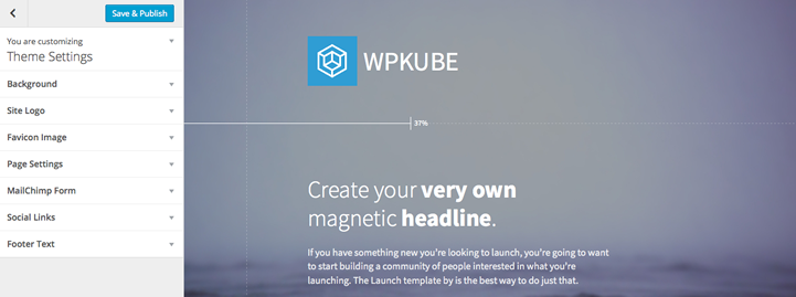
All the action happens right in the Customizer itself, including favicon, logo, heading and sub-heading, etc. Launch comes bundled with a default image, but you can change that to something of your liking from the Customizer itself.

wpkube theme customizer

Since WP Kube is a blog dedicated entirely to WordPress and everything related to WordPress, the release of a new free theme for WordPress is obviously a welcome gesture. That said, there is a lack of impressive (and free) placeholder themes for WordPress users, so Launch does seem to fill that void to a big extent.

You can check out the live demo or download the full Launch “Coming Soon” WordPress theme here. Be sure to share your thoughts about this theme in the comments below!

Read More at Introducing Launch: A New Free “Coming Soon” WordPress Theme

Categories: Designing, Others Tags:

30 Inspiring Examples of Dark Minimalist Website Layouts

September 23rd, 2015 No comments
25-creature-technology-studio-productions-website.jpg

Do you ever notice how familiar web content always seems to catch that twinkle in your eye? Fewer distractions allow for quicker reading material – and in these crazy times with Twitter and Justin Bieber it helps to remove as many distractions as possible. Another element which can help readers achieve deeper focus in a higher contrast between colors on the page.

Very dark text on a light background will read much cleaner than colors which are closer in value. But the reverse is also true, putting dark website backgrounds with lighter text colors. In this post I’ve organized some deliciously dark layouts which achieve brilliant minimalism in both form and function.

Perspective Mockups

Common Ninja

common ninja graphics dark website

Casper Odendaal

ui ux designer casper odendaal portfolio

Incredible Web

dark studio agency incredible web design

Joy Interactive

joy interactive dark website design

Nathan Romero

nathan romero dark personal portfolio

Electrik Company

electrik company dark website software development

Julien Giombetti

julien giombetti graphic designer dark website

Cross Browser Experts

dark website cross browser experts layout homepage

Andy Burdin

andrew burden designer artist dark website

JVeart

jveart design marketing dark website

Davey Heuser

davey heuser ui designer dark portfolio

JestersWild

jesters wild dark portfolio website

Ryan Mulford

ryan mulford freelance design portfolio layout

Pied Piper

pied piper silicon valley dark website

Heavy App

heavy bodybuilding app mobile landing page

All Blacks

all blacks adidas dark website

NoFavorite

nofavorite custom web design firm homepage

ALMA

alma 1938 leather dealer dark homepage

Juliana Rotich

dark website layout juliana rotich

Plural App

plural app news reader dark website homepage

Elliot Condon

elliot condon dark website portfolio homepage

Duplos

duplos ricardo mestre dark website layout

Danny Knaack

danny knaack dark portfolio texture website

Creature Technology Company

the creature technology company dark website

FlipLab

fliplab dark website layout homepage

Tiempo

tiempo flat website simple minimal layout

Ice Cube Design

ice cube web design development dark homepage

Union

union cowork space dark simple website homepage

Savoir-Faire

savoir faire pascal plamondon website homepage

Read More at 30 Inspiring Examples of Dark Minimalist Website Layouts

Categories: Designing, Others Tags:

15 Best Practices of Mobile App Landing Pages

September 23rd, 2015 No comments

No one likes to be overwhelmed by data (textual or multimedia) or graphics. Smart and compact arrangements in collaboration with an optimal balance between those two are what is needed to successfully win customers, especially when it comes to promoting upcoming digital products. Apps that are created to work on cell phones and tablets look great and consistent on various platforms and screens. To see this firsthand take a glance at our fresh collection of excellent examples of mobile app landing pages. Find some inspiration or derive a few design patterns for your next website. Mylo Mylo’s landing page exudes an image of purity, elegance, and fashion. Light coloring in collaboration with a vast amount of white space lets us quickly identify its first priorities. Thus, CTA buttons and vigilantly animated gif of an app routine enclosed in stylish highly realistic white iPhone mockup are natural eye catchers. Moovris The first thing that strikes the eye is a mobile device with a neatly incorporated dynamic walkthrough. Thanks to vibrant, simply beautiful coloring and flat style, the front page bolsters brand identity and has got a refined and sophisticated appearance. Coop Coop goes for a professionally-crafted cartoonish style that gives […]

Categories: Others Tags:

Opera rebrands with elegant new identity

September 23rd, 2015 No comments

To celebrate their 20th birthday, Opera are launching a new brand identity, the most visually striking element of which, is their new logo.

Gone is the familiar high-contrast ‘O’, to be replaced with a chunky, three dimensional ring; intended to convey the idea of Opera as a conduit to the Web, and to the information, entertainment, and services, therein.

Throughout its life, Opera’s oldstyle ‘O’ has represented the company in one stylized form or another. The new, simplified form is inline with the trend away from diverse logotypes towards a more corporate geometric sans.

this is an identity that moves the company forward, whilst properly honoring the brand’s history

In Opera’s case, what’s particularly successful about the design, is that it implies simplification, whilst retaining the essence of prior designs. The curves of the three dimensional ring taper the top and bottom of the shape, recalling the contrast in the earlier form. Unlike the recent rebrands of Facebook, and Google, this is an identity that moves the company forward, whilst properly honoring the brand’s history.

Designed over the last year by Anti, with creative strategy work by DixonBaxi, the new identity is rolling out on Opera Mini, followed by the company’s other departments over the coming months.

Opera’s reputation is as an alternative browser, but that belies the true scale of the enterprise; Opera currently boasts over a billion users each month. They’re hoping this rebrand will grow them further. According to Sean D’Arcy, Opera’s VP of global marketing and distribution: “[They] want to enable more people, in more places, to experience what matters, when it matters most.”

4 Fabulous Design Tools for Textures, Frames, Styles, and Design Elements – only $17!

Source

Categories: Designing, Others Tags:

Sketch Plugin for creating FramerJS Prototypes

September 22nd, 2015 No comments
00-sketch-framer-app-plugin

Interface designers should already know about prototyping and the myriad of tools available online. One such example is FramerJS which happens to be a dynamic prototyping tool for any type of interface.

This library has garnered lots of attention for its diversity and flexibility with unique prototyping styles. While it is a premium resource, it does get hefty use by professional agencies and creative studios around the world.

The rapid acceptance of Sketch has pushed developers to create incredible plugins for all sorts of functionality. One such plugin is Framer Inventory which connects Framer prototypes into Sketch.

It’s completely free and open source hosted on GitHub with plenty of room for advanced features.

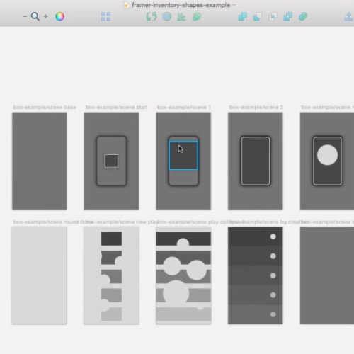
The idea is to build highly-detailed prototypes without having to write a single line of code. You can export full states of an application from Sketch which offer more manageable tips for production-level applications.

Unfortunately this plugin does require some working knowledge of FramerJS, so if you’re unfamiliar with that platform it’s worth spending time there first. But if the concept intrigues you and drives you further down the road why not check out Framer Inventory and see how it runs? Sketch users are especially open to try new things and this free plugin is another resource added into the growing toolkit of Sketch goodies.

Read More at Sketch Plugin for creating FramerJS Prototypes

Categories: Designing, Others Tags:

Rustbelt Refresh claims Cleveland, OH for an All-Day Web Conference

September 22nd, 2015 No comments
00-rustbelt-refresh-conference

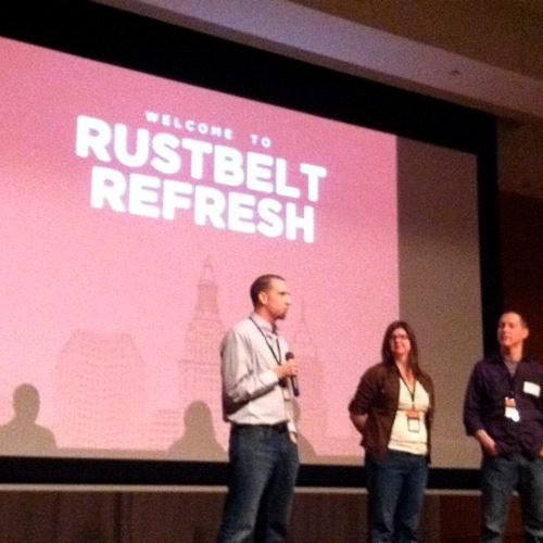
The major 1-day event for web designers and developers has once again popped up in 2015. Rustbelt Refresh has been running for a few years drawing a large handful of interest from developers and designers.

The US is full of talented tech people and this is a great opportunity to meet some of them, share notes, gather info, and have a chat over some delicious foodstuffs.

While it may seem like one day is barely enough time to cover the details, Rustbelt Refresh aims to provide the best experience that web professionals can afford in one jam-packed day.

Speakers include Eric Meyer, Wren Lanier, Ben Callahan, along with a few other talented designers/developers. It’s a very busy schedule with lots of talks and even a fun little after party.

Unfortunately the conference has already sold out for 2015, but you can always get on the waiting list in case there are cancellations. But even if you miss this year’s conference there will surely be another one around the bend in 2016.

There’s an e-mail signup form right on the homepage so you can get conference notifications directly to your inbox. Similarly it’s a good idea to stay up-to-date with the official Twitter account @RustbeltRefresh.

Read More at Rustbelt Refresh claims Cleveland, OH for an All-Day Web Conference

Categories: Designing, Others Tags:

Rustbelt Refresh claims Cleveland, OH for an All-Day Web Conference

September 22nd, 2015 No comments
00-rustbelt-refresh-conference

The major 1-day event for web designers and developers has once again popped up in 2015. Rustbelt Refresh has been running for a few years drawing a large handful of interest from developers and designers.

The US is full of talented tech people and this is a great opportunity to meet some of them, share notes, gather info, and have a chat over some delicious foodstuffs.

While it may seem like one day is barely enough time to cover the details, Rustbelt Refresh aims to provide the best experience that web professionals can afford in one jam-packed day.

Speakers include Eric Meyer, Wren Lanier, Ben Callahan, along with a few other talented designers/developers. It’s a very busy schedule with lots of talks and even a fun little after party.

Unfortunately the conference has already sold out for 2015, but you can always get on the waiting list in case there are cancellations. But even if you miss this year’s conference there will surely be another one around the bend in 2016.

There’s an e-mail signup form right on the homepage so you can get conference notifications directly to your inbox. Similarly it’s a good idea to stay up-to-date with the official Twitter account @RustbeltRefresh.

Read More at Rustbelt Refresh claims Cleveland, OH for an All-Day Web Conference

Categories: Designing, Others Tags:

Compare Speed Tests between 2 Different Websites

September 22nd, 2015 No comments
00-comparison-speed-test

Most web developers know about the significance of speed testing. It offers advice regarding how quickly certain elements of a page load, helping webmasters pinpoint areas that cause laggy speeds.

Some of the most popular choices have been Google’s PageSpeed along with YSlow developed by Steve Sauders. But these free tools are meant to check one website at a time, often focusing on a particular set of “problems” found on the page.

An interesting alternative is the DareBoost speed comparison tool (completely free!)

You can test any two websites to see how they stack in regards to rendering page elements, external HTTP requirements, and other common speed-related features.

Not only this but you’ll also be ample to compare full technology stacks. DareBoost will pull as much information as possible regarding the website’s technology such as CMS engine, server software, database software, and backend technology(Node, PHP, Rails, etc.)

In regards to raw competition this is perhaps one of the best free webapps to date. It’s super easy to punch in a couple domains and let DareBoost do its thing.

Other alternative options include a mobile vs desktop rendering test, along with testing against different browser versions or operating systems. DareBoost really put together one hell of an awesome application that should prove useful to anyone who builds websites.

If you have time give it a test run using your own website, or a couple of your personal favorite websites. The results may surprise you!

Read More at Compare Speed Tests between 2 Different Websites

Categories: Designing, Others Tags:

Compare Speed Tests between 2 Different Websites

September 22nd, 2015 No comments
00-comparison-speed-test

Most web developers know about the significance of speed testing. It offers advice regarding how quickly certain elements of a page load, helping webmasters pinpoint areas that cause laggy speeds.

Some of the most popular choices have been Google’s PageSpeed along with YSlow developed by Steve Sauders. But these free tools are meant to check one website at a time, often focusing on a particular set of “problems” found on the page.

An interesting alternative is the DareBoost speed comparison tool (completely free!)

You can test any two websites to see how they stack in regards to rendering page elements, external HTTP requirements, and other common speed-related features.

Not only this but you’ll also be ample to compare full technology stacks. DareBoost will pull as much information as possible regarding the website’s technology such as CMS engine, server software, database software, and backend technology(Node, PHP, Rails, etc.)

In regards to raw competition this is perhaps one of the best free webapps to date. It’s super easy to punch in a couple domains and let DareBoost do its thing.
Other alternative options include a mobile vs desktop rendering test, along with testing against different browser versions or operating systems. DareBoost really put together one hell of an awesome application that should prove useful to anyone who builds websites.

If you have time give it a test run using your own website, or a couple of your personal favorite websites. The results may surprise you!

Read More at Compare Speed Tests between 2 Different Websites

Categories: Designing, Others Tags: