Archive

Archive for September, 2015

Bulgaria PHP Conference opens September 25th

September 21st, 2015 No comments
00-sofia-bulgaria

A small group of PHP developers organized a gathering just a few years back in Sofia, Bulgaria. This has in turn grown into a unique conference titled PHP Conference Bulgaria with a growing list of attendees.

This autumn the PHP conf in Bulgaria runs from September 25th to the 27th as a full 3-day weekend event. It’s meant to be a cordial meetup of talented folks who want to learn more about the industry, share ideas, talk news, and maybe snag a little grub.

Those who might be interested should check out the list of confirmed speakers. Topics range from launching custom PHP webapps to the use of Zend or Laravel. It feels like the speakers list is practically endless with a wide array of talented developers sharing their knowledge of this exciting three day period.

PHP Bulgaria opens Friday with a training day of two different tracks. This is more of a workshop segment with trained professionals covering unique tools for PHP developers. Check out the full schedule to see what’s planned for this year’s festivities.

Unfortunately most of these tracks have already been filled up by early bird purchasers. However you can still obtain full conference passes for the Saturday & Sunday lineup of speakers.

But if you’re unable to make it stay up-to-date with the conference’s latest news posts and updates on Twitter @bgphp.

Read More at Bulgaria PHP Conference opens September 25th

Categories: Designing, Others Tags:

28 Inspiring Best Practices of Responsive Web Design

September 21st, 2015 No comments

Responsive web design is big. A responsive website is what you will want to create these days as responsive sites function well on any device and any resolution. No matter whether your site is viewed from a smartphone, a tablet or a desktop computer, your content will always be easily digestible. But with an universal availabilty and a self-adjusting look, what secures a positive visual experience. Responsive web sites are much harder to be made awesome as control over most of the design is very limited. We have roamed the web to bring you a whole lot of best practices. This is how a modern responsive design is able to look like. Get inspired… Best Practices of Responsive Design The following article concentrates on great examples created by professional designers and agencies from all over the world. Some of these beauties convince with interesting concepts in user interface design. We encourage you to actually visit these sites to make sure you don’t miss the best part. For those in a hurry we have used Am I Responsive to produce a screenshot collage of any given site. In some cases the service was not able to create this preview. Check these […]

Categories: Others Tags:

Interview with Steve Souders on his Work at The Frontier of Web Performance

September 21st, 2015 No comments
00-featured-steve-souders-headshot-interview

Few people can say they’ve made as much of an impact on web performance as Steve Souders. He’s the author of High Performance Web Sites and a corollary Even Faster Web Sites with great tips for frontend web developers.

His work history includes major Internet companies like Yahoo! and Google, along with open source projects that have forever changed the way we build websites(YSlow comes to mind). From this work grew a Performance/DevOps conference named Velocity which Steve co-chairs & supports in various cities the world.

I was lucky enough to get a very educational & didactic interview to publish here for WDL readers. In this Q&A Steve covers his early beginnings in the tech field and how he’s risen to where he is today.

You’ll find many handy resources, a couple brief anecdotes, and some great tips from one of the web’s most knowledgeable talent on topics of website performance and scalability. Enjoy!

Q: Can you share a little about your youth and what got you interested in technology?

There wasn’t anything in my youth that particularly pushed me towards technology. My personality has always been, you know, thinking in a very logical organized fashion.

Computers were just coming out by the time I reached college so there wasn’t really any access to them. I went to the University of Virginia and halfway through college they started the CS department. They had a CDC Cyber mainframe that you programmed with cards and paper tape. I started using that and I liked it because it was a way of thinking in a very logical, organized fashion.

I like the idea of being able to think in that way and codify your thoughts in programming. The work is done in a very scalable way where you’d write a program that could run hundreds of thousands of times, but you only had to write the code once.

So I got into computers when I was in college, and I really enjoyed them because that’s the way my brain works.

Q: What is your current area of expertise and what type of work are you doing nowadays? When people ask “what do you do” how do you answer without getting too technical?

Up until early 2002 I had been mostly a programmer and technical manager. Then in 2002-2003 I was at Yahoo! running the My Yahoo! team, and I was asked to focus on performance. I thought this meant backend scalability because that was my area of expertise running My Yahoo!, which at the time was the #1 web portal. But it turned out the Chief Product Officer who asked me to do this was talking about the user experience of performance – and I had never thought about that before.

Frontend engineering didn’t exist back then. There was some JavaScript & CSS but it was pretty new. We were mostly C programmers doing JS and CSS work. So I started changing my perspective. Rather than looking at it from the backend perspective, I started looking at websites from the user’s perspective. And that’s when I noticed the performance golden rule: 80-90% of the time the user waits for a page to load is on the frontend, so that’s where we need to focus.

Up until that time I had been focused on how quickly Apache could retrieve the My Yahoo! HTML page from the server. And it was like 27 milliseconds or something like that, it was fantastically fast. But when I looked at it from the end user’s perspective and saw it took 10 seconds to load the page I was gobsmacked. It was surprising and revealing to me, and that’s when I started looking at how browsers work & how the web works.

Since 2003 and for the last 12 years I’ve focused on web performance. I work to make that experience as fast as possible. And it’s really easy to explain to people, even non-technical people because everyone uses the web these days. And they’re frustrated when it’s really slow.

It’s even easier to explain that now because it’s more prevalent since more and more people are now accessing the web from mobile devices. I tell people I make website’s faster. Right away we have a connection, and they start telling me how frustrated they are & the websites they use that are really slow. So yeah, it’s really easy to explain.

Q: What was your goal when first writing “High Performance Web Sites” and do you feel the book has achieved this goal?

In the first 3 or 4 years of my web performance work at Yahoo!, I was able to discover many interesting techniques that could make websites a lot faster. Turns out many of these techniques were pretty straightforward and not that hard to implement.

I started sharing these techniques across the company, and of course Yahoo! has a bunch of different properties like Sports and News, YMail, etc. And we had those in countries all around the world. There were hundreds and hundreds of properties with hundreds of teams of web developers. And every one of those teams could benefit from these best practices.

So I started documenting them to make sharing easier. There was no way I was gonna be able to sit down and talk to hundreds of development teams – so this worked really well.

The techniques were straightforward and easy to explain. People just hadn’t thought about it from the end users’ perspective before.

From that we realized this would be really beneficial to share with the web development community at large, to make the web overall a lot faster and more enjoyable. The goal was to share these fairly straightforward techniques that most people weren’t aware of; and I do think I’ve achieved this goal. The book has sold very well, it’s been published in 8 different languages and most of the techniques are still applicable today.

Steve Sounders book signing

Q: What provoked you to write your 2nd book “Even Faster Web Sites” and was it meant to be a follow-up to “High Performance Web Sites”? How would you compare the two?

Even Faster Web Sites covers another set of web performance best practices.

Comparing the two books, I think readers should definitely start with High Performance Web Sites. It lays the foundation for how websites work: HTTP, DNS, Round Trips, thinking about requests like how many requests are in a page.

Even Faster Web Sites came out of the next round of best practices that we learned from working on web 2.0 websites. That sounds so out of date today. Back then we called it DHTML, which sounds even cornier!

As we built these more complex websites, we found that they often got slower. That’s when I started focusing on these insights about how JavaScript could be loaded asynchronously, how complex CSS could affect page performance. Plus Ajax was just becoming really popular back then around 2008-2009.

I just wanted to share these other best practices covering newer development techniques that were just coming out.

Q: Can you share a little about your time working at Google? How did you land that gig and was it a tough transition to get settled into that role?

Yeah I was really lucky!

I was at Yahoo! for 8 years and Google for 6 years, both of them fantastic companies.

While I was at Yahoo! open source really took off. I was really excited to work on open source projects, write books, speak at conferences and really share with the broader development community. When I first got to Yahoo! In 2000 there wasn’t very much of that. But with the Yahoo! Developer Network and YUI, open source became very popular across the industry. The idea of companies sharing their technology became more accepted.

I really benefited from Yahoo! being early adopters and being willing to share technical advances that had been developed internally, to share those externally.

And of course same thing at Google. So the transition was very smooth because at Yahoo! I was still researching new web performance techniques to benefit the teams internally. But unless those had some very specific competitive advantage, 90% of that work was just general information that was perfectly acceptable to share publicly.

I was spending time doing web performance research, developing techniques, doing some patents for internal competitive advantage – but mostly sharing things by open sourcing code, speaking & writing.

And that’s exactly what I did at Google: work on specific projects that were meant to make certain Google properties like Docs or GMail faster.

As I found new performance best practices, Google was very motivated to share those to make the web faster and help all websites become faster. So I was essentially doing the same thing: research, speaking publicly, open sourcing code, and writing.

My 1st book was published while I was at Yahoo!, my 2nd was published while I was at Google. So yeah that transition was very smooth.

Google wasn’t young when I switched, but it was much smaller when I switched in 2008. And they had this culture of performance and optimization, really working to make things fast. So everyone there was very open about doing more work in that area and sharing it across the company and externally.

Both were great jobs to have, I was really lucky. I think they both produced a lot of valuable knowledge about how to do high performance web development.

Q: Do you think web performance work is growing fast enough to warrant full-time positions at most tech companies? Or would a performance expert be better off working as a contractor?

I think most tech companies do have fulltime dedicated web performance staff. Probably not small companies, but any company with over 100-150 developers probably has someone working full-time on performance.

If I was an individual and I really liked web performance, I would try to get into one of those companies and do that focus. To me we’re still learning a lot about web performance. There’s a lot of work that hasn’t been done yet – some stuff we still don’t even know about! And working at a big company allows you to do that kind of research. To explore areas that haven’t been opened up to see which new performance techniques we should be evangelizing.

I think it’s a little harder as an independent consultant to make time to do research that isn’t dedicated to a specific contract. Also most clients hiring a consultant don’t want to pay for research that may not benefit their website. So I think working at a company that has the resources to let you do research and find new areas of learning is a great way to go.

I’ll also say that every week I get asked several times to recommend web performance consultants. I know a lot of people that go back and forth, working somewhere a few years then going back to consulting.

In truth, both paths can work well.

Steve Souders NextConf speaker

Q: Is there any particular project or job that’s given you the greatest amount satisfaction?

I think the project I’m most proud of is YSlow.

My early career back in the 80’s was doing Artificial Intelligence. So we were building expert systems and I spent years interviewing domain experts, codifying their knowledge in rule-based systems, and other ways of capturing intelligence in computer systems.

And while I wouldn’t say that the logical programming I’ve done in the last 10 years is A.I., certainly there’s a lot of this codifying of knowledge. And that’s what YSlow was.

There was no way for me to personally analyze the thousands of websites that people were asking me to help them with. But I knew the 14 rules inside-and-out. I knew that most of them could be executed through code. So I captured that logic in YSlow and first released it internally at Yahoo!.

It was really successful. People were able to analyze their websites and figure out the most important things to fix. Then Yahoo! agreed to open source it. I was lucky enough to connect with Joe Hewitt who wrote Firebug, which was the first real frontend development tool out there. He agreed that YSlow was cool and he helped me integrate it with Firebug and it became really popular.

I think there’s still a lot of interest in the idea of helping people turn data into actions. Although I think that’s a bigger conversation we could have. In many ways, we’re right at that cusp again today where we’re getting better and better tools for capturing metrics and monitoring our systems, especially in terms of performance. But what’s lacking is a conversion of that data into actions. Diagnosing problems and recommending actions to fix them.

I think YSlow, and also Google’s product PageSpeed, have atrophied from a lack of attention these past few years. I think we’re gonna see a resurgence in those kinds of tools over the next two years.

Q: What are your thoughts on full-stack JavaScript frameworks like Node.js? Do you think these offer serious competition to backend languages such as PHP, Python, etc.?

Oh yeah. I think JavaScript is still the #1 programming language for the web.

Before Node it only ran on the browser side. So everyone had to write their backend using some other language – PHP, Java, C – then write their frontend code in JavaScript.

When we moved into Web 2.0 we wanted to do a lot of those backend actions like using Ajax to generate refreshed HTML for a mailbox. We wanted to do that on the frontend, so we swung that pendulum from having all the HTML generated on the backend, to having all the HTML generated on the fronted. But we found out that was way too slow, you had to download a MB of JavaScript before you could see the inbox.

Then we realized the right answer was a compromise of delivering HTML stitched together on the backend when people first land on a website, and then lazy-loading JavaScript to generate HTML (DOM) after that initial HTML delivery.

So you could have a single-page webapp using Ajax to keep the user in a single-page context. And that was a great solution. Gmail, Google Docs, tons of websites got much faster by adopting this hybrid approach.

The problem was that it got difficult for developers because now they had to write code on the backend to create HTML, and then duplicate that code on the frontend in JavaScript.

Node.js has been so successful because it’s solved that problem. It lets us build the app logic on the backend in the same language used on the frontend.

So yeah I think Node is the preferred platform for people building web-heavy user experiences where you’re gonna have a lot of JavaScript involved. It’s a no-brainer to use Node.js to keep one language on both the frontend & backend.

Q: When a developer starts coding a new project, what should be kept in mind to ensure the fastest load times for all pages?

That’s hard to answer because there’s so much to keep in mind.

I guess there are some high-level things like “make sure to have performance metrics from the very beginning”.

Also don’t optimize too early. If you’re prototyping and it’s loading slowly, at least be aware that it’s loading slowly. Maybe even look into which areas are causing the slower load time – but you don’t have to optimize yet. Maybe you’ll end up using a completely different JS framework or slim down the CSS.

Definitely track performance metrics from the beginning, and also make sure that everyone on the team – marketing, design, content, sales – is aware of the importance of performance. They should have access to these performance dashboards to check metrics. So these are some process things to keep in mind.

When it comes to actual development advice the #1 thing is the user experience. That matters most and it’s all about rendering. When is the user able to see & interact with the content you’re delivering?

When it comes to rendering it’s all about JavaScript & CSS. Your external scripts and stylesheets play a big role. Fonts can have an impact too, but most rendering problems stem from external JS & CSS files. That’s the #1 thing to pay attention to in terms of performance, those external render-blocking resources.

Q: What are some of your favorite tools for checking load times & locating problems in a website’s performance?

The #1 performance tool in the world is WebPageTest; I use it multiple times every day. My new company, SpeedCurve, is built on top of WebPageTest. It’s fantastic, and it’s free. There are some things missing like ACLs and trending results over time. Those features aren’t in WebPageTest so that’s why Mark Zeman and I are doing SpeedCurve.

Many times I’ll use WebPageTest, but most of the time I’m in SpeedCurve working on our website and our customers’ websites to track performance problems.
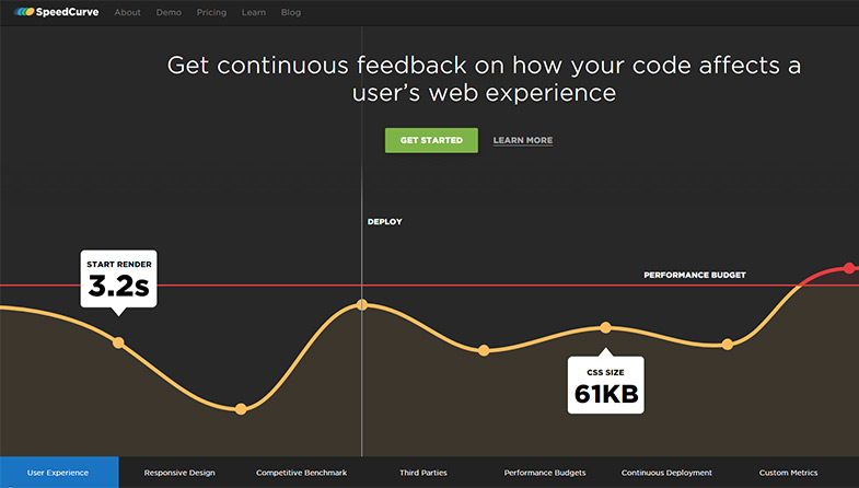
SpeedCurve homepage

WebPageTest lets me see a lot of the rendering performance. But when it comes to debugging what’s causing performance problems I use Chrome Dev Tools. It’s fantastic and they’re always releasing new features, so I really like Chrome Dev Tools.

And when I’m on the web, especially mobile, I’m using bookmarklets all the time because you don’t always have the ability to drop into those developer tools. I grouped some of my favorites into the Mobile Performance uber-bookmarklet. A newer favorite is Performance-Bookmarklet. I’ve got two new ones I’m working on now.

Q: Are there any modern web development techniques that you feel are still surprisingly archaic or just inefficient?

When High Performance Web Sites came out in 2007 it was based on the first 14 best practices I found about web performance. I think it’s surprising that many of those are still the #1 things that people have to work on today. It would seem like if they’ve been around for 8 years we would’ve tackled them. But you still find a lot of requests without caching headers, or sites that aren’t gzipping their responses.

I think that’s surprising and certainly inefficient. But it just tells us we have to be constantly vigilant and evangelize these best practices with our customers and our fellow developers.

I think the biggest archaic problem with the web today is ads. There might be some people who would debate that, and to them I’d say document.write. The fact that the entire ad system infrastructure relies on document.write shows how inefficient and insecure it is.

Because of ads we have blocking scripts on almost every popular website that exists today. And until we fix that, the web ecosystem is broken. Users and website owners are subjected to poorer performance they don’t want, but they’re forced to endure it simply because ad networks haven’t adopted basic performance best practices.

It’s really rather ironic because there are studies that show if you make ads faster, they’re actually more successful. You make more money & you get more clickthroughs. So the ad networks are not only producing bad user experiences by forcing them on people who don’t want them – but they’re also hurting their own business metrics.

Until website owners, developers, and users really get up in arms, the ad networks aren’t gonna change. I do hope we’ll eventually see them change, but I’ve been talking about this for 10 years and there’s been almost no progress.

I think that’s the #1 most archaic, inefficient problem when it comes to performance on the web.

Q: There’s no denying that conferences have taken over the web design/development industry. What do you look for in a conference and what factors contribute to the best experience for attendees?

When it comes to conferences there’s no single best model.

I co-chair Velocity. It’s the world’s #1 web performance conference. It’s fantastic, I really enjoy it. It’s a pretty big conference. Here in Santa Clara we get almost 3,000 people. In NYC, Europe, and China it’s smaller – maybe 700-1,500 people at each event.

Velocity conference Steve Souders

The benefit of a big conference is that most of the big leaders in the space are there. So you can be assured if you go to that conference, you’ll be able to listen to & talk with most of the leaders in that space.

On the other hand, there are smaller conferences that I really enjoy as well that are single track – maybe 300 people. They’re more intimate. You get to have more conversations, learn more from the attendees. But because they’re smaller you’re also gonna have only a fraction of the world’s gurus speaking & attending. So you won’t be able to see everyone, but the people who are there you’ll be able to meet and connect with closely.

I think the main thing about going to a conference is looking at the speakers. Do they know what they’re talking about? Are they good presenters? Will they give you good information that’s thought-provoking & actionable?

Those are the kinds of conferences that I like going to.

Q: What have been your major contributions to O’Reilly’s Velocity conference? How much impact has Velocity made on the field of website performance?

When YSlow and High Performance Web Sites proved to be so popular, I asked the folks at O’Reilly if we could talk about organizing a conference around that content. Someone at O’Reilly, maybe Tim or Brady Forrest, wisely saw that just focusing on web performance was only part of the conversation. There was also this group of people who back then were called “IT” or “sysadmins”; people running the infrastructure that all these websites ran on.

Both of those groups – people working on JavaScript performance & people working on Apache/MYSQL performance – were after the same thing: efficiency, optimization, scalability, faster experiences.

We had that kickoff meeting and we pulled in folks like Jesse Robbins and Artur Bergman from the operations side of the conversation. Out of that came the first conference in 2008 with two tracks: Performance and Operations. And out of bringing those two groups together we formed the term DevOps. Now that’s one of the leading themes around web development: bringing development and operations closer together.

I think that’s the most important thing that has come out of Velocity and it’s been hugely important to the world of web development.

Steve Souders speaking onstage

Q: It seems you give a lot of talks at various conferences all around the world. How do you stay fresh covering interesting topics without running out of things to say?

I spend a lot of time on the web. I tell people you always have to give yourself time to explore. You might not understand why you want to explore/investigate something. You might not know ahead of time if anything valuable will come of it. But when you poke at things that you don’t understand, you learn. And you learn about how systems work. And that’s the full stack developer which is a big part of DevOps.

So for me, I spend a lot of time on the web and usually have Chrome Dev Tools open. So I notice stuff! And I’ll think “Why did that happen? Why was that slow, why did it break? Why did it load twice?” And I’ll spend hours off on a tangent exploring why this browser, or this web stack did this thing that was unexpected and obtrusive to a good experience.

Sometimes there’s no takeaway except “well I learned more about how TLS works. Didn’t know that before”. But a lot of times there are takeaways like “even dynamically-loaded stylesheets block rendering.”

So when I see things that are weird or interesting I stop and poke, and try not to worry about spending a few hours exploring. At a minimum I’ll get smarter and best case I’ll find a new technique we can use to make the web faster.

Q: The Internet is an ever-changing medium that seems to grow faster with each passing year. Do you have any personal opinions on the type of changes we might see 3-5 years in the future?

As I said before, I think we’re entering a phase where we’re gathering a lot of data. We have things like Hadoop and Redshift. But I think what’s lacking is that codification of knowledge to take that data and produce conclusions & actions from it. So I think we’re going to see a real focus on that in the next few years.

I think that we’re going to get systems that are much more interactive. Right now I primarily use a mouse, a trackpad, and a keyboard to interact with computers. We’re going to get a lot more wearable technology, and technology that we have easier ways of interacting with. Maybe vision tracking. Maybe more gesture-based interactions. Methods that are just healthier for human interaction.

I’ve got a lot of problems with my hands and fingers and wrists and shoulders from typing 8 hours a day. I think we’re gonna see a lot of progress there.

I also think we’ve had a lot of progress in this shift that I’ve been trying to lead in focusing on the user experience. I think we’ve made a lot of progress there. I think we’re gonna see even more emphasis and awareness on what the end user is experiencing; How to improve the user experience and how that can make businesses more successful.

Q: Can you name a couple people whom you greatly admire in the field of IT & web performance?

I’ve been chairing Velocity for 8 years, and every speaker that we’ve had is someone I admire and I think should be listened to. That’s why invited them to speak! So that’s hundreds and hundreds of people right there.

A lot of times people ask me who they should follow on Twitter or RSS to stay on top of web performance. The answer I give there is Stoyan Stefanov who I worked with at Yahoo! (he’s now at Facebook). He runs this website called perfplanet.com. It’s an open source list of performance-related blogs. People can add their own blogs and the community maintains who’s in it. There’s also a Twitter account: @perfplanet.

If you follow those you’ll be tracking the latest advances in web performance, and the people who are leading those advances. That’s my recommendation.

Q: Since we’re from Web Design Ledger, anything specific you could share to folks who design websites and user experiences?

Oh yeah. It’s my main area of focus right now.

I think we’re gonna see two big changes in this area of web design & user experience.

The first is design integrated with DevOps. I talked about how DevOps grew out of Velocity from bringing the performance and operations communities together. I think we’re gonna see design pulled more into that relationship as well.

Sometimes there’s almost a contentious relationship where designers create beautiful, content-rich designs that can be challenging for developers to implement in a high performance way. So I’d like to see those two groups closer together – sharing more skills with a common vocabulary and just working together on more tasks. Perhaps bringing designers and developers to the table at the beginning of projects, rather than bringing them on at different stages.

I think that’s one big change we’re going to see in the in the world of web design. And in fact it has already started marked by Lara Hogan’s book Designing for Performance which came out about 6 months ago. It talks about this overlap between design and development. And for the last year at Velocity we’ve had people like Katie Kovalcin, Lara Hogan, and Jason Grigsby talk about how design and performance are related.

The second big change we’re gonna see in this space involves better metrics around user experience and design.

It used to be that a request was sent to an HTML endpoint to track how quickly the first byte of that HTML document came back. And that was considered the website’s performance. Yet we know that HTML document triggers another 50 or 100 HTTP requests. And it’s not until most (or all) of those requests are completed that the user experience is actually delivered & ready. That was around 2005.

Around 2010, we shifted off that single request ping to the world of DOM where we got better metrics. So instead of just the first byte we started tracking window.onload. And 5 years ago that was a pretty good measurement for user experience.

Now we have web pages that are very complex, they have a lot more JavaScript and CSS than 5 years ago. There’s a lot more dynamic behavior, asynchronous loading, lazy loading, proactive loading. So it’s become very hard to have standard metrics built into browsers that we can use across all websites as a way of measuring the user experience – and yet we know it’s really this emphasis on the user’s experience that’s most important. It’s what the user experiences that’ll determine how much they’re gonna buy. Or how frequently they’ll come back.

So we need better metrics that approximate that user experience. And that’s what Pat Meenan of WebPageTest pioneered – the film strips, and Speed Index metrics.

So I think that’s gonna be the 2nd big thing that will evolve in the design space: what I like to call user experience metrics; metrics that help us track what the user experience is like, both single-page and multi-page websites.

We’re trying to include more designers at Veloctiy and trying to think about these new types of metrics that we can track that’ll give us a better idea of what users are experiencing when they visit our sites. I’m really excited to be helping out with that.

Steve Souders photo


Steve made a lot of time for this interview and I’d like to personally thank him for all his efforts. There is so much great information here, and it pertains to such a wide audience that I’m very proud to be able to present this to WDL readers.

If you’d like to learn more about Steve you can visit his website or follow him on Twitter @souders. And if you have any interest in reading Steve’s books you can buy copies from Amazon or at most retail bookstores.

Read More at Interview with Steve Souders on his Work at The Frontier of Web Performance

Categories: Designing, Others Tags:

How To Do Knockout Text

September 21st, 2015 No comments

There are a couple of ways to do knockout text (text that appears cut out, such that you can see a background behind it) on the web. There is one fairly new way that has pretty decent browser support that is pretty interesting. But let’s cover all the ground.

Just Photoshop It Up

Like anything else, you can just fake it with a flat graphic. Sometimes it’s worth covering the obvious. The downsides are it’s not dynamic/hard to change. You can’t copy-and-paste the text. Images can be large in file size, especially as you fight for higher resolution. Etc etc. But, you can do it and it’ll work everywhere:

-webkit-background-clip: text;

This is a non-standardized property, but it was invented to do just this. The beauty is that you can pair it with -webkit-text-fill-color: transparent; so that you’re only “hiding” the text in a browser that can do the clipping. Divya Manian documented this a few years back.

.clip-text-maybe {
  
  /* if we can clip, do it */
  -webkit-text-fill-color: transparent;
  -webkit-background-clip: text;

  /* what will show through the text
      ~ or ~
     what will be the background of that element */
  background: whatever;

  /* fallback text color
      ~ or ~
     the actual color of text, so it better work on the background */
  color: red;
 
}

This is real web text, so with that comes all the accessibility and searchability and easy-to-change-ness and all that.

Here’s some fun examples of this method at work, by Jintos:

See the Pen -webkit-background-clip:text CSS effect by Jintos (@Jintos) on CodePen.

SVG fill

SVG can also have real text, through it’s element. SVG text can be filled with whatever, including a pattern. And a pattern can use an image. So… knockout text!

An example of that would be like:

<svg>
  <pattern id="pattern" patternUnits="userSpaceOnUse" width="750" height="800">
    <image width="750" height="800" xlink:href="image.jpg"></image>
  </pattern>
  <text x="0" y="80" class="headline" style="fill:url(#pattern);">background-clip: text | Polyfill</text>
</svg>

Which you could use right in HTML anywhere. Here’s an example of that by C.Y. Park:

See the Pen SVG Text Clip with Gradient & GIF by C.Y. Park (@cypark) on CodePen.

Lea Verou also documented this technique.

Polyfill the CSS with SVG

Tim Pietrusky created a polyfill for -webkit-background-clip that uses the SVG method as a fallback. The CSS version is certainly easier to write quickly than the SVG version, so it seems like this could be a good way to go while still getting better browser support.

See the Pen -webkit-background-clip: text Polyfill by Tim Pietrusky (@TimPietrusky) on CodePen.

mix-blend-mode: screen;

This is the new one I hadn’t seen before! CSS blending is fairly new. It allows you to blend elements on top of other elements like you would layer styles in Photoshop (e.g. “screen”, “multiply”, “lighten”, etc.)

Done just right, you can blend an image right on top of text without affecting the “real” background. I first saw Giana do it on CodePen:

See the Pen CSS Gradient Text in Firefox by Giana (@giana) on CodePen.

It works like this:

  1. Make the text black.
  2. Cover the entire text with the new text background and mix-blend-mode: screen;
  3. Then cover that with a new copy of the same text (in white) and the same background as the page and mix-blend-mode: multiply;

That will leave just the text with the “knockout” background visible. If you use pointer-events, you can leave the text clickable and selectable too, although it’s hard to see what you’re doing.

The advantage here is that this is a pure-CSS method that works in Firefox as well, not just -webkit- stuff.


How To Do Knockout Text is a post from CSS-Tricks

Categories: Designing, Others Tags:

How directional cues maximize UX and boost conversions

September 21st, 2015 No comments

If there’s a common question that web designers ask themselves, it’s usually: How can I improve user experience? User experience is always front and center—or at least it should be—in design; without users to read or view that content, click that call to action, or sign up on that form, no website would have a purpose.

Designers have a number of different tricks up their sleeve to make UX that much better, and one of those is the use of directional cues. These directional cues aren’t subtle; their job is to make it so that every last user can’t miss that big, ol’ call to action button somewhere on the page. In other words, directional cues are like huge billboards on a page, literally pointing the user in a very clear direction.

The strategy behind their inclusion is to increase all-important conversions. Anything you can do as a designer, to increase conversions, you should do. Directional cues help do this efficiently, here’s how:

What are directional cues?

Directional cues come in all shapes and sizes, and you may even be surprised to learn what can pass as a directional cue. Furthermore, there are both explicit (very obvious) and implicit (more low-key) directional cues.

Page elements that can be considered explicit directional cues include:

  • Arrows
  • Fingers pointing
  • Eye direction (when people’s faces are looking at a call to action)
  • Lines
  • Curves

Kin HR‘s site uses the gazes of models in the background to focus attention on their calls to action in the foreground. (The effect is particularly pronounced on a tablet viewport.)

Here’s an ideal example of an explicit directional cue from Salesforce’s landing page. Note the use of the obvious arrow directing the user’s eye to the short web form.

Implicit directional cues are far easier to miss, and those elements that constitute an implicit directional cue are debatable, but they could include:

  • Color
  • Repetition of size, color and shape
  • Hierarchy

For an example of an implicit directional cue, check out The Daily Egg’s about us page. The email newsletter sign-up form has a green background, but white fields. This noticeable contrast draws the eye, thus providing an implicit cue to fill it out.

How do you clarify page goals?

Every page has a purpose, which is usually to get a visitor to buy, sign up for, or subscribe to something. When users don’t understand what the page’s purpose is—such as when the navigation is poorly implemented or the page is much too cluttered—the user experience will drastically decline.

This is where a crystal clear directional cue can be the page’s lifesaver. After all, when the users receive cues on what they’re supposed to do on the page, then their experience drastically improves. Their confusion and frustration is replaced by a confidence and efficiency that are brought about by great organization, design and planning.

Fittingly, a superb example of a directional cue comes to us on a page that talks about the definition of a directional cue. On Unbounce’s definition page, note the huge arrow pointing to the right and thereby prompting visitors to actually read the definition of a directional cue! Thanks to this simple page element, users can clearly understand that the goal of the page is to read and understand this definition.

Empowering users with directional cues

Visual Website Optimizer looked at a page displaying an ad for Sunsilk shampoo. The results were astounding: when the woman’s eyes in the ad actually looked to her right—at the bottle of shampoo, instead of into space—the number of users who finally looked at the bottle skyrocketed to 84%, from just a meager 6% when the original ad had the woman looking straight ahead.

Eazers.com is a German site for coupons that effectively uses the same technique; the gaze of the model draws your eyes straight to the central calls to action.

There’s no doubt that directional cues are very beneficial on a page, and it comes as no surprise, that the improved user experience provided by directional cues also naturally boosts the conversion rate on sites, as the two are interlinked. When the user experience of your site increases, people convert at higher rates because they understand what they’re supposed to do.

Users sometimes know exactly what they’re looking for when they visit your site. These are likely return visitors who want to use what they used the last time they were on your site. For these types of users, it’s paramount that your user experience is top-notch because the last thing you want to do is repel sure-bet conversions! One of the easiest ways to ensure a great user experience for a returning visitor who wants to use the same feature again is by providing a directional cue that’s easy to spot, interpret and then click on.

Don’t take directional cues for granted

The next time you’re designing and think of dismissing directional cues as just a bunch of unnecessary arrows, lines or curves, think again! Research has shown that they’re definitively tied into the user experience and, consequently, a page’s conversion rate. To help your site visitors experience a much better user experience—and your clients obtain a much better conversion rate—you’ve got to incorporate these directional cues into your design.

More than issuing an instruction, directional cues are heavy-hints at what the user is expected to do. Some users won’t, some will, but the important thing is that they clearly understand what the ‘normal’ use of the page is. Directional cues are one of the best tools designers have for enhancing UX, and helping users to boost conversions for your client.

Lifetime Access to ALL WordPress Themes from TeslaThemes – only $65!

Source

Categories: Designing, Others Tags:

Mobile Navigation For Smashing Magazine: A Case Study

September 21st, 2015 No comments

Since we started plodding around on this rock in space, human beings have always been dissatisfied with their environment — which is (mostly) a good thing. Otherwise we might still live in caves, fearful of the weather and worshipping the sun. It’s dissatisfaction and curiosity which drive us to fix things that ain’t broken.

Mobile Navigation For Smashing Magazine: A Case Study

Back in spring 2013, Smashing Magazine sported a menu as its mobile navigation. It wasn’t considered an anti-pattern back then and I still think it’s a viable solution to the complex problem of how to build accessible and functional cross-device navigation. Brad Frost wrote a few words about the pros and cons of this pattern on his blog and I couldn’t agree more.

The post Mobile Navigation For Smashing Magazine: A Case Study appeared first on Smashing Magazine.

Categories: Others Tags:

25 Free Libraries for Custom Web Animation

September 20th, 2015 No comments
00-parallax-libraries-js-css

From SVG to CSS3 and modern jQuery, website animation is here to stay. What was once considered an excruciating task has now become more forthright and easier to manage than ever before.

Developers also love to share their work and improve the quality of websites across the globe. These particular libraries focus on animating dropdown menus, sliding elements, parallax content and even typography. Best of all these are 100% open source and free to use on as many projects as you see fit.

Dynamic.js

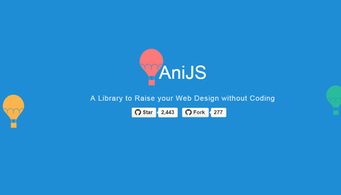
AniJS

ani.js javascript library animation

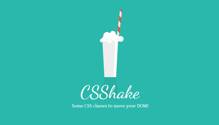
CSS Shake

css shake library transcript

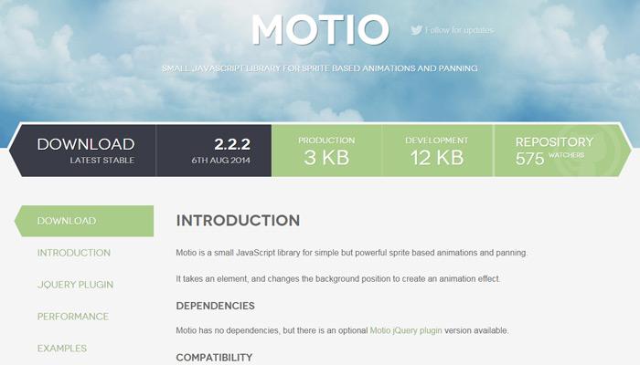
Motio

motio plugin homepage design

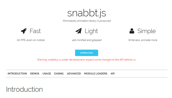
Snabbt.js

snabbt.js javascript open source library

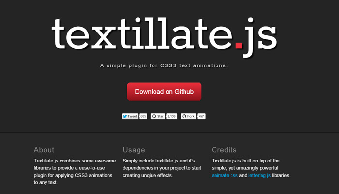
Textillate.js

textillate js javascript

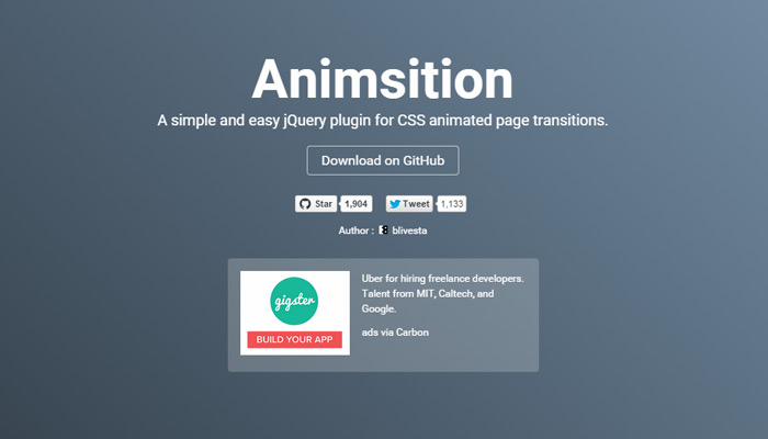
Animsition

animsition js plugin library open source

Parallax.js

parallax js open source motion

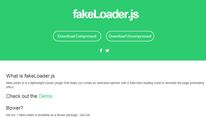
FakeLoader.js

fake loader js javascript library

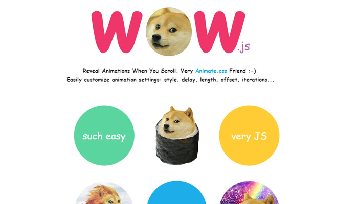
WOW.js

wow js animate css library

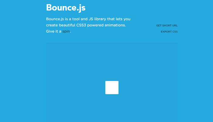
Bounce.js

bounce animation transition library

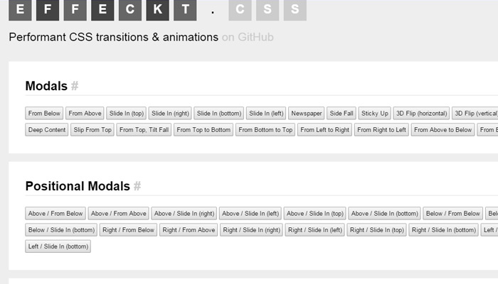
Effeckt.css

effeckt css library open source

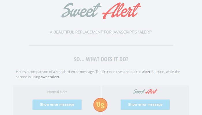
Sweet Alert

sweetalert plugin sweet open source

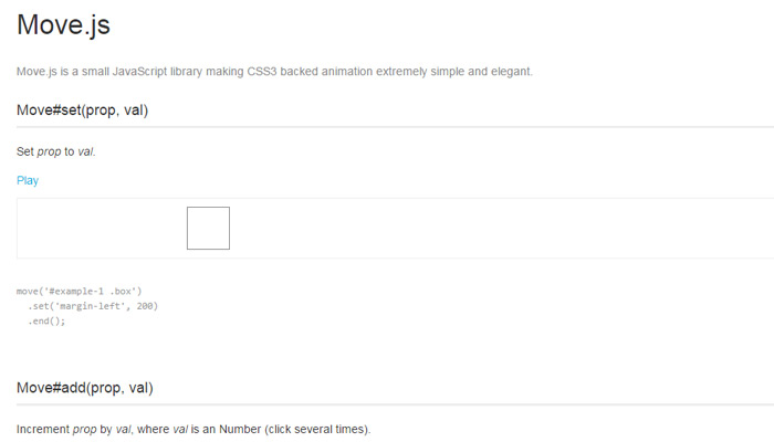
Move.js

move js open source github

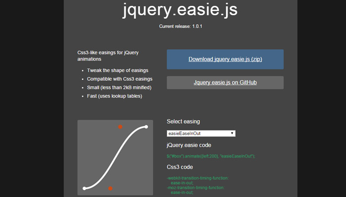
Easie

easie easing plugin jquery

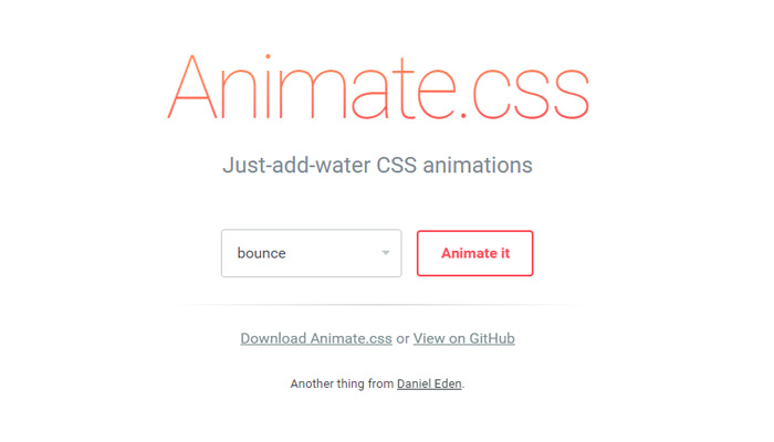
Animate.css

animate css open source code

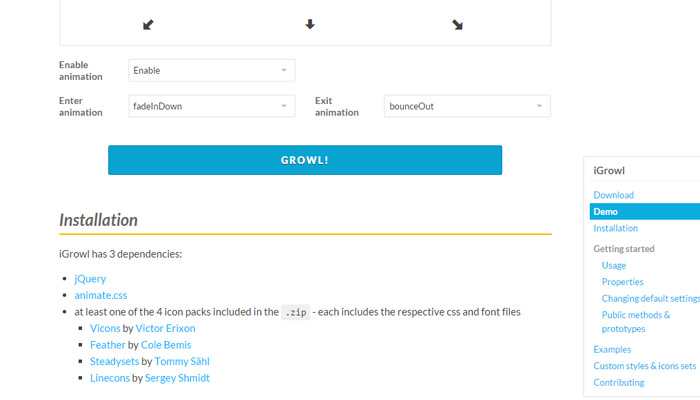
iGrowl

igrowl modal window plugin open source

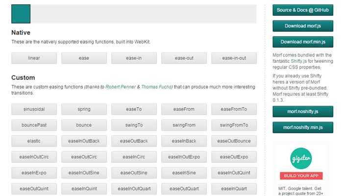
Morf.js

js javascript css3 transitions

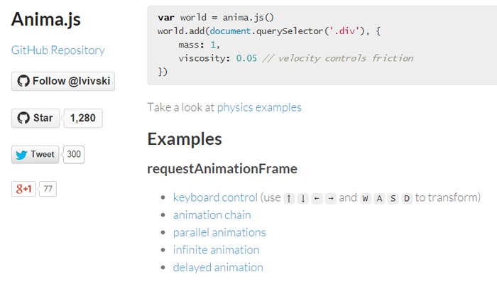
Anima

css animations anima library

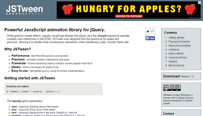
JSTween

js tween javascript animation library

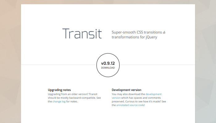
Transit

jquery transit smooth css3 code

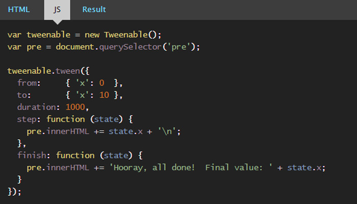
Shifty

shifty open source javascript library

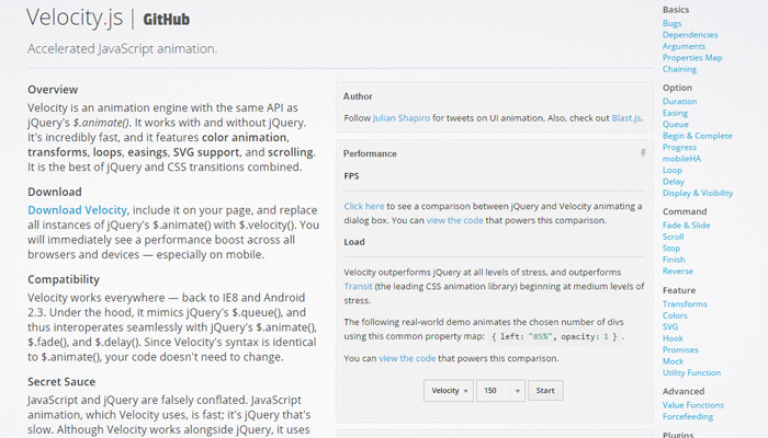
Velocity.js

velocity js open source animation

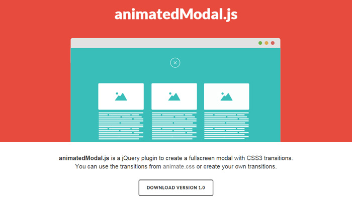
animatedModal.js

animated modal js open source lib

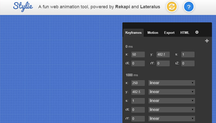
Stylie

stylie web tool animation library

Read More at 25 Free Libraries for Custom Web Animation

Categories: Designing, Others Tags:

Most Useful Multipurpose WordPress Themes

September 20th, 2015 No comments
image001.jpg

The word Premium is a proper description for many of the multipurpose WordPress themes included in this listing. Every theme listed here has a great deal going for it. Even the relative newcomers, of which there are several, have already attracted a substantial following of satisfied clients. Every theme in this list has a reputation for ease and flexibility of use, overall quality, and outstanding customer support.

We have included several special purpose, business-oriented themes, some of which you will find towards the bottom of the list. Most of these specialized themes can be used for a variety of website types, but their strength lies in developing Ecommerce sites.

X Theme

X Theme is the best premium multipurpose WordPress theme on the market according to many, and it certainly deserves the first place on top of our list. With the imminent and much-anticipated release of Version 4, this theme is likely to gain even more adherents.

The crown jewel in the upcoming version is expected to be its new, incredibly powerful and useful, front end page builder. This theme is considered to be the most versatile one in the market. It is fully supported by Themeco, and it is constantly in the process of being updated.

X Theme has been the fastest-selling theme ever. That is unlikely to change anytime soon, especially if Version 4 lives up to its expectations. If you purchase X today, you won’t miss out on the fun. The update will be yours free of charge, whether it arrives a few hours or a few weeks after your purchase, and you will of course be notified when it has been released. Subsequent updates will be free as well.

Be Theme

Be Theme is the biggest theme ever. This WordPress theme is living proof that bigger can indeed be better. With Be, you get more than 100 ready-to-use pre-made layouts. You might expect higher quality is some layouts than in others, but that is not the case here.

Each layout has been designed as if the success of the theme depended entirely on it alone. If you couple the number and quality of these layouts with the multiplicity of Be’s features, including its clean code, its super-fast page loading, and its ease of use, it soon becomes obvious that this theme has set a standard few others can hope to achieve.

Be is ideal for developing a business or professional website. Browse the layouts, and their professionalism will become apparent. If you don’t find a suitable layout, which is rather unlikely, you have the option and the tools to quickly and easily make your own.

Enfold

Enfold is ThemeForest’s top seller, and its reputation for being the best rated of ThemeForest’s themes should come as no surprise if you take the time to view one or more of its demos. When you do, you will find the underlying concept lies in a theme that can get your web page or website development effort off to a rapid start.

In addition to its wealth of useful features, and its versatility, this is an extremely friendly WordPress theme. It features one of the fastest and easiest to master drag and drop layouts of any theme currently on the market.

If you find a demo featuring a concept similar to that of your planned website, which should not be difficult, so much the better. This multipurpose theme can be integrated with WooCommerce to create an online store in no time at all.

Philanthropy Multi-Purpose Theme

Philanthropy is a responsive, retina ready theme that is an ideal tool for non-profit or charitable website development as it has a number of featured dedicated for that particular use.

Philanthropy is a ThemeFuse product, and it is one of the more than 30 themes ThemeFuse has to offer. Themes include sports, religion, blogging, travel, business, and more, each of which is highly customizable. Open a no-obligation account, look for what appeals to you, and take advantage of their free trial offer.

Divi

Divi has become one of the most popular WordPress Themes ever made. Besides flexibility, multiple features, and ease of use, this theme quickly followed WordPress 4.1 in becoming WPML ready, and it currently features 32 different languages.

Other theme developers, sensing the importance of offering a better global website development tool are getting on the bandwagon, but Divi led the way. This theme features more than 20 pre-made layouts, plus it gives you the option of creating your own. This is also a theme that has never stopped updating and incorporating improvements.

Kallyas Theme for WordPress

Kallyas’ iconic design, coupled with its smart loading features, has made it a great option for the business website developer. It is highly flexible, easily integrated with WooCommerce, it has a very clean design (with a clean code foundation), and it is WPML and WordPress 4.x compatible.

This super-fast, top-selling theme currently serves as the basis for the creation of more than 14,000 websites, which, together with its powerful drag and drop page builder and multiple slider options, may be reason enough to give it a try.

GALATICOS

Galaticos has been primarily designed for use by businesses and entrepreneurs. Core features of this HTML-CSS3 (LESS) theme include responsive layout, a revolution slider plugin, and smooth WooCommerce integration. Setting up this easily customizable theme is quick and easy, and a variety of useful demos are but a click away. PHP, CSS, and JS ThemeForest files are also included.

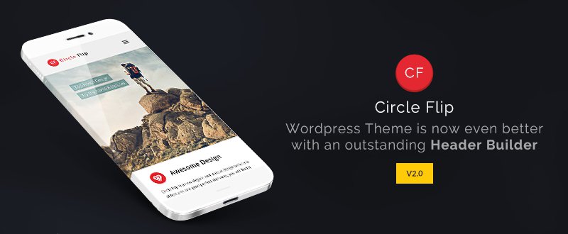
Circle Flip WordPress Responsive Theme

Most multipurpose WordPress themes give you the functionality you are looking for. Some quite naturally do it better than others. A limitation most of them have however, is the lack of a tool that makes designing headers an easy task.

Circle Flip has addressed this issue head on. It now features a unique drag and drop header builder. This, capability, together with its multiplicity of layouts, may make Circle Flip the theme you need.

KLEO – Next Level WordPress Theme

The ease in integrating with Facebook, in combination with a BuddyPress social networking plugin, has made KLEO the top selling community theme so far this year.

By using this theme as your primary development tool, you can load your website with popular community features, publish your social media-oriented blog, or showcase your portfolio. KLEO is even ideal for creating an online store, but its use as a community theme is where it really shines.

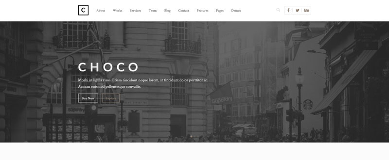
Choco

Choco features a Redux Option panel, which they refer to as “promising”, but it contains slider, map, and form, and a host of other control features. Choco is available in both WordPress and HTML versions. This relatively new theme has already gathered quite a number or rave reviews that attest to its overall capabilities, and its excellent support. This medium-priced multipurpose theme would be worth a look.
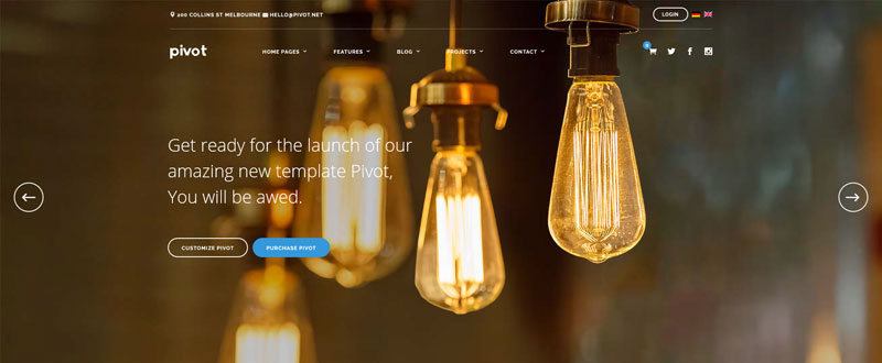
Pivot

Pivot has not only launched but has just released its 3rd update, and its users are cordially invited to comment on what they would like to see in future updates. A WordPress job manager function, Virtual Composer, and BBPress support features, have recently been added. Pivot is responsive, and is Bootstrap 3.x, WP 4.1, WPML, and WooCommerce compatible, as well as browser cross-compatible.
Magnis

Magnis is an Ecommerce theme, and it is being marketed as a corporate multipurpose theme. It is, as you might expect, WooCommerce interrelated and WPML ready. Its Visual Composer drop and drag page builder makes this theme useful for other than corporate and business use, but its strength lies in its application as a business-related theme. Magnis is WordPress 4.1 and Bootstrap 3.x compatible and browser cross compatible.

Cleanstart

CleanStart is another business-oriented multipurpose theme. It is advertised has having a strong business look, and as such is WooCommerce and WPML ready. Visual Builder is your page-building tool, and a selection of custom shortcodes have been incorporated into this theme. Other features include MailChimp and a Twitter feed. User features include online documentation and a selection of video tutorials.
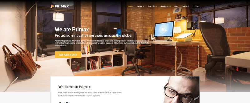
PRIMEX

Primex, the final theme in our listing, is also a business oriented theme, and it can be easily put to use to create product-based websites as well. Built around an impressive Redux framework and Visual Page Builder, this multipurpose WordPress theme is an ideal choice for users wishing to showcase their work in portfolio fashion. Primex is responsive and WPML and WooCommerce ready. Its clean and simple design lends it to use for any type of website.
Within this listing, we have included a number of premium, general-purpose themes, a non-profit oriented theme, and several themes designed for users having business or corporate websites as their primary objectives. We hope you found an ideal theme for your purposes. If so, we would like to know. If you believe something is missing, or you have a specific theme in mind that you feel should have been included, leave us your comments on that as well.

Read More at Most Useful Multipurpose WordPress Themes

Categories: Designing, Others Tags:

Popular design news of the week: September 14, 2015 – September 20, 2015

September 20th, 2015 No comments

Every week users submit a lot of interesting stuff on our sister site Webdesigner News, highlighting great content from around the web that can be of interest to web designers.

The best way to keep track of all the great stories and news being posted is simply to check out the Webdesigner News site, however, in case you missed some here’s a quick and useful compilation of the most popular designer news that we curated from the past week.

Note that this is only a very small selection of the links that were posted, so don’t miss out and subscribe to our newsletter and follow the site daily for all the news.

The Incredible Story of How a Funny Website ‘Personally Offended’ Apple’s Jony Ive

Simpla: An Alternative to the CMS

Why Google Irritates You

Six Stunning Style Guides

10 Rules of Composition all Designers Live by

A Designer’s Most Powerful Words

Can Atomic Be Google Docs for Designers?

Why is it so Easy to Get “Mobile First” Wrong?

UX Design Misconceptions

Why I Cut my Income in Half and Stopped Freelancing

Your Mac Charger, Explained

Web Designers Take Centre Stage in New Sitcom

Introducing the New Web Field Manual

Weld: Create Websites with any Design, for any Device, for Free

Welcome to Hell: Apple Vs Google Vs Facebook and the Slow Death of the Web

Becoming a Designer in Tech

It’s Almost – Your Simple Countdown to Anything

Primer: Marketing Lessons from Google

Google’s Codebase Spans 2 Billion Lines: 40 Times Bigger than Windows

What’s the Red Shape in NASA’s Meatball Logo?

How Pantone Became the Definitive Language of Color

5 Ideas for a Smarter Facebook “Dislike” Button

Mad Scientist Makes an Alphabet Out of Bizarre Ferrofluids

How to Apply Neuroscience Principles to your Landing Pages

The Best Infographics of 2015, and Why We Can’t Stop Looking at Them

Want more? No problem! Keep track of top design news from around the web with Webdesigner News.

LAST DAY: Pure CSS Image Slider with Auto-Cropping and Resizing – only $27!

Source

Categories: Designing, Others Tags:

10 Examples of Hand-Lettering Design Work

September 19th, 2015 No comments
00-featured-hand-drawn-illustration

Hand-lettering is an artistic craft so beautiful that the bewilderment only makes it more alluring. Whether you’re a calligraphist or just an appreciator of the arts, these 10 examples of hand-lettering will surely arouse some internal curiosity.

Spook City U.S.A. by Philip Eggleston

Philip Eggleston is one of my favourite artists, even more so because he churns out epic illustrated lettering on a regular basis. He’s simply a delight and this grunge-style shot is no different.

Spook City U.S.A. by Philip Eggleston

Trophaeal by Joachim Vu

Joachim Vu is a hand-letterer from Paris, France. He crafts anything from elegant scripts to monograms. His raw ink work is astounding from his technical prowess & attention to detail.

I’d encourage you to really get a good look look at the closeups!

Trophaeal by Joachim Vu

One Hell of a Brew by Mary Kate McDevitt

Mary Kate McDevitt hand-crafts stunning illustrations to accompany her explosive hand-lettered typography. These vector curves are quite unique and intoxicating.

One Hell of a Brew by Mary Kate McDevitt

WMC Fest 4 Artwork by Jeff Finley

Designed to appear on stickers, labels, and other merchandise, Jeff Finley incorporates his lovely hand-lettering into this illustration that combines both grunge and minimal styles.

WMC Fest 4 Artwork by Jeff Finley

Make Old Things New Again by Adam Trageser

This is one of those shots you just have to check out in fullview; the tiny Dribbble shot does not show off its entire beauty.

Hand-lettering works well when combined with vintage styles and unsaturated colours. After all we’ve gotta remember there was a time when 100% of design work was done by hand.

Make Old Things New Again by Adam Trageser

Frank’s Barber Shop by Jeff Rogers

Historically barber shops have had some of the most stunning vintage signs. These vintage examples serve as inspiration in modern work;

For this piece Jeff Rogers illustrated his own contemporary take on the style.

Frank's Barber Shop by Jeff Rogers

AAF Cincinnati Addys 2014 by Danielle Evans

Hand-lettering doesn’t limit you to pen and paper; according to Danielle Evans you can even use malt. Actually, using food to create beautiful typography is more common than you might think.

AAF Cincinnati Addys 2014 by Danielle Evans

Hermit Style Iceberg by Mary Kate McDevitt

Inspired by Bjork, Mary Kate McDevitt designed this epic desktop wallpaper which you can download for free. The sharp hand-lettered typography was created for the Fox Is Black Project.

Hermit Style Iceberg by Mary Kate McDevitt

The Haunted by Philip Eggleston

Another one of Philip Eggleston’s best work is The Haunted, creepily hand-scratched on a black background where the texture looks a little like a woodblock print. Splendidly eerie!

The Haunted by Philip Eggleston

Look Up In The Sky by Philip Eggleston

It’s quite amazing how this hand-lettering emphasizes a sarcastic tone with its overly flamboyant swirls and bold colours.

There really isn’t anything better than modernized, digitized hand-crafted typography – especially when the message is conveyed with such a personal touch. Great job Philip!

Look Up In The Sky by Philip Eggleston

Any thoughts on these examples? What do you think about hand lettering for the web?

Read More at 10 Examples of Hand-Lettering Design Work

Categories: Designing, Others Tags: