With the release of Creative Cloud 2015 Adobe has continued their tradition of generating a buzz in the tech sector. In addition to major updates on their programs like Photoshop and Illustrator, Adobe has also released a new platform named Adobe Edge Web Fonts.
Edge Fonts is a stunning font foundry that web designers can use 100% free for all design work. If you’re familiar with Adobe and the creative cloud platform then you know about TypeKit. This is Adobe’s premium font service which costs money.
But with the release of Edge Fonts Adobe now provides an alternative to TypeKit, offering web designers over 500 different font-families to choose from. I’ll give you an overview of Edge Web Fonts and why designers should be excited about this amazing collection of typefaces.
Worth the Wait
In the recent past Google has dominated the web font game. Simply put, no other service provided an extensive collection of web fonts for free.
There is no denying that Adobe TypeKit is extremely popular among web designers. But the price of TypeKit often caused people to stray from using it.
Because Edge Web Fonts is free to use commercially, Adobe now provides an alternative to the once unrivaled Google Webfonts. Edge Web Fonts aims to provide a free service that is easy to use.
Just like Google Fonts, a person does not need any sort of account to utilize Edge Fonts library.
In addition to being easy to use, Edge Fonts is powered by the TypeKit font service. Users can expect high-end performance and stability for their web fonts.
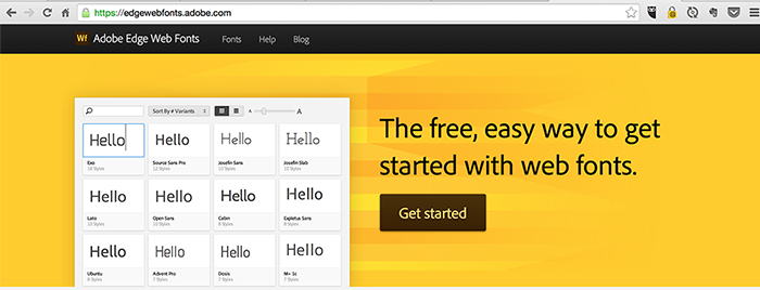
Edge Web Fonts User Interface
In the image above you can see the interface Edge Web Fonts provides for choosing fonts. For those of you who’ve used Typekit in the past, you’ll notice the Edge Fonts website is strikingly similar to that of TypeKit.
As a TypeKit user myself I think this is pretty important to note. The user interface was one of the main reasons why I continued to use TypeKit, and now Adobe is providing this to web designers for free.
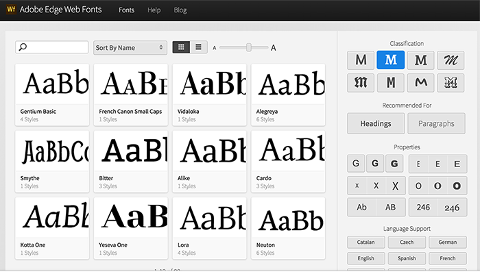
In the example above I’ve narrowed the choices down to only serif fonts in order to show you a basic example of how Adobe’s interface works. Although this may not seem very powerful, it allows you to sift through font faces that are alike in some way.
Edge Fonts also allows you to search fonts depending on whether they will be used as a heading or paragraph text. This interface is much easier to choose the most appropriate font for whatever environment you’re designing.
Google Fonts is indeed a tremendous font foundry for web designers, however sifting through the extensive number of fonts can become a problem.
It seems Edge Web Fonts has a leg up in this regard.
Conclusion
In order to truly grasp the power of Edge Web Fonts you’ll have to check it out for yourself.
Not only does it provide an extensive number of fonts, it also makes the process of finding them quick & easy. Also you should remember that Edge Web Fonts provides premier performance for your font styles by utilizing TypeKit!
You’ll surely not be disappointed when you see what has been given to web designers with the incredible Edge Web Fonts service.
In this month’s edition of what’s new for designers and developers, we’ve included lots of color resources, startup resources, educational tools, email tools, JavaScript resources, icons, inspiration sources, CSS resources, and much more. And as always, we’ve also included some awesome new free fonts!
Almost everything on the list this month is free, with a few high-value paid apps and tools also included. They’re sure to be useful to designers and developers, from beginners to experts.
If we’ve missed something that you think should have been on the list, let us know in the comments. And if you know of a new app or resource that should be featured next month, tweet it to [@cameron_chapman](http://twitter.com/cameron_chapman) to be considered!
HTML Color Codes
HTML Color Codes is a color picker that lets you get HTML color codes, hex color codes, RGB and HSL values, and more. There’s also a color chart, if you’d rather not use the picker.
Framer Inventory for Sketch
Framer Inventory for Sketch is a plugin that lets you generate FramerJS prototypes. You can export states rather than screens, it’s faster than Keynote, and more.
Rucksack
Rucksack is a collection of CSS features like responsive typography and property aliases that’s built on PostCSS. It’s modular and lightning fast.
Chocolat.js
Chocolat.js is a jQuery free lightbox plugin. It’s light, responsive, and powerful.
Frontify Style Guide
Frontify Style Guide lets you create free style guides for your projects quickly and easily. You can include logos, images, color palettes, typography, and much more.
Music Emojis
Music Emojis are designed by Brazilian art director Bruno Leo Ribeiro. He’s created emojis for a variety of artists, including Aerosmith, Elton John, The Spice Girls, and Daft Punk.
iOS 9 GUI for Sketch
iOS 9 GUI for Sketch includes devices, icons, and keyboard vector images. It includes a ton of elements, and respects the latest Apple guidelines for iOS9.
Font Flame
Font Flame is like Tinder for font pairing. You’re presented with a font pairing, and can select whether you love it or hate it to see another.
Flinto
Flinto is a prototyping tool for Mac. You can create prototypes with simple tap-throughs to more impressive interactions.
UI Movement
UI Movement delivers UI design inspiration right to your inbox. You can also search or browse the site for ideas.
Bonsai
Bonsai offers free, bulletproof contracts. It includes simple e-signing and integrated escrow, too.
Bootstrap 4 alpha
Bootstrap 4 alpha has just been released, after a year of development. They’ve moved from Less to Sass, improved their grid system, added new customization options, and dropped IE8 support, among other new features.
Wake
Wake is a private space for sharing and collaborating on design work with your team. You can share screenshots and photos, explain and get feedback, and more.
Typeset.js
Typeset.js is a typographic pre-processor for HTML that doesn’t use any client-size JavaScript. It includes soft hyphen insertion, small-caps conversion, punctuation substitution, and many other features.
Color Hunt
Color Hunt serves up beautiful color palettes every day. You can also see popular palettes, or suggest your own.
Futuramo Icons
Futuramo Icons offers up a huge selection of parametric icons, including over 2500 free icons. There’s an app for instant search by size, color, style, or swatch.
Bumpsale
Bumpsale lets you create a button for selling something using incremental pricing. After each sale the price will increase by an amount you choose, and payments are processed through Stripe.
Kickstarter Stories
Kickstarter Stories is a cureated collection of the best Kickstarter interviews. All the recordings are ad-free and uninterrupted. You can subscribe for free on iTunes to get all 340+ episodes.
Mockerie
Mockerie lets you create interactive, instant mockups of your website or app on free stock photography. Just provide the website URL to see it mocked up on a variety of device images, then take a screenshot to share.
Designer Mill
Designer Mill features the best free design resources out there. They include templates, fonts, PSDs, icons, mockups, and tons more.
HoverCards
HoverCards is a Chrome extension that lets you preview social links before clicking on them. It works with links from YouTube, Twitter, Reddit, Instagram, Imgur, and Soundcloud.
Nectar Ninja
Nectar Ninja allows you to send website notifications via Twitter. Let users know of things like new features, downtime, or deals, with no signup required.
GMass
GMass is a mass email system for Gmail. You can create instant recipient lists, track opens, and personalize based on names and email addresses, among other features.
CoNomads
CoNomads lets you find like-minded freelancers and nomadic workers that you can co-live with. Just meet other digital nomads, make co-living arrangements, and then stay with or host others.
Fanchimp
Fanchimp lets you schedule your social media content in less time. You can add blogs, feeds, Instagram accounts, hashtags, Medium users and collections, and more as sources.
Javvy
Javvy teaches you to code in Java, right on your iOS or Android device. It includes over 150 interactive tutorials.
Small Business API
Small Business API lets you create an Uber-like business for anything, anywhere. Just set up your app or website to take orders from customers, and the Small Business API lets you pick a specific business to handle the request or let local businesses bid on it, and then the request is completed.
Bedrock
Bedrock is a modern WordPress boilerplate that includes dependency management, easy configuration, and more.
The “I’m a better designer” checklist
If you want to greatly improve your design skills, check out The “I’m a better designer” checklist. It’s a curated list of the best practices and characteristics you can follow to become a better designer.
Pure CSS Apple
Pure CSS Apple lets you generate Apple devices in pure CSS. Just specify the device type, width, and inner color, or generate a random device.
FlySolo
FlySolo is an easy way for designers to track their projects. It integrates with your favorite apps, while also organizing your projects, files, email, time tracking, and more.
Paradeiser
Paradeiser is an alternative to the hamburger menu for mobile. It’s only 1.3kb and pure CSS.
Byte
Byte makes it easy to create web pages to share as you like. They can link to each other and the web, and can be created on either your iOS device or your Mac (though that version is still in alpha).
Ashley Madison Avenue
With a tagline like “Creative careers are short. Cheat on your partner”, Ashley Madison Avenue is a hilarious spoof of the infamous dating site. You can browse profiles, or create your own.
Tab Counter
Tab Counter gives you realtime stats from any site with a simple bookmarklet. See activity on a Facebook page, real-time visitors in Google Analytics, upload or download time, and more.
Foxhole
Foxhole is a hand drawn sans serif font made using a Tombow calligraphy pen.
Synsis
Synsis is a futuristic display font from LRC Type Foundry.
Amsdam
Amsdam is a free sans serif typeface with circle details.
What if I told you there was an image format like GIF, but it worked with vectors? What if I said it was possible to reverse the direction of its animation? What if you could take one base image and animate different parts of it separately, at different speeds? Well, the image format, SVG, already exists. It just needs a little gentle encouragement.
In this article, I’ll be mixing old with new, taking a somewhat primitive art and breathing new life into it. With the help of Sass, I’ll be streamlining the necessary workflow and hopefully demonstrating that automation can, sometimes, be a friend to creativity.
The following is a guest post by David Racodon. David contributes to this open source code quality tool he’ll tell you all about. I hadn’t heard of it until now, but I know there are lots of folks out there interested in tooling to help keep their CSS in check. This is a bit like CSS lint but formalized into an interface that handles code quality for a whole project.
The quality of CSS tends to degrade over time. You start a new project and it’s squeaky clean. But, slowly, over changes and maintenance, technical debt adds up. It gets even worse with projects with many different maintainers or employee turnover.
The vast majority of CSS developers I’ve met do care about their code cleanliness, and also feel like they could be doing a better job.
I work on and with a tool called SonarQube, which is specifically for developer to improve code quality.
What is SonarQube?
SonarQube provides feedback on code quality for a wide range of languages including CSS. A web interface provides an overview of your project code quality.
From there, you can drill down and SonarQube can show you problem inline directly in the code, such as potential bugs like duplicated properties:
There’s a demo of these features that you can check out, too.
Where to start? New code.
What if you analyzed your code right now? If you’re lucky, you’ll only have a few dozen issues. But what if you have a few hundred? What should you start working on then? Let’s frame it another way. If your bathtub has a leak, would you first start mopping the floor or would you try and fix the leak first? I believe (or at least I hope) that most of you would try to fix the leak first.
SonarQube provides what you need to focus on new code: the differential views. They allow you to compare the current state of your code to a previous state.(A previous state might be the last analysis, the beginning of the sprint, a version in production, etc.) and highlight new issues.
In the example above, you would just click on +9 to display the 9 new issues introduced since the last analysis and start fixing them.
What sort of CSS checks does it perform?
Over 50 are available at the moment. Here’s just a few examples:
Potential bugs:
Duplicated properties: Bad copy paste? Intended for cross-browser support? A comment would be nice in this case though
SonarQube is open source and free. To get your code analyzed in less than two minutes, a SonarQube package bundled with the CSS plugin and the analyzer can be downloaded here (see the Download ZIP on the right hand side).
Along with Tamas Kende, I contribute to the SonarQube CSS plugin. We’re not exactly CSS gurus and we’re sure that the existing rules could be improved and new rules could be added. Your feedback is more than welcome! Post to the SonarQube user group or ping us on twitter at @kalidasya and @DavidRacodon.
Dan Wilson has an intro article followed by a 5-part series all about the Web Animations API. If you were unaware, .animate() is a native thing now. I think there is a ton of interesting things about the Web Animations API, like:
Yet another great example of how a libraries pave the way, then browsers learn from that and get better. Then:
These libraries can then focus on providing newer features, and the cycle can continue.
Under the browsers proverbial hood, the Web Animations API powers CSS animations as well.
Will animation libraries, under their hoods, use this as part of the fallback stack? Or are they seeing equally good or better performance with requestAnimationFrame or whatever they are doing now?
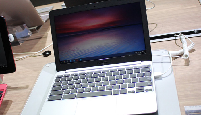
The Asus Chromebook Flip is basically a premium piece of portable computing hardware that happens to be selling for an amazing price. This affordable laptop knocks other cheaper notebook models right off the shelf with a metal-covered body and the ability to transform into a tablet with a single flip.
Other excellent features like a very long battery life, some decent processing power and a compact design only work in the Flip’s favor.
The highly affordable price tops off everything as very useful model for a lot of light casual or work-related uses.
The Good
Chromebooks have come a long way from the days when they were considered cheap plastic toy laptops, good for little more than some light use and their easiness on the wallet. Nowadays these devices are solid laptops that carry their own weight comfortably and competently.
The Chromebook Flip is a shining example of this. As the most interesting and powerful little Chromebook to date, the Flip offers a mix of extremely sleek finish thanks to its metal shell and very thin profile, while also delivering some very decent processing power.
Its ARM processor from Rockchip is a definite winner and its series of hybrid computing features mean some great versatility.
Most notably, the physical design of the Flip is superb by the standards of Chromebooks and both looks and feels like the body of a considerably more expensive laptop. In fact, many models that cost much more than the Flip don’t include metal-clad body features – so in this regard, the Flip is a winner.
As for its versatility, well what you’re getting here is both a conventional laptop and a tablet with a slightly small but nonetheless decent 10.1 inch touch screen. Furthermore, as its name suggests, the Flip can transform into its tablet form simply by flipping the screen a full 360 degrees via the articulating hinge along its bottom.
Other Chromebooks have this same feature but the Flip is one of the few, or perhaps the only one, that can also change its screen orientation depending on how you rotate it.
The Bad
The bottom line about the Chromebook Flip is that it costs just $249 dollars and is designed as a 2-in-1 tablet/laptop, so when we go ahead and say that its biggest detriment is its size, the above have to be kept in mind.
The 10.1 inch screen is rather tiny, with a slightly uncomfortable keyboard that might be a no-go for some buyers. But this is also what you should expect in this device.
The thing is there are larger Chromebooks with better keyboard layouts. But they also aren’t tablets as part of the bargain.
Furthermore we should also mention that the central processor is a bit on the weak side – though it’s more than enough for the light work the Flip is likely to be used for. However because the Flip has been known to crash from time to time, this less than robust CPU might factor into that problem.
Connectivity: 902.11ac WiFi, Bluetooth 4.1, Ethernet, 2 x USB 2.0 ports, 1 x microHDMI 1.4, microSD reader, Headphone/microphone jack
Display
The 10.1 inch 1280×800-pixel native resolution of the Flip’s display gets somewhat overwhelmed by the wide bezels along the edges. But it still delivers some excellent color, contrast, and a decent resolution for such a small screen.
Touch response is an obvious and necessary function of the Flip and it works well for the most part – though it could be a bit slow at times.
Some websites simply don’t have ideal touch navigation but this isn’t the Flip’s fault.
The rotation adjustment flexibility of the Flip and the fact that most text and video look perfectly readable or viewable on the screen make up for some touch and screen size deficiencies. Side angle viewing is also very good in this notebook/tablet, with only minor fade at off-center angles.
Performance and Connections
The Flip performs very nicely for the small, economical laptop that it is. The connectivity ports are remarkably good with microHDMI, dual USB 2.0 ports, and a microSD card reader being more than you’d expect.
While the tiny 16GB SSD storage may be pretty small, it allows for a very fast load time and overall functionality. The built-in WiFi is of the faster 802.11AC variety and this is very useful for the Flip, which is pretty much a strictly online device.
As for the Rockchip 3288-C 100 CPU, it’s a bit slow among competitor chips but this shouldn’t be a problem considering the Flip is aimed at light web-based use rather than heavy-duty software applications. But leaving too many browser windows open can make things sluggish.
While the Flip delivers processing power that is hardly top-notch, it does truly excel at battery life. For a laptop it beats plenty of competitors with the 10 hours it can endure without being charged, assuming you’re not overburdening the battery with lots of videos and music.
Final Opinion
Overall I’d have to recommend the Asus Chromebook Flip for a certain kind of user. For people who just want to surf the web, do some online shopping, browse news sites and read digital books, the flip is more than ideal.
This makes a great travel laptop and as such it can even allow work-minded users to finish up e-mails or catch up on documents on-the-go.
The process of becoming a designer and developer can be excruciating and quite exhausting. Each of these fields has such a depth of study with a lot to earn. And becoming proficient in just design or development can be hard enough. Often times it is easier to pair up and work with a designer/developer for your own projects.
But what are the easiest methods for handling such a relationship? I want to share just a few ideas on how designers and developers can work best together. If each person at least has an understanding of what the other needs to do, it will become a much simpler experience. These two job types should be guiding each other down the path towards creating a wonderful final product.
Key to Collaboration
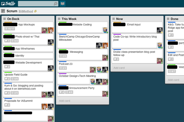
Having a concise schedule for communication is almost the most important aspect of working together. Designers need to make sure each mockup is easily accessible for exporting a logo, icons, backgrounds, and whatever else is part of the website. And this goes double for mobile app designers because the programmer will need direct access to the app icon and the various UI elements(gradients, buttons, etc).
I would recommend working together both in person or via some type of task management software. Wunderkit and Trello are two great options which are completely free to use. It is possible to invite a number of other people to join the conversations. In this way you will have access to a wide assortment of tools for planning each step of the project.
But full collaboration is not always necessary beyond a point. Once the team understands what the overall goal will be, then it is just a matter of doing it. Start with the designer and make sure all of the page elements are realistic. Because once the design is completed then it is just a matter of transcribing the page elements into HTML5/CSS3/JS which the designer may not be able to help very much.
Openly Sharing Ideas
You have to be comfortable in the relationship so that both of you can freely share your own ideas. Even if it may sound stupid, it is important that everything gets fleshed out before sitting down to build anything. Ideas are powerful and they can disappear within a second’s time. Write stuff down if you’ll forget and be sure to pitch your concepts with a grain of salt.
I notice that the way designers think is more geared towards the aesthetics and content display. Whereas a developer will typically think about how a page is going to work, like the links and navigation components.These are two very different forms of “ideas” which are both necessary to craft a brilliant website layout.
Learn to put yourself in the other person’s shoes and try to pitch your ideas in a way that they can understand. This isn’t to say that designers and developers are speaking in completely different terminology. But ideas need to be given some physical form, either through drawing or speech or writing. Present your ideas in a meaningful way and it will make the process go by a lot smoother.
Map Out Responsibilities
Depending on your relationship with the other person and the project your are building, it might be worth getting responsibilities down in writing. If this project is going to require months of planning and hard work then you guys need to know who is handling what tasks. It requires a lot of skill and dedication, but I feel it is worthwhile.
If there is money involved then you also want to know how it is being split. If there is a project manager then they may be handling the money, however all of you should be kept within the loop. The best way to clear through projects is to have absolute transparency in the process. From start-to-finish you all want to know what is going on and who is dealing with certain issues. Taking it all down in writing is a great choice because you can always come back and reference the document at a later time, assuming some issues arise.
Resolving Problems
If you plan to work with lots of creative professionals and you all have a solid focal point, then there may never be real issues. However it is certainly possible that you will encounter disagreements during the process. It is important to keep everybody’s opinions respected so that everybody can say what they feel without restraint.
Settling disputes along the project timeline is all about compromise. Everybody on the team whether it’s 2 people or 10 people should be focused on the final product. This means you want to resolve problems with the most reasonable, useful solution which will most benefit the project itself. Sometimes egos can get hurt but everybody should try checking this in at the door. Keep yourself open to new ideas and be willing to change if you think it would better suit the project.
It is also important to convey your feelings without hurting other people’s feelings. A designer or developer may be critical of the other’s work. And it is always good to have feedback, just make sure you can offer this feedback in a courteous manner. Then you can all move along the path towards completing this project together. Ideally the final picture should be enough to convince everyone that the choices made along the way were ultimately the right ones.
Closing
It is important to remember that we are all humans and we all desire to be respected and appreciated. Working in a team of designers & developers is not much different than other similar jobs. At the core you need to respect your teammates and help them through any obstacles. All the other intricacies are just details within the relationship of working with digital professionals. If you have any other thoughts or questions on the article feel free to share in the post discussion area below.
Every week users submit a lot of interesting stuff on our sister site Webdesigner News, highlighting great content from around the web that can be of interest to web designers.
The best way to keep track of all the great stories and news being posted is simply to check out the Webdesigner News site, however, in case you missed some here’s a quick and useful compilation of the most popular designer news that we curated from the past week.
Note that this is only a very small selection of the links that were posted, so don’t miss out and subscribe to our newsletter and follow the site daily for all the news.
The 7 Reasons Why WordPress Developers are Paid Peanuts
Fake it ’til You Become It: The Science of Self Perception
Live Photos – Death to Gifs
Real or Photoshopped? Take Adobe’s Quiz
Cat Street View – Explore Japan… As a Cat…
Google’s Rejected Ideas
The Proper Way of Creating Outline Icons
Airbnb’s Logo Found in Decades-old Trademark Book
On Google’s New Masterpiece
5 Tips for Making your Designs Future-proof
Apple: Who Wants a Stylus?
Microsoft Design
Comic: The Daily Struggles of an Introverted Freelancer
This Logo Generator Trolls Verizon Pretty Hard, and It’s Wonderful
A Great Approach to the About Page on this Site
Google’s New ‘Fun Facts’ Feature is a Productivity Killer
The Creative Benefits of Being Weird
Forget your Logo – Sign with Words
Google Inbox App Needs UX TLC
Funny: How to Charge Clients for Design Work
Google and Lenovo Fell in Love with the Same ‘e’
Google’s Original Logo Designer Reflects on a ‘Bittersweet’ Run
This is Apple’s iPad Pro
The Rich and Colorful Civilian Life of Eric, the Star Wars Stormtrooper
Apple and Adobe Slammed for ‘Sexist’ Photoshop Fix Demo that Made a Woman Smile
Want more? No problem! Keep track of top design news from around the web with Webdesigner News.
It’s rare to come across an e-commerce website that has more page than sellable items. It’s much easier to design a single-page website anyway, resulting in cleaner code & a higher likelihood of to converting more sales.
Here are 3 stunning single-page websites that focus all of their efforts into selling one product with gusto.
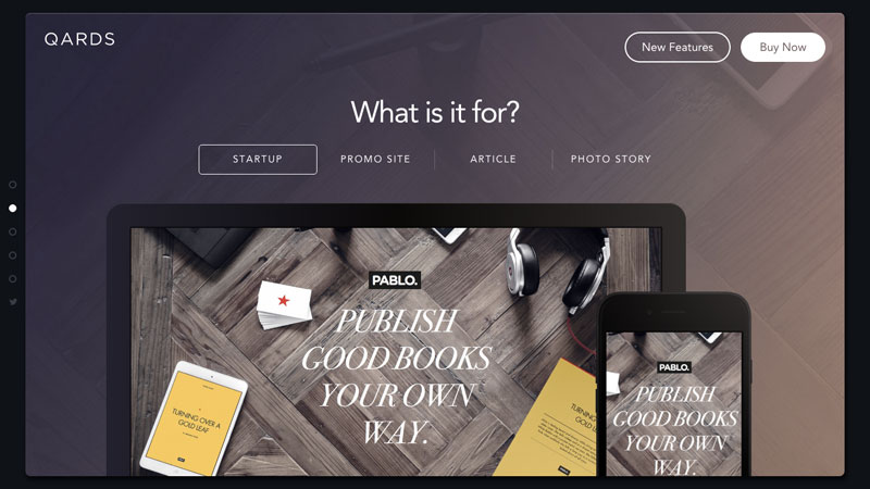
Designmodo’s Qards
Okay, so Designmodo actually has thousands of webpages on its website. But Qards is one of only two themes available on their website and it’s represented with a totally unique single-webpage design.
The page explains Qard’s features using a scroll-snap navigation.
It’s such a beautiful website, but its unconventional full-creen card-style simplicity almost makes you think it’s not a website at all. Not many interactions are required to read content; mostly you sit back and scroll while the page visually walks you through Qards’ features with smooth GIFs and videos – then leaves you with only two buying options: single and agency.
Too many options can be confusing and off-putting. In this case simplicity wins.
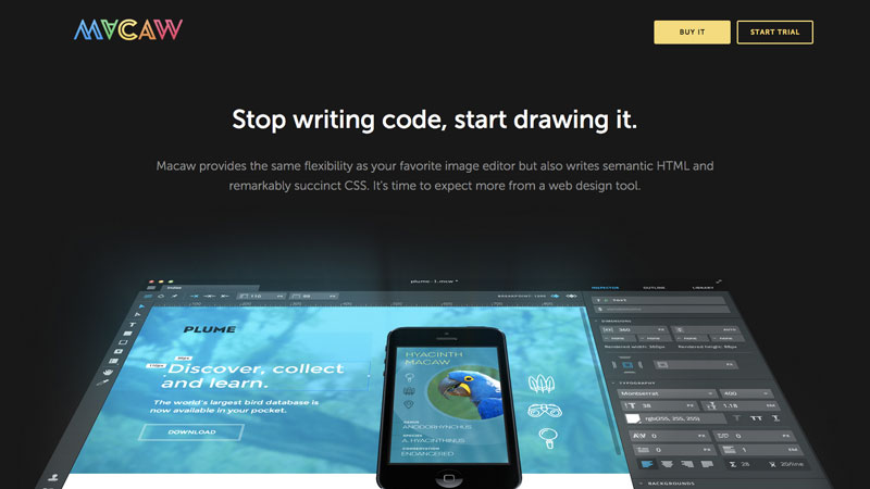
Macaw the Web Design Tool
One design trend that I truly detest is the almost uncontrollable need for some websites to use a generic full-screen stock image that drowns out the legibility of the text.
Macaw is one such site that uses a single fill colour in the background of each section – andto my delight, it doesn’t require any work to read the information.
At the end of their single-page website there is one image, however the text is fixed to the bottom of the block and sits on top of a semi-opaque black overlay.
While there isn’t anything wrong with full-screen images, many designers often forget to fine-tune the vividness to contrast nicely with text.
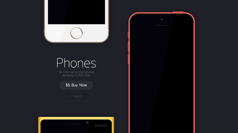
Matias Gallipoli’s “Phones”
This example tackles selling with a very minimalist approach to both design & content. Phones is a brilliant example of how to sell something by letting the product do the talking.
Besides the the one word heading and a single sentence description, Matias Gallipoli sells “Phones” with nothing more than technical details. In fact, if you’re convinced by the first screen there really is no need to scroll down. I really wish that more single-webpage sites would do this.
Products always need further elaboration for the user to make an informed decision, but too often I see designers shoving too much information above-the-fold, or simply wasting this space with meaningless imagery and complex interactions.
Thankfully Phones is a different case and really helps to sell the PSD files.
Based on these examples & your own experience surfing the net, what features do you think make up a well-designed single page product layout?
The following is a guest post by Ana Tudor. If you’ve seen Ana’s work, perhaps you know that she uses mathematics and code together to make art. The finished pieces look like they take ages to make. But as I witness with my own eyes, Ana can think through what it takes to build something like this while doing it incredibly quickly. Here she’ll explain to us the entire thought process in a step-by-step tutorial.
In mid-August, I decided to try to reproduce a nice looking GIF I found on 12gon.
The original GIF
I thought I’d code it live for people to watch using CodePen’s Professor Mode. 30 minutes later, this was the result:
Let’s take a look at how the whole thing works. It’s surprisingly simple!
3D coordinate system
We’ll be working in 3D.
Three dimensions: x, y and z.
The x axis goes from the left (its -) to the right (its +). The y axis goes from the top (its -) to the bottom (its +). The z axis goes from the back of the screen (its -) to the front, towards us (its +). The intersection of these three axes is the origin of the coordinate system. The xy plane (represented in blue in the figure) is the vertical plane of the screen. The yz plane is the vertical plane (represented in green) that splits the screen into a left part and a right part. The zx plane is the horizontal plane (represented in red) that splits the screen into a top part and a bottom part.
Important concept: every HTML element has a local 3D coordinate system, whose origin is initially situated at the 50% 50% 0 point of the element (50% horizontally, 50% vertically and in the plane of the element because all HTML elements are flat, all their points are contained in the same plane). It can be changed with the transform-origin property, but don’t worry, we won’t need to do that here.
Basic setup
The position of an element in 3D is always going to be relative to the 3D coordinate system of its parent, so we make the cover the entire viewport and absolutely position all its descendants at the 50% 50% point of their respective parents. We also set transform-style: preserve-3d on the body’s descendants because we want to allow nesting of 3D transformed elements (the bars will be transformed in 3D and so will its children, the bar faces).
Given that this is a 3D demo and the covers the entire viewport, and therefore be our scene, we have also set a perspective on it. This makes everything that is closer to us appear larger than everything that is far away. The smaller the perspective value, the bigger the difference between what’s in front and what’s in back. The following demo shows how changing the perspective value on the scene makes objects in the scene, in this case two cubes, be rendered differently. For each of the cubes, the demo also shows the xy plane of its local system of coordinates (in blue).
Now let’s gather a bit of data from the image. Kind of difficult since it’s moving and makes us dizzy, so let’s split it into frames. I have an aversion towards stuff I need to install, so I use an online splitter for this kind of stuff, but you can use whatever you’re most comfortable with. Splitting the GIF tells me that there are 43 frames and the delay between them is 0.04s, making the duration of the animation somewhere around 1.75s.
Most importantly, this is the first frame.
First frame of the inspiration gif
Yay, a static image that lets me count the bars (or square right prisms) without getting me dizzy! And yes, I counted them by putting my finger on the current one I was counting and remembering where I started from. If I counted right, there are 24 bars. And if I didn’t, it doesn’t matter, I like 24. I have a good reason to like it. The central points of the bars are distributed on a circle around the y axis in the horizontal zx plane.
The bars are distributed on a circle around the Y axis in the horizontal ZX plane
Around a circle, there are 360°, as the demo below illustrates:
24 happens to be a divisor of 360°, so if we want to distribute the bars evenly on the circle, we distribute them at every 360°/24 = 15°, which is a nice round number and I like round numbers—it’s why I approximated the duration of the animation to be 1.75s. Let’s assume my counting skills are accurate and leave the number of bars at 24 and the base angle between them at 15° because integers are good…they just make our lives easier!
Next, let’s pick the four main shades from the image. I believe I used the dev tools picker for this, but you can use whatever tool you wish.
Picking the four main shades
The four shades I picked were for the end face of the bar in the front (1 in the figure above), the end face of the bar in the back (2), the lateral face of the bar in the front (3) and the lateral face of the bar in the back (4).
After visually approximating dimensions and distances (I’ll admit I’m not good at that, but I guess these values work), we set the following variables in the Sass code:
$n-prisms: 24; // number of bars
$height: 6.25em;               // height of a bar
$base: 1em;                    // base of a bar
$base-c:                       // base shades
	#69f                   // base front (1)
	#7e4b4c;	       // base back (2)
$lat-c:                        // lateral shades
	#542252                // lateral front (3)
	#7e301a;               // lateral back (4)
$radius: 1.625*$height;        // radius of circle we distribute the bars on
$base-angle: 360deg/$n-prisms; // base angle between two bars
$t: 1.75s;                     // animation duration
Basic HTML structure
Next, let’s decide on the HTML structure. Each bar has four lateral faces and two end (or base) faces, so that’s six faces in total for each bar. The bars are all rotating around their fixed midpoints, which are located on a circle of a known $radius in the horizontal zx plane. This means that, inside the assembly of bars, we have 24 positioning elements that will move the bars on that circle and, inside each of these elements, we have a bar with six faces. This gives us the following HTML structure:
<div class="assembly">
  <div class="positioner">
    <div class="prism">
      <div class="prism__face"></div>
      <!-- 6 more faces just like above -->
    </div>
  </div>
  <!-- 23 more positioners just like above -->
</div>
But of course we won’t copy paste the positioner bit so many times. There are smarter and more compact ways of writing this. For example, using Haml or Slim:
.assembly
  - 24.times do
    .positioner
      .prism
        - 6.times do
          .prism__face
The Bar Faces
Now that we have an HTML structure, let’s move on to styling. We start with the faces of the bars because they’re the only elements with a background, and we always want to see something on the screen as soon as possible (especially when live coding!). We give all faces the dimensions of the lateral faces (because we have more lateral faces than base faces, so we’ll treat base faces as a particular case later on). We then set the margins to be minus half the dimensions of the faces, so that their 50% 50% points stay in the middle of their containers. Of course, we need to also give them a background so that we can see them. We can choose any of the two shades we have picked for lateral faces; which one doesn’t matter, we’ll overwrite with the proper mix between the two when we distribute the bars on that circle in the horizontal zx plane.
We have also given the faces backface-visibility: hidden, so that we only see them when we look at them from the front and they’re invisible to us when we look at them from the back.
This is really useful when we want to check they’re facing the right direction. It also prevents wrong 3D ordering issues and flickering in Firefox.
Next, we handle the particular case of the base faces. If we take the lateral faces to be the first four faces (so faces 1, 2, 3 and 4), then the base faces will be faces 5 and 6, so all faces whose 1-based index is greater than or equal to 5. We express this with the help of the nth-child pseudo-class.
The following step is to position the faces so that they actually form a bar in 3D. In order to do this, we need to understand how rotations and translations work.
Rotating an element around an axis by a positive angle value means a clockwise rotation, as seen from the + of the axis we rotate around. A positive rotation around the z axis is a clockwise rotation as seen from the + of this axis—the normal position of our eyes in front of the screen.
A positive rotation around the y axis means a clockwise rotation as seen from the + of this axis, which is at the bottom. In this case, we see the left part of our element coming forward and its right part going towards the back of the screen. For example, if we rotate an element by 90° around the y axis, its front face looks right, while a -90° rotation around the same axis makes it look towards the left.
A positive rotation around the x axis means a clockwise rotation as seen from the + of the very same axis—right of the screen in this case. So we see the bottom part of the element coming up and forward, while its top part goes down and towards the back. For example, after a 90° rotation around the x axis, our element is face up, while a -90° rotation around the same axis makes its face look down.
A very important thing we need to remember is that every transform we apply on an element is also applied on its local system of coordinates.
For example, if we rotate an element around its y axis by 90° degrees, not only is this element facing right after the rotation, but its z axis — the one that was pointing towards us from the screen before the rotation — is now pointing right. If we rotate an element by 90° around the x axis, not only is the element face up after the rotation, but its z axis points up as well. If we were to rotate it by -90°, the element would be face down and its z axis would point down as well.
So we need to keep in mind that, no matter how we transform the element, the z axis always points out from the front face of the element, the y axis always points towards the bottom of the element, while its x axis always points towards the right of the element.
That was about rotations, now let’s see translations. A translation of a positive value along an axis moves the face towards the + of that axis.
For example, a translation of a positive value along the z axis (which is pointing towards us) brings the element forward, closer to us, while a translation of a negative value along the same axis moves the element backwards, away from us.
Just like in the case of rotations, translations also affect the element’s local system of coordinates — you can see it moving along with the element in the demo above.
The fact that any transform affects the element’s system of coordinates means that it also affects the effect of any subsequent transforms we apply on that element.
For example, if we translate an element in the positive direction of the z axis, without having applied any other transform before, this moves our element forward. But if we rotate our element by 90° around the y axis and then translate it along the z axis in the positive direction, this translation moves the element towards the right of the screen (from our point of view in front of the screen), because the z axis now points towards the right after the rotation. In the same way, if we first rotate the element by 90° around the x axis, and then we translate it along the z axis in the positive direction, this translation moves the element up because the z axis points up after the rotation. If we rotate it by -90° around the x axis and then we translate it along the z axis in the positive direction, this translation moves the element down because the z axis points down after the rotation.
Now let’s see where the faces are initially located, and where we want to move them so that they actually form a bar.
Initial vs. Final
Since we have started by positioning everything absolutely in the plane of the screen (xy), dead in the middle of the screen, the initial 50% 50% point of the faces (before moving them so they form the bar) coincides with the point right in the middle of the bar (first panel in the figure above). Half the bar is behind the xy plane (blue, second panel), the other half the bar is in front. Half the bar is to the left of the yz plane (green, third panel), and the other half is on the right. Half the bar is above the zx plane (red, fourth panel), and the other half is below. The distance from that point to the faces in the front and in the back is half the base. The distance to the faces on the right and on the left is also half the base, while the distance to the faces at the top and at the bottom is half the height.
We have taken the first four faces to be the lateral ones and the last two to be the base (end) ones. So, we position the first face in the front of the bar and go around with the next three — the second goes on the right, third goes in the back, fourth of the left. Then, we position the fifth face at the top and the sixth one at the bottom.
Face numbering
In order to position the first face in front, all we have to do is translate it forward by half the base. This means a translation of .5*$base along the z axis:
To position the second face on the right, we first need to rotate it by 90° (a right angle) around the y axis so that its z axis points to the right. Then we translate it by half the base in the positive direction of the post-rotation z axis (to the right of the screen):
To position the third face in the back, we rotate it by 180° (90° more than the previous face) around the y axis so that its z axis now points towards the back. Then we translate it by half the base in this new positive direction of the z axis (away from us):
You may wonder why we aren’t simply translating this face back by half the base — a translateZ(-.5*$base). Well, we could do that, but then we’d have a number of problems:
the code wouldn’t follow a pattern
the front of the face would be on the inside of the bar
the face would be invisible from the outside of the bar, because its back is on the outside since we have set backface-visibility: hidden on it
To position the fourth face on the left, we rotate it by 270° (90° more than the previous face) around the y axis, this way making its z axis point left now. And then we translate it left (in the new positive direction of the z axis) by half the base:
To position the fifth face at the top, we rotate it by 90° around the x axis so that its z axis points up, then translate it in the new positive direction of the z axis (up) by half the height:
To position the sixth face at the bottom, we first rotate it by -90° around its x axis, making its z axis point down, then translate it down, towards the + of the rotated z axis, by half the height:
All right, now we have a prism. But, that code for the faces doesn’t look good; it’s way too repetitive. And, if we change a bit what we have for the first face, we can see a pattern for the first four faces:
Or, if we don’t want to have two ternaries with the same condition:
$j: if($i < 4, 1, 0); // $j is 1 if $i is less than 4 and 0 otherwise
$k: 1 - $j; // $k is 0 if $j is 1 and 1 otherwise

.prism__face:nth-child(#{$i + 1}) {
  transform:
    rotate3d($j, $k, 0, ($j*$i + $k*pow(-1, $i))*90deg)
    translateZ(.5*($j*$base + $k*$height));
}
Now all we need to do is put one of these two versions for the generic face into a loop which will generate the code for all six of them:
Hmmm, this doesn’t look much different from what we had before. This is because of our point of view. Here, if we were to connect it to the middle of the screen, this line would be perpendicular onto the front face, the one that we see the biggest (so it obstructs all other faces), while in the demos above explaining the distribution, the point of view is a bit higher up and to the right, which is why we could also see the top and right faces there. However, what we have here is 3D. This becomes obvious if we rotate the bar (which can be done by dragging in the demo above), or if we change the point of view.
Changing the point of view with CSS is done via the perspective-origin property. Just like the perspective property, this is set on the scene element (the in our case). Its default value is 50% 50% (dead in the middle of the scene element). Dragging up and down in the demo below changes the second value (the y) value of perspective-origin and therefore, our point of view, so the top or the bottom value become visible.
This is actually really similar to distributing the lateral faces on the bar. We rotate the bar positioners around the y axis and then translate them along the z axis in the positive direction. Except now we don’t take 90° steps. Instead, our step is $base-angle (which we have earlier computed to have a nice round value of 15°), and our z translation distance is the radius of the circle we distribute the bars on. So the code is:
.positioner {
  @for $i from 0 to $n-prisms {
    &:nth-child(#{$i + 1}) {
      transform: rotateY($i*$base-angle) translateZ($radius);
    }
  }
}
This demo illustrates how the bar positioning works:
However, there are a couple of problems here. First of all, the bars aren’t vertical in the original GIF. In order to get them into the right position, we need to rotate the positioners around the x axis — let’s say by 70°. Our generic transform chain becomes:
But in the original GIF, we see the bars a bit from above. We have two options for achieving that effect.
The first one would be to simply rotate the entire assembly such that we bring its front half a bit down and its back part a bit up. This would mean a rotation of a negative angle around the x axis — let’s say -30°:
.assembly { transform: rotateX(-30deg); }
Our second option would be to add a perspective-origin on the . Seeing the assembly slightly from above would mean decreasing the y component of the perspective-origin value — we need to make it lower than 50%. However, % values, or any other values measured from the top, aren’t a good idea because when we use them, how we see the bars depends on the height of the scene. To illustrate this better, take a look at the following figure:
Everything is identical for these three cases except the height of the scene (you can check it out live in this pen. But, since the y component of the perspective-origin is measured from the top and each cube is positioned right in the middle of its scene, our point of view is different for different scene heights. Therefore, the way we see a cube depends on the height of the scene it is in.
In our case, the scene height isn’t fixed but rather it’s the height of the viewport. If we resize the viewport, then we see the bars differently depending on the perspective-origin value that’s relative to the top of the scene.
The solution I often use in such situations is subtracting a fixed number of px or em from the initial 50% value inside a calc() function — something like this:
perspective-origin: 50% calc(50% - 32em);
The image below illustrates how things look with such a solution (and you can check it out live in this pen).
Note that if the cubes in the example above or the assembly in the demo we’re working on weren’t positioned at 50% from the top, but at 30vmax, then we would have something like calc(30vmax - 32em). The key takeaway here is that we need to set a perspective-origin that’s relative to the central point of the object we wish to see in the same way regardless of the dimensions of the scene.
Now let’s look at the first frame of the original GIF again:
First frame of the inspiration gif
We’ll now try to tweak each of these two options to see which can get closer to the image above.
Note that there are more things that could be tweaked in either of the two cases and it is possible that a certain combination of bar dimensions, perspective and perspective-origin on the scene gets closer to the original than simply rotating the assembly. My main objective during live coding was to be quick so I went for whatever looked better in that moment and the one that required the fewest number of changes to the values previously set.
Shading the bars
There are a few other things that don’t look right yet.
First, the right and left faces should be darker than the front and back one. This should be easy to fix with the proper nth-child selectors by decreasing the brightness of the selected faces with a brightness() filter:
Second, bars around the circle should have different shades, the laterals going from purple in the front to some kind of orange in the back. So, going around the circle from 0° to 180°, the laterals of the bars go from purple to orange and, from 180° to 360°, they go from orange back to purple.
Shading around the circle
This sounds like a job for the Sass mix() function! In our case, the weight would go from 100% (100% the first shade, purple, the rest up to 100%, so 100% - 100% = 0% the other shade, orange) to 0% (0% purple, 100% orange) in the [0°, 180°] interval and then it would grow from 0% to 100% in the [180°, 360°] interval. Well, this is the cosine function! Sort of…
We can see below the graph of the cosine function for the [0°, 360°] interval. As the angle goes from 0° to 180°, the value of the cosine goes from 1 to -1. For an angle going from 180° to 360°, the value of the cosine goes from -1 to 1.
Next, if we multiply it all by 50%, the graph goes from 100% to 0% on the [0°, 180°] interval and back to 100% again on the [180°, 360°] interval, which is exactly what we wanted.
This is probably the simplest part of all. Every bar rotates counter-clockwise by half a turn around the x axis. Then, it’s stationary for a little while, then the whole thing repeats. It takes a bit of tweaking to get a percentage that feels right — we settle for 75% here. For the timing function, we could use the plain old ease-in-out, or we could try a symmetrical one from easings.net. My first choice for symmetrical easing is easeInOutCubic because it seems to me it makes the animation feel closest to natural motion in most cases.
However, there’s a problem here: all bars rotate at the same time. This means we need to set a different animation-delay for each bar. We use negative delays so that all animations are already started at the 0 moment.
Now you know how I coded something that looks insanely complicated in just 30 minutes. You would probably be faster, because I have never been able to learn how to type with more than one finger!


