Archive

Archive for September, 2015

TemplateMonster Giveaway: Become 1 of 10 Happy Owners of the Monstroid Theme

September 9th, 2015 No comments
monstroid-featured-giveaway

In one of our previous posts we spoke about the release of the universal, multi-purpose WordPress theme for everyone under the powerful name Monstroid. This time we are back with great news from TemplateMonster! Now you have a unique opportunity to get this all-inclusive WordPress package for FREE.

Template Monster Monstroid giveaway

A Couple of Words about the Prize

Monstroid is a ready-to-go WordPress theme that can be used for literally any purpose (blog, portfolio, online store, corporate site, etc.). No matter how skilled you are, with the help of this template you can bring your site live without the help of experienced programmers.

Monstroid comes loaded with a rich assortment of functionality that will make it possible to tweak the design and manage settings intuitively, by simply dragging and dropping.

  • In addition to the standard set of WordPress features, TemplateMonster’s developers did their best to pack this theme with unique functionality that you would be hard-pressed to find anywhere else. For instance, the installation of the theme has become much simpler and more intuitive thanks to the Monstroid Wizard. Shortcode Template Editor allows you to create and edit your own shortcode templates from the simple dashboard. Static Area Builder is a drag and drop tool that makes it easier to place static page elements just the way you wish. Premium MotoPress Editor and MotoPress Slider are also included in the package.
  • The thing that is worthy of your special attention is the rich variety of child themes that are packaged with Monstroid. When downloading this WordPress monster you will get unlimited access to a variety of other cool designs that can add more style and personality to your online project. The gallery is updated with 15 new topics monthly.
  • Monstroid is WooCommerce ready. The template includes a set of pre-designed product pages. Just replace the default content with your products and launch your store hassle-free. All of the Monstroid child themes come with WooCommerce support, though these don’t include pre-designed product pages. However, with the quick customization of any template from the pack you will get a fully-featured online store.
  • Together with a number of user- and developer-oriented features, Monstroid comes with free 24/7 support either via online chat that it available right from the dashboard or by submitting a ticket. The response time has been reduced to 2 hours!

How to Win?

To get Monstroid for free, you won’t need to do anything extraordinary.

  • Go to templatemonster.com, view Monstroid details and live demo.
  • Pick the feature that you enjoy the most and explain why in the comments below.

That’s it!

Important

  • The giveaway starts on September 9 2015 and will be running through September 15 2015.
  • We will pick 10 winners randomly. Every winner will get one Monstroid license.
  • Please make sure that you comment with your real email address, otherwise we won’t be able to contact you regarding the prize.

Don’t miss your chance to get the unique, multi-purpose WordPress theme from TemplateMonster for free!

Read More at TemplateMonster Giveaway: Become 1 of 10 Happy Owners of the Monstroid Theme

Categories: Designing, Others Tags:

Find Free Open Source Fonts with Use & Modify

September 9th, 2015 No comments
00-featured-use-modify-fonts

Although this site’s design is a little rough around the edges, Use & Modify is a brand new tool that’s more than just a homepage layout.

At first glance you might not know where to begin. But with a little scrutiny you should realize that Use & Modify is a great tool with a lot of potential for designers. It uses a high-contrast black & white layout for text organization.

Each typeface has its own list where content is linked out to download links and licenses. Take note that all fonts here are completely free and open source for all purposes.

Some of the menu options at the top allow for dramatic changes to the interface. You can increase the font size using the little slider and switch from a list-style layout to a grid-style layout by clicking the multi-bar icon.

There’s also a half-moon icon for changing the stylesheet from dark to light. Some people would prefer a lighter view while sifting through potential font choices.

The other 3-bar menu icon displays a series of filter criteria. With these options you can sort by font license, author, or keywords.

I still feel the site is a little hectic to use but it does offer a powerful resource on-par with Google’s Webfonts library. Take a peek at Use & Modify to judge for yourself. Over time I think we can expect a lot of great things to come out of this webapp, with potential for even more resources in the near future.

Read More at Find Free Open Source Fonts with Use & Modify

Categories: Designing, Others Tags:

How to design for mobile UX

September 9th, 2015 No comments

You probably know by now that mobile has taken off, and there’s no stopping it anytime soon. What you probably didn’t know is just how popular mobile really is. In fact, did you know that the number of mobile users has already overtaken the number of traditional, desktop users? It’s true!

According to comScore, an Internet analytics company, this past March saw, for the first time ever, the number of mobile-only users surpassing desktop-only users, at least in the US. Let me put it another way: there are now more people accessing the web on their mobile phones than there are people doing it from the comfort of their homes, on their desktops. This has humongous implications for mobile UX design. Huge!

This means that people are increasingly buying things or reading the news on their mobile phones while on the go. The failure to design with mobile in mind will be catastrophic for any e-commerce site or publication.

Keep your design minimalist

Keep your mobile design clean and simple. Go for practicality and usefulness over any fanciness in your design. Remember that you’re designing for a much smaller screen than if you would for desktop. With screen real estate being very precious, it’s also just common sense that you can’t do a complex design. Thus, minimalism is your best bet.

This also helps the user experience. After all, when users are looking at an uncluttered interface in their iPhones or Android devices, they’re going to be able to find what they’re looking for on a site extremely quickly, which improves their user experience.

What does minimalism on a mobile screen look like? Users should only see the content that they need to see to properly use the site—which will automatically prompt them to explore and navigate further. Also, buttons and menus should be intuitive, in keeping with the focus on simplicity.

Look at Crate & Barrel’s mobile site. It’s a study in mobile minimalism because its hamburger menu is tucked away on the top-left of the screen, yet still noticeable, and you know immediately what site you’re on thanks to the word-mark logo on top. Also, the colors and fonts are both basic, which ensures users aren’t overwhelmed.

Be mindful of different devices and environments

Though you’re designing for mobile, not all mobile devices are created equally. This is key to successful mobile UX design today, but some designers forget that there are various platforms for which they have to design. Designing for mobile means designing for mobile apps and mobile sites. It’s imperative that you understand what devices your audience uses and what their mobile behavior is like. In other words, you shouldn’t design an app or a mobile site with the mistaken belief that iPhone and Android users will interact with your app or site in the same way.

Research shows that iPhone users spend more on mobile ecommerce than do their Android counterparts. What’s particularly stunning about this stat is that there are fewer iPhone users than Android users, making iOS users’ spending power even more significant! Therefore, if you’re designing mobile apps and sites for an ecommerce business, you’ll want to focus first and more heavily on making a top-notch UX for iOS than you would for Android — simply because there’s more money to be made.

Use familiarity to create highly functional navigation

Though there are now more people surfing the Internet on mobile than desktop, many of those people obviously started out browsing websites on their desktops. This means that they’ve come to expect a certain standard in terms of site navigation and appearance from all their time using desktop.

Therefore, when designing for mobile, don’t mess with expectations and conventions: make sure your client’s mobile site replicates the navigation standards of any desktop site with great UX.

Here are some common features that you should carry over into your mobile navigation:

  • Your most popular categories or site pages, based on analytics data
  • Navigation menu in the form of a hamburger menu
  • High-quality images
  • Prominent search feature
  • Clear, huge call-to-action buttons

We can see highly functional navigation on Lowe’s mobile site because it features all of the navigational conventions that we’re used to seeing on any good desktop site.

Make the checkout process as convenient as you possibly can

This is the most important tip on this page, by far. It’s so important that every other tip leading up to this is useless if you failed to design your client’s mobile site in such a way as to get the conversion at the end of the user’s mobile-site browsing. The last thing you want is that dreaded shopping cart abandonment to occur, especially when you’ve already gone through the trouble of recognizing and trying to design a completely mobile-friendly site.

Unsurprisingly studies show that like on desktop, shopping cart abandonment occurs on mobile when the UX is bad. For a mobile shopper looking to buy something, the user experience is the worst it can be when they’re trying to place an order…so when something goes haywire, they get frustrated, and leave your site forever, never to come back, not even on the desktop!

One of the most notorious ways that the mobile checkout process can suffer is when the call to action and checkout buttons fail to support the shopper’s expectations. For instance, the buttons could be too small to easily see or tap on, or they could just fail to appear as soon as items are added to the cart.

For an inspiring example on doing this basic design feature right, we look to Cult Pens’ mobile product page for one of its Pental brand pens. Note the large “add to basket” button splashed across the entire bottom of the page.

Mobile design: different from desktop design

Some designers just don’t get it. Designing for mobile is an entirely different concept than designing for desktop. Sure, you’ll have similarities, but they only go so far. Of course you want to keep your mobile design as close to the conventions that users are used to from desktop browsing, but there are exceptions.

Minimalism — doing more with less — should be the golden rule for mobile design since the screen’s much smaller. Designers also have to understand that the user behavior for iOS and Android isn’t the same, so it’s best to research what each user base does with their smartphones beforehand. Of course, you’ll also have to design different mobile and apps for different platforms.

Finally, the big one to get right is to make the checkout process as smooth as possible. Never inhibit shoppers from buying on their smartphones! If you do, it’s like throwing money out the window.

Follow all these mobile-design best practices, and you’ll have happier clients who’ll get more conversions.

Images use mobile experience image via Shutterstock.

Retro & Vintage Startup Toolkit Featuring 47 Items – only $14!

Source

Categories: Designing, Others Tags:

Deal of the Week: Retro Vintage Vector Collection at a 99 Percent Rebate

September 9th, 2015 No comments

Love Coffee? Like Pizza? Do you fancy quotes such as “A Yawn is Just a Silent Scream for Coffee” in poster sizes? If so you’ll absolutely love our current Deal of the Week. While the deal comes packed with great content, that’s not all there is to it. It also sports an unbelievably low price. Instead of a regular 750 dollars you will pay the amount of nine dollars. You read that right. Nine dollars. Whether you need some motivational posters for your office or you’re looking for some fun vector illustrations to use in your latest project, this Mighty Deal’s got your name on it. You’ll get 150 high-quality vintage vector illustrations from Vintage Vectors Studio and Lorand Okos, that covers a wide gamut of topics from coffee to pizza to motivational posters. Customize them any way you’d like with the original .EPS files, and JPG preview files. Highlights: Beef up your designer toolbox with this gorgeous collection of 150 vintage vector illustrations! Use these vectors as fabulous motivational posters, design add-ons or fun signs covering everything from pizza to coffee. Step back in time with a high-quality retro feel exhibited on each of these signs. Easily change up the text, colors […]

Categories: Others Tags:

Q&A with GameIt’s Co-Founder & CEO Bryce Johnson

September 9th, 2015 No comments
gameit-bryce-interview-photo

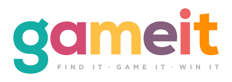
Some apps are made for fun, others for chatting with friends tracking costs or winning prizes. Turns out the hot iOS app gameit pairs fun and prizes together into one thrilling experience.

I got the chance to interview GameIt’s founder Bryce Johnson. We talk about his work history and his experience launching GameIt in the App Store.

GameIt CEO Bryce Johnson

Q: Can you share a little about who you are and your area of expertise?
This is my third startup that I’ve had the pleasure to start from scratch. The other two I was fortunate enough to build and exit(BryteWave and Zarbee’s Naturals).

Over the course of my career I have been lucky to associate with some amazing projects and people. Building a great product or company is not accomplished by one person – it requires a team of great people. It’s great to work alongside teams as we collectively build something that makes the world a better place.

Q: In a nutshell, what is gameit & what makes people want to use it?
Gameit is a brand advocacy platform that rewards its community with amazing deals on products they love for playing trivia games about brands and products.

People are used to being bombarded with ads all the time whether they like it or not, and most don’t like it with 82% of all digital ads ignored. gameit disrupts the advertising world by turning ads into entertainment – this is why people want to use it. They get value while being entertained.

Q: How did the idea for this unique mobile app come about? What made you choose to get started making it a reality?
My co-founder Tyler Hall and I thought shopping could be more entertaining by bundling games with the shopping.

We quickly found that we could build brand and product awareness by making the game all about the brand or product.

Q: Can you share a bit of history around the company? What was it like when first launching and how far have you come since then?
We started out with a team of one…two, then a few. Just trying to create a basic app which was workable.

The idea back then seems almost like a different business since we’ve improved and adjusted so much. In the beginning we were more focused on the UX and not so much the UI.

Once we started focusing on both UI/UX it was exciting to see user response to the app.

Q: Can you share a little about the branding process? Was it difficult coming up with a name, logo, and general design style for the application?
The name gameit was coined very early on and likewise the original logo, which was a hat with a question mark on it. Over the course of our early months we used this logo and branding all throughout our content.

Then a day came where we really started asking ourselves what the design meant. Was it the perfect expression of gameit? We then began a collaborative journey with our team and an awesome design group to fine tune our branding to find purpose and consistency with our app.

So initially it was easy to come up with something, but when we got to the point where we knew ourselves better it was even harder to create something that encompassed who were now, and who we may be in the future.

We had to consider how people would perceive the new design and what people would take away from seeing it. Did it look like other logos? Is it original? Did it catch your eye? These were all things we took into consideration. The design style for our app was designed to be a fine line between game and shopping. We didn’t want to be strictly a game, or strictly a shopping app. So we had to find colors and styles that would place us in the middle.

We came up with a general brand style guide with specific colors, shapes, and ways of using elements that would help us stay consistent across the app.

Gameit raccoon vector logo

Q: How much attention is paid to design(both the website & app)? How do you ensure that design work matches closely with gameit’s theme/style?
A great deal of attention is spent on design, all the way down to the finest detail. Whether it be spelling, placement, or arrangements of assets in our app, we are determined to make an app unlike any other that looks beautiful with a consistent experience.

Our website emulates our app and visa-versa. All content we share is carefully considered to keep in line with our style guide.

This is the way we keep with the same style and theme across platforms. We have carefully worked with our design group to create a design template for everything. This allows us to stay consistent with our designs, colors, and experience when creating new assets.

Q: How do you maintain a smooth collaboration between designers, developers, and marketers? Any useful tips for managing a creative team?
Communication is everything in any relationship – even more so with a team of designers, developers and marketers.

If you don’t communicate well then surprises happen, and not the kind like on your birthday. If you hear, “oh when did that get added” or maybe “I wish I would have known we were changing that” by key individuals on your design or developer team, then you know communication has slipped somewhere.

Each group has their strengths and you must allow them to do their part. With that being said, weekly update discussions with clear objectives assist in proper ideation and implementation of design, programming, and marketing objectives. Test designs on actual users to see how they perceive your design.

Q: What do you feel is the most important aspect to focus on when first launching a new mobile application?
Find passionate individuals that are willing to work hard and smart.

Test your ideas, don’t put everything on one idea or design an app that you love and no one else does. There are a lot of apps out there, over a billion in fact, and so it’s hard to stand out.

How does your app stand out? How could you make it stand out? Find the areas of your idea that truly add value to your customer.

Q: Have you bumped into any major roadblocks from the initial launch to bringing gameit into its current state? Any anecdotes or worthwhile stories to share about your progress?
Building any company is difficult. This is my third startup that I have build from scratch.

Every startup is like pushing a large bolder up a giant mountain: You need endurance.

It’s a long marathon, not a sprint. With this startup, because it’s an app, I would have started building it as a native app for iOS first. We actually started building this with HTML5 and Java Script and we would’ve been better off starting as a native app.

GameIt mobile app logo

Q: Do you have any specific plans or features you hope to launch in the coming months?
We plan to add many different game play features, as well as a brand admin portal where they’ll be able to create their own games, manage their content, write their own trivia questions, and track results and conversions.

Also the app should be released on Android sometime in the foreseeable future.


It you’re curious to learn more about gameit you can download the app for free on the iOS app store.

Read More at Q&A with GameIt’s Co-Founder & CEO Bryce Johnson

Categories: Designing, Others Tags:

15 Websites for Free Bootstrap Themes

September 9th, 2015 No comments

‘Seek, and ye shall find’. With the extremely intelligent and all-embracing search engine Google, it is pretty hard to argue this eternal saying. However, when the time plays against you, you’ll be struggling for some efficient ways of speeding up the process to achieving the goal. In this case, various directories, collections and articles with a quick access to a bulk of helpful links and resources that provide necessary information will be warmly welcome. These toolboxes at your fingertips are what you cannot have enough of. The following article is one of that kind. If you are in quest of some good-looking professionally-crafted Bootstrap templates that either can be used as a starting point for further transformation into one of the CMS themes or quickly customized and adapted as a simple yet quite functional website then our list is ready to give you a helping hand. We have rounded up 15 resources where you can find free Bootstrap themes. Some of them are regularly updated, others are replenished on occasion; some of them are general catalogues, others are personal lists of freebies, yet this does not prevent them from equipping developers with some relevant and useful stuff. BootstrapZero Features: Bootstrap themes, starter themes, responsive […]

Categories: Others Tags:

New Poll on Performance Culture

September 8th, 2015 No comments

What’s the web performance situation on your main project? For simplicity, but also wide coverage, I broke it down into five choices ranging from a nobody caring to everybody caring. This isn’t about how well you’re doing at performance, but how much it’s a part of the culture of your project.

To vote, the poll is in the sidebar (large screens) or down-there-somewhere (small screens).

It will be interesting to know, right? Performance is such a hot topic these days, is it making an impact such that most teams are wholeheartedly into it? Or is it still a fight? Perhaps most people don’t care still? We’ll find out.


New Poll on Performance Culture is a post from CSS-Tricks

Categories: Designing, Others Tags:

Ghost CMS Releases a New Admin UI

September 8th, 2015 No comments
ghost-cms-blogging-update

A number of changes have been applied to Ghost’s newest release for bloggers. In particular, Ghost now supports a revamped administration panel with cleaner links and an easier-to-read code editor.

In a recent blog post the Ghost team outlines their changes and how they impact the workflow of users. It seems the entire navigation structure has been restyled to move links over into a vertical hierarchy. Some people feel the Ghost admin UI really imitates WordPress, which has drawn mixed feelings among users.

Note this release includes a lot more stuff like an improved search bar, theme API updates using Handlebars, along with small fixes & issues from previous versions.

The full 0.7 release notes contain in-depth info regarding what has been fixed and what users should expect.

If you want to try Ghost you can find the open source code on GitHub, along with a collection of older versions.

Read More at Ghost CMS Releases a New Admin UI

Categories: Designing, Others Tags:

New Freebies Gallery “Designer Mill” Launches Online

September 8th, 2015 No comments
featured-designer-mill

Designers of all skill levels can appreciate the value of an open source resource. Whether it’s a font family, iconset, or complete website PSD.

And with so many online collections there seems to be a never-ending supply of freebies. This latest site Designer Mill just launched in early September 2015 and it shows a lot of promise.

The goal of any gallery is collection & maintain a series of useful resources whether they be inspiring websites or free interfaces.

Although the site is small, it has grown rapidly in just under a week’s time. Here’s a brief list of the current categories:

  • Free Fonts
  • UI Kits
  • Photoshop Freebies
  • Illustrator Freebies
  • Sketch Freebies
  • Website Templates

Designer Mill does accept submissions from any other website including Dribbble, blog posts, or your own personal portfolio. If you know of any great freebies head over to the submission page and contribute to this growing collection of resources for designers.

Read More at New Freebies Gallery “Designer Mill” Launches Online

Categories: Designing, Others Tags:

29 Websites using Clean Thin Typography

September 8th, 2015 No comments
25-antro-agency-website-homepage.jpg

Typekit and Google Webfonts have paved a new superhighway for web typography. Designers have the option to choose from a growing library of fonts that include all font styles. Thin font families are great for minimalist layouts and spacious areas of content.

Choosing the right font is difficult – and it’s even more difficult to match different fonts together. The websites in this gallery exhibit thin, crisp typographic choices. Design qualities span the gamut from corporate sites to startups and live events but they all use similar typographic design characteristics.

Federation Square

Comedy Hack Day

comedy hack day event website

Supereight Studio

supereight studio uk website layout

Small Fortune

small fortune website homepage layout

Northbound Design

northbound design agency homepage

Wild Blue Technologies

wild blue technologies website

The Modern House

the modern house website homepage

Department Creatif

dept department creatif typography

Kingdom

kingdom coffee cycles website

Kettle

kettle nyc design agency

Crowns&Owls

crown and owls website design

Design Week Portland

design week portland website layout

Solo

solo webapp tool resource website

The Design Files

the design files open house

Kin HR

kin hr website typography thin

Whoa Nelly Catering

whoa nelly catering homepage layout design

Oli Lisher

oli lisher designer portfolio typography

Jason James

jason james freelance layout big text

Jun Duffy

jun duffy clothing website design

Hartford Design

graphic design firm typography orange layout

Miss Mary’s Morning Elixir

miss mary morning elixir retro

Design for Good

design for good aiga homepage layout

Status Bureau

fullscreen custom typography layout

Another Pony

another pony digital agency layout

Antro

antro creative agency homepage layout

Stonehenge Veterinary Hospital

stonehenge veterinary hospital virginia homepage

True Ventures

true ventures capital investing homepage typography

Monograph

monograph design typography layout inspiration

Syropia

syropia layout website design homepage

Read More at 29 Websites using Clean Thin Typography

Categories: Designing, Others Tags: