Archive

Archive for September, 2015

Adobe Stock CC: A Fully-Featured Stock Photo Library for Designers

September 8th, 2015 No comments
adobe-stock-cc-featured

Adobe has recently introduced Adobe Stock, a major addition to its Creative Cloud collection, hoping to reshape the stock image industry to its own advantage.

The move comes after Adobe acquired microstock photography agency Fotolia in December 2014 for $800 million. Adobe claims that 85% of people who buy stock imagery use their apps, so it seems they have enough ground to potentially dominate the stock image industry.

Although still relatively new, this service already has thousands of photos with more added every week. Let’s take a peek at what Adobe Stock has to offer creative professionals.

Integration

Uniquely integrated into Creative Cloud, Adobe Stock allows users to search and preview stock images while working in Photoshop CC.

After finding a suitable item, the watermarked image can be added directly to the Creative Cloud library making the image immediately available in all Creative Cloud apps. The watermarked version can be freely tweaked like any other photo, allowing the user to be absolutely sure of the outcome before spending any money.

Furthermore, you can access your stock images within Adobe’s Library on any Adobe licensed machine.

The shared Creative Cloud library also makes it easy to share stock images with other team members.

Pricing

Adobe Stock offers competitive tiered pricing, allowing its subscribers to be flexible with their plan. This goes both for freelancers and big creative studios.

  • 1 Single Image – $9.99
  • 10 Images/Month – $29.99/Month (with an active Creative Cloud Membership,)
  • 10 Images/Month – $49.99 with no contract.
  • 750 Images/Month –$199.00

Single stock images cost $9.99/piece ($4.99 until September 20th, 2015).

A big advantage to the 10 Images/Month plan is that up to 120 images of unused Adobe Stock photos can be rolled over, which makes sense when work is not steady or doesn’t require photographs.

How do you feel about Adobe Stock? Is it something you’d want to use in your professional workflow? Let us know in the comments!

Read More at Adobe Stock CC: A Fully-Featured Stock Photo Library for Designers

Categories: Designing, Others Tags:

Design Case Study of the General Mills Homepage

September 8th, 2015 No comments
00-general-mills-website-design-trends

General Mills is a major manufacturer of breakfast(and other) foods in the US with a rather interesting website design. It feels modern and distinguished yet simple and usable at the same time.

There’s a lot to learn from such a site and I want to break down a some common features in this post. General Mills is a fairly large company with a lot of employees and products. Most of the time these websites are horrific but I’m happy to say that General Mills’ website is clean, timely, and best of all responsive!

Dynamic Content Slider

One of the first things you’ll notice is the large content slider. This uses photos for background content along with text blocks to share info about General Mills.

Content sliders play a huge role in modern web design because they convey information quickly and efficiently. Everything in the slider is animated and connected to the small navigation panel on the right-hand side.

Each text box links out to a page on the site explaining more about General Mills and what they do. This first struck me as odd but after a few seconds I recognized the design as classy and rather well-suited to the layout.

Plus the compositional choices for this slider are phenomenal.

full header homepage generalmills

Great color scheme, excellent photo quality, and text that’s large enough to read without overtaking the whole page. And did I mention it’s responsive?

Trim Navigation Menu

Try hovering over any of the navigation links and you’ll be presented with an exceptional dropdown menu. Not too complex, not too flashy. It all seems to work and blends perfectly with the General Mills branding.

dropdown menu general mills website

Typographic design styles are noticeable right away since they match with everything else in the site. Navigation links are large enough and resize appropriately when the screen size is reduced.

White space is also utilized between elements in the dropdown menu. Larger screens have a much easier time accessing these links since they take up so much space. It all feels very corporate, but not in a stuffy way.

responsive dropdown general mills nav

If the site is viewed on a very small screen the navigation turns into a toggleable sliding menu. This includes all the same links and behaves much in the same manner.

Focus on News & Videos

Beyond the header are some areas of content for showcasing General Mills’ latest updates. Some are blog posts, others are videos, but they’re all useful tidbits of news for customers and clients alike.

Most links are hosted internally with some videos embedded from YouTube. General Mills does an excellent job of blending content together so it all feels natural in the same layout.

general mills news videos

It’s worth noting that many news articles lead out to larger publications discussing the latest buzz about General Mills’ products. All of these news posts connect together with corporate headlines & an updated ticker from the NY Stock Exchange.

Big Blue Branding

Every company relies on its logo & identity to bring attention. General Mills uses this to its advantage by incorporating its big blue logomark in a few places.

First you’ll notice their logo positioned atop the header bar. It’s not meant to be overly flamboyant since the only goal is to let people know what website they’re visiting. While scrolling the navbar stays fixed and the logo updates to a more minimalist style.

fixed navbar scrolling

But as you move lower into the footer you’ll see the large mark embedded into the dark blue color scheme. It looks exquisite and seamlessly blends with the flat blue tones.

general mills logomark footer

Every large brand should rely on these branded features without too much restraint. Visitors like design aesthetics because they don’t get in the way of content yet they still deliver a purpose of recognition to any website layout.

Wrap-Up

While it’s doubtful you’ll be creating a food conglomerate’s website in the near future, there’s a lot to take away from General Mills’ design strategy. Simplicity wins in the end since the goal is to deliver a quality interaction with the inclusion of minor yet eminent design aesthetics.

Read More at Design Case Study of the General Mills Homepage

Categories: Designing, Others Tags:

Poll Results for Managing Styles with JavaScript

September 8th, 2015 No comments

In our last poll, we asked “What’s your take on managing styles entirely in JavaScript?”. This is a concept we wrote about in depth here and recently talked about in a panel on ShopTalk.

Over 23,000 people voted.

See the Pen Crazy Pie Chart by Chris Coyier (@chriscoyier) on CodePen.

The largest contingent, at 49%, voted “Are you insane? This is an awful idea.”. Only 6% voted “I love it. I’m all in. CSS is over.”. More people are strongly against the idea than strongly for it. But it does mean that more than half of people don’t necessarily dislike it. In fact one notch down from dislike was “It kinda rubs me the wrong way, but I’m trying to be open minded about it.” which was the second largest contingent at 26%. Next down was the favorable “I think it’s an interesting idea and makes sense in some situations.” leaving only 5% completely on the fence with “I don’t feel strongly about it either way.”

Overall I guess I’d say the response was a bit more welcoming that I would have expected on a CSS site, and the bias that evokes. The phrasing likely affected that as well, but I’m happy with it.

This poll will be particularly interesting to look at again in a year or two. I don’t have a good sense if this idea of styling only through JavaScript has legs or not. I have a fairly strong sense that CSS is far from “over” for most sites on the web, but even if we scoped it to “large, very dynamic sites” we’ll have to see where that needle is down the road a few years.


Poll Results for Managing Styles with JavaScript is a post from CSS-Tricks

Categories: Designing, Others Tags:

Zurb's Foundation 6 Private Release within the Month

September 8th, 2015 No comments
featured-zurb-foundation

The Zurb team has been working on the successor of Foundation 5.5 and recently put together a few ideas for public scrutiny. Zurb dev’s are looking for feedback regarding important updates, changes, or functions that should be added into Foundation.

In a recent blog post the team covered everything from prototyping to final production. In it there’s a lot of great information that really makes you think: for example, the average Foundation project has ~90% unused CSS code. That’s a lot of extra KB!

The idea of simplifying yet improving the framework is tough. It requires a keen eye for recognizing things that work, and things that don’t.

With Foundation 6 we’re simplifying the setup process for our Sass version to allow users to get our CLI set up with far fewer dependencies than before. We’ll be handling errors much more intelligently, so that if users do run in to problems they’ll much more easily be guided towards a correct answer. Finally we’ll be offering not only the regular Sass version of Foundation, but a souped up stack complete with our own static site generator, live-reload server and tons of ways to better optimize your code with UNCSS and UglifyJS. This is the same stack we build at ZURB and are excited to use our experience to modify your process.

So when exactly can you expect to see Foundation 6?

As of now there is no set date. Many internal elements are still in development, testing & debugging.

However it seems the team will be releasing a private beta(or alpha?) release for certain individuals ideally by the end of September.

We’ll be pushing out a private release within the month and continuing to make iterations based on what we hear from the community.

Read More at Zurb’s Foundation 6 Private Release within the Month

Categories: Designing, Others Tags:

Understanding Retina-Ready Design for Websites and Mobile Apps

September 8th, 2015 No comments
retinajs-2013-website-layout.jpg

Apple was the first major company to introduce standard retina screens on many devices. The newer MacBook Pro computers have been launched with a retina monitor, along with most iOS devices. This means a larger consumer market is growing and designers have to keep up with the changes.

In this guide I want to share ideas about retina displays and their purpose. Building a native application for Android or iOS is much simpler than a retina-ready website. It will take a bit of practice if retina design is unfamiliar to you. But it’s worth the effort when your final product comes out looking spectacular on all monitor resolutions.

The Basics of Retina

When you think about screen density the units attempt to compare digital pixels with physical inches. PPI(Pixels Per Inch) is the common unit of measurement and it changes for each device. Regular density screens have a certain number of pixels found in a 1×1 inch block.

This amount would double in a retina display. Apple packs a double-dense number of digital pixels into the same physical screen. The technology is supposed to be dense enough that a human eye couldn’t tell where the individual pixels appear.

Scalable page objects like text, CSS containers, and SVG graphics can naturally adapt to this double resolution. Bitmap images and fixed-width objects tend to remain stationary while trying to spread out the pixels more evenly. The goal of designing for retina is to create most of your website using flexible content. Images should be SVG when possible, or you can provide duplicate images for both resolutions.

Take a peek at this retina-focused article published on Smashing Magazine. It goes into more depth about the design techniques and how you might code an HTML/CSS website for natural adaptation. I’m more interested in the techniques you can use right now to update any current websites. You could also start practicing these methods in newer projects as time goes by.

Replacing Icons with Fonts

Some designers who are familiar with CSS3 will know about custom fonts. You can include a local or remote link to font files, and this becomes a new family accessible within CSS. Aside from letters and numbers you can include icon-based fonts as well.

This can work much better than making vector icons, or creating a double set for each image. Font icons will naturally scale up based on the screen size. Using percents or ems for units will ensure the font stays at an appropriate size for the monitor resolution. And you can write the icons into your HTML code without needing to reference an HTTP request to an image file.

The largest drawback is getting icons which look shiny, colorful, and utilize detailed graphic styles. Most icons will display just like a font, using one color and maybe some text effects. If this can work for parts of your website I’d highly recommend it. Otherwise you may need to split the difference using some real images along with some fonts.

If you’re looking for a nice font collection, start out browsing the directory We Love Icon Fonts. Many designers will host their files on Github but they won’t always appear in Google searches. You can use this tool for locating new icon fonts to include for your own projects.

Scalable Vector Graphics

Vectors are commonly built for logos and icons that need to scale for different resolutions. But these graphics don’t have support for displaying naturally in a web browser – until SVG was recently pushed through with tremendous support. These are simple vector graphics which define points of data in a key-value syntax.

The graphics themselves include data about how to display colors, curves, line segments, shadows, and other typical features. Older web browsers can’t support these graphics when the page renders, but you can include a script like SVGeezy to handle fallback methods.

svgeezy pink purple fullscreen background website layout

Sitting down to design a full graphic will take some reading and most likely a vector design suite. If you’re not a skilled designer then try checking Google for open source freebies to download and play with. I would also very much recommend this primer to hacking SVGs for web developers.

CSS3 Retina BG Images

The two most common solutions for handling retina replacement graphics are through CSS3 media queries or JavaScript libraries. CSS3 is less supported in older browsers, while JavaScript can still be disabled by anyone. Either can work fine it just depends on your purpose and how you generally code websites.

Replacing the images with CSS3 follows the premise of media queries to check when a user is on a retina screen. Then we can replace the image through a background URL setting, which only displays for the retina user. Check out the code below found in this Sitepoint article.

#myimage {
  width: 400px;
  height: 300px;
  background: url('lo-res.jpg') 0 0 no-repeat;
}

@media
screen and (-webkit-min-device-pixel-ratio: 1.5),
screen and (-moz-min-device-pixel-ratio: 1.5),
screen and (min-device-pixel-ratio: 1.5) {
  #myimage {
    background-image: url('hi-res.jpg');
  }
}

Checking each screen device for the min-device-pixel-ratio value will always return something. Modern browsers supporting CSS3 will typically react quickly and it seems almost instantaneous to the visitor. And you will definitely want to take a peek at this article on vendor prefixes which states an opposing property name for min–moz-device-pixel-ratio in Mozilla Gecko browsers.

Media queries today are built around the newer CSS3 specifications. It’s very popular but still gaining traction among newer designers who haven’t tried out these techniques. Just keep yourself practicing and search through Stack Overflow whenever you run into code problems.

JavaScript Implementation

Not all browsers can support CSS3 effects, although most browsers on a retina display certainly would. But in any case I still recommend JavaScript solutions where appropriate. Smartphones and tablets come with JS support enabled by default.

I’d like to share two libraries which are definitely worth checking out. The first is called Foresight.js which detects if a device has the retina display or not. Then it will automatically pull the correct image based on your settings. Take a peek at some live demos along with source code examples.

retina.js library open source website layout screenshot

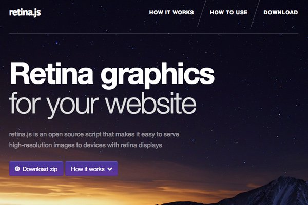
The other library I’ve come to enjoy is Retina.js. It’s an open source jQuery plugin which performs many of the same tasks as Foresight. It will determine if the user’s display has retina properties or not, and then replace regular images with the @2x counterpart. It will only pull if there is a replica on the server, otherwise it leaves everything alone. A very small script and pretty simple to work with.

Further Reading

Closing

I hope these tips can get you started on the path to building flexible retina-ready website layouts. Planning a design is the first step and using this knowledge can really expedite the process. How will the site look in a responsive style? It’s wise to plan out which techniques you need(if any) to handle average retina displays. If you have any questions or related suggestions feel free to share in the post discussion area.

Read More at Understanding Retina-Ready Design for Websites and Mobile Apps

Categories: Designing, Others Tags:

It’s The Smashing Birthday Party, And You Are Invited (With Goodies!)

September 8th, 2015 No comments

Exactly 9 years ago we published the very first article on this very website. Many things changed since then, but one thing remained the same: our obsession for publishing valuable, practical quality content. We proudly stand behind our work — the books, the eBooks, the conferences; our craft is ours, but our work serves the community and belongs to everybody.

The Thanks Page inside the book

As a team, we are happy and privileged to do what we truly love, and we know that this wouldn’t be possible without your kind and generous support. So thanks for sticking around. Now, a birthday calls for a birthday party, so we’ve prepared a little something for you to celebrate the day: a free chapter on responsive design patterns (PDF), a Mystery Riddle, a new free eBook and a birthday special: if you grab the hardcover of the Smashing Book 5 today, you’ll get five Smashing eBooks as a gift for your kind support.

The post It’s The Smashing Birthday Party, And You Are Invited (With Goodies!) appeared first on Smashing Magazine.

Categories: Others Tags:

Adobe CC Visual Keyboard Shortcut Webapp

September 8th, 2015 No comments
fastprint-featured-keyboard

Learning to use the Adobe creative suite can be a grueling task. It requires a lot of practice(and failure) to achieve any semblance of familiarity.

One crucial learning area is mastery of keyboard shortcuts. These shortcuts can dramatically improve your workflow once you actually know your way around the programs like Photoshop or Illustrator. But there are hundreds of shortcuts for so many different commands & tools – how do you jam them into your brain?

Well a hot new Adobe Shortcut Mapper was made for just this situation. It’s a completely free webapp that runs dynamically on JavaScript. You set the program(Ps, Ai, or Id) and the key mapper outlines what each key represents and its primary function.

This project is based on a similar shortcut mapper on GitHub built by Waldo Bronchart. His map includes dozens of different programs but it also has a slightly smaller interface which is a bit difficult to read from a distance.

While the Adobe Shortcut Mapper does not support as many programs, it does have the big 3 for graphic designers and it’s a great tool for anyone trying to grasp the major key commands in Adobe software.

Mastering your Shortcuts

The first step in this process would be to learn the webapp’s interface. When first landing on the page you’ll be presented with Photoshop’s shortcuts. It’s set to “global context” which means just typical document view.

You can switch between Windows, OS X, and Linux keyboards based on whichever OS you’re running. And while the default keyboard is English(US) it’s easily possible to change this to any number of alternatives.

The visual way to use this map is through modifier keys. These are the keys you press & hold to access different keyboard shortcuts.

The most common modifier keys are Shift, Alt, CTRL/Control, and the OS key(Apple key/Windows key). You can actually press & hold any of these keys while on the site and your keyboard map will change accordingly.

ctrl modifier keys shortcuts

Also these modifier keys may be combined to access completely new levels of shortcuts. For example CTRL+S will save your current document. But CTRL+SHIFT+S will “Save As” your current document.

There are hundreds of these minute differences and you probably won’t need to know them all. For example, CTRL+SHIFT+W closes the current file and goes to Bridge. Only photographers would find that shortcut useful – most web designers may never use that in their entire career.

Pick and choose which shortcuts you’d like to memorize. The best way is through muscle memory, which just means using Photoshop a lot.

Or perhaps Illustrator instead. Maybe InDesign?

adobe indesign cc key shortcuts

By switching the program from the dropdown menu the keyboard updates immediately to display new results. The page color also changes to match the software’s branding.

Although Photoshop, Illustrator, and InDesign are just a few programs from the entire Creative Suite, they’re also the most prominent among designers. Hopefully in the future the guys at Fastprint will add more CC applications into the mix.

Autocomplete Search

Look at the very bottom center of the page and you’ll notice a tiny search box.

This is how you can find a shortcut when you don’t have any clue what key to press. For example, I want to find how to cycle through the pen tools.

I know hitting the “p” key gets me the pen tool, but how do I cycle through them without needing my mouse? Well go down to the search bar and type “cycle” – an autocomplete list pops up with tons of results.

cycle tools pen keyboard

Scroll through the autocomplete box until you find the shortcut for cycle pen tool. In this case it’s SHIFT+P – great! No need to guess by hitting a bunch of keys hoping to find the answer.

The only problem with the search is that you can’t actually type spaces into the box. Hitting the space key only manipulates the visual keyboard, so it’s a bug that really should be fixed.

Other than that I have to say this is an incredible learning tool for new designers.

If you have the time check it out and play around with different contexts & modifier keys. It’s a surprisingly versatile application that can offer something even to seasoned professionals.

Read More at Adobe CC Visual Keyboard Shortcut Webapp

Categories: Designing, Others Tags:

The New Smashing Mystery Riddle: Have You Figured It Out Yet?

September 8th, 2015 No comments

Ah, these mystery riddles never stop, do they? To celebrate our ninth birthday, we’ve prepared yet another riddle, and this time it will require a bit more teamwork. We’ve hidden secret keys in different (physical) locations across the world. To move from one level to another, you’ll have to find a hidden print-out in all (four) locations. Watch out for GIF file names.

Smashing Book Mystery
Tip: Watch out for the file name. Large view.

To find the key password, you have to follow the clues and hints in a series of animated GIFs. Once put together, the keys will add up to a secret Twitter hashtag. Below you’ll find the first animated GIF that contains a location clue. Identify the location, go there (yourself, or ask a friend, colleague or a total stranger) and find a hidden print-out.

The post The New Smashing Mystery Riddle: Have You Figured It Out Yet? appeared first on Smashing Magazine.

Categories: Others Tags:

The ES6 Conundrum

September 8th, 2015 No comments

ECMAScript 6 or ES6 is the evolution of JavaScript and it is the future. It is the technology innovation for the web we’ve all been waiting for. It is full of great functionality we always craved and it finally enables us to build huge applications for the web in a scalable and easy to maintain manner. It empowers thousands of developers coming from Java or C# or other “higher” languages to finally write JavaScript and bring all the goodness of their experience to a market in dire need of organization and direction. That’s the sales pitch and – to be fair – a lot of it is true. However, it also makes a lot of assumptions as to what needs fixing on the web. And there is a real problem with evolving a language as ubiquitous as JavaScript without having control of the environments it is executed in. The web is a distributed platform. It is much harder to change the wheels on a vehicle that is constantly in motion than on one you can bring back to the shop, lock up, upgrade and drive out again. JavaScript doesn’t seem to cut it any longer The, shall we say, lenient […]

Categories: Others Tags:

DrupalCon 2015 in Barcelona from September 21st-25th

September 8th, 2015 No comments
drupalcon-2015-conference

Each year at 3 different locations DrupalCon rocks the house with talks, workshops, and some awesome community gatherings. Drupal users can learn a lot by attending these conferences with the hope of meeting great people and learning about new features, plugins, etc.

This year’s European event will be held in Barcelona, Spain from September 21st-25th. It’s a large five-day event packed with a lengthy schedule of multiple tracks(or sessions). These tracks pertain to different workshops & speakers that cover varying subjects like coding, DevOps, Symfony/PHP, or even business management.

From the DrupalCon website:

DrupalCon brings together thousands of people from across the globe who use, develop, design, and support the Drupal platform. DrupalCon is the heartbeat of the Drupal community. It’s where improvements to the project are made, where important business connections are built, and where lifelong friendships bloom.

Attendees range all across Europe from a variety of different backgrounds and skillsets. If you’d be interested check out the registration page for more information about dates & pricing.

You can also keep up-to-date with the official DrupalCon Twitter account @drupalcon.

Read More at DrupalCon 2015 in Barcelona from September 21st-25th

Categories: Designing, Others Tags: