Archive

Archive for September, 2015

Engage users with strong calls to negotiate

September 8th, 2015 No comments

Every site has a goal, whether it’s making more money, building a client list, or getting a customer to pick up a phone and call. To achieve those goals you need your users to emotionally engage with your site.

You might think that your calls to action are prompting user interaction, but every call to action is really a negotiation. You have to give, in order to receive. And the more you want to receive, the more you need to offer in return.

Whether applied to your whole site, or a single input field, negotiation is a serious business, if you want to radically improve your site’s engagement, then focus on these proven negotiation tactics:

1. Be generous

Human beings mimic the behaviour they encounter. Try smiling at a complete stranger, chances are they’ll smile back.

Be generous, and offer something that outweighs what you’re asking in return. Your users will go out of their way to take you up on it.

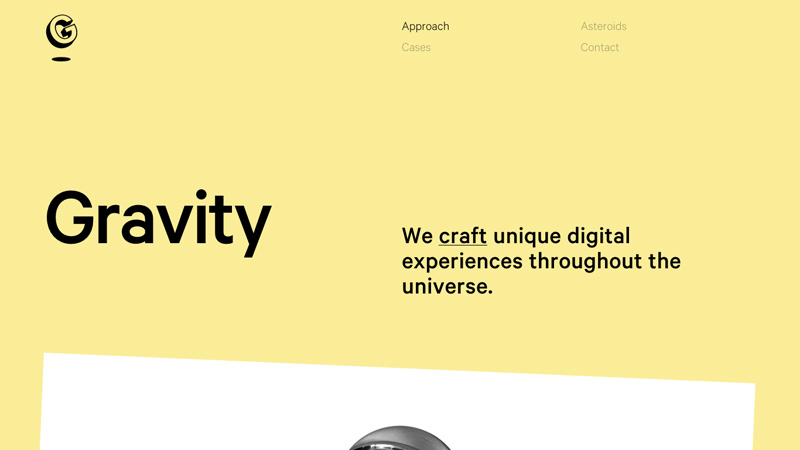
Nitwinski‘s site successfully promises that whatever your dreams may be, they’ll over-deliver.

2. Share information (any information)

You have to be the first to blink. Be open about information you’re hoping to receive from the user, and be prepared to give them at least as much in return.

When you offer the user something, you create an atmosphere of cooperation, and an emotional connection.

Berlin Connect is a multi-cultural church in Berlin, Germany. They’re open about who they are, and what they’re passionate about, before inviting you to join them this Sunday.

3. Have a target

An experienced negotiator will always have a target in mind. It might be acquiring the user’s email address, it might be persuading them to open an account, but you can’t hit a target that doesn’t exist.

It doesn’t have to be a level playing field; an existing customer is more valuable than a potential customer, so be prepared to lower the bar for them.

Visionare want your email address, but they don’t ask outright, they ask you for your dream, then draw a line by asking for your email address in return. Making it clear, that is their bottom line.

4. Have a walkaway

As well as a target, you also need a walkaway; it’s the point at which the transaction no longer works for you. When you would, in the real world, literally walk away.

Just don’t set your walkaway too high, users are often prepared to provide more information about themselves once you’ve made divulging it optional.

Trip Sniffer is open, almost blunt, about what they want: leave your email, without it they can’t notify you of early access.

5. Be prepared to compromise

Allow users to interact with you as they would prefer. You might like them to sign up for your newsletter, but don’t make that a condition of engagement.

Always compromise your position before you compromise the user’s.

The Episcopal School of Knoxville wants you to take the next step, what that step is, is up to you: you can request more info, schedule a tour, or apply online; you are in control.

6. Make the first offer

This is known as psychological anchoring. Whatever offer is on the table, both parties negotiate around it.

If you have a product on your site, don’t let the user set a price in their head. Be up front about it. If the user knows what the deal will cost them, they’ll judge it on the actual price, rather than the price they’re hoping to pay.

Erik Zuuring wants you to hire him, for money. No mistaking the approach: he’ll solve your problem, you’ll pay him.

7. Feign backing out

When writing your copy, always make reference to the date. Phrases such as “This Summer’s best buys” or “Treat yourself this Fall” imply there’s a time limit in place, and encourage the user to take action before it’s too late.

Amando Campbell would like to help you reach your fitness goals in 2015. (He’ll probably be just as happy to help you in 2016.)

8. Get to the point

These days users are tech-savvy and experienced. They don’t appreciate an extended sales pitch, and a pitch that doesn’t focus on key features will feel like a snow job.

Your product is good, have faith in it and so will your customers.

Nothing But Thieves‘ website opens with their music (and some sweet visualizations). It’s clear from the moment you land on the site exactly what they’re selling.

9. Get them committed

The further into a negotiation someone progresses, the more invested they feel. The longer you can keep them interested, the less likely they are to throw away that investment.

Fast track users through initial stages of a sales pitch, and always tell them how far into the process they are.

Reebok sell sportswear, and they sell more by taking you on a journey. It’s about constant progress and once you start you won’t want to stop. You might even buy some running shoes.

10. Do your prep work

You can’t always persuade a user to click that button, fill in that form, or download that file. But understanding why they didn’t will help you next time.

Anytime a user drops out of your sales funnel, especially if they drop out at checkout, find out why. Then correct it for next time.

Introduction to Windows 10 Video Course – only $24!

Source

Categories: Designing, Others Tags:

The Huge September Font Bundle including 49 Professional Typefaces

September 8th, 2015 No comments
00-featured-hungry-jpeg-september-bundle

So far today I’ve spent one hour perfecting the design of one of my client’s new media packs, and honestly I am very happy with it. To tell you the truth I am super happy that I managed to get it looking so great within such a short space of time (Don’t tell the client).

What I am not happy with, however, is having spent the past nine hours trying to find two fonts that not only look great within the design, but that also complement each other nicely. I’m still no closer to finding them.

These really are first world problems – well for a designer anyway.

A good font library should really be a designer’s treasure chest. But with new fonts being released daily it can be extremely expensive to continually purchase fonts at $15 – $100 each.

However, last month I stumbled across a gem of a site called TheHungryJPEG.com (Love the name as well). They provide monthly design packages that include stacks of resources from fonts to illustrations, themes to mock ups, and lots more.

The best part of it all is that they’re sold at around 95% off the standard retail price of all items included.

This month’s offer includes 66 fonts for $29. Some fonts included are best sellers and cost $30 alone, so this package really is a steal.

See all items included via the image below. You can also view the website here.

All products included come with commercial licenses, making them perfect for not only personal use but for business purposes too.

The downside is that these great bundles are only available for a single calendar month. This current bundle expires at midnight on September 30th. And once they expire, they really are expired, as I found out with last month’s bundle which I missed by a few hours.

Be sure to comment at the bottom and share other sites you like that offer great deals. Because at the end of the day, every little bit of saving helps.

Have a great day, and a great September!

Read More at The Huge September Font Bundle including 49 Professional Typefaces

Categories: Designing, Others Tags:

Cycligent.js – Brand New Open Source Asynchronous Loading Library

September 7th, 2015 No comments
00-featured-cycligent-js-async

The best developers try to stay on top of the latest technologies. The old adage “why reinvent the wheel” comes to mind.

Although there are plenty of JS-based libraries for lazy loading and asynchronous page scrolling, new libraries pop up every day. The goal of a new library is to solve problems that haven’t been solved with other code bases.

Introducing Cycligent.js, a free open source solution for JavaScript asynch development. Of course this can include lazy loading but also async tasks like connecting to remote servers and pulling down assets.

There’s a large amount of documentation to read and familiarize yourself with. Cycligent runs with traditional objects like classes, methods etc.

The library has been tested to work in all modern versions of Chrome, Safari, Firefox, and IE 9+. Browser support can be improved with another JS script like IE7.js.

If you’re interested to check it out, head over to the GitHub repo and pull down a copy. Cycligent.js may also be accessed via npm module.

Read More at Cycligent.js – Brand New Open Source Asynchronous Loading Library

Categories: Designing, Others Tags:

Thingthing iOS Keyboard allows Faster Sharing on iOS

September 7th, 2015 No comments
00-featured-thingthing-ios-keyboard

How often have you needed to switch between apps to move/copy data? It seems like a common task, especially using communication apps and when messaging people.

Well this has always been somewhat of a pain, and there’s certainly no reason for Apple to add functionality by default. However a new app named Thingthing has recently launched on the iOS App Store.

It’s a keyboard that links to all your different applications be they file storage, SMS, or e-mail(or anything else!)

Thingthing app keyboard

The keyboard is meant to allow easier transfers of data between applications that may not have as much attention given to them. This allows data such as text links to be moved easily between a Safari tab into a text message. Images are still in the works but in time it’ll be just as easy to copy those – perhaps even into multiple text-base apps at once!

Thingthing is completely free and will run on iPhone, iPad, and iPod Touch devices. Although it’s still brand new, there is a lot of hope for this app to draw plenty of attention in the coming years.

Check out the application’s website to learn more and delve deeper into available features.

Read More at Thingthing iOS Keyboard allows Faster Sharing on iOS

Categories: Designing, Others Tags:

GitHub to Launch Protected Branches for Code Repos

September 7th, 2015 No comments
00-featured-github-octocat

The GitHub team recently put up an interesting blog post covering a new feature called “Protected Branches”. The goal is to save stress by protecting certain branches from being overwritten by contributors.

This ability should be setup by an administrator on the repo, but obviously it’s not a necessity all the time. From GitHub’s blog:

Repository administrators [will have] the ability to disable force pushes to specific branches. When it’s enabled for your repositories you’ll be able to go to the Branches tab in repository settings and protect branches.

According to GitHub, this new feature will connect into the Status API if you also wish to force status checks. It’s merely another optional feature to triple-check the security of your repo.

Most small-time developers may not find this exceptionally useful, especially for a very small project. But when you’re juggling dozens of contributors the work can get confusing very fast.

There isn’t much information regarding a release date, but protected branches have already been listed in the GitHub Help section – so I’d say we should expect this feature at some point in the near future.

Read More at GitHub to Launch Protected Branches for Code Repos

Categories: Designing, Others Tags:

Ember.js Releases Ember Data v2.0 (with Upcoming Beta to Follow)

September 7th, 2015 No comments
00-featured-ember-js-framework

Ember.js is a common MVC framework for JavaScript developers. It’s meant to provide standard procedures that you’d expect in any other framework, but with the core basis running in JavaScript.

This library has gained popularity amongst developers who want to switch over the JS solutions. Interestingly enough, this framework has also been popular due to its connection with the Handelebars.js templating engine.

Earlier this week the Ember team released an update for the Ember Data library. The v2.0 Ember Data release includes typical bug fixes along with some deprecated functionality. The entire structure was recently overhauled to work with JSON formats for greater control in JavaScript.

Anyone who uses Ember.js should note that this upgrade is not critical and does not patch any major security holes. Everything is about moving forward towards newer technologies & improving Ember.js as a whole.

You can view the Ember Data v2 changelog on GitHUb to see what’s been updated.

Also the team has released news about reworking v2.0 for a v2.1 beta. This is certainly not stable and should not be attached to your current webapps – however early adopters might play around with the beta to report bugs, annoying features, or perhaps even suggest features to improve Ember’s performance on single-page web applications.

Read More at Ember.js Releases Ember Data v2.0 (with Upcoming Beta to Follow)

Categories: Designing, Others Tags:

Ryan Carson & Treehouse’s 32-Hour Work Week

September 7th, 2015 No comments
00-featured-ryan-carson-treehouse

The Atalntic recently did a small video piece with Ryan Carson, CEO & founder of the online learning website Treehouse.

Treehouse was founded as a way for people with little-to-no knowledge of design/development to teach themselves the prerequisite skills to get a job in the industry. It has flourished since being originally founded and offers a tremendous amount of information for types of digital creatives.

In a short 5-minute video clip, Ryan talks about Treehouse’s 32-hour work week and why he starkly imposes a 4-day week for his employees(and himself).

It’s an interesting look into the machinations of Treehouse. But more than this it’s an interesting look at a modern 21st century company that’s building a framework for happy employees and profitability.

If you have the time check out the video and let us know what you think in the comments below.

Read More at Ryan Carson & Treehouse’s 32-Hour Work Week

Categories: Designing, Others Tags:

The anatomy of responsive images

September 7th, 2015 No comments

Because sometimes looking at code with arrows that point to each little bit and explain what it does is the best way to understand.

If you’re new to responsive images, you can poke around here for a bunch more information including some videos.

Direct Link to ArticlePermalink


The anatomy of responsive images is a post from CSS-Tricks

Categories: Designing, Others Tags:

10 Minimal Websites with Attractive Typography

September 7th, 2015 No comments
00-degordan-academy-type

One of the biggest trends of the last few years is using fullscreen hero images combined with big typography.

But like most trends, designers often abuse them only because they’re in fashion, with no regards to critically think about a design choices. Flat design is the worst and often misunderstood.

Minimalism isn’t about stripping down to basics simply for the sake of it. But instead it’s about taking what’s required and utilizing it in such a way that its blatantly easy to understand.

Let’s look at a few examples of clear minimalism with a focus on typography.

Rally Interactive

You’ll notice some flat design colours here. For the intention of making something more visible to the human eye, colours stand out very well on an otherwise blank website.

Flat colours accomplish this in a more subtle way without stinging the eyes.

Rally Interactive

Thomas Buffet

By design, Thomas Buffet includes his most important information smack-bang in the middle of the webpage with nothing more than a sans-serif font and a clean, white background. The rest of the webpage spies on us from the bottom of the screen, but makes itself apparent so that we know where to look next.

Thomas Buffet

Fifty Five

Fifty Five also rejects a heavy use of imagery in their website, but that’s for a different reason: they’re a data agency.

Since data is communicated with text, this makes for an interesting challenge – one that results in a minimal website with legible typography and a combo of serif and sans-serif fonts.

Fifty Five

Huuman

Huuman’s minimal design is more than just a style. It’s a demonstration of what they stand for and aim to do for their clients, which is to help them speak human in a digital world.

When a “cool” trend is used inappropriately the website fails to communicate its brand, despite wowing the audience for a split second. Finding a middle ground is crucial to good design.

Huuman

Sendamessage.to

You’ll actually receive a(sometimes rude) message every time you load the page, but more importantly the creator is showing you the concept of the website with a simple header and a clever scroll-based animation. Gestures are very communicative, which makes this minimal-style web design wonderfully effective.

Sendamessage.to

Lunar Gravity

I really adore the use of white space in this design. In fact, this one inspired me so much that a few months ago I built a website for myself inspired by it.

Lunar Gravity

Velvet Hammer

Websites are structurally defined by blocks made to divide content. One thing you may have noticed in minimal design is that their creators fight the need to style those dividers with borders, backgrounds, and anything else they can think of.

Velvet Hammer

Truth Labs

White is traditionally used in minimal design and it should be noted there is nothing wrong with that.

But by creating a series of snazzy interactions, subtle animations, and a flat alizarin background, Truth Labs creates an enriched experience by doing something other than the norm while still maintaining a minimal approach.

Truth Labs

Werkstatt

Werkstatt is another studio that keeps it simple with bold yet modest typography and augments the experience with smooth animations. Yet this studio takes it to another level by even styling the window scrollbar in an effort to keep it strictly monochrome.

Werkstatt

Degordian Academy

I’ve included Degordian Academy to demonstrate that full-screen header images can work in a minimalist design – as long as they offer contrast so the text canbe read.

When flat colours are not overused we can accomplish a beautiful, well-designed website that makes use of current trends without forcing the user to turn back in irritation.

Degordian Academy

Read More at 10 Minimal Websites with Attractive Typography

Categories: Designing, Others Tags:

UX Cambridge 2015 convenes at The McGrath Centre Sept. 9th

September 7th, 2015 No comments
00-featured-ux-cambridge-fest

One of the smaller yet more intimate UX events is UX Cambridge in England. The event focuses on practical user experience guidelines for building better websites, mobile apps, and desktop programs.

The conference includes many handy keynotes, educational workshops, group+solo tutorials, along with personal case studies and experience reports from significant individuals.

There’s also plenty of time for networking and chatting it up with fellow UX Cambridge attendees(and speakers!)

The event runs for three days from September 9th to the 11th. As of this writing tickets are still available for both single-day passes and full event passes.

If you’re curious check out the schedule to see planned events and keynotes. While the event is somewhat small, there are a few interesting keynote speakers in attendance:

If you want to learn more check out the UX Cambridge 2015 website. You can also follow the official Twitter @uxcambridge for live tweets & photos from the event.

Read More at UX Cambridge 2015 convenes at The McGrath Centre Sept. 9th

Categories: Designing, Others Tags: