Archive

Archive for September, 2015

Top jQuery Plugins for Common Website Features

September 7th, 2015 No comments
00-featured-jquery-tabs-plugin

UI design is meant to follow ideas from the user’s perspective. Many ideas relate to typical page elements but others focus on user experience. These UX design ideas typically involve dynamic action or animated elements which breathe life into a traditional website.

With jQuery it’s possible to create every type of dynamic effect imaginable. Plus instead of writing code from scratch you can build on top of a plugin to save time and the stress of debugging.

Whether you’re creating a rich media gallery or scrolling content pane, these free plugins are sure to fill whatever void you may have in your current design project.

Navigation UI

A website’s navigation is arguably the most significant interactive piece in every layout. Without a reliable nav area it’s impossible for users to move between pages on the site.

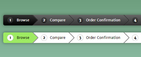
Since the navigation is a staple of any layout it should be handled as such. You can add colors or increase link size, but dynamic effects often draw more attention. Take for example stickNavbar.js which is a free jQuery plugin for pinned navigation.

As you scroll down the page a navigation bar will stay fixed at the top. It can appear right after pageload or be fixed after the user scrolls past a certain point on the page.

The plugin markup is real simple to the point where even a newbie coder could get this running.

tendina jquery sliding nav

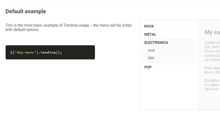
For sub-navigation effects consider Tendina which can add slideable dropdown navigation to the page. Each link includes a series of sub-links that slide into view when clicked.

Tendina certainly wouldn’t work on every site but it does have its value. The nav can be setup like an accordion or regular dropdown to leave all submenus open until closed manually.

Form Accessories

Web forms are another powerful aspect of UI design. Forms take information from visitors to pass into the server for processing.

This information could be an e-mail contact request or a purchase from an e-commerce shop. Either way forms are vital and can be dramatically improved with a little TLC from the jQuery community.

formvalidation io jquery plugin

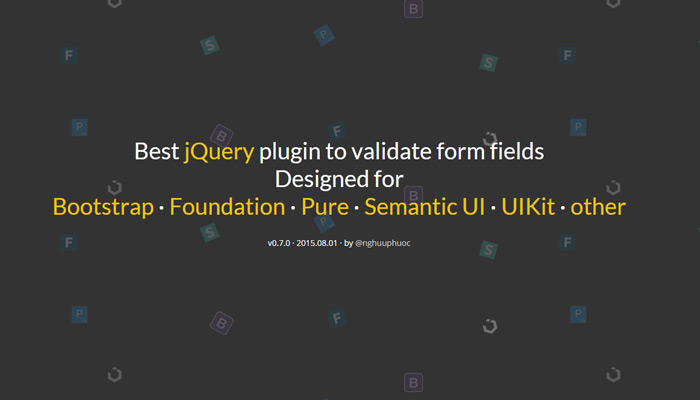
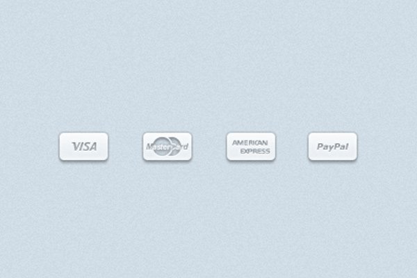
Let’s start with a very popular choice named FormValidation. This plugin is more like a complete library of form validation techniques. It can check any type of content and validate before the form has even been submitted.

Also FormValidation can connect with a number of great frontend frameworks like Boostrap, Foundation, and Semantic UI(among others).

If you like FormValidation you can connect it with other free form plugins like iCheck.

icheck checkboxes radio buttons plugin

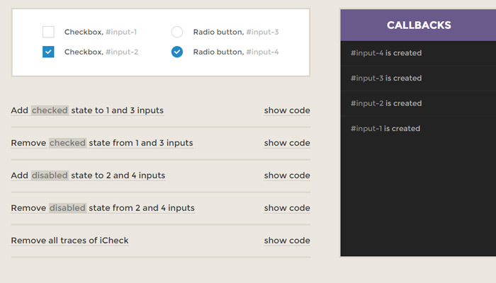
This open source jQuery plugin offers a quick way to customize checkboxes and radio fields. Some basic design features could be changed with CSS, but jQuery offers a lot more power with higher levels of manipulation.

Check out this page for examples of iCheck connected into FormValidation.

With these two plugins at your disposal you can build dynamic forms that submit to the whim of every visitor’s preferred user experience.

Content Tabs

In-page content takes many shapes & sizes. When you have large blocks of run-on statements it can help to rearrange that content into tabs.

Most users are familiar with how tabs work from common software applications like web browsers. Thus tabbed interfaces are a safe way to arrange large collections of info into bite-sized chunks.

tabtab js jquery plugin

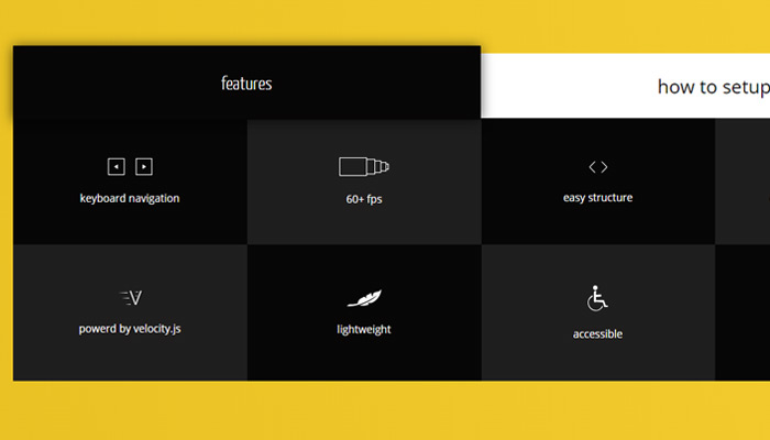
TabTab.js is an open source project made for tabbed content manipulation. It’s based on jQuery animation techniques where tabs animate between segments of content. Along with jQuery it also relies on Velocity.js which is another free open source library.

This is a rather flashy example but if you want something a little simpler take a peek at jQuery Accessible Tabs.

accessible tabs plugin

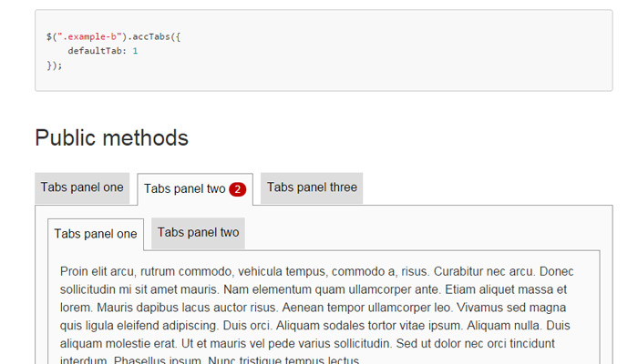
This library is great for all-purpose use because it comes with no default styles or requirements. Accessible Tabs is one of the simplest plugins you can use for tabbed content on the web.

If you know a little about jQuery you should be able to change tab options and even add your own callback functions. Plus the tabs are all based on HTML/CSS code so you don’t need to worry about complex styling.

Media Galleries

In the world of media sliders there are dozens and dozens of options. Some are free, others cost money, but they all work to provide the best possible user experience while showcasing your gallery of photos or videos.

lightSlider is a free jQuery plugin for adding dynamic sliding galleries to any page. The content style uses thumbnail images that load into a fullscreen view.

lightslider jquery plugin

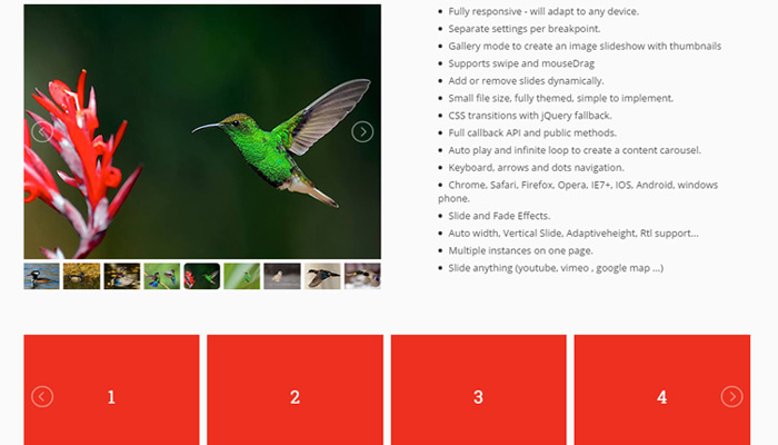
It’s a simple matter to rearrange photos as you need, along with adding extra effects like transition animations.

For a touch-based interface PhotoSwipe could be more suitable. It’s another free open source jQuery plugin made for image galleries with the added bonus of supporting swipe transitions.

photoswipe jquery plugin gallery

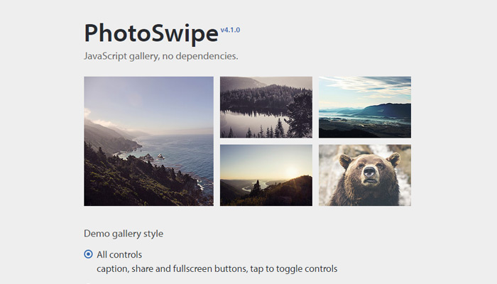
The PhotoSwipe plugin is completely responsive and works in gallery view. The user taps a thumbnail which then brings up a fullscreen modal window. Directional arrows are positioned left & right to move between slides with ease.

While these are just 2 examples out of dozens online, they behave exactly as you’d expect with plenty of customizable features for any website.

Parallax Motion & Scrolling

Although few designers work with parallax motion it has become much more popular in recent years. This is different from scroll hijacking which is a ruthlessly infuriating beast that only somewhat resembles parallax scrolling – usually without the parallax.

The purpose of motion in web design is to give the illusion of life and depth. Parallax plugins add motion to page elements, sliding areas, scrolling effects, or all 3 techniques combined.

parallax scroll plugin

Parallax-Scroll is an example of motion added to photos within a page. Normally this content remains static while the user scrolls but with jQuery we can give the illusion of depth.

If you want to add this effect onto a site check out the Parallax-Scroll GitHub page which includes a free download & setup details.

More typical parallax effects rely on the entire layout. These are most often single-page designs with a focus on content structure. Nav menus attach to areas on the page which animate into view through scrolling effects.

labscroll menu jquery

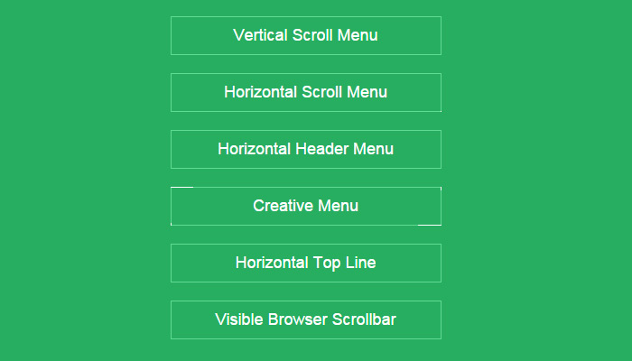
ScrollMenu.js is an excellent open source plugin for this exact technique. You can choose from various demos like the horizontal header or the fixed topbar.

A slightly different experience can be created with FullPage.js or multiScroll.js. They both work in a similar manner with single-page designs featuring animated content sections.

The great thing about parallax design is that it’s easy to setup. If you have a solid plan for your project then it’s easy to extrapolate parallax features into a custom single-page interface.

Wrap-Up

If you’ve ever wanted dynamic plugins to push your site onto the next level these free resources are perfect. If you dig around you’re likely to find dozens of similar plugins with every eccentric feature you could imagine.

Just be sure to limit your plugins and strike a balance between natural browser effects paired with dynamic JavaScript components.

Read More at Top jQuery Plugins for Common Website Features

Categories: Designing, Others Tags:

30 Open Source HTML/CSS Projects from CodePen

September 7th, 2015 No comments
00-featured-open-source-projects

I have always been a supporter of CodePen ever since I found the website. It is an online HTML/CSS/JS code editor where you can build ideas and test them in real-time. Developers can also share their pens with others all around the world! It is a great web application which allows frontend developers to practice their skills from any computer with Internet access.

I’ve gone through the latest pens and gathered 30 of the best code samples. Projects which are free to duplicate will have an open source license on the codes. Ideally these can save you time and stress when attempting to build more convoluted interfaces. Granted you may not find a use for all of these concepts. But it is worth skimming the collection just to see what is out there and what is possible when building with CodePen’s IDE.

Flat Navigation Menu

Switch Inputs

custom css3 jquery switch slider inputs

Progress Meter

html5 css3 progress task meter

Pure CSS City Sunset

css-only sunset effect city animation

Intro Animation

website icons animation transition effects

Flip Menu Gallery

flip menu items images gallery food

Animated Bubbles

jquery javascript bubbles background blues

Flat Navigation Tabs

fancy icon flat navigation menu tabs

Parallax Keyframes

css3 keyframes parallax animation slider

Fixed Sticky Menu

fixed sticky navigation navbar menu

Fullscreen Background Image

jquery dynamic fullscreen background image codepen

Mini Toggle Nav

mini navigation item toggle jquery

Path-Style Flyout Menu

jquery path app flyout navigation animation

iOS-Style Definition List

custom html5 css3 ios designed definition list

Big Pressable Button

big red css3 pressable press button

Flat Responsive Form Inputs

oversized html5 css3 responsive form contact

Self-Numbered Lists

green icons lists items self numbering

CSS3 Knob Animation

rotating light knob animation keyframes

iOS Sliding Navigation

sidebar mobile sliding app navigation html5 css3

Dynamic Color Palettes

webapp html5 css3 color palettes selector

Pure CSS Breadcrumbs

pure css breadcrumbs menu navigation

Basic Image Slider

simple basic image slider jquery

Custom HTML5 Range Slider

css3 html5 custom design features slider input

CSS3 Animated FAQ

css3 transition custom animation questions answers faq

Circle Image Captions

circle image hover captions effects

Multi-Colored 3D Buttons

multi colored 3d buttons effect open source

Simple Buttons

css3 hover effect colorful buttons

CSS3 Image Captions

css3 transition animation effects hover captions

Customized Form Inputs

custom html5 css3 form vehicle make model

HTML5/CSS3 Dashboard Interface

custom css3 website code dashboard interface

Read More at 30 Open Source HTML/CSS Projects from CodePen

Categories: Designing, Others Tags:

Eliminating Roundtrips with Preconnect

September 7th, 2015 No comments

Last week we wrote about prefetching and preloading but forgot to mention preconnect. Thankfully however, Ilya Grigorik has written a great post about this elusive resource hint:

Preconnect is an important tool in your optimization toolbox. As above examples illustrate, it can eliminate many costly roundtrips from your request path — in some cases reducing the request latency by hundreds and even thousands of milliseconds. That said, use it wisely: each open socket incurs costs both on the client and server, and you want to avoid opening sockets that might go unused. As always, apply, measure real-world impact, and iterate to get the best performance mileage from this feature.

Direct Link to ArticlePermalink


Eliminating Roundtrips with Preconnect is a post from CSS-Tricks

Categories: Designing, Others Tags:

Rumors Swirl around Apple’s Upcoming September 9th Event

September 7th, 2015 No comments
apple-event-sept-9th

In just a few days Apple is holding a release event discussing a few major product updates. It’s hard to say exactly what will be released, but there’s no doubt it’ll be a media circus.

One possibility is a revamped iPhone 6S with fewer chips and faster CPU speed. If this turns out to be true we’ll likely learn a whole lot more once the phone is announced onstage. And according to 9to5 Mac, we may even see 4K Video recording native to the iPhone 6s.

iPhone 6 and 6S models

Other announcements will likely focus on an revamped Apple TV model. The internals will of course get an overhaul but the specs are yet to be 100% confirmed.

An interesting point is the inclusion of Siri within the Apple TV operating system.

You should also expect news surrounding an updated iPad Pro and/or iPad Mini model.

We also know watchOS v2 is expected to release somewhere around the same time as iOS 9. So could we also see a 2nd release of the Apple Watch?

September 9th will tell the story and give us all the info we could ask for.

Read More at Rumors Swirl around Apple’s Upcoming September 9th Event

Categories: Designing, Others Tags:

Lies, damned lies, and A/B testing

September 7th, 2015 No comments

A/B testing is frequently billed as a scientific way to validate design decisions. Occasionally referred to as split testing, A/B testing is a simple process that on the surface appears to promise concrete results:

Create two variations on a design element, randomly swap them on your site and record how your users react, compare the results, implement whichever variation performed best. It makes sense.

The classic example is: a red button vs. a green button, which will be tapped more? However, the more interesting question is: a green button vs. the same green button, which will be tapped more?

What happens when we A/B test two identical variations? An A/A test, if you will.

Green button vs. green button

In order to test the validity of any A/B test, we need a test that has a ‘correct’ answer. We need a correct answer because we want to know, all things being equal, how likely is it that the A/B test will produce the result it should, and for that we need to know what result to expect.

If we A/B test two identical buttons, the result should be a dead heat

So, let’s assume that we’re testing a green button vs. the same green button, and that the button is so enticing that 100% of users will tap it.

(The percentage doesn’t actually matter, it could be 14.872%. What matters is that because the buttons are identical, the tap rate should also be identical.)

If we A/B test two identical buttons, the result should be a dead heat.

The coin toss test

Toss a coin. Which side will come up, heads or tails? We know there are two sides, both identical, so it’s a 50-50 chance.

If we toss our coin twice, we know that there are three possible outcomes: 2 heads, 2 tails, or 1 head and 1 tails. And so on…

Let’s say the coin toss is our A/A test; the odds of the heads side coming up are identical to the odds of the tails side coming up, just as the odds of either of our green buttons being tapped are equal.

So let’s write a quick script in the browser (because most A/B testing happens in the browser) to simulate users tapping one button or the other, depending on which one they’re presented with.

Remember: we’re testing two identical variations of a button, and the way we know they’re identical is that we’re treating the likelihood of them being tapped as identical. All we’re looking for is a consistent (and therefore correct) result.

Firstly, we need an HTML table to record our results in, the table will look like this:

<table id="results">
    <tr>
        <th>#</th>
        <th>Heads</th>
        <th>Tails</th>
        <th>Difference</th>
        <th>Margin of Error</th>
    </tr>
</table>

<div id="summary"></div>

In the first column we’ll record the number of the test (all good A/B tests, are repeated to verify results, so we’ll repeat the test a few times). Next we’ll record the number of Heads results, then the number of Tails results. The column after that will be the difference between the two results (which should be zero). Then we’ll record the margin of error (which again, should be 0%). Beneath the table we’ll print out a summary, the average of all the results, and the worst case result.

Here’s the script:

var bestOf = 12, // the number of times we want to run the test
    testRepeat = 12, // the number of times we'd like to repeat the test
    testCount = 0, // the number of the current test
    testInterval = setInterval(performCoinToss, 100), // call the coin toss function
    totalDifference = 0, // used for calculating the average difference
    worstDifference = 0; // the worst case

function performCoinToss()
{
    
    testCount++; // increment the current test

    var testCounter = bestOf, // the current iteration of the test
        headsCounter = 0, // the total number of times the script came up with "heads"
        tailsCounter = 0; // the total number of times the script came up with "tails"

    while(testCounter--) // loop 'testCounter' times
    {
        Math.round(Math.random()) ? headsCounter++ : tailsCounter++; // finds 0 or 1 randomly, if 1 increments headsCounter, otherwise increments tailsCounter
    }
    
    var difference = Math.abs(headsCounter - tailsCounter), // the difference between the two
        error = (difference / bestOf) * 100; // the error percentage

    document.getElementById("results").innerHTML += "<tr><td>" + testCount + "</td><td>" + headsCounter + "</td><td>" + tailsCounter + "</td><td>" + difference + "</td><td>" + error + "%</td></tr>"; // add result to table
    
    totalDifference += difference; // increments the difference counter
    worstDifference = difference > worstDifference ? difference : worstDifference; // updates worstDifference
    
    if(--testRepeat == 0) 
    {
        
        var averageDifference = totalDifference / testCount, // finds average difference
            averageError = (averageDifference / bestOf) * 100; // finds the average error margin
            
        document.getElementById("summary").innerHTML = "<p>Average difference: " + averageDifference + "</p><p>Average margin of error: " + averageError + "%</p><p>Worst Case: " + worstDifference + "</p>"; // write summary to page
        
        clearInterval(testInterval); // if the test has been repeated enough times, clear the interval
        
        
    }
    
}

The code is commented, so here are just the highlights:

Firstly we set up some variables including the number of times we want to toss the coin (bestOf) and the number of times we want to repeat the test (testRepeat).

Spoiler alert: we’re going to get into some fairly high loops, so to avoid breaking anyone’s browser we’re running the test on an interval every 100ms.

Inside the performCoinToss function we loop the required number of times, each iteration of the loop we use JavaScript’s random function to generate either a 1 or a 0, which in turn increments either the headsCounter, or the tailsCounter.

Next we write the result from that test to the table.

Lastly, if the test has been repeated the number of times we’d like, we find the averages, and the worst case, write them to the summary, and clear the interval.

Here’s the result. As you can see the average difference is, well it will be different for you, but as I’m writing this the average difference is 2.8333333333333335, the average error is therefore 23.611111111111114%.

Over 23% error does not inspire confidence, especially as we know that the difference should be 0%. What’s worse is that my worst case result is 8, that’s 10–2 in favor of heads.

Using some realistic numbers

Okay, so that test wasn’t fair. A real A/B test would never claim to find a conclusive result from just 12 users.

A/B testing uses something called “statistical significance” meaning that the test has to run enough times in order to achieve an actionable result.

So, let’s double the bestOf variable and see how far we need to go to reach a margin of error, of less than 1% — the equivalent of 99% confidence.

At a bestOf of 24 (at the time of writing) the average difference is 3.1666666666666665, which is 13.194444444444445%. A step in the right direction! Try it for yourself (your results will vary).

Let’s double it again. This time, my average difference 6.666666666666667, with a margin for error of 13.88888888888889%. Worse still, the worst case is 16, that’s an error of 33.33333333333333%! You can try that one for yourself too.

Actually, no prizes for guessing that we can keep going: best of 96, best of 192, best of 384, best of 768, best of 1536, best of 3072, best of 6144, best of 12288, best of 24576, best of 49152, best of 98304.

Finally, at a best of 98304, the worst case scenario drops below 1%. In other words we can be 99% confident that the test is accurate.

So, in an A/A test, the result of which we knew in advance, it took a sample size of 98,304 to reach an acceptable margin of error.

The $3,000,000,000 button

Whenever A/B testing is discussed, someone recalls a friend of a friend, who A/B tested a single button on his/her site, and promptly made some improbable profit (the actual dollar value of the button increases each time I hear the story).

In those tales, the buttons are usually tested for micro-copy, “Download my ebook” vs. “Download my free ebook”. It shouldn’t be a surprise that the latter wins. It’s an improvement that any good copywriter would make. A more appropriate A/B test would be “Download my ebook” vs. “Download the ebook” (my money’s on the latter).

If you find yourself with a result heavily weighted towards one of the options, it suggests that something is very wrong with one of your variations. More often, a good result will be an improvement of less than 5%, which presents a problem if you’re testing with around 1000 users (the margin for error of which is around 5%).

The more useful a test is, the tighter the margin of victory for one variation or the other. However, the tighter the margin of victory, the greater the sample size needed to give you an acceptably small margin of error.

Lies, damned lies, and A/B testing

Mark Twain, possibly quoting Disraeli, once used the phrase: lies, damned lies, and statistics. By which he meant that something proved by statistics, is not necessarily true. Statistics can be used to prove anything you want them to.

A/B testing will provide you with a result, but it’s a result that will say more about you and about what you expected to find, than about your customers

The most dangerous thing about A/B testing is that it can prove anything you want it to; it can produce false positives, and it enables us to discern patterns that aren’t properly supported.

Furthermore an A/B test may indicate that a green button outperforms a red button, but what about a blue button? Even successful A/B testing only allows us to validate our design decisions within the context of the test itself.

For an A/B test to function as intended, we need two opposing conditions to be true:

  1. there should be minimal variation between options, so the test is not weighted by our preference;
  2. the sample size should be sufficient that the margin of error is less than the strength of the result.

Unfortunately most sites don’t have a sample size large enough to reach a sufficiently small margin of error. And because we can’t increase our sample size (we would if we could), our only choice is to increase the variation of the options in order to produce a clear result, skewing the test by our preferences.

A/B testing will provide you with a result, but it’s a result that will say more about you and about what you expected to find, than about your customers. When it comes to making design decisions on any site other than those with very high volumes of traffic, we might as well toss a coin, as A/B test.

Featured image, coin toss image via Shutterstock.

Hands Bundle of 4 Beautiful Brush Script Fonts – only $9!

Source

Categories: Designing, Others Tags:

27 Free Credit Card Icon Sets for Online Web Shops

September 6th, 2015 No comments
flat-themed-cc-icons

eCommerce is a booming industry which is only growing larger by the year. Beyond physical products it has become easier than ever to sell digital items like e-books, music, videos, and even website graphics online. But any good eCommerce website also includes a set of its own graphics for a simpler user experience.

One of the most common sets of graphics would be payment icons. Credit cards are usually a big part of the online payment cycle, along with digital accounts such as PayPal. This gallery features 27 free icon sets including hundreds of various payment methods. When designing or redesigning an online webshop consider using some of these icons to spruce up the interface.

Dark Flat Cards

Basic Cards

simple basic credit card shapes icons

Glossy Payment

glossy credit card bevel icons freebie

Flat & Filled Cards

line icons filled credit cards freebie

Semi-Transparent Payment

white clear transparent payment method psd

Grey Credit Cards

free glyphs grey credit card icons iconset

Free PSD Set

freebie psd set icons credit cards

Flat Slim Cards

flat slim credit cards freebie

Payment Glyphs

payment logo design glyph freebie set

Credit Card CCV Icons

credit card ccv number icon design freebie

Ecommerce Cards

ecommerce payment cards icons

Payment Method Icons

credit cards digital payment methods icons

Small Payments

small payment icons iconset freebie

Single-Color Cards

one color single cards icons freebie

Payment Method Icons

bowtied payment method icons iconset webpage

Payment Freebie

credit card payment icons freebie

YooTheme Icons

freebie credit card iconset yoothemes

75 Payment Buttons

75 payment icons service providers freebie

Pixel-Perfect Card Icons

48 iconset pixel perfect credit cards

Credit Card Retina Icons

retina icons iconset freebies design creditcard

Payment Icon Set PSD

credit debit card set icons freebie psd

Vector & PSD Icons

themeraid icon set payment vectors psd

Shopify Credit Card Icons

shopify freebie 32 credit cards iconset

Design Bolts Iconset

themebold freebie icons payment method svg png

Flat Card Icons

flat payment method icons freebie download

33 E-Commerce Icons

smashing magazine 33 iconset freebie payment methods

Payment Method Vector Icons

square vector icons payment methods freebie

Read More at 27 Free Credit Card Icon Sets for Online Web Shops

Categories: Designing, Others Tags:

29 Website Layouts using Spectacular Animation Effects

September 6th, 2015 No comments
20-design-matters-homepage-designs.jpg

CSS3 has paved the way for clean website animation without any reliance on JavaScript. Unfortunately it can’t handle every task but it’s got a fantastic track record so far. Modern website animation has grown from simple dropdown menus to animated backgrounds and parallax scrolling.

There’s a lot to see in the way of digital interface animation and the more you see the more ideas you’ll excogitate. In this showcase I’ll be focusing on 29 websites that utilize interesting animated effects. They might be full-page effects or just slightly glamorous touch-ups to the navigation. Either way these examples are perfect for inspiration when planning your own animated layouts.

ReadMe.io

Read more…

Categories: Designing, Others Tags:

Popular design news of the week: August 31, 2015 – September 6, 2015

September 6th, 2015 No comments

Every week users submit a lot of interesting stuff on our sister site Webdesigner News, highlighting great content from around the web that can be of interest to web designers.

The best way to keep track of all the great stories and news being posted is simply to check out the Webdesigner News site, however, in case you missed some here’s a quick and useful compilation of the most popular designer news that we curated from the past week.

Note that this is only a very small selection of the links that were posted, so don’t miss out and subscribe to our newsletter and follow the site daily for all the news.

How to Write an “About Me” Page that Gets You Hired

Fake UI – Fake Websites and Fake User Interfaces from TV and Movies

A Tool for Creating Cohesive Color Palettes

1,500 4K Video Clips Available Free for Commercial Use

The New Apple Campus as Seen from a Drone

How to Tell if your Logo Design is Lazy

Famous Brand Logos Remade in Google’s New Design

Recolor – Coloring Book App for Adults

Hacking Google Earth to Create Stunning Mountain Shots

The Anti-Web-Design Manifesto

How to Become an Awesome Designer in 365 Days

What has Happened to all of the Web Design Ideas?

Frontify – Create Free Brand & Design Style Guides

What Colour is It?

Why You Hate Google’s New Logo

Brooklyn Bar Menu Generator

New Zealanders Offered Flag Shortlist Ask: Can We Have this One Instead?

PayPal.Me – Request Money Using your Own Personalized URL

Google’s Logo Killed Serifs Because Serifs Had it Coming

A Guy Duct Taped a Superman Figure to his Drone – See the Video

The Branding Gods (Mostly) Love Google’s New Logo

New Logo for Google Done In-house and it’s all Gooooooooood

Japanese Suggest New Tokyo Olympics Logo as Official Emblem Scrapped

A Living Typeface that Actually Grows in a Petri Dish

Is There any Difference Between Google’s and Microsoft’s Colors?

Want more? No problem! Keep track of top design news from around the web with Webdesigner News.

LAST DAY! Contrastica for Photoshop: Smart Contrast Intensifier – $15!

Source

Categories: Designing, Others Tags:

“the movement away from symbolic representations”

September 6th, 2015 No comments

Stephen Hay on the classic designers should learn to code maxim. He sets it up nicely:

One thing you notice when hanging hundreds of paintings and drawing by kids, especially the younger ones, is that many tend to draw symbols of what they see. The don’t draw the sun, they draw a circle with lines around it.

Then, maybe, you learn to draw:

Learning to look carefully at what’s really there. What’s really happening. Circles on a wine glass become ellipses. The hard lines of the sun become gradations of color. […] For those inexperienced with drawing, it will be one of the best drawings you’ve ever made up to that point.

And so too with websites:

… it wasn’t the coding that was important. It was the movement away from symbolic representations of that which we were designing. It was about not using flat images as a poor proxy for something that’s different

Direct Link to ArticlePermalink


“the movement away from symbolic representations” is a post from CSS-Tricks

Categories: Designing, Others Tags:

React Color offers Free Color Picker UIs Duplicating Sketch, Photoshop, and More

September 5th, 2015 No comments
00-react-color-featured-github

Most design editing suites take color into consideration. This usually involves a pre-built setup of color pickers that focus on a crisp user experience — they also often cost money.

But React Color is a completely free GitHub repository featuring over 7 different color pickers. You can get it setup right out of the box with default features that match your color picker UI preferences.

Everything is easy to setup on your website and the callback features automatically return the color to JavaScript. You can build exceptionally dynamic websites without customizing much of anything from this library.

You can choose from a block-level picker to a slider, a swatches palette and even a simple thumbnail collection reminiscent of Microsoft Paint.

Here are the 7 default color picker interfaces to choose from:

  • Common
  • Material design
  • Photoshop
  • Sketch
  • Compact
  • Slider
  • Swatches

With React CSS and some extra JS libraries you’ll be able to customize various color components to build your own interface. This does require a little knowledge of development, but the default options are just as valuable to any designer.

If you need a free JS color picker for your website then hop onto React Color’s GitHub page and download a copy for your next project.

Read More at React Color offers Free Color Picker UIs Duplicating Sketch, Photoshop, and More

Categories: Designing, Others Tags: