Archive

Archive for September, 2015

5 Desktop Apps for Better Productivity

September 5th, 2015 No comments
00-featured-sublime-text-editor

Developers need to get the most out of their computers. After all, the computer is the primary tool that developers rely on each & every day.

Over time there have been a number of applications created to expedite the development process. Programmers & coders want a smooth and simple workflow so they can focus on what matters: writing code.

I’ll shed light on a few applications that do make development easy and so much quicker.

Alfred

Alfred Logo

If I had to describe Alfred I would call it Finder on performance enhancing drugs.

This workflow manager not only sifts through your computer for specific files, but it also allows you to operate applications with the use of hotkeys. You can navigate through your iTunes library, find and copy a CDN to your clipboard, calculate numbers, all without leaving the Alfred command prompt.

Alfred also makes it possible to create highly complex workflows that launch specific applications through the use of hotkeys. These workflows can only be used if the power pack is purchased – but other than that Alfred is completely free to use.

Dash

Dash

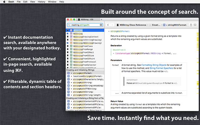
Kapeli’s Dash application is the programmer’s encyclopedia.

Dash houses all of the documentation for pretty much every major programming language and framework currently in use.

Also Dash can be configured to work with Alfred so you can easily search through documentation for stuff like BootStrap classes & Angular modules.

Dash is free to use, however you must wait 10 seconds each time it opens – unless you’re willing to pay a flat fee of $9.99 which eliminates the wait time.

TotalTerminal

Total Terminal

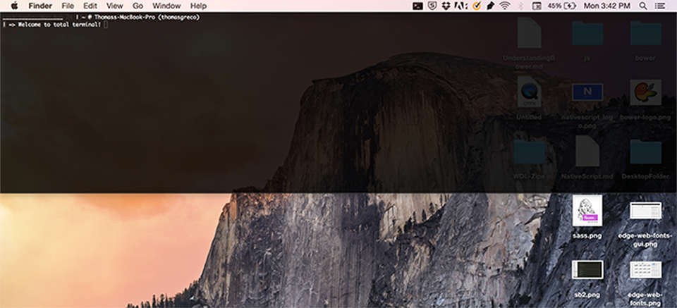
The importance of your computer’s command-line is something that can not be overlooked. Like it or not, any developer worth his or her salt should be able to navigate the command line.

TotalTerminal makes this a bit easier by providing a full-width terminal window. The picture above was taken from my computer desktop; As you can see, I’ve changed the opacity so that I can still see information through the command-prompt if necessary.

Sublime Text 2

Sublime Text 2

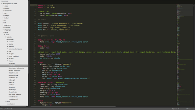
Although this may seem a bit obvious, the next application is one of the most popular text editors available for use: Sublime Text 2.

With an extensive list of plug-ins created by an open-source community, Sublime Text 2 provides programmers with everything they need to run a solid IDE. Also I think it’s important to note that Sublime Text 2 is partially free – a completely free alternative is Brackets by Adobe.

Evernote & Evernote Web Clipper

Evernote Web Clipper

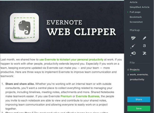
Nowadays so many developers receive their knowledge through searching Google. As a self-starter myself, I understand the immense amount of reading and research that must be done in order to truly understand concepts that seem extremely foreign at times.

With the Evernote Web Clipper you can create an annotated version of whatever you’re reading and save it into a specific notebook. This file will then be synced into your Evernote account, and you’ll be able to view it on any device where you have Evernote installed.

I certainly hope these 5 tools can get you more organized and ready to tackle that next dev project!

Read More at 5 Desktop Apps for Better Productivity

Categories: Designing, Others Tags:

Design Techniques used by Garelick Farms

September 5th, 2015 No comments
00-featured-garelick-farms-website

Food & drink manufacturers follow many of the same design techniques. Website layouts differ from corporate conglomerates to small-town restaurants but the goals are often very similar.

In the case of recognizable brands such as Garelick Farms, design techniques are used to build on top of the brand to create a memorable browsing experience.

Garelick Farms uses natural design aesthetics to symbolize a down-to-earth feel in their site. Crisp textures, earthy tones, and lots of photos bring out the natural style of Garelick Farms’ products and their company image. I’ll cover a few of these techniques and how they affect the website’s overall tone and delivery.

Textures & Stitching

Right from the first pageload you should recognize a matted woven texture repeating across the site. It looks like a burlap sack or some type of hand-made case – definitely brings to mind the countryside and farm life.

The Garelick Farms branding is lined up into a box in the header. It uses a green logo with a basic hand-drawn font. Everything about the design gives off a sense of homemade style.

garelick farms texture

You’ll find a stitched border surrounding the content box with slim navigation links. It all ties into a general brand of natural Earthy colors and imagery. The idea is to give visitors a sense that they’re actually visiting Garelick Farms.

This is why many farm-based products have illustrations on their packaging. Eggs, chicken breasts, and milk all use imagery & colors to evoke a sense of down-home cooking no matter where you’re located.

Colorful Green Branding

The logo for Garelick Farms is finely shaped, illustrated, and delightfully green. It’s a rather simple logo but also recognizable which is crucial for good identity design.

Since green happens to match up with Earthy colors, the Garelick Farms website follows this throughout the whole website.

garelick farms navigation ui

Each navigation link uses a green hover effect with a dotted line indicating the link is active. Green is used as a highlight color where it stands out against the other beige elements.

mini navigation slideshow images

Scroll down a bit further on the homepage and you’ll find a mini-menu of products. This slider relies heavily on green overtones for the navigation buttons and hover effects.

In this case other colors are used to distinguish elements as non-active.

products page garelick farms website

A very similar effect is used on the products page with another green mini-nav menu.

When clicking on a product you’re brought to a unique product page with nutrition facts and possible recipes. Again we find green tones used to highlight certain areas surrounding the general beige background.

Garelick Farms’ color scheme is a good example of how less can be more.

Hand-Drawn Page Elements

Bringing more natural style into the layout are the many customized page elements. Hand-drawn stitching is one such effect, but not the only one.

You should recognize that some headers and text blocks use a custom hand-drawn font named Populaire. It’s very subtle and doesn’t look like 10-year-old handwriting – but it does feel more natural than most pixel-perfect fonts.

garelick products page fonts

While it’s obvious that Populaire is still a digital font, it gives off the impression of a bespoke hand-made font family. It all returns back to the same theme of natural & earthy design qualities to be strewn across the entire site.

If you scroll down on the homepage you’ll also find this same font applied to buttons.

custom buttons typography

Some buttons & links use icons to offer visual cues to visitors, but they don’t detract from the UI design at all.

There is room for improvement on this site, but overall Garelick Farms stays true to their brand & theme consistently across the entire layout. This makes the design feel uniform and true to itself while still maintaining a simple user experience.

Closing

A great designer can bring out their ideas perfectly to match the tone & style of a company. Garelick Farms is a relatively simple company and their layout also works in simple ways.

Very few colors, basic textures, and hand-drawn elements give this site a recognizable style across every page. Sometimes a basic website can work better from a stylish perspective since it gives visitors a reason to connect with the design & remember it in the future.

Read More at Design Techniques used by Garelick Farms

Categories: Designing, Others Tags:

Overpass Webfont Released as Open Source on GitHub

September 5th, 2015 No comments
00-overpass-featured-font

Free webfonts allow web designers to move far beyond system default typefaces. Now designers have dozens(if not hundreds) of free fonts at their fingertips.

A new contender named Overpass has just been released on GitHub. It was published by Andy Fitz and copyrighted to Red Hat, Inc. But while the font is maintained through copyright, free use and distribution rights are retained through the SIL Open Font License.

Check out the Overpass website to read more about the font. It has many different previews of font weights, styles, and text properties.

The OFL(Open Font License) is pretty lax regarding usage of the font. Obviously you cannot change it and go try to sell it as a new font under a different name. But you are allowed to make changes and manipulate those changes into a design.

If you want to learn more just skim the font license under the headline Permissions & Conditions.

Although Google Webfonts offer plenty of alternatives, Overpass offers a glimpse of what font design could be.

The open source movement is only growing, and in a few years’ time we could have entire font foundries licensing their work as open source & publishing on GitHub for the world’s benefit.

Read More at Overpass Webfont Released as Open Source on GitHub

Categories: Designing, Others Tags:

Comics of the week #303

September 5th, 2015 No comments

Every week we feature a set of comics created exclusively for WDD.

The content revolves around web design, blogging and funny situations that we encounter in our daily lives as designers.

These great cartoons are created by Jerry King, an award-winning cartoonist who’s one of the most published, prolific and versatile cartoonists in the world today.

So for a few moments, take a break from your daily routine, have a laugh and enjoy these funny cartoons.

Feel free to leave your comments and suggestions below as well as any related stories of your own…

Defeating the purpose

Counterintuitive

Work from home

Can you relate to these situations? Please share your funny stories and comments below…

97+ Design Elements from Creative Veila – only $24!

Source

Categories: Designing, Others Tags:

Extending Advanced Custom Fields With Your Own Controls

September 5th, 2015 No comments

Advanced Custom Fields (ACF) is a free WordPress plugin that replaces the regular custom fields interface in WordPress with something far more powerful, offering a user-friendly interface for complex fields like location maps, date pickers and more.

Extending Advanced Custom Fields With Your Own Controls

In this article I’ll show you how you can extend ACF by adding your own controls to tailor the experience to your needs.

The post Extending Advanced Custom Fields With Your Own Controls appeared first on Smashing Magazine.

Categories: Others Tags:

All 4 of these Logos are Better than Verizon's

September 5th, 2015 No comments
00-featured

While checking Dribbble I stumbled onto a really great shot by David Kovalev.

preview Verizon redesign David Kovalev

Looking through the comments I noticed a fairly accurate point made by Claudiu Cioba:

Claudio's comment on Dribbble

So what do you think? Are all of those logos really better than Verizon’s?

In my eyes the answer is pretty clear, and I think Verion should hire David Kovalev to give them a real 2015 redesign.

Read More at All 4 of these Logos are Better than Verizon’s

Categories: Designing, Others Tags:

Quick Tip: Mathematical Operations in Sketch

September 4th, 2015 No comments
00-sketch-math-operators

Whoever told you that you’d need math later on in life might be wrong in this case, because Sketch App takes care of all that math for you.

If you’ve ever used a computer calculator then you already know how to speed up your workflow in Sketch by specifying values with formulas. Let’s look at an example.

Open up Sketch App. Press “R” to create a Rectangle and in The Inspector choose ”194” for the Width and “277” for the Height; any other values are completely up to you.

Create a Rectangle in Sketch

Now let’s create another rectangle(or duplicate this one – command+d) that is 150% bigger than this rectangle. For the Width, lets try “1942”, and “2772” for the Height.

Sketch rectangle with maths

Easy right?

Now let’s try something more complex; undo(command+z) those last two steps and we’ll add different values.

For the Width, try “(1941.5)-10” and for the Height “(2771.5)-20”. Basically this means the same thing as before, only we’ve trimmed 10px and 20px from the shape.

If you didn’t undo the last two steps just click one of the larger rectangles, hold option, and then hover over the other rectangle. Sketch will tell you exactly how much space exists between the two layers – just for comparison.

Sketch App complex math operators

Hope you enjoyed this quick tip! Be sure to put it to good use and share your thoughts in the comments below.

Read More at Quick Tip: Mathematical Operations in Sketch

Categories: Designing, Others Tags:

25 Amazingly Creative Contact Forms

September 4th, 2015 No comments
markjaworskistudios.jpg

For any website or blog, the contact form is an element that makes a very powerful statement. Just like a business card, the contact form speaks for itself, as it is the gateway people use for passing their love to you. Best web forms are strong in three parameters: idea, design, usability. Let’s take an expedition to the nicest of the contact forms out there.
The following snapshots are taken from visual art websites and blogs. Dive in!

krijtenberg.nl

No doubt over the professional look of this website. This photography boosts the effect of a simple contact form. It really ties the tie!

m1-design.de

25 Amazingly Creative Contact Forms
A flash contact form that impressed us. Everything is in dynamic here, kind of hard to catch but surely an eye-catcher.

englishworkshop.eu

25 Amazingly Creative Contact Forms
Modern graphics and wise choosen colours join in this contact form to create a powerful effect.

beakable.com

25 Amazingly Creative Contact Forms
Is your posted content fragile? If so, there’s nothing to worry about, the envelope is completely safe, beakable.com has taken care of that.

moozedesign.com

25 Amazingly Creative Contact Forms
What do reindeers and the colour blue have in common? This contact form right here.

Along with the beautiful design of the contact form itself, proper positioning is also important, so that the other elements on the page contribute to the overall aesthetics. The following blogs have made the best out of the available space, colours and shapes from the general theme.

alexarts.ru

25 Amazingly Creative Contact Forms
We are in Moscow and everything floats around in the world of Alexey Abramov. The lightbox contact form fits perfectly in.

bio-bak.nl

25 Amazingly Creative Contact Forms
This flashy website is a show and the contact form makes no exception. You can fill it in as soon as you get used to the big hand that replaced your mouse cursor.

apbaxter.com

25 Amazingly Creative Contact Forms
Seems like the phone booth is a little crowded right now in here, but you can still leave a message using the contact form. If you dare to.

denisreggie.com

25 Amazingly Creative Contact Forms
A photographer’s website in contre-jour has its contact form all the same.

fullfatdesigns.co.uk

25 Amazingly Creative Contact Forms
This contact page also contains information on payment plans, so that the user wastes no time in getting the point.

markjaworskistudios.com

25 Amazingly Creative Contact Forms
Mark Jaworski is here to help and so is his contact form.

dreamerlines.lv

25 Amazingly Creative Contact Forms
This contact form is the main element on the homepage of dreamerlines.lv. Crystal clear message.

crayonslife.com

25 Amazingly Creative Contact Forms
A playful overall theme in which the blog’s contact form is immersed as well.

Sense the elegance of simplicity! A brief contact form is just all you need most of the times, if it hits the right spot. Some of them come in lighboxes, some in plain HTML. Let’s have a look at how wonderful they are.

charliegentle.co.uk

25 Amazingly Creative Contact Forms
Contrast and a touch of handmade graphics give the unique feel of this contact form.

christianothstudio.com

25 Amazingly Creative Contact Forms
A telephone is quite a frequent icon for contact forms. This old fashioned phone, however, is no cliche, but an impressive touch.

du-bout-des-yeux.com

25 Amazingly Creative Contact Forms
Just like that! Simple, clear and effective.

ftdesigner.net

25 Amazingly Creative Contact Forms
The joy of minimalism. The playfulness of colours when in contrast with a black background makes this contact form a very wise choice for a designer’s website.

fullstopinteractive.com

25 Amazingly Creative Contact Forms
An out of the box send button and, boom, there we have one impressive feedback form.

yourbeautifulphotography.com

25 Amazingly Creative Contact Forms
A contact form in high key. The logo balances the page beautifully.

thetoke.com

25 Amazingly Creative Contact Forms
This one here represents the low key. Straight to the point.

theserved.com

25 Amazingly Creative Contact Forms
The burst of layered colours is the salt and pepper of this contact form.

amazeelabs.com

25 Amazingly Creative Contact Forms
Back to basics… but not quite. A beautifully designed contact form in delicate colours.

softicons.com

25 Amazingly Creative Contact Forms
Pixel art and a contact form make a good team in here.

tympanus.net

25 Amazingly Creative Contact Forms
Use of colours is very important in a contact form, as it speaks about the brand. The combination of blue shades here is distinctive for tympanus.net.

sushimonstr.com

25 Amazingly Creative Contact Forms
Last but not least, a wood textured message board that nails it.

Read More at 25 Amazingly Creative Contact Forms

Categories: Designing, Others Tags:

Mozilla’s Thimble IDE gets Resurrected as a Frontend Dev Teaching Tool

September 4th, 2015 No comments
00-new-logo-thimble-mozilla-code-ide

Some developers may remember Mozilla’s old Thimble development webapp. It was an online coding platform where you could write code and build simple interfaces without the need to save any files locally to your computer.

Over the years many better online IDE’s have been created such as CodePen. Thimble simple hasn’t been able to keep up, and has since fallen by the wayside.

But now Mozilla has re-launched Thimble as an online IDE made for teaching people how to read & write code.

If you have time be sure to check out the new Mozilla Thimble landing page. It’s a fully-featured eduational coding webapp meant to teach curious designers, unskilled developers, or just average Internet users how to write code.

The IDE is runs solely on the frontend so you can update HTML/CSS/JS code and see the changes in real-time. It seems Mozilla’s goal is to share this product as completely open source for educators and individuals to share the knowledge. Taken from the article:

Thimble exemplifies the hands-on, collaborative learning philosophy at the core of Mozilla’s work. Thimble can be used by educators to create a customized and interactive classroom experience, or used by independent learners eager to teach themselves via step-by-step tutorials. All of Thimble’s creations are open source and fully remixable. And Thimble itself is free and open source, always.

In this newer version you’ll find a bunch of helpful features including multi-page projects & websites linked together in one Thimble.

Also the experience can be guided by a wizard that’ll teach the basics and offer helpful code hints along the way. Thimble is now perfect for anyone who just wants to understand how to write code and build websites.

If you want to learn more check out the new Thimble website or preview the following ~2 minute video:

Read More at Mozilla’s Thimble IDE gets Resurrected as a Frontend Dev Teaching Tool

Categories: Designing, Others Tags:

Los Angeles hosts Adobe MAX running October 3rd-7th

September 4th, 2015 No comments
featured-adobe-max-conference

Designers and creative professionals have taken it upon themselves to both visit and create meaningful events. These events have turned into yearly conferences with some of the biggest names flying around the world to attend.

A lesser-known yet vital conference is Adobe MAX which is promoted by Adobe Systems in the US, Europe, and Japan.

For 2015 the US conference will be held in sunny Los Angeles, California. The event will be split between a couple venues and early registration can bring about reduced ticket prices. The venues includes the Los Angeles Convention Center along with the Microsoft Theater.

Again there is limited availability so if you book ahead of time you’ll save money with special hotel rates.

So it seems like a great time, and lots of talented people will be there. But why should you attend?

Well take a look at the lengthy agenda to see everything that’s in store. You can attend workshops and perform hands-on lab training assisted by Adobe professionals.

Not to mention that the list of speakers is practically endless, with a very large number of web designers/developers in attendance. Here’s a brief list of notable speakers you might see at MAX 2015:

Of course there are dozens of other very talented & incredible speakers that simply can’t be listed in full. The “Speakers” page has all the information you’ll need: https://max.adobe.com/speakers/.

Tickets range from 1-day passes starting at $595 up to a week-long full pass at $1,595(with reductions for students & educational institutions). You can see a full list of prices and compare the features for yourself.

For more details about the conference you can check out the Adobe MAX website or follow their updates on Twitter @adobemax.

Read More at Los Angeles hosts Adobe MAX running October 3rd-7th

Categories: Designing, Others Tags: