Archive

Archive for September, 2015

Office 365 Outlook on the Web has Stellar New Features

September 3rd, 2015 No comments
00-featured-outlook-for-web-preview

As of August 4th Microsoft has had readied for consumers a new, beefed up version of Outlook for Office 365’s web version. According to the Office blog, this revamp of Outlook for the web is part of Microsoft’s effort to “deliver the richest email and calendar experience”.

The company has modified Outlook Web with an improved user interface and a number of new features that are designed for greater efficiency, inbox management, and calendar tracking.

The new Outlook app was formerly known as Outlook Web App(OWA) but will now simply be referred to as Outlook on the web.

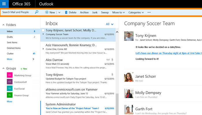
outlook 365 web inbox

While Outlook on the web has been revamped with quite a few new features, one of its main new attributes is actually a reductive one. Namely the app now sports a simplified UI for what Microsoft hopes is a more efficient work platform.

A new action toolbar across the Mail, Calendar, People and Task pages is on hand for users who want quick access to commands that are most commonly used. These include inbox cleaning, email replies and adding or removing events in the Calendar segment.

Furthermore the UI as a whole now enjoys several other simplifying tweaks such as a larger email subject line, indented messages in the reading pane for easier scanning, and a more prominent button design in Calendar for creating new meetings and overall calendar navigation.

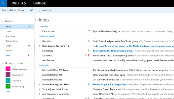
full screenshot outlook365 online webapp 2015

However the above are just some of the additions to Outlook for the web. The full list of modifications is a bit too large to add in detail here.

For that list you can head over to the Office Blog’s post on the new Outlook features. But here’s a quick rundown of the larger changes:

  • Sorting through email and marking particularly important messages is now easier thanks to a “Pin” feature that lets you highlight any message in your inbox so that it stays fixed at the top of the pane.
  • New “Sweep”, “Archive” and “Undo” controls for handling messages from a single sender in batches (such as newsletters and coupons that cause unwanted clutter), archiving with a single click to clean up your inbox and undoing unintended actions with a single click.
  • An improved single line view and immersive reading pane for easier viewing of messages in condensed form, and for opening them in the same Outlook window.

There are quite a few other features detailed in the original blog post which explain features for crafting more visually appealing emails, finding email contacts, managing your calendar and using the Outlook app via your mobile device.

The whole thing is definitely worth checking out if you’re a regular user of Outlook’s web app for email management.

Read More at Office 365 Outlook on the Web has Stellar New Features

Categories: Designing, Others Tags:

Principles Of HTML5 Game Design

September 3rd, 2015 No comments

Visual effects in games define their overall look and feel, and gameplay. Players are attracted to high visual quality, which generate more traffic and reach. It’s key for creating successful games and providing a lot of fun for players.

Procedural curved line

In this article I want to present a few ideas of how to implement different visual effects in -based HTML5 games. These examples will be based on effects we made in our game, Skytte. I will explain the basic ideas supporting them and provide the effects used in our work.

The post Principles Of HTML5 Game Design appeared first on Smashing Magazine.

Categories: Others Tags:

Sponsor: Treehouse

September 3rd, 2015 No comments

I’d like to specially thank Treehouse today for being such an awesome long-time sponsor of CSS-Tricks. Just imagine how many people they have helped over the years learn web and mobile design and development. It’s damn impressive. I’ve watched Treehouse evolve over the years and you can see how their experience with students guides how they teach and how the site works. For instance, I love how there are different ways to learn: take a track toward a goal like becoming a front end web developer, tackle a project like building a Swift weather app, or dig into a topic like JavaScript.

Direct Link to ArticlePermalink


Sponsor: Treehouse is a post from CSS-Tricks

Categories: Designing, Others Tags:

7 Golden Rules of Combining Fonts for Mobile

September 3rd, 2015 No comments
00-featured-mobile-type-text

At Webydo, we understand the importance of creating websites that work well and look great across a wide range of devices being used today.

Responsive websites with layouts that change based on a visitor’s screen size are critical to success on today’s Web. The typographic styles used on those sites (and how those styles adjust for mobile viewers) are an important part of this equation.

When it comes to combining fonts that will be viewed on mobile there are 7 Golden Rules that apply to pretty much every case:

1. Make It Readable

Even if you chose to ignore every other rule on this list(which you shouldn’t), one rule that you can never ignore is that you need to make your site’s text easy to read.

If a site’s content is a challenge to read then people will simply not read it. This means lost business and potential customers.

On mobile devices screens are small and variables such as lighting & reflections can make those screens more difficult to read. Text with letterforms that are sized properly, not too thin, and colored in such a way to make them easy to read against their background are all keys in making text readable.

2. Establish a Visual Hierarchy

visual hierarchy text responsive layout

Visitors typically scan websites very quickly. By establishing a visual hierarchy with your text, you immediately show those readers which text is most important and where they should focus their attention.

You can use this focus to your advantage by directing people to the content you want them to pay attention to, rather than where they decide to look. This can be the difference between a mobile visitor quickly scanning a page with homogenous text & quickly leaving the site because nothing stood out to them, or that same person keying in on critical content that will keep them interested and driving towards a goal destination. This could be making a purchase, becoming a member, or simply requesting more information.

3. Consider the Audience

Think about the audience that will use a website. The typographic styles and font choices that you use should feel natural and welcoming.

If they’re used to going to sites with very modern fonts and sophisticated design, then using grungy fonts will be out of place and confuse visitors.

The font choices you make should immediately set a tone that feels familiar to a site’s visitors and makes them comfortable.

4. Create Contrast

Contrast in typographic design works in a number of ways. You must use contrasting colors to ensure readability. Dark text set against a lighter background makes that text easier to read, while fonts and backgrounds that are too low in contrast make the text difficult to process (see point #1).

Contrast in typography also can refer to the different fonts that are paired or the way that they are styled. If those fonts are too similar, you lose the visual hierarchy benefits of a design and that design starts to look bland lacking any variety.

5. Use Fonts from the Same Family or Designer

When deciding which fonts to combine on a site the possibilities can seem daunting. With so many amazing fonts available it’s easy to feel overwhelmed.

One way to find great combinations is by using fonts that are a part of the same family, or which were created by the same designer.

One of my favorite fonts to use on websites is Raleway. This font was designed by Matt McInery as a single thin weight, but was later expanded by other designers to include 9 weights ranging from very thin to extremely bold and thick.

The variety that this one family gives designers is incredible, and pairing the different weights of this font into a design offers variety while still feeling uniform.

In some cases fonts do not have multiple weights or versions. You can then look for other fonts that were created by the same designer. Oftentimes those fonts share similar characteristics and are perfect candidates to work together.

6. Limit the Number of Fonts

font table designs typography examples

Regardless of how you decide to combine fonts, one important thing to look out for it overdoing it with too many fonts. Many experts will suggest you use only two or maybe three fonts in a given design.

While this is certainly good advice to consider and follow, there are instances where more fonts may make sense. But in most cases too many fonts is a sign of a design that lacks focus.

Overloading a site with fonts not only affects the visual appearance of that site, it can also have a dramatic impact on the performance of the web pages. Web fonts that must be loaded require time to download, either from the server or from a third party webfont service.

This can make a site crawl and when people are visiting that site on mobile devices with laggy Internet, every millisecond counts!

Too many fonts = slower load time, and slower load times often mean unhappy visitors who decide to go elsewhere.

7. Don’t Forget to Test It Out

All the rules in the world are pointless if you don’t test a site in real world settings.

Make sure you load your webpages on actual mobile devices and see how the text flows and lays out for those small screens. What may have made sense in your design concepts may break down once you see it in practice, meaning you need to make some adjustments to get that text where it needs to be to be most effective.

Author Bio: Hadar Talyosef is Community Designer at Webydo, a web design platform for professional designers and web agencies. Hadar also runs “TALYOS” a line of bespoke, Japanese-bound notebooks, sketchbooks and notepads.

Read More at 7 Golden Rules of Combining Fonts for Mobile

Categories: Designing, Others Tags:

DjangoCon 2015 kicks off September 6-11 in Austin, TX

September 3rd, 2015 No comments
00-featured-djangocon-stage

This year’s DjangoCon 2015 US conference is just around the corner and is scheduled to begin September 6th.

The event runs all week long from Sunday the 6th to Friday the 11th. It’ll be held at the AT&T Executive Education and Conference Center located in Austin, Texas.

For the unfamiliar & uninitiated, DjangoCon is to Django what WordCamp is to WordPress – a regular meetup of enthusiasts, users, developers, and anyone with an interest in Django.

The event spans 6 full days and this is what the schedule looks like:

  • September 06: Tutorials
  • September 07-09: Conference Talks
  • September 10-11: Sprints

A few high points of the event include a keynote by Lynn Root, Database Design by Andrew Godwin, and a technical overview of Django deployments by Peter Baumgartner. Of course there are dozens more talks & code-offs that would be too lengthy to list in full.

But you can see the full scheduled right on the DjangoCon website.

If you develop apps using Django, or wish learn more & meet people who already use Django on a regular basis, then DjangoCon is the best event to attend. While there will be intermediate-to-advanced presentations there are also many novice-level talks for beginners. There’s a lot to learn, and 6 days surrounded by experts will be more than enough time for a jump start!

This year’s DjangoCon will also feature the first ever Microsoft Azure Code Challenge. Also, while proposals for presentations and calls for papers are already closed, you can still volunteer to be a session coordinator or helper at DjangoCon.

This means you won’t be able to attend most sessions BUT tutorials and other events are still open.

You can register here and find out the current rates for admittance.

featured image source

Read More at DjangoCon 2015 kicks off September 6-11 in Austin, TX

Categories: Designing, Others Tags:

Verizon follows Google with a Sleek Logo Redesign

September 3rd, 2015 No comments
featured-new-verizon-logo-2015

According to Verizon’s featured article, the company has just released a brand new logo only 1 day after Google’s update. I can’t help but notice that Verizon is going in a similar fashion with simpler colors and curves.

The change has been described as a new chapter for the large telecommunications company. Here are shots of both to compare:

Old Logo

older Verizon logo

New Logo

brand new Verizon logo August 2015

As quoted from their blog:

As our customers and our business evolve, so must we. The reveal of our new brand is more than just a new look. It’s a chance to further everyone’s understanding of who Verizon is and where we are going. After 15 years, the new visual identity marks the beginning of the next chapter to distinguish Verizon in the minds of consumers and signals our revitalized purpose of delivering the promise of the digital world — simply, reliably and in a way that consumers want.

The idea is to place less emphasis on the Verizon “check mark” icon, but still keep it as a vital part of the brand identity. Imagery creates a strong force and Verizon’s check mark is often associated with “getting things done”. Not much has been lost in this redesign – only a restyling of existing elements.

A source photo was taken and posted on Twitter, and there’s also a preview on the Verizon blog.

What are your thoughts on this change? Love it? Hate it? Couldn’t care less?

Do you think it make as much of an impact as Verizon hopes it will?

Read More at Verizon follows Google with a Sleek Logo Redesign

Categories: Designing, Others Tags:

Embracing the latest web trend: card-based design

September 3rd, 2015 No comments

There are always new webdesign trends gaining momentum. Who could forget parallax scrolling from a few years ago, which is still popular today? As of late, long-scrolling pages are getting more attention from site visitors.

One trend that’s not gotten as much recognition as many others, and has been around for a little while already, is card-based design.

The most popular website that showcases this design trend is Pinterest, but there are also other sites that are increasingly using this design approach, and with good reason. When visitors browse a site that uses this design technique, they immediately notice the cleanness and well-organized planning behind such a simple-yet-elegant approach to design.

There’s a slew of benefits to using card-based design on your own site.

A grid approach to IA

When you look at any card-based design, it’s impossible not to also see a grid-based design peeking through. That’s because every edge of a card is really the edge of various grids in a bigger, well-organized system that promotes great consistency and harmony in the way the site’s presented.

This in turn significantly helps the information architecture of your site. Information architecture is the intelligent order and flow in which your visitors absorb site information, ideally in keeping with the goal of each page and the overall site.

Think of it: The card-based design guides your visitors’ eyes due to its emphasis on consistency. Every card is part of a column or row that directs their eyes along uniform horizontal and vertical lines. This arrangement helps your visitors understand what piece of information is more important than others.

Take, for instance, Contrastly, a photography magazine. Following its grid/card layout helps you understand what’s more important in the information hierarchy. The newest articles are placed along the top row while the older articles appear in the bottom row. Newness is generally associated with greater importance, so following this descending order of rows in the card system lets users quickly associate what content is more important. They can therefore prioritize the order in which they read this information.

Heavy reliance on images

We’ve heard the old saying that people are visual creatures so many times that it’s a cliché, yet in card-based design, it takes on new meaning. Card-based design relies on visuals almost exclusively; any copy on the same page is usually secondary to the visual in terms of the information architecture.

Going heavy on images like this is a strength of card-based design because studies already confirm that images elevate web design. For example, both high-quality pictures and using more human faces in images boost conversion rates. In fact, all told, there are several ways in which using images in design can increase your site’s conversions.

In other words, the emphasis on using images makes card-based design more attractive to site visitors. It’s no coincidence that Pinterest is, according to Alexa, the 15th most popular site in the U.S.

Looking at the Pinterest results for the search term “food,” we can see that images are the very first things that draw your eye when you’re on the site. You don’t care about the descriptions underneath the pictures, at least not at first. The high-quality, dazzling pictures are what nab your attention, and then, after deciding you want to learn more (but already committing to that card), you read the card descriptions.

Enhanced UX

Any designer should tell you that the user experience matters most. It’s what we’re supposed to be designing for, first and foremost. Another reason that card-based design has resonated so well, and will continue to do so for the foreseeable future, is because it helps the user experience. And that encourages site visitors to keep coming back to your site, which in turn leads to them spending a longer time there, which finally leads to more conversions!

A great user experience centers around people being able to find their way around your site without any friction; basically, they should find what they want to find immediately and with no headaches.

Dribbble is a site that understands this well because its designers have used cards to make the user experience simpler and better. This site is well-known in the online creative community as a showcase for user-generated artwork.

The point of the site is for people to admire illustrations, graphics and images of all kinds, so card-based design is really the most suitable way for presenting this. Since images draw the visitor’s eye efficiently and immediately, the user experience is greatly enhanced when visitors can quickly peruse the cards in the grid layout to see which ones interest them. As soon as they see one that interests them, they can instantly click on the card to take a closer look.

A site like Dribbble lets visitors find right off the bat what they’re looking for in a super-convenient way. That’s the epitome of a great user experience!

Well-Suited for mobile design

You may’ve heard that mobile has already overtaken desktop in the sheer number of users. In the U.S. alone for 2015, mobile media digital time comes out to 51% compared to desktop’s 42%. Card-based design is ideal since it takes this trend into consideration by being eazily compatible with responsive frameworks. Because cards offer content in more digestible chunks, it makes it easier to display on mobile frameworks.

Look at cards this way: their shape and size is practically a mimicry of the shape and size of a smartphone or tablet. Of course, not exactly a perfect match due to the multitude of different models available, but still a pretty close match when you think in terms of aspect ratio.

As a result, cards are never going away as long as mobile keeps growing, and it’s not showing any signs of slowing down anytime soon.

Not merely another design fad

The problem with some design trends is that they turn into fads, which makes them short-lived and forgettable. Card-based design, though, is anything but! Because of the slew of practical uses and benefits that it offers, it’s only going to become more popular as time wears on. This means that it has staying power.

It provides consistency in the information architecture of sites and taps into users’ obsession with sharp images as a way of driving more conversions. Consequently, the entire user experience also gets a huge improvement with card-based design simply because it actually makes it easy for users to find what they’re searching for on the site. Thanks to the rise of mobile in the last couple of years, this design approach is becoming a mainstay that more and more people are encountering and enjoying.

When you think of it, cards are really an old concept, yet they’ve been given a shot in the arm and updated to a fresh, new way of web design. It just goes to show you that innovative designers can take something old and mundane and turn it into something that’s extremely relevant and beneficial in the 21st century.

LAST DAY: Bundle of 9 Beautiful, Professional Script Fonts from FontYou – $27!

Source

Categories: Designing, Others Tags:

Responsive Web Design: How to Find the Right Photos

September 3rd, 2015 No comments

The Web – open space for any web designer out there. Today’s and even more so tomorrow’s web is one big challenge for our industry. Web sites are supposed to adapt seamlessly to any screen size with any aspect ratio on any device. Desktop computers, tablets, and smartphones are only the beginning. No one knows what kind of device will be popular next year. On the other end of the spectrum, high definition displays are growing in popularity. What results from this is a balancing act in many ways. One of the more prominent challenges is the choice of adequate images. Images that work fine on a smartphone as well as on a UHD display. Today’s article will focus this problem to help you choose the right photos for responsive web design. Details – When Less is More Conventional devices such as desktops or notebooks allow for a regular display of pictures in any resolution. Even the most detailed images are readily perceptible to the visitor’s eye. On tablets and more so smartphones, this is an entirely different story. The larger the image, the more significant the difference when this picture has to be scaled down to smartphone dimensions. It […]

Categories: Others Tags:

Sass vs. Less: A Comparison for Frontend Developers

September 2nd, 2015 No comments
00-featured-lass-v-sass

As the web continues to progress more people are turning to CSS pre-processors to help style their web applications.

Although there are several options there’s no doubt that two of the most popular pre-processors are Sass and Less. By using these programs web designers can practice nesting, use mixins, and other features in order to rapidly style web pages.

But people often come to a crossroads when choosing which preprocessor to use. Therefore I’ve compiled this article to give you deeper insight about both Sass and Less, with the hope of helping you determine which CSS pre-processor is right for you.

Sass

Sass Logo transparent

Since first being developed in 2007, Sass has become the most widely known CSS pre-processor of them all – and for good reason. Although it’s been around for nearly a decade the tycoons behind Sass continue to extend its functionality.

It is currently in version 3.4.x and will only continue to progress. Where Sass really excels is in the framework category. Developers can use Sass with frameworks such as Bourbon and Compass, which provide Sass programmers additional functionality.

For example, the Compass framework provides the following mixin for styling links.

link-colors($normal, $hover, $active, $visited, $focus)

By passing in values to this mixin, Compass will generate five different styles for all of the links inside your layout. Although this is just one case it exemplifies how useful frameworks such as Compass can be.

Less

Less Logo transparent

Two Years after the release of Sass another CSS pre-processor arrived on the scene. The Less ruby gem was developed in 2009 as an alternative to Sass and has since been rewritten in JavaScript.

Although it does not make much of a difference, some people prefer to use JavaScript over Ruby. That said, Less provides functionality very similar to that of Sass. However the syntax is a bit different.

Whereas Sass uses the $ symbol for variables, Less uses the @, which is the sign Sass uses for mixins. If you want to check out a side-by-side syntax comparison you can view them through this link. One thing that Less provides which Sass does not is the use of Namespaces, which you can see an example of below.

bundle () {
  .red { background-color: red }
  .green { background-color: green }
}
.foo {
  #bundle > .red;
}

Once processed, the code above would produce the following result:

.foo {
  background-color: red;
}

The purpose of namespaces is to group mixins together; but as you can see, this can become a little confusing. Therefore the core developers of Sass decided against including this feature.

Nonetheless it still shows the power that Less gives you when styling a web page.

Conclusion

You may still be wondering what preprocessor is right for you. In the end the choice is ultimately yours.

However I personally believe that the frameworks, specifically Compass, make it extremely easy to write in Sass. It provides a number of mixins that are created to make your life as a web designer easier. Regardless of which preprocessor you decide to use, use it well, as each is extremely powerful in the right hands!

Read More at Sass vs. Less: A Comparison for Frontend Developers

Categories: Designing, Others Tags:

Up and Running with NativeScript

September 2nd, 2015 No comments
00-featured-nativescript-blue-logo

Last spring the development team at Telerik unveiled its biggest project yet: NativeScript.

NativeScript is a runtime for building completely native applications for iOS and Android using either JavaScript or TypeScript. Yes, you read that correctly. NativeScript makes it possible to develop fully functional native applications without the need to learn Objective-C or Java.

NativeScript Logo

The NativeScript runtime also gives you the power to style applications using css, and provides different custom components for building user interfaces for both Android and iOS devices.

The Telerik team really did a phenomenal job when building the NativeScript runtime. It grants JavaScript developers access to 100% of the native APIs on both iOS and Android – an extremely significant advancement. Although this may sound confusing at first, it’s actually quite simple to understand. This article aims to simplify the process of how NativeScript produces such results. Once you understand that you’ll have a much better understanding of how powerful this new technology really is.

How It Works

NativeScript is not a framework; rather it is a runtime that targets the JavaScript VMs (Virtual Machines) on Android and iOS devices.

On Android the V8 engine is the JavaScript VM, whereas iOS devices rely on the JavaScriptCore engine.

NativeScript targets both of these JavaScript VMs in order to access the different native APIs on a device. This is where NativeScript differentiates itself from the group. When building native applications using technologies such as Apache’s Cordova, your code will be packaged in a container in order to access the native APIs for iOS and Android devices.

The NativeScript runtime, on the other hand, was developed to be a bridge rather than a container. It allows JavaScript code to run on native devices. The Cordova container displays native applications as ‘web views’ whereas NativeScript runs your JavaScript code to display native experiences.

You can read more about NativeScript metadata through this link. Simplified it’s what NativeScript injects to access native APIs.

Live Example

Let’s take a look at the following block of code.

var time = new android.text.format.Time();
time.set( 1, 0, 2015 );
console.log( time.format( "%D" ) );

This is valid NativeScript code and it would result in the string ‘01/01/2015′. In this example, the NativeScript runtime tells the V8 JavaScript Engine that we need to access Android’s time API.

The V8 JavaScript engine does not know how to read Android properly, so NativeScript needs to use metadata to help translate this into a format that a native API on a device can understand.

In that example the Android object is a bit specific, so NativeScript offers a broad variety of cross-platform components. The Telerik team does not want you to have to learn iOS or Android specific terms.

This ability to create cross platform applications is yet another reason why NativeScript is so powerful. Without having to modify a single line of code, developers can use JavaScript to reach both iOS and Android devices. Because NativeScript targets both the JavaScriptCore and V8 virtual machine, the runtime offers the ability to utilize the latest features of these engines as soon as they’re implemented.

Now that you have a basic understanding of NativeScript you should go on and check it out for yourself. The Telerik team has been generating a great deal of buzz with its release, and for good reason. I’ve provided a few links below to videos and other resources for learning NativeScript.

As always, if you have any questions about the NativeScript runtime I would be happy to answer them!

NativeScript Resources

Read More at Up and Running with NativeScript

Categories: Designing, Others Tags: