Archive

Archive for September, 2015

The New Divi 2.5 – A Genuine Time Saver

September 2nd, 2015 No comments
image001

A massive revamping took place when Elegant Themes released Version 2.4 of their flagship theme Divi a couple of months ago. A number of key features were improved, and Divi’s authors took a step forward toward their goal of creating a Divi plugin and establishing a Divi framework.

With the release of Version 5, another key step has been taken, and the authors’ goal will soon become a reality. Divi 2.5 brings with it a number of new and extremely useful features. One of these, Divi Live Editor, is already proving to be an awesome time saver and productivity booster.

Divi 2.5’s New Features

You can usually tell when a new feature is going to save you time, improve your productivity, or be a real game changer when you begin to wonder how you ever managed to get along without it. You might also wonder why no one ever thought of it before when its value is so obvious. In truth, premium themes are not created overnight. As they evolve, the need for new and improved features becomes more obvious, and user feedback plays a role as well. Several new features have been incorporated in Divi 2.5, including one or two that you have, up until now, somehow managed to get along without.

Right Click Options

image003

Divi employs a modular approach toward building a website. This type of an approach is straightforward and orderly, but you may still find managing your work a bit cumbersome at time. A new feature that allows you to right-click on modules, and enables the Builder to accept hotkey commands, makes task management easier by giving you quick and easy access to Divi Builder’s existing and newly integrated settings.

Several important functions can be activated by right-clicking on the Builder and selecting a specific action. The ability to Copy, Undo, and Save with a mouse click can be a genuine time saver. This is especially true, given with the newly incorporated capability to preview work before saving it to the Library.

The Divi Role Editor

image005

The new Divi Role Editor will enable you to smooth out the occasional bumps in the road you may experience when working with a client. It is one of several UX improvements that ships with Version 2.5 that are designed to assist small web design agencies and freelancers. These smaller enterprises have at times expressed frustration at having to share control over the Divi Builder with their clients.

When you work hard to create a top quality website, only to have a client intentionally or unintentionally mess up some of your design, you may begin to wonder if the effort you put into it was worth it.

With Divi 2.5, that frustration will be a thing of the past. The Role Editor allows you to specify certain design elements that clients can edit, and retain full editing rights over other design elements by locking them. The Role Editor also enables you to establish website administrator, editor, author, and contributor roles. This new feature is a valuable tool that helps to avoid web designer-client misunderstandings.

Preview Module

image007

The Live Preview feature is not simply a convenience. It is in fact a huge time saver in that it significantly reduces the number of steps required in the page-building process, A few hours saved over the course of a project can equate to meaningful gains in productivity.

Once you have completed one or more page-building steps, it takes but a click to save your work to the Library. If on the other hand, you want to preview your work before filing it away, you can save and edit it. You will have better control over your page-building and editing activities, and save the time and effort involved in redoing past mistakes at the last minute.

Live Preview is a particularly valuable feature when used in conjunction with the Builder History, Undo, and Copy/Paste Shortcuts feature.

Builder History with Undo and Copy Paste Shortcuts

image009

The Divi Undo, Redo & History feature should prove to be one of the most useful and powerful features that has been incorporated into this theme to date. Divi 2.5 will record every step you take as you design a website. At any time during the design phase, you can not only review the actions you have taken, but you can go back to a specific step in the design process and make any needed changes or corrections. You can undo a step, change a step, or redo a step. It’s somewhat like a computer’s restore function, but this feature is much more powerful, and it will prove to be an extremely valuable design tool.

This latest step in the process Divi’s lead developers are currently following has resulted in several extremely valuable and time saving benefits to Divi users. With the release of Divi 2.5, the developers are that much closer to producing the framework that will serve as a base for all Elegant Themes products. Give Divi 2.5 a closer look, and learn more about this premier WordPress theme.

image011

Read More at The New Divi 2.5 – A Genuine Time Saver

Categories: Designing, Others Tags:

Elegant Themes introduce a new workflow with Divi 2.5

September 2nd, 2015 No comments

Divi 2.5 is the latest release from Elegant Themes. The Divi theme is designed to create beautiful WordPress websites with no need to understand code at all.

Regular updates from the Elegant Themes team have made Divi one of the most popular WordPress builders on the market; Divi powers thousands of business sites globally, with over 290,000 WordPress users signing up as Elegant Themes members.

Since we last reported on Divi version 2.4 back in June, the Elegant Themes team have been hard at work, refining and restructuring Divi’s workflow so that Divi 2.5 is the most usable version of this terrific WordPress Theme builder ever.

What’s new?

The focus of Divi 2.5 is firmly on helping you work smarter. Workflow has been examined and optimized to make sure that Divi Themes don’t just look great, but are a snap to build.

Probably the most useful new feature in Divi 2.5 Builder is the ability to access options with a right-click. This is a huge timesaver when working with Divi; it means that for actions like locking, or copying and pasting, you can save real time by right-clicking instead of having to access a control panel. If you’re not a fan of right-clicking hotkey commands are included too.

Divi 2.5 also features an exciting new Role Editor for working with clients. Allowing your clients to access their sites as they’re being built, without giving them the option to make changes to your design work themselves — that’s a few headaches solved!

As well as the new features, Divi 2.5 includes a slew of bug fixes and community requests.

Divi Builder 2.5

Divi Builder is at the core of everything that Divi does. It’s a drag-n-drop interface sat between you and the trickier parts of WordPress. It empowers users to design and build the kind of sites that you want to build.

Divi Builder uses Divi Modules to rapidly generate site designs, exactly how you want them. Divi Modules feature advanced settings that map to CSS controls, meaning that anything you can build in HTML and CSS, you can build with Divi 2.5.

Divi Builder 2.5 is the final version of the Divi Builder Framework. This is the framework all of Elegant Themes’ themes will be built with from now on, so the experience of switching between different themes will be seamless in future.

Live Preview

Divi 2.5’s Live Preview feature is another great addition; allowing you to preview changes directly in Divi Builder. This streamlined workflow significantly reduces the amount of time taken to build and modify designs: when you’re ready to save your changes, it only takes one click.

Live Preview is integrated with Divi 2.5’s new undo feature, so you can work with Divi 2.5 almost as you would a graphics editor.

Divi Library

The Divi Theme includes the Divi Library, which is a place to collect your templates, and most successful designs. You can save elements of your designs here, and reuse them later, even on other projects.

Fully Responsive

As you’d expect for a modern WordPress theme, Divi 2.5 is fully responsive. Its grid, that was entirely recoded in version 2.4 is entirely fluid. Meaning that Divi 2.5 sites look amazing no matter what device you use to view them.

How to get Divi 2.5

To get Divi 2.5 for yourself, simply sign up for Elegant Themes membership; not only will you get access to Divi 2.5, but you’ll also get access to the whole of Elegant Theme’s collection of 87 WordPress themes!

[— This is a sponsored post on behalf of Elegant Themes —]

150 Retro, Vintage Vector Illustrations – only $9!

Source

Categories: Designing, Others Tags:

Prefetching, preloading, prebrowsing

September 2nd, 2015 No comments

When we talk about front end performance we think things like concatenation, minification, caching, or gzipping assets on the server so that the page loads faster and users can complete their goals as quickly as possible.

Resource prefetching is another performance enhancing technique. We can use it to tell the browser which assets the user might need in the future—before they even need them.

Patrick Hamann explains:

Pre-fetching is a way of hinting to the browser about resources that are definitely going to or might be used in the future, some hints apply to the current page, others to possible future pages.

As developers, we know our applications better than the browser does. We can use this information to inform the browser about core resources.

This practice of guessing what users need before they need it is has been called prebrowsing. It’s not just a single technique though, it breaks down into a number of different techniques: dns-prefetch, subresource, the standard prefetch, and prerender.

DNS prefetching

This notifies the client that there are assets we’ll need later from a specific URL so the browser can resolve the DNS as quickly as possible. Say we need a resource, like an image or an audio file, from the URL `example.com`. In the of the document we’d write:

<link rel="dns-prefetch" href="//example.com">

Then, when we request a file from it, we’ll no longer have to wait for the DNS lookup. This is particularly useful if we’re using code from third parties or resources from social networks where we might be loading a widget from a .

In his epic front-end performance post, Harry Roberts suggests using this technique:

That simple line will tell supportive browsers to start prefetching the DNS for that domain a fraction before it’s actually needed. This means that the DNS lookup process will already be underway by the time the browser hits the script element that actually requests the widget. It just gives the browser a small head start.

This might seem like such a tiny performance improvement as to not matter very much, but this is not necessarily the case – Chrome does something similar all the time. It’ll automatically preresolve the DNS (and sometimes even prerender the page) if you type just a small part of the domain into the URL bar, thus shaving crucial milliseconds off each request.

Prefetching

If we’re certain that a specific resource will be required in the future, then we can ask the browser to request that item and store it in the cache for reference later. For example an image or a script, or really anything that’s cacheable by the browser:

<link rel="prefetch" href="image.png">

Unlike DNS prefetching, we’re actually requesting and downloading that asset and storing it in the cache. However, this is dependent on a number of conditions, as prefetching can be ignored by the browser. For example, a client might abandon the request of a large font file on a slow network. Firefox will only prefetch resources when “the browser is idle”.

As Bram Stein explains in his post on the matter, this could have huge performance benefits for webfonts. At the moment, font files have to wait for the DOM and CSSOM to be constructed before they even download. But, if we prefetch them, then that bottleneck can be circumnavigated with ease.

Note: although prefetching assets used to be a little difficult to test, Chrome and Firefox will now show prefetched resources in the Network panel. Also, it’s helpful to remember that there’s no same-origin restriction for link prefetching.

Subresources

Another prefetching technique helps identify the resources that are the highest priority and should be requested before prefetched items. For example, in Chrome and Opera we could add the following to the head of our document:

<link rel="subresource" href="styles.css">

According to the Chromium docs, it works like this:

“LINK rel=subresource” provides a new link relation type with different semantics from LINK rel=prefetch. While rel=prefetch provides a low-priority download of resources to be used on subsequent pages, rel=subresource enables early loading of resources within the current page.

So: if the asset is required for the current page, or if it’s needed as soon as possible, then it’s probably best to use subresource, otherwise stick to prefetch.

Prerendering pages

This is the nuclear option, as prerender gives us the ability to preemptively load all of the assets of a certain document, like so:

<link rel="prerender" href="http://css-tricks.com">

Steve Souders wrote a great explanation about this technique:

This is like opening the URL in a hidden tab – all the resources are downloaded, the DOM is created, the page is laid out, the CSS is applied, the JavaScript is executed, etc. If the user navigates to the specified href, then the hidden page is swapped into view making it appear to load instantly. Google Search has had this feature for years under the name Instant Pages. Microsoft recently announced they’re going to similarly use prerender in Bing on IE11.

But beware! You should probably be certain that the user will click that link, otherwise the client will download all of the assets necessary to render the page for no reason at all.

Souders continues:

As with any of this anticipatory work, there’s a risk that the prediction is wrong. If the anticipatory work is expensive (e.g., steals CPU from other processes, consumes battery, or wastes bandwidth) then caution is warranted. It would seem difficult to anticipate which page users will go to next, but high confidence scenarios do exist:

  • If the user has done a search with an obvious result, that result page is likely to be loaded next.
  • If the user navigated to a login page, the logged-in page is probably coming next.
  • If the user is reading a multi-page article or paginated set of results, the page after the current page is likely to be next.

Finally, the Page Visibility API can be used to guard against scripts firing before they’re rendered on the user’s screen.

OK, so with those design considerations out of the way, we can talk about future additions to the spec that might be of interest, too.

Future option: Preloading

A new spec called preload suggests that sometimes it’s best to always download an asset, regardless of whether the browser thinks that’s a good idea or not. Unlike prefetching assets, which can be ignored, preloading assets must be requested by the browser.

<link rel="preload" href="image.png">

So, although preloading is not currently supported by any browser at the moment, the idea behind it is certainly interesting.

Wrapping up

Predicting what our users will do next is difficult, and it certainly requires a lot of planning and testing. But, the performance benefits are definitely worth chasing. If we’re willing to experiment with these prefetching techniques, then we’re sure to improve the user experience in a noticeable way.

More information about prefetching, preloading, prebrowsing techniques


Prefetching, preloading, prebrowsing is a post from CSS-Tricks

Categories: Others Tags:

Energize Bootstrap: 12 Fresh Free Themes, PSD Templates, Code Snippets

September 2nd, 2015 No comments

Among numerous free and premium frameworks that are used to provide web projects with a solid and reliable base, Twitter Bootstrap is considered to be one of the most attractive and viable options. With an excellent structure that is simple and straightforward to every tech-savvy person and a quite vast potential, the boilerplate allows prototyping absolutely different websites starting from simple one-column blog and ending with a multi-column e-store that will treat multimedia as well as dish up content in a proper way. A significant benefit of this system is its mobile-first approach that deals with numerous issues concerning responsiveness without a hitch and in no time. The foundation is a perfect choice for those of you who prefer to focus more on design aspect rather than on functionality. It does all the heavy lifting, providing artists with a plenty of time for decorating and tidying up an appearance of a project. What’s more, let us not forget about such vital advantage as the availability of a ton of free and paid third-party plugins, components, code snippets and themes that are regularly created by the dev community. They significantly enhance and enrich Bootstrap-powered websites as well as extend their possibilities. […]

Categories: Others Tags:

dConstruct Conference 2015 goes Futuristic in Brighton

September 2nd, 2015 No comments
00-featured-dconstruct-2015-conference

Each year in Brighton the first Friday of September gives host to a day full of tech enthusiasts, coders, designers, and creators sharing their ideas with one another. This one-day event is called dConstruct which was originally created by Clearleft back in 2005.

This conference has grown by leaps and bounds proving to be one of the most popular events for digital creative professionals.

Each year the dConstruct conference follows a particular theme with a thematically-designed website layout. Well 2015 is no different as dConstruct prepares for its exhilarating launch on Friday, September 11th.

This year’s theme is “designing the future” with an incredible Jetsons-esque website layout.

It features vector graphics that can only be compared to George Jetson’s futuristic Hanna-Barbera utopia. The layout follows a clever slanted angle to draw your attention onto individual segments of the page.

I’ve checked out the dConstruct layout every year in recent history and this one is by far my favorite. But the conference’s website layout is only a small part of the excitement!

dConstruct has a handful of speakers lined up to cover subjects ranging from futuristic devices to growth in the field of user experience design and even a bit about time travel.

Here’s a list of current speakers pulled from the dConstruct 2015 website:

Please note that for a one-day conference this can be a pricey event.

Tickets are currently on sale for £159 each(approx $250 USD). However you can get a 10% discount if you sign up to the dConstruct mailing list.

order tickets dconstruct 2015

If you’ve never been to a conference before and want to try it out, or even if you have and might be willing to hit Brighton for a day, then consider mounting a brief expedition to the southern coast of England.

It’s a one-of-a-kind event with great people, awesome food, and plenty of memorable banter to take with you on your journey back home.

Read More at dConstruct Conference 2015 goes Futuristic in Brighton

Categories: Others Tags:

Hey Designers: Stop Being An Afterthought

September 2nd, 2015 No comments

There are reasons you’re still saying the same thing after all these years — still talking about how it always seems like design gets tacked on to the end of the process. You should be at the concept meeting, you say, where you can make a real difference.

Hey Designers: Stop Being An Afterthought

I’ve been hearing it for 15 years. I once had a job where I got to say it myself a few times. I got tired of that pretty quickly. I don’t say it anymore. You shouldn’t either. Primarily because it’s not true.

The post Hey Designers: Stop Being An Afterthought appeared first on Smashing Magazine.

Categories: Others Tags:

How good is Google’s new logo?

September 1st, 2015 No comments

Today, Google released an update to its logo which it describes as: “simple, uncluttered, colorful, friendly”. The discernibly scrappy dotcom-era style has been replaced by a simpler, geometric sans-serif, with only the famous blue, red, yellow, blue, green, red color sequence surviving.

The new design is a vast improvement aesthetically, but it’s unlikely it will stand the test of time because it’s too now, too of the moment. This is Google’s 2015–2016 logo.

Google is one of the most recognizable brands in the world, so any kind of redesign will inevitably present a challenge. On this occasion Google has chosen to play it safe, by following Facebook’s recent dumbing down of its own logotype.

According to Google the redesign has been inspired by mobile usage:

So why are we doing this now? Once upon a time, Google was one destination that you reached from one device: a desktop PC…These days, people interact with Google products across many different platforms, apps and devices – sometimes all in a single day.

Considering that Google makes what is arguably the most successful mobile OS, you might think that mobile-friendly branding would have been a priority a few years ago.

Speaking about logos, identity supremo Paul Rand once said:

The principal role of a logo is to identify, and simplicity is its means… Its effectiveness depends on distinctiveness, visibility, adaptability, memorability, universality, and timelessness.

These principles were brilliantly laid out by Dave Schools in his simple 7-step logo test based on Rand’s statement. Following his process, I rated the new Google logo a disappointing 41 — 19 points short of avoiding the trashcan — although those scores are subjective, so try it yourself.

If Google had chosen to be daring, they might have moved forward with just their sequence of colors. They have their doodles, and with Alphabet Inc. taking over corporate duty, they had the option to be ultra-minimal. Afterall they are one of the few companies ubiquitous enough to do so successfully.

What they have delivered, in addition to the logotype, and a hasty uppercase ‘G’ colored in the four (now slightly tweaked) colors, are the new ‘Google Dots’.

The Google Dots are four dots, colored blue, red, yellow, and green. They animate, they communicate, they’re playful, versatile, memorable; everything you’d ask for in an identity. The previews we’ve seen so far suggest that they’ll be central to all of Google’s future UI design, providing visual feedback on interactions.

All in all, this is a safe corporate rebrand that Google didn’t need to make. The logo is more appealing, but a design that is so on-trend has a limited shelf-life. The Google Dots however, are a great addition that will be built into everything Google do, and will be around for years to come.

150 Retro, Vintage Vector Illustrations – only $9!

Source

Categories: Others Tags:

Windows Server Containers are coming whether you like it or not

September 1st, 2015 No comments

After posting giddily on Docker in the Windows world recently, Microsoft released Windows Server 2016 Technical Preview 3 with container support. I’ve had a chance to play with it a little so let’s see where this goes…

It’s a preview

Like movie previews, this is equal parts exciting and frustrating. Exciting because you get a teaser of things to come. Frustrating because you just want it to work now. And extra frustration points for various technical issues I’ve run into that, I hope, are due to the “technical preview” label.

For example, installing container support into an existing VM is mind-numbingly slow. Kudos to the team for making it easy to install but at the point where you run ContainerSetup.ps1, be prepared to wait for, by my watch, at least 45 minutes without any visual indication that something is happening. The only reason I knew something was happening is because I saw the size of the VM go up (slowly) on my host hard drive. This is on a 70Mbps internet connection so I don’t think this can be attributed to “island problems” either.

I’ve heard tell of issues setting up container support in a Hyper-V VM as well. That’s second-hand info as I’m using Fusion on a Mac rather than Hyper-V. If you run into problems setting it up on Hyper-V, consider switching to the instructions for setting up containers on non-Hyper-V VMs instead.

There’s also the Azure option. Microsoft was gracious enough to provide an Azure image for Windows Server 2016 pre-configured with container support. This works well if you’re on Azure and I was able to run the nginx tutorial on it with no issues. I had less success with the IIS 10 tutorial even locally. I could get it running but was not able to create a new image based on the container I had.

It’s also a start

Technical issues aside, I haven’t been this excited about technology in Windows since…ASP.NET MVC, I guess, if my tag cloud is to be believed. And since this is a technical preview designed to garner feedback, here’s what I want to see in the Windows container world

Docker client and PowerShell support

I love that I can use the Docker client to work with Windows containers. I can leverage what I’ve already learned with Docker in Linux. But I also love that I can spin up containers with PowerShell so I don’t need to mix technologies in a continuous integration/continuous deployment environment if I already have PowerShell scripts set up for other aspects of my process.

Support for legacy .NET applications

I can’t take credit for this. I’ve been talking with Gabriel Schenker about containers a lot lately and it was he who suggested they need to have support for .NET 4, .NET 3.5, and even .NET 2.0. It makes sense though. There are a lot of .NET apps out there and it would be a shame if they couldn’t take advantage of containers.

Smooth local development

Docker Machine is great for getting up and running fast on a local Windows VM. To fully take advantage of containers, devs need to be able to work with them locally with no friction, whether that means a Windows Container version of Docker Machine or the ability to work with containers natively in Windows 10.

ARM support

At Western Devs, we have a PowerShell script that will spin up a new Azure Linux virtual machine, install docker, create a container, and run our website on it. It goes without saying (even though I’m saying it) that I’d like to do the same with Windows containers.

Lots of images out of the gate

I’d like to wean myself off VMs a little. I picture a world where I have one base VM and I use various containers for the different pieces of the app I’m working on. E.g. A SQL Server container, an IIS container, an ElasticSearch container, possibly even a Visual Studio container. I pick and choose which containers I need to build up my dev environment and use just one (or a small handful) of VMs.


In the meantime, I’m excited enough about Windows containers that I hope to incorporate a small demo with them in my talk at MeasureUP in a few scant weeks so if you’re in the Austin area, come on by to see it.

It is a glorious world ahead in this space and it puts a smile on this hillbilly’s face to see it unfold.

Kyle the Barely Contained

Categories: Others Tags:

Interview with Jeffrey Zeldman: A Candid Look at the Life & Work of a Web Standards Pioneer

September 1st, 2015 No comments
00-featured-final-jeffrey-zeldman-interview

Mostly everyone who works on the web should know the name Jeffrey Zeldman. He’s been working on the web for almost as long as I’ve been alive, and he’s one of the biggest contributors to modern web standards.

I feel more than fortunate to bring you this interview covering his career, his journey, and his deep passion for effective web design.

This article should intrigue both beginners and seasoned pros alike. Jeffrey’s answers are not only educational but also eloquent, personal, and brimming with candor. Truly an interview made for anyone that cherishes the web & its extensive history.

Q: When did you first start working on the web and what got you interested in the field?

I was working in advertising in 1995. Our client Donald Buckley of Warner Bros. wanted to promote their upcoming “Batman Forever” movie. I thought it would be appropriate, exciting, and fun to do the majority of the film’s marketing in a brand-new technological medium called the World Wide Web that had a certain underground cachet.

After all, Batman is the ultimate geek superhero; what better medium for Batman fans than this almost completely unknown digital platform used almost entirely by nerds and college students?

Don asked if we could make a website. We lied and said we could. Three months later we launched batmanforever.com, an amazing site for the time.

It had full-screen backgrounds, an animated splash page (three years before Flash was a thing), theme and storytelling-based navigation and copy, and even typography and margins – Kind of.

These were things you couldn’t really achieve in 1995, but we were too ignorant to know they couldn’t be done.

There were 3 million people using the web in 1995. 1.5 million of them visited our site. As a long struggling artist who’d spent years fruitlessly trying to interest people in my music, writing, and illustrations, I was thrilled to reach an audience that big and that cool. Plus I loved the way the web married design, writing, and technology—three things I loved and was kind of good at. I never looked back.

Q: How would you generalize the major changes in web design from the ’90s to now? Or to put it another way, do you see web/interface design culminating towards something?

In the 1990s we were stuck with a false dichotomy between a web that was richly interactive and visually exciting (but only worked for certain browsers and platforms), and a web that worked for all (but was visually and experientially lackluster).

Today we can create a web that works for all people, using any device, at any connection speed. A web whose content is rich no matter how you access it, and whose visual and dynamic experience “levels up” when accessed by browsers and devices with more capabilities.

In the 1990s we talked about “graceful degradation”: the idea that a site existed in some perfect form when visited with the right browser, but would offer an “acceptable” experience in some lesser circumstances.

Today we believe in “progressive enhancement”: the idea that a site can be a great experience for everyone without limiting its expressive capabilities.

In the 1990s we had the fantasy that we could design for a set size (say, 640×480) or a specific range of two sizes (from 640×480 up to 800×600), and if our layout worked in both settings then our work was done.

Today we know our content will be accessed from devices with absurdly varying screen dimensions (and sometimes, no screen at all).

Put another way, Tim Berners-Lee introduced the web as a stripped-down, no-frills, two-way publishing platform that would allow anyone to communicate with anyone else, anywhere. Designers in the 1990s introduced a web that was rich in design and experience, but limited who could participate.

The web standards movement married the two ideas; mobile devices and responsive design took the marriage that much further, and today we have a richly layered web that, when done right, works for everyone.

ALA circa 1999 screenshot

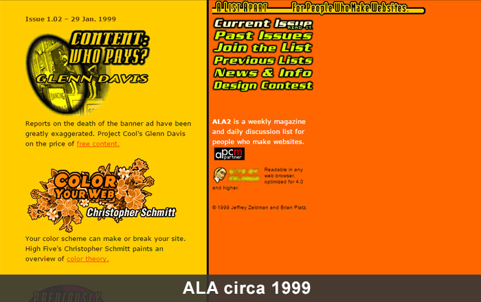
Q: A List Apart has become one of the most influential resources for designers & developers. What was your goal when first launching the site (originally a mailing list) and do you feel that goal has been accomplished?

There’s a principle that if you don’t see what you want in the world, it’s up to you to make that missing thing.

Back in 1998 there were mailing lists and websites about how to code web pages. There were mailing lists and websites about how to design web pages. Plus there were mailing lists and websites about how to write for the web.

But no site or list covered all three areas; nobody seemed to see that they were all part of the same thing: 21st century design.

A List Apart connected those dots for readers who felt, as we did, that design, code, and content were connected in important ways—that the whole they made was greater than the sum of the parts.

ALA circa 2008 screenshot

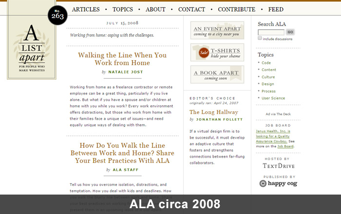
Q: What was it like to watch A List Apart grow from a simple mailing list to a company with its own publication wing & design conference? And how much collaboration was involved to grow ALA into its current state?

Growing a brand over nearly 20 years is like having a kid. There are times you rejoice and times you worry.

At the beginning you infuse your personality because the thing won’t come into being without it. Later you work to ensure the independence of the new life you’ve brought into the world. Your kids need to be able to survive on their own, and so do your creations.

Bringing in collaborators, and letting go of control, is one of the most exciting (and at times most painful) experiences a designer can have. I’m thrilled with where the magazine is and where it’s going—and sometimes, I’m a little sad that, if I do things right, it will ultimately go where it needs to go without me. (Sad, but also happy if I’ve built something that can outlast me.)

ALA circa 2015 screenshot

Currently seventeen people work on A List Apart under the supervision of editor-in-chief Sara Wachter-Boettcher.

Sara is a force of nature. She not only works on the magazine’s “editorial” aspects, she also manages personality conflicts, identifies points of interpersonal and systemic dysfunction in the way we approach tasks, and so on. Sara’s amazing, and her influence on the direction of ALA is huge.

But she is just one of the world-class editors I’ve had the privilege to work with over the course of ALA’s history. You can see all the incredible people who contribute to ALA at http://alistapart.com/about/masthead.

There are article editors, column editors, and blog editors; designers, producers, and project managers; technical editors and developers. There are illustrators. And, of course, there are the writers. Without them, we’re nothing.

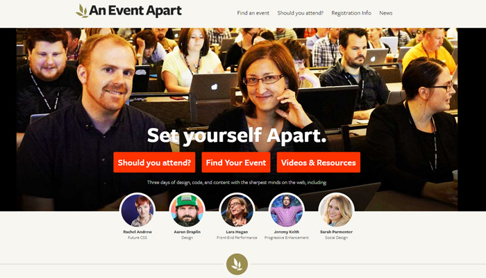
As for the conference: each year at SXSW Interactive in Austin, Texas, Eric Meyer and I used to meet for breakfast at a little hole-in-the-wall Mexican place that, sadly, no longer exists.

We’d talk about the fun we were having at SXSW and we’d daydream about creating our own different kind of conference: one with just a single track where designers, developers, content folks, and other specialists would learn together from the smartest designers and influencers in the field. Our friend Brian Alvey suggested the name “An Event Apart” (although what else would you call a conference from A List Apart?).

In the last month of 2005 we launched our first test event at a little event space in Philadelphia’s Franklin Institute. After a couple additional events proved we could create meaningful content for an event series, and attract web professionals to attend, we made the very lucky decision to hire event planner Marci Eversole and producer Toby Malina. They helped us take AEA from a cool but homespun grassroots affair to the world-famous, three-day web design and development event it is today.

Q: What initially motivated you to launch Happy Cog? Back in ’99 did you ever think it’d still be going strong over a decade later?

I was working as a creative director at a dot-com company just before the first dot-com boom imploded. Despite my title, I didn’t feel I had any real say in the direction the company was taking. I wasn’t even sure I was free to run the design and development area as I saw fit.

One day after a principle in the company raised five million dollars via a logo I’d designed in 30 minutes, I said to myself “my talent is what makes this little contraption go. I should start working for myself.” (I overstated my own value to the company, but it’s what I needed to believe to give myself the push.)

I walked out a month before I would have been vested in company stock, and three months before that stock became worthless.

Before leaving I lined up $6,000 worth of freelance web design work. By Christmas Happy Cog was an LLC, and I was no longer a “freelancer”. I was an “entrepreneur” — which was just another word for chain-smoking designer/developer working in his underwear.

Happy Cog office space
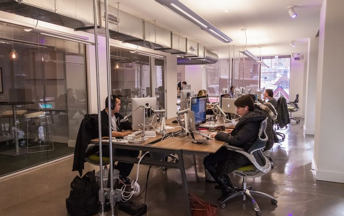
Happy Cog office space – photo source

Q: What do you feel makes Happy Cog so successful & makes it stand out from the many other creative studios?

When I was a pre-teen I wanted to fit in, but I just couldn’t. Somehow I was just different. That was a sad thing at the time (so sad it pushed me into self-destructive behavior for years) but today it makes me happy, because a business run by someone who is different can’t help being a different sort of business … and it’s the uniqueness, not the boilerplate capabilities, that make a company exciting and fun; and that gives it a real purpose in the marketplace.

We demand originality, and our people deliver — it’s just who they are. And that, in turn, attracts clients who also think differently.

Another thing that’s helped us is that, early on, we drew a line in the sand deciding never to work on anything we didn’t believe in.

My first Happy Cog consulting gig was $1,000 a day, which more dough than I’d ever made in my life—and it came at a time when I was broke. But the relationship with the client wasn’t working out. It wasn’t the right dynamic. I wasn’t the right consultant for this client. I couldn’t help her achieve what she wanted because we didn’t share the same vision for the project, and didn’t have the same belief in focusing relentlessly on the user. So I resigned after three days.

I remember it was snowing, and my girlfriend wasn’t working, and I wondered how we were going to pay next month’s rent. And I live in New York where rent is high. But then I smiled—because I knew that there were things I wouldn’t do for money.

And we’ve made that a principle of Happy Cog. Even when things occasionally get tight for us, we’ll never take a job just to pay the bills. If we’re going to commit to months of close collaborative work, we must believe in the work our clients are doing. I’m thrilled to have partners like Greg Hoy and Joe Rinaldi, who share this belief—and, of course, it makes our staff very happy because they know we’ll never ask them to work on something they don’t believe in.

We’ve always been content-driven and user-focused. We didn’t need to wait for someone to invent a term like “usability” for us to know we shouldn’t design things that are pretty but not functional.

And we always had this relentless focus on web standards and accessibility. Initially it made us different from all the other studios. Eventually the good studios caught up, of course.

Today we’re as focused on content strategy as we are on design and development. Above all, we care about the user’s experience—from the smallest design detail to the biggest obstacle we remove from the user’s critical path. This is the kind of design decision that makes a huge difference in site experience, but nobody ever notices. Just like nobody ever notices when the air conditioning is working—we only notice when it’s too hot or too cold. And that’s… okay.

Happy Cog has been(and continues to be) a launching pad for some of the biggest talents in design, development, and content.

We hire folks who really care, and who are delightful to work with—because along with having empathy for the website’s users, we also believe in having empathy for the people who hire us. And enjoying your collaborators’ company is part of that good experience.

Most of our clients are repeat customers, which is the only claim I’m making here that really matters.

Design is like love. You can burn through lovers and die alone, or you can learn to love someone else. And when you really love, you sometimes get loved back.

That’s what Happy Cog’s repeat customers mean to me: we’re doing something right, and it’s appreciated.

Zeldman headshot, founder of Happy Cog

Q: Would you be able to walk us through a typical Happy Cog project workflow? What’s the creative process like starting from idea conception all the way to completion & delivery?
Not to be contrary but there truly is no typical project.

Every job is different, every user is different, and every company’s goals are different.

That said, we typically do a ton of research and have a hundred thoughtful conversations before pitching any job. And once we get the gig, we never stop asking questions. We’re not a waterfall shop that promises a certain number of fixed deliverables, ticks off a bunch of checkboxes, and rushes on to the next project. We engage in committed, collaborative relationships with our clients, with projects and deliverables that evolve over time.

At the risk of sounding pretentious, our projects are like wonderful conversations that go on and on until somehow, almost magically, they produce a product. Like love makes a baby. (In this case, of course, the baby is a professional site or application that solves real business problems and anticipates real user needs.)

Q: Can you share any crucial milestones or learning experiences that hastened your growth as a designer?
When I was in high school my science teacher began growing a beard. Then one day he cut it off. When he came to the school that day all clean-shaven, everyone asked about his beard and why he had cut it. After we all settled down he informed us that he had been dying his hair black, and we’d never noticed.

He was a gray-haired man when he began growing the beard. Slowly he began coloring his hair in sections, while growing this very strong beard. We were so taken with the beard we didn’t notice that he was subtly and slowly changing his hair color. On the day he chopped off his beard, his hair went fully black—but not one kid in that classroom noticed. We wouldn’t have known at all if he hadn’t explained it to us after the fact. He had deliberately focused our attention on the wrong problem in order to achieve his real goal.

I never forgot that story, and it still shapes the way I think about interaction design.

My mom was a musician and my dad was an engineer with an artistic avocation. He painted at night and on weekends, and led an art group in our town. I was surrounded by the stuff of art-making, and by books about art, and I developed a very early interest in cartooning and lettering.

By the time I was ten I had produced a series of comics about a spy character named “Rick Purvis.” My drawing skills kept improving with each new comic I created. To keep my nonexistent readers from becoming confused, I explained away the differences in drawing style from one comic to the next by saying Rick Purvis had had plastic surgery to hide from his enemies.

Q: What can interns & junior designers do to build their skills as quickly as possible in a studio environment?
Learn from everyone whether they work above you, under you, or at your side.

Arrive early and stay late.

Read books and blogs, listen to podcasts, and subscribe to newsletters.

Never stop learning. This business changes every six months. If you stop learning, you stop caring. And once you stop caring your career is over.

What do you feel are the differences between “good” design and “great” design?

It really depends. There are lots of clever ways of answering your question, but they’re not necessarily always true.

Like, I could say, when people see good design they say how nice your website looks. When they see great design, they say what a great service you have. It’s true—but not always.

Or I could say, good design makes the person who uses the site think the site looks cool. Great design makes the person who uses the site think she herself is cool.

Both those things are completely true—except when they aren’t. Sometimes great design is invisible; sometimes it gets noticed. The same is true in film.

Some directors are so great that we notice all their wonderful shots. Orson Welles comes to mind.

Other directors are so great that we don’t notice the camera work at all. John Ford comes to mind.

This industry is full of people who love absolutes. “Great design is invisible,” they’ll tell you. Sometimes they’re right—and sometimes not.

All great design is effective, but not all effective design is great.

You’re more likely to achieve great design if you work harder and longer. A great graphic designer keeps moving little things around on the page, even after a lesser graphic designer would say “the design is done.” The same is true for interaction design.

The beauty of interaction design versus graphic design is that you can keep testing your work on new people, and improving it over time.

At a certain point the graphic designer ships. Web and interaction designers never really ship; we’re always somewhere in the middle of a process, learning from the people who interact with what we make.

Q: How important are aesthetic design trends like flat design or Material Design? Where do you feel design trends rank compared to technical trends like responsive layouts?

Aesthetic trends don’t matter at all. By the time they have a name and you’ve noticed them, they’re already obsolete.

Chasing trends is what the beginning designer does. I did it. We’ve all done it. It’s part of the learning curve. It gives the beginning designer something to think about so she doesn’t have to think about the much scarier things—like if my design fails, how many people will lose their jobs? If my guess about privacy settings is wrong, how many families will be hurt? Those are the huge questions interaction designers wrestle with.

Copying styles gives the beginning designer something smaller and safer to worry about. Meantime, an experienced designer creates the style that best suits the content and brand.

Responsive design isn’t just technological, and it isn’t a trend. It’s the beginning of us understanding what the web medium actually is and the many ways in which it can be experienced.

A Book Apart - Responsive Web Design

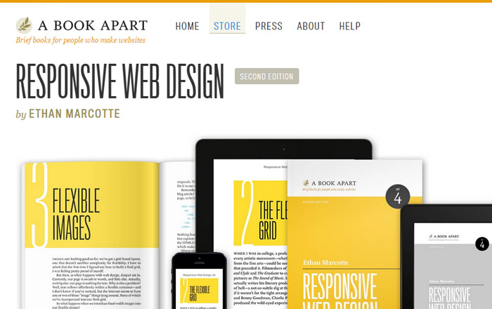
When Ethan Marcotte wrote Responsive Web Design for A Book Apart (after premiering the concept at An Event Apart), he initially focused on layout and technology to give people time to begin absorbing the concept. And that was absolutely the right thing to do.

But today, five years after Ethan introduced the world to responsive design, we know that it has implications for content and other aspects of user experience—aspects that go well beyond layout.

The Responsive Web Design podcast run by Ethan Marcotte and Karen McGrane addresses these complex issues beautifully. I highly recommend listening!

Q: Web design/dev conferences have become powerful learning & networking opportunities for the industry. Do you have any tips or advice for someone thinking of attending their first conference?

A good conference conveys an astonishing amount of information—too much to absorb in a single sitting. Bring a laptop or a sketchpad to take notes (depending on whether writing or drawing best helps you remember).

Sit close to the front even if you are shy (focus drops as you move closer to the rear of the auditorium), and avoid distractions that keep you from learning (i.e. use your laptop to take notes, not to check email or catch up on Twitter—unless you post notes on Twitter, which can actually also be very helpful).

At An Event Apart, we know how hard it is to take in all the amazing things you’re learning. That’s why, after the show, we provide attendees access to slides of every presentation they saw, plus a printed workbook for those who attend the optional third-day single-topic learning session.

We also curate and create a custom Resource page for every event, containing links to any articles or online tools our speakers may have mentioned in their sessions, plus links to community tools (such as aggregators of tweets and photos from the show) along with attendee summaries and reviews of individual sessions or the whole show.

In this way AEA attendees keep learning long after the curtains have. Plus all the links and tools help folks remember exactly who said what.

After some time passes, we also publicly post videos of some of the important AEA sessions from that year, after first making them privately available to folks who subscribe to our newsletter … which also helps attendees keep learning even after the show ends.

Conferences are also great places to meet other folks who do similar work and who care about great interaction design as much as you. So even if you’re shy by nature—and most of us in this business are—don’t be shy during the few days you’re at a conference event.

Walk up to folks between sessions and strike up a conversation. A single track format like An Event Apart helps with that, because you can be sure the person you’re approaching just saw the same session you did.

Bring your business card or be creative and bring fun Moo cards. At AEA, to break people out of their shy shells we offer An Event Apart Conference Bingo. It’s a fun live interactive game that helps folks connect with their fellow attendees and speakers.

Because even better than taking back a head full of new ideas and exciting inspiration is also taking back an improved Rolodex. Someone you meet at a conference might be your next employer, your next colleague, your next employee, or even your future marriage partner(it happens).

An Event Apart homepage circa 2015

Q: What were some of the struggles you faced when first organizing your own conference “An Event Apart”?

Capitalism is a blood sport. When the AEA conference was beginning to grow in scope and scale, there was a period where we had to promise some large venues that we would spend anywhere from $60,000 to $200,000 in their location over the course of a two-or-three-day event. Without those guarantees, we wouldn’t have been able to book those venues.

But we were acting in faith that we’d sell tickets. There was always the possibility that we wouldn’t.

If the product we were making didn’t have the appeal we thought it had—if not enough people bought tickets—then our company was going to have to make up the difference. Since the company was just a two-person LLC, what it really meant was that if Eric and I were wrong about AEA’s future we were going to have to find hundreds of thousands of dollars somewhere.

I would wake up at three in the morning with my heart pounding, wondering if I was going to lose my home. (It was the first home I’d ever owned and I’d only just bought it; my daughter was just a baby at the time.)

Turns out we were right to bet on our ideas but I wouldn’t want to go through that again.

Of course, this same thing happens to every self-financed company and every company I own has gone through it. And some of them may go through it again. Scary stuff.

Q: If someone with little experience wanted to learn web design today, what should be their first area of focus?

Beginning web professionals should learn the basics of semantic HTML markup and progressive enhancement. You should learn CSS, including new stuff like Flexbox. And should at the very least understand the principles behind how JavaScript works and what it is for.

You’ll know you’ve learned enough code (at least for now) when you can hand-code a basic web page that works in any browser on any device.

Once you’re past the basics, read my Designing With Web Standards. It’s the textbook for modern web design.

Typographic basics are just as important. Web design is largely type design. Read Ellen Lupton and Robert Bringhurst. Have some fun with Lewis Blackwell’s 20th Century Type Remix.

Be like someone discovering a new country. Look at everything critically and with fresh eyes.

If there’s a website you like, figure out all the little details that make you like it.

If you have a good experience on a shopping site, figure out what the designers, developers, and content folks did to make the experience so smooth. Was there a clear hierarchy? Was it easy to spot buttons and forms? Did you generally have a pretty good idea what your options were, and what you were expected to do next?

Every time something worked well for you meant a designer made one or more good choices. Many folks call this design. Some call it “usability” (which is really just a label for good design). Steve Krug wrote a bestselling book on the subject: Don’t Make Me Think should be on everyone’s list.

At A Book Apart we’re publishing what we modestly believe to be the modern canon for web and interaction design. You’ll recognize many of the titles. Our books are laser-focused on what design should be, and what’s coming next.

Phrases like “Mobile First” and “Responsive Web Design” taken from our pages have entered every designer & developer’s vocabulary.

Stay up to date with great free resources like A List Apart, CSS-Tricks, and Smashing Magazine.

Q: Over your career you’ve worked on a lot of cool stuff. Do you have a favorite project or personal career highlight?

Designing With Web Standards, A List Apart and The Web Standards Project changed how the web gets made & influenced hundreds of thousands of my peers. I’m in humble awe of that.

Q: If you had the chance to give any advice to your younger self, what would it be?

It’s all happening for a reason.

Q: And finally could you name 1-2 people who you greatly respect in the field of designing/building websites?

You can tell who I admire because I put them onstage at An Event Apart. I publish their articles at A List Apart, and I publish their books at A Book Apart.

And then there are folks outside my sphere of influence whom I also greatly admire and learn from—folks who write for Rosenfeld Media, for O’Reilly, for New Riders, and for other great publishers.

Some of my web design heroes don’t write at all. They just work, and their work is their art. I’m thinking of folks like Happy Cog’s Mark Huot who is an incredible inspiration.

Those who’ve overcome harassment like my friend Jen Simmons of The Web Ahead podcast, and who’ve stood onstage and maintained their professionalism & cool while anonymous cowards were attacking them via the Internet, like my friend Sarah Parmenter, inspire me to do better and be better.

And then there’s my friend and partner Eric Meyer, who has turned an unspeakable tragedy into a burgeoning movement to help those web users who are least capable of helping themselves in the moment of their greatest need.


I’d like to sincerely thank Jeffrey Zeldman for all his time and marvelous answers. If you want to learn more you can visit his website or check out his studio Happy Cog.

Read More at Interview with Jeffrey Zeldman: A Candid Look at the Life & Work of a Web Standards Pioneer

Categories: Others Tags:

Approaches For Multiplatform UI Design Adaptation: A Case Study

September 1st, 2015 No comments

There is no winner in the battle between iOS and Android, and we all know that. If a product succeeds on one platform, it will undoubtedly be ported to the other. Sometimes app developers don’t even bother waiting, and release apps for both platforms simultaneously. For designers this means only one thing — they will have to adapt an application’s UI and UX to another platform while ensuring a consistent design language across the product.

Three Approaches For Multiplatform UI Design Adaptation: A Case Study

There are three different scenarios for UI multiplatform adaptation: retaining brand consistency; aligning with the conventions specific to the platform; and seeking a balance between the two. We decided to analyze these three approaches by looking at the most popular apps out there so that you get some insight into what method might work best for you.

The post Approaches For Multiplatform UI Design Adaptation: A Case Study appeared first on Smashing Magazine.

Categories: Others Tags: