Archive

Archive for September, 2015

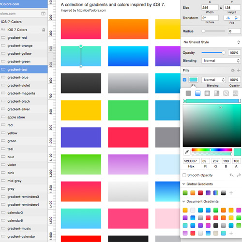
Free Sketch Color Palette Plugin for Designers

September 28th, 2015 No comments
00-featured-sketch-gradients

Every UI designer should at least know about Sketch as it’s been making waves through the online design community. This OSX-exclusive application is an alternative to Photoshop made solely for graphic/UI designers.

One of the best things about Sketch is the open nature of plugin development. Many developers have built and released free Sketch plugins that dramatically enhance workflow.

A developer by the name Andrew Fiorillo has recently put out a brand new plugin named Sketch Palettes.

I first found this plugin via Designer News which explains its purpose:

It grabs the colors from the Document Colors section of the color picker and saves them as a .sketchpalette file, which you can then share with other people that have the plugin. Loading the palette file replaces the colors in the Document Colors section of the color picker for the current document. There is also a command to just clear out all of the Document Colors.

Color palettes can be saved and loaded together based on similar import/export features. Everything ties into the Document Colors area of Sketch which can behave much like a selection of colors.

New files are saved with .sketchpalette extensions which are meant solely for this plugin.

If you want to check it out visit the Sketch Palettes GitHub page for the download link + install details.

Read More at Free Sketch Color Palette Plugin for Designers

Categories: Designing, Others Tags:

Free Open Source Team Chat with Zulip

September 28th, 2015 No comments
00-zulip-logo-featured

Powerful chat platforms like Slack have been dominating the marketplace for a few years now. Teams have moved onto these powerhouse systems to quench their thirst for communication, coupled with a lack of alternatives.

Thankfully a new chat platform has reached the web and it’s completely open source!

Zulip allows group chat that can be hosted on your own corporate server with full control over the infrastructure. It can work on mobile devices along with desktop/laptop computers.

Conversations are organized by topics and include flags for messages you’ve missed since your last visit. It functions very much like Slack, but using a different interface coupled with various features on a fully open source platform.

Naturally a system like this could be off-putting to anyone who doesn’t have time to setup an internal chat system. But there’s something to be said about saving money if you’re willing to take the time and learn how to use Zulip to its fullest potential.

There’s a tremendous list of features that will surely grow over time. Here are some poignant examples:

  • @notifications
  • Audio + visual notifications
  • Drag & Drop file attachments
  • Keyboard shortcuts
  • History search
  • Open API Library

Another great feature is the ability to integrate webapps into Zulip. You can have auto-updates posted from many top services like Git/GitHub, Trello, Asana, or even directly via e-mail.

If you want to get started visit the Zulip documentation or the official Zulip GitHub repo. There are three other repos for the iOS, Android, and desktop clients.

In a few years’ time Zulip could snowball into the best free chat platform for new startups and creative agencies worldwide.

Read More at Free Open Source Team Chat with Zulip

Categories: Designing, Others Tags:

Free jQuery Filer HTML5 File Uploader Plugin

September 28th, 2015 No comments
00-featured-jquery-filer-plugin

When it comes to form inputs there’s nothing quite like file upload fields. These are often the most difficult to style and also require the largest amount of backend server logic.

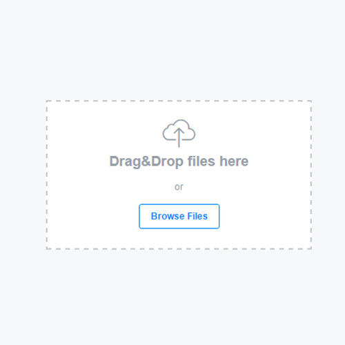
Over time these upload fields have been given much more TLC with custom CSS libraries and JavaScript code snippets. I’d like to share one whopper of a jQuery upload plugin named jQuery filer. It’s completely free and open source for use on any project.

This is meant to be a direct solution to the static HTML upload fields we’ve all grown accustomed to seeing around the web. jQuery Filer is much more dynamic with all the modern features of 21st centruy web development.

Take a peek at the jQuery Filer demo to see it in action. The plugin is loaded with custom features on the frontend + backend.

This list of features includes:

  • Completely change File Input
  • Add more files to input without uploading them
  • Create thumbnails
  • Append existing files to input for a preview
  • Image paste from clipboard
  • Drag & Drop functionality
  • Custom callbacks

Web browser support is rather bleak except for the most modern options. But since this relies heavily on HTML5 it should be obvious that IE6-9 users will be in a rough situation.

You’ll notice in the documentation that there are dozens of custom options to add into your Filer function. This plugin can handle a lot of custom functionality from image thumbnails to custom UI templates for the uploader.

Take note that you will need a backend server language to handle the file uploads. This can be in the style of PHP, RoR, Python, .NET or even Node.js if you like sticking to JavaScript.

If you’re interested please check out the GitHub repo for documentation, download links and a live demo.

Read More at Free jQuery Filer HTML5 File Uploader Plugin

Categories: Designing, Others Tags:

Interview with Qapital's Head of Product Henrik Wrangel

September 28th, 2015 No comments
qapital-henrik-wrangel-photo-featured

Recently I was able to ask some questions about a new money management application named Qapital. It’s an interesting program that can connect into your accounts and help you save money for future expenditures.

Curiosity got me asking about the history of this application, how it was designed/developed, and what may lie in the future for Qapital users. Special thanks to Henrik Wrangel, George Friedman, and Lindsay Goldwert for helping to setup this great interview!

Henrik Wrangel qapital interview

Q: What is the gist of Qapital and how does it work? What does it offer that’s unique to the current app marketplace?

Qapital is a new approach to saving. It works by automating savings of small amounts of money, the $5 to $20 a week that people often spend on nothing special, toward your goals.

The goal of the app is to keep people motivated to save toward the things they want to do or experience in life and to feel the satisfaction of having achieved that goal.

We believe in a model of ease of use and transparency — no hidden fees and a vibrant user experience. We are the first app to have an IFTTT channel allowing users to tie their savings strategies to many of their favorite apps including Facebook, Instagram, and Twitter.

Q: How did the initial idea get started & how quickly has it grown?

We’re all adults. We know that saving is important. But honestly, it’s boring.

No one gets excited about saving money even if it’s for something we really want to do or buy or experience. Our idea was to bring some fun into it and weave it into people’s everyday life.

We started building the app for Swedish users in 2013 but soon found that we could create a more exciting product for a U.S. audience. We launched on the App Store in March. We’re looking to launch the Android version of Qapital later this fall.

Q: Can you share a little about the Qapital team? How many people work for the company and what are some typical day-to-day tasks?

We are a 16 person team based in New York, Stockholm, and Slovenia. We all work very closely and have joint Skype meetings every day.

We also get the entire team together IRL regularly to bridge the geographical gap.

Our day-to-day tasks include:

  • Continuous development/improvements of existing product.
  • Prototyping new features that might end up in the app.
  • Analyzing app usage
  • All-hands team meetings to focus on marketing and growth.
  • Improving customer experience
  • Creative content development

Q: What was the design process like to create Qapital’s branding & app UI? Was there any specific creative vision from the start?

Our goal was to create an app that was playful but serious at the same time.

When designing the UI we wanted to create an interface that felt emotional and lightweight, but where ease of use always would be prioritized above fancy design solutions. From the start the vision was to create something that stood out from the rest.

We wanted to position ourselves as very different from traditional banks while still being perceived as a serious banking product, which we are.

Q: Finances are very personal and require high levels of security. What are Qapital’s security measures to ensure the safety and privacy of each user?

We take security extremely seriously. We have a dedicated person that only works with keeping our users’ data and our systems safe.

We have also been audited and cleared by Intuit and their external security partners. All Qapital accounts are insured by the FDIC. We work with Idology, one of US’s largest and most trusted verification services.

Q: What was the process like to acquire agreements from charter banks to connect into Qapital? Could Qapital eventually be recognized as its own banking entity?

NOTE: This answer came from George Friedman, CEO of Qapital

I would say the process was relatively easy. Since we, together with partners, built a robust front and middle layer that would pass an FDIC audit it allows Qapital to transact on behalf of the bank. So the actual integration work needed is relatively limited.

Plus lots of banks are looking for access to new technology that can bring something new or cost efficient to the bank, as well as cheap deposits. We can bring all those things to the table

Qapital is a technical platform designed to help people set specific savings goals and meet these goals with very little effort through incremental behavioral changes. However, all funds transferred through a Qapital transaction are held by our banking partner, an FDIC insured bank, and can be accessed at any time and transferred back to a user’s existing bank.

Because we use a 3rd-party partner as an intermediary for our savings deposits and a 3rd-party partner to manage our debit card, Qapital is not subject to FDIC regulation.

Q: Since you have an office in Sweden are there any plans to expand outside of US banking institutions?

If everything works out according to plan we would love to go global. But right now, we’re focused on helping Americans save :)

Q: Have there been any major lessons learned throughout the process of building & launching Qapital for public use?

I think the major lessons for us all have been how to adapt to the startup way of doing things and running your own company instead of working for the man.

When you’re just a few people with a joint vision you tend to run as fast as you can. But when you start growing the team you quite quickly how important it is to get team communication right and that some things needs to have structure.

So now we try to be much stricter about how we do things and what our process looks like. It’s a constant work in progress.

Q: Are there any plans for new updates/features for Qapital in the near future?

We have partnered with Intuit and will now offer support to almost every bank in the U.S. including community banks, credit unions, and bank-affiliated credit cards.

We also have two new savings rules coming up which have been frequently requested by our community. So we’re really excited about that.

Right now, we offer rules for saving such as Moves(reward yourself with savings when you hit a fitness goal) and including the Guilty Pleasure rule(save money every time you spend at a certain location).

We’re also working on streamlining the onboarding process. We’re really proud of our Shared Goals function and we’ve got exciting plans to make them more engaging.

If you’re curious to learn more about Qapital check out their website or download their app from the iOS app store.

Read More at Interview with Qapital’s Head of Product Henrik Wrangel
Categories: Designing, Others Tags:

User Interface Design Techniques for Mobile Web Applications

September 28th, 2015 No comments
iui-mobile-framework-open-source.png

Having developed smaller projects using Objective-C/iOS I learned there are many benefits and drawbacks to native applications. HTML5 mobile web apps provide a quicker all-around experience for any mobile device – and even regular desktop monitors. This means you don’t need approval from a marketplace or app store and you can publish online right away.

There are certainly some drawbacks, namely that you can’t access default libraries found in the Android/iOS SDKs. But if your application can work better running on a website then you should consider the possibilities. In this article I hope to present tips for new designers who may wish to attempt building their own HTML/CSS/JS web application from scratch.

Simplicity vs. Aesthetics

There are so many common web applications online, but not many have been structured for mobile support. You have to weigh the necessities of logos, icons, background textures, and other assets which may require more HTTP requests. Mobile users are not always on wifi so the waiting time could be longer than a visitor is willing to stick around.

find and replace javascript webapp codepen

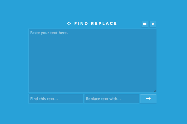
I like this little find & replace webapp on CodePen because it defines what a simplistic interface may look like. The form itself is not responsive, but it is small enough that anyone should be able to use it. Before designing your webapp think about which components are absolutely necessary for it to function properly.

Then go over your mockup and consider which areas might be improved upon, and how to do so. Try looking at other native Android/iOS applications to pinpoint trends from other experienced developers. The process of replicating an effect to the web can take a lot of work – but stick to your guns and you may be surprised at what can be accomplished.

Compact Nav Menus

Page navigation is a key piece to any mobile website or webapp. But one crucially important idea you need to keep in mind revolves around screen real estate. Mobile smartphones do not have the luxurious displays that you find on tablets or laptops. You need to create navigation menus which can expand when appropriate, but also contract and even hide links to avoid clutter.

ios apple style mobile hidden sliding navigation codepen

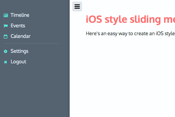
Here’s a fantastic example of the iOS-style sliding menu which has become wildly popular in recent years. Mobile iOS applications often hide links off to the side so they can be opened and closed at will. This gives more control to the user so they are interacting with links only at times when they actually need to navigate the site.

Other solutions include fixed-top dropdown menus or even stationary links at the bottom of the page. It all depends how your webapp is structured and if you even need multiple pages.

UI Design Patterns

Working towards a native look and feel will take a bit of practice. Common UI design patterns include top title bars, icon-based tab bars, large buttons and pre-formatted tables. Have a look at this CodePen entry playing with the Kendo UI.

kendo ui codepen mobile webapp tabbar interface

I’ve built simpler mobile webapps running entirely on CSS3 gradients and media queries. It’s pretty simple to mimic design ideas from native applications by taking screenshots and matching the colors in your CSS file. And the benefit of running a responsive layout means you only need one primary design – as opposed to native apps which require both vertical and horizontal views.

Apple’s iOS is a great framework that runs on top of a well-recognized interface. But you may also prefer the flat design styles on Windows phones and in many Android applications. Toy around with various applications on your smartphone and do some research into what you like and what you don’t like.

Write down a list if that helps you remember ideas. Consider how each user would navigate through your application and how you could simplify this process with more recognizable page elements.

Mobile Frameworks

If you want that real native app UI design style then try starting with a basic framework. Many web developers have put out free open source frameworks that you can build upon and even contribute towards. Most designers are familiar with Bootstrap which is a personal favorite of mine. The components are well-received from everyone and it can behave exactly like a typical mobile-responsive website(or webapp).

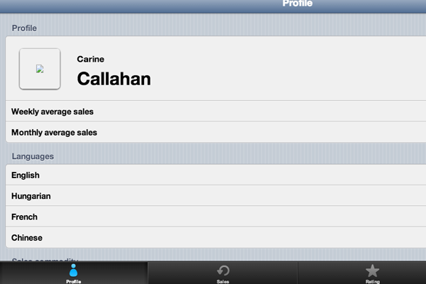
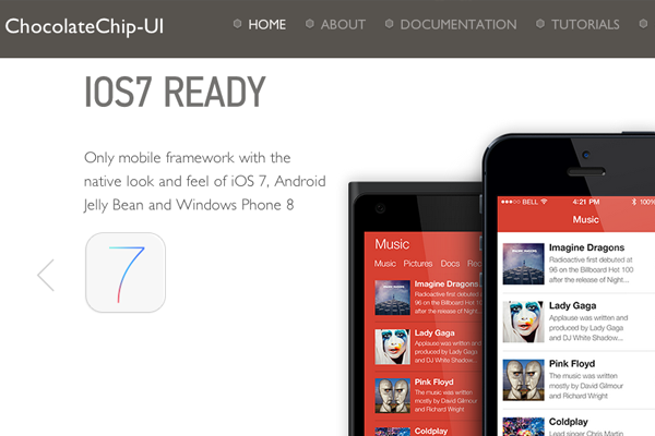
chocolate chip ui open source screenshot webdesign

One of the newer projects I stumbled onto is called Chocolate Chip UI. This open source project allows developers to create websites using a design like iOS 7, Android Jelly Bean, or Windows Phone 8. Components are easy to setup much like Bootstrap except they are built to render more like a mobile web application.

This is a big step forward as greater layers of abstraction provide quicker turnaround time on new projects. If you have a small webapp idea it could take you less than a week to get it working and launched online. If you’d rather create your own UI with HTML5/CSS3 that is always a possibility, but greater customization will require more time in the development phase.

iui open source mobile framework design webapps homepage

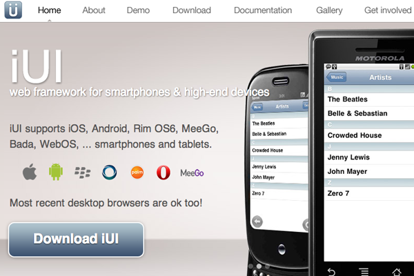
Another framework you’ll want to remember is called iUI, specifically geared towards mobile websites and webapps. These components are built to match so you can design interfaces for iOS, Android, Blackberry, really anything you’d like. iUI is quite advanced with multi-column navigation and more detailed JavaScript effects.

Take a peek at the live demo to see how this framework behaves on a mobile viewport. Naturally you can allow these webapps to expand out wider for tablets or large monitors. The purpose is greater support within a wider audience all over the planet.

Related Articles

Closing

Mobile web trends are evolving faster than one could keep up with. There are so many new ideas worth testing and even though many will be cast aside, designers are always willing to push the envelope further. This article should get you started thinking about mobile web applications, user interface design, and possibly brainstorming your own webapp ideas.

Read More at User Interface Design Techniques for Mobile Web Applications

Categories: Designing, Others Tags:

AngJobs is an open source Gmail-Style Job Board

September 28th, 2015 No comments
00-featured-angjobs-homepage-list

Digital jobs span the gamut of in-house to part-time gigs and freelance/remote projects. Many opportunities are out there for designers and developers if you know where to look.

Among the handful of job boards already online, a newcomer named AngJobs recently popped onto the scene.

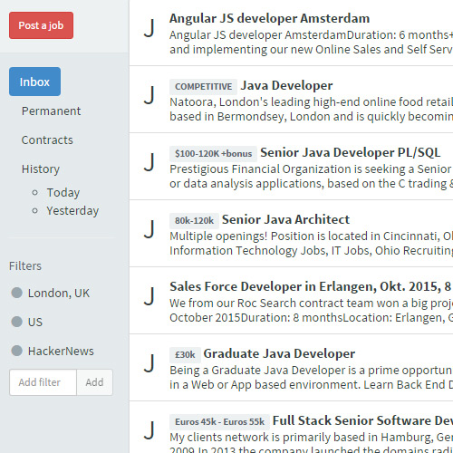
The site is rather unique as it features a very simple Gmail-style layout design with a dynamic loading page structure(also like Gmail).

Everything is very clean and easy to use for prospective employers and employees alike. Since it’s still in beta the site does have various small bugs related to the interface(title pages, for example). But functionality is very clean and surprisingly intuitive.

It’s a simple task to sort by permanent/temp positions, or to limit based on location or filters like Python. AngJobs is also unique because the whole platform is free and open source on GitHub.

Whether this site will prove to be a starting point for job hunting has yet to be seen. It’s still a relatively new launch and has been gaining publicity slowly.

Either way it’s truly an interesting project and it’s always great to find new resources for locating digitally-skilled job opportunities from the comfort of your local Internet connection.

Read More at AngJobs is an open source Gmail-Style Job Board

Categories: Designing, Others Tags:

Breaking Up Large Files Into Sections

September 28th, 2015 No comments

It’s a 2,000 line behemoth. It’s hard to browse or easily find what you are looking in there. What can be done? This article isn’t about actually dismantling the file (although that would be a good one), it’s mostly about what to do when you need to leave the file that way.

Don’t Make Files That Big

Ideally, you don’t let files get too long. The longer the file the more likely it is that it’s become a dumping ground rather than a proper cog in the machine.

We’re talking about authored files here. Your production `style.css` file probably is quite long, but it’s probably compiled from smaller bits, organized into sensical parts.

If your authored files are already too long, can you find a way to break it apart that makes sense? If you can, it’s probably a good idea. Perhaps your monster `user_controller.rb` can be split up into concerns which the main controller can inherit.

Abstraction at work!

But let’s say, for whatever reason, it makes sense to have a mega-long file in your project. It needs to be that way, and you need a way to make it more manageable. Maybe we can have a little fun with it.

ASCII Art Blocks

If you do a lot of scrolling up and down the file, perhaps putting a bunch of space between sections is helpful. And then how about a big commented block of ASCII art text to label the section?

  ______                       
 |  ____|                      
 | |__ ___  _ __ _ __ ___  ___ 
 |  __/ _ | '__| '_ ` _ / __|
 | | | (_) | |  | | | | | __ 
 |_|  ___/|_|  |_| |_| |_|___/

If you use an editor with a “mini map”, these can really stand out, as pointed out by Xah Lee:

Comment Blocks

Maybe it’s just the space and the big block of commented code that stands out, so instead of being fancy artistic, maybe get real practical and label each section with metadata.

/*

  Section: Form Styles
  Purpose: To style form elements like <input>s and <button>s and such.

  Author: Chris Coyier
  Last updated: September 28, 2015
  Favorite TV Show: Northern Exposure

*/

Weird Indentation

Code tends to cluster to the left. It looks weird when things are indented pretty far without nesting that leads to it. Perhaps you can use that do your advantage.

.main-header {
  background: black;
  color: white;
}

              // *****************
              // -----------------
              // FOOTER STYLES
              // _________________
              // *****************

.main-footer {
  background: white;
  color: black;
}

Long Lines

Especially if you don’t have wrapping/soft-wrapping turned on, super long lines can be a nice way to break things up.

// XXXXXXXXXXXXXXXXXXXXXXXXXXXXXXXXXXXXXXXXXXXXXXXXXXXXXXXXXXXXXXXX

Things You Can Search For

If you used a convention for how you named sections, that makes searching through the project (or parts of the project, or single files) yield good results for finding those sections.

Searching is so much faster than scrolling!

Use Code Folding Feature

If your editor features code folding, make use of it! The whole point of it is to temporarily visually hide blocks of code so they aren’t distracting.

Sourcemaps

If you write in a language that compiles to something else that the browser uses (e.g. Sass, CoffeeScript, Closure compiler, etc) it may offer source maps, meaning the DevTools can tell you what line a bit of code is on in the original authored file, not just the compiled version. That way you know exactly file you need to go to to edit it:

And you know what line as well, so you can jump right to it no matter where it is.

Does your editor help you in special ways?

Is your editor really good with it’s “Find in Project” feature that jumps you right to the line? Use it!

Does your editor have some cool way to jump around in files? I know “Go To Symbol” is pretty popular in Sublime Text and Jetbrains has it (I’m sure many others as well).

Does your editor (or an add-on) have some way to tab through sections of code? Try it!


Breaking Up Large Files Into Sections is a post from CSS-Tricks

Categories: Designing, Others Tags:

How To Run A Side Project: Screenings Case Study

September 28th, 2015 No comments

Did you know you have a superpower? No, I’m not talking about super-strength, sticking to walls or pushing metal claws out of your forearms (although you might have those as well, for all I know).

Screenings: A Side-Project Case Study

If you work on the web — which I assume you do if you’re reading this — your superpower is side projects. Unlike your regular job, where you have to listen to your boss or please your client, a side project lets you take on an alternate identity, one of which you’re in charge and no one can stop you.

The post How To Run A Side Project: Screenings Case Study appeared first on Smashing Magazine.

Categories: Others Tags:

Freebie: World Landmark Icons (AI, EPS, PDF, PNG and PSD)

September 28th, 2015 No comments

Today we’re happy to release a new Smashing freebie: 18 lovely world landmark icons such as the London Eye, the Eiffel Tower or the Empire State Building. The icons are detailed enough to show architectural elegance but without adding chaos. They’re designed to work best in both digital and print media.

Landmark Icons Excerpt

Today we’re happy to release a new Smashing freebie: 18 lovely world landmark icons such as the London Eye, the Eiffel Tower or the Empire State Building. The icons are detailed enough to show architectural elegance but without adding chaos. They’re designed to work best in both digital and print media.

The post Freebie: World Landmark Icons (AI, EPS, PDF, PNG and PSD) appeared first on Smashing Magazine.

Categories: Others Tags:

Portland, Oregon hosts Delight 2015 from October 5th-7th

September 28th, 2015 No comments
00-featured-delight-2014-conf

Delight is a rather diverse conference spanning the gamut from technology, design, programming, and overall user experiences. 2015 will be the fourth annual occurrence of Delight which will be hosted in Portland, OR for a lovely three-day conference period.

The Delight conference is unique because many people from distinct backgrounds gather together to talk about their passions. These could relate to technology, business, marketing, webcopy, design, or any area inbetween these topics.

If you check out the schedule you’ll notice that Delight actually gets started on the night of October 4th with a pub crawl and brief reception period. The next three days are full of talks, workshops, and plenty of snacks.

Speakers from all over will represent some of the largest brands including GoldenKrishna of Zappos, Rachael Yu of Airbnb, Dean Cookson of Virgin America and so many others!

Tickets are still on sale but going fast. Discounts can be obtained by purchasing ahead of time, so if you can schedule ahead be sure to get in early.

Even if you can’t make it to Delight 2015 you can still follow updates and photos shared on their Facebook page, or recent posts on Twitter @DelightConf.

Read More at Portland, Oregon hosts Delight 2015 from October 5th-7th

Categories: Designing, Others Tags: