Archive

Archive for September, 2015

How to design forms that convert

September 28th, 2015 No comments

Web forms are the scourge of many a designer, and by extension, their clients.

Forms play a vital role on any site because they’re how sites gather all-important info during the checkout process, or lead information on landing pages. If you want to please your clients and boost their sites’ conversion rates, there’s perhaps nothing more significant you can do than design effective, optimal forms.

Design outside the box with narrative forms

The standard form is characterized by a few fields where leads fill in their basic contact details like their name, email address and phone number. It’s humdrum and very mundane…just because it’s typical doesn’t mean that it shouldn’t be messed with, though. On the contrary, try shaking things up for better conversions with narrative forms.

Narrative forms, as the name implies, are forms that keep the conversation going; instead of simply ending the story when the site copy ends. These types of forms continue to engage your leads by prompting them to fill in the blanks in a form in the style of a first-person narrative. This makes the sign-up process way more personal!

Vast.com, a site that lets users search for millions of cars for sale and real estate deals, experimented with narrative forms. They A/B tested their narrative form with the control, their standard grid form, and saw a conversion boost of between 25% to 40%. At the very least, including narration in the form produced a 25% conversion boost.

The next time you’re thinking of playing it safe when designing forms, don’t. Take this small, calculated risk, and it may pay off.

Use fewer (or more) fields

In the past few years, there’s been a debate about the specific form length that works best at boosting conversions. Newsflash: There actually isn’t a specific length that works better; shorter forms get more of a certain kind of conversion, while longer fields get more of another kind of conversion.

Conventional wisdom dictates that fewer fields on a form boosts conversions. That’s true, but only in that fewer fields produce a greater quantity of conversions rather than a greater quantity of quality conversions.

Finery‘s form includes a drop down to specify why you’re contacting them. It’s an extra field, that could be omitted, but including it increases the quality of the message being sent.

Let’s look at this further. Say you have a really minimalist form that only asks for leads’ names, email addresses and phone numbers. You’ll get more conversions because the effort and time spent on inputting that info is minimal, yet the quality is questionable since you don’t know how relevant these leads are to your business. HubSpot found this to be true in its research.

On the other hand, if you have a longer form that asks for more than leads’ names, email addresses and phone numbers, you’ll have more detailed info on them, which leads to more higher-quality leads. With more info, a business can better tell if they can more easily market to them.

If your client has the goal of greater quantity of leads, then your forms should be relatively short, such as Marketo’s sign-up form for its free, downloadable guide to digital advertising. If your client has the goal of wanting a greater amount of high-quality leads, then it’s perfectly alright to lengthen your form by including more fields, so your client can get more info. Case in point: TD Ameritrade’s account sign-up form.

Only use clear labels and explanations

It’s stunning to discover that some designers still neglect the fundamentals of ensuring that users can actually make sense of a form straightaway.

The registration form for TheHugo couldn’t be clearer.

The purpose of using clear labels and explanations in forms and their fields is to neutralize any potential input problems, many of which can stem from confusion in what to enter.

The sign-up page for the Barnes & Nobles MasterCard credit card is one such case where clarity dominates the form. Looking at the fields, we can immediately see how the understandable labels are inside the boxes and easy to read.

As a bonus, said labels don’t disappear when you start typing your info into the boxes; instead, they simply become smaller, change color, and are still readable. This allows users to always understand what’s expected of them to type into any box—even if they’ve started typing. Some forms have taken criticism for removing the labels once users begin typing.

Even the explanations—like the number of required fields to fill in and extra directions for specific fields—are placed outside the boxes and in different colors to promote easy reading.

Do away with mandatory registration

If there’s anything that can kill conversions quickly when your customers are already all set to buy something from your client’s online store, it’s the dreaded registration process during checkout. Experience tells us that forcing customers to register or sign-in, which equals additional steps, prior to a purchase will lower conversion rates.

Condor‘s checkout process doesn’t force you to register. Logging in to an account simplifies the checkout process, but the default form is for guests.

When designing forms for the checkout process, make them as short as possible to encourage the customer to go through with the purchase. Customers are rightly impatient when buying something, and no one wants to waste time on extra steps before they can properly check out.

Staples understands this perfectly. The retailer of office supplies and electronics features an initial checkout page that doesn’t force shoppers to register again or force registration on new shoppers. Instead, it allows them to easily type in their username and password into two fields if they’re returning shoppers or go directly to the checkout-as-a-guest page, where they’ll just input basic shipping info, if they’re new customers. Such a setup makes things simpler for customers and gives them more freedom and control over the checkout process, which is always welcome.

Web form best practices

Designing smart, effective forms all comes down to incorporating these best practices into your design. There’s a reason that these approaches are best practices: they’ve been proven to work, which is also why you tend to see them in the sign-up forms of successful online stores. Badly designed forms will be a drag on the site’s conversion rate so logically, it makes sense to drastically improve the design of forms on any page to improve the conversion rate of the entire site.

Remember that designing forms is just one aspect of broader web design, but it, too, should be guided by the principle of designing first and foremost for the user experience. All the tips discussed above are tried, tested and true ways to please your clients’ customers and therefore increase the conversion rates of your clients’ sites.

1400+ Creative Silhouette & Decorative Shapes Bundle – only $21!

Source

Categories: Designing, Others Tags:

Pintsize Automates Sass & HTML Template Building

September 28th, 2015 No comments
00-featured-pintsize-css-sass

Sass/SCSS has changed the way developers create websites. It saves time, frustration, and offers a powerful new workflow to hasten web projects.

This excitement has naturally caused developers to jump into the ring with their own Sass-related ideas. Some are basic mixins while others are plugins or libraries that run on top of Sass commands.

Pintsize is a Sass template generator for building out full HTML layouts. It relies on Gulp to automate the process which generates HTML columns/rows based on predefined settings.

Granted there are other ways to do this, like a framework such as Zurb Foundation. But Pintsize gives credence to the notion that sometimes we want to create our work from scratch.

Pintsize is easy to install through either Bower or NPM(via Node.js). It runs on top of files much like Sass, and Pintsize actually comes with default SCSS settings for you to use.

To learn more take a peek at the official GitHub Repo and browse through some of the example snippets. I was surprised at the simplicity of Pintsize and I hope more developers can rely on this Sass/HTML template generator for hand-crafted web projects.

Read More at Pintsize Automates Sass & HTML Template Building

Categories: Designing, Others Tags:

GitHub Comments can now include File Attachments

September 28th, 2015 No comments
00-featured-github-octocat-logo

A brand new update to GitHub allows all comments to include much more than just images.

GitHub users have always been able to attach images to their comments in pull requests or support issue threads. Just recently GitHub put out a new feature that allows posters to attach files with their comments.

Currently the supported file types are as follows:

  • .txt (Plaintext)
  • .docx (MS Word)
  • .xlsx (MS Excel)
  • .pptx (MS PowerPoint)
  • .pdf (All PDFs)

Files can be attached via browsing your hard drive, or by dragging & dropping them into the comment window.

At this point most of these file formats should suffice for ancillary info to a post. Over time we may see further filetypes added to the list, but for now this is a welcome improvement on behalf of the GitHub team.

Read More at GitHub Comments can now include File Attachments

Categories: Designing, Others Tags:

Deal of the Week: Trend Font Family Bargained Away

September 28th, 2015 No comments

I like this vintage retro look with slight reminiscences to stonewashed clothing. Our Deal of the Week has a whole family of 20 different fonts following that trend. These typefaces are so trendy, they are even named Trend. Besides all the cletters and numbers there four dingbats fonts featuring ornaments, words and general dingbat symbols included. This font family offers a wholesale solution for any retro project. All the Best in Short Words Get three large font families in one with Trend, Trend Hand Made and Trend Rough, each featuring loads of typeface variations. The Trend Font Family was created as a group of layers using a sans and slab font as the base. Beautifully fashionable, Trend seamlessly integrates elements of fashion in a popular and current trend-worthy manner. With so many different weights and styles (including Italics, Sans and Slab versions), this collection features 20 unique fonts in total! Add even more elegance to your designs with a variety of Trend Rough Ornaments. Use Trend Rough Words to share common and popular words in a preset design. You’ll even get a set of Trend Rough Dingbats to finish off your project in total style. This is How it Looks […]

Categories: Others Tags:

How To Create Informative Landing Pages that Stick

September 27th, 2015 No comments
treehouse-website-illustration-homepage-layout.png

When visitors find your website online they are expecting a certain experience or depth of information. Landing pages are the single webpages that visitors are directed onto, either from search results or a link elsewhere online. Different pages will have different purposes in regards to drawing in users and feedback from the audience.

But generally speaking there are some common traits within all good landing pages. In this article I want to discuss just a few ideas on spicing up your pages to keep visitors interested. Also it is important to focus on the purpose of the page and getting users to convert doing whatever action you deem necessary.

Branding with Big Page Elements

You only have a split second to entice visitors into staying on your page and reading further. Branding is one solution where you can blend a logo, icon, or vector into the page above-the-fold. This way your visitors already catch an idea of the product and may decide for themselves if it looks interesting.

Sipp is an iPhone app for wine lovers with an exceptional homepage. There are lots of big screenshots and photo slideshows demonstrating why you might get this application. But notice right at the top you find a large fullscreen background element with some text. The wine is in the shape of an ‘S’ denoting the Sipp branding. It is truly a brilliant example of a landing page utilizing these big oversized features.

lifedots landing page app design illustration screenshot

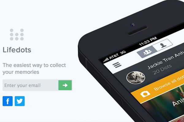
The page for Lifedots is similar but with a different purpose. There is no detailed information or external links to other profiles. The goal here is to get people interested in the idea of their product, so as to sign up for email notifications. One large preview screenshot along with a flat signup form brings minimalism to this oversized landing page.

Product Designs

Big or small you will want to display some products on the page itself. Unless you are still in early beta stages and do not have anything to show – but in this case at least put up some recognizable branding. Icons or vector characters will go a long way towards brand recognition.

team treehouse homepage illustration learning startup

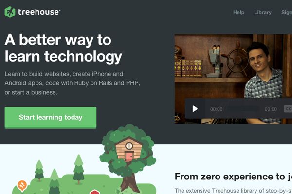
The website for Treehouse is fantastic because it displays many of the natural product features in an easy-to-understand design. There are screenshots and video players explaining what somebody could learn by studying at Treehouse. Also of the small icons littered throughout the page add to this natural earthy design. It draws you in right from the get-go.

Blog/Magazine Articles

Many Internet marketers do not even consider blog pages as single landing pages. But when going out to market your blog online it is common to share links which lead back directly to the blog article. People have certain expectations of blogs online and what type of content should be found in the post.

You can design blogs to look more like online magazines if you have enough content. This design strategy often keeps people hooked to the website for longer periods of time because it appears more professional. Also you can include widgets for related posts that readers may also click onto and read. When done properly, your blog articles may behave as landing pages which advertise your entire website full of related content.

the verge magazine website article page design

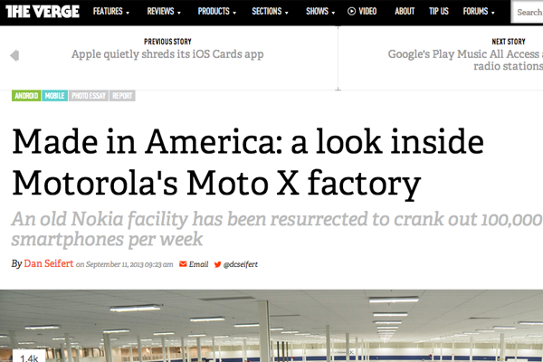
Articles on The Verge provide an excellent demo of these traits. It is never a good idea to overwhelm your audience with too many distracting widgets. But similar content and related suggestions are often welcome as long as they don’t overlap within the article content itself.

Listing Dynamic Features

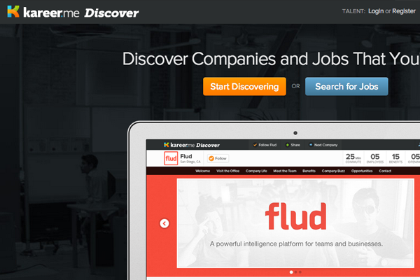
When looking back to individual product pages it is worth discussing features and how your visitors will see them. Small lists including icons or screenshots will help readers to digest your info quicker. You want visitors to keep moving throughout the page without getting lost. Kareer does a good job at using annotated captions which animate onto the page.

kareer me homepage landing website layout

Granted you do not need anything fancy to grab attention. Not everybody will be interested in your product so it’s really about catering to the audience who would sign up and get on board. Living in the modern world of CSS3 and jQuery animation can be your friend. Don’t be afraid to push boundaries and try out new UI/UX techniques which other people aren’t trying yet.

Place yourself into the seat as a visitor and look at each page with a critical eye. Think about what kind of information you would want to know as a potential customer. Why should anyone want to pay or use your service? What specific value do you provide that other competitors may not provide(or not provide well)? Keep asking the right questions and you will eventually write a high-quality list of features that gets people digging deeper into your landing page.

Single-Page Layouts

Possibly one of the most common forms of landing page design focuses on a single page. Aside from blog posts you may want to push a single product or service to clients who would need this done. Single-page websites allow visitors to quickly consume what you are offering and decide for themselves if they could use the service.

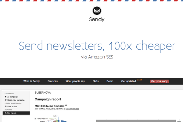
sendy email startup homepage website layout minimal inspiration

For example Sendy has a great single-page design which is focused around e-mail newsletters. You immediately find a whole bunch of screenshots and stats explaining how they work and what you get for signing up. What I really like towards the bottom of the page is a small FAQ section for newcomers. This is a good way to introduce confused visitors to your product while explaining things in “normal” language.

Many other example websites in this article are built using single page layouts. Keep this in mind when developing a landing page for any product. You want to provide just enough information to get people hooked, but not so much as to drive them away in boredom or restlessness.

Closing

I hope these tips will prove useful to some designers getting started with Internet marketing. When you study the numbers it will become clear which pages are drawing the most attention for the longest time. Bounce rates and user exits are also statistics worth analyzing. Stay alert for newer landing page trends and keep practicing your own ideas. Eventually you will find the right solution and learn more about website UI design in the process.

Read More at How To Create Informative Landing Pages that Stick

Categories: Designing, Others Tags:

Those Words Again

September 27th, 2015 No comments

It’s interesting to see how many people over time have come to the conclusion that certain seemingly-harmless words can be problematic while communicating:

A good message to keep spreading.


Those Words Again is a post from CSS-Tricks

Categories: Designing, Others Tags:

Back to the :roots

September 27th, 2015 No comments

simurai:

I’ll try to show a few ways how you can make the cascade be your friend and maybe reduce the need of overriding and thus encounter less fighting with specificity.

Direct Link to ArticlePermalink


Back to the :roots is a post from CSS-Tricks

Categories: Designing, Others Tags:

Popular design news of the week: September 21, 2015 – September 27, 2015

September 27th, 2015 No comments

Every week users submit a lot of interesting stuff on our sister site Webdesigner News, highlighting great content from around the web that can be of interest to web designers.

The best way to keep track of all the great stories and news being posted is simply to check out the Webdesigner News site, however, in case you missed some here’s a quick and useful compilation of the most popular designer news that we curated from the past week.

Note that this is only a very small selection of the links that were posted, so don’t miss out and subscribe to our newsletter and follow the site daily for all the news.

CSS Frontend Frameworks: The Best 10 for Modern Web Design

How to Be a Badass Front-end Developer

How to do Knockout Text

Web Design is Now Completely Boring

Apple Subtly Rickrolled Everyone and It’s Hilarious

10 Tips to Design your Email Signature

Infographic: Stereotypes in Design

Wanted: A Designer that Can Design and Write Code? Really?

Google Fortunetelling – Predict your Future

The Lost Apple Logos You’ve Never Seen

Yes, this GIF Takes 1,000 Years to Loop

Stylesheets: Commnunity Generated Collection of the Best CSS Resources

This Guy Made his Million Selling his Last Name. Now He Wants to Sell You his Future

The Hidden Meanings Behind 50 of the World’s Most Recognizable Logos

Foundation 6: Leaner, Meaner and Cleaner Sass

How to Build an App That’s as Addictive as Coffee

Meet Opera’s New Brand Identity

The Apple Bias is Real

Introducing 360 Video on Facebook

Facebook Patent Reveals What its ’empathy’ Button Might Look like

What has Flash Ever Done for Us? Quite a Lot, Actually.

Open NASA – NASA Data, Tools and Resources

Facebook M’s Bet and the Future of Web Interfaces

A Look Inside Design at Facebook

Ad Blocking Irony

Want more? No problem! Keep track of top design news from around the web with Webdesigner News.

LAST DAY: Snackbar Script – A Superfamily of 18 Delicious Fonts – $24!

Source

Categories: Designing, Others Tags:

Creating a Visually Consistent UI Design – Key Tips & How To use Them

September 27th, 2015 No comments
00-featured-visual-consistency

To build a conveniently interactive application or website, you’ll have to create a noticeably usable UI.

The UI of a product (app or site) is crucial. It’s powerful enough to create a positive or negative perception from the very first appearance.

A smooth and consistent UI allows visitors to seamlessly navigate through your site; whereas an inconsistent interface will make a chaotic layout that will surely annoy visitors and ultimately force them to abandon the product.

A surefire UI design is the best approach to guide visitors to efficiently access the design, and easily seek the information they need.

visual consistency UI design

An interactive, intuitive, and impressive interface may be construed as good UI design. By endeavoring for a visually consistent interface you’ll garner much success among visitors.

What Does Visual Consistency Mean?

By making consistent use of visual design elements including color, typography, and layout, you can ensure a smooth flow of actions. This will eventually help visitors to navigate through the design with flair and conveniently accomplish their task.

So it can be said that consistency is one major key to a successful design.

Along with consistent use of elements, it’s also essential to consistently position visual elements. If an icon (let’s say search bar) is at the top right corner of a page, it must remain in that same position for the entire layout.

How To Make Visually Consistent UIs

There are several factors upon which one can focus to deliver a consistent interface design.

I’ll break down each point in the following sections along with some brief examples.

1. Distinct and Consistent Typography

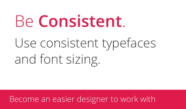
consistent type example

Typography is a crucial visual element which always makes a first impression. It’s required to be handled with utmost precision.

You might wonder how one would create a distinct and consistent typographic experience. Well to create consistency in typography one needs to focus upon the typefaces, text styles, sizes, and colors.

The heading, and most importantly the body, must remain true to themselves. Paragraphs should look different than headings, but similar to other paragraphs.

Using too many unfamiliar font can lead to poorly-styled text, which brings illegibility into account.

It’s advisable to write clear messages that can help users to easily access your product. Stick to a few fonts and keep them readable.

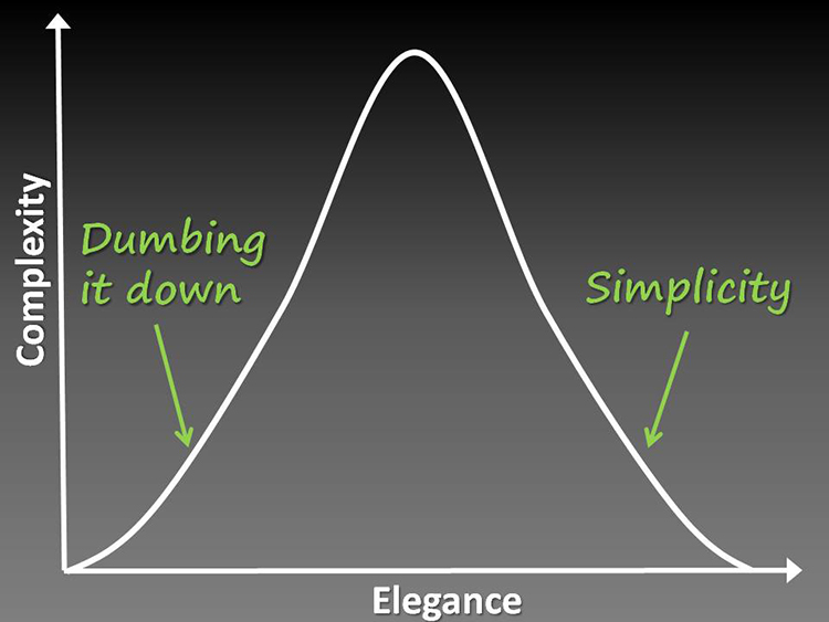
2. Keep it Simple!

keep it simple chart graph

It can’t be denied that a bulkier interface will unnecessarily add to the design complexity.

Keeping things simple by using consistent UI elements can dramatically improve the usability of a product. One must keep the user expectations in mind while designing the interface. Both internal and external experiences of users should be considered.

This will help you deliver a design that your viewers are already familiar with. It must be ensured that while creating a sense of familiarity, make sure that your interface design appears fresh and appealing to viewers.

You can also control the flow of the interface and make it appear more apparent by offering only a few numbers of choices.

This can be accomplished by making your content expandable and collapsible. It’ll allow users to explore the content only as needed.

3. Offer a Visual Treatment

The visual treatment may vary from one product to another. But it’s vital to ensure all visitors get the same visual treatment throughout the product.

You can choose a visual language of your choice and embrace it wholeheartedly. This will create a professional impression and give visitors a sense of security.

For the ultimate consistent visual treatment you must ensure consistency among all UI elements. This means all related components must display in a similar way.

For instance, if you’re showcasing your services, all the services should be represented in the same fashion (size, color, language, layout, etc). If one is enclosed in a circle, other services should look very similar as if they’re all part of a group.

Let’s consider an example: The homepage of Appsted represents various development services that it offers. It can be noticed that all the services are displayed in a consistent manner.

Final Thoughts

Embracing visual consistency in interface design can definitely heighten the overall look and feel of your work. In fact, it can also curtail your maintenance and development costs.

With consistent design techniques you’ll generate a marvelous user experience, which causes more visitors to interact with the design for longer periods of time. Take the aforementioned tips into account; these key tips will help you deliver stunning and highly usable UIs over and over again.

Author: Addison Cohen is a mobile app developer working with Appsted Ltd, the leading mobile application development company which delivers comprehensive mobile app solutions. He loves sharing the latest information about mobile technologies like iOS, Android, and development processes.

Read More at Creating a Visually Consistent UI Design – Key Tips & How To use Them

Categories: Designing, Others Tags:

Dummy SMTP Email Testing with Mailtrap

September 26th, 2015 No comments
00-featured-mailtrap-vector

Many web applications & social networks have features that are delivered via e-mail. While in development these features often require a testing sandbox of some kind. It is possible to set this up manually.

But a new service named Mailtrap offers these features by default.

You can sign up for a free account just to gauge the features with a single inbox. The goal is to test how your e-mails will be sent, how they behave, and how they look on the user’s end.

The benefits allow developers to save costs & time setting up their own servers, or running through an existing SMTP/POP3 setup. But here are the primary benefits:

  • no need to tune your mail server
  • no need to clean up your database from the customers’ email addresses
  • no need to make any special tweaks in your application code
  • Can be used for both development and staging purposes

After sending a test e-mail you can log into Mailtrap’s web UI to see how it looks & functions. Then you can forward that same e-mail to other addresses, or pull it down via e-mail applications such as Thunderbird or Outlook.

There’s a bunch of information on the Mailtrap FAQ page which should answer most people’s questions.

If you’re more curious about the development side you’ll be happy to know Mailtrap has full API documentation accessible right from their website. TutsPlus actually published a brief introductory guide for setting up Mailtrap on a demo application.

To learn more visit the pricing page where you can sign up for a free account & test out everything Mailtrap has to offer.

Read More at Dummy SMTP Email Testing with Mailtrap

Categories: Designing, Others Tags: