Archive

Archive for September, 2015

Radial Circle Chart Generator for Apple Watch

September 25th, 2015 No comments
00-radial-charts

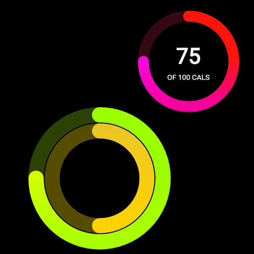
Anyone who’s familiar with the Apple Watch should know about the radial ring design. This was created as a way to display data on the very small Apple Watch screen.

It’s an easy thing to create if you know where to look – but thankfully Hitesh Maidasani just made it even easier.

He built an incredible radial chart generator hosted on GitHub completely for free! You simply enter the data statistics and colors that you need for the chart, and the web application handles everything else. The charts are exported as images which can be applied to Watch OS apps, or even onto other interfaces with a similar function.

Arcs can be set from single to triple with auto-darkened areas that don’t completely circle around. Very cool effect that practically nails down the Watch OS design style.

The abundance of GitHub development work has become truly astounding in this modern era. Never before have developers had access to so many incredible projects with completely free source code! It really brings to mind the idea of a whole new era of web design that’s slowly enveloping the old to make room for the new.

If you’re interested please take a look at the live project on GitHub and see what else you can build.

Read More at Radial Circle Chart Generator for Apple Watch

Categories: Designing, Others Tags:

Reference Imports in LESS (are kinda cool)

September 25th, 2015 No comments

You know how you can extend things in CSS preprocessors? (If not, you can learn about it here.) Sass can do it. LESS can do it. Stylus can do it. While it’s a feature you want to be careful with (see here and here), I find it pretty useful sometimes.

At a recent CodePen Meetup in Chicago, I heard Sam Allan do a quick presentation on LESS’ ability to do (reference) imports, which I had never seen before.

They look like this:

/* Normal import */
@import "colors-or-whatever.less";

/* Reference import */
@import (reference) "less-for-reference.less";

A normal import will grab the contents of that file and dump it into the file asking for it. Super useful. Concatenating files is a vitally important feature of preprocessors. A (reference) import doesn’t do that. In fact, it doesn’t put anything at all into the file asking for it. The code in that file is just now ready to use, either by calling a mixin within it or extending a selector within it.

That’s a pretty powerful concept. It means you could import an entire library but just use the bits and pieces you want.

Have you ever wanted to use a CSS framework or library but thought it was too much?

As in, a bunch of code that you don’t think you’ll ever use. Including the whole library seems like overkill, not to mention not ideal for performance. You could pick it apart yourself, but then that kinda wrecks the upgrade path.

With (reference) imports you can import whatever you want and then just extend the bits you want out of it. It might be weird, but you could import a bunch of libraries and just pick and choose parts, getting just the output you need.

Example

Say you really dig Pure CSS. Mattia Migliorini has a port of it in LESS. It’s full of good stuff, but it’s 33 KB and maybe you don’t need all of it.

Within it, there is a .pure-button class, Pure CSS’s take on the button. If you wanted to use it, you could do this:

@import (reference) "https://s3-us-west-2.amazonaws.com/s.cdpn.io/18728/pure.less";

.my-button {
  &:extend(.pure-button all);
}

And hey look, I can call my version whatever I want. And, if and when the library updates, I just update it. Assuming names didn’t change, I get the changes.

(The all keyword you see above means “extend all it’s nested stuff too” and that’s totally optional, which is another kinda awesome thing LESS extends can do.)

Here’s that demo:

See the Pen GpjzOj by Chris Coyier (@chriscoyier) on CodePen.

More

Again, credit to Sam Allan for showing this to me. He has more demos on the subject. Some of them he calls “Semantic Remapping” because he uses selectors he feels are more semantically appropriate than what the original library used.

See the Pen Semantic Remapping — Framework Centipede example by dehuszar (@dehuszar) on CodePen.


Reference Imports in LESS (are kinda cool) is a post from CSS-Tricks

Categories: Designing, Others Tags:

3 Things Everything Freelance Design Contract Must Have

September 25th, 2015 No comments
00-featured-contracts-freelancing

If you’re freelancing then you need a contract, full stop. If there’s only one thing you take away from this article, take that.

But read on to learn the basics of what each contract should include and why.

Freelancing without a contract is surprisingly common for new and experienced freelancers alike. Whether you don’t know how to create one or have been working with a client for a while and think it’s unnecessary, there are tons of excuses. But it doesn’t matter if it’s your first or fiftieth time working with a client – use a contract.

Contracts have the benefit of protecting you against bad clients and bad situations. But they also help set proper expectations with good clients.

Don’t think of a contract solely as a complicated legal document to help you if you get sued.

Think of contracts as a critical tool for building a strong client relationship. A contract should clearly define the client’s expectations of you and your expectations of them, as well as what happens in these various scenarios.

Remember, contracts don’t need to be hundreds of pages of unreadable legalese. At their core good contracts focus on three critical parts that we’ll go through here.

Scope of Work

What work are you going to do for the client? Detail matters here, and ambiguity is your enemy. You can describe what you’re going to do as “design a landing page for the client’s new product”, but the devil’s in the details.

Poorly defined scope of work is the most common cause of scope creep and missed guidelines, which arise from mismatched expectations.

Payment

This is probably a clause you should care about a lot. And you should! It’s strongly related to the scope of work. Like the scope of work, the devil’s in the details here and disagreements can arise when you’re not too clear about how much, how, and when you’ll be paid. Get these things explained clearly and in writing upfront.

One common gotcha, especially for larger companies, is their Net 30 or even Net 90 payments. This means they have 30 or 90 days to pay you after you submit an invoice. Remember that all parts of the contract are up for negotiation so if this is your only client and they expect Net 30+ terms, you can rearrange other terms. For example, ask for a certain payment upfront or say you won’t begin work on the next milestone until the previous milestone’s invoice was paid.

Intellectual Property

This is another very important part of your contract, and one that’s often glossed over because it can be confusing. Regardless of how small or large your work, make sure your IP ownership is spelled out clear. This means being crystal clear about who owns what at each step in the process of your work.

Generally speaking, when you begin working on something copyright belongs to whomever created the work (likely you). That means you have two options: you can transfer the IP to the client, or allow the client to use your work with a license. The standard does vary across industries and geographies, so talk to other freelancers to see what’s best for you.

Another important point related to payments: if you transfer IP ownership to the client, make sure it doesn’t transfer until your final invoice is paid. This not only provides them an incentive to pay you faster, but also gives you more leverage if they don’t pay you at all and use your work anyway. Believe me it happens!

Contracts should always be used for all freelance work, and they can be rather simple if done effectively. Think of them as tools to help maintain your relationship with clients by setting clear expectations.

Happy freelancing!

Read More at 3 Things Everything Freelance Design Contract Must Have

Categories: Designing, Others Tags:

12 e-commerce solutions for selling on mobile

September 25th, 2015 No comments

According to recent research published on Internet Retailer, mobile commerce now accounts for 30% of all U.S. e-commerce; and mobile commerce is expected to grow 2.58 times faster than total e-commerce sales in 2015. This is in line with data that shows that mobile internet usage has now exceeded PC usage, with mobile devices currently accounting for 50.3% of all e-commerce traffic.

If you sell online, or if you’re planning to sell online, going for an e-commerce tool that makes it easy for mobile users to navigate and perform transactions on your store is a no-brainer. The following free e-commerce tools make it extremely easy to sell on mobile devices:

1. PrestaShop

PrestaShop is open source e-commerce software with over 250,000 online store owners, and a community of 800,000 members.

PrestaShop is renowned for its mobile commerce feature, which boasts a built-in mobile optimized shopping cart, a smooth mobile shopping experience, and a responsive front and backend. They also offer integration with Shopgate, a solution that helps you create an iOS and Android app for your users, leading to a more seamless mobile experience.

You can either download Prestashop’s software and set it up for yourself, or you can use their cloud-hosted option. Prestashop also has over 5,000 modules and themes that give you full customization of your mobile store.

2. MobiCart

MobiCart is an innovative piece of e-commerce software that helps you turn your existing e-commerce store to a mobile commerce app.

Depending on your needs, MobiCart works on its own or it can be linked to your existing website. MobiCart can also be integrated with other popular shopping cart software, so you don’t have to tamper with your existing e-commerce structure to be able to use it.

MobiCart integrates with Paypal and Stripe amongst other payment processors to create a seamless checkout experience for your users.

3. Shopify

Shopify is a global leader when it comes to e-commerce, and they help you create an online store from scratch, or if you prefer, add a store to your existing site.

While Shopify has lots of features and addons, like 100+ themes, the ability to edit your store’s HTML and CSS, and a web-based website builder, one of their key differentiators is their mobile commerce support.

Whether it is about fulfilment of orders, managing inventory, or knowing when an order is submitted, Shopify makes the process of running a store on mobile seamless. They also offer a 14 day free trial.

4. X-Cart

X-Cart is a free, fully customizable open source e-commerce solution that gives you a full-blown e-commerce site upon installation.

X-Cart operates as a standalone solution, and it comes with a neat design, a shopping cart, and sample product sets that you can customize. Its smooth user interface and support for Ajax enhancements allows for one-page checkout and allows your users to drag products to the cart with a mouse.

X-Cart features a mobile admin that helps you manage your e-commerce business on mobile devices, and their integration with Shopgate makes it extremely easy to serve all forms of mobile users. You can accept payments via Paypal, and they make it easy to integrate with dozens of other payment processing services in their store.

5. SquareUp

Many of us are familiar with Square as a payment service and a revolutionary mobile payments system. What very few people know, however, is that Square also has an e-commerce store builder called SquareUp.

SquareUp is a customizable e-commerce store builder that makes it easy to sell on mobile; registration is free, and they take 2.7% of online sales you make.

6. WooCommerce

This list wouldn’t be complete without WooCommerce, and this is because, unlike all the other options listed, WooCommerce makes it extremely easy to run an e-commerce store on WordPress.

If you’d like to run an ecommerce store on your WordPress site and you’re worried about support for mobile, then worry no more…WooCommerce has been downloaded by almost 10 million people, and it reportedly powers over 30% of all online stores; WooCommerce has an iOS app that helps you know what’s going on with your store on your mobile, and you can easily download other WordPress plugins to enhance your WooCommerce mobile functionality.

7. CS-Cart

With over 35,000 stores created with it, CS-Cart is leading e-commerce software that helps you build an e-commerce store on your own server. Their software is fully customizable, and they have hundreds of add-ons and themes in their marketplace that you can use to supercharge your online store.

Besides offering integration with over 80 payment processors, a noteworthy feature of CS-Cart is its ability to customize your storefront in real time; just head over to your store and make the exact changes you want to see.

While CS-Cart isn’t as mobile friendly as the other options listed above, it makes it easy to integrate with Twigmo, a set of tools that makes ecommerce stores extremely mobile friendly for users and merchants, without tampering with your existing CS-Cart store.

8. AbanteCart

AbanteCart is an all-in-one, open source e-commerce solution. It is powered by HTML5 and jQuery, and optimized for PhpStorm IDE.

AbanteCart offers integration with Paypal, Authorize.net and other payment processors. It also integrates with USPS, UPS and other shipping services to make product delivery easy.

AbanteCart is mobile friendly, leveraging HTML5 technology, and boasts a responsive e-commerce store that can be accessed on all devices. AbanteCart is supported by a marketplace with various extensions to help you get more features for your e-commerce store, and it is completely free.

9. AspxCommerce

AspxCommerce is another piece of open source e-commerce software for creating online stores. Some of its key features are a KPI (Key Performance Indicator) module that helps you track your store growth, user personalization, and its in-built A/B testing system; it is a performance focused e-commerce solution, and makes it easy to track performance in your store.

AspxCommerce features responsive design from its central core that makes it easy to use your store across all devices, and that makes it easy to serve mobile users.

10. Quick.Cart

Another robust shopping cart and e-commerce store system, Quick.Cart boasts about the fact that it takes only 1 minute to install and set up their software.

Besides an easy to manage admin panel, mobile support and a programmer/web developer friendly system, Quick.Cart’s major selling point is that it is built for speed. No matter how big your store is, it is simple and fast.

11. Ecwid

Ecwid is complete e-commerce software that makes it easy to sell on websites, mobile phones, social sites and online marketplaces. They offer a mobile responsive design that automatically adapts to any device, including mobile devices.

Ecwid boasts over 800,000 users, and they offer seamless integration with your existing site in minutes.

12. NEO LMS

NEO LMS is a unique e-commerce service that focuses on helping users sell classes on their online store.

NEO LMS is a cloud-based platform, and some of its key features are gamification to motivate students of your classes, integration with leading payment processors like Authorize.net, Stripe, and Paypal for payments, and full customization to various parts of your store. It also supports over 20 languages, with automatic translation allowed for other languages.

Besides making it easy for mobile users to transact on your store, they also make it easy for you to access all their features on a mobile or tablet device.

9 Contract Templates for Creative Freelancers – only $37!

Source

Categories: Designing, Others Tags:

Cartoon: If Web Designers Were Pilots … [009]

September 25th, 2015 No comments

People working in the web design and development industry need to become thick-skinned over the years if they intend to survive long term. I am in this business since web design got invented in the early Nineties, and I sure know what I’m talking about when it comes to the hidden secrets of client communication. My remedy these days is laughing. I refuse to get angry anymore. Instead, I make fun of the situations that only a few years ago made me want to hire a professional killer. There are quite a few people out there who are only still alive for the fact I couldn’t afford to pay one. Nah, just joking. As making fun of it all is the healthiest way to cope with it, we decided to start a new cartoon series titled “If Web Designers Were” here at Noupe. This is part nine. Hope you enjoy it… If Web Designers Were Pilots Clients tend to approach a design project very differently from what you as a designer would expect. That relates to their perception of prices but stretches across many other aspects too. The one big common reasons aka problem behind the whole bunch of peculiarities […]

Categories: Others Tags:

Web Development Reading List #105

September 25th, 2015 No comments

What’s happening in the industry? What important techniques have emerged recently? What about new case studies, insights, techniques and tools? Our dear friend Anselm Hannemann is keeping track of everything in the web development reading list so you don’t have to. The result is a carefully collected list of articles that popped up over the last week and which might interest you. — Ed.

Firefox 41 is released.

Hey, fog and rain take over, temperatures are falling and the leaves of the trees are changing their colors. Sitting in front of a computer all day, reflecting how fast things change in nature, I can often see a similarity between our world of front-end development and things going on in the world.

The post Web Development Reading List #105 appeared first on Smashing Magazine.

Categories: Others Tags:

Why Performance Matters: The Perception Of Time

September 24th, 2015 No comments

Those of us who consider ourselves developers, including me, are very task-oriented. We like to be guided towards optimal results, and we find ourselves uncomfortable when there is no clear path to follow. That is why we all want to know how to do things; we like step-by-step tutorials and how-tos. However, such guidelines are based on certain theories, deep knowledge and experience.

Deconstructing Performance

For this reason, I will not provide you, the reader, with a structured answer to the question of how to make a website faster. Instead, I aim to provide you with the reasons and theories for why things function in certain way. I will use examples that are observable in the offline world and, using principles of psychology, research and analysis in psychophysics and neuroscience, I will try to answer some “Why?” questions.

The post Why Performance Matters: The Perception Of Time appeared first on Smashing Magazine.

Categories: Others Tags:

Tommy Hilfiger eCommerce Website: Trends & Analysis

September 24th, 2015 No comments
00-featured-tommy-hilfiger-homepage

Clothing & accessory brands traditionally earned profit from in-store sales. But in recent times we’ve seen a lot of transactions move from department stores & shopping malls onto the web.

This is why it’s crucial for every clothing manufacturer to offer some type of online shopping experience. Customers want to purchase goods but may not always find what they’re looking for on store shelves.

One great example of online shopping is the Tommy Hilfiger shop. Their website and store is rolled into one layout with an elegant design style. And while aesthetics are important, usability and UX design are the most important aspects of an eCommerce experience.

I’d like to delve into Tommy Hilfiger’s website to examine some of the trends used for their online eCommerce solution.

Inferred Usability

Perhaps the best aspect of Tommy’s layout is the accessibility of everything. Right from the first pageload you’re able to recognize everything from new products to sales and fashion trends.

The site is very easy to browse and all links offer a clear description of the products. Their navigation is also stylish but easy to use. Links are clean and straightforward. Hover effects are perceptible yet not overly flamboyant.

tommy hilfiger ecommerce shoppe

Since Tommy Hilfiger’s layout is so clean, it requires lots of graphics and typography to draw attention. Thankfully this layout has plenty of typography in spades. All the text is crisp, easy to read, and blends ever-so-carefully into the layout.

Also consider the website’s content structure and how that plays a role in the shopping experience. If you land on the page looking for scarves you can go to Accessories > Scarves & Hats.

tommy hilfiger items shopping grid

Everything is organized clearly so that browsing is almost effortless. This is the reason most people prefer to shop online because it makes browsing products much simpler than wandering around a store.

Spacious Room for Shopping

All items in the shop are organized on a grid system. This means items are displayed equidistant between each other, creating a level playing field for each product.

Your eyes naturally gravitate towards asymmetry or items that particularly stand out from the crowd. Tommy Hilfiger’s design is meant to bring attention toward all products.

tommy hilfiger checkout cart ui

Also the shopping card itself offers a stylish 2-column layout. The left column is much wider with a focus on the products themselves(items, quantity, etc).

The right column is where you’ll find a total for all products and can move on to checkout. Font choices help a lot while also integrating differences with colors.

Fonts, colors, and white space create a salubrious shopping experience for customers of all ages.

Live Product Previews

When viewing any product page you’re given the option to check out details in a quick modal popup window. This can save a lot of time instead of forcing you onto many different pages without reason.

The thumbnails act as selling points whereby you can check out small details, or view the whole product with reviews and features.

On the product page you’ll get to view a fullscreen zoom preview with the magnifying glass effect.

fullscreen modal window view

Also you can switch between product colors and they’ll update in real time. Dynamic effects always add to the shopping experience and bring about more trust in new customers who have never used the website before.

Interwoven Tommy Branding

It may not seem like branding plays a very big role, but when it comes to branded products you really want people to remember the company. A good name will always stick but it’ll be more sticky with a clean branding.

Tommy uses their typical red white & blue colors sporadically in the layout. One great example is their footer which turns dark blue with crisp white text.

footer typography branding hilfiger

Also the header stays fixed at the top no matter what page you’re on. This header includes the Tommy logo which offers a quick reference to the brand at all times.

Branding is like marketing which means it can be rather capricious. There is such a thing as “too much” branding and it’s not good. But too little branding isn’t useful, either.

Tommy does an excellent job of working their colors into the site without being patently obnoxious or excessive.

Closing Ideas

Anyone who’s looking for eCommerce design ideas should look no further than Tommy Hilfiger. This design is clean & easy to use without a boring or bland aesthetic. Finding this middle ground is tough, especially for very large eCommerce projects, but it is possible.

Read More at Tommy Hilfiger eCommerce Website: Trends & Analysis

Categories: Designing, Others Tags:

ArrrrCamp for Ruby Devs hits Belgium in October 2015

September 24th, 2015 No comments
00-arrrrcamp-ruby-rails-conf

Rails development is perhaps one of the best choices for building modern web applications. PHP is still a widely-accepted choice powering frameworks like WordPress – but Rails has grown into its own community with so much support and plenty of groundbreaking tools.

ArrrrCamp is a conference made specifically for Ruby programmers and Rails developers. In 2015 it’ll be hosted in Ghent, Belgium spanning the first two days of October.

The goal is to inspire developers to learn new things, meet new people, and simply build awesome products.

ArrrrCamp has a packed schedule for a two-day event. There are plenty of breaks for food and drinks, along with general networking to meet some really cool people.

While the event is held in Belgium you likely won’t need to master Dutch or German to get around. It’s a fairly open event with a laundry list of speakers from around Europe & the western world.

If you can’t make it this year but want to keep up on recent happenings you can check out the official ArrrrCamp Facebook page or follow their updates on Twitter @arrrrcamp.

Read More at ArrrrCamp for Ruby Devs hits Belgium in October 2015

Categories: Designing, Others Tags:

32 Examples of Clean Flat Web Design Mockups

September 24th, 2015 No comments
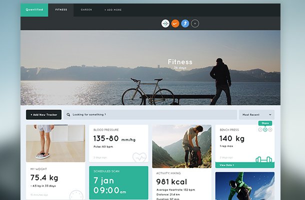
20-quantified-dashboard-fitness-layout.jpg

Flat design has seeped into the fabric of website design and mobile apps alike. Many popular interfaces are switching over to flat design because it’s simpler and easier to create. Some users prefer flat website layouts because they don’t use flashy graphics or distracting elements on a typically minimalist webpage design.

This gallery features 32 brilliant mockups created using flat interface pieces. If you’re thinking of designing a flat website yourself, this may be a good place to look for inspiration. Study the different types of interfaces and see how flat page elements will appear based on color scheme and the type of website. Generally speaking design should always serve content, but focusing a bit of time on aesthetics can provide a much more pleasurable user experience.

Dating Site Profile

Invoice Sherpa Tour

invoice sherpa tour webpage layout

Paypoint

paypoint flat website layout inspiration

Web Concept

simple flat icons website web concept

Loudfund

loudfund concept website fullscreen background

Photo & Video Page

photo and video website flat

The First Calendar Website

first calendar iphone app website

We Beat Traffic Tickets

wbtt we beat traffic tickets website

Instagram Redesign

instagram website flat layout redesign

Flat King

flat king single page bootstrap layout

Condo Communities Landing Page

condo communities landing webpage layout

TEDxWroclaw

tedx wroclaw event website layout

Client Portal

instant chemistry website portal flat

Startup Project

flat startup homepage website layout

Jan Cavan Website

jan cavan portfolio flat website

Flat Ecommerce Store

flat ecommerce website layout design

Gather V2 Event

gather event website flat design layout

code.IT

code it website flat layout

Life Dojo

life dojo landing page website layout

Quantified Dashboard

quantified dashboard fitness flat website layout

MyTrips

my trips website flat minimal layout

Shopping Centre

shopping centre website flat layout

Contact Page

stormfront website contact page responsive layout

Tru Music

tru music instrument store website layout

Social Feed

tokster social media feed website layout

E-pay Landing Page

epay flat landing page design

Treehouse Free Template

treehouse flat website template design freebie

Escape

escape single page freebie template

Marketing Company

flat website marketing company design

Hexactly

flat homepage dark hexactly inspiration

Sheltr Profile

sheltr social network profile webpage flat layout

Google Redesign

google search results flat redesign inspiration

Read More at 32 Examples of Clean Flat Web Design Mockups

Categories: Designing, Others Tags: