Archive

Archive for October, 2015

2015 – The Awkward Year For Drupal

October 31st, 2015 No comments
Drupal-Security-Breach

It’s been a long roller coaster ride for Drupal this year. It all started with one of the biggest security breaches in open source history, where millions of websites were compromised. Then, there was the rumored poor performance of DrupalCons. Cap this with the repeated postponement of Drupal 8 release and, on the outside, it appears that 2015 has not been a great year for Drupal. Despite all the misunderstanding and mishaps, we think Drupal is up for bigger things and even more growth. And here’s why.

The Big Security Breach

Sadly, 2015 found us in the thick of Drupalgeddon – A very big security breach. The issue was magnified by BBC’s incorrect reporting, stating that up to 12 million websites were under attack, but in reality there were less than a million Drupal sites online at the time. Even though content management systems (CMS) are widespread, Drupal only compromises about 5% of the total CMS websites on the internet. Nonetheless, the impact of the attack was so dire that Drupal deemed it to be their most critical attack.

The breach was caused by a vulnerability in the database, where hackers could take over the site and patch it. Basically, the breach let hackers create a custom PHP module, allowing them write files directly into a Drupal site. Drupal announced the vulnerability, released a patch fix and sent a message stating that all Drupal websites had 7 hours to update, else they’d be considered compromised.

It was a mess, both for Drupal as a business and websites running on the CMS.

But let’s review: There was an extremely critical vulnerability found. The Drupal Team went to work and quickly turned around a thorough fix. On top of that, with Drupal 8, PHP module dependencies have been removed to avoid such mishaps in the future. Thus, future sites need not worry about the security threats – Drupal 8 has fixed them.

Take home: Drupal had an error, fixed it and built a sustainable solution. If only all companies were so quick.

DrupalCons Attendance – Not Up To The Mark

With Drupal being an open source CMS, they rely on the success of DrupalCon to plan their yearly budget. Their budget was created based on their attendee forecast and, with Drupal 8 release almost at the finish line, the core committee was banking on much higher attendance. The events were focused on Drupal 8 tutorials and many guest speakers were flown in to entertain the enthusiastic Drupalistas and Drupalites.

Unfortunately, DrupalCon didn’t perform to their expectations. There was a lot of positive response regarding the interest in learning Drupal 8, but the number of people attending didn’t meet their projections. Many blamed it on the Drupal 8 release having been postponed so many times.

But, this scenario is also temporary. Indeed, Drupal just launched Drupal 8 Release Candidate 2! Based on conversations with other developers, the renewed interest in the platform will bring in more active contributors to the community in 2016. Also, we’ve had numerous customers reach out to us about Drupal 8. This drop in attendance: Just a blip on the Drupal growth radar.

Similarly, in 2015 the core Drupal Committee identified a lot of unknown opportunities. Regarding DrupalCon Latin America, they were surprised at the amount of interested Drupalistas attending, as they initially didn’t expect such a crowd. Even though they didn’t make tons of money, the community was genuinely surprised by the response. There are various other hidden treasures that Drupal is researching and analyzing. There will be more growth.

The Finances – It Always Comes Down To This

Numbers always speak louder than words. No matter how we try to portray the current scenario in rosy words and attractive images, finances show the real Drupal picture.

Drupal’s financial committee met mid-year to rework their entire budget, hoping to make amends for the failed forecasts. The result of the new financial plan was big level budget cuts, along with few people losing their jobs. It truly was a dark period for Drupal, as layoffs are one of the toughest decisions to make.

Before you start talking about the death of Drupal, these kinds of mishaps are bound to happen in a growing organization. The budget cuts were not because of the decline in Drupal, but rather a result of poor planning. This year, Drupal as an organization has ventured into new spends, such as advertising and job boards, where there wasn’t enough data to plan accurately. Similarly, since past DrupalCons indicated a higher attendance at DrupalCon Los Angeles, the drop in numbers was a big surprise.

But, Drupal is actively learning from this. For example, they conducted a community-wide survey to understand what attendees expect out of DrupalCons to plan future conferences. There was plenty of valuable data that was gathered and processed to make the future events more fun, as well as profitable.

Take home: These are natural (and probably good) growing pains that any organization has.

Do You Still Feel It’s An Awkward Year For Drupal?

While most might say yes, I feel it’s a rough patch that they’ve come across. However, based on our internal talks and discussions with customers, this will be a non-issue with the final release of Drupal 8.

Plus, I respect the Drupal community for knowing that the slow progress of Drupal 8 is affecting their business and reputation, but still are bound to make the product perfect before final release. They’re not going to release something that is sub-par. Most organizations would look at the business aspect and push the product out and then work on the defects later. If you’re an open source fan, then you should love that Drupal is sticking to their principles to give us a secured product.

Yes, it’s been a rough and awkward year for Drupal. But I think they’ve poised to come out on top. What do you think? Let us know in the comments below.

ABOUT THE AUTHOR:
Krithika is the Senior Content Writer at Drupal Partners. When she’s writing about open source trends, Drupal and Drupal e-Commerce Development, you can find her running behind her 3 year old son and on the quest to find the best carrot cake recipe (with cream cheese <3)! Follow her on Twitter @DrupalPartners.

Read More at 2015 – The Awkward Year For Drupal

Categories: Designing, Others Tags:

Got a Startup Idea? Send it onto @Request4Startup to get Featured

October 31st, 2015 No comments
startups-silicon-valley

Have you ever thought of something that would really improve your workflow, but you just don’t have the skills to make it?

Request for Startup is a service that brings all these ideas together into one curated feed. Twitter users can send an idea to @Request4Startup for a chance to be featured on the site.

Ideas can get voted on either from the site itself, or via faves/retweets on Twitter. The highest-voted ideas naturally rise to the top for extra visibility.

Then talented developers can check out the list and pick out cool ideas that seem worth building.

You can sort by newest ideas, currently trending ideas, and the top ideas of all-time. This gives everyone a chance to get noticed and (hopefully) see some cool stuff added into the world.

Check out the Request for Startup homepage to see recent ideas or sign up for the weekly newsletter.

Folks who want in on the action should fire out a tweet to @Request4Startup to see if their idea can get listed on the website.

Read More at Got a Startup Idea? Send it onto @Request4Startup to get Featured

Categories: Designing, Others Tags:

font: caption;

October 31st, 2015 No comments

Joe Richardson shared this little trick over on CodePen:

body {
   /* operating system font  */  
   font: caption;
}
  • If you’re on Ubuntu this will be the Ubuntu Font.
  • If you’re on Yosemite this will be Helvetica.
  • If you’re on El Capitan this will be San Francisco.
  • If you’re on Microsoft this will be Segoe UI.

Not entirely sure the support of this, but if it works for your needs it’s a lot easier than declaring them directly or sussing it out with JavaScript.

Direct Link to ArticlePermalink


font: caption; is a post from CSS-Tricks

Categories: Designing, Others Tags:

Listify Converts Plain Text Lists into HTML Syntax

October 31st, 2015 No comments
unordered

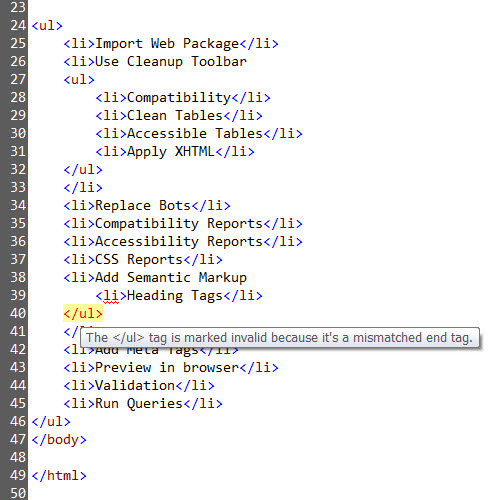
HTML preprocessors like Haml make coding items a breeze. However the hard-coding aspect of HTML is never fun – it’s not hard but rather mundane and monotonous.

While a webapp can’t automate the whole process, Listify can help when building HTML lists.

You simply input a raw text list of items and choose an ordered/unordered list format. You’ll also be able to specify if each list item should have an ID or various classes. You can choose spacing counts for indentations along with many other similar settings.

The Listify webapp is actually hosted for free on a GitHub project page. Anyone is free to fork the Listify repo or download a full copy for their local web server.

If you want to try it out just visit the Listify page and give it all you’ve got.

While it is rather simple, it’s also an incredible piece of automation for frontend developers who constantly find themselves transcribing Word documents into HTML.

Read More at Listify Converts Plain Text Lists into HTML Syntax

Categories: Designing, Others Tags:

Comics of the week #311

October 31st, 2015 No comments

Every week we feature a set of comics created exclusively for WDD.

The content revolves around web design, blogging and funny situations that we encounter in our daily lives as designers.

These great cartoons are created by Jerry King, an award-winning cartoonist who’s one of the most published, prolific and versatile cartoonists in the world today.

So for a few moments, take a break from your daily routine, have a laugh and enjoy these funny cartoons.

Feel free to leave your comments and suggestions below as well as any related stories of your own…

Some upgrades aren’t free

Why can’t you make chicken salad out of this?

Day and night

Can you relate to these situations? Please share your funny stories and comments below…

Mobile Design Book of 21 Topics, 40+ Apps Explored – only $9!

Source

Categories: Designing, Others Tags:

Desktop Wallpaper Calendars: November 2015

October 31st, 2015 No comments

We all love a good wallpaper to polish up our desktops. So to provide you with fresh artwork on a regular basis, we embarked on our desktop wallpaper mission seven years ago. Each month we challenge you, the design community, to get your creative juices flowing and produce some interesting, beautiful and creative wallpapers. And, well, it wasn’t any different this time around.

Desktop Wallpaper Calendars: November 2015

Just like every month, designers and artists from across the globe challenged their artistic abilities and contributed their designs. The result is a collection of desktop wallpapers that are a little more distinctive than the usual crowd. All of them come in a version with and without a calendar and are free to download. A big thank-you to everyone who shared their artwork! Which one will make it to your November desktop?

The post Desktop Wallpaper Calendars: November 2015 appeared first on Smashing Magazine.

Categories: Others Tags:

Font Combiner can Reformat TTF/OTF files for the Web

October 30th, 2015 No comments
fontcom

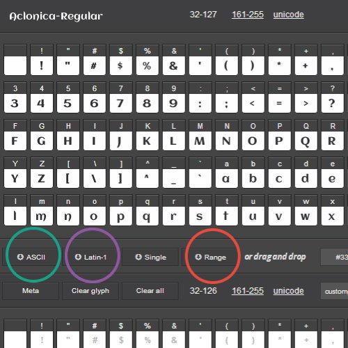
Font Combiner is a free web tool used to customize, reuporpose, and publish fonts to get them ready for use on the web.

Users have access to 100+ different free web fonts that are ready for customization. All you have to do is set your own parameters and publish the font files. Each creation will export all the necessary items for including within a CSS file.

Here’s a brief snippet from the Font Combiner website:

All fonts offered as sources are free and open license. Simply apply as many or as few glyphs as you require and generate a brand new custom font.

A versatile web font creator and font improvement tool exposing advanced font features to the end user – kerning, subsetting, various hinting options and custom font glyph combinations.

Free to use, with an ethical subscription service for advanced users allowing the upload of any TTF or OTF font for use with the same system (license permitting).

This can be an excellent choice for anyone who wants to craft their own webfonts without any worry of licencing issues.

To learn more & try it out just visit the app homepage or follow the latest updates on Twitter @FontCombiner.

Read More at Font Combiner can Reformat TTF/OTF files for the Web

Categories: Designing, Others Tags:

DSGN JBS is your Dashboard for New Design Job Openings

October 30th, 2015 No comments
dsgn-jbs-design

There are dozens of great websites to check for new web design jobs. Unfortunately this can be tedious, and tedium breeds mediocrity.

Instead of checking out a dozen websites you can just visit DSGN JBS. This is an automated curation of new design jobs as they’re posted all over the web.

The feed pulls from large job boards like Dribbble, Authentic Jobs, Behance, Designer News, and more. The site is updated daily with fresh jobs both freelance & full-time.

Each job listing includes the location & title while linking out to the original source. DSGN JBS is not exactly a job board in itself, but rather a collection of openings from the best boards online.

However DSGN JBS has a new listing feature where companies can post a job listing for 30 days exclusively on the DSGN JBS website. This is a great way to bring exposure along with the many other services online.

If you want to learn more visit the DSGN JBS homepage. You can also get a feed of new jobs by following the official Twitter account @dsgnjbs.

Read More at DSGN JBS is your Dashboard for New Design Job Openings

Categories: Designing, Others Tags:

GOTO Berlin 2015 Coneference runs from December 2nd-4th

October 30th, 2015 No comments
goto-conf

The GOTO Berlin conference is a yearly event held all around the world. It’s a place for like-minded folks to gather and share ideas between software developers, engineers, architects, and project managers.

Folks who plan on attending the GOTO Berlin event in 2015 should order their tickets ASAP. While it is a big event it’s also limited to 3 days and tickets will likely sell out fast.

GOTO runs from December 2nd-4th with a split between workshops and presentations. December 2nd is a full workshop day with topics like software analytics and graphing programs.

The 3rd & 4th have more presentations and periods for chatting with other atendees. Take a look at the full schedule to get an idea of the topics being presented.

Those who won’t be able to make it can always stay up-to-date with social posts on Twitter @GOTOber.

Or you can always check out past videos from the GOTO Berlin 2014 conf in a free YouTube playlist.

Read More at GOTO Berlin 2015 Coneference runs from December 2nd-4th

Categories: Designing, Others Tags:

Noupe Site Check: Bloomberg

October 30th, 2015 No comments

News portals don’t always seem to be receptive to contemporary design and the use of new technologies such as HTML5 or CSS3. Often, a fixed layout is used, only supporting the vintage banner advertisement. A notable exception is the website of the US-American news portal Bloomberg, which is internationally known for its economic news.

Responsive Layout and Clear Navigation

While many news websites have different versions for mobile and desktop users, Bloomberg uses only one responsive design. On the desktop, the clearly organized navigation is placed in the header. This is also true for menus. On the top of the page, there is a slim black bar that contains links to the company, its products and more. Below that, there is a larger area containing the actual navigation. Using few links, the user can quickly access the portal’s main areas as well as the search functionality. A layer that shows additional links and teasers to recent articles, sensitive to the where the visitor just is, pops up on mouse-over.

bloomberg_startseite_navigation
Unfolded Navigation

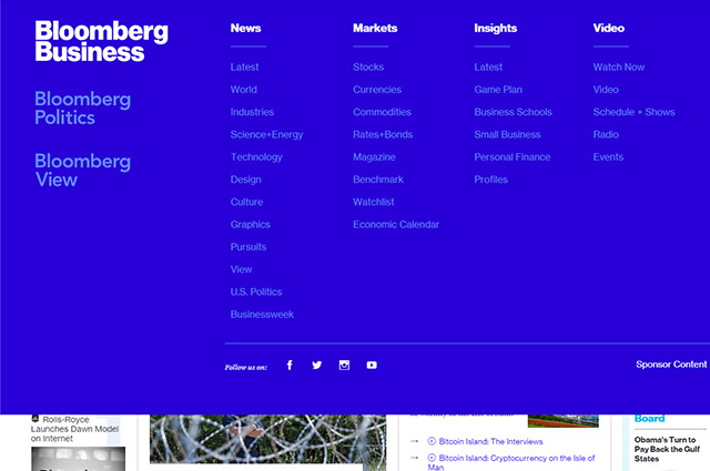
An arrow button shows you the detailed navigation pop-up. It allows you to directly access sub-pages of the respective main areas. The navigation also contains links to the other news pages „Politics“ and „View“. Bloomberg’s navigation bridges the large gap between clarity and detail.

If needed, the navigation can simply be expanded. This way, the user does not instantly get confronted with a plethora of menu options and links and can access different content very comfortably.

On the mobile version, the navigation is restricted to the arrow button and the search box, so that the mobile navigation is very clear as well.

bloomberg_startseite_mobil
Mobile View With and Without Unfolded Navigation

What is also nice is that Bloomberg forgoes an overloaded footer. This role model of a footer only contains a few links.

Multi Columns that Self-adjust

One thing that Bloomberg has in common with many other news portals is multiple columns. In the desktop view, there are four columns with the content distributed over them. The two slimmer outer columns are used for top news, comments and opinions. In the two wider columns, there are teasers to other articles. As the left column is significantly longer than the other three, JavaScript makes sure that the left column is moving faster than the others when scrolling. This way, there is no unappealing space below the other columns.

bloomberg_startseite_mehrspaltigkeit
Different Number of Columns – Depending on Available Screen Real Estate

The number of columns shrinks with slimmer representation. First, the right column disappears and with even narrower representation, the left one disappears as well. In mobile view, there is only one column remaining. As it should be on a proper responsive layout, the columns don’t just disappear but are reintegrated at the bottom of the remaining columns.

As the areas for top news, comments and opinions are distinct in colours anyway, they can also be easily integrated into the remaining columns and still remain separate from the article teasers.

HTML5 and CSS3 – but Flash-Videos

The source text and the use of HTML5 and CSS3 are also exemplary for the most part. Besides the „“ element, certain elements are marked up with the „

“ element. Teaser and articles are enclosed via „

“ elements. Only the navigation is not enclosed with the fitting „

Categories: Others Tags: