Archive

Archive for October, 2015

Live CSS Editor offers Instant CSS Manipulation In-Browser

October 30th, 2015 No comments
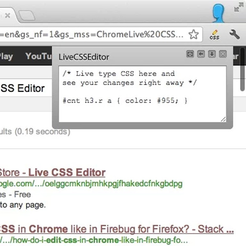
live-css-editor

While many browsers have developer tools, most of then work within complex containers and have lots of excessive unused tools.

Live CSS Editor is much like the Chrome Dev Tools editor, however it updates automatically with each change. You can manipulate anything in the CSS with just a few keystrokes and they changes appear in real time.

The window itself is resizable and can be positioned anywhere you like. There’s also a brief config menu which allows you to change settings and a keyboard shortcut.

You can find the source code hosted for free on GitHub for pull requests and forking your own features. Live CSS Editor is open source and will remain this way for the entirety of its life cycle.

The GitHub repo holds all of the source files but you can install Live CSS Editor directly from the Chrome Web Store. Safari users will find an extension file link in the GitHub repo for installation.

Also you can stay up-to-date with the latest info by following the official Twitter account @livecsseditor.

And if you want to see it in action check out this 2 minute intro video.

Read More at Live CSS Editor offers Instant CSS Manipulation In-Browser

Categories: Designing, Others Tags:

Background Image Shapes

October 30th, 2015 No comments

The following is a guest post by Joe Markevicius. Joe had a particular design he needed to implement for the BFI’s Britain on Film website. Like a true front end developer, Joe considered the requirements and went through many different options to find the best approach. He’ll take us through that journey here. I don’t know about you but I love this kind of thing.

In July this year BFI’s Britain on Film launched to widespread acclaim. An archive of historical footage like no other, Britain on Film invites viewers to take a journey through British history.

One of the key features the team at Ostmodern had to design and build for this product was a landing page which invited users to explore the archive, discovering content by time, subject and location. A core component of this landing page is an animated module of content suggestions, each depicting a still images of films from the archive.

Here’s a video showing the final result:

The brief for the project made clear that this task needed to be split into manageable chunks and had to account for the following restrictions:

  • CMS Managed Images – The people who manage content on the BFI team upload images with predefined dimensions. That image is then allocated to one of the three containers: left, top or right.
  • Responsiveness – Not only does the container need to be resizable horizontally, but as it gets narrower it needs to take up less height as well.
  • Animations – The images don’t immediately change but fade to the next one.
  • Browser Support – It should work as far back as it can and fall back gracefully.
  • Semantics – Use HTML and CSS, not Flash or anything crazy like that.

We will be looking into combinations of the above restrictions. As I have spent a reasonable amount of time researching for the best approach to this task, I thought it would be very useful to share my findings, approach and, obviously, the final result.

This is a Sketch wireframe of the layout we need:

All three sections here need to have images as backgrounds.

We’ll go through a number of techniques. The final one is the version that made it into production.

  1. CSS transform on divs
  2. CSS clip-path
  3. SVG
  4. SVG +

Attempt #1: CSS Transforms

This one is the first that came to my mind. An image container with a set width/height, position relative and overflow hidden. Two rectangles within, position them absolutely, transform rotate – all magic numbers. See my quick Sketch mock-up:

The biggest issue here is getting the rotation degree right. Setting the correct over-sized width and height of each of the shapes, positioning of the elements outside of the boundaries of the main container. All achievable, but very boring and dirty. If you were going to go this route, perhaps a good way to get it done is export the mockup from like I have above as a flat image and set it as the background image of the page, then start positioning and tweaking the elements in DevTools until you get it right.

There’s a big problem though. Say you put images in these containers (like with background-image). Those images are also rotated which is not what we want. It’s not impossible to fix. You could use the pseudo elements on them and rotate them in the reverse direction, but believe me, it gets very tricky, especially when you start dealing with media queries.

Pros

  • Comfortable tech: some rotated and positioned divs

Cons

  • A lot of calculation and measuring
  • Responsive breakpoints are difficult to pull off

This option is clearly a no-go.

Attempt #2: CSS clip-path

CSS clip-path came to mind as one of those “I’ve heard of it, but never used it” things. Clippy, the tool by Bennett Feely, makes it look very easy and straightforward.

This is probably the most clean, straightforward, and most definitely my favourite option.

Pros

  • Easy to create and modify
  • Clean code

Cons

  • No IE support, which is a requirement for this project

Sadly, the cons knocked it out of the game. Here’s a demo of how it works anyway:

See the Pen LpbzRa by Joe (@jmarkevicius) on CodePen.

Attempt #3: SVG

I had to do quite a bit of research to figure out what I was doing here and get to the desired result. My SVG exports from Sketch were a bit confusing and seemed to include a lot of junk. I had to experiment quite a bit and I found understanding viewBox and preserveAspectRatio pretty key. Here are some resources to help that understanding:

Pros

  • Wide browser support (IE 9+, Firefox 41+)

Cons

  • A bit of a disappointment after CSS clip-path
  • Firefox has got a bug in versions

Example of a croppable image as the background in various SVG shapes:

See the Pen SVG Pattern playground by Aleksey (@bonflash) on CodePen.

Attempt #4: SVG +

This option came about as a workaround for the Firefox bug described in the last attempt. It applies the images through the normal SVG tag, then applies a clip-path to them built from the necessary s.

See the Pen jPgmWG by Joe (@jmarkevicius) on CodePen.

This is the example that made it into production due to its wide browser support.

Throw in some fancy transitions, layer some more elements on top and voilà – Britain on Film landing page on BFI Player is ready to go.

Let me know your thoughts in the comments!

Additional Resources


Background Image Shapes is a post from CSS-Tricks

Categories: Designing, Others Tags:

Fresh SVG Talks

October 30th, 2015 No comments

I’m just back from CSS Dev Conf (Dave and I wrapped it up over on ShopTalk) and it was a pleasant surprise for me to have seen four (!) SVG talks back-to-back on the first day. Just a little confirmation SVG is a hot topic these days. Anytime anyone asked the room who was using SVG, nearly every hand in the room went up. Here’s the presentations:

  1. Sara Soueidan (@SaraSoueidan): SVG For Web Designers (and Developers)
  2. Brenda Storer (@brendamarienyc): Cracking the SVG Code
  3. Brenna O’Brien (@brnnbrn): Creative Typography with SVG & Collection
  4. Sarah Drasner (@sarah_edo): Designing Complex Animations

Lots of SVG content around here as well, including my own recent talk, exploring the “SVG” tag, and the comprehensive course on The Lodge “Everything You Need To Know About SVG”.


Fresh SVG Talks is a post from CSS-Tricks

Categories: Designing, Others Tags:

HIVE: Magazine-Style WordPress Theme for Publishers of Any Kind

October 30th, 2015 No comments
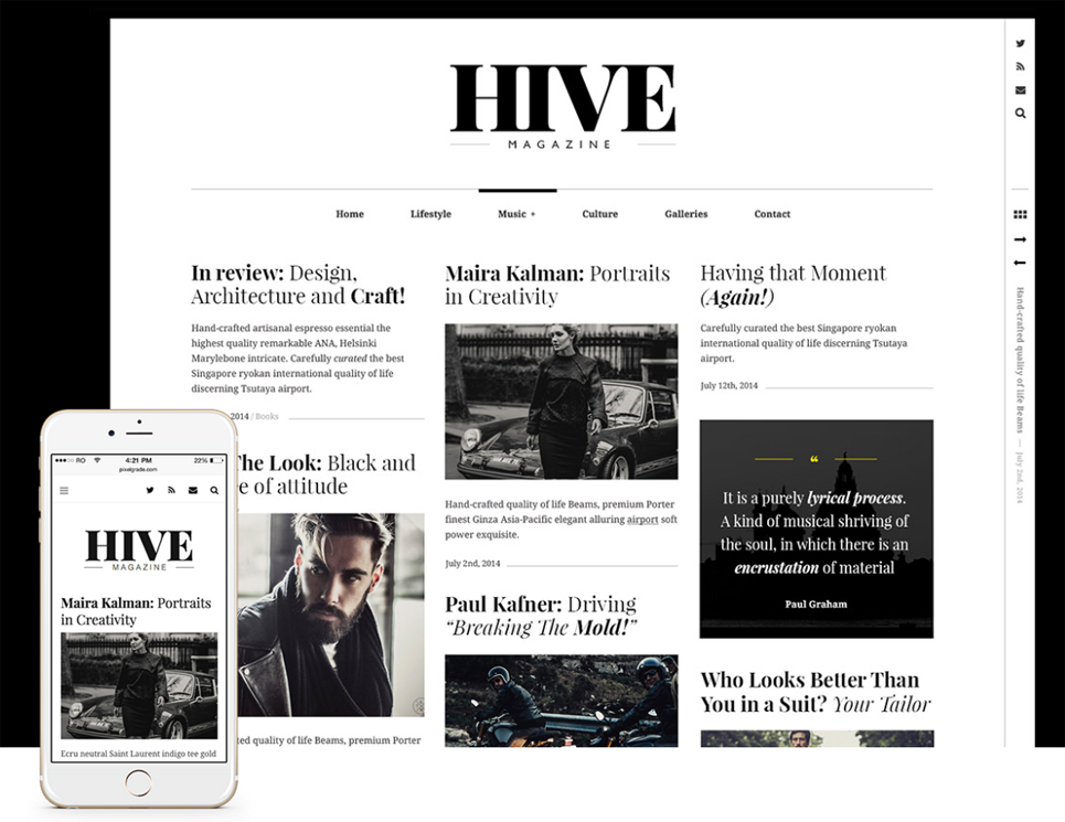
1-hive-magazine-wordpress-theme

Hive is a WordPress theme with magazine-style layout and minimalistic design, which makes it perfect for publishers of any kind. With black and white photos the theme looks exactly like an old-fashion newspaper.

1-hive-magazine-wordpress-theme

It will be perfect for those who is going to create a blog to share thoughts, or those who are going to create a website for big magazine.

Mobile-Ready

The perfectly spaced design of Hive will make your content look amazing – no matter what screen or device you’re using. Hive is completely flexible and mobile-ready theme.

Posts Customization

Hive has various post types to choose from. It means that you can customize each post you publish and get your messages stand out.

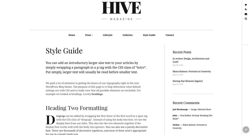
2-hive-magazine-wordpress-theme

There is a floating toolbar on the right side which can be changed with ease: just add your own social media links there.

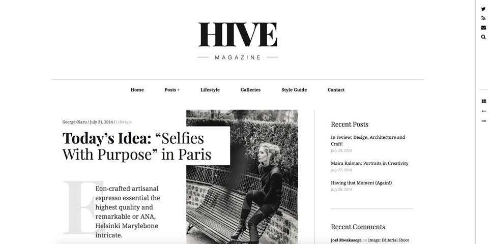
Moreover, HIVE offers adaptive titles which emphasize your headline with custom typography elements, such as dropcaps, highlights, and columns.

No Limit Fantasy

There are also unlimited customization options which allows you personalize the theme as you like: change colors, fonts, styles and more. You don’t need coding skills or a developer to personalize your website with Hive.

3-hive-magazine-wordpress-theme

Social Icons

While managing a blog, it’s critically important to make sure your readers can share and like your content with ease.

Just add your links to Twitter, facebook, Instagram and social media buttons will appear on the site.

Choose Your Language

HIVE supports any language, so the theme is ready to be translated into any language you choose. One the theme is installed, you get Spanish, French, Portuguese, Dutch, Norwegian, and Turkish.

Customer Support

If you’re unhappy with your Hive theme for any reason, or if something goes wrong, feel free to get in touch with Hive WordPress theme creators. They’ll take care of you.

Do you like Hive Magazine? Please, let us know in the comments.

Read More at HIVE: Magazine-Style WordPress Theme for Publishers of Any Kind

Categories: Designing, Others Tags:

Enjoy CSS Generates Custom & Valid CSS3 Code

October 30th, 2015 No comments
enjoycss

One of the fastest time saving techniques for web development is to reuse code. Naturally this may come in the form of snippets saved locally to your computer. But it may also come in the form of code generators like Enjoy CSS.

This free webapp creates valid CSS3 code for many common features like gradients, shadows, and even transitions.

Everything works within a GUI running in your browser window so it can function on any computer with Internet access.

The app not only acts as a code generator, but also a library of previously-created items.

You can browse through custom codes for text effects, buttons, repeating patterns and so much more.

Enjoy CSS3 is more like a community for building repeatable code snippets for web development. If you want to save your creations you can sign up for free and keep all your snippets in a user account.

But it’s just as simple create your CSS anonymously as well.

Take a look at the webapp and see if you could put it to good use. Also you can stay on top of news & updates by following the Twitter account @enjoycss.

Read More at Enjoy CSS Generates Custom & Valid CSS3 Code

Categories: Designing, Others Tags:

Echo JS is a User-Voted JavaScript News Community

October 30th, 2015 No comments
jsnews

First there were social sites like Digg and Reddit covering all topics of user-powered news.

Then niche websites popped up like Hacker News and Designer News. This has paved the way for smaller communities to spring up with a focus on certain news topics.

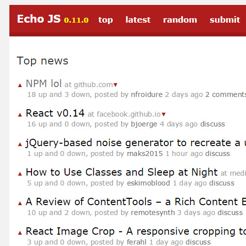
Echo JS is a social community with a direct focus on JavaScript & frontend webdev news. Topics are submitted by the community and the ones with the most votes hit the front page.

Registration is free and your account privileges are granted immediately, unlike similar sites like Designer News.

News can be sorted by top voted, newest submissions, and even random if you’re feeling daring.

Echo JS runs on top of Lamer News which is a Ruby-based Hacker News clone script. This makes it completely open source and easy to manage.

Top news stories from the homepage are also posted on the official Twitter account @echojs. If you’re a big fan of JS then be sure to check it out and sign up to join the community.

Read More at Echo JS is a User-Voted JavaScript News Community

Categories: Designing, Others Tags:

How to use balance in web design

October 30th, 2015 No comments

Achieving balance in web design takes some thinking, effort and skill, but it’s absolutely worth it. The great thing about balance, which can be applied to the broader category of design as a whole, is that it keeps what you create from being an excessive, overloaded mess that fails to serve the user experience. In other words, balance in web design makes sure that you as a designer just hit that sweet spot of moderation. Not too much, but not too little. Not too noisy, but not too subtle. It keeps your entire design in harmony while still hitting all of the usability goals of your clients. Now that’s a skill to definitely put into your designer’s toolbox! In this article, we’ll look at how you can incorporate good balance into your clients’ websites.

Symmetrical balance

One of the most common examples of balance that you come across when browsing websites is symmetry, though you may not realize it, because it’s so seamlessly presented. Symmetry is innately pleasing to the eye, and creates a design that’s aesthetically well-organized and harmonious. Symmetrical balance is defined by placing elements equally on either side of a horizontal or vertical central axis. In other words, both sides of an imaginary diving line across the middle of the page are essentially mirror images of each other. While some critics may write off this type of balance as boring or predictable, it has nonetheless stood the test of time and remains one of the best ways to show balance in web design.

Cisco’s site has opted to go for this tried, tested and true approach to design. Note how the site is perfectly balanced across its vertical axis. If you took an imaginary line and divided it right down the middle of Cisco’s homepage, you’d notice the following:

  • The same number of elements in the navigation bar (including search icon) on both sides
  • The headline and subheadline are equally long on both sides
  • The call to action button is perfectly centered
  • The same number of elements under the “Quick Tasks” heading on both sides

While the site may not be the most terribly exciting site ever, it doesn’t have to be since the company sells networking equipment. Plus, the site is usable and functional, both attributes that its customers can appreciate. Let’s look at two other examples of symmetry:

IWC Schaffhausen, the Swiss watchmaker, has a site that features horizontal, symmetrical balance. If we divide the page across a central axis down the middle, both sides have symmetry.

Same thing goes for the Beanstalk App website. Featuring a simple, minimal design, its central axis goes down the middle of the homepage, which leaves the two halves of the page with horizontal, symmetrical balance.

Asymmetrical balance

The polar opposite of symmetry, asymmetrical balance is possible too. Don’t be fooled by the fact that asymmetry means a lack of equivalence between parts! As you’ll soon see, asymmetrical balance achieves a system of counterweights in design as well… just not in ways you might expect. Asymmetry can be represented in a number of ways on a webpage. For instance, one half of the screen, vertically or horizontally, could boast a more intense element while the other half could have subtler elements. In spite of this inequality, both in strength and numbers, balance is created by the juxtaposition of the contradicting elements. In this way, asymmetry can be truly beautiful, perhaps more so than straightforward symmetry, because it plays on the concept of dissimilarity to create balance. That’s a design paradox, but one that works so well on any site. Asymmetrical balance is therefore more interesting and thought-provoking than predictable symmetry. It evokes themes of modernism, energy and wonder. Designers should take note, however, that creating asymmetry on a page requires more work than regular symmetry. After all, you’re having to represent relationships between design elements that are more complicated.

Honda gives us a crystal clear example of asymmetry in web design. Below the fold, on its homepage, the company uses a card-based design, but this produces a somewhat disorganized look that, while visually appealing and colorful, creates a lack of equality on either side of a vertical or horizontal central axis. For one thing, the cards themselves are always different lengths, horizontally, and fail to always be stacked in any uniform column or row. This creates major asymmetry that’s very interesting to look at. It’s almost like a small maze on the homepage of the car company! There are also other interesting examples:

Typographisme is a picture-perfect case of asymmetry in web design. Its site features two elements that are lopsided. Both the TG logo and the green stamp in the right, upper corner create asymmetry.

Duplos‘ asymmetry is starker. Its site boasts a floating-elements design that won’t line up consistently with the other half, whether the central axis is vertical or horizontal. Overall, it produces an eye-catching appearance that’s interesting to take in.

Radial balance

Radial balance is pretty straightforward. As the name implies, radial balance occurs when all the design elements on a page emanate in equidistant points from a unifying, central point. So if you’d divide the page either vertically or horizontally along a central axis, both sides’ elements would be equally as far or near from the central point. Some of the most basic examples of radial balance are things like rays of sunlight coming from a central point or a pond that has a bunch of ripples on its surface. What makes this form of balance more special is that the radiating effect goes both ways: Just as the attention leads away from the central point, it also leads back to it due to the common center. Because of this, keeping a focal point is easy.

The best example of radial balance — which is quite rare on websites, especially homepages — is Vlog. It is the epitome of radial balance, as everything radiates outward from the central point of the white type of “Vlog.it”.

All kinds of balance

By now, it should be pretty obvious that all types of balance have some common bonds. There are uniform factors that consistently appear in any design that features attractive and interesting balance. Balance in web design is all around you. Chances are that you’ve neglected to appreciate it on all the different sites you’ve ever browsed throughout your life; but that’s only because balance isn’t really the first thing you think of when you navigate any site. Nonetheless, balance is important to site design. It doesn’t only provide aesthetic touches that are interesting from a visual standpoint. It also can help the user experience by making the visual information on a site easier to absorb, which is to say nothing of improving site navigation, too. Designers can strive to include better balance in their web design by paying extra close attention to harmony, counterweights and equidistance. The end result of good balance pays untold dividends for your clients and the user experience.

350+ Watercolor Design Elements & 100+ Watercolor Stamp Brushes – only $17!

Source

Categories: Designing, Others Tags:

South Dakota Code Camp in Sioux Falls on November 7th

October 30th, 2015 No comments
south-dakota-code-camp

The South Dakota Code Camp event is a single-day meetup for people to gather for talks and practice coding. The 2015 event will be held in Sioux Falls, ND on November 7th.

It’s actually a free event where tickets can be ordered well in advance. Granted you are more than welcome to donate if you have the available funds.

This code camp is dedicated to teaching about how to code for the web. It places a focus on HTTP & architecture along with environments like PHP or .NET.

Here’s a brief blurb taken from the SD Code Camp website:

This is an event hosted by the Sioux Falls Developers Group and South Dakota .Net User Group with the sponsorship and support from many area businesses. Most of you visiting may be wonder “Whats a code camp?” Here is the basic idea.

To learn more about the all-day sessions visit the website and browse through topics. You can also see a full list of speakers with background info & experience for each person.

If you’d like to attend visit the conference website and sign up today.

Otherwise you can always keep updated over Twitter by following the official account @sdcodecamp.

Read More at South Dakota Code Camp in Sioux Falls on November 7th

Categories: Designing, Others Tags:

(Re)building Trust in the Healthcare System

October 30th, 2015 No comments

Earlier this month, it was reported that 22 patients in a renal ward of the Singapore General Hospital (SGH) have been infected with the deadly hepatitis C virus. 4 have since died. The current prognosis is that it was likely due to cross-contamination across medical equipment. I’m convinced that the hospital in question and the Ministry of Health will take steps in identifying the root cause and fixing the problem, however the real victim in this series of unfortunate events is trust.

If we took a user or customer centric point of view to these proceedings, we will soon realize that the basic reason for medical institutions to exist has not been held. All this said with no disrespect to the many professionals in the industry, many of whom are my good friends.

In design thinking, we often adopt a problem solving mindset we call: “Jobs to be done”, or “What’s in it for me?”. This helps us understand what is in the mind (or heart) of the consumer when he or she visits a medical institution. In most cases, our research tells us that this “job” is to get well. In this case of cross contamination due to poor infection control, not only did patients not get well, they just happen to pick up an incurable disease as well.

This aligns with some ethnographic research that we did some time back when people whispered to us that there are certain “hospitals” you don’t bring the sick or elderly to…if you do they never leave. When people’s deep-seated needs and motivations have not been satisfied, they lose trust in the system. Further reports telling us that such infections are rare is only going to create more cynicism. While this challenge of building trust is a wicked one to solve, some basic principles apply.

Say Sorry – To the credit of all the parties involved this was done. Admission of guilt shows that you are taking responsibility and ownership of the problem. Nothing diffuses hate and distrust quicker than saying sorry.

Transparency – This is one of the cornerstones of building trust, which unfortunately, takes guts to deliver authentically. People don’t like to see the responsible parties hiding behind bureaucracy or even things beyond their control. Try engaging your stakeholders (patients, caregivers etc.) by brining them into your organization to validate what you have done to solve the problem. Even better, work with them to co-create an even better solution. I believe the role of patient or community advocates in hospitals are here to stay.

Stop treating people like numbers – Many large organizations, not necessarily in healthcare, tend to look at their customers as a number on a spreadsheet. When this happens, it becomes too easy to treat problems like we do collateral damage. Numbers should be used to track improvements, not as a means to accept failure when your percentages are low enough.

Be Human – understand that people have deep seated needs and motivations (often not expressed or made visible) that need to be satisfied. Most importantly recognize that this is going to conflict with how you do your job, especially if you are in healthcare.

The key to all of this is about understanding and managing your stakeholder’s expectations. Many things that we do, especially when they are systemic, are now expected as a standard deliverable by our customers. Especially if we have good competitors that do their job well. This means we need to classify services, productivity, efficiency, infection control etc. as “hygiene” factors. Something that we need to get right from the start, if not we are just wasting our time doing what we do. Not an easy task, but at least we know that the design thinking mindset will help you manage this and even alert you when these expectations shift.

The post (Re)building Trust in the Healthcare System appeared first on Design Sojourn.

Categories: Designing, Others Tags:

(Re)building Trust in the Healthcare System

October 30th, 2015 No comments

Earlier this month, it was reported that 22 patients in a renal ward of the Singapore General Hospital (SGH) have been infected with the deadly hepatitis C virus. 4 have since died. The current prognosis is that it was likely due to cross-contamination across medical equipment

I’m convinced that the hospital in question and the Ministry of Health will take steps in identifying the root cause and fixing the problem, however the real victim in this series of unfortunate events is trust.

If we took a user or customer centric point of view to these proceedings, we will soon realize that the basic reason for medical institutions to exist has not been held. All this said with no disrespect to the many professionals in the industry, many of whom are my good friends.

In design thinking, we often adopt a problem solving mindset we call: “Jobs to be done”, or “What’s in it for me?”. This helps us understand what is in the mind (or heart) of the consumer when he or she visits a medical institution. In most cases, our research tells us that this “job” is to get well.

In this case of cross contamination due to poor infection control, not only did patients not get well, they just happen to pick up an incurable disease as well.

This aligns with some ethnographic research that we did some time back when people whispered to us that there are certain “hospitals” you don’t bring the sick or elderly to…if you do they never leave.

When people’s deep-seated needs and motivations have not been satisfied, they lose trust in the system. Further reports telling us that such infections are rare is only going to create more cynicism.

While this challenge of building trust is a wicked one to solve, some basic principles apply.

Say Sorry – To the credit of all the parties involved this was done. Admission of guilt shows that you are taking responsibility and ownership of the problem. Nothing diffuses hate and distrust quicker than saying sorry.

Transparency – This is one of the cornerstones of building trust, which unfortunately, takes guts to deliver authentically. People don’t like to see the responsible parties hiding behind bureaucracy or even things beyond their control. Try engaging your stakeholders (patients, caregivers etc.) by brining them into your organization to validate what you have done to solve the problem. Even better, work with them to co-create an even better solution. I believe the role of patient or community advocates in hospitals are here to stay.

Stop treating people like numbers – Many large organizations, not necessarily in healthcare, tend to look at their customers as a number on a spreadsheet. When this happens, it becomes too easy to treat problems like we do collateral damage. Numbers should be used to track improvements, not as a means to accept failure when your percentages are low enough.

Be Human – understand that people have deep seated needs and motivations (often not expressed or made visible) that need to be satisfied. Most importantly recognize that this is going to conflict with how you do your job, especially if you are in healthcare.

The key to all of this is about understanding and managing your stakeholder’s expectations. Many things that we do, especially when they are systemic, are now expected as a standard deliverable by our customers. Especially if we have good competitors that do their job well. This means we need to classify services, productivity, efficiency, infection control etc. as “hygiene” factors. Something that we need to get right from the start, if not we are just wasting our time doing what we do.

Not an easy task, but at least we know that the design thinking mindset will help you manage this and even alert you when these expectations shift.

Categories: Designing, Others Tags: