Archive

Archive for October, 2015

(Re)building Trust in the Healthcare System

October 30th, 2015 No comments

Earlier this month, it was reported that 22 patients in a renal ward of the Singapore General Hospital (SGH) have been infected with the deadly hepatitis C virus. 4 have since died. The current prognosis is that it was likely due to cross-contamination across medical equipment

I’m convinced that the hospital in question and the Ministry of Health will take steps in identifying the root cause and fixing the problem, however the real victim in this series of unfortunate events is trust.

If we took a user or customer centric point of view to these proceedings, we will soon realize that the basic reason for medical institutions to exist has not been held. All this said with no disrespect to the many professionals in the industry, many of whom are my good friends.

In design thinking, we often adopt a problem solving mindset we call: “Jobs to be done”, or “What’s in it for me?”. This helps us understand what is in the mind (or heart) of the consumer when he or she visits a medical institution. In most cases, our research tells us that this “job” is to get well.

In this case of cross contamination due to poor infection control, not only did patients not get well, they just happen to pick up an incurable disease as well.

This aligns with some ethnographic research that we did some time back when people whispered to us that there are certain “hospitals” you don’t bring the sick or elderly to…if you do they never leave.

When people’s deep-seated needs and motivations have not been satisfied, they lose trust in the system. Further reports telling us that such infections are rare is only going to create more cynicism.

While this challenge of building trust is a wicked one to solve, some basic principles apply.

Say Sorry – To the credit of all the parties involved this was done. Admission of guilt shows that you are taking responsibility and ownership of the problem. Nothing diffuses hate and distrust quicker than saying sorry.

Transparency – This is one of the cornerstones of building trust, which unfortunately, takes guts to deliver authentically. People don’t like to see the responsible parties hiding behind bureaucracy or even things beyond their control. Try engaging your stakeholders (patients, caregivers etc.) by brining them into your organization to validate what you have done to solve the problem. Even better, work with them to co-create an even better solution. I believe the role of patient or community advocates in hospitals are here to stay.

Stop treating people like numbers – Many large organizations, not necessarily in healthcare, tend to look at their customers as a number on a spreadsheet. When this happens, it becomes too easy to treat problems like we do collateral damage. Numbers should be used to track improvements, not as a means to accept failure when your percentages are low enough.

Be Human – understand that people have deep seated needs and motivations (often not expressed or made visible) that need to be satisfied. Most importantly recognize that this is going to conflict with how you do your job, especially if you are in healthcare.

The key to all of this is about understanding and managing your stakeholder’s expectations. Many things that we do, especially when they are systemic, are now expected as a standard deliverable by our customers. Especially if we have good competitors that do their job well. This means we need to classify services, productivity, efficiency, infection control etc. as “hygiene” factors. Something that we need to get right from the start, if not we are just wasting our time doing what we do.

Not an easy task, but at least we know that the design thinking mindset will help you manage this and even alert you when these expectations shift.

Categories: Designing, Others Tags:

Web Development Reading List #110: Jekyll, libSass, 2G Tuesdays and Service Workers

October 30th, 2015 No comments

What’s going on in the industry? What new techniques have emerged recently? What insights, tools, tips and tricks is the web design community talking about? Anselm Hannemann is collecting everything that popped up over the last week in his web development reading list so that you don’t miss out on anything. The result is a carefully curated list of articles and resources that are worth taking a closer look at. — Ed.

Jekyll 3.0

My friend Tobias told me of an interesting approach a few weeks ago. If you work on a big project with a team, just force all developers to delete the project before they leave on Friday, and have them reinstall and set it up every Monday morning (or every other week). This way, you’ll ensure that the process of onboarding people and the whole project’s setup is as simple as possible. And you will love it if the server crashes and you can set up the whole thing again within a couple of minutes. Now, enjoy this list and have a great weekend!

The post Web Development Reading List #110: Jekyll, libSass, 2G Tuesdays and Service Workers appeared first on Smashing Magazine.

Categories: Others Tags:

Adobe releases award-winning Slate app for the web

October 29th, 2015 No comments

Adobe have announced that their award winning iPad app, Adobe Slate, is available from today, free of charge, as a web app.

Slate is a simple tool for rapidly crafting beautiful stories, from images and text. Positioned somewhere between a micro-site and a Medium post, Slate features fullscreen images, well refined typography, and slick transitions.

Creating in Slate is easy, just add your images and text, select one of the 11 pre-designed styles, and share on social media or via email.

Slate is packed with parallax transitions, and the predefined layouts, while a little generic, are more than adequate for newsletters, simple brochures, and one-shot communications.

Slate is fast to use and potentially a really good platform for photo-essays, diaries of road-trips, wedding-day photos, and any other meaningful event in your life.

If you already have Slate on your iPad, upgrade to the latest version to automatically sync with the web app.

You don’t need to be a Creative Cloud subscriber to use Slate on the web, simply sign up for a free Adobe ID and log in at slate.adobe.com.

LAST DAY: Get creative with Sant’Elia Script (includes 44 fonts) – only $19!

Source

Categories: Designing, Others Tags:

With Be Theme and 130+ Pre-made Layouts, the Sky’s the Limit

October 29th, 2015 No comments
000

Once you have an idea how you want your website to look, the first step is to take that idea and create a conceptual design. Once the conceptual design is firmed up, you can begin the page building process. The problem is, creating a website from scratch isn’t usually that easy. Creating a workable conceptual design can easily become a trial and error process, and false starts are time wasters and best avoided.

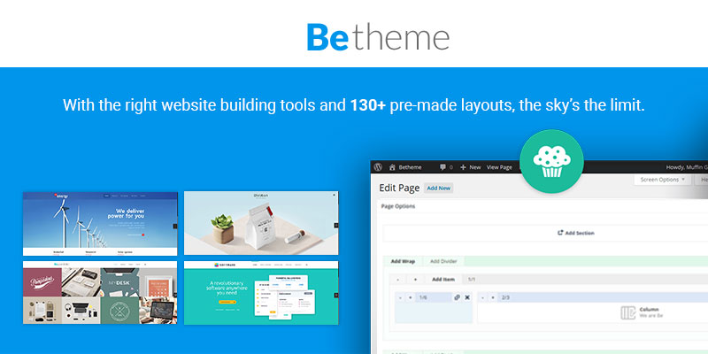
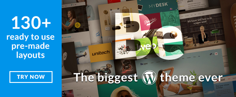
If you have the right website building tools at your disposal, and a conceptual design in the form of a pre-made layout with one-click installation in front of you, everything becomes easier. A pre-made layout is the ultimate productivity hack, and when you have 130+ to choose from you can get your project off to a fast start.

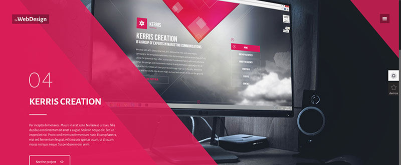
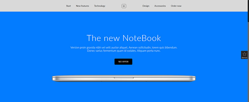
Check out the Be Theme pre-made layouts below, and see how impressively diverse they are.

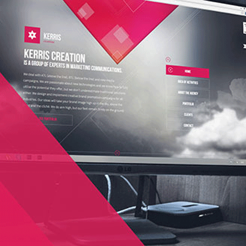
Digital

Web Design

2

Club

3

Investment

4

NoteBook

5

Getting Started – Quickly Edit a Pre-Made Layout using Muffin Builder 3

Be Theme just keeps getting better and better, and one of the reasons is Muffin Builder. Muffin Builder 3, the latest version features greater speed and performance than ever before. This page builder was popular to begin with, and with these latest improvements it is certain to become more popular than ever.

6

Muffin Builder’s clean, new look, improved graphics and a lighter color scheme offers improved readability. Data transfer is faster and navigation has been improved. Muffin Builder has always been easy to use, but users will quickly discover that with Version 3 it takes less time to find needed items thanks to a super-efficient search tool.

Another improvement that is creating a great deal of enthusiasm among Be Theme users is a set of new containers in Muffin Builder’s Section feature, called Wraps. Wraps gives users greater freedom in creating content that will take your breath away.

Take a few moments to check out this video. It demonstrates how incredibly fast and easy it is to edit a pre-made layout and to create exactly the web page you have in mind.

bethemevideo

Show the Results to your Client, along with Your Invoice

There is never a need to worry about sending your client an invoice accompanied by substandard results when a pre-made layout serves as your product’s foundation, and Be Theme with Muffin Builder is your tool of choice. An increasingly larger segment of clients have limited budgets to work with, but they still want exceptional quality for what they are able or willing to pay.

When you deliver outstanding results to your client, and do so on time or ahead of time, your client will not only be more than willing to pay the amount shown on the invoice, but will most likely be wanting more. If you have any doubt as to what the quality of your deliverables can be using this WordPress theme, see what others have to say. You can expect your clients to echo the words.

789

Be Theme is a Feature-Packed Theme

Be Theme is the biggest WordPress theme on the market today. This is due in part to the 130+ pre-made layouts, more than are offered by any other theme, and in part due to its more than 40 core features. Describing what each core feature offers would take pages, but this small sampling should give you a good idea as to what you can expect:

10

  • The Shortcode Generator with 200+ Shortcodes allows you to build your web pages faster and easier than ever.
  • Be Theme’s selection of 20 Customizable Header Styles and 6-Column Support gives you a practically unlimited number of page configurations and styles to base your web pages on.
  • Most Be Theme users prefer Muffin Builder as their page builder of choice, but if you happen to be a Visual Composer fan, you can use it as well. You can even use both to edit your website.

All in all, each website you create using Be Theme will be unique. You can create one jaw-dropping website after another with no two looking alike. Clients and users will be quick to credit you for being a creative genius. You’ll discover how nice it is to have a set of one-click-to-install pre-made layouts, in combination with an easy-to-use tool that makes you look good.

Costumer Support is Always there for You

Customer support is never more than a phone call or mouse click away. Be Theme is so delightfully easy to use that it is unlikely you are going to need much in the way of assistance, but even in the best of times there is always something that could crop up. When you are trying something new and different, or trying a different approach to something, there are always questions that can arise, and you always count on prompt courteous service from Be Theme’s, top-rated support team. The User Manuals and video tutorials will have much of the information you may need, and the forums represent a gold mine of information.

111213

If you would like to create higher quality websites faster, and with less effort, Be Theme is just the right solution. This productivity enhancing WordPress theme, with its 130+ pre-made layouts and its host of powerful core features, including a new and improved version of Muffin Builder, will take your website-building adventures to a new level.

The video gives you a sampling as to just how easy this theme is to use, and by all means visit the website to check out the many core features along with the other 130+ pre-made layouts. Having done all of that – Hop on Board!

14

Read More at With Be Theme and 130+ Pre-made Layouts, the Sky’s the Limit

Categories: Designing, Others Tags:

Type Genius helps you match Fonts for Web Projects

October 29th, 2015 No comments
typegenius-logo

Designers are not always masterful typographers and this includes the ability to perfectly match up interesting font choices.

The Type Genius webapp was made specifically for help with font matching. You can select from a number of very popular web typefaces and you’ll get a custom list of possible matches.

Some typefaces some with a few options, others just have one. The idea is to find a series of fonts that go well together in a heading/paragraph setup, or something similar that you’d find in a print design project.

Each matchup references a featured image along with a source if possible. For example, Adobe Caslon Pro + Effra can be sourced from Typequest.

The list includes a number of system defaults along with popular choices from the Typekit library and Google Webfonts.

If you’re stuck with a particular font pair-up I’d highly recommend Type Genius. The app is simple to use and delivers quality results every time.

Read More at Type Genius helps you match Fonts for Web Projects

Categories: Designing, Others Tags:

jQuery Audit lets you analyze jQuery from Chrome Developer Tools

October 29th, 2015 No comments
audit

Have you ever needed to find information regarding your jQuery scripts? It’s common practice to scour through code looking for a certain function that targets an element on the page, or find which callback method ran after an event.

Well thankfully there’s jQuery Audit which installs as a browser extension for Google Chrome.

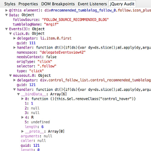
The extension will append onto Chrome’s Developer Tools which allows you to analyze and delve into any jQuery source code with dynamic control. It’s completely open source on GitHub with some handy introductory guides for getting started.

Here’s a brief technical rundown of the plugin’s capabilities:

jQuery Audit creates a sidebar in the Elements panel containing jQuery delegated events, internal data, and more, as live DOM nodes, functions, and objects.

Find delegated events and their handlers.

Variables behave like objects in the “Sources panel – Scope Variables” sidebar. You can right-click on a function and goto “Show Function Definition”, or hover over a DOM node to highlight it in the document, as well as right-clicking it to “Reveal in Elements Panel”.

Generally speaking, this is one of the best tools for a new jQuery developer. You’ll be able to pull definitions for native jQuery methods while also studying how bits of code behave.

It’s especially helpful for breaking down jQuery plugins that you may not fully comprehend.

To get this in your browser just visit the Chrome Web Store and install jQuery Audit for free today!

Read More at jQuery Audit lets you analyze jQuery from Chrome Developer Tools

Categories: Designing, Others Tags:

Sponsored: Syncano – Database. Backend. Middleware. Real-time. Microservices. All in one place.

October 29th, 2015 No comments

Syncano is a backend platform to build powerful real-time apps more efficiently. Customize your backend with several different modules and minimize boilerplate code. Define your data schema, add real-time communication, integrate with any API, add microservice-like functionality without setting up a server or building out a custom API route, and more – all from one place. Get started with our Rest API or one of our open source libraries. Start building, take the time you need, and pay only when you’re ready to deploy. Try it out for free!

Direct Link to ArticlePermalink


Sponsored: Syncano – Database. Backend. Middleware. Real-time. Microservices. All in one place. is a post from CSS-Tricks

Categories: Designing, Others Tags:

Springloops offers SVG/Git Control combined with Web Deployments

October 29th, 2015 No comments
springloops

Managing a website’s deployment digitally may seem like a chore at first. But once you understand the fundamentals and learn to work within a system it can become a tremendous time saver.

Springloops is a service that helps with deployment and version control management. You’re able to setup SVG or Git repos and contain all files in one location.

Whenever a new update is ready to be pushed it’ll go through Springloops’ deployment service. You can rely on FTP/SFTP or Amazon S3 for cloud hosting. Team members are also notified whenever new changes are pushed so that everyone’s on the same page.

Since you’ll be using version control it’s also very simple to revert back to earlier changes. The Springloops dashboard UI makes it simple to browse commit history and choose exactly what you’re looking for.

Best of all you can get started completely free and hold that account for life. New free accounts are limited to 1 repository with 100MB of space, but upgrades are always available.

To learn more visit the Springloops webpage and take a tour through the webapp’s many features. Alternatively you can stay up-to-date via the official Twitter account @springloops.

Read More at Springloops offers SVG/Git Control combined with Web Deployments

Categories: Designing, Others Tags:

Joomla World Conference celebrates 10 years of Joomla Nov 6th-8th

October 29th, 2015 No comments
joomla-world-conf-2015

The PHP/MySQL CMS Joomla has been around for a very long time. In fact, 2015 is the ten year anniversary of this well-respected Content Management System.

A large annual gathering known as Joomla World Conference will be held this year in Bangalore, India. The 2015 conference will run for three days from November 6th-8th and provide talks, workshops, and plenty of celebratory partying.

Take a look at the conference website for more info regarding the venue & schedules.

It seems the 2015 Joomla World Conf schedule is fairly open containing a wide array of topics, both technical & administrative. There are also various presentations occurring at the same time where attendees will have to pick & choose their favorites.

Those who can attend should consider the ticket options between a basic pass & all-access pass.

But since not everyone has such an open schedule, it’s likely many Joomla enthusiasts will not be able to make it. But you can always follow live updates from the JWC Facebook page or via Twitter @jworldcon.

Read More at Joomla World Conference celebrates 10 years of Joomla Nov 6th-8th

Categories: Designing, Others Tags:

13 Ways Designers Screw Up Client Presentations by Mike Monteiro

October 29th, 2015 No comments
monteiro

Recently at Generate NYC 2015 we saw a number of incredible presentations. Some of these have been posted on YouTube and one in particular has resonated with freelancers, contractors, and anyone who deals with clients on a monthly basis.

Mike Monteiro is the author of books like “Design is a Job” and “You’re My Favorite Client”. He’s known as a prominent speaker on topics relevant to freelancers in the design & development field.

This hour-long presentation from Generate NYC covers how you should, or rather shouldn’t, pitch ideas to clients.

It has been mirrored all across YouTube and been met with some very positive feedback.

If you have the time I’d highly recommend listening to what Mike has to say about client presentations regarding the client’s reactions, and more specifically framing the work so that it’s appealing to your audience.

Read More at 13 Ways Designers Screw Up Client Presentations by Mike Monteiro

Categories: Designing, Others Tags: