Archive

Archive for October, 2015

A Brief History of People Being Mad About Inputs

October 25th, 2015 No comments

Jonathan Gillette, “Textarea, You Are A Sunken Nothing”, 2004:

Yes, I mean it, Textarea. You are a Sunken Nothing. You have a beveled edge, but you are a worthless thing to jot upon. Bad pad! BAD PAD!!

[…]

Do you accept tabs? Oop. Well, my premature article is published now.

You are the most popular text editor. You are the worst text editor. Even Notepad has search and replace. And I can make it bigger and smaller.


Kroc Camen, “Ode to Textarea”, 2011:

Textarea, how do I hate thee?
Let me count the ways…

[…]

Fix textarea now. Not later. Not after you’ve shipped some other constantly changing HTML5 feature. Not when someone else does so first. Now. Please accept the responsibility and the scale of the damage your lackadaisical attitude has wrought.


Monica Dinculescu, ” I [heart] you, but you’re bringing me down”, 2015:

However, the API isn’t quirky — it’s literally just a jar of spiders, and the moment you open the jar, it’s too late. You’re covered in spiders. Even your cat is a spider now. Better find some fire.

[…]

The thing is, browsers have had 21 years to sort out inputs, and they haven’t even managed to agree on how to communicate “you haven’t picked a file”.


A Brief History of People Being Mad About Inputs is a post from CSS-Tricks

Categories: Designing, Others Tags:

Popular design news of the week: October 19, 2015 – October 25, 2015

October 25th, 2015 No comments

Every week users submit a lot of interesting stuff on our sister site Webdesigner News, highlighting great content from around the web that can be of interest to web designers.

The best way to keep track of all the great stories and news being posted is simply to check out the Webdesigner News site, however, in case you missed some here’s a quick and useful compilation of the most popular designer news that we curated from the past week.

Note that this is only a very small selection of the links that were posted, so don’t miss out and subscribe to our newsletter and follow the site daily for all the news.

Rawcode – A New Home for your Code Snippets

4 UX Habits for Improving Interaction Design

Let’s Redesign Web Design

Google User Experience Research Studies

Google Goes After Microsoft by Making Google Apps for Work Free

Hypsum – The Themed Placeholder Text Generator

Rare Photos of Apple’s Highly Secretive Input Design Lab

Choosing a CMS your Organization will Love

404 – Back to the Future

Bootstrap Studio: Create Responsive Websites Using the Bootstrap Framework

StarWars.iOS

Project Flux – Leaked Internal Google Document

TechPrep by Facebook

Covers – A Series of 55 Animated Vintage Book Graphics

Blocks – The World’s First Modular Smartwatch

Voice & Tone by MailChimp

Apple Bans Over 250 Apps that Secretly Accessed Users’ Personal Info

Site Design: What is Burning Man?

Siri Celebrates ‘Back to the Future’ Day with Humorous Responses

Introducing Boomerang from Instagram

Windows 10 Upgrade Nags Become More Aggressive, Offer no Opt-out

Google Frightgeist

Twitter and Facebook are Turning Publishers into Ghost Writers

The Secret History of the Hashtag, Slash, and Interrobang

Existential GIFs That’ll Make You Question your Daily Grind

Want more? No problem! Keep track of top design news from around the web with Webdesigner News.

LAST DAY: 650 Hi-Res Stock Photos from ApertureVintage – only $24!

Source

Categories: Designing, Others Tags:

Cartoon: I’ll Know it When I See it

October 25th, 2015 No comments

Spit out that design. Are you a designer or a mouse? The client sure will tell you if he likes it. He’ll know it when he sees it. Don’t you understand that getting a new design is like getting a new lover? You’ll know it when you see her (or him – what the bleep do I know?). I really don’t understand what’s so funny about that 😉

By the way, we have more cartoons for you here.

Categories: Others Tags:

Free Community-Generated CSS Resources

October 25th, 2015 No comments
00-css-code-sample-stylesheets

The web of 2015 offers a much easier time of locating resources than the web of 2005. Dozens of web applications pop up every year with a focus on particular areas. Since many of these sites are made by designers/developers, it seems obvious that actual web design/development is one very popular area.

Stylesheets.co is a free online directory of CSS resources curated by the community. People can submit CSS resources into the site and users who sign up can then vote on these resources. The most popular items appear on the front page with the growing list of beloved CSS resources.

Right away you’ll notice the Stylesheets website is very minimalist. It’s just a simple gallery of CSS resources whether libraries, online webapps, or handy guides.

You can read more on the about page which explains the purpose of Stylesheets.co and offers links to profiles and official chat groups.

The site was created by Jamie Wilson who also released his Stylesheets code for free on GitHub.

With so many new assets every day it’s tough to rule out the significance of a website like this. Both beginners & experts alike can find some incredibly handy tools and libraries for coding in CSS.

Also if you want to support the site financially you can make a donation to help keep Stylesheets online for years to come.

Read More at Free Community-Generated CSS Resources

Categories: Designing, Others Tags:

Free Measurement Plugin for Sketch Designers

October 24th, 2015 No comments
00-sketch-measure-plugin

The ongoing group of free Sketch plugins just got another member with Sketch Measure. The plugin already has over 2,000 stars on GitHub with dozens of separate forks.

Photoshop users don’t have as much of a luxury regarding free plugins, but PS has also been through two decades of iterations to implement features natively. The difference is that many UI/icon designers are moving to Sketch for its ease-of-use and natural tools that feel naturally “made for UI design”.

Sketch Measure is free to download from GitHub and super easy to install. You simply download the plugin and copy the files into your Sketch plugins folder(in Sketch’s menu bar click Plugins > Reveal Plugins Folder).

Keyboard shortcuts will reveal the height/width dimensions of any selected element or layer. This makes pixel-perfect design one step closer to automation.

You’ll find a full list of keyboard shortcuts right on the GitHub page along with screenshots and preview demos.

Sketch Measure is primarily made for UI design but can be useful for anyone who creates things where pixel precision is indispensable.

Read More at Free Measurement Plugin for Sketch Designers

Categories: Designing, Others Tags:

CSS-Tricks Chroncile XXIV

October 24th, 2015 No comments

I’m just back from Barcelona, where I was at Smashing Conf. It was a lovely trip for many, many reasons. The city itself was a beautiful labyrinth of narrow streets between lovely old buildings dotted with lively shops, bars, and restaurants. The Smashing crew (and Media Temple) treated us to fancy meal after fancy meal, including one on top of a tower we traveled to by cable car. I met loads of interesting people for the first time, attendees and speakers alike. Very late one evening I stumbled past a closed shop and saw this wonderful deer(?) head, and when I walked past the same shop again more soberly the next day, I knew I had to buy it. A perfect keepsake from the trip.


I gave my talk “The Wonderful World of SVG” there. I updated it every time I give it, but this may have been the last time I’ll give it without a complete revamp, or moving onto something else someday when I have something new to share.

The slides are here:

Smashing Conf is good about posting videos of talks, so I’ll link to it once that goes up. But variations of this talk have been recorded and posted a number of times, including SVG Is For Everybody at beyond tellerrad Düsseldorf 2014, The Wonderful World of SVG at Madison+ UX 2015, and The Wonderful World of SVG at CSS Conf NY 2015.


Tomorrow I take off for CSS Dev Conf 2015, this time happening in Long Beach, California aboard the giant, permenantly docked ship The Queen Mary.

I won’t be giving a talk at the event, but rather just hanging out and hosting a 2-hour Show & Tell session near the end of the event. I designed a little invite for it, just for fun:

See the Pen Show and Tell Invite by CodePen (@codepen) on CodePen.


Speaking of Show & Tell, that’s the format that a lot of CodePen Meetups have been taking. Some folks, often the organizer, kick if off by sharing something awesome (likely a Pen on CodePen, but it could be anything) and talking about it a little, then it tends to snowball and lots of people end up showing off something they’ve built or otherwise find interesting. That’s how I found out about LESS reference imports, just as one little example.

Upcoming meetups include:


My plan is to take a bit of a break from speaking in 2016. So many reasons. The big one is that speaking takes loads of time. Time preparings ideas, building presentations, practicing, traveling, etc. I’m hoping to reclaim much of that time and put it towards things like CodePen, CSS-Tricks, and ShopTalk that are all growing where I want to be spending that time. Not to mention more time to have a more well rounded life.

I’m going to save my traveling for friends and family, CodePen Meetups, internal gatherings.

I think the one exception I’ll make is AEA Orlando. =)


The growth of the teams I’m a part of is a big deal to me and part of the need to refocus. Check out Team CSS-Tricks these days! We’re all part timers, but with that kind of teampower we’re able to keep to content flowing around here.

Not to mention brand new stuff we’re doing like Office Hours. If you aren’t familiar, Office Hours is a big new part of having a Lodge membership around here. Most Mondays, Wednesdays, and Fridays, we hold 2-hour sessions at various times of day for anyone to pop in and ask questions.

Each session has a theme, so if you just wanna sit back and listen, the instructor will do some teaching around that theme during any time nobody has any specific questions. Upcoming sessions include: Front end frameworks, build tools, Bootstrap, styling forms, SVG icon systems, and more.


There has been some big redesigns lately!

We launched a huge one at CodePen just recently which was, amazingly, incredibly well received. I couldn’t be happier with it, especially knowing that it’s just the beginning and there is so much more excellent stuff to come.

This very site, CSS-Tricks, I redesigned as well. The reactions have been quite the contrast! Every redesign in CSS-Tricks history has been met with sweeping negativity, so that’s not overly surprising. I think the drastic color simplification took people offguard and the replies have been extra nasty. I’ve gotten quite a bit of useful critical feedback as well. I stand by most of the choices. I think it’s typographically stronger, faster, and accomplishes the various goals I’ve had set. Plus, sometimes you gotta just tear things down to free up your own thinking.

Never fear, I’ll be evolving the design in the coming weeks in ways I think will be more widely palatable.


Team CodePen has grown significantly lately too, thanks to the friends-and-family funding round we recently took. Marie Mosley, Tim Holman, and Jake Albaugh have joined recently. We’ve also been working with consultants like David DeSandro and Percona on things. We have one more hire starting early next year. We’re full on employees at the moment, but all goes well, we’ll be growing and hiring again within a few years.


In the last few months over on ShopTalk, Dave and I have done some slightly unusual episodes. We were experimenting with different formats, just for fun. For example we did a panel discussion on managing styles with JavaScript, a book club on a famous bit of tech writing, a direct interview with a web legend, a live show from a web conference, a themed topic with invited guest opinions, an inside look at Dave’s development life, as well as some classic guest shows and RAPIDFIRES.

Next season our plan is to do more topical and themed shows, as it seems everyone has been happy with switching up the format and doing more unique shows.


I’m sure it’s no surprise we have guest authors here on CSS-Tricks. In fact, we have a whole page about how it works. We don’t accept all ideas, but certainly get in touch if you have an idea you want to write about that you are 1) knowledgeable about 2) care about 3) want to share for the good of the web 4) don’t have a weird secret agenda about.

If you’re the type who prefers assignments, I even put together a list of articles we’d love to commission.


CSS-Tricks Chroncile XXIV is a post from CSS-Tricks

Categories: Designing, Others Tags:

Toptal features the Top 3% of Freelance Talent

October 24th, 2015 No comments
00-featured-toptal-logo

Finding work can be tough if you don’t already have a name for yourself. Freelancing can be a terrific way to earn consistent money while working on your own schedule.

A new service Toptal is meant for the highest-quality freelancers on the market. It’s basically a treasure trove of programmers & designers across multiple disciplines that have been proven to deliver quality work.

While the integration process is difficult, Toptal can be an excellent way to meet potential clients for big-budget projects. And it never hurts to get your name out there on as many sites as possible because you never know where your next job will come from.

To learn more about the acceptance process check out their top 3% page. The drafting process breaks down into 4 important stages: interviewing, skill reviews, live tests, and finally practice projects.

If you apply be sure to bring your A-game! Results are all that matters. You need to prove your value in a way that’s beyond any reasonable doubt to offer value to the client.

The freelancer application form is very simple and offers an easy way to get started. You can only sign up as a designer or developer, but you can pick a specialty that best suits your skillset.

Toptal clearly has strict requirements for new signups. But if you can get in you might be surprised how easy it is to land new jobs and nail down particular skills.

Find more info on the FAQ page or follow their latest updates on Twitter @toptalllc.

Read More at Toptal features the Top 3% of Freelance Talent

Categories: Designing, Others Tags:

SEO Basics: Backlinks – The Good, the Bad, and … [Infographic]

October 24th, 2015 No comments

If you are currently working on search engine optimisation, you will notice quickly that most people in this business only talk about one thing: the so-called “Link Building”. This, put simply, means that you should try to establish a situation where as many external links as possible point to the website that is supposed to be optimised. Google uses the amount of entering links as a measure of relevance and popularity of the website. The more there are, the higher the search engine lists the website in the ranking. Relevant and popular sites with many good links occupy the first spots; other sites are placed below. Today, we are presenting two infographics that want to shed some light into the darkness link building is for some.

Ranking Power and Link Quality

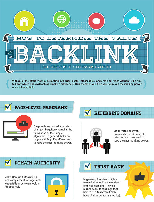
Today’s infographics deal with the topic backlinks. While both of them were made in 2014 already, they still carry truth. The first one tells you how you can estimate the ranking power of a backlink and what has to be considered regarding that. The second graphic informs you on how to find out whether a particular backlink is helpful or harmful to your website. The two graphics cover the basic knowledge on this topic well.

Measuring the Ranking Power of a Backlink

Not all inbound links are equally good. The contrary is the case, as some links can damage the website more than they help it. This infographic by Pole Position Marketing shows you how to measure the efficiency of a backlink.

SEO-Basics - Rankingpower eines Backlinks messen

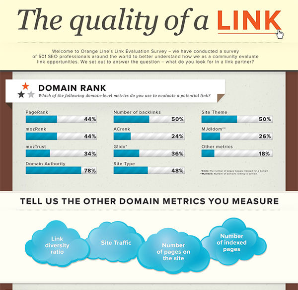
Are Inbound Links Helpful to your Website?

For the ranking in search engines, the amount of websites that link to your site is vital. However, not all links are equally valuable in that regard. There are even links that are more harmful than helpful for your website.

Orange Line asked 501 SEO professionals how they judge and estimate the value of a good link. The results are aggregated in the following graphic.

Sind die Aufgebauten Links gut für Ihre Website

Conclusion

The infographics mentioned above convey some „basic knowledge” of building backlinks. This should be enough to help you estimate whether a link to your website is good and if so how useful it will be for you. With that knowledge in mind, we hope that you can build inbound links a little „safer” now and that you enjoy doing so.

Related Links:

(dpe)

Categories: Others Tags:

Comics of the week #310

October 24th, 2015 No comments

Every week we feature a set of comics created exclusively for WDD.

The content revolves around web design, blogging and funny situations that we encounter in our daily lives as designers.

These great cartoons are created by Jerry King, an award-winning cartoonist who’s one of the most published, prolific and versatile cartoonists in the world today.

So for a few moments, take a break from your daily routine, have a laugh and enjoy these funny cartoons.

Feel free to leave your comments and suggestions below as well as any related stories of your own…

Catch and release

When Ho Ho Ho is No No No

Don’t ask, don’t tell

Can you relate to these situations? Please share your funny stories and comments below…

Learn to Launch Your Own Business with the Freelance Startup Guide – only $4.97!

Source

Categories: Designing, Others Tags:

Guide To Using WebP Images Today (A Case Study)

October 24th, 2015 No comments

They say a picture is worth a thousand words. But online, a picture can be worth a thousand kilobytes or more! HTTP Archive shows that images make up 64% of a web page’s total size on average. Given this, image optimization is key, especially considering that many users will abandon a request if it doesn’t load within a few seconds.

WebP Images And Performance

The problem with image optimization is that we want to keep file sizes small without sacrificing quality. Past attempts to create file types that optimize images better than the standard JPEG, PNG and GIF formats have been unsuccessful.

The post Guide To Using WebP Images Today (A Case Study) appeared first on Smashing Magazine.

Categories: Others Tags: