Archive

Archive for November, 2015

Sponsored: Learn by Doing with Code School

November 19th, 2015 No comments

Join over 1 million students who are learning by doing with Code School. With more than 50 courses covering JavaScript, HTML/CSS, Ruby, Git, iOS, Database, and more, Code School pairs experienced instructors with engaging content.

Direct Link to ArticlePermalink


Sponsored: Learn by Doing with Code School is a post from CSS-Tricks

Categories: Designing, Others Tags:

Designing Healthcare Apps With Delight

November 19th, 2015 No comments

Apps and devices designed to improve people’s health are becoming more pervasive. I serve as VP, Director of User Experience, in the New York office of a global agency with both healthcare and consumer clients. During my 13 years of working in the healthcare space I have never before had such a rich opportunity to directly affect health behavior.

Designing Healthcare Apps With Delight

In this article I’ll guide you through best practices when designing consumer-facing healthcare apps. (We’re not covering medical devices that need to be approved by authorities.) We’ll explore how to plan and conduct research, design moments of delight, integrate data from third-party devices and develop a messaging matrix. We’ll also look at examples of apps live in the wild that have been designed for delight at every moment of interaction.

The post Designing Healthcare Apps With Delight appeared first on Smashing Magazine.

Categories: Others Tags:

9 proven ways to enhance UX with microcopy

November 19th, 2015 No comments

Two words of microcopy can double a site’s sales or lead conversion numbers.

Microcopy is more than just verbs on buttons. It’s the words that show someone how to sign up for your newsletter. Or the instructions that guide buyers through your website.

Microcopy deserves the same attention that every other level of the UX gets.

If you’ve never given it a second thought, you’re not alone. To get your head in the right place, here are 9 tips to make a little bit of text pay off in a big way.

1. Give it more thought

Instead of just “filling in the blanks” on buttons and forms, think about the actions and results you’re looking for.

The user suffers when microcopy is rushed or not thought out. Digital product designer Sean Crowe found a perfect example of this when Gothamist.com used “Go” as a label for both their sign up and search fields.

If your [sic] going to put your search and registration fields so close to each other the least they could do is change their button vocabulary to ‘search & ‘sign-in.’ By having both of them use the word ‘Go’ it causes mass confusion.

2. Use multiple proofreaders

You would be amazed how often microcopy isn’t even proofread. People will proofread an entire website, but forget “the little stuff.”

Use as many editors and proofreaders as you can. This helps you avoid common errors like “Your about to log in” or “You’re about to login” (login is not a verb).

3. Alleviate the user’s worries

Your microcopy can also objection-handle any doubts a user has about registering, subscribing or buying.

They may worry that signing up takes too long. Simply adding “You’re 60 seconds away from creating you account” will eliminate this fear. Or adding “You can change this at any time” to an email or username field will address their fears of being locked into something.

Make the user to feel like everything they want is just around the corner. So, consider changing the generic “Log in” to something more active. Tumblr encourages their bloggers with the great line, “Sign in and start posting.”

3. Revisit it when things aren’t working

If the site is underperforming, some simple copy tweaks can help you convert more leads or sales.

The most talked about example is Jared Spool’s 300 million dollar button. Spool’s client had an issue on the final step in checkout at an ecommerce site, which required the user to hit “Register.” After vigorous testing, they discovered that users just wanted to buy something without registering for anything.

The fix? Change the button label from “Register” to “Continue,” and add a bit of copy advising the user that they don’t have to create an account, but it would speed things up.

The result? “The number of customers purchasing went up by 45%. The extra purchases resulted in an extra $15 million the first month. For the first year, the site saw an additional $300,000,000,” wrote Spool.

On a smaller scale, Joshua Porter‘s site was losing leads because the address users entered didn’t match the one on their credit card.

So I ended up adding the copy ‘Be sure to enter the billing address associated with your credit card’ at the top of the form. And just like that, the errors went away. — Joshua Porter

Small tweaks can make a huge difference. So scrutinize the microcopy when things aren’t working.

4. Don’t ask it to do too much

Good copy can’t fix bad design. And microcopy can’t guide the user through a wonky UX.

If there’s a problem with the design, then fix the design. “The best experiences have minimal copy because they’re intuitive,” wrote Bill Beard.

If you can’t explain what a user needs to do in eight words or fewer, then reconsider the design.

5. Get in your user’s head

You think you know people. So you chose the words that you thought people would respond to. But they’re not responding. Now what?

Usability testing gives you insights into what parts of the copy are clear, and what confuses the user. So make sure you monitor how the users react to microcopy during these tests and make the required changes.

6. Use specific and helpful error messages

Always tell the user what’s wrong and how to fix it.

Nothing frustrates me more than being told that either my username or my password is wrong. Why do I have to guess which? You know which part I screwed up. Why are you keeping it a secret?

Talk to your user like a person. Tell them the credit card number they entered is too short, instead of saying “Invalid input.”

7. Reiterate the value of your offer

If you’re giving something away for free, shout it loudly. Your microcopy should read, “Click here to download our free___,” or “Fill out this form to start your free trial.”

Remind them it’s free at every step. We’ve all received bait-and-switch offers from e-blasts (looking at you, Hotels.com) and we’re weary of something that’s too good to be true. If your user suspects for one second that there is a hidden cost, they’re gone.

8. Avoid jargon

Don’t worry. Everyone does this.

Most web, sales and microcopy is choked with jargon. Simply put, people want to sound smart. Most people assume using industry specific jargon makes them sound like an industry expert.

The truth is, being able to convey technical information in simple terms conveys a far greater mastery of the topic.

9. Take the chance to add social proof

There’s nothing wrong with reminding your customers or subscribers they are about to do a very smart thing.

So feel free to add a little boast like, “You’re about to join our 10,000 satisfied newsletter subscribers” or a quick client testimonial.

Not everybody thinks about microcopy. But, if you’re one of the few people who use it strategically to build or enhance the overall experience, your users and clients will love you.

Featured image, website copy image via Shutterstock.

LAST DAY: Going Retro! 150 Vintage Vector Illustrations – only $9!

Source

Categories: Designing, Others Tags:

Microsoft Announces New Developer Tools

November 19th, 2015 No comments
Microsoft-New-Tools

Connect

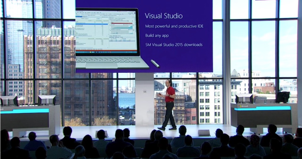
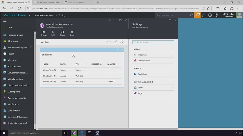
Microsoft has released its new and updates developer tools during Connect(); // 2015, their annual developer event. The updates include cloud subscriptions for Visual Studio and a preview of the new Azure Service Fabric.

Connect event 2015Azure

Microsoft’s release of Visual Studio Dev Essentials aims to give developers more power. Developers can use it to build apps using any device, with any technology, and on any operating system of their choosing absolutely free! In their continued effort to empower developers, Microsoft has made its Microsoft Graph API available to everyone. The company also announced that Azure Service Fabric would be available for public preview as of today today.

Azure

“We started the journey for a new Microsoft for developers, unveiling the future of an open source .NET on Linux and Mac, and a free Visual Studio for targeting any device and any OS.”

Scott Guthrie, Executive Vice President of Microsoft’s Cloud and Enterprise Group

View and the announcements and demos of the new tools in Scott Guthrie’s complete keynote video during Microsoft’s Annual Developer Event, Connect(); // 2015.

Read More at Microsoft Announces New Developer Tools

Categories: Designing, Others Tags:

WordPress: This Checklist Helps you Optimise your Articles

November 19th, 2015 No comments

Have you already published that blog post and just noticed that you forgot some important aspects? We all make mistakes when writing our articles. It happens a lot that you forget something and get angry at yourself for clicking “Publish” too early. Highly successful bloggers always use a checklist that contains the most important aspects for that exact reason. You can then simply go through the list, and will never forget anything again. Today, we will show you how you can easily create a checklist like this.

Why You Need a Checklist for Your Blog Posts

As a blogger, you have developed a particular process that you go through when constructing and publishing your articles. When you work in a team, like I do here at Noupe, you are lucky, as there is a chief editor that will look over your articles before they see the light of day.

However, when you are working on your own, mistakes are made much more quickly. For example, articles without a featured or any post image at all go live, or you forget to check the spelling to prevent at least the most obvious mistakes. Another very popular mistake is publishing an article without optimising it for search engines aka Google. The bigger your project is, the more mistakes can be made.

But it doesn’t have to be like that. Think of how you usually make sure you achieve all the tasks you have to achieve. Don’t you do that using a checklist? Also in WordPress we can have a list that helps you work more efficiently. Let’s look at this list together.

Creating an Article Checklist in WordPress

The »Pre-Publish Post Checklist” Plugin

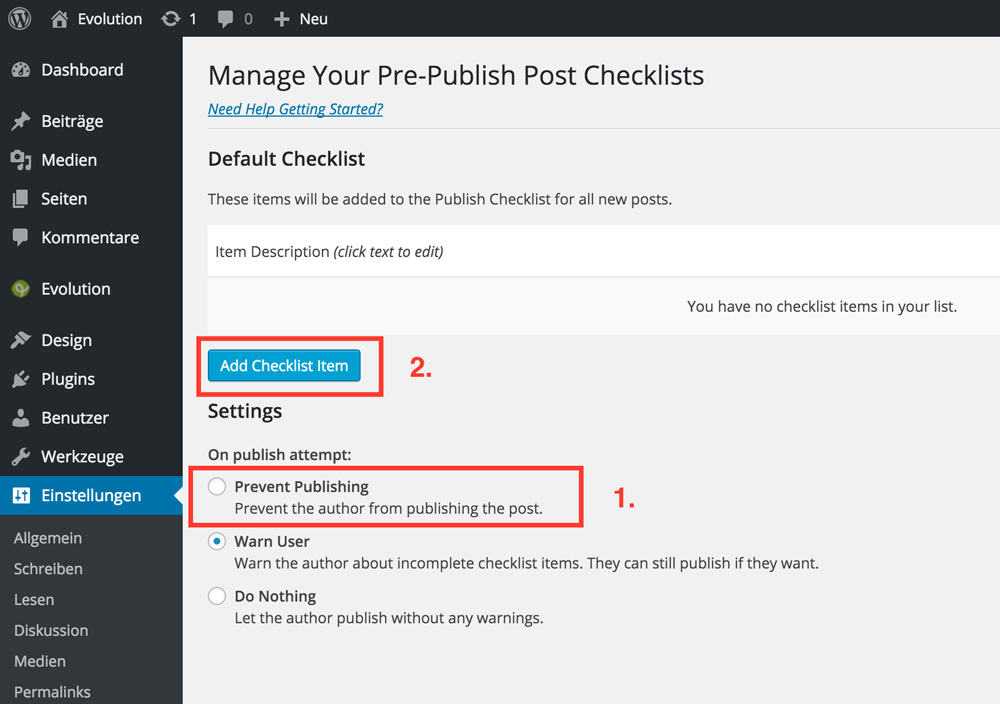
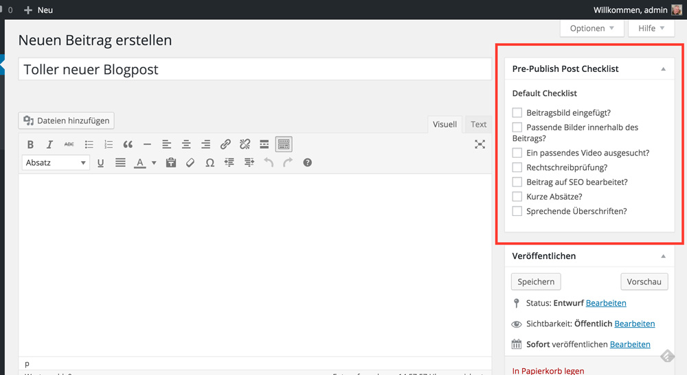
First, you need the plugin »Pre-Publish Post Checklist“. You can download and install it the usual way from WordPress.org. Don’t get scared off because the last update of the plugin happened a year ago. It still works on the latest WordPress version without any issues and should in the future as it does not add any exotic functionality. After installation and activation, you will see the following screen:

Screenshot Plugin

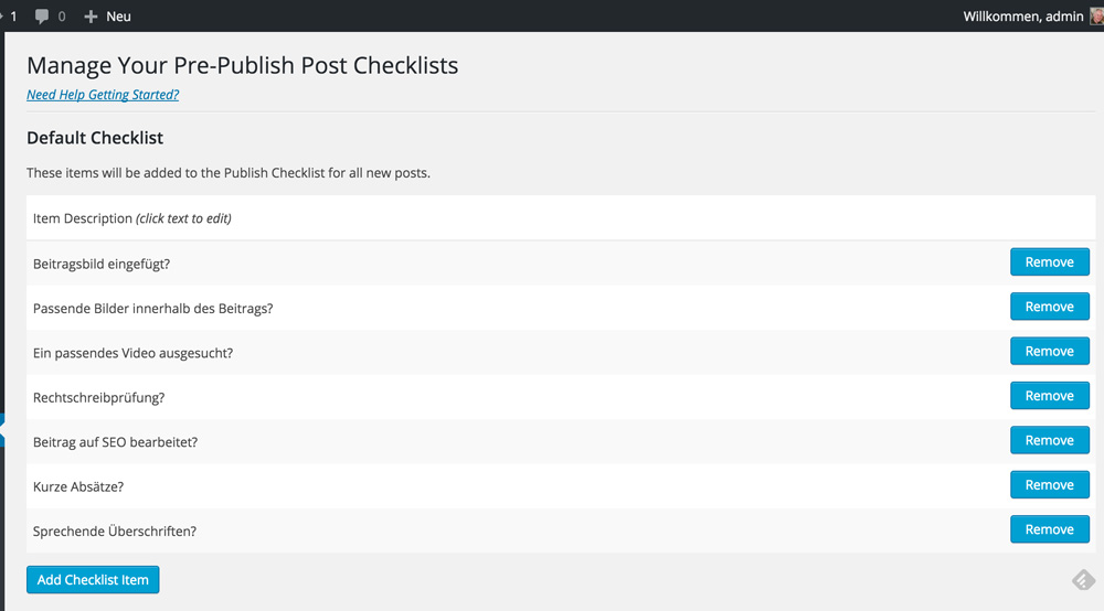
There you need to tick the item “Prevent Publishing”. This setting prevents you from publishing (or scheduling) the article when there are still important things missing. Second, you click the button “Add Checklist Item”. This allows you to enter the items on your checklist. Of course, you can also delete aspects from your list when you don’t need them anymore. To do that, just click the “Remove” button on the right.

Screenshot Plugin

After adding the most important aspects to your list, you can finally use it. All you need to do now is write a new article.

Screenshot 3

The widget boxes on the right side of your screen, next to the blog post editor, can be ordered via drag and drop, so move the box with your new list wherever you want it to be. A good idea would be having it right atop the others.

Working With the New Checklist

Using this checklist, you won’t be able to forget anything ever again. By the way, the list can always be altered or extended when your requirements change.

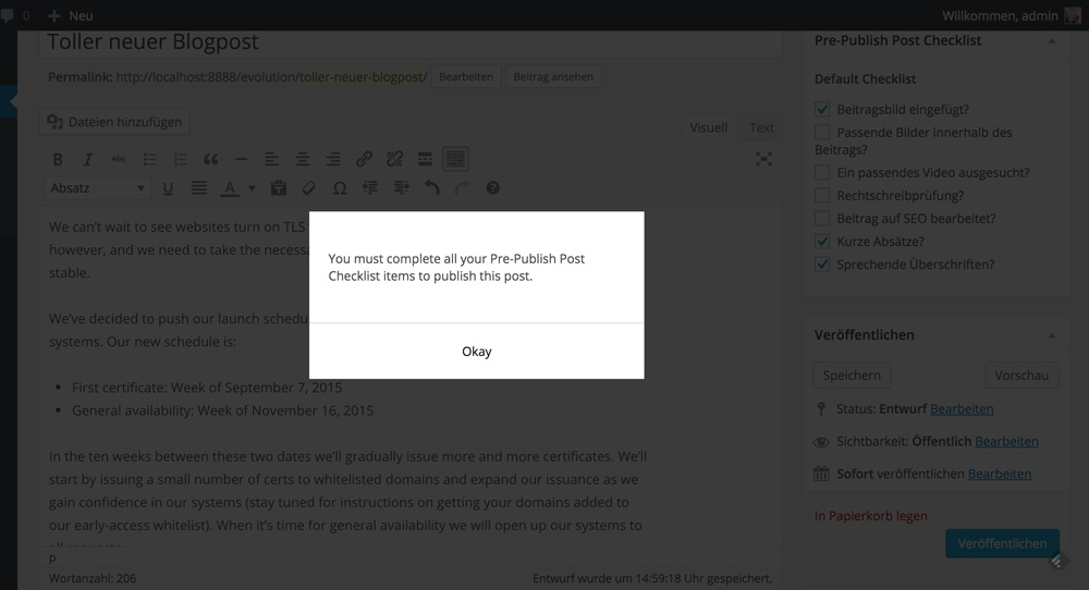
Simply write your articles just like you always do. Then, look at your checklist to see if you forgot something. When you try to publish the post without ticking all points on the list, you will quickly realise that it doesn’t work.

Screenshot 4

Every single aspect needs to be ticked before you can publish an article. This also works with scheduled pieces but not with drafts, obviously.

Conclusion

In my opinion, the »Pre-Publish Post Checklist” plugin is one of the most useful plugins of them all. This applies to people that write a lot and under pressure. You can easily forget something but still publish. This small plugin fixes the problem. Only “excellent” articles can be scheduled and published. Given that you didn’t forget to put a significant point up on the list, however 😉

(dpe)

Categories: Others Tags:

Anonymous Releases “NoobGuide” to Encourage Involvement in #OPParis

November 18th, 2015 No comments
Anon-OPParis

Three “NoobGuides” have been published on the IRC Channel, used by Anonymous to share information, to recruit people and promote involvement in #OPParis (Operation Paris). The recent war declared involves cyber attacks against the Islamic State (Isis). The first of the attack is a list of suspected extremist.

The DIY hacking guide includes instructions on how to perform cyber attacks against Isis in the forms of man in the middle (MITM) attacks and distributed denial of service (DDoS). in an effort to make this the biggest operation deployed against Isis. Anonymous has already taken down over 5K ISIS-affiliated Twitter accounts and encourages those who are interested in helping to research and track other affiliated social media accounts.

“Your contribution means a lot and we encourage you to partake in all of the Op’s activities if you can, the more the merrier.”

This post is simply to report the news and not intended to suggest hacking.

Read More at Anonymous Releases “NoobGuide” to Encourage Involvement in #OPParis

Categories: Designing, Others Tags:

HTML5 Sets New Standards for Web Advertisers

November 18th, 2015 No comments
Advertising-HTML5

Now that Flash is officially dead since Apple and Google have decided to no longer support it.

despite being mostly irrelevant in the web design space, Flash was still seen in the online advertising space. Recently, The Interactive Advertising Bureau (IAB) has published guidelines on an international standard that set the latest specifications following HTML5-based banner advertising.

HTML5 replacing Flash

The change comes as Google AdWords now makes it possible to automatically convert advertisements created using Flash into HTML5. Below is a list of some of the advantages that come with the change from Flash to HTMLs when it comes to ad design and capability.

  • Smaller File Sizes
  • Mobile friendly
  • Advertisers and developers have more options
  • HTML5 banners can be constructed responsively
  • Can use everything from animations, web fonts and complex graphics, even video!

Read More at HTML5 Sets New Standards for Web Advertisers

Categories: Designing, Others Tags:

Card Design Is Taking Over

November 18th, 2015 No comments
Card-Design

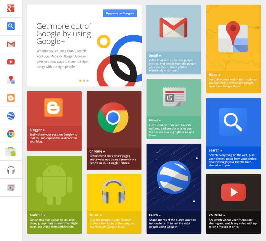
The card design is taking over, seen everywhere from website to mobile apps and games, it everywhere. Commonly referred to as tiles, or The Stack, it is dominating design due to its ease of use and familiarity. The design is not entirely new, Pinterest was one of the first to really layout content using cards. The main reason card design has become such a craze is because they have great compatibility with mobile screens and are one of the most aesthetically pleasing UI design for mobile users.

Card-Design Tinder

Card are particularly great for organizing content into neat little containers. Card can contain a variety of different elements like video, text, music, forms, data, social sharing, links or a combination of any of these. From a UX standpoint, this assist with wireframing as well, giving you the ability to quickly layout content card by card, this allows for faster wireframing when it come to adapting content to multiple screens.

Card design web

Cards can contain different behaviors. In the same way you would handle a deck of card with your thumbs, you can adapt that usability to design giving the user something they are familiar with using. This gives a certain familiarity to the design of a mobile application or website. This is covered more in depth on UXPin‘s Mobile Design Trends 2015 & 2016.
Pick up you phone and looks through you mobile apps and see how many apps you can find using card design. Share the best examples in the comments below.

Read More at Card Design Is Taking Over

Categories: Designing, Others Tags:

Win a Membership Account from PixelKit and Access Thousands of Premium Graphic Files

November 18th, 2015 No comments

Have you been searching for high quality UI kits that provide you with everything you need all in one place? If so, you’ve finally found it with PixelKit. This resource is the only solution you will ever need for your website designs. Three winners will get A free one-year PixelKit membership, including Access to more

Categories: Designing, Others Tags:

History of Web Design Technologies

November 18th, 2015 No comments
History-of-Web-Design

Web design technologies have evolved over time giving web developers the opportunity to come up with new generations of immersive and useful web experiences. The web these days is a result of continuous labors and accomplishments of an open web community which helps distinguish web technologies such as CSS3, HTML5 and WebGL ensuring that all web browsers support them.

Web Design Technology Evolving

History of Web Design inforgraphic1989 – Lynx
This year was the unbroken age of web design. Picture Lynx and other web browsers that were Unix-based which did nothing more than spit out bits of text from one monitor to another inside university networks. There is only a blinking cursor and a bunch of text; no graphical user interface.

1995 – Tables
Next came browsers that images could be displayed on. The closest option we had for structuring information was through tables that already existed in HTML. Basically, adding tables inside tables and coming up with brilliant ways of mixing fluid cells with static cells. The good news, JavaScript popped up to make things easier for designers. Creating dynamic site designs also became easier with flash, for instance, have a window pop up or modify the content order on a page dynamically. JavaScript, however, is slow when you compare it to native HTML.

1996 – Flash
To break the restrictions of current web design, a new technology was introduced that showed promise. The web designer could design any type of layouts, shapes, interactions, animations, use any fonts and do all of this using one tool – Flash. The aftereffect is compressed into a single file and displayed on the browser. Of course, the user would need to have the latest flash plugin and some time on their hands to wait as it loaded. This was the time of intro animations, splash pages and all types of interactive effects. Sadly, it was not too search-friendly or open and definitely took up a great deal of processing power. When Apple came out with their iPhone (2007) and decided to abandon Flash, it started to deteriorate, for web design at least.

1998 – CSS
In 1998, CSS was unleashed and seemed to be the answer to a lot of early web design problems. By dividing up a website’s content from its aesthetic, technology was finally put in designers’ hands that enabled them to design sites exactly how they wanted them, custom-made for the specific device it was displayed on. Early versions of CSS were not that flexible, however, eventually it became a crucial technology for web designers to master.

2007 – Mobile
The introduction of the iPhone stirred up whole new issues for web designers in the year 2007. How are they supposed to design a site that will fit on the smaller screens of smartphones? The solution the designers adopted in the beginning was a grid system. This system stripped columns away from a site’s design depending on the device’s screen size.

2010 – Responsive Web Design
Ethan Marcotte, a brilliant man, took it upon himself to challenge the current approach by suggesting the use of the same content, but with different design layouts which brought about the term: responsive web design. We do technically still use CSS and HTML; therefore it is rather a theoretical advancement. There are still various misconceptions here. For the web designer, responsive meant mocking up a variety of layers. For the client, it meant it can work on the phone and for the developer, it is the download speeds, how images are served, semantics, desktop/mobile first and more. The primary advantage here is the content balance, meaning the site works everywhere.

What happens in the future? In our grasp is total flexibility. Soon enough web designers will not need to stress about browser compatibility any more. They will have all the right tools needed to make websites look and function how they want and on any device.

This essay about web design is written by AdvancedWriters.com – online writing service.

Read More at History of Web Design Technologies

Categories: Designing, Others Tags: