Archive

Archive for November, 2015

Popmotion, Javascript Motion Engine for Animated UI

November 27th, 2015 No comments
Popmotion

We seen an up-and-coming trend in design that will definitely bleed into 2016 for animation incorporated into UI. With the opposite trend of static websites emerging as well, some would argue otherwise. However, with the development of CSS3 and JavaScript, we see more and more developers embracing interactive animation in their programming. The development of clever little Javascript engines like Popmotion, make it even easier for developers to create and innovative user interfaced using animation.
Popmotion 1Popmotion2

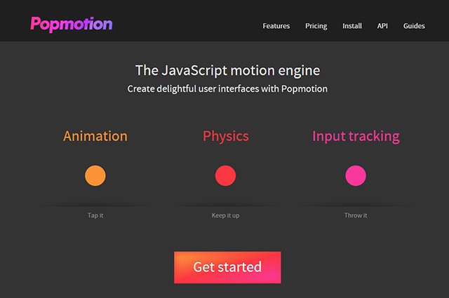
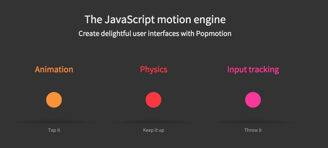
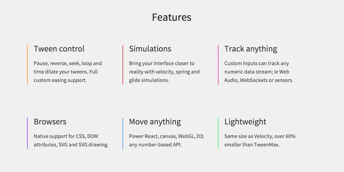
The motion engine has become popular on Github, boasting abilities like animation, physics and input tracking; along with many more, like to following listed on the site:

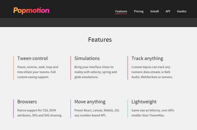
  • Input smoothing: Optionally smooth noisy data sources.
  • Easy distribution: Available on npm, Bower, Meteor, or as a simple file-include.
  • Low level: A single processing loop, open for low-level use.
  • Watch: Values can watch other values and do as they do, faster than recalculating.
  • Complex number support: Colors, path definitions, matrix transforms and more.
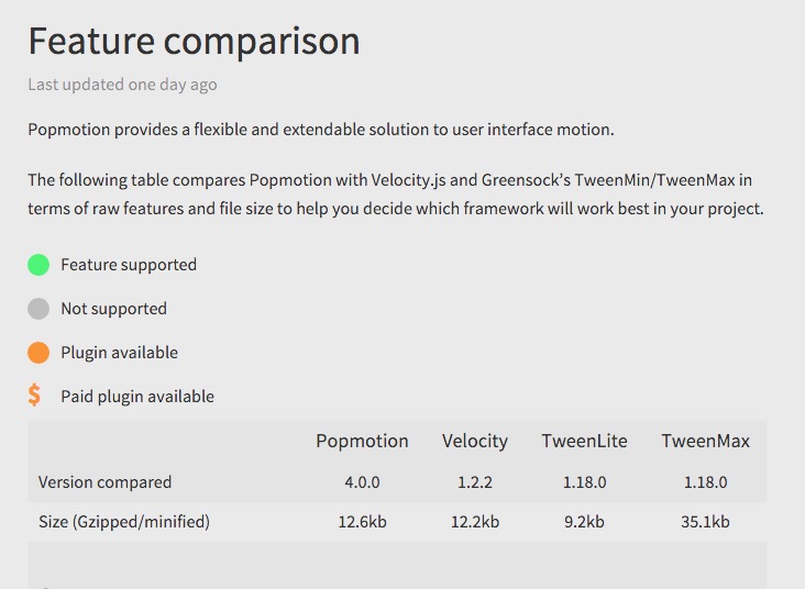
Popmotion comparison
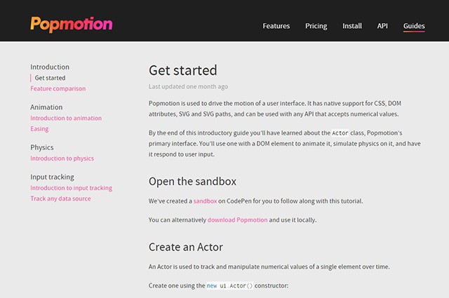
If you are looking to get started with animation, check out their handy introduction to animation.

Read More at Popmotion, Javascript Motion Engine for Animated UI
Categories: Designing, Others Tags:

Amazon Cloud’s Black Friday $5 Deal

November 27th, 2015 No comments
Amazon-Cloud

Amazon is competing with all the major players of cloud storage with it’s latest Black Friday deal. $5 for Unlimited Online Storage through Amazon Cloud Drive. Amazon, unlike Apple, Dropbox, Microsoft, Google…the list is endless…, is not yet a household name when it comes to cloud storage, we think more of them as “the most convenient way to shop, period”. Amazon is also known for their amazing deals, which is not surprise they are running this deal to undermine the competition.

Amazon Cloud 1

Today only Amazon is offering everyone an additional spacious cloud to store all your precious digital design and pictures of your cat.

Amazon Cloud 2

Read More at Amazon Cloud’s Black Friday $5 Deal

Categories: Designing, Others Tags:

Drag and Drop File Uploading

November 27th, 2015 No comments

The following is a guest post by Osvaldas Valutis. Osvaldas is going to show us not only how drag and drop file uploading works, but goes over what nice UI and UX for it can be, browser support, and how to approach it from a progressive enhancement standpoint.

I work on an RSS reader app called Readerrr. I wanted to enrich the feed import experience by making allowing for drag and drop file upload alongside the traditional file input. Sometimes drag and drop is a more comfortable way to select a file, isn’t it?

View Demo

Markup

This markup doesn’t have anything specifically to do with drag and drop. It’s just a normal, functional

, albeit with some extra HTML elements for potential states.

<form class="box" method="post" action="" enctype="multipart/form-data">
  <div class="box__input">
    <input class="box__file" type="file" name="files[]" id="file" data-multiple-caption="{count} files selected" multiple />
    <label for="file"><strong>Choose a file</strong><span class="box__dragndrop"> or drag it here</span>.</label>
    <button class="box__button" type="submit">Upload</button>
  </div>
  <div class="box__uploading">Uploading&hellip;</div>
  <div class="box__success">Done!</div>
  <div class="box__error">Error! <span></span>.</div>
</form>

We’ll hide those states until we need them:

.box__dragndrop,
.box__uploading,
.box__success,
.box__error {
  display: none;
}

A little explanation:

  • Regarding states: .box__uploading element will be visible during the Ajax process of file upload (and the others will still be hidden). Then .box__success or .box__error will be shown depending on what happens.
  • input[type="file"] and label are the functional parts of the form. I wrote about styling these together in my post about customizing file inputs. In that post I also described the purpose of [data-multiple-caption] attribute. The input and label also serve as an alternative for selecting files in the standard way (or the only way if drag and drop isn’t supported).
  • .box__dragndrop will be shown if a browser supports drag and drop file upload functionality.

Feature detection

We can’t 100% rely on browsers supporting drag and drop. We should provide a fallback solution. And so: feature detection. Drag & drop file upload relies on a number of different JavaScript API’s, so we’ll need to check on all of them.

First, drag & drop events themselves. Modernizr is a library you can trust all about feature detection. This test is from there:

var div = document.createElement('div');
return ('draggable' in div) || ('ondragstart' in div && 'ondrop' in div)

Next we need to check the FormData interface, which is for forming a programmatic object of the selected file(s) so they can be sent to the server via Ajax:

return 'FormData' in window;

Last, we need the DataTransfer object. This one is a bit tricky because there is no bullet-proof way to detect the availability of the object before user’s first interaction with the drag & drop interface. Not all browsers expose the object.

Ideally we’d like to avoid UX like…

– “Drag and drop files here!”
[User drags and drops files]
– “Oops just kidding drag and drop isn’t supported.”

The trick here is to check the availability of FileReader API right when the document loads. The idea behind this is that browsers that support FileReader support DataTransfer too:

'FileReader' in window

Combining the code above into self invoking anonymous function…

var isAdvancedUpload = function() {
  var div = document.createElement('div');
  return (('draggable' in div) || ('ondragstart' in div && 'ondrop' in div)) && 'FormData' in window && 'FileReader' in window;
}();

… will enable us to make an effective feature support detection:

if (isAdvancedUpload) {
  // ...
}

With this working feature detection, now we can let the users know they can drag & drop their files into our form (or not). We can style the form by adding a class to it in the case of support:

var $form = $('.box');

if (isAdvancedUpload) {
  $form.addClass('has-advanced-upload');
}
.box.has-advanced-upload {
  background-color: white;
  outline: 2px dashed black;
  outline-offset: -10px;
}
.box.has-advanced-upload .box__dragndrop {
  display: inline;
}

No problems at all if drag & drop file upload is not supported. Wsers will be able to upload files via good ol’ input[type="file"]!

Note on browser support: Microsoft Edge has a bug which stops drag and drop from working. It sounds like they are aware of it and hope to fix it.

Drag ‘n’ Drop

Here we go, here’s the good stuff.

This part deals with adding and removing classes to the form on the different states like when the user is dragging a file over the form. Then, catching those files when they are dropped.

if (isAdvancedUpload) {

  var droppedFiles = false;

  $form.on('drag dragstart dragend dragover dragenter dragleave drop', function(e) {
    e.preventDefault();
    e.stopPropagation();
  })
  .on('dragover dragenter', function() {
    $form.addClass('is-dragover');
  })
  .on('dragleave dragend drop', function() {
    $form.removeClass('is-dragover');
  })
  .on('drop', function(e) {
    droppedFiles = e.originalEvent.dataTransfer.files;
  });

}
  • e.preventDefault() and e.stopPropagation() prevent any unwanted behaviors for the assigned events across browsers.
  • e.originalEvent.dataTransfer.files returns the list of files that were dropped. Soon you will see how to use the data for sending these files to the server.

Adding and removing .is-dragover when necessary enables us to visually indicate when it is safe for a user to drop the files:

.box.is-dragover {
  background-color: grey;
}

Selecting Files In a Traditional Way

Sometimes dragging & dropping files is not very comfortable way for selecting files for upload. Especially when a user is in front of a small screen size computer. Therefore it would be nice to let users choose the method they prefer. The file input and label are here to allow this. Styling them both in the way I’ve described allows us to keep the UI consistant:

Ajax Upload

There is no cross-browser way to upload dragged & dropped files without Ajax. Some browsers (IE and Firefox) do not allow setting the value of a file input, which then could be submitted to server in a usual way.

This won’t work:

$form.find('input[type="file"]').prop('files', droppedFiles);

Instead, we’ll use Ajax when the form is submitted:

$form.on('submit', function(e) {
  if ($form.hasClass('is-uploading')) return false;

  $form.addClass('is-uploading').removeClass('is-error');

  if (isAdvancedUpload) {
    // ajax for modern browsers
  } else {
    // ajax for legacy browsers
  }
});

The .is-uploading class does double duty: it prevents the form from being submitted repeatedly (return false) and helps to indicate to a user that the submission is in progress:

.box.is-uploading .box__input {
  visibility: none;
}
.box.is-uploading .box__uploading {
  display: block;
}

Ajax for modern browsers

If this was a form without a file upload, we wouldn’t need to have two different Ajax techniques. Unfortunately, file uploading via XMLHttpRequest on IE 9 and below is not supported.

To distinguish which Ajax method will work, we can use our existing isAdvancedUpload test, because the browsers which support the stuff I wrote before, also support file uploading via XMLHttpRequest. Here’s code that works on IE 10+:

if (isAdvancedUpload) {
  e.preventDefault();

  var ajaxData = new FormData($form.get(0));

  if (droppedFiles) {
    $.each( droppedFiles, function(i, file) {
      ajaxData.append( $input.attr('name'), file );
    });
  }

  $.ajax({
    url: $form.attr('action'),
    type: $form.attr('method'),
    data: ajaxData,
    dataType: 'json',
    cache: false,
    contentType: false,
    processData: false,
    complete: function() {
      $form.removeClass('is-uploading');
    },
    success: function(data) {
      $form.addClass( data.success == true ? 'is-success' : 'is-error' );
      if (!data.success) $errorMsg.text(data.error);
    },
    error: function() {
      // Log the error, show an alert, whatever works for you
    }
  });
}
  • FormData($form.get(0)) collects data from all the form inputs
  • The $.each() loop runs through the dragged & dropped files. ajaxData.append() adds them to the data stack which will be submitted via Ajax
  • data.success and data.error are a JSON format answer which will be returned from the server. Here’s what that would be like in PHP:
<?php
  // ...
  die(json_encode([ 'success'=> $is_success, 'error'=> $error_msg]));
?>

Ajax for legacy browsers

This is essentially for IE 9-. We do not need to collect the dragged & dropped files because in this case (isAdvancedUpload = false), the browser does not support drag & drop file upload and the form relies only on the input[type="file"].

Strangely enough, targeting the form on a dynamically inserted iframe does the trick:

if (isAdvancedUpload) {
  // ...
} else {
  var iframeName  = 'uploadiframe' + new Date().getTime();
    $iframe   = $('<iframe name="' + iframeName + '" style="display: none;"></iframe>');

  $('body').append($iframe);
  $form.attr('target', iframeName);

  $iframe.one('load', function() {
    var data = JSON.parse($iframe.contents().find('body' ).text());
    $form
      .removeClass('is-uploading')
      .addClass(data.success == true ? 'is-success' : 'is-error')
      .removeAttr('target');
    if (!data.success) $errorMsg.text(data.error);
    $form.removeAttr('target');
    $iframe.remove();
  });
}

Automatic Submission

If you have a simple form with only a drag & drop area or file input, it may be a user convenience to avoid requiring them to press the button. Instead, you can automatically submit the form on file drop/select by triggering the submit event:

// ...

.on('drop', function(e) { // when drag & drop is supported
  droppedFiles = e.originalEvent.dataTransfer.files;
  $form.trigger('submit');
});

// ...

$input.on('change', function(e) { // when drag & drop is NOT supported
  $form.trigger('submit');
});

If drag & drop area is visually well-designed (it’s obvious to the user what to do), you might consider hiding the submit button (less UI can be good). But be careful when hiding a control like that. The button should be visible and functional if for some reason JavaScript is not available (progressive enhancement!). Adding a .no-js class name to and removing it with JavaScript will do the trick:

<html class="no-js">
  <head>
    <!-- remove this if you use Modernizr -->
    <script>(function(e,t,n){var r=e.querySelectorAll("html")[0];r.className=r.className.replace(/(^|s)no-js(s|$)/,"$1js$2")})(document,window,0);</script>
  </head>
</html>
.box__button {
  display: none;
}
.no-js .box__button {
  display: block;
}

Displaying the Selected Files

If you’re not going to do auto-submission there should be an indication to the user if they have selected files successfully:

var $input    = $form.find('input[type="file"]'),
    $label    = $form.find('label'),
    showFiles = function(files) {
      $label.text(files.length > 1 ? ($input.attr('data-multiple-caption') || '').replace( '{count}', files.length ) : files[ 0 ].name);
    };

// ...

.on('drop', function(e) {
  droppedFiles = e.originalEvent.dataTransfer.files; // the files that were dropped
  showFiles( droppedFiles );
});

//...

$input.on('change', function(e) {
  showFiles(e.target.files);
});

When JavaScript Is Not Available

Progressive enhancement is about the idea that a user should be able to complete the principal tasks on a website no matter what. File uploading is no exception. If for some reason JavaScript is not available, the interface will look like this:

The page will refresh on form submission. Our JavaScript for indicating the result of submission is useless. That means we have to rely on server-side solution. Here’s how it looks and works in the demo page:

<?php

  $upload_success = null;
  $upload_error = '';

  if (!empty($_FILES['files'])) {
    /*
      the code for file upload;
      $upload_success – becomes "true" or "false" if upload was unsuccessful;
      $upload_error – an error message of if upload was unsuccessful;
    */
  }

?>

And some adjustments for the markup:

<form class="box" method="post" action="" enctype="multipart/form-data">

  <?php if ($upload_success === null): ?>

  <div class="box__input">
    <!-- ... -->
  </div>

  <?php endif; ?>

  <!-- ... -->

  <div class="box__success"<?php if( $upload_success === true ): ?> style="display: block;"<?php endif; ?>>Done!</div>
  <div class="box__error"<?php if( $upload_success === false ): ?> style="display: block;"<?php endif; ?>>Error! <span><?=$upload_error?></span>.</div>

</form>

That’s it! This already-long article could have been even longer, but I think this will get you going with a responsible drag and drop file upload feature on your own projects.

Check out the demo for more (view source to see the no-jQuery-dependency JavaScript):

View Demo


Drag and Drop File Uploading is a post from CSS-Tricks

Categories: Designing, Others Tags:

The Latest Statistics Proving the Validity of UX Design

November 27th, 2015 No comments
UX-Design1

User Experience (UX) is not a new concept, it has been a working part of some of the greatest and most successful design, especially when it comes to digital design. Weather it be mobile apps, websites, software or anything involving a user’s interaction, the experience should always be taken in mind. In our recent interview with Karen Mcgrane, previous VP and National Lead for UX at Razorfish, we asked how she dealt with companies reluctant to invest in UX Design to which she responded:

“I don’t even try to convince the non-believers. It’s not worth it. Partner with people who already understand why user experience is important and value your work. We don’t have enough skilled UX people to solve the problems of companies that already get it, why waste time trying to convince people?”

-Karen McGrane, UX Designer & Content Strategist

With that in mind, there is an acknowledgement that certain people within organizations could identify a major need to incorporate UX into their process; but don’t necessarily know how to convince others on doing so. This is a tricky situation to be in, it is difficult to imagine the benefits of UX prior to applying UX. The best option is to lead by example. There is no better example than the following stats. Here is a brief on the impressive findings rounded up by Jozef Toth, Senior Designer at Cameron & Wilding. Read the full list of stat on the Invisionapp Blog.

85% of adults think that a company’s mobile website should be as good or better than their desktop website.

Choosing a specific blue over some other hues amounted to an additional $80 million in annual revenue for Bing.

Blue revenuw bing

In 10 years, a $10,000 investment in design-centric companies would have yielded returns 228% greater than the same investment in the S&P.

return on UX

In an evaluation of 200 small business websites, 70% of them didn’t display clear calls-to-action for anything on their home pages, such as specials, email newsletters, how-to guides, demos, and interactive tools.

Call to action buttons

Read More at The Latest Statistics Proving the Validity of UX Design

Categories: Designing, Others Tags:

40% Sale in the Shop

November 27th, 2015 No comments

Have you been trying to find some kind of SALE happening online today, but coming up empty handed? We have some CSS-Tricks T-Shirts and hoodies in the store at 40% off (use coupon code trikzare4kids) now through Monday.

If you’re size Small or XXL/XXXL, most of the designs are available. If you’re Medium or Large, not so much, but we hope to have some kind of new fun merch soon.

Direct Link to ArticlePermalink


40% Sale in the Shop is a post from CSS-Tricks

Categories: Designing, Others Tags:

P Vs. NP: The Assumption That Runs The Internet

November 27th, 2015 No comments

Let’s get a few things out of the way first. This isn’t your regular Smashing Magazine article. It’s not a “how to“; it won’t show you how to build a better menu or improve your project tomorrow.

P Vs. NP: The Assumption That Runs The Internet

You’re looking at Smashing Magazine right now because you’re standing on the shoulders of a giant assumption called “P versus NP”. It’s a math problem that protects governments, runs the Internet and makes online shopping possible.

The post P Vs. NP: The Assumption That Runs The Internet appeared first on Smashing Magazine.

Categories: Others Tags:

Rolling Out Responsive

November 27th, 2015 No comments

Redesigning a site with responsive design? The tech stuff can be challenging, but the easy compared to the decision-making, process-defining, and organization-wrangling before you even get there. Karen McGrane has a new book on all this stuff called Going Responsive, and this link post links to Chapter 2 of that, published on A List Part.

In other book news, Christopher Schmitt is working on a book around one of those rollout options: retrofitting. And there is a new Ethan Marcotte book as well: Responsive Design: Patterns & Principles.

Direct Link to ArticlePermalink


Rolling Out Responsive is a post from CSS-Tricks

Categories: Designing, Others Tags:

Black Friday Deals for Web Designers

November 27th, 2015 No comments
Blk-Friday

Black-Friday-Deals-WDL

Visual Hierarchy

Visual Hierarchy an online store that offers a variety of resources for designers is sharing a special deal with Web Design Ledger readers. They are offering a variety of beautifully designed resources like UI kits, icons, and fonts at the minimal price of $8 each for Black Friday & Cyber Monday!

  • Great for fast design and prototyping on websites, mobile apps and print design projects (logos, clothing, banners, posters, identity design, promotional products etc.)
  • Save money on hundreds of designs through this special offer, stock up this Black Friday and design modern websites and mobile layouts.

If you are searching for Mockups, we offer them at a reduced price ranging from 50% to 66% off mockups and UI layout kits. Hurry to get the best deals of the season, get yours before the Black Friday & Cyber Monday deal ends!

DealFuel

WDL-dealfuel (1)

DealFuel is daily deals site for web professionals. It’s an awesome place where you will find deals related to web design and development, SEO and marketing, software and tools and much more. Not only this, you will find a whole bunch of freebies which everyone is bound to fall in love with.
DealFuel is the place where you will find discounts that you won’t find anywhere. Apart from that they regularly give out coupons that gives even more discount.
For this Black Friday and Cyber Monday, they are giving a special discount of 15% on all their deals.
Details
Coupon Code: DFBLACK2015
Validity: Till 6th Dec 2015
Link: http://dealfuel.com
If you want special discounts, subscribe to their newsletter.

Photowhoa

WDL-photowhoa (1)

PhotoWhoa has curated products to improve your photography. It has got something for every genre of photographer. You will find actions from PhotoShop actions from Seasalt, tutorials from Trey Ratcliff, Dan Hostettler, Nick Saglimbeni, ebooks from Andrew Gibson, Andy Lim and much more. From Fashion, Portraits, Street and Landscape, this site has it all. Grab some awesome deals at Photowhoa.com.
Black Friday / Cyber Monday Offer
15% Discount offer on all Deals
Coupon Code PWBACK2015
Offer valid from 23 November 2015 to 7th December 2015
Link: https://photowhoa.com/deals/

Cyberchimps

WDL-cyberchimps (1)

With over 5 million downloads and 11 million websites launched using a CyberChimps theme, CyberChimps is aptly referred to as one of the pioneers in Responsive WordPress Themes. Its most popular plan is CyberChimps Club, a $97 membership that gives you access to all its 24 current themes and new themes as well. At least 2 New Themes are released every month – so you get real value for your money.
Black Friday / Cyber Monday Offer
30% Discount offer on all Themes & CyberChimps Club
Coupon Code – BFWDL30
Offer Valid from 23 November 2015 To 7th December, 2015
Link – http://cyberchimps.com/pricing/

Read More at Black Friday Deals for Web Designers

Categories: Designing, Others Tags:

How we redesigned Youthletic.com

November 27th, 2015 No comments

A consistent trait among digital products that have withstood the test of time is adaptation. Adapting to new technologies. Adapting to new devices. And adapting to users (essentially user experience research and analysis).

Youthletic began as a repository of youth organization data, targeting both parents and organizations. For parents, the site was intended to be a one-stop-shop to search and register their children for youth organizations. For organizations, the site was supposed to be an easy place for coaches and group leaders to gather registrations, payments and information about the children (ie. allergies). Initially as an afterthought, the site added a collection of articles pertaining to youth sports and relevant topics.

With the initial plan came several challenges:

  1. The project depended on youth sport organization commitment and this proved to be more difficult than planned. Most youth sport organizations are run by non-profits and volunteers so communication and developing relationships is challenging.
  2. Organization data is fragmented?—?gathering and maintaining data is a tedious and time consuming process.
  3. There were legal hurdles when accepting payments and gathering information about children. Many hurdles would take serious time and financial investment.
  4. The project depended on several third parties add-ons and services, such as payment processing. Many of these third parties proved to be buggy and problematic.

The site needed change to further justify its existence. Maintaining a local focus would continue to be a priority but widening YL’s reach to a national level through content would be an emphasis moving forward. So here’s where we focused our efforts:

1. A parallel approach towards content

With organization search and registration not gaining as much traction as initially expected, more youth sports articles were published to keep the site active. They say “content is king” and this proved to be evident on Youthletic, as proven by the direct correlation between number of articles published and site traffic.

To cement the change further was the fact that YL’s parent company is a media company at its core so the move to a content focus made even more sense.

2. Becoming agile

Initially, there was a group of four creating the entire project: ?a business owner, a project manager, a UX/UI designer, and a back end developer. The separation of duties was strictly defined and the project followed a waterfall methodology. This proved to be problematic as the project was meant to be brought to life quickly.

Waterfall methodology is ideal for some companies and products, but the issue with a waterfall process is that the project requires the fulfilment of one phase, before proceeding to the next.

Switching to an agile methodology encouraged collaboration among team members and allowed for the product to evolve quicker.

3. Designing a better user experience

There were four principles that we wanted to make sure to get correct when designing a better user experience:

Thinking mobile-first?

We knew that a majority of site users were accessing the site on mobile devices (roughly 65%). Mobile usage continues to grow so the design needed to be consistent and beautiful across devices. To accomplish this, we used site-wide, mobile-friendly navigation (a slide-in from the side).

Developing a light site

If users want content, we need to give it to them and do so quickly. Speed matters. Page abandonment goes up dramatically for every second a page takes to load.

To avoid abandonment we implemented a content feed that makes ajax calls to load content at vertical scroll distances. This decreased page load time dramatically (in our case by 400%) and helped drop the site’s bounce rate by 30%.

Making sharing prominent

A social media analysis showed that parents loved sharing Youthletic articles. On the previous design, sharing was enabled but it was only accessible on one area of the story page.

But sharing is caring. With article pages in the new design, parents could share from 3 separate places, and sharing capabilities were omni-present. Chartbeat data suggests that users will share content without reading it, so the new design also allowed users to share without going into an article.

Giving users other means of navigation besides the top nav bar

Through Google Analytics and Google Tag Manager, we knew that users were not using the top navigation very often, thus shortening site visit length and increasing bounce rate. To counter this, we added author, sport and category tagging for easier access to information users may be interested in. Not only did this provide additional means for users to travel around the site, it more neatly organized our content in the CMS and made it easier to give users related content.

Tag activity has been used more and more since its implementation and we expect that trend to continue as users become more familiar with the new design.

4. Altering the definition of “success”

Looking at expectations from a higher level, the site’s initial goals were flawed. They were driven by registrations and other bullshit metrics?—?page views, page visits, pages per visit, etc.

We wanted to measure quality over quantity.

Planning for the future and laying a groundwork for the rest of the Scripps organization (YL’s parent company), we knew that companies buying advertising would soon catch on to the fact that site metrics were often misleading and didn’t measure quality. Modeled after Medium’s Total Time Reading metric we began gathering user data like scroll distance on article pages and visit depth. As we gathered information we were able to establish realistic, relative goals while learning about users’ experiences.

Moving forward

As a result of the redesign, total sessions are up by 98.54%, the average session duration has increased by 20%, and mobile usage is up by 217%; at the same time, the average page load time is down by 6%, and the bounce rate is down by 17%.

New challenges arise everyday as we continue to build the product out. Local youth sports will continue to be a huge focus and area of opportunity but content will also be a driving force. The roadmap includes new feature implementation, a mobile application and continued growth towards creating a quality user experience, so there may be updates as we go on.

Black Friday Bundle: 10 Creative Products for your Designer Toolkit – only $27!

Source

Categories: Designing, Others Tags:

JavaScript Engine Popmotion: Interactive Animations in a Snap

November 27th, 2015 No comments

Static websites without any animations are getting less and less common, or more and more uncommon, depending on the viewpoint. CSS3 and JavaScript provide plenty of effects for animated transitions and more complex animations. Even interactive animations don’t pose any general problems for web development anymore. However, especially complex movements in combination with interactive elements require a certain programming effort. The JavaScript engine Popmotion provides a vast array of tools that help you create diverse interactive animations and animated user interfaces.

Clear Division: Popmotion Uses Actors and Tweens

The base for a Popmotion animation is the so-called Actor. Actors are HTML elements that are moved by an action like a tween or a simulate.

var ball = new ui.Actor("#ball");

In the example, we turn the HTML element with the ID “ball” into an Actor via „ui.Actor()“. The looks of an element are set using CSS as usual. Subsequently, we define an action that describes the way of the animation.

JavaScript Engine Popmotion: Interactive Animations in a Snap

Tween is recommendable for a classic animation. Here, we choose what the Actor’s animation has to look like.

var move = new ui.Tween({
  values: {
    y: 100
  }
});

In the example, a simple move is created via „ui.Tween()“. An object literal allows you to add more properties to the tween. Here, the value „y“ is set to be 100. That means that the actor will move down 100 pixels following the y-axis.

JavaScript Engine Popmotion: Interactive Animations in a Snap
The Features of Popmotion

In the last step, Actor and tween need to be brought together.

ball.start(move);

Careful readers probably already noticed. Until now, tween is not any different from native CSS3 animations. However, Popmotion provides a bunch of additional parameters. For example, there is a multitude of easings that exceed what CSS3 offers.

ball.start(move.extend({
  duration: 5000,
  ease: "backOut"
}));

Via „extend()“, you can add additional parameters to the animation. Besides „duration“ for the length of the animation, you can enter an easing function with „ease“. The keyword „backOut“, for example, makes the animation exceed the defined goal at first and then spring back like elastic material.

Advanced Popmotion: Physical Simulation via Simulates

There are so-called simulates as an alternative to the classic tweens. These are different from the tweens in the way they function. By replacing „ui.Tween()“ with „ui.Simulate()“ in the example, the animation changes its behaviour.

var move = new ui.Simulate({
  values: {
    y: 100
  }
});

Now, the Actor is not moved down 100 pixels, but infinitely. The value „y“ now determines the movement per second. That means the Actor is moved down 100 pixels per second.

Additionally, simulates provide specific parameters that allow for the simulation of physical animations. There is the parameter „acceleration“ that defines the acceleration of the animation. A value that represents the acceleration in units per second has to be entered.

ball.start(move.extend({
  acceleration: 500
}));

In the example, the Actor accelerates to 500 pixels per second. As an alternative to the acceleration, a value for the friction can be introduced via „friction“. A value between 0 and 1 is to be entered here. 1 is equivalent to maximum friction. An animation is decelerated fast or slowly depending on the value.

ball.start(move.extend({
  friction: 0.1
}));

Event Handler for Interactions

To make sure that the animations can actually be used interactively, Popmotion provides a couple event handlers that can allow access to a feature at any point in the animation – at the beginning, the end and on any frame.

var ball = new ui.Actor({
  element: "#ball",
  onComplete: function() {
    alert("Finished.");
  }
});

In the example, we add the event handler „onComplete“ and the ID of the element to the actor. Everything is labeled as an object literal, so the ID has to be deposited as a value of „element“.

After the animation has been displayed, a simple alert is played in the example.

Tracking with Popmotion: Using User Entries for Motions

Another interesting and useful aspect is the so-called tracking. It allows the user to move an element in a limited area using the mouse.

var tracking = new ui.Track({
  values: {
    x: {
      min: 0,
      max: 100
    }
  }
});

In the example, an area between 0 and 100 pixels is defined for the x-axis. Via an event, you can now use the tracking on the Actor.

document.getElementById("ball").addEventListener("mousedown",function(e) {
  e.preventDefault();
  e.stopPropagation();
  ballActor.start(tracking, e);
}, false);

The user can now move the element with the ID „ball“ between 0 and 100 pixels on the x-axis by keeping the mouse button pressed. Thanks to tracking, you can easily define progress bars.

Conclusion, Costs and License

The presented options are just a small part of what the JavaScript engine is capable of. Taking a look at the guides is worth it as you gain a detailed impression of Popmotion. There is also an extensive documentation.

JavaScript Engine Popmotion: Interactive Animations in a Snap
Guides Show What Popmotion can do

The library is not even 50 Kilobyte large and works without any dependencies. jQuery or other frameworks are not needed to use Popmotion. The engine uses contemporary JavaScript like „requestAnimationFrame“ to display animations performantly.

Popmotion is free to use for non-commercial projects. The commercial use costs about USD 10 per month and project.

(dpe)

Categories: Others Tags: