Archive

Archive for November, 2015

Responsive vs. Adaptive, What’s Best for Designers?

November 25th, 2015 No comments
Responsive-or-Adaptive

blog-rwd-v-awd-1Mobile devices can not be ignored. People are using them to visit websites instead of their desktop computers. If your site isn’t easy to view on a mobile device, you are decreasing your chances to get more visitors and increase usage of your site.

What’s the difference?
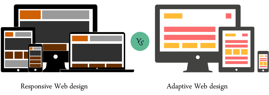
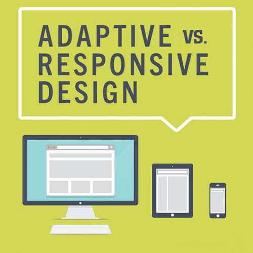
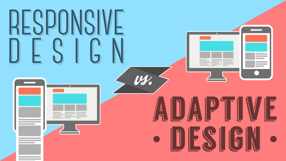
Responsive is fluid and adapts to the size of the screen no matter what the target device. Responsive uses CSS media queries to change styles based on the target device. This “fluid grid” resizes the page width and/or height to adapt to different screen sizes and show correctly.

r_vs_a-1

Adaptive design uses several distinct layouts for multiple screen sizes, and the layout used depends on the screen size used. Adaptive works to detect the screen size and load the appropriate layout for it.

vs_banner

How do responsive and adaptive compare?
responsive-or-adaptiveResponsive design is the more difficult choice since it requires extra attention to the site’s CSS and organization to make sure it functions at any possible size. It can be daunting making one layout that can work in any screen size.

Adaptive designs are less flexible, only working on as many screens as its layouts enable. If a new device with a new screen size is released, you may have to edit your design or add a new one. Responsive sites are flexible enough to keep working on their own, but Adaptive sites will likely need some occasional maintenance.

r_vs_a-2

Should I use responsive or adaptive design?
Responsive is the safer option to go with for your site in most cases. It functions well regardless of screen size, improves loading times and is usually well worth the extra initial design time.

Read More at Responsive vs. Adaptive, What’s Best for Designers?

Categories: Designing, Others Tags:

Twitter kills-off social proof

November 25th, 2015 No comments

You might have noticed in the last few days, that social share buttons on Webdesigner Depot, and across the Web, look a little different. Twitter has finally implemented its planned changes to both update the look of its buttons, and remove the accompanying shares counter.

The updated share buttons are white on Twitter-brand blue and modern looking. But they may not be used for much longer, thanks to the second change.

Until now share counts on articles, product pages, and almost everything else online, have acted as a form of social proof. Consciously or subconsciously users gauge the quality of content based on whether other users have taken the time to share it. In fact Search Engine Watch reports that social share buttons are themselves rarely used; between Klout, Buffer, and simple copy and paste, the buttons themselves are largely superfluous, the share number is what counts.

Twitter made the announcement on its blog six weeks ago, and implemented it over the weekend:

The choices are to deprecate the feature, or rebuild it on a more modern tech stack. Rebuilding has its own costs, and would delay our work on other, more impactful offerings for our developer community.

Twitter has a long history of pulling the rug out from under developers, but on this occasion it’s not the short notice period, but the lack of viable alternatives that has the community up in arms.

Twitter’s old share button reported the number of tweets that contained your specified URL, but it didn’t include the number of retweets, replies, or favorites; nor did it place the data in context by reporting the social reach of the people tweeting.

To get that kind of data, you need to turn to Twitter’s commercial data subsidiary, Gnip. However, Gnip’s pricing starts at $3600 per year. Many commercial blogs have that kind of revenue, most bloggers—writing for fun in their spare time—do not; especially not for a single piece of data that most providers supply for free.

Social shares can have a positive, or a negative impact. When sites display a share button that (incorrectly) implies zero shares on Twitter, it won’t be long before site owners start removing the button.

It’s a gift for networks like Google+ and LinkedIn: used for similar content to Twitter, they retain their share counts free of charge. Furthermore networks like Medium, who supply their own statistics together with their own sophisticated social proof, look increasingly attractive to the casual content producer.

There have been a lot of changes at Twitter recently. All of them tell of a company being steered away from its users’ goals. Twitter is a business, and it has to monetize its platform, but pushing its content producers towards other platforms is unlikely to improve its finances.

Award-Winning Adriane Text Font Family – only $15!

Source

Categories: Designing, Others Tags:

A New Responsive Font Format for the Web

November 25th, 2015 No comments

Nick Sherman gave a fascinating talk at Ampersand earlier this month which was based on an article he wrote called Variable Fonts for Responsive Design. In both the talk and the essay he suggests that we need a new font format to solve complex responsive design problems:

…the glyph shapes in modern fonts are restricted to a single, static configuration. Any variation in weight, width, stroke contrast, etc.—no matter how subtle—requires separate font files. This concept may not seem so bad in the realm of print design, where layouts are also static. On the web, though, this limitation is what I refer to as the “glass floor” of responsive typography: while higher-level typographic variables like margins, line spacing, and font size can adjust dynamically to each reader’s viewing environment, that flexibility disappears for lower-level variables that are defined within the font. Each glyph is like an ice cube floating in a sea of otherwise fluid design.

Manipulating a character in this way is commonly referred to as interpolation in the type design community: designers pick multiple poles, such as thick or thin, condensed or extended characters, and let a clever algorithm create a value in between. The example below, from Andrew Johnson’s SVG interpolation experiment, explains this process well:

As Nick mentioned, interpolating from light to bold, or from thin to wide letterforms is unfortunately impossible with the current font formats that we have for the web. However, he’s not the only designer calling for improvements to be made here, as Andrew Johnson has made similar requests for a responsive font format:

…today’s webfonts tie our responsive sites and applications to inflexible type that doesn’t scale. As a result, our users get poor reading experiences and longer loading times from additional font weights.

But why would we want responsive features like this in a font format anyway? How would that help us solve design problems?

The benefits of a variable font format

This new format would offer minute typographic control for designers, particularly for when a regular weight looks too thin and a bold weight looks too thick. Instead, we could pick a value in between thin and bold and the font would interpolate between them — in other words, designers would be able to make a substantial improvement to legibility.

Also, we could finally make layouts where words or sentences take up the whole space of its parent container, just like in the demo called Font to Width:

This technique might sound similar to FitText or using viewport units to set responsive text, but there is a clear distinction to be made that the type designer Erik van Blokland outlined:

Width variations will have an immediate application in fitting typography to the target rectangle. Words need to be able to respond to the page geometry.

So in order to best respond to the “page geometry” we need more control over the fonts that we apply to our designs and the width of each glyph is just as important as being able to set a responsive value for the font-size.

Another reason for implementing a new variable font format might be performance, as we’d only request the download of a single file, rather than the multiple fonts we need today when working with systems that require large type families that contain Extra-Light, Light, Regular, Medium, Semi-Bold, Bold and Black variants.

This idea of a responsive font format isn’t new and there have been multiple attempts in the past of creating something very similar. Adam Twardoch, the Director of Products at Fontlab, called for a resurgence of these ideas back in 2013:

In the web context, I think at least one of these variable font models deserves resurrection – because it offers tremendous compression potentials, lends itself well into the “responsive web” paradigm, offers new possibilities for text layout on the web and, above all, can be implemented much more easily on the web than it ever could be on desktop platforms.

Nick continued to summarise the benefits like this:

A variable font would mean less bandwidth, fewer round-trips to the server, faster load times, and decidedly more typographic flexibility. It’s a win across the board. (The still-untested variable here is how much time might be taken for additional computational processing.)

However, there are lots of technical considerations to think about when introducing a new font format to the web, so how might we implement these features in our designs?

How this new format might work in CSS

In his talk, Nick suggested a practical example in CSS that I’ve developed a little here with an imaginary property called font-width that lets us set the width of a character just like we can set the font-weight of an element today:

@font-face {  
  font-family: WebFont;
  src: url('webfont.new') format('new format');
}

body {
  font-family: WebFont;
  font-weight: 450;
  font-width: 200;
}

h1 {  
  font-weight: 600;
  font-width: 999;
}

We could then set another element to have a font-weight of 601 or 411 or whatever value that the design required for that particular element and the text would respond in kind.

Now, there are most definitely flaws in the example above, but I think it gets to the heart of the matter which is that our websites would be capable of so much more subtlety and nuance than they currently possess. And I can think of lots of examples where this new format would create more striking and beautiful layouts, not to mention how useful it might be in zoomable user interfaces.

What about WOFF?

There’s another font format that’s currently gaining traction called WOFF 2.0. It’s been designed to greatly improve the compression algorithm over its predecessor and it’s going to be wonderfully useful for Asian scripts and other languages that require fonts made up of lots of glyphs. However, WOFF 2.0 still doesn’t give us the design variation that we can get from a variable font format as we still need multiple fonts for different widths and weights.

So I think WOFF is great in the short term, but it doesn’t really help our long term goals of making these font formats truly responsive.

Potential problems

As much as I’ve discussed the advantages of this new format in terms of design and development, there are problems with it, too. Here are some of the most pressing issues that I’ve come up with so far:

  • If this interpolation algorithm is running client-side then it’s fair to say it might be bad for performance.
  • Licensing web fonts would need to be reconsidered since customers now only need a single font file instead of the multiple weights and widths that they need today.
  • Playing devil’s advocate here for a second: but is it really necessary for type to be dynamic on the user’s device?
  • I’ve talked to a couple of designers about this and they’ve mentioned that a half-working proposal in browsers would be worse than nothing at all.
  • Type designers would need to figure out how to educate designers why this new system might help them in their work and what benefit it has for the web overall. I spoke to a type designer recently and he mentioned how he avoids adding OpenType features into his fonts, such as small caps and ligatures, because so many graphic designers simply don’t know and/or care about them.
  • Likewise, type designers can’t easily redesign existing typefaces to use these new variables as they would have to be designed from the ground up to use this technology from the very beginning of a project.

Summing up

I think there’s huge potential for a new variable font format to become a key part of the designer’s tool belt. It would greatly improve the reading experience of general users of the web, too. But that doesn’t mean we can ignore the many problems and hurdles that we have to overcome to get a draft spec agreed upon.

What do you think? Would you welcome variable font files with open arms? Or is the whole idea an idealistic pipe dream? We’d love to hear what you think below in the comments.

Related


A New Responsive Font Format for the Web is a post from CSS-Tricks

Categories: Designing, Others Tags:

Google is Getting Up To Speed With Accelerated Mobile Pages

November 25th, 2015 No comments
Accelerated-Mobile-Pages

Accelerated Mobile Pages (AMP) is Google’s answer to Facebook’s Instant Articles. There is a sudden race to bring responsive content, in the most scalable manner, as quickly as possible to mobile. Publishers, developers, and now Google are jumping on board the quick-to-mobile bandwagon. With AMP, pages are set to load much faster than existing mobile web pages. According to Google’s blog, speed and user experience is the main focus behind launching AMP.

“We hope the open nature of Accelerated Mobile Pages will protect the free flow of information by ensuring the mobile web works better and faster for everyone, everywhere.”

David Besbris, Vice President Engineering, Search

The AMP Project is open source and more than 4K developers are taking part in the discussion on GitHub, and encourages other to take part as over 250 pull requests have been submitted in the forms of new code, samples, and documentation.
Google is set to begin implementing AMP into mobile search beginning 2016.

Read More at Google is Getting Up To Speed With Accelerated Mobile Pages

Categories: Designing, Others Tags:

Free WordPress Plugins: The Top10 of November 2015

November 25th, 2015 No comments
Free WordPress Plugins: WordPress Next Posts

The best thing about WordPress is its adaptability. Everything you can think of is generally possible, and a lot of it can be done very fast. You just need to search through the official WordPress plugin index to find the features of your desire and even more. Just install a plugin and your website becomes a bit better and more functional. But be careful: you shouldn’t use every plugin. You need a guide through the repository. That’s why I present ten free WordPress plugins every month. They are the best plugins of the last four weeks and with them, you’re always on the safe side.

1 – WordPress Next Post by errnio

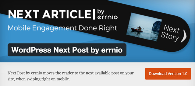
Next Post is a plugin that is interesting for the mobile view of a website, which is why it only works on mobile devices. When swiping to the right on a smartphone or tablet, the next article will be displayed. The plugin offers real added value for the mobile visitors to your website.

  • Developer: errnio
  • Frequently updated: Yes
  • Latest version from: 18.11.2015
  • Cost: free on WordPress.org
  • License: GNU GENERAL PUBLIC LICENSE
  • Compatibility problems with other plugins: not known
  • Developer Homepage: unknown
  • Download on WordPress.org

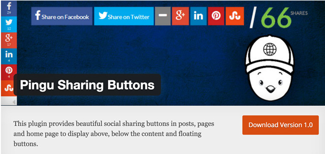
2 – Pingu Sharing Buttons

Free WordPress Plugins: Pingu Sharing Buttons

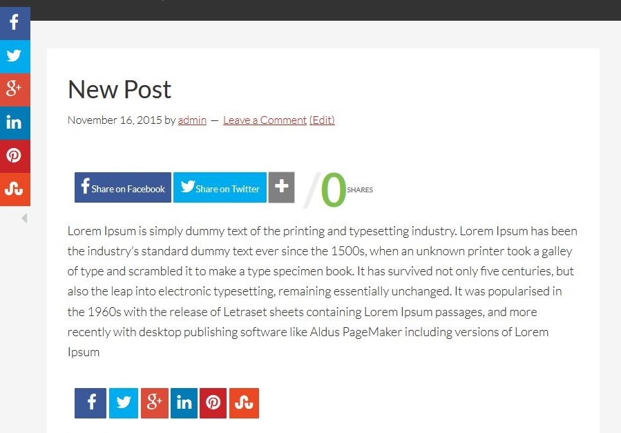
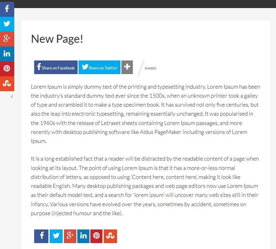
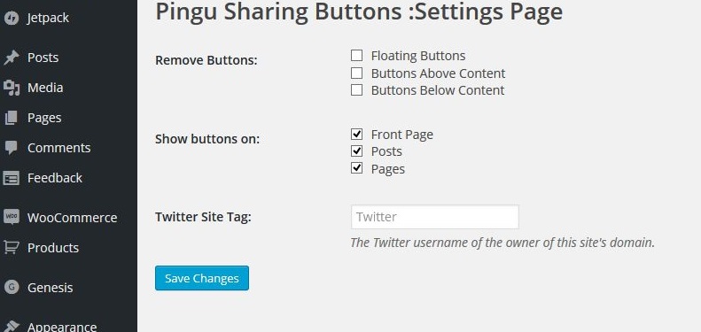
The Pingu Sharing Buttons are inspired by the well known Mashshare button solution. However, Pingu offers a lot more options to edit the buttons. The buttons can be placed on the side as “floating buttons” but also on top or below the content.

Pingu Sharing ButtonsPingu Sharing ButtonsPingu Sharing Buttons

  • Developer: Tech Pingu
  • Frequently updated: Yes
  • Latest version from: 18.11.2015
  • Cost: free on WordPress.org
  • License: GNU GENERAL PUBLIC LICENSE
  • Compatibility problems with other plugins: not known
  • Developer Homepage: unknown
  • Download on WordPress.org

3 – Off Your Site

Free WordPress Plugins: Off Your Site

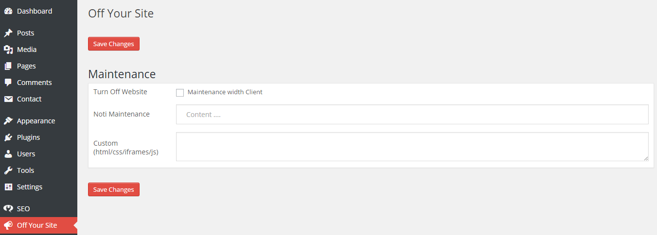
“Off Your Site” is a maintenance mode plugin without any nonsense. It shows the visitor of the website a simple maintenance mode page while the administrator of the WordPress site still sees the full interface of the website. This is an ideal solution for testing your new design before going live with it.

Off Your Site Screenshot 1Off Your Site Screenshot 2

  • Developer: enqtran
  • Frequently updated: Yes
  • Latest version from: 18.11.2015
  • Cost: free on WordPress.org
  • License: GNU GENERAL PUBLIC LICENSE
  • Compatibility problems with other plugins: not known
  • Developer Homepage: unknown
  • Download on WordPress.org

4 – Vulnerabilities Check

Free WordPress Plugins: Vulnerabilities-check

Vulnerabilities Check checks your website for known security issues. It receives its knowledge data from the “WPScan Vulnerability Database“, sponsored by the well-known security service provider Sucuri. The plugin scans the complete WordPress installation, including plugins and themes.

  • Developer: Sensorete
  • Frequently updated: Yes
  • Latest version from: 18.11.2015
  • Cost: free on WordPress.org
  • License: GNU GENERAL PUBLIC LICENSE
  • Compatibility problems with other plugins: not known
  • Developer Homepage: unknown
  • Download on WordPress.org

5 – Create DB Tables

Free WordPress Plugins: create-db-tables

Create DB Tables is especially attractive for developers as it allows the creation of new database tables within an existing WordPress database. Thanks to the plugin, those tasks can now be completed easily from the WordPress backend without needing to log into phpMyAdmin or similar solutions.

  • Developer: jppreuss
  • Frequently updated: Yes
  • Latest version from: 18.11.2015
  • KCost: free on WordPress.org
  • License: GNU GENERAL PUBLIC LICENSE
  • Compatibility problems with other plugins: not known
  • Developer Homepage: unknown
  • Download on WordPress.org

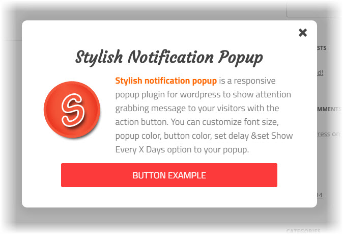
6 – Stylish Notification Popup

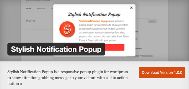
Free WordPress Plugins: Stylish-Notification-Popup

Stylish Notification Popup is a plugin that displays beautifully designed popups. These can contain text as well as call-to-action buttons. The popups are responsive and thus adapt to various screen resolutions. The plugin is intentionally lightweight and does not slow down the website.

stylish-notification-popup

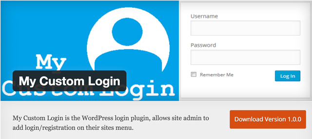
7 – My Custom Login

Free WordPress Plugins: My-Custom-Login

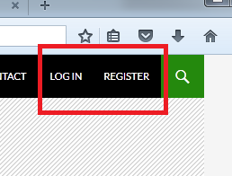
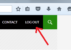
My Custom Login adds a login and register option to your website’s main navigation menu. To do that, the plugin uses native WordPress features, namely wp-login.php for login and wp-register.php for registration.

Free WordPress Plugins: My Custom Login

Free WordPress Plugins: My Custom Login

  • Developer: Ajay Singh
  • Frequently updated: Yes
  • Latest version from: 18.11.2015
  • Cost: free on WordPress.org
  • License: GNU GENERAL PUBLIC LICENSE
  • Compatibility problems with other plugins: not known
  • Developer Homepage: unknown
  • Download on WordPress.org

8 – Simple Sidebar Ads

Free WordPress Plugins: Simple-Sidebar-Ads

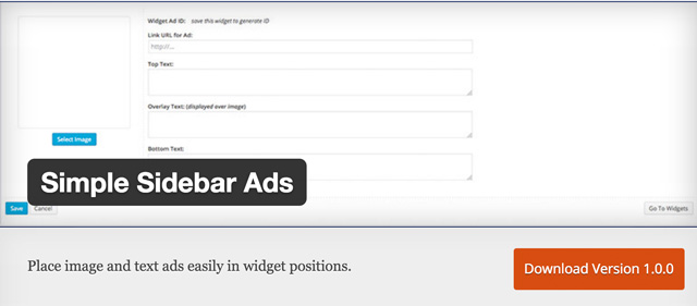
A simple, yet useful plugin to display text and banner-based advertisements. It adds a widget that is filled with the required information for the ads. Afterward, you can make it display the ads in every widget area of the website.

  • Developer: witnox
  • Frequently updated: Yes
  • Latest version from: 17.11.2015
  • Cost: free on WordPress.org
  • License: GNU GENERAL PUBLIC LICENSE
  • Compatibility problems with other plugins: not known
  • Developer Homepage: unknown
  • Download von WordPress.org

9 – LDW Clean

Free WordPress Plugins: lwd-clean-plugin

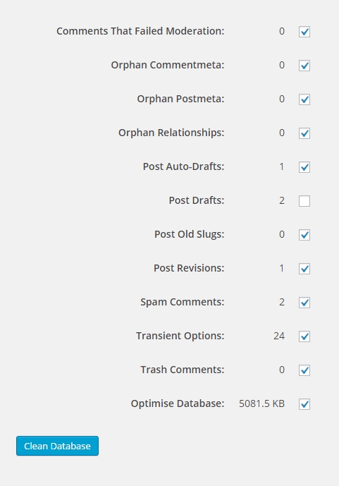
The LWD Clean Plugin cleans your WordPress database and deletes double entries and things that are not needed anymore. It promises to increase the website’s speed through its actions. You can individually choose what should be cleaned and what not. Additionally, it is supposed to optimize the database. Although the database is not the most important influencer when it comes down to performance increases you should still keep an eye on it.

Free WordPress Plugins: LWD Clean

  • Developer: Lake District Walks
  • Frequently updated: Yes
  • Latest version from: 17.11.2015
  • Cost: free on WordPress.org
  • License: GNU GENERAL PUBLIC LICENSE
  • Compatibility problems with other plugins: not known
  • Developer Homepage: unknown
  • Download on WordPress.org

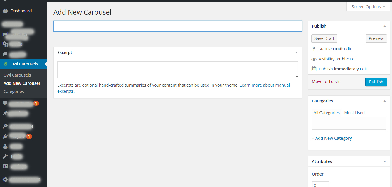
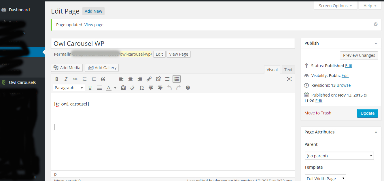
10 – Owl Carousel WP

Free WordPress Plugins: Owl-Carousel-WP

The Owl Carousel WP plugin is a simple plugin to integrate the popular carousel in any article or page. Just create a carousel and tie it into any place you want via shortcode. The carousels adjust to any screen resolution, meaning they are responsive.

Owl Carousel WPFree WordPress Plugins: Owl Carousel WPFree WordPress Plugins: Owl Carousel WP

  • Developer: imranemu
  • Frequently updated: Yes
  • Latest version from: 17.11.2015
  • Cost: free on WordPress.org
  • License: GNU GENERAL PUBLIC LICENSE
  • Compatibility problems with other plugins: not known
  • Developer Homepage: Owl Carousel WP Demo
  • Download von WordPress.org

Conclusion

This month was pretty rich with new interesting plugins. I like the »Pingu Sharing Buttons” a lot, and I will surely use »Off Your Site” on my website. I like the clear, simple design without any nonsense.

Which one of this month’s plugins do you like the most?

More Recent WordPress Plugins:

(dpe)

Categories: Others Tags:

Technical SEO 2015: Wiring Websites for Organic Search

November 25th, 2015 No comments

Ask ten people what SEO is, and you’re likely to get ten different answers. Given the industry’s unsavoury past, this is hardly surprising. Keyword stuffing, gateway pages, and comment spam earned the first search engine optimisers a deservedly poor reputation within the web community.

Modern Technical SEO: Wiring Websites for Organic Search

Snake oil salesmen continue to peddle these harmful techniques to unsuspecting website owners today, perpetuating the myth that optimising your website for Google or Bing is an inherently nefarious practise. Needless to say, this is not true.

The post Technical SEO 2015: Wiring Websites for Organic Search appeared first on Smashing Magazine.

Categories: Others Tags:

Background Music is Still A Thing on Hospitality Websites

November 25th, 2015 No comments
Music-on-Websites

We are going way back to when background music was a popular thing that plagued the internet, even before Myspace profiles pages blasted theme music. Even though it reflected “personality” and set a scene, background music was considered more of a nuisance. Mostly because it was really inconvenient to have music unexpectedly blasting out of your computer speakers in a quiet environment like a meeting, or class session. Not surprisingly, like most bad trends in early 2000’s web design, it faded away.

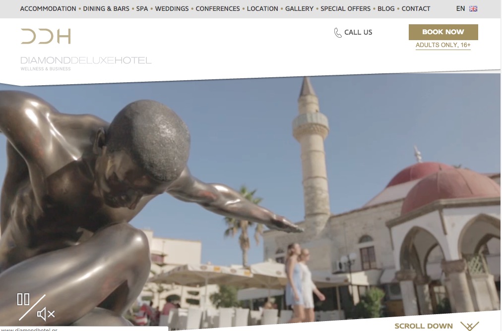
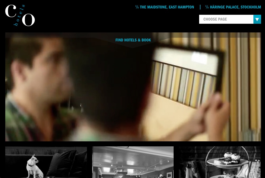
Surprisingly, this is still a thing! Only in the Hospitality industry do you hear background music accompanying a design. Below are some examples. Though the design is pretty great on some of these, we are surprised at the use of background music. However, we do appreciate the auto mute on some of them. A great solution for the modern website.

Le Burgundy

Diamond Hotel

Diamond Hotel

c/o Hotels

CO Hotel

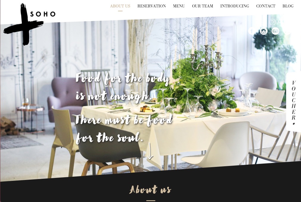
Soho Restaurant

Soho

Ritz Paris

Ritz

View more examples on oneextrapixel.com

Read More at Background Music is Still A Thing on Hospitality Websites

Categories: Designing, Others Tags:

Best Design Advice for 2016 from Computer Arts Is. 248

November 25th, 2015 No comments
Computer-arts

The Latest issue of Computer Arts, 248, is to be released before end-of-year and it will be filled with a forecast for 2016. The magazine has a variety of great advice for designers and the latest trends and concepts to look for in the new year.

Inside issue 248, interviews with leading designers and employers share the best ways develop your skills. They also share what you will need to learn in order to boost your success in the coming year.

The issue is on sale starting December 11. Save by subscribing before Thursday 26th November.

Subscribe to get CA issue 248 now

Read More at Best Design Advice for 2016 from Computer Arts Is. 248

Categories: Designing, Others Tags:

The Latest Web Design Tools Made To Focus On Design

November 24th, 2015 No comments
web-design-tools

Web design tools have not been keeping up. Trends are evolving so fast designers cannot keep up using traditional tools. As a result, Designers are then forced to resort to learning various forms of code. HTML, CSS, JavaScript is now a necessity, having an expert eye and talent for design is not enough to accomplish most modern design trends.

In my opinion, being a talented designer is not something that comes across easily to everyone. Therefore, design should be enough. Perhaps the problem is not the designers, it’s the tools. I believe design tools need to step it up and deliver or be left to wither away. This is why I’m overjoyed to see established companies like Adobe, and other up and coming software developers, willing to take on the challenge to create the latest and greatest web design tools.

Here are some of the best tools for web designers who want to focus on what they simply do best, design.

Macaw

“Stop writing code, start drawing it”

Macaw provides the same flexibility as an image editor (traditionally photoshop) and goes beyond to write beautiful HTML and remarkably succinct CSS on the backend. It’s time to expect more from a web design tool.

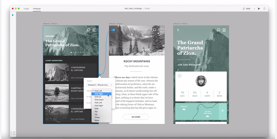
Project Comet

comet 3comet 2

“A tool for designing and prototyping user experiences”

Adobe is committed to staying in the design game, Following the release of Adobe Muse, we’re expected to see a suit of design tools with advanced capability for web and mobile. Comet hopes to consolidate the amount of prototyping tools used and increase the ability to design, prototypes and iterate quickly. Comet is yet to be released, preview is set for 2016.

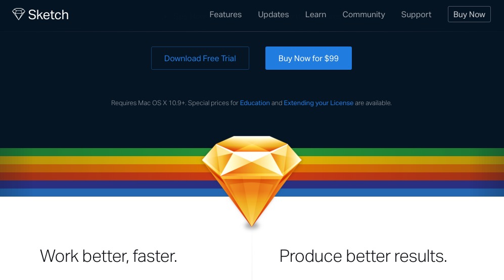
Sketch 3

Sketch 1Sketch 2

“The tool meant for web design”

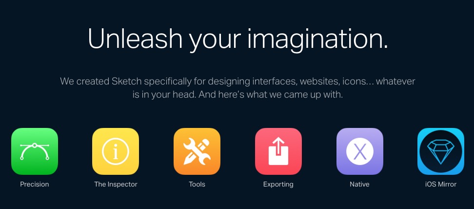
Sketch was designed to be faster and more powerful that Photoshop & Illustrator. It combines all the best features and tools designers use to Intelligent design. Finally, you can focus on what you do best: Design.

image credit: Designed by Freepik

Read More at The Latest Web Design Tools Made To Focus On Design

Categories: Designing, Others Tags:

Interview – Karen McGrane, UX Designer & Content Strategist

November 24th, 2015 No comments
Karen-McGrane-Interview

karen-headshot-bw-webFor nearly 20 years Karen has helped create more usable digital products through the power of user experience design and content strategy. She founded Bond Art + Science in 2006, and has led content strategy and information architecture engagements for Franklin Templeton, Marriott, and Celebrity Cruises. She has worked with nearly every major publisher in the business, including Hearst, The Atlantic, Fast Company, and Time Inc.

Previously, Karen helped build the User Experience practice at Razorfish, hired as the very first information architect and leaving as the VP and national lead for user experience. There she led major design initiatives for The New York Times, Condé Nast, Disney, and Citibank, and managed a diverse team of information architects, content strategists, and user researchers.

Karen teaches Design Management in the MFA in Interaction Design program at the School of Visual Arts in New York, which aims to give students the skills they need to run successful projects, teams, and businesses.

Her book Going Responsive was published in 2015 by A Book Apart, and her first book, Content Strategy for Mobile, was published in 2012. She is also the co-host of A Responsive Web Design Podcast with Ethan Marcotte. Her pithier writings often wind up on Twitter at @karenmcgrane.

Can you share a little about yourself and some history about how you got into UX Design work?

I’m one of the rare people in this industry who came in through the front door and I’ve never done anything else. I have an M.S. in Technical Communication and Human-Computer Interaction from Rensselaer Polytechnic Institute, an engineering school in upstate New York. The mid-90s was a great time to learn the principles of user-centered design, and to learn them in a communications program means I was trained in information architecture and content strategy from the start. I got my first job at Razorfish in 1997 and have been working in UX ever since.

As a creative, how did you transition into Content Strategy?

I wouldn’t use the term “a creative” to refer to anyone in this industry. Everyone is creative—I’ve worked with back-end developers who are some of the most creative people I’ve ever known.

What were some of the most challenging websites you’ve worked on? Can you share the solutions you developed for them?

I just worked with a fantastic team on the redesign of The Toast and we wrote up a case study of our process. What made this project special was working with a group of people who are all exceptionally good at what they do. The team at The Toast was also a delight to work with. There are so many complex decisions to be made over the course of a web project, being able to trust the people you work with is the most important thing.

What do you say to companies that are reluctant to invest in UX Design, how do you make others aware of the significance of UX Design?

I don’t even try to convince the non-believers. It’s not worth it. Partner with people who already understand why user experience is important and value your work. We don’t have enough skilled UX people to solve the problems of companies that already get it, why waste time trying to convince people?

Can you tell us about the time you spent at Razorfish as the VP and National Lead for UX? Can you share some of your notable accomplishments there?

I was the first person hired with a background in user experience, and when I left I was running the practice nationally. Over the years, I helped shape and build the practice, managing a team of information architects, content strategists, user researchers, and experience directors. I was privileged to work with some exceptionally talented designers at Razorfish, and it seems like most of my cohort from those early days at Razorfish have gone on to interesting leadership positions.

Was there any specific problem you set out to solve at Razorfish?

I had a different job every year, even though I worked for the same company. I often describe it as a crash course in every situation that a business might encounter: explosive growth, going public, multiple acquisitions/mergers, massive layoffs, strategic shifts. As a designer and a manager I was exposed to so many different situations—not all of which I was prepared to deal with. I learned a lot about running teams, projects, and businesses, and that has paid off handily in the years to come.
Karen-McGrain-Quote2

How did you transition from Razorfish to Bond Art+Science?

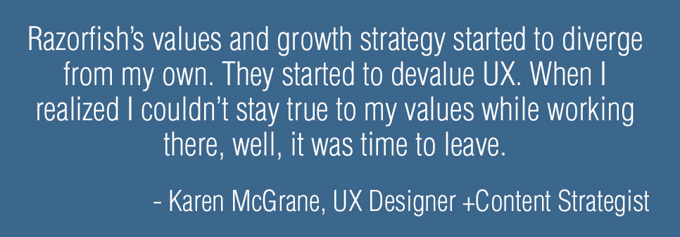
I made a very good decision to quit my job. For the majority of my time at Razorfish I felt the values of the company aligned solidly with my values, and my career opportunities dovetailed nicely with the needs of the company. At a certain point, Razorfish’s values and growth strategy started to diverge from my own. The company became more of an advertising agency and I’d say—from my admittedly biased vantage—that they started to devalue UX. When I realized I couldn’t stay true to my values while working there, well, it was time to leave.

I have been running Bond since 2006, at first with partners and now entirely on my own.

Could you explain your thoughts on “company culture” and how it can be fostered in a work environment? Do you feel that Bond Art+Science has its own unique culture?

Bond is just me, but I work quite regularly with a variety of partners. Culture means something different to me today than it did even a decade ago, when I might have talked about how the office space should be conducive to meetings and discussions, or how lunches and other social activities go a long way towards creating trust. With so many people working remotely, and many people working on ad-hoc teams, culture is more elusive since people aren’t working face to face. But, regardless of whether it happens in person or on Slack, clear communication and being kind to each other are things I value.

What do you believe are some vital content strategy concepts that designers/developers may not understand?

“Starting with the content” doesn’t mean waiting until all the content is done. Too often, I see content treated as almost a binary state: either we have the content or we don’t. Designers and developers often complain about how difficult it is to get clients to give them the content.

Content strategy is a whole set of processes that make it easier for clients to say what the content should be—and make it easier for clients or copywriters to actually create that content. Content strategy also makes it easier for designers and developers to understand the structure of the content, its size and shape, where it will come from, and how it might be reused. Knowing the structure of the content is the most useful input to the design process—in some ways even more useful than having a few examples of the “real” content, because this process ensures you’re considering a range of possible scenarios and variables.
Karen-McGrain-Quote1

As someone who knows both content strategy and UX Design, do you think it’s advantageous for anyone in the business of design to learn the strategy side of things?

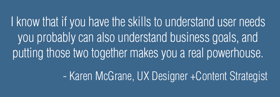
I teach the Design Management class in the MFA in Interaction Design program at the School of Visual Arts. It’s basically “business skills for UX designers.” I’m fond of saying that “design is the easy part.” Working in isolation, it’s not difficult to imagine a better interface, a better user experience. (That’s why redesigning something like the United Airlines website as a portfolio piece is so satisfying and yet so superficial.) Figuring out how to actually make better design happen, understanding the business strategies that support or hinder great experiences—I think every designer needs to have some understanding of how business works. Frankly, I’ve seen so many of my UX design peers go on to lead successful businesses, I know that if you have the skills to understand user needs you probably can also understand business goals, and putting those two together makes you a real powerhouse.

You teach Design Management at SVA, what does one learn from the Interaction Design program?

The interaction design program is a 2-year MFA, and it’s run with a studio model, so the students move together as a cohort. They take all their classes together and there are no electives. The program covers a range of perspectives in interaction design—this isn’t just about design for the screen. I recommend it for professionals with a few years of experience who are looking to explore user experience design more fully. One of the benefits of a program like SVA is the network of relationships students make, with the school and with other members of the program.

Is this a difficult process to teach in an industry where technology and tools are constantly changing/improving? How do you stay up-to-date?

The class I teach is about business principles, which don’t change all that much! A lot of what I do in content strategy is also more slow-paced. I believe that investment in content modeling, taxonomy, and information architecture is something that can last companies for years or decades. People working in front-end design and development have to keep up with so much! If you’re familiar with Stewart Brand’s concept of Pace Layers the work most web designers and developers do is on the fashion layer, and I work in the commerce and infrastructure layers.

What kept you motivated in the early days of your career, and what keeps you actively engaged in the industry now?

I feel genuinely lucky to have found a profession that maps so well to my interests and how my brain works. I am never bored. Honestly, I just have a huge amount of gratitude for the growth of the web over the past 20 years.

What was the general process of writing your latest book, Going Responsive?

Going Responsive was my second book and it came out last week, on November 18. The process was a bit different from writing the first one, Content Strategy for Mobile. For my first book, I didn’t really know what to expect or how the ideas would emerge, so I just started writing. With Going Responsive, I was very clear from the start what I wanted to talk about, and I mapped out an outline for each chapter and section with expected word counts for each. I stayed pretty close to that structure and wrote about 1500 words per day (on the days that I wrote; I didn’t write every day.) The first draft took around three months to write. Once the book was drafted then there were successive rounds of development edits, line edits, copy edits, and proofreading. Then the book went into production for the print layout and the ebook. That whole process took a few more months, give or take. I haven’t actually seen the print book yet, so it’s not quite real yet!

What are the major points you feel the reader can take away from your book?

Responsive design is more than fluid grids, flexible images, and media queries—it’s a new way of communicating and working that affects the whole team. This book is based on research and interviews with dozens of companies that have pulled off a successful responsive redesign.

Readers will learn about:

  • Why responsive is the right solution (given other options for mobile)
  • Planning and scoping responsive projects
  • Changing how teams are structured and collaborate
  • Why every responsive design project is also a content strategy project
  • New ways of dealing with browser support and testing
  • Measuring success and expected outcomes

If you could travel back in time and give your younger self one piece of advice, what would it be?

The problems you’re anxious about today won’t matter at all in 5 months or 5 years, so don’t waste so much time and energy worrying about them. The benefit of age is that you have experience getting through things, and so you feel more confident you can deal with whatever challenges life throws at you.

karen-mcgrane-web-res-photo-by-erik-westra-1

What do you believe the future of UX will look like over the next 5 years? Do you have any plans for new projects in the future?

I hope the future of UX is more diverse. People who use the products we design are increasingly diverse—mobile phones bring the internet to a much wider audience than traditional desktop computers. Having more perspectives on a team results in better products. Right now, the tech industry is dominated by affluent white people, with most tech companies skewing heavily male. If we care about creating great products for people, then we should ensure that the design and development team also brings a range of different perspectives.

Finally can you share any individuals you look up to in your industry and why?

Dana Chisnell is a personal hero of mine. Her work at the Center for Civic Design helping election workers design more usable ballots landed her a consulting job at the White House and the US Digital Service. I find her work so inspiring.

Lisa Welchman is another person I admire greatly. Her book, Managing Chaos, is one of the best books I’ve read this year. There’s no one else out there who understands how to wrangle large organizations and their digital processes like she does.
I don’t know him personally, but I think
Tim Allen
is the UX professional most likely to become CEO someday. He’s worked agency side at RGA and Sapient and later as ECD at Amazon, and now is the North American president for Wolff Olins. Someone to keep an eye on.

Read More at Interview – Karen McGrane, UX Designer & Content Strategist
Categories: Designing, Others Tags: