Archive

Archive for November, 2015

Scaled/Proportional Content with CSS and JavaScript

November 24th, 2015 No comments

The web is a fluid place. Different sized screens, yadda yadda yadda. Fortunately for us, the web is ready for it. Text wraps. CSS gives us control over how to size things. What we don’t get (easily, anyway) is a way to scale whole element (and it’s children) proportionally—retaining its exact layout as it changes size.

We can do it though.

Proportional scaling of a *container* is fairly easy

Uncle Dave’s Ol’ Padded Box:

.parent {
  height: 0;
  padding-bottom: 56.25%; /* 16:9 */
  position: relative;
}

Then if you want content inside, you can absolutely position a covering container inside:

.child {
  position: absolute;
  top: 0; left: 0;
  width: 100%; height: 100%;
}

This can be quite useful for things like images, containers that can independently scroll, or containers with so much spare room that it can handle dramatic changes in shape.

If the content of this container was, say, an image, it works great!

But things aren’t so happy if there are a bunch of HTML element children just doing what regular ol HTML elements do.

Proportional scaling of everything

Let’s say this is the kind of thing we’re after:

CSS alone can’t really do this. But CSS is still the answer! transform: scale(); is what we need. It scales things perfectly proportionally. We just need to give it a number to scale it by, and that scale we can figure out with some JavaScript.

The trick is:

var scale = Math.min( 
  availableWidth / contentWidth, 
  availableHeight / contentHeight 
);

Here’s one possible approach to that, using jQuery and jQuery UI Resizeable (because that’s easy and comfortable for me):

See the Pen Resize with Scale by Chris Coyier (@chriscoyier) on CodePen.

Other ways…

SVG does this all by itself. Let’s cover this in an article really soon. I have some things to say. 😉

Also, you may be able to size everything with vw/vh units maybe, but that sounds like a pain in the butt and a whole lot of magic numbers.

It’s probably a bit rare that you’d need this

The reason I’m all into this idea is because I noticed that embeddeddable slide decks from Slides.com work like this.

@chriscoyier Thanks! Content scales proportionally but the background size is flexible to fill 100% of avail space. pic.twitter.com/1CybHUBdoS

— Slides (@slides) November 18, 2015

That’s a perfect use case. Slides.com gives you a fixed size canvas to create your slides on, which completley makes sense. Then those slides can scale up if needed, to present in a larger space. Or scale down to fit on smaller screens (like if you embed them into a blog post with a narrow content column or view on a mobile device).

I think about Embedded Pens as well. Sometimes people design Pens to work in a larger area, and the design breaks down when it’s embedded. I could use this to proportionally resize the guts, but only as much as needed to fit.

Maybe iframes? Probably mostly third-party or user-generated stuff, and in situations where the proportion matters, otherwise, carry on with regular RWD action.


Scaled/Proportional Content with CSS and JavaScript is a post from CSS-Tricks

Categories: Designing, Others Tags:

WPO stats

November 24th, 2015 No comments

WPO, as in, “Web Performance Optimizations”, I believe.

Case studies and experiments demonstrating the impact of performance optimization on user experience and business metrics.

Real companies, real performance changes, real impact. Ya know, Little things like:

Staples reduced median homepage load time by 1 second and reduced load time for the 98th percentile by 6 seconds. As a result, they saw a 10% increase in their conversion rate.

Direct Link to ArticlePermalink


WPO stats is a post from CSS-Tricks

Categories: Designing, Others Tags:

Animate box-shadow with Silky Smooth Performance

November 24th, 2015 No comments

Neat trick by Tobias Ahlin:

How do you animate the box-shadow property in CSS without causing re-paints on every frame, and heavily impacting the performance of your page? Short answer: you don’t. Animating a change of box-shadow will hurt performance.

There’s an easy way of mimicking the same effect, however, with minimal re-paints, that should let your animations run at a solid 60 FPS: animate the opacity of a pseudo element.

Direct Link to ArticlePermalink


Animate box-shadow with Silky Smooth Performance is a post from CSS-Tricks

Categories: Designing, Others Tags:

Calypso

November 24th, 2015 No comments

Pretty bold step for WordPress. Totally new UI. Totally new technologies. No more PHP and MySQL, it’s Node.js, React, Flux, Babel, Webpack… the fanciest of fancy modern tooling. Still completely open source.

Matt Mullenweg:

On one hand it seems risky. How much of WordPress’ success is based on the epic backwards compatibility and ability to run on nearly any server? Will this ever become the self-hosted WordPress.org varient? At the moment, they are saying “Install JetPack and you can manage your self-install from WordPress.com” – but that doesn’t feel like an answer. If we can never self-install, maybe the backwards compatibility doesn’t matter? Can you keep developers interested in working on “the old thing” when the new shiny open source thing that powers the core business is right there?

On the other hand it seems to stifle risk. If you stay stuck in old tech, how long can you retain talent? How long until using it feels awkwardly antiquated?

This chart really drives home the before/after benefits.

Direct Link to ArticlePermalink


Calypso is a post from CSS-Tricks

Categories: Designing, Others Tags:

No Hard Feelings: The Wait For “Hardboiled Web Design” Is Over

November 24th, 2015 No comments

Some books deserve a spot at your desk. The brand new Hardboiled Web Design by Andrew Clarke is one of them. In its 5th anniversary edition, Andy explains how you can use HTML/CSS efficiently in responsive design — and how to reduce wasted time in the process with developers, designers and clients. No fluff, no theory — just insights into his own experiences with clients such as ISO and WWF.

A look on the new Hardboiled Web Design Softcover

If you get a printed copy (free worldwide shipping), you’ll get the eBook for free — available in PDF, ePUB, Amazon Kindle. All printed copies will ship from Dec 8th. Softcover, 441 pages. Jump to the table of contents. Proudly published by yours truly Smashing Magazine.

The post No Hard Feelings: The Wait For “Hardboiled Web Design” Is Over appeared first on Smashing Magazine.

Categories: Others Tags:

SVG without SMIL: Google Chrome Kills Support

November 24th, 2015 No comments

It should be common knowledge by now that interesting charts, illustrations and complex animations can be created using the SVG format. SVG provides three different ways of creating animations. Next to JavaScript and CSS3 animations, SMIL is another approach to making shapes move. However, with Chrome 45, Google classified SMIL animations as deprecated and will not support them in the future. Why did Google do that? What do web developers need to know now?

The History of SMIL

SMIL is short for „Synchronized Multimedia Integration Language“ and presents a simple way to animate SVG elements in many different ways. To do so, one of the SMIL elements „“, „“ or „“ is used as a “child” of the element you want to animate. Next to simple movements, rotation, scaling and shapeshifting are also possible.

<rect x="0" y="0" width="100" height="100">
  <animate attributeName="x" from="0" to="500" dur="5s" />
</circle>

The above example shows how a rectangle is moved on the x-axis via an „“ element. Although SVG animations have only gained popularity lately, the first SMIL approaches are more than 15 years old. 1999, SMIL 1.0 was passed by the W3C and in 2008, the current version 3.0 was passed.

SMIL is not only suitable for the SVG format and creation of animations. As the name already tells, the markup language is used to implement multimedia content. That’s why SMIL can also be used for audio and video formats. The HD DVD format, for example, uses SMIL to provide interactive content via HTML, CSS and SMIL.

Version 2.0 added animation options for the SVG format in 2001.

SMIL: Two’s Company, Three’s a Crowd.

Despite the simple syntax and the rather long history of SMIL, Google has decided to no longer support the markup language in its Chrome browser. Those that open an SVG graphic with SMIL animation on Chrome 45 will see a screen that says that SMIL is deprecated and that you should switch to CSS or web animations.

SVG without SMIL: Google Chrome Kills Support
Tips in the Chrome Developer Tools

The reason Chrome forgoes SMIL is the lack of support for all big browsers. Neither Internet Explorer nor the new Edge can work with SMIL, and they won’t be able to do so in the future. That’s why the users of Microsoft browsers are always excluded when SMIL is used.

In addition to that, there are two other ways of animating SVG shapes. Namely the popular CSS3 animations „transition“ and „animation“ in combination with „@keyframes“ are available for the SVG format as well.

There are so called web animations for more complex animations that require calculations. These animations can be realised using the „animate()“ method of JavaScript.

The lacking Microsoft support and the existing alternatives have made Google quit its SMIL support.

Disadvantages of Relinquishing SMIL

CSS3 and Web Animations can do a lot of what SMIL can do. Simple movements on the x- and y-axis, scaling and rotation can be realised with CSS3 without any issues. However, one thing poses a problem, at least at the moment. SMIL makes it very easy to create an animated morphing between two shapes.

CSS3 and Web Animations don’t provide this option. Without additional JavaScript libraries, this morphing can not be done without either SMIL or extensive programming efforts.

What Developers Should Do

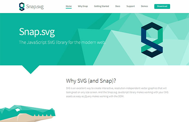
Even when SMIL is now classified as deprecated, the support is not instantly banned from Chrome. For future projects, however, other animation options and libraries such as SVG.js or Snap.svg should be used.

SVG without SMIL: Google Chrome Kills Support
An Alternative to SMIL: Snap.svg

In the Google group for Chromium, there are some explicitly criticizing voices asking the Chrome developers to continue the SMIL support. Although SMIL is currently not enjoying extended usage, there is no alternative that can replace SMIL’s full scope of features.

Also criticized is the fact that the relatively simple SMIL application has to be replaced with a complex JavaScript animation. The development of the SVG topic in the next months and years and how other browser providers are going to react can not be predicted. Only time will tell.

(dpe)

Categories: Others Tags:

The secret of web success: figure out what your user wants, then give it to them

November 24th, 2015 No comments

We all want to give our users an optimal user experience; it has been one of the more recent pillars of web design. Most people equate good user experience with such stuff as great design or a fast-loading website, and it’s great that such attention is being given to optimize these experiences.

There is one type of experience though, that people tend to miss, or forget to optimize for.

Many times we focus on the user who has the specific intent of visiting our website, but we tend to forget the user who has just discovered our site through an organic search. Remember that the user who directly visits your site already has an idea of why they are visiting. On the contrary the users who land on your site via search, don’t know who you are.

users who land on your site via search, don’t know who you are

Are you optimizing the user experience for users who are landing on your site after searching for something?

Even though, according to OutBrain: “Search is the #1 driver of traffic to content sites, beating social media by more than 300%”; most people can’t figure out how to get visitors and keep them on their site through Google and other search engines.

There is a way however of optimizing the user experience for those users who are coming from search. Using the below technique, you’ll be able to figure out why the visitor has landed on the page. From that information you’ll be able fulfil their need by providing content which is optimal for them.

Although we will be showing you how to do this using an example based on articles, this technique also works for whole websites. Your website design would need to be complimented by creating great content around the problem you want to solve for your customer.

With “93% of online experiences beginning with a search engine” (Search Engine Journal) this is one use case you really can’t afford to ignore.

Focus on user goals

In the older days of optimizing content around search, there was a lot of focus around keywords. All advice was that you should focus your content, your website, your blogs around specific keywords which people typically use to possibly find your website. Do as much on-page and off-page keyword optimization as possible, get good backlinks and you’ll get a good ranking on search results for those keywords; with the result of getting more visitors who are using those keywords in their search queries.

78% of client-side respondents stated that their company was extremely, or quite committed to delivering the best online user experience. — Econsultancy

There was also the so-called “long tail” strategy. Rank for as many long tail keywords as possible so you’ll get visitors to your site by creating content around these keywords.

This was as negative a user experience as a searcher could get

However, this was missing the woods for the trees. By focusing content around keyword searches people were trying to game the system. The unfortunate end result was a negative user experience for those users searching for specific keywords. Rather than finding the content they needed, they typically landed on a spammy result which was focused on keywords where the intent of the website owner was to push their particular content, product, or website.

This was as negative a user experience as a searcher could get; you had to bounce through a number of search results in the hope of finding what you needed.

Google eventually realised that their users were having a negative user experience. Algorithmic changes and updates (in the form on the Panda search results ranking algorithm) penalized sites which were ranking for keywords alone.

Google was trying to give the user an optimal user experience through search but bad content around good keywords was thwarting what Google was trying to do.

Focus on user needs

In general the content which ranks well for specific keywords should be able to satisfy the “search need” of that specific user. The content which ranks well should be able to address the user intent behind that search.

88% of online consumers are less likely to return to a site after a bad experience — The Gomez Report

This should be your primary focus.

Today, in the age of Google being able to analyse massive amounts of data coming from their various sources, and with the extensive experience Google has amassed during the years, they can quite easily tell which content satisfies a user need, and which content is not working. Whether a user is having a positive or a negative user experience can be determined through data such as clicks on the content, time spent on the page, whether they searched again or visited a different page and stayed longer, whether they scrolled on the page and lots of other data sensors.

(If Google can create a ReCaptcha which can tell whether you are a human or not from the way you move your cursor towards a button, you can rest assured they are able to tell which content delivers a good experience to the searching user.)

Even Facebook uses this concept to show stories in the News Feed which are most likely to keep the content on Facebook and engaged.

Essentially if you want your content to rank, ideally in the first position – you must address the critical need of that specific search query. Your content must be content which is able to address the user’s intent.

Give the user “the best content on the Web”

Given that Google knows good content from bad content, there is one thing you’ll need to do. You’ll need to produce the best content on the Web. This is not an exaggeration. For a specific user search intent, your content must be the best content on the Web, not only in terms of quality but in terms of addressing users’ needs. It must be many times better than similar content on other websites.

If you had to think about why you use your favourite search engine and your own search experiences, you’ll probably find that it confirms our assertion. The first two or three results for a search query about a specific topic or phrase, typically return the most complete articles about that topic. The content you landed on was the best content on the Web!

A recent MOZ study confirms this:

On average, 71.33% of searches result in a page one organic click. Page two and three get only 5.59% of the clicks. On the first page alone, the first 5 results account for 67.60% of all the clicks and the results from 6 to 10 account for only 3.73%.

Creating the best content on the Web might sound hard, however the following tips will guide you on how to understand what your users want; you’ll then be able to come up with content which fully addresses a user’s search intent.

To put this into action, we’re going to look at the data we have available to us, and try to understand the user intent from what we see.

Monitor the search traffic to a page

First thing we want to do is login to Google Search Console (formerly known as Google WebMaster tools) and see what search keywords are driving traffic to a specific page.

  1. Go to Search Traffic > Search Analytics for a specific website.
  2. Click on Pages, and click on the page you want to analyse.
  3. Go back to Queries. You should have something similar to the below:

We can see that the above page is generating approximately 8,800 impressions and 843 clicks for a CTR of slightly less than 10%. This is quite good however from the data we can try to understand the user intent, and then improve the content to fully address the user’s search intent.

Clearly, our audience is looking for ways to create an Ajax popup window.

First thing you want to do is self-critique your content in the context of the above new information. Does the content explain what the user is trying to do completely? Is the content leaving any gaps? Are there ways and means to improve the content?

Below is another excellent example of a page which is sending traffic from lots of different keywords, so there is lots of potential for filling gaps in user intent.

Once you understand what a user is trying to achieve make sure to rewrite or write additional content to answer any queries which have not been answered yet in your existing content. Make sure that any user search clicks which are sent to your page can satisfy the user search intent.

Check the pages that are outranking you

Now comes the fun part! Overtaking your competitors based on creating “The best content on the Web”. If you order the keywords by impressions as opposed to clicks, you’ll see where there is the most potential to grow.

Above you can see that “web design checklist” is generating the most impressions, but the CTR has room for improvement. We are also so close the top that we should be able to muscle ourselves into first place. The third example also has potential, but we’re more likely to win the first battle, and it has a better ROI because the impressions are larger.

So click on the “Run Query” link right next to the keyword. We can see that there are two higher results. The first result is a generic article which is leading to a multitude of links. Given that this is Smashing Magazine, we’re going to have a very hard time nudging them out of that position. However, on the positive side, this looks like quite an old article, so people might skip to the next results.

The 2nd article on the other hand, has content which is good, but which should be fairly easy to better.

Create the best content on the Web

At this point, what you need to do is improve your content to be better than that of your competitor. Do use the keywords which are being searched for, but most especially make sure you answer as fully as possible the user’s intent. For our example, you need to create a web design and development checklist which is as extensive as possible.

Organize your content around the user’s search intent. It is extremely likely that the user is looking for a list of things to do when executing a web design and development project, so the more complete the checklist in that regard, the more likely you to hit the sweet spot.

Cheats to get to the top faster

  1. Write a long article.

    Studies have shown that longer articles rank better on Google. your article should be longer than those at spots higher than yours.

    The average content length for a web page that ranks in the top 10 results for any keyword on Google has at least 2,000 words. The higher up you go on the search listings page, the more content each web page has. (serpIQ)

  2. Create an incredible title to get better clicks and traffic by boosting the CTR

    A great title makes for a number of things. One, it compels the user to read your article. Given that the ranking you want to skip doesn’t have an incredible title, it should be fairly simple to create an article which piques the user curiosity — but always remember the user search intent and focus the title around that. Also, remember that if the CTR of your content is better than that of your competitor, you will get ranked better

  3. Keep monitoring your content and keep it updated

    Google loves updated content. It means that the author of that content cares so much about the content, that they are making sure it stays updated. This is also a ranking factor, so make sure you keep the content updated with new happenings as they occur. Or keep iterating on it making it better.

Featured image, analytics image via Shutterstock.

100+ Premium Christmas and New Year Vectors – only $15!

Source
Categories: Designing, Others Tags:

The Different Styles of Card Design Layout

November 24th, 2015 No comments
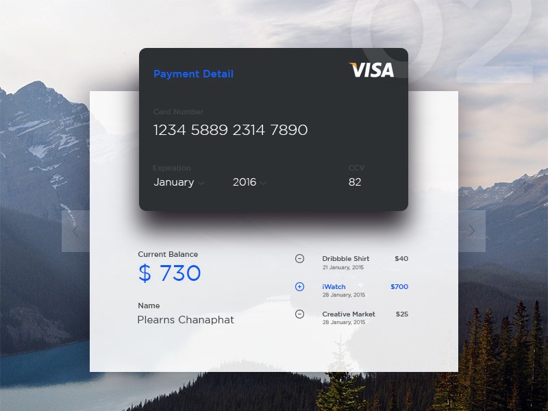
Card-Style-Layouts

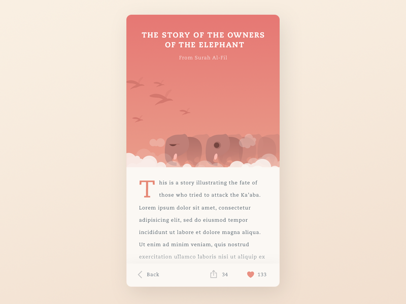
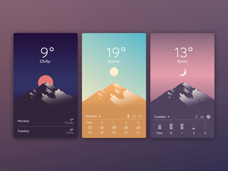
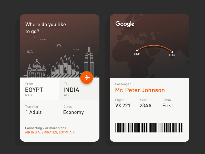
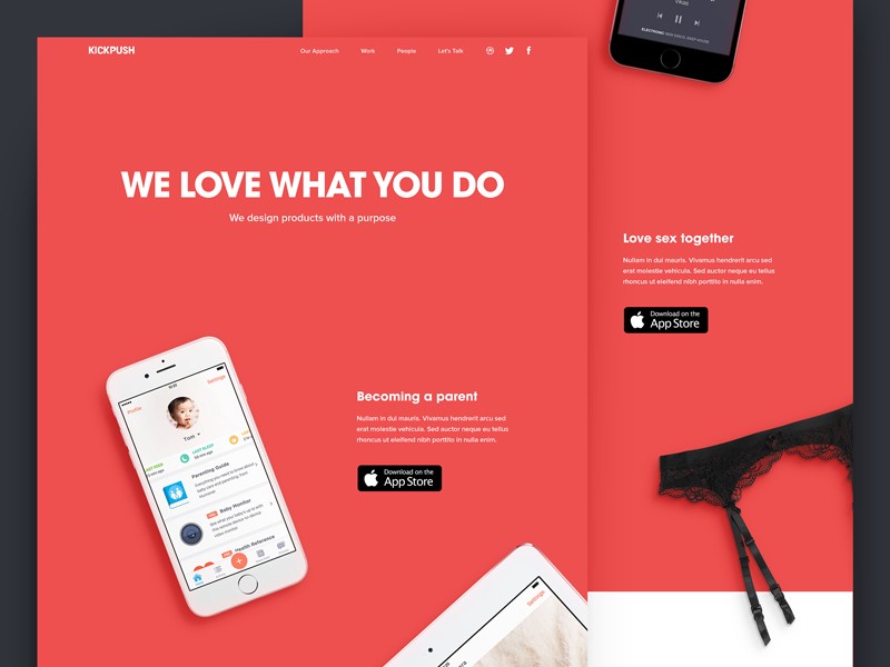
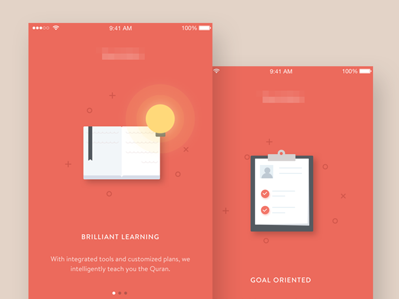
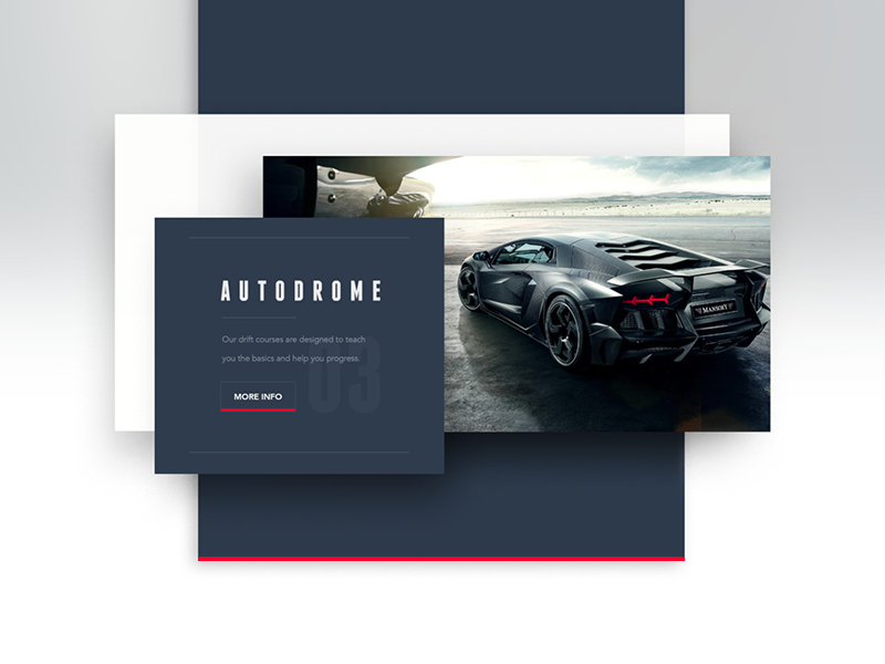
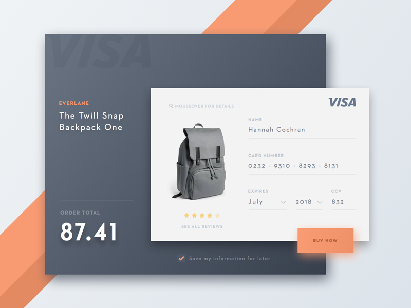
As I’ve mentioned before, Card Design is taking over! What makes it even more refreshing is the different takes you can use to achieve the card style and how adaptable it has become. From tiles, stack, to layers, here are four examples of different ways to use card design in a layout from Dribble.

Floating Cards

Card Layout1Card Layout3Card Layout2

Tiles

Tiles3Tiles2Tiles1

Stack

Stack3Stack1Stack2

Layers

Layer2Layer3Layer1

Read More at The Different Styles of Card Design Layout

Categories: Designing, Others Tags:

Sailing With Sails.js, An MVC-style Framework For Node.js

November 24th, 2015 No comments

I had been doing server-side programming with Symfony 2 and PHP for at least three years before I started to see some productivity problems with it. Don’t get me wrong, I like Symfony quite a lot: It’s a mature, elegant and professional framework. But I’ve realized that too much of my precious time is spent not on the business logic of the application itself, but on supporting the architecture of the framework.

Sailing With Sails.js

I don’t think I’ll surprise anyone by saying that we live in a fast-paced world. The whole startup movement is a constant reminder to us that, in order to achieve success, we need to be able to test our ideas as quickly as possible. The faster we can iterate on our ideas, the faster we can reach customers with our solutions, and the better our chances of getting a product-market fit before our competitors do or before we exceed our limited budget. And in order to do so, we need instruments suitable to this type of work.

The post Sailing With Sails.js, An MVC-style Framework For Node.js appeared first on Smashing Magazine.

Categories: Others Tags:

Web Design Inspiration: Pricing Tables

November 24th, 2015 No comments
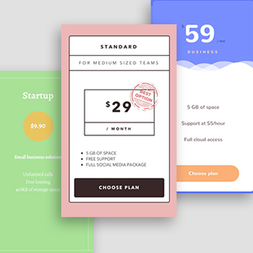
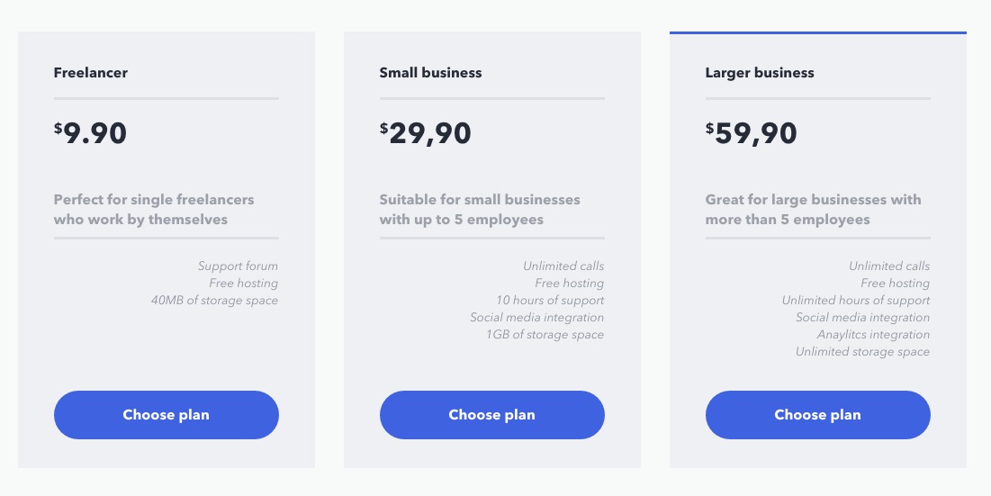
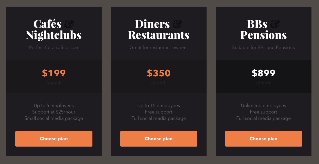
Pricing-tables

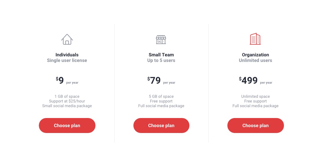
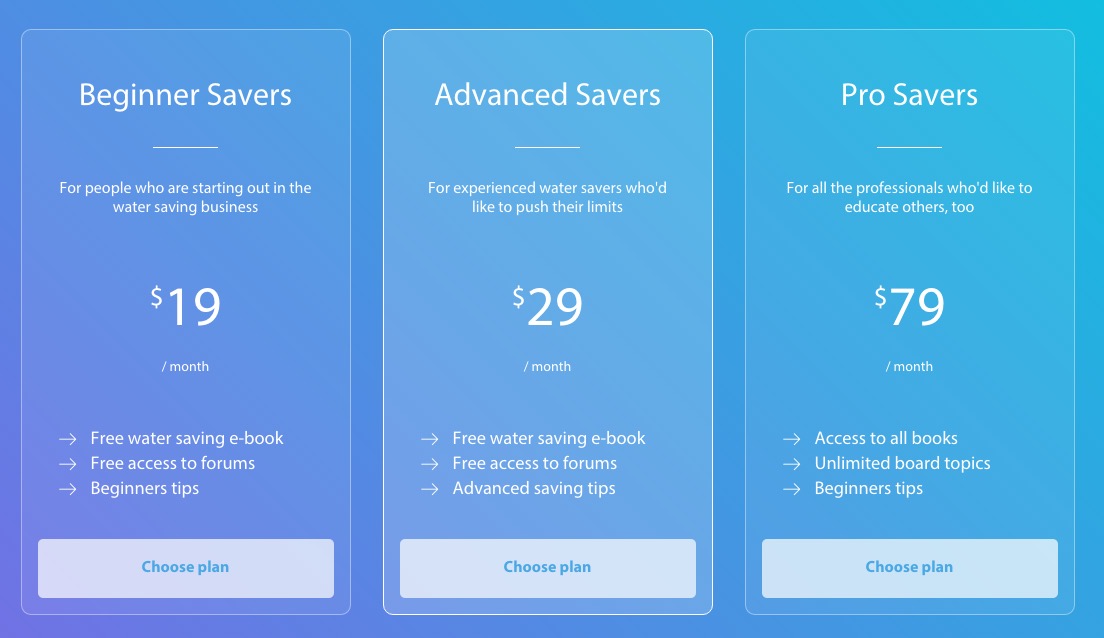
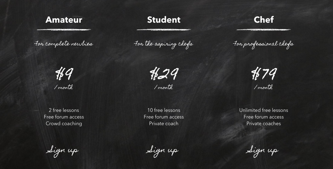
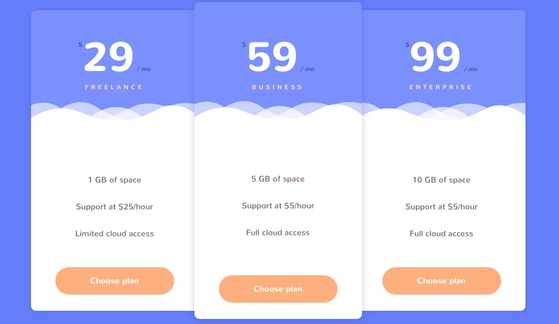
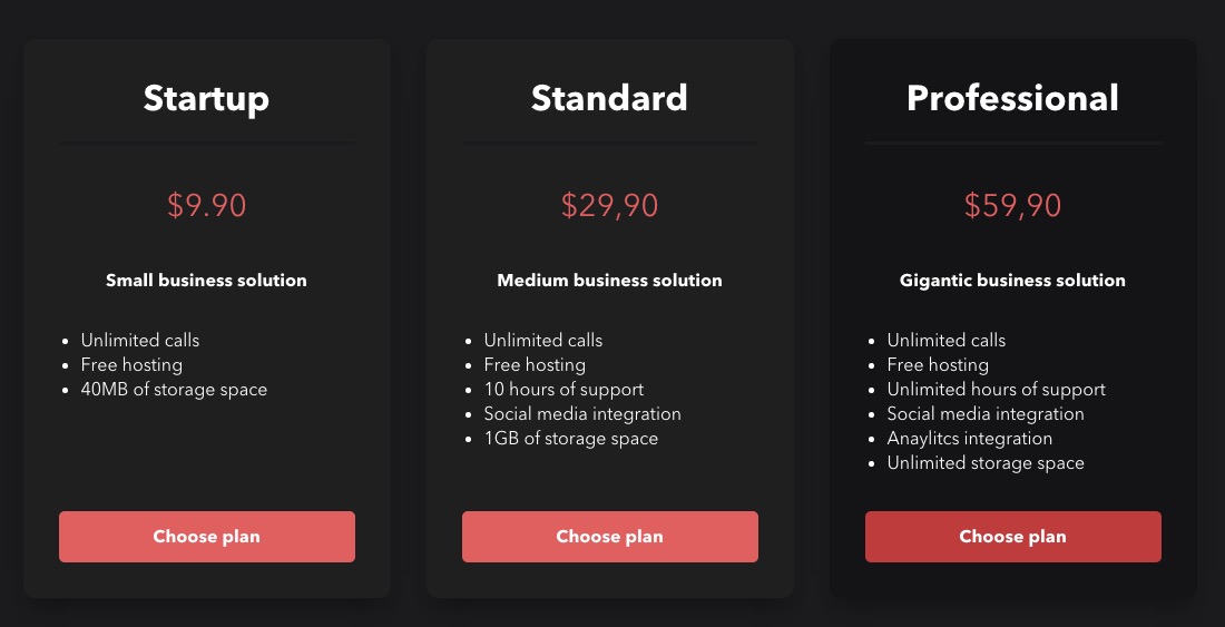
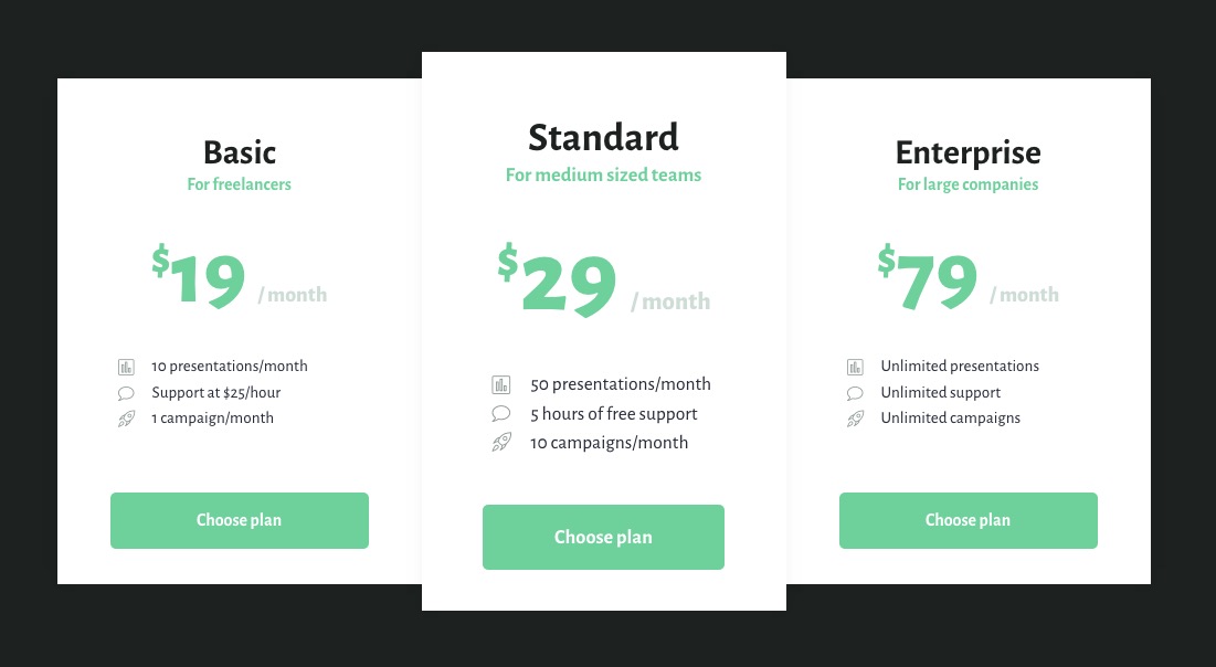
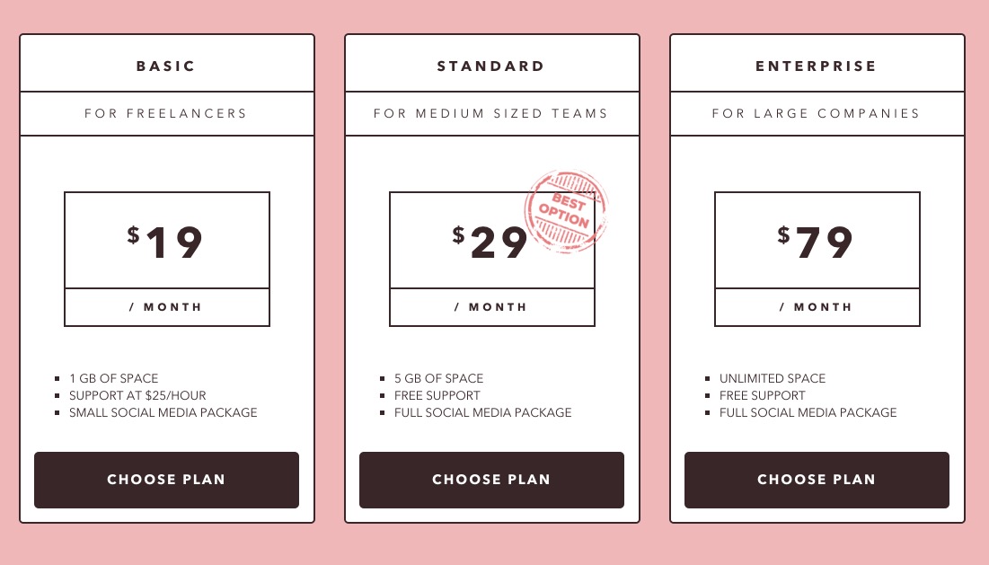
Pricing tables are an essential part of most websites selling a service or subscription. There is an endless variety of design option when it come to pricing tables. Here are a couple examples of modern designs, essential layout and animations styles.
Sonam

Sonam

Jinpa

Jinpa

Tenzin

Tenzin

Yama

Yama

Rabten

Rabten

Pema

Pema

Karma

Karma

Norbu

Norbu

Dawa

Dawa

Yonten

Yonten_

Tashi

Tashi_

Palden

Palden

Read More at Web Design Inspiration: Pricing Tables

Categories: Designing, Others Tags: