Archive

Archive for November, 2015

DrawSVG for jQuery – Animated SVG Enlivens Your Website

November 21st, 2015 No comments

Fortunately, the SVG format can do a lot more than just provide vector-based graphics. Animations are possible as well. With JavaScript, you can control and influence these animations in many different ways. The jQuery plugin DrawSVG allows you to draw the paths of an SVG graphic in an animation. This opens interesting ways of drawing the paths.

Requirements for DrawSVG

As a jQuery plugin, this well-known JavaScript all-rounder has to be integrated into the HTML head together with the plugin. After that, it is possible to animate the paths of an SVG graphic. These are the SVG shapes created via „“ element. Line width and colour can be defined as usual, using attributes or CSS. A fill colour should not be assigned to the paths as it would not be animated and thus would always be visible.

DrawSVG uses „stroke-dasharray“ and „stroke-dashoffset“ to draw the paths. Because of that, these two attributes should not be used elsewhere.
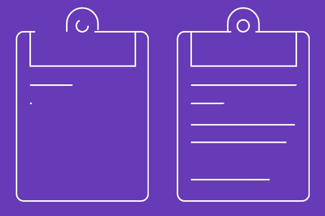
DrawSVG: Animated Paths Enliven Your Website
Two States of the Animation

Since the plugin requires access to the DOM tree of the SVG graphic, the SVG source should be tied to the HTML element. A simple animation can be created by a single line of JavaScript.

$("svg").drawsvg("animate");

The example accesses all SVG elements that are labeled in the HTML document and shifts them to the animation function „drawsvg()“. To do so, the entire graphic is faded out at first. After that, the plugin draws the single paths of the graphic by itself. To create a realistic drawing effect, individual paths are animated with short breaks in between.

The more paths the graphic contains, the more animations are created.

Adjusting Animations via Settings

The duration of the break between the starting points of the separate paths can be set individually using the option „stagger“.

var $svg = $("svg").drawsvg({
  stagger: 5000
 }).drawsvg("animate");

The settings are transferred over as an object literal via the selection of „drawsvg()“. In the example, the break is set to five seconds. The duration of the animation, which is set to one second by default, can also be altered in the settings.

var $svg = $("svg").drawsvg({
  stagger: 5000,
  duration: 10000
 }).drawsvg("animate");

Additionally, there is the option of using a callback feature that pops up when the animation is finished, and the full graphic becomes visible.

var $svg = $("svg").drawsvg({
  callback: function() {
    alert("Animation is finished.");
  }
 }).drawsvg("animate");

In the example, we set up a simple alert when the animation is complete.
DrawSVG: Animated Paths Enliven Your Website

Drawing Graphics on Scroll

With a few additional lines of JavaScript, you can have the SVG graphic drawn on your visitor’s scrolling your website. To do so, the SVG element has to be fixed („position: fixed“) using CSS so that it is always visible. The page needs to be scrollable of course which you can achieve by defining a sufficient height with CSS. The following lines make sure that the graphic is drawn by scrolling down.

var $svg = $("svg").drawsvg();
 
$(window).on("scroll", function() {
  $svg.drawsvg("progress", $(window).scrollTop() / ($(document).height() - $(window).height()));
});

Defining the total duration of the animation is of course superfluous this way because the animation depends on the speed of scrolling. The faster you scroll, the faster it is drawn. The drawing disappears when scrolling in the opposite direction again.

Using DrawSVG with Paths and Masks

Another way to use the plugin is the combination of paths and masks. For example, a „“ element can also contain a path when this approach is used. When the path is drawn so that it covers the entire mask area due to its massive line strength, you can easily fade in nice images or other elements.

DrawSVG: Animated Paths Enliven Your Website
Two States of a Masked Animation

Conclusion

The usage options of DrawSVG are varied. Applying the plugin is easy. Beautiful effects are achieved despite the fact that there are only a few options. The documentation is very clear. A couple of demos show examples of what’s possible.

DrawSVG is being developed by Leonardo Santos from Porto Alegre and is provided on Github for use and participation. The plugin is free for commercial purposes also as Santos distributes it under the liberal MIT license.

(dpe)

Categories: Others Tags:

Comics of the week #314

November 21st, 2015 No comments

Every week we feature a set of comics created exclusively for WDD.

The content revolves around web design, blogging and funny situations that we encounter in our daily lives as designers.

These great cartoons are created by Jerry King, an award-winning cartoonist who’s one of the most published, prolific and versatile cartoonists in the world today.

So for a few moments, take a break from your daily routine, have a laugh and enjoy these funny cartoons.

Feel free to leave your comments and suggestions below as well as any related stories of your own…

Sprinkle it with pixel dust

Browse responsibly

Would you like fries with that job?

Can you relate to these situations? Please share your funny stories and comments below…

Handcrafted Newsletter Bundle of 15 Premium Newsletter Templates – only $17!

Source

Categories: Designing, Others Tags:

WordPress Themes With Great Use of Photography

November 20th, 2015 No comments
WPThemes

WordPress is a world of creativity, and the best of it comes forward with photography and related themes. Whether you’re a photography beginner just starting out, a professional with a huge stack of pictures already to your name, an enthusiast, or just an avid photo-blogger; you’ll find the best ways to showcase your work online with stunning themes.

To help you narrow it down a bit, here’s a list of 15 of our favorite photography themes.

Because the best things in life are free, let’s start with 5 of the most awesome freebies. Take a look:

Gallery

Gallery is nice and clean and has everything you need, namely:

  • Responsive design
  • SEO optimized
  • Cross-browser compatible
  • Auto updates and support
  • Fast loading
  • Easy navigation

You get a simple, distraction-free theme with sweet typography and icons. It’s perfect for every photographer.

Divina

Divina is dark and beautiful. It’s also packing features like:

Divina

  • Fully responsive
  • Easy navigation
  • Nice icons (for ‘loading’, post types)
  • Custom 404 page
  • Active support from author

Divina is great for haute couture glamour photography and portfolios if you want visitors to focus on your work and nothing else.

Radar

Radar

This theme will cozy up to the rebel in you in no time. It has:

  • Responsive design
  • Easy, multiple level navigation that looks great
  • Custom sidebars and footers (you can add your own widgets)
  • Great icons
  • Flat style elements and design (to keep focus on your pictures)
  • Additional customization (full support and documentation from authors)
  • Translation ready
  • Cross-browser compatible

The amazing full-width slider at the landing is obviously awesome. It’s a great theme for photo-bloggers and magazines alike.

Lens

Lens

Lens is the perfect example of how beauty lies in simplicity. That’s not to say it’s lacking in any sense. It has:

  • Responsive, Retina-ready design
  • Multiple layouts (Homepage, blog pages)
  • Optional sidebars
  • Integrated Google Fonts
  • Easy navigation
  • Customizable (with great support from author)
  • Passionate photo-bloggers, this theme is for you.

Adirondack

Adirondack

Adirondack is elegant and has everything a photo-blogger could need:

  • Responsive design
  • Grid layout for featured content
  • Jetpack enabled (for infinite scroll and Photon)
  • Easy navigation
  • 4-columned collapsible ‘footer’ (at the top of the page)
  • Neat typography and fonts
  • Customizable (support from authors)

This theme is perfect for photographers and bloggers alike.

RokoPhoto

RokoPhoto

A theme for photographers designed by photographers, RokoPhoto is stunning, stylish, and shrewd. You get:

  • Responsive
  • Custom widgets included
  • Easy to use and customize
  • Translation-ready
  • Cross browser compatible
  • Great typography and icons
  • Selectively placed CTA buttons
  • Added blog for long-form writing
  • Smooth and easy navigation

It doesn’t binge on design elements and lets your work speak for itself. For professionals, it’s a must. Savvy?

Lumen

Lumen

This lovely theme tells your story like no other. Lumen has:

  • Responsive, Retina-ready design
  • Amazing customizations (12 backgrounds, options panel, great support and documentation)
  • Unique and easy navigation
  • Ajax support
  • Cross-browser compatible
  • Translation ready
  • Beautiful icons and typography
  • Added Blog
  • Fast load time

That’s just the tip of the iceberg. It’s perfect for photographers who want a unique showcase for their work.

Photex

Photex

For professional photographers looking for more than a portfolio showcase, Photex is the end of the search. Check out the features:

  • Responsive design
  • Great typography
  • Awesome icons (Font Awesome integrated)
  • Shortcodes and PSD files available
  • WooCommerce integrated
  • Added custom widgets
  • Customizable (sidebars, gallery presentation, support from authors)
  • Easy, elegant navigation
  • Infinite scroll
  • Added blog

It’s everything you need is packed in one stunning theme.

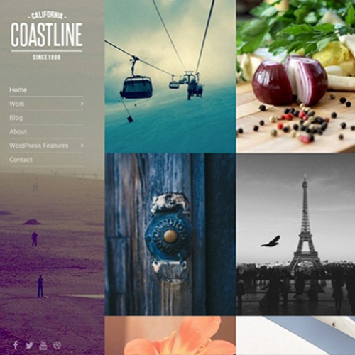
Coastline

Coastline

A chic theme for photographers and photo-bloggers alike, Coastline combines class with performance.

  • Responsive, Retina-ready design
  • Customizations (Theme options, layout options)
  • Nice shortcode library
  • Added custom widgets
  • SEO and page-speed optimized
  • WP-update friendly (works with latest and preceding release)
  • Translation ready
  • Great support and theme updates (for 1 year)
  • HTML version and PSD files included (For complete customization)
  • Infinite scrolling (Homepage portfolio content)
  • Simple navigation

There’s nothing not to love in this theme.

Chocolate

Chocolate

If you are into glamor/ high-fashion photography, this theme is the best fit for your work.

  • Responsive design
  • Spectacularly unique 3D slideshow
  • Password-protected portfolios/albums (for members, premium users, ‘classified till completion’ etc.)
  • Added custom widgets
  • Homepage video
  • Added blog
  • Shortcodes
  • Customization options
  • Tumblr style post types
  • Masonry (auto-fit) posts layout
  • Available support
  • Easy navigation

It’s efficient, elegant, and unique.

ePix

ePix

ePix is in vogue and au courant with everything you need to show-off (and sell) your snapshots in style.

  • Responsive, Retina-ready design
  • Superb, Live customizations (skins, advanced theme options with built-in Customizer)
  • 5 gallery display options (portfolio, grid, 3D carousel, Stage, Group Slider)
  • Added custom widgets
  • Visual page builder (for easy upload and page creation)
  • WooCommerce integrated
  • Ajax Lazy load support
  • Translation ready
  • Added blog
  • Outstanding navigation (drop down, collapsible menu)
  • SEO optimized
  • Great support

It’s a classic, with all you need and more.

Kameron

Kameron

This theme looks and feels exquisite yet effortless. Kameron packs:

  • Responsive design
  • 3 (Dark, white, and Green) demos’ content
  • SEO and Page-speed optimized
  • Easy setup and customization
  • Panoramic image-support
  • Great customization (navigation, background and colors, shortcodes)
  • Good support from authors and updates
  • Youtube and Vimeo support

It’s the kind of theme that sets trends.

Ideas

Ideas

This is one of those themes that will put life in your pictures, figuratively speaking. Here’s why:

  • Responsive, Retina-ready design
  • Touch-swipe and 6 kinds of homepage slideshows (still and animated)
  • 2 demos (dark and light)
  • Added Custom Widgets
  • SEO optimized
  • WooCommerce integrated
  • Great customizations (shortcodes, theme options, color controls)
  • Translation ready
  • Added blog
  • Easy navigation
  • Great support and documentation

Take the hint and get Ideas.

Sirius

Sirius

Modern and minimalistic, Sirius is a no-nonsense, back-to-basics-but-with-bangs sort of theme.

  • Responsive, Retina-ready design
  • Great CSS3 animations
  • Great gallery types (Ajax Grid, Masonry, Fullscreen, Kenburns, and more)
  • Great customizations (layout, colors, typography)
  • Easy migration (Built-in export-import theme settings)
  • Easy, off-canvas navigation
  • WooCommerce integrated
  • Music support
  • Filterable content
  • Added blog

For no (obvious) bells or whistles, go with Sirius.

Big Gallery

Gallery

A photographer will let their pictures do the talking. This theme lets you do just that.

  • Responsive design
  • Brilliant slideshows (fill, uncut, full width, and more)
  • Auto-hide navigation on slideshows (hover/tap for show)
  • Smooth, multi level navigation
  • Great customizations (portfolio types, light/dark skins, typography, advanced theme options and more)
  • Added custom widgets
  • Added blog with 3 layouts
  • Cross browser compatible
  • Translation ready
  • Full screen video (self hosted, Youtube, etc.)
  • Great documentation and support.

Need I say more?

Author Bio: Tracey is well known as a professionally qualified Web developer with hobbies of innovative and technical writing. Currently, she is employed at HireWPGeeks Ltd, where she provides WordPress theme customization service with her team of expert developers. Being a passionate writer, she uses to write unique and useful tutorials related to design and development.

Read More at WordPress Themes With Great Use of Photography

Categories: Designing, Others Tags:

Web Design Inspiration: Zendesk

November 20th, 2015 No comments
Zendesk

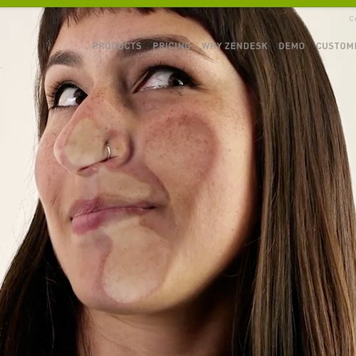
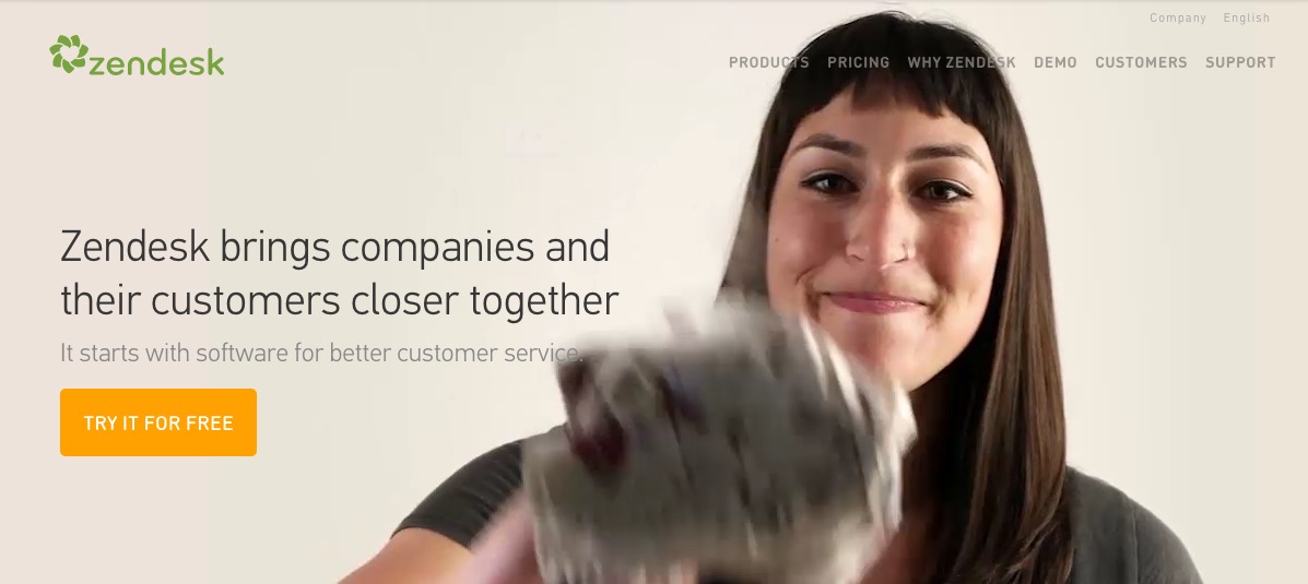
Zendesk uses some pretty fun design element in their current website design. A particular favorite is their awesome use of HTML5 to create a full page video header. The header adds an amazing visual-impact. With HTML5 it’s now easier to use video to engage the visitor and when used creatively can give a great visual impact.

Zendesk1

What to love:

3D effect created given to the video

Zendesk4

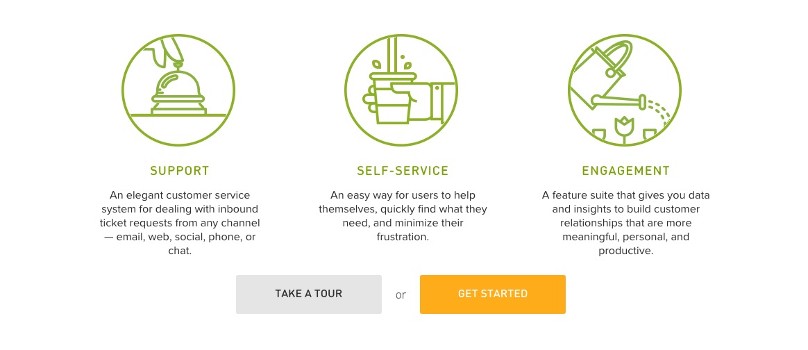
Fun icon that animate as you scroll

Zendesk2

Great use of illustration in colorful character

Zendesk3
If you haven’t yet, take a look visit Zendesk’s site. be sure to check out our post for more examples on beautiful video headers.

Read More at Web Design Inspiration: Zendesk

Categories: Designing, Others Tags:

Floating Action Button Solves Designer’s Problems, Not The Users

November 20th, 2015 No comments
Floating-Action-Buttons

Floating action buttons is a mobile first solution that doesn’t necessarily transfer to larger screens. It has become largely popular due to the popularity of contemporary web design used in Google’s Material Design which features a layer-based UI design.

floating action button

“An emphasis on user actions makes core functionality immediately apparent and provides waypoints for the user.”

The benefit of floating action button is that it can be used as a direct button to initiate a next step action. However, often times it is not associated with a primary action, leaving the user confused by the single action button that does not allow them to perform the necessary action.

The latest example we’ve seen of floating action buttons by Google is in their Google+ redesign. The action seen encourages you to post content, but at the same time it blocks part of the content, making it more of a nuisance for the user. It is also different from the rest of the navigation and is not very functional on larger screens.

For more information on the use of the floating action button references the Material Design specification.

Read More at Floating Action Button Solves Designer’s Problems, Not The Users

Categories: Designing, Others Tags:

Is the Floating Action Button the new Hamburger Menu?

November 20th, 2015 No comments

Google’s Material Design continues to be a popular approach to contemporary web design. An almost-flat style, the set of principles—originally designed as brand guidelines for Google—describe a layer-based approach to UI design.

Aside from the prescriptive color scheme, the carefully neutral typography, and Disney-esque animation, Material Design’s floating button concept is perhaps the most recognizable aspect of the style. However, the Floating Action Button appears to be following the same trajectory as the Hamburger Menu; from saviour to pariah in a few short months.

Floating Action Buttons sit apart from the rest of a UI, styled to appear as if floating over the top of content. Almost exclusively a circle, they’re a pleasingly minimal shape, that lends itself to animation. Floating Action Buttons are the natural evolution of the sticky header that have been popular for the last few years. The leap Google made to move beyond the sticky header was to decouple the Floating Action Button from the rest of the navigation. This was largely influenced by the rise of the mobile web; positioning the Floating Action Button in the bottom right of the screen (as is almost always the case) makes it easy for your thumb to tap it.

The use of a Floating Action Button in the Google+ redesign encourages you to post content, rather than helping you consume it. What’s more, being diametrically opposite the rest of the navigation is an inconvenience on larger screens.

As the Floating Action Button finds its way into designs for screens larger than a phone, the convenience of bottom right placement increasingly becomes a hindrance. Like the Hamburger Menu before it, the Floating Action Button is discovering that mobile-first solutions don’t always translate to desktop.

Their shape, position, and color ensure Floating Action Buttons stand out from the rest of a UI, mainly because the current trends for flat, semi-flat, and Material Design style all other elements as regular rectangles. But it’s important to recognize that just as the Floating Action Button is visually distinct on a page, it’s visually recognizable across a range of different projects. Material Design is first and foremost a corporate brand; with brand identity such a vital business asset, mimicking Google’s is unlikely to add value to your client’s business.

The VKPlayer app uses a Floating Action Button to toggle controls, which looks cool, but wouldn’t a play/pause button be the primary action here?

According to the Material Design specification Floating Action Buttons are used as a shortcut to the primary action on a page; adding a new item, or initiating a new search. In that scenario the icons for the function are relatively canonical, and the action the button is associated with is clear. However, often a single icon does not adequately represent a function.

What’s more problematic is the drive to reduce a site or app to a single use. As highlighted in Teo Yu Siang’s detailed critique of the Floating Action Button the use of Floating Action Buttons imposes a designer’s intentions on the user; they are encouraged to compose an email when they want to read through their inbox; they are encouraged to take a new photo, when they want to review their past images.

The Floating Action Button is intended to pull a primary action out of the UI as a convenience, but if the UI necessitates a primary action, why isn’t it more focused?

The otherwise excellent Beegit uses a Floating Action Button to provide quick access to help messages and news updates on the platform. Is that really the primary function of a composition page?

To paraphrase a common design truism, there are no bad design patterns, only bad designers. Like the Hamburger Menu, the Floating Action Button has a good use-case, but that use-case rarely occurs; like the Hamburger Menu, the Floating Action Button’s achilles heel is frequent mis-use. The MD section on Floating Buttons stipulates that the functionality mapped to Floating Action Buttons are “important and ubiquitous enough”, however they’re more commonly used as a style, when the better option would be a more focused UI.

Like the Hamburger Menu, the Floating Action Button solves the designer’s problem, not the users’.

http://polarb.com/232113

Libertad, 14 Unique Fonts in 1 Versatile Sans-Serif Font – only $14!

Source

Categories: Designing, Others Tags:

On Building Digital Capacity And Attracting Talent

November 20th, 2015 No comments

Traditional business logic dictates that you should outsource functions that aren’t core to your business in order to let the efficiencies of the market drive down costs. Let’s say you run a profitable magazine publishing company. You’ll probably have in-house editorial, marketing and finance teams. However, there’s little point in hiring your own cleaners because they’re not core to your business.

Companies are moving away from the old way of engaging with agencies, and towards something much more collaborative

Digital services used to be seen in this way — as a cost to be minimized by hiring external agencies that would compete with each other on price and quality. Sadly, this attitude resulted in many large organizations spending less on their digital services than they did on their restrooms, which seems crazy considering how important digital channels have become. If you equate expenditure to value, this paints a stark picture of how some traditional companies valued this sector.

The post On Building Digital Capacity And Attracting Talent appeared first on Smashing Magazine.

Categories: Others Tags:

Creating an Animated Menu Indicator with CSS Selectors

November 20th, 2015 No comments

The following article is by James Nowland, a front end developer for Headjam, a creative agency in Newcastle, Australia. James has created a fairly simple little effect here, but one that you might think would require a little JavaScript. Instead, it uses some clever selector usage.

In this article, I’ll cover creative ways of using sibling selectors and pseudo elements to make a CSS-only menu indicator that would normally be achieved using JavaScript.

Here is what we will be making:

See the Pen Step 3 by CSS-Tricks (@css-tricks) on CodePen.

We’ll break this down into three steps:

  • Basic structure and styling
  • Building the indicator
  • Making the indicator move

We’ll also be leveraging SCSS throughout this example to take advantage of the variables and functions Sass offers that make things much easier to maintain in the long-run.

Step 1: Basic structure and styling

First off, let’s set up the HTML for the menu using a basic unordered list structure. We can also mark up the base class names to kick things off.

<ul class="PrimaryNav">
  <li class="Nav-item">Home</li>
  <li class="Nav-item">About</li>
  <li class="Nav-item is-active">Writing</li>
  <li class="Nav-item">Clients</li>
  <li class="Nav-item">Contact</li>
</ul>

Nothing too fancy so far. We have the

    element with a PrimaryNav class name that acts as the container for the list items inside of it, each with a Nav-item class.

    Defining the variables

    One of the key features of this navigation is a maximum width that fills the space of a container based on the number of menu items in it. In this case, we will set up a $menu-items variable in our SCSS which will then be used to calculate the $width value of each .Nav-item in the markup.

    We’ve also added a $indicator-color variable to define—you guessed it—the color that will be used for the hover indicator of the menu.

    // Menu Item Variables
    // The number of items in the menu
    $menu-items: 5;
    // We multiply it by 1% to get the correct % unit
    $width: (100/$menu-items) * 1%;
    
    // Colors
    $background-color: #121212;
    $indicator-color: #e82d00;

    Styling things up

    From here, we can create the basic styles for the menu:

    // The parent container
    .PrimaryNav {
      // Remove the bullet points by default
      list-style: none;
      // Center all the things!
      margin: 50px auto;
      // The nav will never exceed this width and what our calculated percentages related back to 
      max-width: 720px;
      padding: 0;
      width: 100%;
    }
    
    // The menu items
    .Nav-item {
      background: #fff;
      display: block;
      float: left;
      margin: 0;
      padding: 0;
      text-align: center;
      // Our current calculation of 5 items will generate 20%
      width: $width;
    
      // The first item in the menu
      &:first-child {
        border-radius: 3px 0 0 3px;
      }
    
      // The last item in the menu
      &:last-child {
        border-radius: 0 3px 3px 0;
      }
    
      // If the menu item is active, give it the same color as the indicator
      &.is-active a {
        color: $indicator-color;
      }
    
      a {
        color: $background-color;
        display: block;
        padding-top: 20px;
        padding-bottom: 20px;
        text-decoration: none;
    
        &:hover {
          color: $indicator-color;
        }
      }
    }

    See the Pen Step 1 by CSS-Tricks (@css-tricks) on CodePen.

    Step 2: Building the indicator

    We’re going to mark this up in a way that uses multiple classes. We could accomplish the same thing using just the .PrimaryNav class, but adding another class name will allow greater flexibility down the road.

    We already have the .PrimaryNav class that contains the main navigation styling. Now let’s create .with-indicator to build the indicator:

    <ul class="PrimaryNav with-indicator">
    
    </ul>

    This is where we can use CSS in place of what we would normally accomplish in JavaScript. We know that adding a class to an element on hover is JavaScript territory, but let’s see how we can do this in CSS alone.

    The tricky part is getting the menu items to communicate to each other. In an unordered list, the first list item (:first-child) can talk to the second child via either sibling selector + or ~, but the second child list item cannot talk to the first child (can’t go backwards in the DOM like that in CSS).

    See the Pen Step 2 by CSS-Tricks (@css-tricks) on CodePen.

    Turns out the best listener out of the list items is the :last-child. The last child can hear all of the :hover and :active states of its siblings. This makes it the perfect candidate for where to set the indicator.

    We create the red indicator using the :before and :after elements of the last child. The :before element will use a CSS Triangle and negative margin to center it.

    // The hover indicator
    .with-indicator {
      // The menu is "relative" to the absolute position last-child pseudo elements.
      position: relative;
    
    .Nav-item:last-child {
      &:before, &:after {
        content: '';
        display: block;
        position: absolute;
      }
      
      // The CSS Triangle
      &:before {
        width: 0;
        height: 0;
        border: 6px solid transparent;
        border-top-color: $color-indicator;
        top: 0;
        left: 12.5%;
        // Fix the offset - may vary per use
        margin-left: -3px;
      }
    
      // The block that sits behind the text
      &:after {
        width: $width;
        background: $indicator-color;
        top: -6px;
        bottom: -6px;
        left: 0;
        z-index: -1;
      }
    }
    }

    Step 3: Making the indicator move

    Now that the indicator is set up, it needs to be able to move around when a cursor hovers over menu items. Behold the power of the ~ selector, which will be used to match any elements between the first and last children in the markup.

    Right now, position:relative is set on the

      element by default, meaning the indicator sits flush on the first item. We can move the indicator from item to item by modifying the left position and—since all the menus are equal width—we know that to move it down one spot the :last-child selectors for :before and :after must have an offset equal to the width of a .Nav-item. Remember our handy $width variable? We can use that to on the left attribute.

      This is how we would set that up in vanilla CSS:

      .with-indicator .Nav-item:nth-child(1).is-active ~ .Nav-item:last-child:after {
        left: 0;
      }
      .with-indicator .Nav-item:nth-child(2).is-active ~ .Nav-item:last-child:after {
        left: 20%;
      }
      .with-indicator .Nav-item:nth-child(3).is-active ~ .Nav-item:last-child:after {
        left: 40%;
      }
      .with-indicator .Nav-item:nth-child(4).is-active:after {
        left: 60%;
      }
      .with-indicator .Nav-item:nth-child(5).is-active:after {
        left: 80%;
      }

      Let’s make this dynamic with Sass:

      // Menu Item Variables
      // The number of items in the menu, plus one for offset
      $menu-items: 5;
      // The actual number of items in the menu
      $menu-items-loop-offset: $menu-items - 1;
      // We multiply it by 1% to get the correct % unit
      $width: (100/$menu-items) * 1%;
      
      .with-indicator {
        @for $i from 1 through $menu-items-loop-offset {
          // When the .Nav-item is active, make the indicator line up with the navigation item.
          .Nav-item:nth-child(#{$i}).is-active ~ .Nav-item:last-child:after {
            left:($width*$i)-$width;
          }
          
         .Nav-item:nth-child(#{$i}).is-active ~ .Nav-item:last-child:before {
            left:($width*$i)+($width/2)-$width; /* this ensures the triangle lines up to the menu. */
          }
        } // end @for loop

      It’s worth noting the triangle :before has an additional half-width offset on top of this leftoffset.

      Now let’s add some animation and another Sass for loop so we can initialize where the indicator is, based on the page we are on. When you :hover over the item the indicator will move. But, once you mouse out it will return to the is-active state. A nice and neat JavaScript-free way of making a menu indicator.

      // This is in a separate loop to avoid having to use "!important" as the hover rules need to be stronger than the ".is-active" class.
        @for $i from 1 through $menu-items-loop-offset {
          // When the menu is :hover make the indicator line up with it.
          .Nav-item:nth-child(#{$i}):hover ~ .Nav-item:last-child:after {
            left:($width*$i)-$width;
          }
      
          .Nav-item:nth-child(#{$i}):hover ~ .Nav-item:last-child:before{
            left:($width*$i)+($width/2)-$width;
          }
        } // end @for loop
      }

      The final result

      And there we have it! An animated menu indicator without the JavaScript dependency.

      See the Pen Step 3 by CSS-Tricks (@css-tricks) on CodePen.


      Creating an Animated Menu Indicator with CSS Selectors is a post from CSS-Tricks

Categories: Designing, Others Tags:

The Cost of Frameworks Recap

November 20th, 2015 No comments

A classic blog-and-forth, my favorite form of internet discussion.

Paul Lewis does some research on the performance of differnet frameworks, pitting each of their TodoMVC versions against one another:

For me the results are pretty clear: there appears to be a pretty hefty tax to using Frameworks on mobile, especially compared to writing vanilla JavaScript.

Tom Dale:

Most critics miss the key one: frameworks let you manage the complexity of your application as it and the team building it grows over time. All of the other stuff is just gravy.

and

… my hypothesis is that, for apps of any complexity, the ones that start off “vanilla” will accrete their own Frankenframework that performs similarly to, if not worse than, an off-the-shelf framework

Dave Rupert:

… the interesting discussion to be had from Tom’s post is: Are we trying to make lightweight sites that WORK FAST or maintainable sites WORK FOR YEARS?

My take: yes, maximum performance and maximum developer comfort are a bit at odds. It’s a dance as old as time. The river runs slower when you dam it, but hey you get some electricity. OK enough metaphors.

More baby bear porridge from Zach Leatherman, and a hopefull call for benchmark-pushing competeition:

If you decide to spend valuable kilobytes on a framework, fortunately there are plenty of frameworks to choose from. Just like DOM libraries used to compete on selector engine performance, the onus is on framework authors to compete against each other on initial render performance.

Another thing I’d add: this uncached time-to-glass stuff is a good metric; perhaps the most important metric. But measuring performance after that is pretty important too. Who is winning the “clickin’ around and doing stuff” performance race?


The Cost of Frameworks Recap is a post from CSS-Tricks

Categories: Designing, Others Tags:

Learning UX design from print design

November 20th, 2015 No comments

Every new field of knowledge and endeavor develops its own jargon and acronyms. Web design is no different; we have terms like tags, keywords, analytics, user testing, mobile first, responsive design, etc. We also have acronyms such as SEO, UI, and UX. In recent years, there is a new term – UX Design, or User Experience Design.

It’s almost as if this is some new concept—the sleekest, eye-stopping design is worthless unless the user can navigate easily, can take in the important information quickly, can interact seamlessly, and get to conversion pages with no effort other than a click—in short that designers have to design for the user, not for themselves. But this concept of designing for the user is nothing new; magazines and newspapers have been doing this for years with engaging and compelling print design.

Part of UX design, of course, is the written word, and how it is presented to the user. Print design was around long before the Internet, and it has permeated everyone’s lives, just as the Internet does today.

Print design was, and still is, found in flyers left on doorknobs and in mailboxes; it is found in magazines, in newspapers, in printed grocery ads, in brochures found at brick and mortar travel agencies, and big box home improvement retailers. It is found on billboards. While there are no analytics to evaluate its effectiveness, there are years and years of experience under print designers’ belts. It’s experience that web and print designers should certainly take into account as they design sites.

Using grids

Newspaper and magazine print designers have known this forever: as content on pages is laid out, there is some type of grid pattern used. This should be no different when content is placed on a web page. Using a grid provides balance and provides a level of comfort for the user.

If a page is divided into equal sections, more important content can be spread out into more sections on the grid that less important content.

A single focal point

In newspaper and magazine design, the focal points are easy to see: the large headlines. The same goes for web pages. There has to be a focal point to capture the “point” of the information on the page.

The point is that the user should see that focal point first, so that the nature of the content on the page is clear.

Using white space

White space around the elements and the text provides “breathing space” for the user’s eyes, allowing those eyes to focus on images and words. This is one factor that early newsprint was unable to provide, other than space between paragraphs and columns. Once images were added to newspapers and magazines, layout designs provided for more white space, and that was a good thing.

Today, web design allows for even more white space, and that enhances the UX.

Consistency

It’s all about repetition. This keeps the user comfortable. A grid gives consistency, but more importantly, typeface and content do to. Readers should not have to continually adjust their eyes to different print types. Consistency also means use of words and colors—keeping terminology the same and projecting the same image with color use. Repetition of placement of the same elements can also bring a consistency, if possible.

Tight consistency may not always be possible; but good print design is as consistent as possible — especially with typefaces, terminology, and color.

Hierarchy

Font size and type are the best means to show the relative importance of different pieces of content. There are two goals here: we want content to be easy to absorb and for the user to know immediately what is contained on the page, and we also want the user’s eyes to travel as we want them to. Thus headlines are large and bold, sometimes in a contrasting color; sub-headlines are smaller and less bold perhaps, but still more important than the smaller text which provides the detail.

These things also make a page more scannable. If there is a great deal of print, breaking it up with sub-headings in a large type and bulleted points improves scannability and, consequently, user experience.

Using scale

Some elements will be larger than others so that the reader will automatically be drawn to the larger elements in the layout and then move to the smaller elements as they read through the content. This allows the designer to “force” focus on the most important elements and text.

Legibility

Legibility means just what it says. Can the reader easily read your text without strain? Is it divided up into chunks with bullet points or other “dividers” so that it is scannable? What is the spacing between words and between letters within those words?

If you make that difficult, the reader is not comfortable reading any of your content. Here are some things to consider:

  1. The text should not be too light or too bold.
  2. Letters need to have good space between them.
  3. Use ornate and difficult-to-read text very sparingly, and mostly for dramatic effect.

Use of color

When color came to print media, it was huge. Print designers had much greater opportunity to use colors and shades of color to attract the eye and to deliver some psychological messages as well. There is an entire field of the psychological appeal of colors, and good print designers will study this research in making color selections.

The takeaway

Decades upon decades ago, print designers were creating layouts for newspapers and magazines. They learned the basic principle of layout grids, of focal points, hierarchy of type, legibility, and, when it became available, color.

Those principles still apply today, whether they are utilized in traditional print media or in website design.

Featured image, print design image via Shutterstock.

Libertad, 14 Unique Fonts in 1 Versatile Sans-Serif Font – only $14!

Source

Categories: Designing, Others Tags: