Archive

Archive for December, 2015

WordPress 4.4 will revolutionize how we publish

December 10th, 2015 No comments

WordPress 4.4, named ‘Clifford’ in honor of jazz legend Clifford Brown, has just been released. It’s available to download or can be updated from an existing installation’s dashboard.

The latest version of the Web’s favorite CMS is focused on responsive web design enhancements, connecting content across sites, and could signal a new way forward for WordPress.

As always, WordPress 4.4 ships with a new default theme, named ‘Twenty Sixteen’. The Twenty Sixteen theme is a stripped down version of a blog post. It’s a minimal, type-based approach that is ideal for blogging.

Designed by Takasho Irie, who designed the last two default themes for WordPress, it’s been available for a few months on GitHub. It has five color variations, an optional sidebar, custom features like header styles, and is of course fully responsive.

Twenty Sixteen…delivers a modern blog design right out of the box

Twenty Sixteen is inspired by rival platforms Ghost, and Medium, and delivers a modern blog design right out of the box. Expect to see plenty of WordPress users stick with the default theme in 2016.

As is frequently the case with WordPress updates, many of the new features were previously available as plugins, and have now made it into the WordPress core in a standardized and streamlined format. We have WordPress’ engaged community to thank for the platform’s continued advancement.

A great example of this are the fully responsive images built into WordPress 4.4. Implemented with the srcset attribute WordPress images will now provide alternate sizes for displays such as retina screens, allowing the browser to select the most appropriate file itself.

WordPress 4.4 includes expanded support for oEmbed. Previously WordPress users could embed YouTube and Twitter content. With 4.4 you can embed even more content — specifically content from Cloudup, Reddit Comments, ReverbNation, Speaker Deck, and VideoPress — allowing WordPress users to curate, almost syndicate, content from across the Web.

Interestingly, WordPress posts themselves will, optionally, be embeddable in this way. Meaning that the content of sites that choose to embrace the approach can be embedded in other WordPress sites.

oEmbed support…[heralds] a major change in the way we publish on the platform

It’s a revolutionary idea for WordPress because it opens the way for Medium-style collaborative blogging, with users embedding and then responding to posts on their own sites. Ultimately making WordPress publishing an open conversation.

Developers will also note a couple of big changes. Firstly the REST API has been built-in as a core feature. (API endpoints still require the WP API plugin, but they’re expected to make it into the core in a subsequent release.) Secondly, developers are being encouraged to move over from the wp_title() method to the title tag feature. Originally wp_title() was slated to be deprecated, but will continue to be supported for a short while yet.

WordPress 4.4 Clifford is a major step forward for WordPress. Whilst responsive images will receive the attention, the extended oEmbed support is the real story, heralding a major change in the way we publish on the platform.

Lifetime Access to SitePoint Premium (1000s of Developer and Designer Books & Tutorials) – only $44!

Source

Categories: Designing, Others Tags:

Using Multi-Step Animations and Transitions

December 10th, 2015 No comments

CSS animations are rad and the concept is fairly simple. Name the animation, define the movement in @keyframes and then call that animation on an element. If you haven’t worked with them, you can level up on the syntax right here in the Almanac.

While the concept is simple, there are little tricks to make the animations seem complex and one of those is multi-step transitions. That’s what we’re going to look at in this post.

A keyframe can be a “step”

If we set up a keyframe animation to change the background color of an element to change from orange to black (because orange is the new black, after all) on hover over five seconds, it will do exactly that. It will divide that change up over time and make the transition.

body {
  background: black;
  animation: color-me-in 5s; /* other keywords like "infinite alternate" can be useful here */
}

@keyframes color-me-in {
  /* You could think of as "step 1" */
  0% {
    background: orange;
  }
  /* You could think of as "step 2" */
  100% {
    background: black;
  }
}

See the Pen ZbePzr by CSS-Tricks (@css-tricks) on CodePen.

We can add as many steps as we like in a keyframe animation. For example, here is blue being added right in the middle of the transition.

@keyframes color-me-in {
  0% {
    background: orange;
  }
  /* Adding a step in the middle */
  50% {
    background: blue;
  }
  100% {
    background: black;
  }
}

See the Pen meWoyy by CSS-Tricks (@css-tricks) on CodePen.

That’s the concept of multi-step animations in a nutshell: more than one change taking place in the animation from start to finish.

Keyframes are interpolated and tweened, unless you don’t want them to be

Notice the colors above fade into one another in each of the steps. That’s a good default. They even “ease” into each other, as that’s the default animation-timing-function, another good default as it’s a lot smoother and relaxed feeling that than the computer-y feeling linear in general, although everything has it’s use.

Using the steps() function you can force the interpolation to be an exact number of keyframes. Demo:

See the Pen bEdKaW by CSS-Tricks (@css-tricks) on CodePen.

Putting multi-step animations to use

A good example is the sound equalizer in Apple Music. You’ve likely seen it or at least something like it: a series of vertical bars that wave up and down in a way that gives the illusion of it dancing to the beat of the music.

Here’s a non-moving version of what we’re talking about:

See the Pen Apple Music Sound Equalizer in SVG by CSS-Tricks (@css-tricks) on CodePen.

Five vertical bars and want to animate them moving up and down at various heights. Let’s create an animation called equalize with 25 keyframe steps. That’s one step for every 4% of the animation, which is then called to the .bar element:

See the Pen Apple Music Sound Equalizer in SVG by CSS-Tricks (@css-tricks) on CodePen.

Great, but they’re all moving at the same pace at the same time. Not exactly a cool equalizer to look at. However, we can add a different animation-duration to each .bar when the animation is called to give the effect that they are moving at different paces.

See the Pen Apple Music Sound Equalizer in SVG by Geoff Graham (@geoffgraham) on CodePen.

There we have it! An equalizer that, when active, looks as though it could be moving to the rhythm of a song, even though we are using the same multi-step animation on each element.

And here’s an alternative that plays with animation-delay (negative values, so they all still start at the same time) instead:

See the Pen Apple Music Sound Equilizer in SVG by CSS-Tricks (@css-tricks) on CodePen.

But wait, there’s also multi-step transitions!

Transitions are just like simpler animations. They move from one fixed set of properties to another. The shorthand:

.move-me {
  transition: [transition-property] [transition-duration] [transition-timing-function] [transition-delay];
}

And, just like animation we can animate the same set of properties.

Let’s transition a red box to an orange rectangle on hover by chaining the background-color and width properties:

.box {
  width: 150px;
  height: 150px;
  background-color: red;
  transition: 1s;
}

.box:hover {
  width: 300px;
  background-color: orange;
}

This tells our .box element to transition both the width and background-color properties on hover and to make the transition in one second.

See the Pen CSS Transition Property by Geoff Graham (@geoffgraham) on CodePen.

Not exactly multi-step yet, but it’s possible!

Adding multiple steps to transitions

We can make things a little more interesting by chaining our transitions together using commas, then playing with the duration and delay of them to create the same sort of multi-step movement effect that is possible in keyframe animation.

Let’s take the above example and make it change width then after that’s done change color.

.box {
  transition: 
    /* step 1 */
    width      1s,
    /* step 2 */
    background 0.5s 1s;
}

See the Pen CSS Transition Property by CSS-Tricks (@css-tricks) on CodePen.

We can get much fancier here and choreograph additional movements.

  • Change the width from 150px to 300px immediately on hover for 1 second
  • Change the background-color from red to orange immediately for 1 second
  • Add a box-shadow and change the direction of it immediately on hover for 1 second
  • Add one line of text that fades out and is pushed away to the left after the width and height have transitioned
  • Add another line of text that appears and swoops in from the right after the first line of text has disappeared

We can do this by chaining our transitions on each element where there are multiple properties to transition!

/* Our box element */
.box {
  width: 150px;
  height: 150px;
  background-color: red;
  box-shadow: 5px 5px 25px #000;
  transition: all 1s;
}

/* On hover... */
.box:hover {
  /* Increase width */
  width: 300px;
  /* Change color */
  background-color: orange;
  /* Move the shadow */
  box-shadow: -5px 5px 25px #000;
}

/* The first line of text */
.box__blurb {
  /* Start with full opacity and centered */
  opacity: 1;
  transform: translateX(45px);
  /* Then transition these chained properties */
  transition:
    opacity 0.5s 2s,
    transform 0.5s 0.5s;
}

/* On .box hover... */
.box:hover .box__blurb {
  /* Fade out */
  opacity: 0;
  /* Move over to the right */
  transform: translateX(-500px);
}

/* The second line of text */
.rect__blurb {
  /* Start with no opacity and pushed off the element */
  opacity: 0;
  transform: translateX(500px);
  /* Then transition these chained properties */
  transition: 
    opacity 0.5s 1s,
    transform 0.5s 1s;
}

/* On .box hover... */
.box:hover .rect__blurb {
  /* Face in */
  opacity: 1;
  /* While entering from the right */
  transform: translateX(-100px);
}

Here’s what we’ve got. Some flourishes were added for presentation:

See the Pen Multi-Step Transitions by Geoff Graham (@geoffgraham) on CodePen.

Here’s another example of a button where all the hover effects are clearly staged into steps:

See the Pen zrGvaq by Chris Coyier (@chriscoyier) on CodePen.

Wrapping up

Multi-step animations and transitions are fun little tricks we have at our disposal to create rich, dynamic movement in CSS. The example of an equalizer in this post is a practical application but there are many other ways that multi-step transitions can be used. In fact, Ana Tudor used them to make a mind-blowing animation in a post she published here on CSS-Tricks. Rémi Lacorne has a sweet example of transitions as well.

Where have you used multi-step animations and transitions in your CSS animations? Have you made something super and complex that shows off your animation chops? Or maybe a subtle touch that enhances the user experience? Let us know in the comments.


Using Multi-Step Animations and Transitions is a post from CSS-Tricks

Categories: Designing, Others Tags:

Top iOS Apps of 2015 Are Here

December 10th, 2015 No comments
apple-iphone

Apple has recently released its selection of the best and most popular iOS apps of 2015. Some of the picks, such as Instagram and Snapchat, come as no surprise to anyone, whereas the success of certain other apps has been surprising for many people in the community.

To begin with, Periscope by Twitter has grabbed the distinction of being the app of the year. Other iPhone apps that have earned praise include Enlight, a photo editing app, Workflow, a productivity app, and Robinhood, a stock trading app. Similarly, health apps such as Lark too have been ranked high.

On the iPad frontier, The Robot Factory, an app that lets kids build, test and collect robots, has been ranked as the app of the year. The Robot Factory is in good company, ranking alongside apps such as HBO Now. Prune has been named as the iPad game of the year.

The results of this year’s list are a diverse lot. For instance, Prune has been developed and is maintained by a team of one man, whereas HBO Now are apps developed by gigantic corporations.

In terms of downloads, games have left everyone else behind, and the first rank holders across different categories are all games. Apps like Trivia Crack and Crossy Road have beaten the likes of YouTube, Facebook and Snapchat in terms of download count. Here is the list of apps, ranked in terms of downloads:

Top Free iPhone Apps

  1. Trivia Crack
  2. Messenger
  3. Dubsmash
  4. Instagram
  5. Snapchat
  6. YouTube
  7. Facebook
  8. Uber
  9. Crossy Road – Endless Arcade Hopper
  10. Google Maps

Top Paid iPhone Apps

  1. Heads Up!
  2. Minecraft: Pocket Edition
  3. Trivia Crack (Ad Free)
  4. Five Nights at Freddy’s 2
  5. Facetune
  6. Geometry Dash
  7. Five Nights at Freddy’s
  8. Afterlight
  9. Plague Inc.
  10. Goat Simulator

Top Free iPad Apps

  1. Crossy Road – Endless Arcade Hopper
  2. Candy Crush Soda Saga
  3. Messenger
  4. Netflix
  5. YouTube
  6. The Calculator – Free
  7. Microsoft Word
  8. Trivia Crack
  9. Skype for iPad
  10. Pinterest

Top Paid iPad Apps

  1. Minecraft: Pocket Edition
  2. Five Nights at Freddy’s 2
  3. Five Nights at Freddy’s
  4. Geometry Dash
  5. Terraria
  6. Goat Simulator
  7. Heads Up!
  8. Five Nights at Freddy’s 3
  9. Toca Kitchen 2
  10. Monument Valley

If you are an iOS users, simply open iTunes to check out the list of Apple’s top picks.

Read More at Top iOS Apps of 2015 Are Here

Categories: Designing, Others Tags:

The Seven Best Sharing Solutions for WordPress

December 10th, 2015 No comments
addthis

WordPress sharing solutions are a dime a dozen. Unfortunately, not all of them are good. This has different reasons. Some plugins – like Digg Digg for example – don’t work with every website. Additionally, not all plugins offer a fresh or, at least, contemporary design. Original share buttons, those provided by the social networks themselves, are in the past. You will barely see them on a well-maintained website. I got myself an up to date overview that I would like to share with you today.

Sharing Solutions for WordPress in Two Flavours

Some of the following sharing solutions are free. Then, you’ll only get a downscaled trial version from others. I will always add whether the plugin is entirely free or if a premium version exists.

1 – Add This

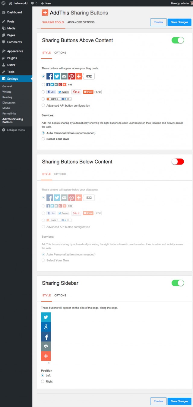
AddThis is one of the best plugins, as it offers a lot in the free version already. You can place the buttons above or below the content, and you can also use a sidebar. The most important networks are supported. The buttons in the sidebar can not be altered in the free version. The premium version is 10 USD a month. The loading time of the plugin is acceptable.

Screenshot Optionen AddThis

2 – Shareaholic

Sharaholic

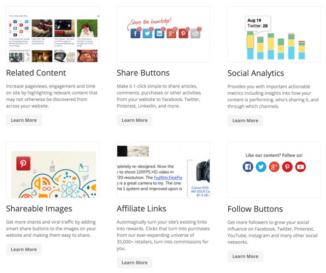
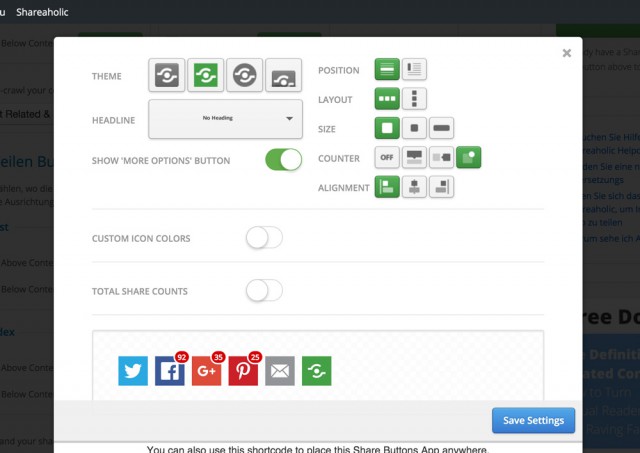
Shareaholic is an all-in-one platform not only for WordPress and not restricted to sharing articles. The service is completely free to use. However, you should definitely register for a free account on their website. Afterwards, you can use additional features like floating share buttons and analysis features. The interesting part about Shareaholic is, that “similar articles” can be implemented with just a few clicks as well. The similar articles can also contain advertisements. This way, you can earn money off of it as well. The appearance of the buttons and the similar articles can be adjusted in plenty of different ways. The loading time is okay. The plugin is free.

shareaholic-tools

share-aholic-buttons

3 – Shariff for WordPress

Shariff für WordPress

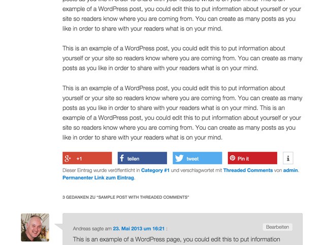
Shariff has been developed by the editorial staff of German tech magazine c’t to meet the German data protection law. Many other sharing solutions provide data for the social networks without even clicking them. Shariff however, only starts sending the data when the share button has been clicked. Just one downer: Shariff can neither be placed above nor below the content. The buttons load very quickly. The plugin is completely free.

shariff-buttons

4 – Simple Share Buttons Adder

simple-share-buttons-adder

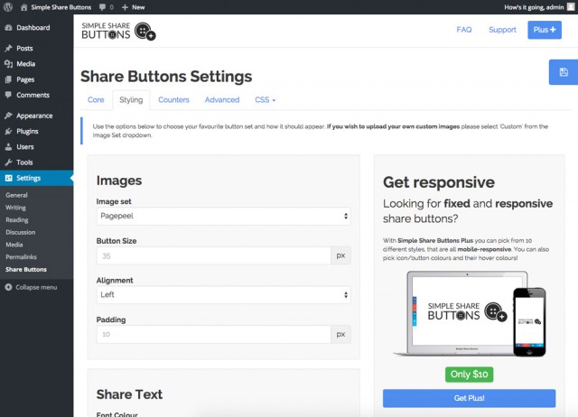
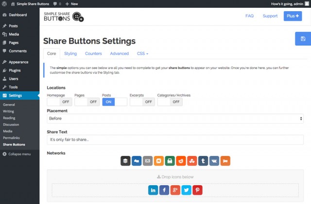
Simple Share Buttons Adder is another nice solution for share buttons. You can already do a lot with just the free version. All important social networks are included, but Xing and WhatsApp need to be purchased via the “plus version” if needed. The plus version costs 10 USD once and adds features such as a click analysis and a widget. The loading time, however, is not that convincing. If you depend on a fast website, choose a different plugin.

screenshot-8

screenshot-7

screenshot-1screenshot-2

5 – Sumome

Sumome

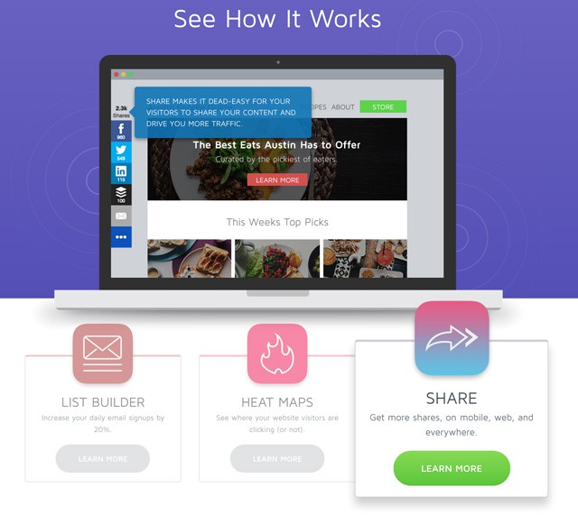
SumoMe is, without a doubt, one of the most exciting solutions for WordPress. It does offer a sharing bar that can be displayed on any side of the screen (top, bottom, left, right) and a bunch of other tools. There are tools to promote subscriptions to newsletters, text highlighters to share text snippets on Facebook and Twitter and a lot more. Most tools can be used for free. There is a paid version that unlocks further features. This release is available starting from 10 USD per month. A registration on the website is necessary. The loading time is alright when you have a fast server. SumoMe is currently being used here at Noupe.

SumoMe

6 – Viral Social Media Buttons by Upshare

Viral-social-media-buttons

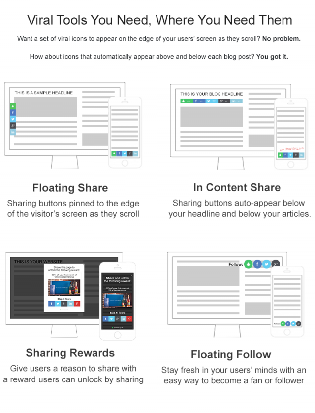
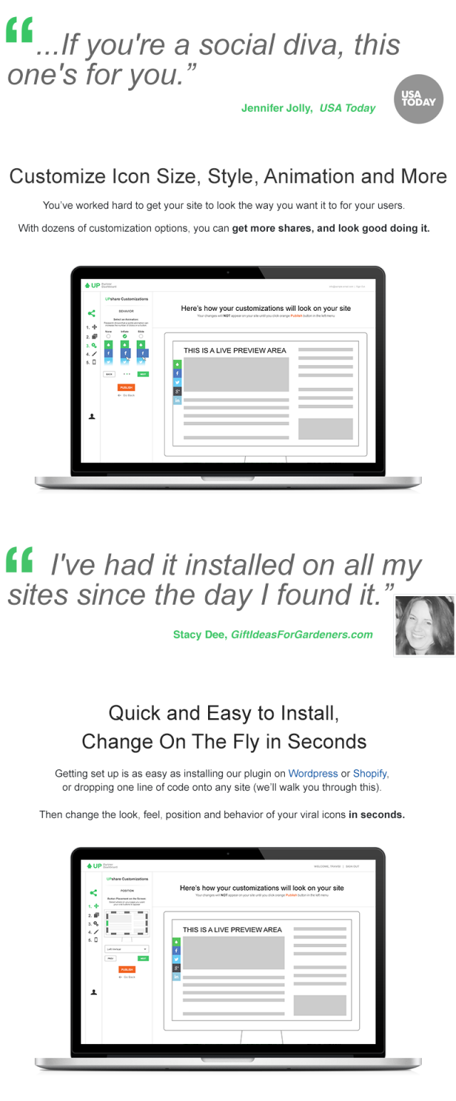
The Viral Social Media Buttons are recommendable. They have an appealing, modern design, but require a free registration on the company’s homepage. Subsequently, you can adjust the buttons to your personal wishes quickly. The buttons and the share bar load rather quickly and don’t slow the website down.

screenshot-1

screenshot-3

7 – Mashshare

mashshare

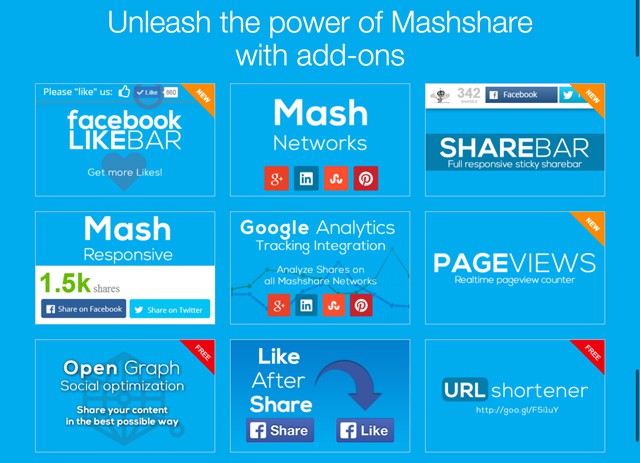
Mashshare is one of the best solutions for sharing on social media. However, Mashshare is a “freemium” solution, which means that there is not a lot to expect from the free WordPress plugin. For free, you get a share button for Facebook, Twitter and a newsletter subscription. This could be enough for a lot of people, however. Other’s will want more. Mashshare is a building kit system, which allows you to buy the modules that you need. Additional share buttons, for example, cost 19 Euro per website. For 39 Euro, there is a bundle with the most important extensions. Mashshare loads fast.

Mashshare

Conclusion

There are tons of sharing solutions for our popular WordPress. Only very few of them are superb. On the other hand, some developers think about what they are doing and offer excellent plugins even in the free area. Whether you want to buy your favourite or prefer a free version is your decision.

Before anyone asks: I didn’t present the Pingu-Sharing Buttons on purpose as they offer close to nothing at all in the free version.

(dpe)

Categories: Others Tags:

Why Performance Matters, Part 3: Tolerance Management

December 10th, 2015 No comments

When technical performance optimizations reach certain limits, psychology and perception management might help us to push the limits further. Waiting can consist of active and passive phases; for the user to perceive a wait as a shorter one, we increase the active phase and reduce the passive phase of the wait. But what do we do when the event is a purely passive wait, with no active phase at all? Can we push the limits even further?

Why Performance Matters, Part 3: Tolerance Management

Waits without an active phase happen quite often in the offline world: waiting in a checkout line to the till, waiting for a bus, queuing in an amusement park, and so on. It is widely accepted that the longer the user has to wait, the more negative the reaction to the wait. User reaction to a wait online is no different from that in the offline world. Studies based on the analysis of more than a thousand cases identify 14 distinct types of waiting situations on the web. Being dependent on our users’ loyalty, we cannot leave them facing a passive wait.

The post Why Performance Matters, Part 3: Tolerance Management appeared first on Smashing Magazine.

Categories: Others Tags:

Affinity Photo: the Best Mac App of 2015 just got better

December 9th, 2015 No comments

It’s a tribute to the hard work and ambition of Serif’s Affinity team that on the same day that they pushed major updates for both Affinity Photo and Affinity Designer, they discovered that Apple have named Affinity Photo the Best Mac App of 2015.

Today’s award from Apple comes just 10 months after we first got our hands on Affinity Photo’s beta release, and 5 months to the day that Affinity Photo was launched.

There are so many developers creating fantastic products nowadays, so it’s really very humbling to be recognised in this way — Ashley Hewson, Serif

Building on the already popular application, today’s release is the first major update to Affinity Photo. The biggest new feature of which is super-accurate image alignment, which enables both image stacking and panorama stitching; invaluable tools for artworking.

The accuracy of panorama stitching in the app really is as good as it gets–and with Affinity Photo’s advanced memory management you can build up images of 100s of mega-pixels and still have incredible performance when you go to edit — Ashley Hewson, Serif

What’s really impressive is that Serif claim to have made performance improvements; as most fans of the application will tell you, it’s so fast already, it’s hard to imagine where they could possibly find any extra speed.

In addition to panorama stitching, image stacking, and performance gains, the Affinity Photo update includes:

  • Improved PSD compatibility
  • Liquify feature
  • Updated RAW support
  • Haze removal
  • 6 extensions for Apple Photos on El Capitan

Affinity Photo isn’t the only award-winning application Serif make, Affinity Designer was recognized in its own right with a Design Award from Apple back in June. It too has received a major update today with a raft of new features.

The biggest addition for Affinity Designer are its new artboard capabilities. Not only can you create artboards of any size, including common device sizes, but you can group them, and nest them. What’s more Affinity Designer now allows you to create artboards of any shape, not just rectilinear. Perfect when designing UI for wearables.

Without doubt artboards have been our most requested new feature since we launched…It really is a must-have feature for UI and responsive design, so it’s great to be widening the use case of Affinity Designer into these areas too. — Ashley Hewson, Serif

In addition to artboards, the latest Affinity Designer includes:

  • Improved typography controls
  • Rotatable canvas
  • Professional print features
  • Customizable keyboard shortcuts
  • Improved support for PSD, PDF, SVG, and EPS formats

The updates for Affinity Photo and Affinity Designer are free downloads for existing customers, and the planned 1 week 20% discount for new customers has just been extended for as long as Apple run their Best of 2015 feature on the App Store. That means both apps are currently available for the one-time price of $39.99.

Add or Change Photo Colors With CODIJY Pro for Mac & Win – only $29!

Source

Categories: Designing, Others Tags:

Free e-Book: Web UI Design for the Human Eye

December 9th, 2015 No comments
Web-UI-Design-for-the-Human-Eye1

Long before the Internet, scientists have been unraveling the mysteries and peculiarities of human sight. As a visual medium, web design has only to gain from their discoveries.

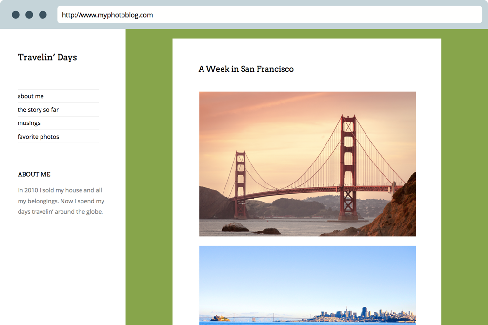
Aside from simply knowing their craft, designers can mine a variety of practical applications from the study of human sight. In the realm of visual hierarchy alone, knowing how to implement size, spacing, and contrast can influence the order elements are seen and the how important they appear.

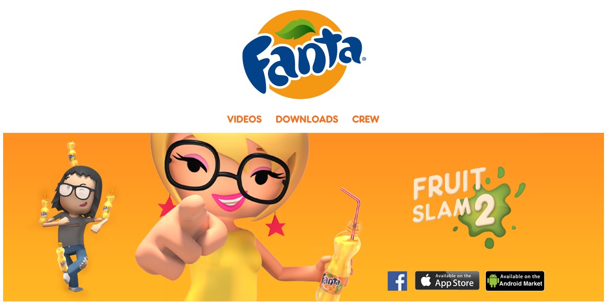
Colors, too, are a powerful tool in the hands of those that use them. With each color evoking different feelings (orange for playfulness, blue for trust, etc.), designers can quantitatively construct the right emotional atmosphere for their project. Even the way in which different colors are combined changes their effects.

Web UI Design for the Human Eye2

Source: Fanta

UXPin collects the most helpful resources on human sight for web design, and compiled them into their e-book series Web UI Design for the Human Eye. The guide describes practical techniques with visual case studies from 33 companies like Google, Bose, Intercom, Medium, Tumblr, and others.

Volume 1, downloaded by almost 40,000 people this year, covers advanced topics such as the use of spacing, the emotional affects of colors, and the principles of Gestalt (an early 1900s movement analyzing visual phenomena).

It’s not enough that people see your site — what matter is how they see your site.

Check out the free guide and let us know what you think in the comments.

Read More at Free e-Book: Web UI Design for the Human Eye

Categories: Designing, Others Tags:

The “Better Than Christmas Morning” Winter Design Bundle

December 9th, 2015 No comments
big-winter-bundle-2015-webdesignledger-blog-post

Ho, ho, HO-LY MOLY! That’s a lot of design goodies.

There’s enough stress during the holidays over what presents to buy for others, or whether or not your Christmas bonus is going to cover all your gift expenses. Not to mention, as a designer, everyone and their mother comes to you for that last minute, custom Christmas card for their dear aunt Sally.

You’ve worked hard to make everyone elses holidays special. Now it’s time to treat yourself.

This collection contains thousands of creative goodies, like vectors, layer styles, textures, patterns, PSD templates, and much more. They are perfect for seasonal designs, not just this year, but each and every year to come. Many of the items in this bundle can even be used year round.

The best part is that this deal includes extended licensing, so you can use these items in designs you create for resale!

If you bought all of these items individually, you’d have to pay $1,342. For a very limited time, you can grab everything from MyDesignDeals for just $29. That’s 98% off the regular price.

The MyDesignDeals team scoured the internet all year to put together a bundle better than Christmas morning itself, so make sure you grab it now before it’s gone forever.

Grab This Mega Christmas and Winter Bundle Now

Read More at The “Better Than Christmas Morning” Winter Design Bundle

Categories: Designing, Others Tags:

Caring about OpenType features

December 9th, 2015 No comments

Type aficionado Tim Brown has written a great piece about how to make typographic enhancements with the OpenType features of a web font. These additions can be subtle, such as ligatures and small caps, but other tools such as kerning or contextual alternates can often have a big impact on the overall reading experience:

More than fancy swashes and superfluous ligatures, OpenType features are font superpowers. The best, most capable typefaces are full of sophisticated reasoning and delightful surprises — things that are often integral to the design of the type itself, or that help it work better for specific typesetting tasks.

Direct Link to ArticlePermalink


Caring about OpenType features is a post from CSS-Tricks
Categories: Designing, Others Tags:

Jetpack’s Photon Now Supports WebP Images

December 9th, 2015 No comments
jetpack-photon

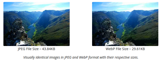
Introduced by Google, WebP is an image format that provides lossless and lossy compression for images on the web. WebP images are considered to be nearly 26% smaller in size as compared to PNGs, and as much as 25%-34% smaller as compared to JPEGs.

Recently, Photon, the image service module provided by the popular Jetpack plugin for self-hosted WordPress websites, decided to offer support for the WebP image format.

Since Photon is primarily used by website owners to serve images using WordPress.com cloud infrastructure, thereby saving the host website’s bandwidth and improving the overall loading times, WebP format is especially beneficial since offers smaller file sizes than both PNG and JPG, and can result in faster website performance.

jetpack-webp

By default, Photon will be compressing WebP images at the high quality settings. However, it must be noted that since many web browsers still do not support WebP image format, Photon will auto-detect the visitor’s web browser, and then pick the ideal image format, size and compression for better performance.

Jetpack is actively used by several WordPress websites, and the Photon module is a very useful feature as it provides CDN-like service for free. Since images form the bulk of content on most websites, serving them via Photon can improve overall website performance. As of now, WebP image format is not the most popular one out there, but for web browsers that do support WebP images, Photon will be able to serve images even faster.

To learn more about the WebP image format, check this out; and you can also go through the comparative study between WebP and JPEG image formats. Alternatively, if you are a Photon user, simply head to the Jetpack Settings section to learn more about how Photon will work with WebP images.

Read More at Jetpack’s Photon Now Supports WebP Images

Categories: Designing, Others Tags: