Premium for Free, the WordPress Theme HC Blog is a Must-Have

4 – The Extended Gallery Features
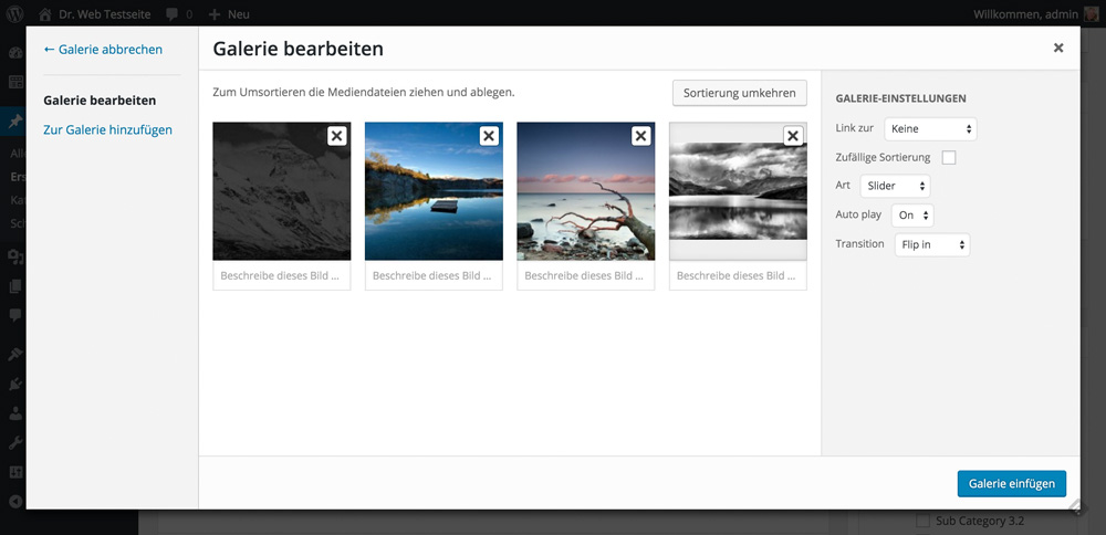
Choosing between many unique versions of galleries allows you to always present your photos in the best possible way.
5 – Multiple Layouts
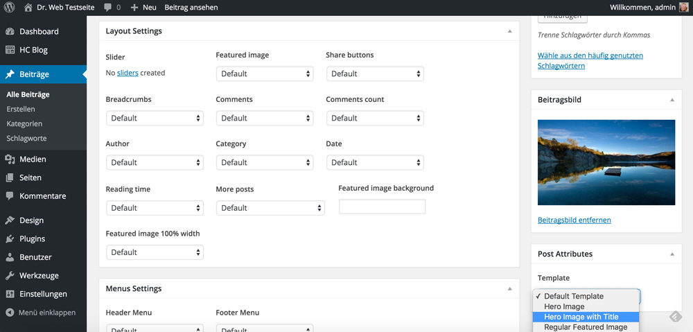
Multiple layouts allow you to choose a different design for each article.
6 – The Custom Post Type Builder
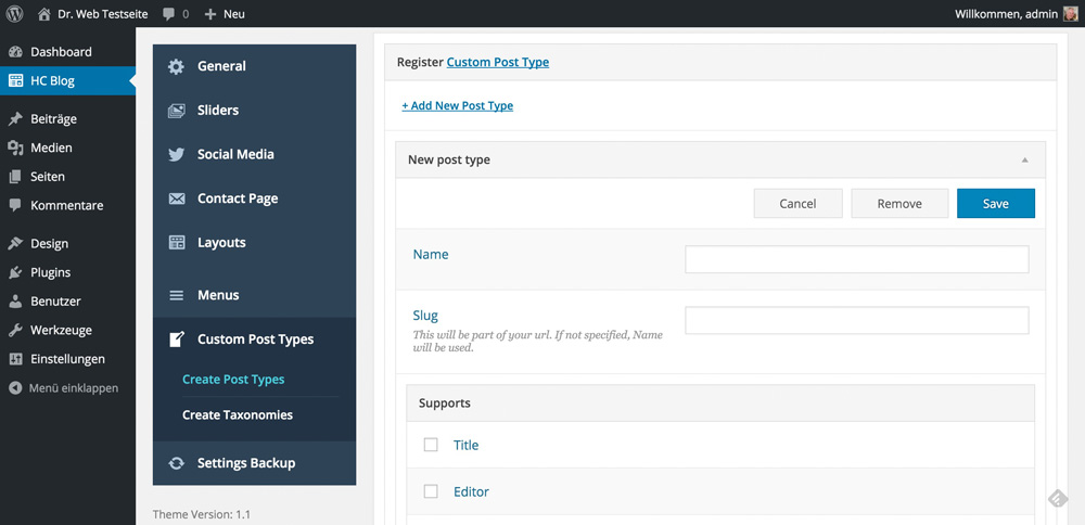
Custom post types are needed now and then. Whether you want to set up an area for cooking recipes or extend any other sector. The implemented generator allows for fast execution.
A Quick Overview of the Feature Set
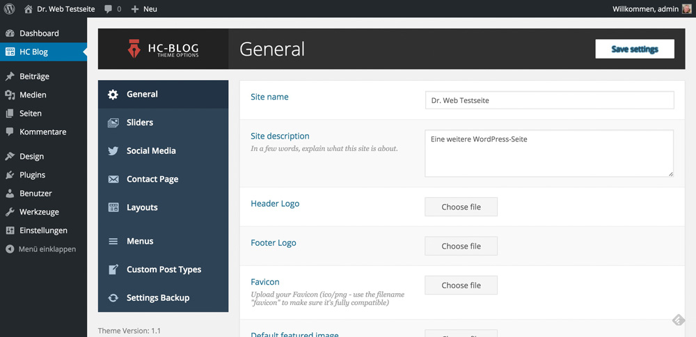
HC Blog’s Theme Options
The theme options can be accessed via their menu item and offer quite a lot of settings. The interface has been designed to feel modern and clean. It is easy to work with.
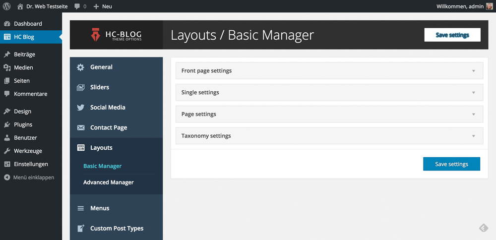
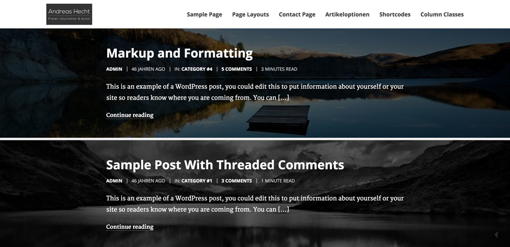
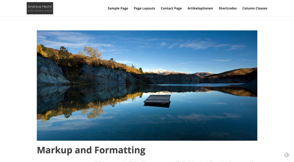
The different menu items are partially hidden in sub-menus that, just like in standard WordPress, only appear after touching them with the mouse (or the finger). The layout manager is comprehensive. You can use it to create separate layouts for the landing page, the posts, the pages and the taxonomies.
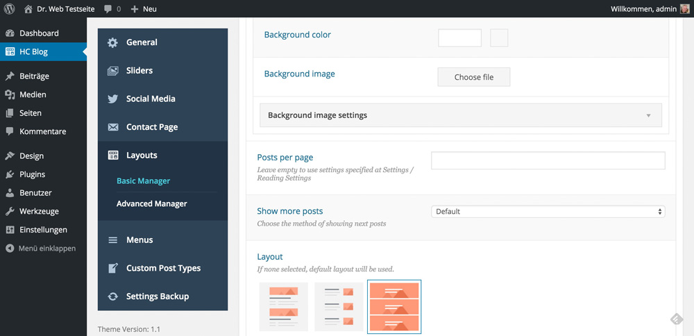
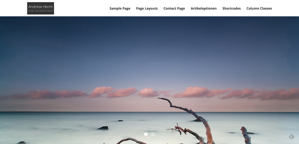
There are three preset layouts and a unique slider, allowing you to edit the landing page.
The Complex Contact Page
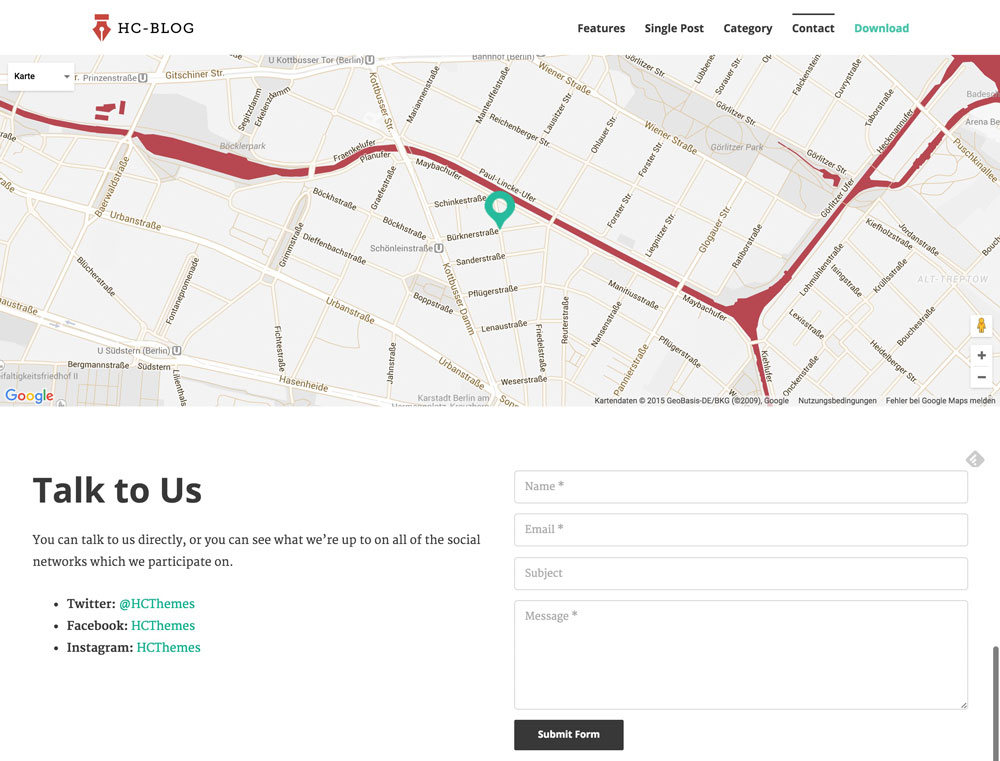
HC Blog comes with a contact form. This means that you won’t need an extra plugin for this feature either. The contact page is equipped with an interactive map. Freelancers or self-employed people, which depend on being found, will be very happy with this feature.
Conclusion
The »HC Blog Free Premium WordPress Theme” is one of the most convincing free themes that I was able to test in a while. If you need a professional looking blog, a portfolio or a photo page, you should definitely take a closer look at HC Blog. Web designers and developers will especially like that as it comes with a code highlighting by default. But other users should also look at HC Blog as it impresses with its unique adaptability and many small features that even expensive premium themes don’t offer.
(dpe)
Sometimes, you find true gems in the depths of the internet when looking for themes. One of these gems is the new free premium WordPress theme »HC Blog”, which offers a whole bunch of interesting features. HC Themes is the name of a new theme provider. To raise its popularity HC Themes makes this free theme with premium features available to the public. It seems like a promotion for the distribution of a new framework, which is currently in the works, is what they are aiming for. The HC Blog WordPress theme is supposed to advertise that new product. This is not a disadvantage, just another good reason to take a closer look at the theme.
The HC Blog Theme – Free, But Premium Nonetheless
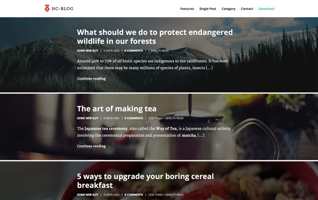
It’s rare to find themes that are not only free but also come with advanced features. Features that render some other themes superfluous. But first, let’s talk about the purpose: the HC Blog Theme is a theme for personal blogs, portfolios and friends of photos. Of course, it is responsive and Retina ready. It is fully compatible with WordPress 4.4 and available for download from the following website:
HC Blog Theme Download | HC Blog Theme Demo | Documentation
What HC Blog Offers
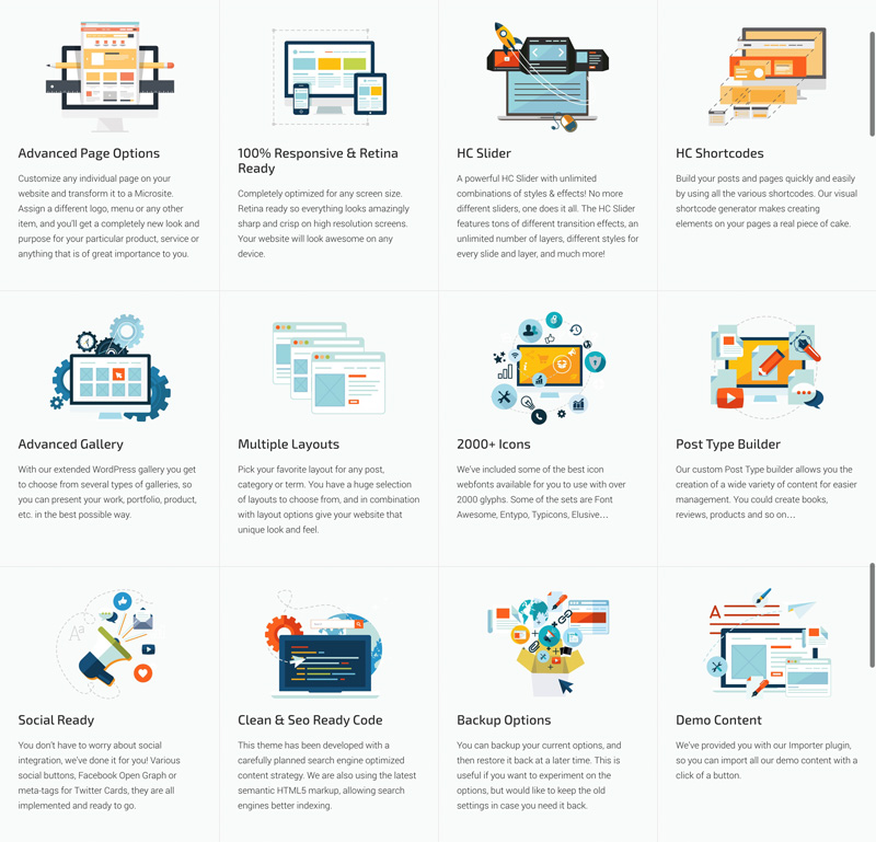
An overview of the most important features:
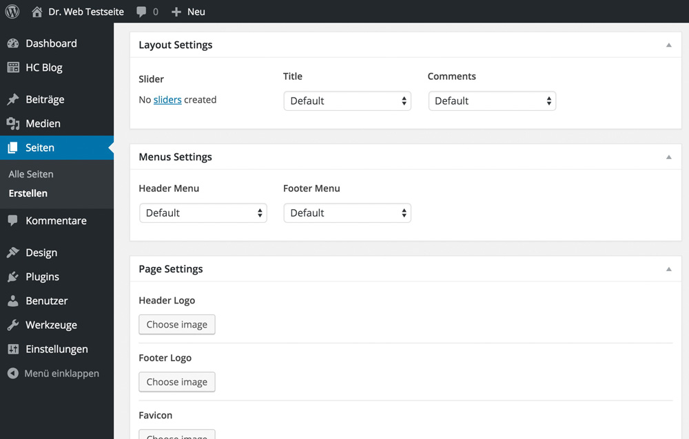
1 – The Extended Page Options
Every single page can be equipped with different layouts. This allows you to distribute a custom logo for every page, set a custom menu and much more. This way, it is possible to create unique landing pages.
2 – A Slider With Many Features
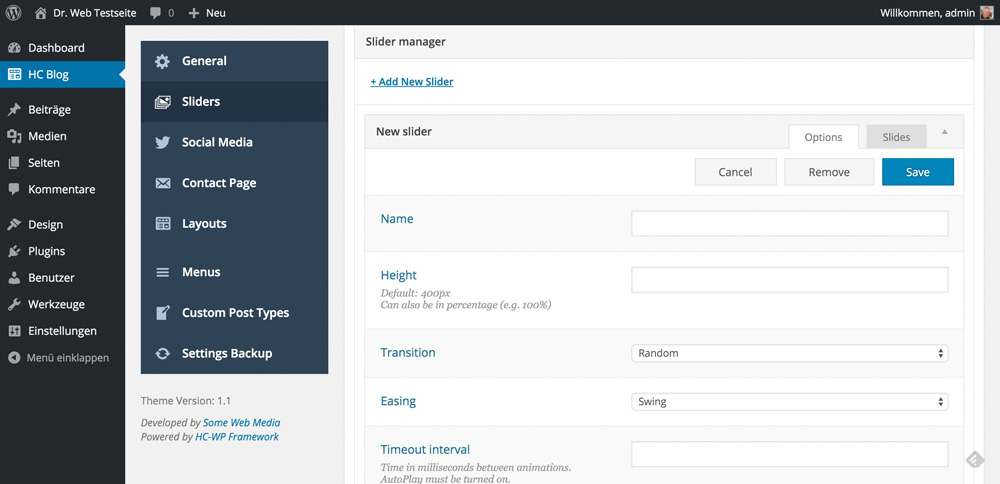
The theme provides a slider with a lot of effects and designs. A third-party slider is not needed anymore, as the internal slider can be used wherever you want to. Transition effects, an unlimited number of images and different ways of presentation for each slider round off the picture.
3 – An Integrated Shortcode Generator
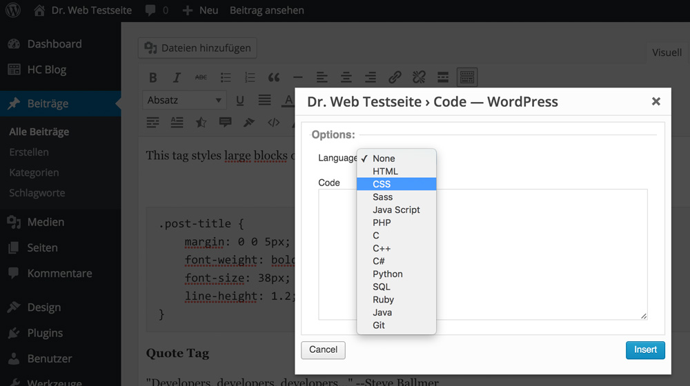
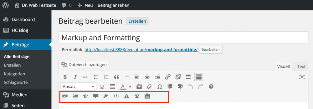
The integrated shortcode generator offers many additional features like buttons, Font Awesome icons, contact forms and nicely formatted code blocks. This means that the plugin that you needed to highlight code blocks is now oblivious.


4 – The Extended Gallery Features
Choosing between many unique versions of galleries allows you to always present your photos in the best possible way.

5 – Multiple Layouts
Multiple layouts allow you to choose a different design for each article.

6 – The Custom Post Type Builder
Custom post types are needed now and then. Whether you want to set up an area for cooking recipes or extend any other sector. The implemented generator allows for fast execution.

A Quick Overview of the Feature Set

HC Blog’s Theme Options
The theme options can be accessed via their menu item and offer quite a lot of settings. The interface has been designed to feel modern and clean. It is easy to work with.

The different menu items are partially hidden in sub-menus that, just like in standard WordPress, only appear after touching them with the mouse (or the finger). The layout manager is comprehensive. You can use it to create separate layouts for the landing page, the posts, the pages and the taxonomies.


There are three preset layouts and a unique slider, allowing you to edit the landing page.


The Complex Contact Page
HC Blog comes with a contact form. This means that you won’t need an extra plugin for this feature either. The contact page is equipped with an interactive map. Freelancers or self-employed people, which depend on being found, will be very happy with this feature.

Conclusion
The »HC Blog Free Premium WordPress Theme” is one of the most convincing free themes that I was able to test in a while. If you need a professional looking blog, a portfolio or a photo page, you should definitely take a closer look at HC Blog. Web designers and developers will especially like that as it comes with a code highlighting by default. But other users should also look at HC Blog as it impresses with its unique adaptability and many small features that even expensive premium themes don’t offer.
(dpe)
- Best Of 2012: 50 Free WordPress Themes
 Top 10: Free WordPress Themes of December 2015
 Best of WordPress: 10 Free Themes of October 2015
 November or Never: 20+ Free WordPress Themes to Make Your Blog Shine
 14 Free WordPress Themes, Fresh from March 2013
 June 2014: 20 Fresh and Free WordPress Themes of The Month
The value of accessibility
What if I told you web designers out there that there are people who might visit your website that don’t care what it looks like?
Visually impaired people navigate the web for the same reasons we all do, to find information, to shop and to perform a myriad of important tasks using web-based applications. But visually impaired people experience the web differently and we need to be sensitive to their needs when we design and build websites.
According to the U.S. Census Bureau and the U.N. and World Bank over 47 million Americans, and up to 650 million people worldwide, have some kind of disability. Every visitor to the sites you design needs to be able to find the information they are looking for and perform the tasks they intended to perform regardless of what the web page or app looks like. A lot of different factors that go into the creation of the web page or application can impact accessibility.
You take the blue pill–the story ends, you wake up in your bed and believe whatever you want to believe. You take the red pill–you stay in Wonderland, and I show you how deep the rabbit hole goes. — The Matrix
Are you ready to go down the accessibility rabbit hold with me? We will need to dive into to the technical aspects of web pages. HTML is the skeleton of a webpage while CSS, JavaScript and images enhance the HTML. Often times visually impaired people miss out on all these enhancements. Although accessibility is mainly a developer task, sometimes the technical requirements required to preserve or enhance accessibility will affect the appearance of the website. That means that design, copy, user experience and development all need to collaborate to make sure that navigation controls, forms, buttons, headings, buttons, links, and more are accessible.
design, copy, user experience and development all need to collaborate to make sure that navigation controls, forms, buttons, headings, buttons, links, and more are accessible
People who are blind, visually impaired, illiterate or learning disabled use assistive technologies to navigate the Internet. Screen readers are the most common assistive technology for the web, these software programs attempt to interpret what is displayed on the web page and convey it to the user, usually through converting the text to speech but sometimes through a Braille output device. Screen magnifiers are also often used in conjunction with a screen reader. Typically a screen reader will attempt to parse the HTML from the top of the HTML file to the bottom and speak relevant elements to the user. Ideally the screen reader will allow the user to successfully move a virtual cursor down the page in order to fill out form fields, click buttons and make selections from drop-down menus and other controls.
To test thoroughly for accessibility you’ll need to ensure that the website or app performs well on each of the many screen readers available. There are several popular free and/or open source screen readers on each platform including JAWS, and NVDA. Microsoft users can use NVDA, while Apple computers and iOS devices come with Voice Over which can magnify keyboard controls and read screen contents, and for Unix devices there’s Orca. The Chrome browser has two assistive technology plugins, ChromeVox for screen reading and ChromeVis for magnification.
Most web accessibility problems occur when the screen reader’s virtual cursor becomes trapped in a poorly designed form or skips over an important control or an important piece of textual information. Verifying that websites are indeed usable is similar to browser testing because each screen reader has different requirements and limitations. This is why understanding the behavior of each screen-reader is important. The needs of various screen readers can be accommodated by adding various special HTML tags to the important elements of the page.
Modern dynamic web UI can be particularly problematic for accessibility because important elements are added to the page dynamically using JavaScript. Custom drop-down menus, modals, tooltips, accordion content and dynamic errors and notifications can be challenging for screen reader users to understand because of a communication breakdown between the HTML, JavaScript and the screen reader. Native HTML and JavaScript have no way to communicate page (Document Object Model) updates to the screen readers. Developers need to move “focus” (the screen reader’s virtual cursor) to the part of the UI that changed. When a modal opens up developers need to put the user’s focus on that modal so that the screen reader can read that content and the user can understand and interact with it.
WAI-ARIA can bridge the gaps between what the raw HTML of the page says and what sighted users see
This is done through the use of special HTML tags called WAI-ARIA tags. WAI-ARIA (Accessible Rich Internet Applications) can bridge the gaps between what the raw HTML of the page says and what sighted users see by providing a standardized way for developers to add extra meaning to states, properties, relationships, roles and live regions that a screen reader otherwise would not understand. Developers can use aria-level to explain to screen readers the hierarchy of each heading on the page. With aria-label developers can add a heading to describe the purpose of a discrete element on the page. This helps developers create clear relationships between different elements. Developers can also draw attention to important controls by labeling them with aria-role tags, for example a drop-down menu button would be labeled with the following tag: Aria-has popup: true.
See the Pen Simple Accessible Tabs by Scott Vinkle (@svinkle) on CodePen.
In the HTML in the example above the tabs are created using an unordered list with classes on each list item. The jQuery captures the click events when a tab is clicked and adds ‘aria-selected’ : ‘true’ and ‘tab-widget__tab-content—active’ to the selected tab and hides the other tabs by adding ‘aria-selected’ : ‘false’ to the remaining tabs. On line 127 the initial attributes for the tabs are set, together these snippets help screen readers recognize which tab is visible. The JavaScript on line 35 also adds keyboard support to the tabs. The rest of the file handles capturing click and keyboard events so that jQuery can add ‘role’ and ‘presentation’ attributes to the currently selected tab.
Aria tags can help screen readers to interpret custom controls as radio buttons when the custom control is labeled with: Aria-role=radio button. When an application has a sandbox area that communicates feedback or updates to the user it can be labeled with a live region tag: Aria-live. This ensures that when the text on this element changes it will automatically be spoken to the user through the screen reader.
Page refreshes are a key part of the web for screen readers because when a page refresh occurs it signals to the screen reader that it should announce the new page to the user and re-read the contents of the page to the user. This means that single page web applications pose special challenges to accessibility. In a single page app there no full page refreshes so the screen reader and therefore the user will not be alerted to the updated content. The result will be that the user receives no feedback on their actions. The best solution is to emulate native page refresh behavior. On view loaded, update the page title and announce it to the user.
The full specifications for WAI-ARIA are maintained by the W3 like the specifications for HTML itself under the Web Accessibility Initiative (WAI) but sometimes guidelines can be more helpful than specifications so here are a few general guidelines for designers:
- make sure that there is visual contrast between text and its background.
- don’t use color alone to convey information;
- provide your website with clear and consistent navigation;
- ensure that form elements clearly include associated labels;
- make sure that feedback elements like error messages can easily be identified;
- use headings and spacing to group related content;
- provide alternate text for images;
- consider designing your website so that all functionality is accessible through the keyboard.
There are several simple decisions you can make when developing a website that will make the website more accessible without getting too deep in special accessibility markup or screen reader testing. By making sure that your HTML conveys meaning through its structure you will help screen readers process information in the same way it appears on the page for sighted users. This is important for users who use a magnifier in conjunction with a screen reader.
Using appropriate HTML mark-up for headings, lists, tables, and other elements allows the screen reader to categorize the structure of the page for the user in a familiar way. For more involved layouts HTML5 provides additional elements, such as
Generating SVG With React
React is one of today’s most popular ways to create a component-based UI. It helps to organize an application into small, human-digestible chunks. With its “re-render the whole world” approach, you can avoid any complex internal interactions between small components, while your application continues to be blazingly fast due to the DOM-diffing that React does under the hood (i.e. updating only the parts of the DOM that need to be updated).

But can we apply the same techniques to web graphics — SVG in particular? Yes! I don’t know about you, but for me SVG code becomes messy pretty fast. Trying to grasp what’s wrong with a graph or visualization just by looking at SVG generator templates (or the SVG source itself) is often overwhelming, and attempts to maintain internal structure or separation of concerns are often complex and tedious.
The post Generating SVG With React appeared first on Smashing Magazine.
Cartoon: Spec Work
Spec Pizzas. Need I say more? The absurdity is so obvious that it is hard to understand why thoughts of spec work being positive prevail. I have never done that. And as much as these pizza guys will never visit that potential customer again I want to encourage you that you also walk away from people who show no respect for your professionality. No money, no cookies. (Or pizza, for that matter.)
By the way, we have more cartoons for you here.
Popular design news of the week: December 21, 2015 – December 27, 2015
Every week users submit a lot of interesting stuff on our sister site Webdesigner News, highlighting great content from around the web that can be of interest to web designers.
The best way to keep track of all the great stories and news being posted is simply to check out the Webdesigner News site, however, in case you missed some here’s a quick and useful compilation of the most popular designer news that we curated from the past week.
Note that this is only a very small selection of the links that were posted, so don’t miss out and subscribe to our newsletter and follow the site daily for all the news.
Design Trend: How to Create a Cool Split Screen Aesthetic
The 4 Top Colour Trends for 2016
Design for Startup
Ultimate Guide to Font Pairing
Google Blocky – The Web-based Visual Programming Editor
FontPro – Typography Project Made Simple
I’m not a Talented Designer
The Very Best of Material Design in 2015
The Galaxy of ‘Star Wars’ Fonts
Being Responsive to the Small Things
Grid, Flexbox, Box Alignment: Our New System for Layout
The 10 Chrome Extensions You Need Most
Juntoo – Add Notes to any Element on any Web Page
How Advertising Taught Me Good Design
Brands that Won (and Lost) Google in 2015
Ad Blocking Phase II
National Geographic Release its Pictures of 2015
The New York Times: The Year in Visual Stories and Graphics
Google Trends – Exlore the Biggest Moments of 2015
Miss Universe: A Case Study on Banner Blindness in Print Design
The 15 Most Beautifully Designed Apps of 2015
Responsive Images Now Landed in WordPress Core
The State of the Modern Political Logo
I Analyzed 250 SaaS Pricing Pages – Here’s What I Found
Complete Beginner’s Guide to Information Architecture
Want more? No problem! Keep track of top design news from around the web with Webdesigner News.
| LAST DAY: Libertad, 14 Unique Fonts in 1 Versatile Sans-Serif Font – only $14! |
|
`flex-grow` is weird. Or is it?
The following is a guest post by Manuel Matuzovic. It illustrates how flex-grow works, weird quirks and all. Then he goes into several examples on how common layout patterns may be implemented using flex-grow and flex-basis.
When I found out about flex-grow, I made a simple demo to find out what it did and how it worked.
I thought I got everything figured out, but when I tried it on a website a colleague has recently made, nothing worked as expected. No matter what we did, the layout didn’t look and work like it did in my demo. That got me thinking and I started to doubt that I knew what flex-grow was all about.
How flex-grow doesn’t work
Before we are going to take a deep dive into the functionality of flex-grow, I want to explain to you what I got wrong at first.
I thought that all flex items with flex-grow set to 1 would have an equal width. If one of the items had flex-grow set to 2 that item would be twice as big as all the others.
This sounds great. It seems as if this is exactly what’s happening in the Pen I mentioned before. The parent element is 900px wide, the section with flex-grow: 2 has a calculated width of 600px and the aside element with flex-grow: 1 has a calculated width of 300px.
As you can see, everything works out perfectly in this demo, but it did not work at all in a real life example, even though we used the exact same CSS. As it turns out, the problem wasn’t the CSS, but the content (or lack of content). The demo I made works, because by only using two empty elements I created a test case that was too simple to depict the important specifics of the property.
How flex-grow really works
I just described how flex-grow does not work, but I showed you a demo that actually does do what I claim it does not (Later on in this article I will explain the reason for this.).
To clarify things, let me show you another Pen. We have got the exact same setup as in the first pen, but this time the section and aside elements aren’t empty. Now the ratio isn’t 2:1 anymore and the element with flex-grow set to 1 is actually bigger than the element with flex-grow set to 2.
Explanation
If we apply display: flex; to the parent element and don’t change anything else, the child elements will be stacked horizontally, no matter what. If there isn’t enough space, they will shrink in size. If on the other hand there is more than enough space, they won’t grow, because Flexbox wants us to define how much they should grow. So rather than telling the browser how wide an element should be, flex-grow determines how the remaining space is distributed amongst the flex items and how big the share is each item receives.
Or in other words:
A flex container distributes free space to its items (proportionally to their flex grow factor) to fill the containers, or shrinks them (proportionally to their flex shrink factor) to prevent overflow.
https://drafts.csswg.org/css-flexbox/#flexibility
Demonstration
The concept is much easier to understand if we visualise it.
First we set the display property of our parent element to flex and by doing that our child elements become flex items and are positioned horizontally next to each other.
Next we decide how many shares of the extra space each element receives. In our previous example the first element receives 2/3 of the remaining space (flex-grow: 2) and the second element 1/3 (flex-grow: 1). By knowing how many flex-grow values we have in total, we know by which number to divide the remaining space.

Finally we have the number of distributable pieces. Each element receives the appropriate number of pieces based on its flex-grow value.

Calculation
Theory and visual representations are nice, but let’s get dirty and do the math for the above example.
For our calculation we need 4 numbers: The parent width, the initial width of our section and our aside element and the total number of flex-grow values we’ll use.
parent width: 900px
section width: 99px
aside width: 623px
total flex-grow values: 3
1. First we have to calculate the remaining space
That’s pretty easy. We take the parents width and subtract the total initial width of every child element.
900 - 99 - 623 = 178parent width – initial section width – initial aside width = remaining space
2. Next we have to determine how much one flex-grow is
Now that we have the remaining space we need to determine into how many slices we want to cut it. The important thing here is that we don’t divide the remaining space by the number of elements, but by the number of total flex-grow values. So in our case that’s 3 (flex-grow: 2 + flex-grow: 1)
178 / 3 = 59.33remaining space / total flex-grow values = “one flex-grow”
3. Finally the sliced up remaining space gets distributed between all elements
Based on their flex-grow values the section receives 2 slices (2 * 59.33) and the aside 1 (1 * 59.33). These numbers are added to the initial width of each element.
99 + (2 * 59.33) = 217.66 (≈218px)initial section width + (section flex-grow value * “one flex-grow”) = new width
and
623 + (1 * 59.33) = 682.33 (≈682px)initial aside width + (aside flex-grow value * “one flex-grow”) = new width
Easy cheesy, right?
Alright, but why does the first demo work?
We have the formula, now lets find out why we actually got the numbers we wanted in the first Pen even though we didn’t know what we were doing.
parent width: 900px
section width: 0px
aside width: 0px
total flex-grow values: 3
1. Calculate the remaining space
900 - 0 - 0 = 9002. Determine how much one flex-grow is
900 / 3 = 3003. Distribute the sliced up remaining space
0 + (2 * 300) = 600
0 + (1 * 300) = 300
If the width of each element is 0, the remaining space equals the actual width of the parent element and thus it looks like flex-grow divides the parent element’s width in proportional parts.
flex-grow and flex-basis
Just a quick recap: flex-grow will take the remaining space and divide it by the total amount of flex grow values. The resulting quotient is multiplied by the respective flex-grow value and the result is added to each child elements initial width.
But what if there’s no remaining space or what if we don’t want to rely on the elements initial width, but on a value we set? Can’t we still use flex-grow?
Of course we can. There is a property called flex-basis which defines the initial size of an element. If you use flex-basis in conjunction with flex-grow the way the widths are calculated changes.
This component sets theflex-basislonghand and specifies the flex basis: the initial main size of the flex item, before free space is distributed according to the flex factors.
https://drafts.csswg.org/css-flexbox/#valdef-flex-flex-basis
The big difference if we apply flex-basis to an element is that we don’t use its initial width in our calculation anymore, but the value of its flex-basis property.
I have adapted our previous example by adding flex-basis to each element. Here’s the Pen for you.
parent width: 900px
section width: 400px (flex-basis value)
aside width: 200px (flex-basis value)
total flex-grow values: 3
1. Calculate the remaining space
900 - 400 - 200 = 3002. Determine how much one flex-grow is
300 / 3 = 1003. Distribute the sliced up remaining space
400 + (2 * 100) = 600
200 + (1 * 100) = 300
Just for the sake of completeness, you don’t have to use pixel values and hope for the best, percentages work as well.
Working with the box model
So to cover everything, let’s check out what happens if we add padding and margin. Nothing too special actually. In the first step of the calculation you just have to remember to subtract the margins as well.
The only thing to note is that in terms of box-sizing flex-basis behaves like the width property. That means that the calculation as well as the results change if the box-sizing property changes. If box-sizing was set to border-box, you would only work with the flex-basis and margin values in your calculation, because the padding is already included in the width.
Some useful examples
Alright, enough with the math. Let me give you some examples of how you’re able to establish flex-grow effectively in your projects.
No more width: [ x ]%
Due to the fact that the remaining space gets distributed automatically, we don’t need to think about width values anymore, if we want our child elements to fill the parent element.
See the Pen QyWEBb by Manuel Matuzovic (@matuzo) on CodePen.
The “Holy Grail” 3 column liquid layout with pixel-widths
Mixing fixed and fluid widths in column layouts is possible with float, but it is neither intuitive or easy nor flexible. Of course with Flexbox and a little flex-grow and flex-basis magic that is a piece of cake.
See the Pen jbRjMG by Manuel Matuzovic (@matuzo) on CodePen.
Filling remaining space with any element
If you, for example, have an input field next to a label and you want the input field to fill the rest of the space, you don’t need ugly hacks anymore.
See the Pen eJYdWV by Manuel Matuzovic (@matuzo) on CodePen.
You can find more examples on Philip Waltons Solved by Flexbox.
Listening to the specs
According to the specs, we should use the flex shorthand rather than flex-grow directly.
Authors are encouraged to control flexibility using the
flexshorthand rather thanflex-growdirectly, as the shorthand correctly resets any unspecified components to accommodate common uses.
https://drafts.csswg.org/css-flexbox/#flex-grow-property
But be careful! If you just use flex: 1; some of the above examples won’t work anymore, because the values set for the common uses don’t equal the default values and thus interfere with our needs.
If you want to use flex for our use case, you should define it like this:
flex: 2 1 auto; /* (<flex-grow> | <flex-shrink> | <flex-basis>) */Learning Flexbox
If you want to learn more about Flexbox, please check out these great resources:
- A Complete Guide to Flexbox by Chris Coyier
- Flexbox adventures by Chris Wright
- Flexbox Froggy by Thomas Park
- What the Flexbox? by Wes Bos
- flexboxin5
- Flexbox Tester by Mike Riethmuller
Summary and lessons learned
Is flex-grow weird? Nah, not at all. We just have to understand how it works and what it does. If an element has flex-grow set to 3 it does not mean that it’s 3 times bigger than an element that has flex-grow set to 1, but it means that it gets 3 times more pixels added to its initial width than the other element.
I learned my lesson by testing flex-grow with two empty elements, which gave me a completely different understanding of what the property actually does and this of course led to wrong conclusions. You should check out new stuff in an environment that is as realistic as possible, to get the best impression of how it really works and behaves.
`flex-grow` is weird. Or is it? is a post from CSS-Tricks
HTML5: Plyr is a Responsive and Accessible Video Player
Today, those that want to integrate video and audio files in a website, rely on HTML5. Plyr is an extensive tool to help with that, allowing you to create a custom interface for HTML5 video and audio. As Plyr is a contemporary piece of web technology, it is both responsive and accessible.
Simple Operation, Freely Configurable
Coming to results with the Plyr is easy. There are three files: a JavaScript, a stylesheet and an SVG file. The JavaScript and the stylesheet file need to be implemented in the HTML document. They are responsible for the functionality and the appearance of the user interface. The icons of the function buttons are available as SVG sprites and are tied in via the stylesheet file.
The markup of the videos and audios is done by using their respective HTML5 elements, as usual. An additional „
<div class="player"> <video poster="film.jpg"controls> <source src="film.mp4"type="video/mp4"> … </video> </div> |
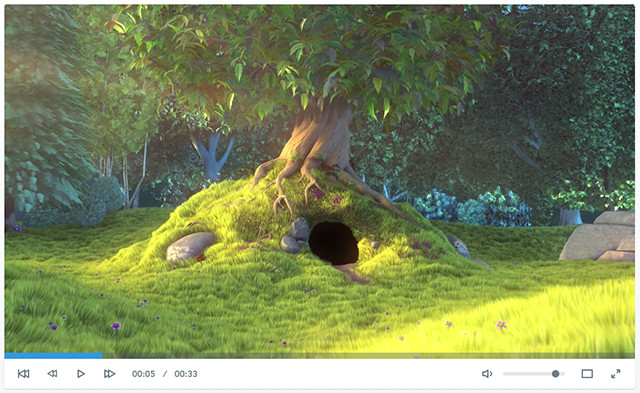
Plyr adds classic buttons for play and pause as well as volume control. It also displays a button to switch into fullscreen mode and one to show subtitles. A progress bar that allows you to skip back and forth on both audio and video is also included by default. Additionally, the current playing time and the total duration are displayed.
![]()
SVG Icons Can be Changed
Apart from that, there are plenty of options to modify the appearance and behaviour of the user interface via JavaScript. This way you can choose which buttons and what information should be displayed. The name of the buttons can also be defined using a language object.
plyr.setup({ controls: ["play", "volume"], i18n: {play: "Get it going", volume: "Let's get loud"} }) |
In the example, only the play and volume buttons are shown via „plyr.setup()“. The designation is done via „i18n“. The labels are shown using tool tips.
The looks of the player can be adjusted using a stylesheet. Besides a classic stylesheet file, there is also a SASS and a LESS variant. You can replace the SVG file and use your own icons instead.
Accessible Controls and Responsive Presentation
All of the player’s elements are labelled semantically with HTML5. The volume control is given as a „“ element with a „range“ attribute. The progress bar is realised by a „“ element.
Screenreader and WebVTT are supported as well. The latter allows for the display of subtitles to make video files accessible for hearing-impaired people.

Support of WebVTT for Subtitle Display
When using HTML5 and SVG, the support of responsive layouts is pretty much essential. Plyr does an examplary job with that as well. Videos are always displayed so that their maximum width is the width of the browser tab or the display.
The user interface can also be aligned in several lines if necessary.
YouTube Videos Running in Your Own Player
Especially videos are often hosted via YouTube and integrated into your website. Because of Plyr, you can still use your own design for these videos as well. The framework allows you to equip external YouTube videos with the user interface of Plyr. You simply need to integrate a „
<div data-video-id="L1h9xxCU20g"data-type="youtube"></div> |
Via JavaScript, Plyr makes sure that the video is displayed with the according user interface. In future versions, Plyr is also supposed to support the video platform Vimeo.
Individual Control Via JavaScript
In addition to the interface, Plyr also provides its own API which allows you to control audio and video files independently from the player. Methods such as „play()“ and „pause()“ allow you to start or stop a video or audio file from any link or button.
document.querySelectorAll(".player")[0].plyr.pause(); |
In the example, a playing video is stopped.
Browser Support and Related Links
Plyr is supported by all modern browsers. The Internet Explorer is supported from version 10 and up. The new Edge is supported as well. Here and there, you will need to live with some small restrictions. For instance, the Internet Explorer 10 doesn’t have a fullscreen mode. Safari mobile lacks support for the custom appearance.
Plyr also enables you to deactivate the framework for certain browsers and devices. It is possible to generally deactivate Plyr on mobile devices.
A good documentation as well as demos for the display of video, audio and YouTube files are available. Plyr is distributed under the liberal MIT license and can also be used for commercial purposes.
(dpe)
- Online Advertisement and HTML5: New Standards to Replace Flash
 Lord Of The Rings: Ringmark Checks Mobile Browsers For HTML5…
 Stitches: Free CSS Sprite Generator
 What You Need to Know About the Latest HTML5 Video
 HTML5 Imports: Import HTML Files Into HTML Files
 HTML5 Video: Understanding Compression and DRM with Azure Media…
Comics of the week #319
Every week we feature a set of comics created exclusively for WDD.
The content revolves around web design, blogging and funny situations that we encounter in our daily lives as designers.
These great cartoons are created by Jerry King, an award-winning cartoonist who’s one of the most published, prolific and versatile cartoonists in the world today.
So for a few moments, take a break from your daily routine, have a laugh and enjoy these funny cartoons.
Feel free to leave your comments and suggestions below as well as any related stories of your own…
Medically speaking
It’s a one to one ratio
Where’s the concession stand?
Can you relate to these situations? Please share your funny stories and comments below…
| Easily Rename Multiple Photoshop Layers with the Renamy – only $7! |
|
Noupe says “Merry Christmas”
Whether you are celebrating Christmas or not. We wish you all the best no matter what. Take the days until year’s end to reflect on what has been and what is there to come. Foremost, spend time with your loved ones. No matter the colour of your skin, your religion, your sexual orientation – we are all world’s citizens. We here at Noupe live up to the claim that there are no differences and you should, too.
- Give it to Someone Special: Free Christmas Design Resources by Freepik
 Let It Snow: Festive Resources to Santa up Your Website
 Merry Christmas: 10 Free Vector Xmas Cards as AI and EPS
 The Right Mood #2: 25+ Free Christmas Cards, Flyers, Tags and…
 Flat Christmas: Creative Xmas Greetings on Behance
 Capture the Christmas Mood: 20+ Festive Websites
Adobe Portfolio: New Website Builder for Creatives
Adobe has already established a social network for designers and illustrators with its creative network Behance. The new service Adobe Portfolio allows you to easily set up a website to present your work on. The service is free to all subscribers of the Creative Cloud. If you already have a profile on Behance, you can import your work in Adobe Portfolio.
Homepage Building Kit for Creative People
At the very latest since Adobe bought Behance, Adobe has shown that they don’t want to restrict themselves to the sale of creative applications, but also want to give their customers the opportunity to present their work on the internet. Using the so-called ProSites, the subscribers of the Creative Cloud were already able to set up a portfolio on Behance, which is different from standard profile pages.
Now, Adobe will abandon ProSites for their independent service Adobe Portfolio. At the moment, Adobe Portfolio is in a preview phase. As a Creative Cloud subscriber, however, you can apply for an „Early Access“ which allows you to test the service already.
Adobe Portfolio is similar to other website builders that allow you to construct a website using a visual user interface without any knowledge of HTML, JavaScript, and CSS. Adobe Portfolio focuses on creative people that want to share their work.
Choose and Edit Layout
Once you log into the service, you can create your portfolio from a very clean surface. As of now, there are five basic layouts available. Each layout is specialised on the presentation of large format images. Once you decide on a design, you can further adjust it according to your needs. The website’s display size, its borders and the maximum width can be altered.
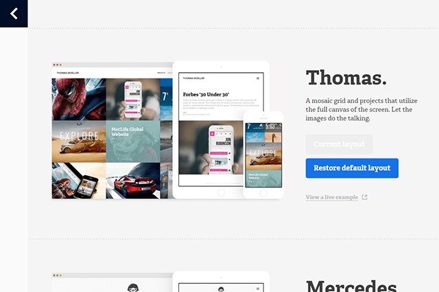
Choose from Several Layouts and Start Editing
A portfolio site consists of a logo, footer, navigation as well as the actual content. Logo, footer, and navigation can be faded out if desired. A lot of things, such as the position of navigation and logo, can be changed using sliders. There are different colour schemes for each layout. There is a bright and a dark scheme, for example. You can decide which background your projects look best on.
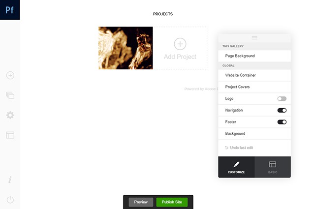
Change Settings via Switches and Sliders
You can choose one of the many fonts from Adobe’s Typekit. You can individually customise headlines, paragraphs, and other text elements. You can edit not only the font, but also the colour, size, and orientation.
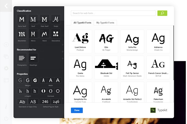
Choose Fonts from Typekit and Implement them
Create Content
Adobe Portfolio’s focus is on the presentation of creative works. These can be added to the website as projects. You can upload pictures or videos and give information on each project. Besides the title, you can also add a description and a date. Additionally, choose a category.
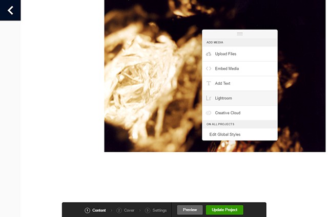
Upload Content or Import Them From Creative Cloud and Lightroom
You can upload a project to Behance at the same time. Instead of uploading images and videos, directly import them from your Creative Cloud or Lightroom. Here, Adobe does a good job at connecting the various services of its Cloud.
All projects and a cover image are displayed on an overview page. You can choose a part of one of your project images as the cover picture.
Besides projects, you could also create simple pages. This is where you can introduce yourself and your services to the viewers. Here, you also have the option to integrate images, videos and links.
Test and Publish the Website
Once you uploaded all of your content, there is nothing that stops you from publishing the website. Using a preview, check if everything looks the way it is supposed to. You can also test how it is displayed on different devices, such as smartphones and tablets.
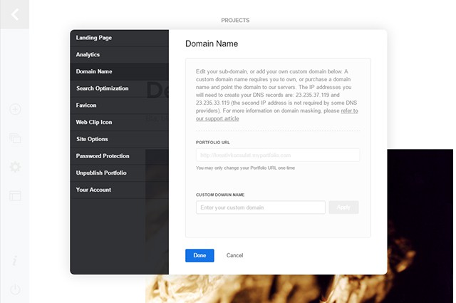
You Can Choose Different Settings and Implement Analytics Before Publishing
Your portfolio will be published via the subdomain „myportfolio.com“. You can freely choose the subdomain or decide to publish your portfolio using a separate domain. However, to do that, your provider needs to allow you connect the IP address given by Adobe Portfolio to your domain.
If you want to, you can use a password for your portfolio so that not everyone has access to it. To view how often your website is visited, you can implement Google Analytics. Just enter the corresponding tracking code.
If necessary, you can also deactivate your website and have it display a message that informs the users about the reason for its downtime.
Conclusion
Adobe Portfolio targets creatives that want a simple website to display their work on but have no knowledge of web design and development. The layouts are clean, modern, and leave lots of room for the work itself. The operation is easy and intuitive.
The website is contemporary, written in HTML5 and CSS3 and is, due to its responsive design, suitable for mobile devices. Adobe Portfolio is definitely not the right service for those looking for a completely individually designed website. For all others, however, this service could be worth a closer look. As a subscriber of the Creative Cloud, this is an included offer. So why not give it a spin?
(dpe)
- A Life Without Adobe: Possible, but Pointless (IMHO)
 Adobe Lightroom Mobile: Image Processing on the Go (including Android)
 Dribbbox: And Your Dribbble Profile Becomes a Website, Hosted on Your…
 Lifelong Learning: Certified Online Tutorials by Adobe Experts Train…
 Social Media Self-hosted: Neosmart Stream
 5 Best Free HTML Editors for Web Developers on Mac OS X


![Cartoon: If Web Designers Were Pizza Boys [005] Cartoon: If Web Designers Were Pizza Boys [005]](http://www.noupe.com/wp-content/plugins/contextual-related-posts-2.0.1/timthumb/timthumb.php?src=http%3A%2F%2Fwww.noupe.com%2Fwp-content%2Fuploads%2F2015%2F02%2Fcartoonteaser_noupe.png&w=250&h=200&zc=1&q=75)
![Cartoon: If Web Designers Were Butchers… [008] Cartoon: If Web Designers Were Butchers… [008]](http://www.noupe.com/wp-content/plugins/contextual-related-posts-2.0.1/timthumb/timthumb.php?src=http%3A%2F%2Fwww.noupe.com%2Fwp-content%2Fuploads%2F2015%2F03%2Fteaser_noupe_butcher.png&w=250&h=200&zc=1&q=75)
![Cartoon: If Web Designers Were Sculptors… [006] Cartoon: If Web Designers Were Sculptors… [006]](http://www.noupe.com/wp-content/plugins/contextual-related-posts-2.0.1/timthumb/timthumb.php?src=http%3A%2F%2Fwww.noupe.com%2Fwp-content%2Fuploads%2F2015%2F02%2Fnoupe_cartoon_teaser_220215.png&w=250&h=200&zc=1&q=75)


