Archive

Archive for December, 2015

Designing the holidays

December 25th, 2015 No comments

It’s that time of year again. You know, the time when we all write articles about “that time of year”? I thought it would be fun to research how design (and the advertising industry) have affected not only Christmas, but a few of the major international holidays.

It’s hard to know exactly how much advertising has affected history. I mean, consider the story of how Coca Cola made Santa fat and red. It’s not true… at all.

According to the Snopes article that I just linked:

at best what Coca-Cola popularized was an image they borrowed, not one they created.

All in all, that story says more about how the advertising and design industries sell themselves than how they’ve changed holidays. The truth is that it’s usually the ads themselves that change with current practices, values, and trends.

But still, advertising has had some impact. Let’s find out just how big that impact was.

Christmas

There are a hundred Christmas legends, and even more theories about how we came to have the holiday we have now. Mind you, I say “the holiday we have now” somewhat loosely, because Christmas is celebrated differently all over the world.

One of the best Christmases I ever had was when I was alone, and I made steaks for myself and my dog, then watched a ton of Stargate SG1. My point is that while there are some common cultural markers, Christmas itself can be very different for all of the people who celebrate it.

coke ornaments.png

Now those cultural markers… that’s where the advertising comes in. While Coca-Cola may not have invented the Santa we know today, it definitely spread Santa a lot further than he would have gone on his own.

japanese-santa-claus-billboard.jpg

Mind you, that second one is not specifically a Coca-Cola ad, but it serves to show the extent of their marketing prowess.

But they were just working with existing elements. Santa was red already because Christmas itself was red (and green) by long-standing tradition. (Thank you random plants and the Catholic church). Long before Coca-Cola practically patented the color, other brands were using red for emphasis on Christmas as early as 1900:

l-ve11m3kf04rmxx.jpg
l-bj82e4gjt47il0.jpg

And now?

Now, Christmas is a much bigger deal than being a religious festival, because it’s a huge marketing opportunity. I mean, yes, Santa is known in Japan, but other parts of Asia are getting in on it too.

I won’t go on about how brands made Christmas more of a consumer holiday than a religious festival. The truth is, we did that ourselves. Coca-Cola just adapted existing imagery to their brand, and cashed in big, while reaching into new markets.

Heck, they’re even trying to give Chinese New Year the Santa Claus treatment with some new mascots.

Valentine’s

Okay, I’ll give Hallmark the credit for this one. Them and Hershey’s, basically. I mean sure, it was a thing before all of that. People exchanged notes, handmade cards, small gifts, and the like.

However, it was having a reliable mail system that really made the whole thing take off. Shy types could buy ready-made cards, drop then in the mail for a cent or two, and declare their love from afar. Lovers separated by distance could celebrate together… sort of.

Esther A. Howland began selling the first mass-produced Valentine’s cards somewhere in the 1840s. Hallmark was founded in 1910. Now there’s a thing called the “Hallmark channel”, and it’s every bit as sappy as you might imagine. It’s as if Lifetime and the C.W. had a family-friendly baby.

In between the greeting cards and the TV channel are thousands of examples of aggressive marketing along the lines of: “Buy her stuff (especially chocolate) or she won’t love you.”

l-6m9injz9ag2k18.jpg

This is one holiday where I have to say that marketing and design did make a huge difference, and not necessarily for the better. Congratulations Whitman’s Chocolates (and others), you turned Valentine’s day into our cautionary tale.

Halloween

Halloween is only an “international holiday” in a very general sense. It was only recently that trick-or-treating became a common thing here in Mexico. In some places in Europe, no one does it at all.

The interesting thing about Halloween — or “All Hallows’ Eve” (as in the day before All Saints’ Day) — is that it’s an Irish holiday, that was virtually forgotten in Europe, took off in America, and was then exported back to (amongst other places) Ireland.

But even when it got started in America, it was more of a harvest festival. Pumpkins were just big squash-things. Sweets were something you made for your guests when they came over to party.

And those sweets were home-made, mostly. There was, it is amusing to note, a general distrust of candy packaged and sold by companies. The home-made treats had to be more healthy, right? Why would a company know better than someone who baked their treats fresh?

By the 1950s, however, packaged candy become more acceptable, and the candy companies advertised it more. The 1970s brought urban legends of evil homeowners randomly poisoning children, or putting razor blades in the brownies. By then, anything that wasn’t packaged was seen as unsafe.

l-6p34aa2lqy2l70.jpg

Then all candy companies needed to do was stick cute ghosts and bats on their packaging, and it was basically a goldmine.

Conclusion

Market forces follow the opportunities, and sometimes make them, if they have to. It’s not necessarily a bad thing, but we should not be proud of what happened to Valentine’s day.

We designers may not be as powerful as we’d like to imagine; however, we do need to pay attention to the work we do. Stay tuned for my inevitable future article: “Do we need a Hippocratic oath for designers?”

Easily Rename Multiple Photoshop Layers with the Renamy – only $7!

Source

Categories: Designing, Others Tags:

Migrating from Jekyll to Hexo

December 25th, 2015 No comments

WesternDevs has a shiny new look thanks to graphic designer extraodinaire, Karen Chudobiak. When implementing the design, we also decided to switch from Jekyll to Hexo. Besides having the opportunity to learn NodeJS, the other main reason was Windows. Most of us use it as our primary machine and Jekyll doesn’t officially support it. There are instructions available by people who were obviously more successful at it than we were. And there are even simpler ones that I discovered during the course of writing this post and that I wish existed three months ago.

Regardless, here we are and it’s already been a positive move overall, not least because the move to Node means more of us are available to help with the maintenance of the site. But it wasn’t without it’s challenges. So I’m going to outline the major ones we faced here in the hopes that it will help you make your decision more informed than ours was.

To preface this, note that I’m new to Node and in fact, this is my first real project with it. That said, I’m no expert in Ruby either, which is what Jekyll is written in. And the short version of my first impressions is: Jekyll feels more like a real product but I had an easier time customizing Hexo once I dug into it. Here’s the longer version

DOCUMENTATION/RESOURCES

You’ll run into this very quickly. Documentation for Hexo is decent but incomplete. And once you start Googling, you’ll discover many of the resources are in Chinese. I found very quickly that there isposts collection and that each post has a categories collection. But as to what these objects look like, I couldn’t tell. They aren’t arrays. And you can’t JSON.stringify them because they have circular references in them. util.inspect works but it’s not available everywhere.

MULTI-AUTHOR SUPPORT

By default, Hexo doesn’t support multiple authors. Neither does Jekyll, mind you, but we found apretty complete theme that does. In Hexo, there’s a decent package that gets you partway there. It lets you specify an author ID on a post and it will attach a bunch of information to it. But you can’t, for example, get a full list of authors to list on a Who We Are page. So we created a separate data file for the authors. But we also haven’t figured out how to use that file to generate a .json file to use for the Featured section on the home page. So at the moment, we have author information in three places. Our temporary solution is to disallow anyone from joining or leaving Western Devs.

CUSTOMIZATION

If you go with Hexo and choose an existing themes, you won’t run into the same issues we did. Out of the box, it has good support for posts, categories, pagination, even things like tags and aliases with the right plugins.

But we started from a design and were migrating from an existing site with existing URLs and had to make it work. I’ve mentioned the challenge of multiple authors already. Another one: maintaining our URLs. Most of our posts aren’t categorized. In Jekyll, that means they show up at the root of the site. In Hexo, that’s not possible. At least at the moment and I suspect this is a bug. We eventually had to fork Hexo itself to maintain our existing URLs.

Another challenge: excerpts. In Jekyll, excerpts work like this: Check the front matter for an excerpt. If one doesn’t exist, take the first few characters from the post. In Hexo, excerpts are empty by default. If you add a Read more...

Categories: Others, Programming Tags:

Indispensable tools for low-budget startups

December 24th, 2015 No comments

Starting a web design studio can be an expensive undertaking, but it doesn’t have to be impossible! In this article, I will take you through some of the software and hardware options available that will help keep your costs down during this critical phase of your business venture. An old saying goes that a poor workman blames his tools. Indeed, it is true that if you can’t create awesome designs using free or low-cost tools, then you’re probably not really a designer. You are relying on the tool itself to do the work for you. If, on the other hand, you are truly worthy of the title “Designer”, then you should be able to create great designs using anything at hand. Which obviously begs the question: Why pay more?

Operating system: Mint Linux (Mate Edition)

Alternative to: Windows, Mac Cost: $0 This really does not require a lot of thought. The best strategy for any good designer, regardless of budget, is to build in Linux and test on Windows. Then test on your friend’s Mac. By building your sites in Linux, you gain some advantages:

  • Stability
  • Security
  • No upgrade cost
  • Access to thousands of free software titles

Of course there is also a downside:

  • Limited (but improving) hardware support
  • There are not many mainstream entertainment titles

Well, that last one should not be too much of a worry for a business machine. Hardware compatibility is a bit more of a concern, but you can deal with this in four ways:

  1. Check for Linux compatibility before purchase
  2. Run Windows in a VM, and it’s possible your hardware will work
  3. Boot into Windows if you only need to use the hardware occasionally
  4. Buy HP products, because HP products are natively supported

You could choose any version of Linux; but if you are coming from a Windows background, Mint will make the transition smoother. Mate is a simpler desktop user interface that does not have the annoyances present in the default edition. Using this OS, you will save money and time. You will be more productive and spend more of your time on income producing activities and less of your time babysitting the OS.

Vector drawing software: Inkscape

Alternative to: Adobe Illustrator, Sketch Cost: $0 Illustrator has a few advanced features that are still missing from Inkscape; but for most people those extra features are not used often enough to justify forking out extra cash for them. Besides, it is also true that Inkscape has a few features that you won’t find in Illustrator or Sketch. The argument that you can’t make professional illustrations with Inkscape can be squashed immediately with this showcase of images created by Sven Ebert (aka “Dillerkind”). Personally I found that working with text in Inkscape on Linux was much easier than trying to do the same thing in Illustrator on Mac. But maybe that was just me…

Photo editing software: GIMP

Alternative to: Photoshop, Affinity Photo Cost: $0 The biggest argument against GIMP is that it does not support CMYK color spaces. If you’re a web designer, that is not relevant to you, and furthermore GIMP is natively tuned to work in RGB color space. You could always use both anyway, since Photoshop can be made to work in Linux. One of the things that I really like about using GIMP in Linux is that I can assign the various dialog boxes to reside in a different workspace to the editor window. This means I can let the whole image fill my screen, and just switch to the other workspace when I want to select a different tool or layer. Many filters designed for Photoshop will work in GIMP; and some of GIMP’s built-in filters actually work better than their Photoshop equivalents. This is not to say GIMP is a substitute for Photoshop, but then again it isn’t trying to be. GIMP does what it does very well, and if you are good at image editing, you should be able to produce amazing results with GIMP; but perhaps with some extra effort compared to using Photoshop.

Color matching software: Agave

Alternative to: Adobe Kuler Cost: $0 Agave is a simple tool that helps you quickly create color schemes based on criteria you select. It works like a color wheel, only faster.

2D animation software: Synfig Studio

Alternative to: Flash, Unity Cost: $0 Synfig Studio is one of those rare gems where an open source product has significantly fewer features than its main commercial rival, but still tends to receive better consumer satisfaction reports (at least according to data sourced from a direct comparison by Software Insider). Synfig Studio can’t yet directly import SWF files, and it doesn’t support ActionScript, so unfortunately you are not going to develop the next Candy Crush game with Synfig Studio as a standalone product. Even so, Flash is no longer the sole option for online games, and doesn’t have the same feature set as Unity. Developers are increasingly attracted to the potential offered by HTML5, SVG, and JavaScript to create manageable online games that don’t require a plugin to work. Synfig studio allows you to create extremely high quality animations which can be used in any context, even for movies and television. You don’t have to take my word for it though, check out some sample videos of animations that were made with Synfig.

Accounting software: GNU Cash

Alternative to: QuickBooks, Microsoft Money, etc. Cost: $0 Any serious design business needs to have good accounting software. I have used many different products in this category and none of them have been as good as GNU Cash. It is extremely easy to set up and use, but has powerful features that are sometimes lacking in commercial software. It’s a really high quality piece of software with an unbeatable price tag!

Office software & PDF editor: LibreOffice

Alternative to: Microsoft Office Cost: $0 For all the miscellaneous documents you need to write for your business, LibreOffice fills that need; and goes even further by providing built-in PDF creation. Team it up with Master PDF Editor and PDF Shuffler, and you can create pretty much any kind of business document you need. LibreOffice can read and write documents formatted for Microsoft Office.

Conclusion

These solutions won’t suit every business, but if you are just starting out and need to carefully manage your expenses, saving money wherever possible, then you really can’t go wrong with the items on this list. Remember, a dollar saved is a dollar earned!

Featured image, web design tools image via Shutterstock.

Listz FY – 385 Glyphs in 6 weights and italics – only $17!

Source

Categories: Designing, Others Tags:

Responsive Images Now Landed In WordPress Core

December 24th, 2015 No comments

While the growing adoption of responsive images cannot be ignored, it can be very difficult to employ the functionality under the constraints of a large CMS like WordPress. Although it is entirely possible to write the feature into your theme on your own, doing so is a challenging and time-consuming endeavour.

Responsive Images In WordPress Core

Thankfully, with the launch of WordPress 4.4, theme developers and maintainers will find it much easier to introduce responsive image functionality into their themes. In this recent launch, the RICG Responsive Images plugin has been merged into WordPress core, which means that responsive image support now comes as a default part of WordPress. Let’s take a look at how the feature works, and how you can use it to get the best support for your WordPress site.

The post Responsive Images Now Landed In WordPress Core appeared first on Smashing Magazine.

Categories: Others Tags:

Web Development Reading List #118: Opera Mini, BPG Format, Accessible Tabs and Flexbox

December 24th, 2015 No comments

What’s going on in the industry? What new techniques have emerged recently? What insights, tools, tips and tricks is the web design community talking about? Anselm Hannemann is collecting everything that popped up over the last week in his web development reading list so that you don’t miss out on anything. The result is a carefully curated list of articles and resources that are worth taking a closer look at. — Ed.

Wi-Fi in public places

Today is the Christmas day for many of us around the world and I hope you’re already enjoying the day with your family or friends. This time is often a rare opportunity to relax a bit, avoid emails for a couple of days and not to be disturbed by daily routine, as other people aren’t working either. Before the new year comes up next, there’s a yet another web development reading list, so you won’t get bored over the next few days! 😉

The post Web Development Reading List #118: Opera Mini, BPG Format, Accessible Tabs and Flexbox appeared first on Smashing Magazine.

Categories: Others Tags:

JavaScript: Explained in Simple Words

December 23rd, 2015 No comments
javascript

Anyone who has ever tried explaining technical jargon to someone who is not well-versed with the terminology is aware of how difficult the explanation process can be.

Simplified JavaScript Jargon, as the name suggests, is an attempt to cure the above mentioned problem. Basically, it is a community driven exercise that explains the buzzwords related to JavaScript in simple words.

In other words, Simplified JavaScript Jargon is a glossary that you can refer to, when you need to figure out the meaning of JavaScript terminology in simple language.

javascript

To help you get a better idea, here is how it describes some of the major terms:

  • AJAX: a technology for asynchronous HTTP requests.
  • AMD: a standard defining how to load JavaScript libraries or modules asynchronously.
  • AngularJS: a structural framework for dynamic web apps.
  • Babel: a JavaScript transformation toolkit which started as an ECMAScript 2015 / ES6 code translator (transpiler).
  • Backbone: a structural framework for dynamic web apps.
  • Bluebird: a fully featured Promise library with focus on innovative features and performance.
  • Bower: a package manager for front-end dependencies.
  • Broccoli: a fast and reliable asset pipeline.
  • Browserify: a tool making possible to use the require function from Node.js within the browser.
  • Brunch: a tool focusing on the production of deployment-ready files from development files.
  • Canvas: an HTML element for graphic applications in 2D or 3D.
  • Chai: an assertion library used with a JavaScript testing framework.
  • CoffeeScript: a language that compiles into JavaScript.
  • CORS: a way for a server to make things accessible to pages hosted on other domains.
  • CouchDB: a NoSQL database with JavaScript as query language and HTTP as API.

Need more? Check it out over at GitHub, and if you wish to contribute, simply open a pull request to complete, update or fill in a given section.

Read More at JavaScript: Explained in Simple Words

Categories: Designing, Others Tags:

The Vital Guide to HTML5 Interviewing

December 23rd, 2015 No comments
toptal-blog-image-1442562773864-7004785bb32cdbcde9cf125ea5873560.jpg

The Challenge

Today, HTML is over 20 years old. Over these 20 years, HTML was upgraded 4 times, leaving us with current HTML version 5. The upgrade path was not an easy one: W3C, official maintainer of the HTML specification, was slow in bringing new features to the specification, so web browser developers took things into their hands. This only resulted with more problems, especially for developers that were struggling to create web pages. It caused many cross-browser compatibility issues and wasted development hours. In today’s technology landscape, HTML5 has become an integral part of any front-end development. Although it is not a programming language, it is still an essential component of web applications, and even modern desktop and mobile applications. Today in technology, being 20 years actively used is a very long period. Accordingly, resumes that reference at least some degree of HTML5 experience have essentially become universal in the software development community. This makes locating HTML5 developers fairly easy, but makes pinpointing the perfect one that much more of a challenge.

Old habits die hard. Start using new HTML5 semantic tags today.

Our hiring guide will help you find developers who strive to follow high-quality approaches and have strong knowledge of HTML5 specifications. There’s no magic or foolproof technique, but there are certainly questions you can pose that will help determine the depth and sophistication of a candidate’s knowledge of the language. A brief sampling of such questions are provided below.

Questions and Answers

Q: HTML5 was designed to replace both HTML 4 and XHTML. Discuss new HTML5 features and key goals of the HTML5 specification.

Major goals of the new HTML5 specification were to deliver rich content (like graphics and videos) to customers without the need for additional plugins (namely Flash and Silverlight), to provide better semantic support for web page structure through the introduction of new structural element tags, to provide a stricter parsing standard to simplify error handling, and to simplify backward compatibility with documents written to older standards. In the end, the most important goal in a modern world is to provide better cross-platform support and to ensure that it all works well whether running on desktop computer, laptop, tablet, or even a smartphone.

To achieve all that, many new features were introduced with HTML5. New HTML5 improved support for embedding graphics, audio, and video content via the new , , and tags. Web workers were introduced, new extensions to the JavaScript API such as geolocation were added, new drag-and-drop features, as well as local storage and caching features. Many new semantic tags and new form controls were introduced to complement the structural logic of modern web applications.

Q: Explain what semantic HTML is and name new semantic HTML5 elements.

Semantic HTML is an HTML where the markup, or tags, show the meaning instead of pure presentation or look. For example, HTML5 recommends use of tags instead of for bold text, and instead of for italic text. These semantic tags will generate the same bold and italic text, but instead of pure formatting information, they provide a meaning too.

HTML5 specification defined whole new semantic elements, like:


New HTML5 form controls include:

Q: Discuss potential developer’s pitfalls with HTML5.

Old habits die hard. Many developers write modern web applications in HTML5 by using old specifications. The most prominent examples are when developers use

tag to setup a layout, or or

when new semantic tags like

,

,

or

Categories: Designing, Others Tags:

Truffle Pig: Knwl.JS Finds Data Snippets Automatically

December 23rd, 2015 No comments

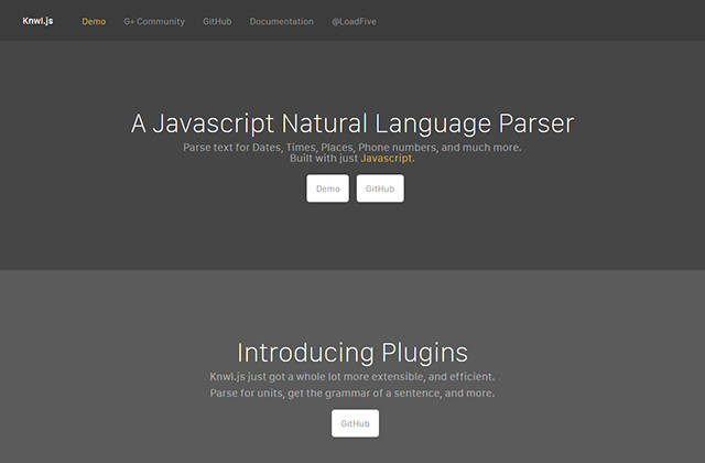
What if important information, such as time or location information, email addresses, phone numbers, links and other data snippets, are hidden in plain text? If you’d want to mine these valuable fragments a lot of manual work would be necessary. Wait. Not anymore. The JavaScript library Knwl.JS can automatically find this information, filter it and make it available for further use. With some creativity, very flexible solutions are possible. Usage is not complicated, so let’s give this a spin.

Knwl.JS: Plugins for The Recognition of Different Content

To kick things off, Knwl.js needs to be implemented into the HTML head first. Afterwards, you can search any text passage for particular content. To do that, the text is assigned to the method KnwlInstance.init() either directly or as a variable. Afterwards, you need to decide on a plugin that searches the text for certain patterns. One of the plugins is date which looks for – well – date information.

KnwlInstant.init("Today is December 23rd 2015.");
var output = KnwlInstance.get("date");

In this example, the plugin date is accessed via KnwlInstance.get(). It digs through the previously transferred character string, searching for date information and returns all results in JSON format.

var output = [
  {
    "year": 2015,
    "month": 12,
    "day": 23,
    "preview": "Today is December 23rd 2015.","found": 2
  }
]

The JSON character string contains different values depending on the plugin. When searching for a date, the year, month and day are returned in an itemised form. Additionally, the sentence the respective value was found in is transferred via preview by all plugins. Via found you’ll mine the information in what spot of the text the information was found in.

Truffle Pig: Knwl.JS Finds Data Snippets Automatically

When more information is found, Knwl.js displays it as individual JSON objects.

Date, Time and Location Information Only in English

Knwl.js only recognises date and time information when this info is available in English. At least for now, other languages are not supported. The same applies for the place plugin, which recognises country names in texts.

var output = [
  {
    "place": "Germany",
    "preview": "This is Germany.","found": 2
  }
]

Recognising phone numbers in different languages poses a similarly difficult problem. Here, only the English spelling is supported.

Links and Email Addresses Possible in any Language

Although only the English language is supported, it is still possible to use Kwnl.js on texts in other languages – at least concerning links and email addresses.

var output = [
  {
    "link": "http://www.drweb.de/",
    "preview": "At the German site http://www.drweb.de/ you can find daily news.","found": 1
  }
]

Important when searching for links is, that the respective protocol – „HTTP://“, „HTTPS://“ or „FTP://“ – is given. Email addresses are also recognised reliably.

Develop Your Plugin

When you want to support the recognition of the time and location information in other languages, you will need to get your hands dirty and develop a custom plugin for Knwl.js. In the library’s documentation, there is an extra section on that topic. Each plugin is deposited as its own JavaScript file.

This way, you can build plugins relatively quickly. Of course, it is not only possible to support other languages. You can also develop plugins that e.g. search for metric units, currencies or colours in a text.

Some experimental plugins can be found along with the Knwl.js documentation.

Conclusion

Knwl.js offers many ways of filtering structured data from texts. While adjustments need to be made when trying to use it on texts in other languages than English, it allows you to create flexible solutions when you approach it with a bit of fantasy.

knwljs2
Demo to try it out

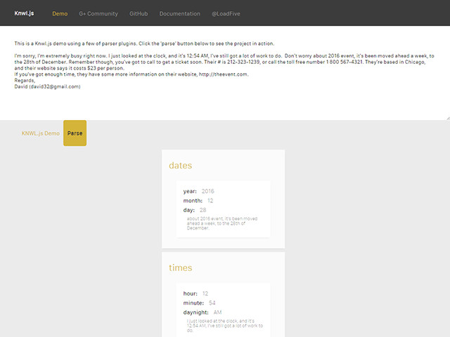
Besides the documentation, there is also a demo in which you can enter any desired text and have Knwl.js dig through it.

(dpe)

Categories: Others Tags:

Proactive UX design

December 23rd, 2015 No comments

When it comes to designing UX, it’s a good idea to take a proactive stance.

This means anticipating everything a user is likely to do, or want to do, and providing a simple way to make it possible. It means making the use of your site as effortless as you can make it, and making the experience efficient for the user.

Good UX design results in good UX, which in turn will reward you (or your clients) in many ways; usually increased page views, more social sharing of your pages, better page rank, and possibly also more sales and conversions.

On the other hand, bad UX design will have exactly the opposite effect, and users will be more likely to look elsewhere, only coming back to your site if there’s no other choice, and certainly not recommending it to others. When the UX of your site is poor, users feel that you don’t care about them and their needs.

Keep it simple

Users shouldn’t ever have to “figure out” how to do what they want, it should be completely obvious how to do it. One thing you should never do is hide important features away, requiring some kind of metaphorical voodoo (like having to click on an icon) to get them to appear. It’s different if there’s a well-known and accepted standard convention already in place (such as the now ubiquitous “hamburger menu”), but otherwise you need to be cautious about being too creative.

When standards exist, use them

It’s not a problem to be original, but you should try to stick with accepted standards so that you don’t run into the problem of users having to figure things out. This means, for example, that the navigation should be at the top, on the left, in tabs, or a combination of these things.

If you’re using hidden navigation, then the means of revealing that navigation system must be located at the top left of the page, and should be easy to identify (such as by using a hamburger menu icon, or even a text directive).

A search box belongs in the top right corner, and moving it elsewhere will create confusion. If you don’t have room to have the search box always visible, the icon for it should be a magnifying glass (nobody knows why, but that’s the most usual convention, even though it has nothing to do with searching), a pair of binoculars, or a button with the word “search” on it.

Links to your privacy policy, terms of service, etc should either appear as the final items on your main menu or at the foot of the page.

Don’t add gimmicks

Plenty of things look cool, and that’s great. But if the only reason they are there is because they look cool, and they don’t serve the needs of your user, then they’re in the way of efficiency and you should get rid of them.

Featured image, UX design image via Shutterstock.

Easily Rename Multiple Photoshop Layers with the Renamy – only $7!

Source

Categories: Designing, Others Tags:

Getting More Work Done Without Simply Working More Hours

December 23rd, 2015 No comments

The past few months have been challenging for me. I have taken on a host of new responsibilities at work and juggling that added workload has proven to be difficult.

Getting More Work Done Without Simply Working More Hours

Like many web professionals, my first instinct was to work longer hours – to come in to the office early, stay late, and to give up some of my weekend time. While this certainly helped me get more work done, I quickly realized it was not something I could sustain without eventually burning out. I knew that if this was going to work, I had to find a way to be more productive within the hours I had available to me.

The post Getting More Work Done Without Simply Working More Hours appeared first on Smashing Magazine.

Categories: Others Tags: