Archive

Archive for December, 2015

Usability and the mobile web

December 17th, 2015 No comments

For some time now, anyone concerned with search engine optimization made sure a mobile version of their website was available because otherwise they ran the risk of angering the Google algorithm. Yet unlike so many other trends in the SEO world, research shows that mobile web use isn’t slowing down, even though many of the so-called mobile friendly websites are a pain to use. Not only are mobile views growing, they are blowing up. Research from Statista estimates that the amount of web traffic in the year 2019 will be around 24.3 Exabyte, up from 4.2 Exabyte in 2015.

Just to make sure you understand the gravity of that, one Exabyte is equal to 1 billion Gigabytes.

Despite evidence showing that visitors are using their mobile devices to browse the web, not everyone designs with the mobile user in mind. According to the Nielsen-Norman Group:

…there are more smartphone users worldwide than desktop and laptop users [but] the usability of mobile websites and applications is still well behind the usability of desktop websites.

Of course, not everyone wants a mobile website that is just good enough for Google. They want their visitors to have a positive experience when they land on their website, or one that they designed for a customer. So they adjust their designs accordingly.

Choose your approach

Most people associate mobile web with responsive web design because that has been the buzzword thrown around different blogs and presentations for some time now. However responsive web design isn’t the only strategy, and it isn’t always the best approach. The best choice is based on how you want your visitors to interact with the content on your site.

Responsive web design

Using media queries to change the display of the site based on the screen size, this is a fluid approach to designing for multiple devices. You design once and rely on the CSS to scale the display based on the screen.

Adaptive design

This approach relies on static pages designed for different breakpoints. When the screen size is detected, the appropriate layout is displayed. Here, you need to design different layouts to accommodate various screen sizes. Usually, six layouts are built for the more common widths: 320, 480, 760, 960, 1200, 1600.

Native application

This is when you build an iOS, Android or Windows app designed to serve up your web content to mobile users.

Understand how interactions work

You would be hard pressed to find a website these days that doesn’t offer some sort of user interaction. It could be a business website that collects information from prospective customers, an ecommerce site built for shopping, or a site that allows visitors to check-in to an event or location. In any event, the user is going to have to provide information, make selections and press buttons and you have to get into the mindset that things on a mobile device are different.

For starters, focus on important features. This might require some rearranging on your part, or you may have to cut back on some of the elements you wanted to include. Not only will this help reduce clutter, but it will allow for larger buttons and other elements that larger fingers may have a hard time engaging with. When at all possible, reduce the need for users to enter text. They may have an onscreen keyboard to use but we all know that there is a high rate of error when using these and features like autocorrect or text predict can become quite frustrating. Also, understand that there is a good chance that a mobile visitor may be interrupted or lose their connection. The less they have to re-do if they time out, the less frustration they are going to feel.

Help your visitors navigate easily

For SEO purposes, many designers have been trained over the years to incorporate complex navigation menus into their work so that the search engine spiders are able to index everything. Having everything accessible from the navigation menu also makes sure that your visitors are able to find what they are looking for. But for the mobile visitor, these overwhelming menus actually make navigation more difficult, and a properly created sitemap will send the search engine crawlers where you need them to go.

Instead of long lists of menu items, keep the choices to no more than six so mobile visitors don’t have to try to scroll down to see everything while trying to keep a menu open. Also, eliminate the submenus. That little + sign that you expect users to click to expand the options is really hard to tap unless they are using a stylus. Apple’s UI Design Basics states that the average finger requires 44 pixels left to right and up and down. Design with that space in mind.

The trend of the single page website is something to consider here as well. Designed with mobile visitors in mind, this technique allows the visitor to scroll through your site and find everything they need on one long page. This type of design forgets all about the fold since mobile users are comfortable swiping through content to find what they need.

Don’t sacrifice your purpose

When thinking about your mobile visitors, you are asked to leave out quite a bit. But what you should never sacrifice is the reason you have a website in the first place. Make sure your branding remains consistent, if you need your logo to remain prominent then use the right amount of real estate to display it. If your site is heavy on content, make sure your mobile users have access to all of it. Hiding content from mobile displays essentially punishes visitors for not being on a full-screen.

As web designers, we are used to trends in our industry. Every year there are lists that introduce us to the latest fads and methodologies that we should be paying attention to. Designing for the mobile user isn’t one of those. It is the reality of where our industry is going and they just keep adding more screen sizes for us to work with so there really is no one size fits all approach that you can take.

You, your organization, your customers and any other stakeholders have to determine what is important and structure your sites around those elements. But think about what is important to your visitors because that is what counts. User experience should never be about what we think is best or what we want to see. We can’t force people into having a great experience when they visit our pages. Instead, we have to look at giving them what they want, in a way that is easy for them to access.

So before we look for checklists or guides that tell us what a good user experience is, take the time to think about what we have to say and what our visitors want to hear.

Featured image, mobile web image via Shutterstock.

LAST DAY: Massive Designer Toolbox: 350+ Best-Selling Graphics, Fonts & Resources – only $27!

Source

Categories: Designing, Others Tags:

Behance Year in Review 2015: Illustrator Conquers All!

December 16th, 2015 No comments
behance-2015

Behance is one of the most popular and well-loved websites where designers and creative artists can showcase their works. Whether you are a web designer, or graphic designer, or someone who works with UI or UX, or even any other creative design activity, Behance lets you put forth your work for the world to see.

Recently, Behance published its Year in Review for 2015. Let us go through some of the major highlights and noteworthy points.

To begin with, the Behance community now has over six million people. Obviously, this is a very good number, but it also shows another point: there is no dearth of talent in the design community, and the fact that there are six million people in the Behance community shows that creative work and web design are a populous and highly saturated field.

behance-2015

Interaction Design grew at a faster pace as compared to other genres. Again, this can be read as the rise of interaction design in general, and interactive content in particular.

Adobe Illustrator beat all others, including Photoshop, and became the most popular tool of 2015. In fact, the number of projects made using Adobe Illustrator grew by 57% this year.

For 2016, the popularity of Adobe Illustrator does not seem to be falling anytime soon. Even more so, the design community is expected to grow even further, as more and more designers come forward. This will lead to better quality designs, and also, more competition in the industry.

What do you think of the dominance of Adobe Illustrator and Interaction Design? Share your views in the comments below!

Read More at Behance Year in Review 2015: Illustrator Conquers All!

Categories: Designing, Others Tags:

Elegant Themes release the Extra theme

December 16th, 2015 No comments

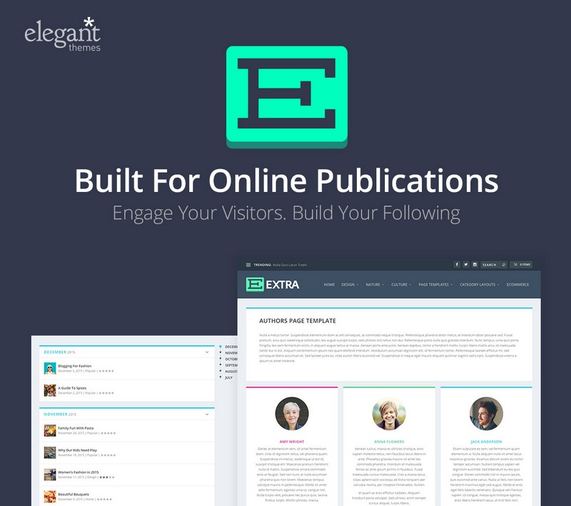
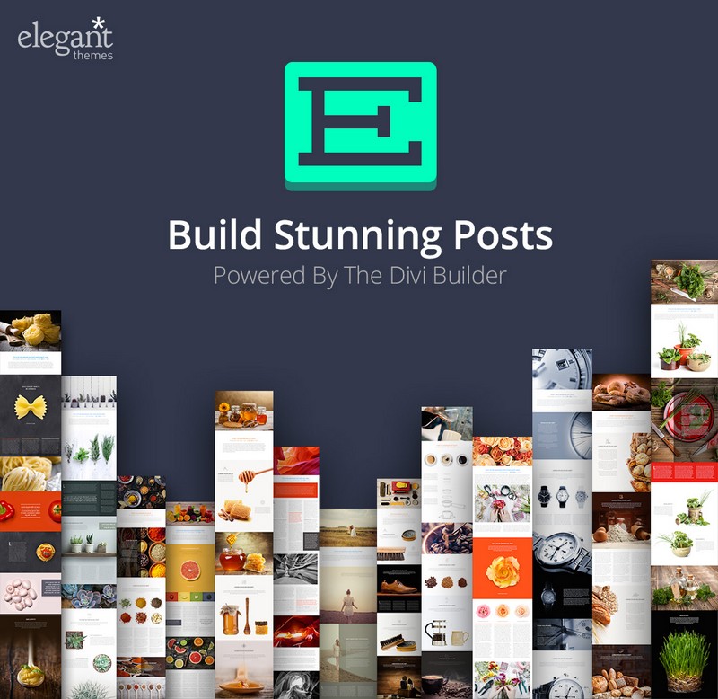
The latest release from the Elegant Themes team, is the engaging Extra theme; one of the most promising and complete WordPress magazine themes currently available on the market and powered by Elegant Themes’ own Divi Builder.

Extra boasts many of the same features as Divi, but far from being a simple clone, the code has been refocused to deliver a high-end magazine experience; perfect for blogs and online publications.

Modern style

Extra is designed on an 8 column grid, with the footer switching to 3 columns, which gives a nice ordered feel to the content.

The color scheme is modern, and although you can adjust it, many users will decide to stick with the defaults.

The first thing you’ll notice is the drop down menu. Instead of fading in, or popping up, or any of the standard ways of opening a drop down menu, Extra’s menu folds out using CSS3’s 3D transform. The extra perspective this gives really livens up the page. It’s a super cool effect, without getting in the way of what it’s designed to be; a simple, functional menu.

Extra feels like an ideal lifestyle blog. Its categories, and considered typography, coupled with the page-like fold-down navigation feel very much like a magazine.

Design with Divi Modules

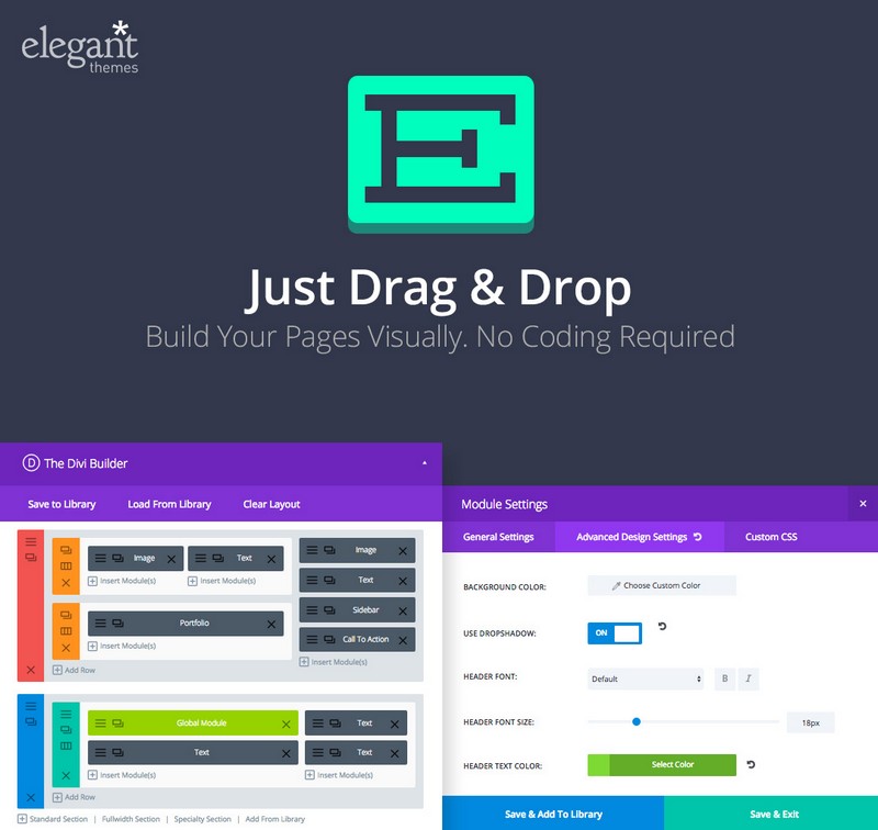
Using Divi’s 40 Content Modules, you can customize the design however you see fit, by simply dragging and dropping modules into place to create your very own magazine layouts.

Dozens of Divi Builder modules are included, ranging from testimonial widgets, to videos, from sliders, to an email opt-in. All of these great modules are supplemented by 7 modules custom built for Extra: Posts, Post Carousel, Featured Post Slider, Masonry Blog Module, Standard Blog, Tabbed Posts, and Advertisements.

Pre-built page templates & layouts

As with most themes, you’ll never use all of the page designs, but it’s great to know you have them available. Extra includes pages for Authors, Timeline, Portfolio, Sitemap, Member’s Login, Contact Us, and Blog Feed. You’ll also find the generic pages Right Sidebar, Left Sidebar, and Fullwidth, which are perfect for any other page you might need to create.

Extra comes with 8 different layouts, so you can pick and choose what style suits your content best. Options include Left Sidebar, Right Sidebar, No Sidebar, Magazine Homepage, Image Focused, Masonry Blog, Simple Blog, and Homepage Dark.

Ecommerce enabled

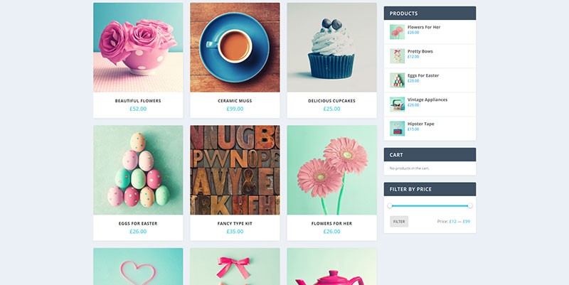
On top of all of this, Extra is ready for WooCommerce, giving you the option to create a full online store. Products can be added with descriptions and images; individual products can even be reviewed and rated by customers with a dedicated ratings system.

A full product search is built-in. And to help drum up sales social media is tied in. And thanks to its Advanced Design Settings and Custom CSS, you can easily edit your call to action buttons. Things like padding, margin, button text size, color, width, or background can all be changed rapidly.

Get Extra

Best of all, the Extra theme is free to Elegant Themes subscribers. Just sign up for Elegant Themes membership and you’ll get access to Extra, and the rest of Elegant Themes’ 85+ WordPress themes.

[– This is a sponsored post on behalf of Elegant Themes –]

Filmora: Robust, High-Quality Video Editor – only $24!

Source

Categories: Designing, Others Tags:

Angular 2 Beta Has Been Announced

December 16th, 2015 No comments
angular-js-wdl

Earlier today, Angular 2 Beta was announced, and with this, AngularJS has officially moved towards a new version, with many new changes and enhancements.

The Beta release is functional enough to let you build large applications using it, but as a matter of caution, it is advisable not to use it for production projects.

With that out of the way, what does Angular 2 Beta bring to the table?

To begin with, Angular is expected to be much faster than Angular 1 in terms of performance and compilation. With view caching and faster compilation of scripts, Angular 2 will load faster and better. Plus, this release also comes with several security tweaks and fixes, in addition to, of course, a new architecture.

angular-js-wdl

The Beta release is still far from perfect, and as of now, many new changes are expected to arrive, such as:

  • Reduced payload size
  • Usable Angular CLI for developmental process
  • Support for animations
  • Better support for ES6 and Babel
  • Better documentation

AngularJS has become quite popular, and the fact that it is backed by Google makes it all the more attractive for web developers. In fact, if you head over to Made with Angular website, you will notice that AngularJS can, indeed, accomplish a lot and is a powerful tool for your projects.

If you are an existing user of Angular 1, be sure to read the migration guide before shifting to Angular 2 Beta. That said, you can download Angular 2 Beta from the homepage.

What do you think of Angular 2? Share your thoughts in the comments below!

Read More at Angular 2 Beta Has Been Announced

Categories: Designing, Others Tags:

Discovering Elegant Theme’s New Release – Extra Magazine WordPress Theme

December 16th, 2015 No comments
image001

Elegant Themes’ new magazine WordPress theme Extra is one of its most highly anticipated and promising themes to date. The reason for this is Extra’s stunning selection of layouts and templates, and the fact that it is powered by Divi Builder. This Extra/Divi Builder combination guarantees that users will be able to create online magazines that stand head and shoulders above the competition.

Extra’s focus on building magazine-style websites takes Divi Builder in exciting new directions in the world of online publications. Extra’s websites offer ideal settings for bloggers as well, as this premium theme takes full advantage of Divi’s post building capabilities. Many special effects can be created to capture viewers’ attention.

If you’ve been looking for just the right WordPress theme to use for an eye-catching online magazine, or if you are curious about how to go about building a magazine-style website – read on!

Extra Magazine WordPress Theme’s Core Features

It couldn’t be much easier to build a magazine-style website. For one thing, the number of different layout possibilities are endless.

image002

As you can see, you it is possible to create virtually any format you want. Create your own custom headings, set up a grid system, use a masonry format, and include a right or left sidebar, or none at all.

Once you’ve settled on a format – which you can easily modify should you come up with a better idea, it’s simply a matter of drag and drop – whether you are selecting or moving major blocks of elements or the smallest of details.

image003

Divi Builder makes creating page after page easy, and you are able to save your work as you go along. You will always have full control over what you are doing, and it’s never a problem should you need to go back and do something differently.

There’s no need to follow the crowd by focusing on creating an interesting home page and following up with a series of look-alike additional pages. There’s no law that says pages like the Contact Us, a Testimonials page, and the ubiquitous About Us page, have to be boring.

With Extra, you can create an About Us page that will encourage viewers to discover that “Us” consists of real people who have a story to tell. Why not build a Contact Us page that serves its real purpose – encouraging your customers to get in touch?

It’s an easy task with Extra.

image004

With Extra’s new set of Divi Modules, you can allow your artistic talents to run wild. You may even discover your website building talents are greater than you imagined once you begin creating customized category page layouts.

Select one of more of Divi Builder’s 40 Content Models, and start building amazing Posts and Pages. These will not be run-of-the-mill posts and pages either – they will be story-driven pages.

image006

Incorporate pricing tables, countdown timers, video, testimonials, or portfolio sections wherever appropriate or where they will make the greatest impact on the readers, and encourage them to get involved.

You can do the same with posts as you can with pages…

You can Customize Anything and Everything. Easily modify things like padding, margin or button text size, background color or border width thanks to Extra’s advanced design settings. If you are looking to add custom CSS, you can do that rapidly too.

image007

Extra offers dozens of different ways to establish your unique brand and build on it. Not only will you have complete control when creating page or post layouts, you also have full control over the customizing process, down to the smallest design element detail. Experiment with text fonts, letter spacing, block padding, image margins, or the color, size, or style of a button until your page has precisely the look you want it to have.

Extra’s Template Collection Makes Building a Website Twice as Easy

image008

You don’t have to start building your website with a home page, but most web designers do. Here is one idea of how your home page might look.

This is just one of many different formats to consider. As shown earlier, you can create just about any home page layout you want. You can then turn your attention to your other website pages, including key landing pages, and the templates you can use to build them.

Some website pages need to focus on whatever actions your visitors might want to take, whether it’s checking out your product offerings or articles, contacting you, or placing an order. You’ll want pages that address these to be attractive as well as being information-packed. Extra enables you to do just that.

  • Extra makes it a simple task to incorporate anything and everything that is important into your website. You can put into play Custom Widgets to create a truly amazing customer experience
  • The ability to tie into the various Social Media platforms is all-important for today’s eCommerce sites. Extra enables you to connect with your social media accounts and profiles and track customers visits. Everything necessary to add social media links is ready to implement.
  • Extra is WooCommerce Ready as well!

image009

Now you see why Extra in combination with Divi Builder is a sure winner. Divi is a powerful website-building tool, and Extra provides exactly what is needed to create amazing online magazines in any format their authors desire.

Visit Extra’s website and browse the templates and layouts.

You’re sure to come up with some great ideas for your own magazine website, and how easily you can turn your ideas into realities. See for yourself why this WordPress theme is one of the best magazine themes on the market, and why it is so highly recommended.

Read More at Discovering Elegant Theme’s New Release – Extra Magazine WordPress Theme

Categories: Designing, Others Tags:

Firefox For Windows is Now 64-bit

December 16th, 2015 No comments
firefox-main

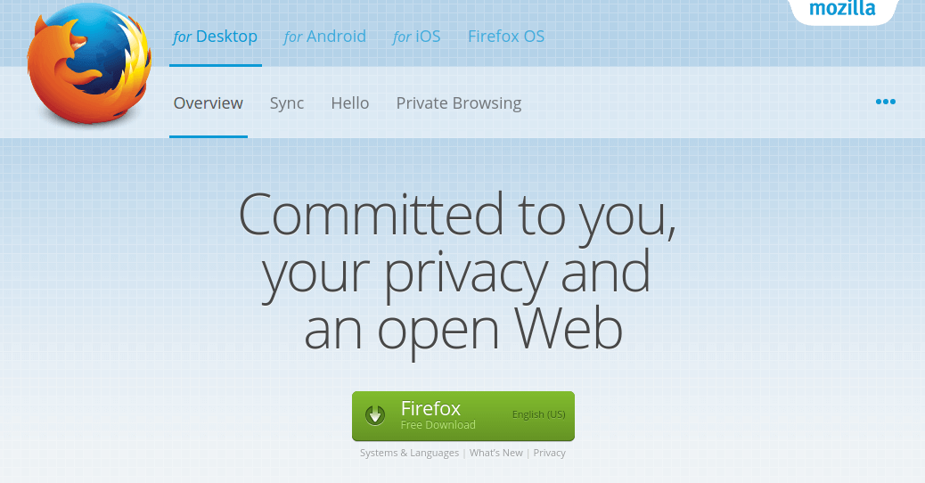
When it comes to web browsers on Windows, both Google Chrome and Internet Explorer had been offering 64-bit web browsing experience for quite a while. Mozilla Firefox, on the other hand, had remained firm on 32 bit until now.

However, all of that has changed, and now, Mozilla Firefox on Windows is finally 64 bit. The latest version of Firefox for Windows is 64 bit, and it can take advantage of the latest hardware that your machine has, as long as you are running Windows 7 or higher.

As the end user, what does this mean for you? To be frank, the web browser in itself will not offer any noticeable advantage in terms of speed of operation. However, you do get better security features, better app compatibility and various other features that 32 bit browsers do not offer otherwise.

firefox-2

Other than that, Firefox for Windows also offers certain other new features: you can block many other web trackers under the Private Browsing session, and also choose search suggestions whilst typing in the address bar. For users of touchscreen devices, Firefox for Windows now brings up the keyboard right when you need it.

While the new set of features is indeed an impressive lot, Firefox for Windows still trails behind Google Chrome in terms of popularity, and it surely has a lot of catching up to do. Considering the fact that Firefox is realizing the importance of touchscreen devices and making UX changes accordingly, Firefox does have a chance of gaining a bigger market share and establishing itself as a viable web browser for the apex spot.

You can download and install Firefox 64 bit for Windows from this page.

What do you think of the latest version of Firefox? Given it a spin yet? Share your views in the comments below!

Read More at Firefox For Windows is Now 64-bit

Categories: Designing, Others Tags:

Poll Results on Performance Culture

December 16th, 2015 No comments

Our latest poll asked:

What’s the web performance situation on your main project?

Then provided five possible answers related to the general attitude of the team as it relates to web performance, ranging from “everybody cares” to “nobody cares”.

With over 13,000 votes, the data is in!

See the Pen Data on Performance Culture by Chris Coyier (@chriscoyier) on CodePen.

The good news is that between “Everybody cares and actively works to maintain and improve.” (19%) and “Some people care, but isn’t often an active priority.” (34%), that’s 54% of projects where that at least multiple people caring about performance. For a subject that feels like it’s only recently been in the spotlight, that seems pretty good.

You gotta feel for the quarter of people who voted “I care, but I’m the single lonely voice.” (26%) and especially for the projects where there is no consensus “There are warring factions. (e.g. dev is on board, but management isn’t)” (8%).

That leaves only “Nobody cares at all.” with only 13% of projects.

You gotta wonder how this will evolve. Will performance awareness and active effort become a bigger thing on projects? Perhaps entire teams like DevOps has become? Or are we at peak performance-caring-abouting?


Poll Results on Performance Culture is a post from CSS-Tricks

Categories: Designing, Others Tags:

Building a Better Web Browser

December 16th, 2015 No comments

James Mickens, an associate professor of computer science at Harvard, gave a talk about the various flaws of web browsers and how we might go about making them more secure and robust:

To fix the browser, we need to radically restructure the browser architecture…so in particular I propose that we dramatically narrow the responsibilities of the browser itself and give more responsibilities to web pages. So in this new model the web developer defines her own rendering engine and her own script engine and her own markup parser.

The idea that web developers in the future might have this much control over the underlying technology of the web is completely mind boggling. James gives some good examples as to why we need this much control and how web pages that don’t send their own markup parser or rendering engine down the wire would then progressively fallback to whatever the browser provides.

What’s most interesting to me however are the questions that James asks, rather than his suggestions. Namely, what should be the relationship between a web page and a browser? How much control should developers have? What technologies do we need to make a functioning website?

Direct Link to ArticlePermalink


Building a Better Web Browser is a post from CSS-Tricks

Categories: Designing, Others Tags:

Fearing the Blank Page: Ignite Your Creativity

December 16th, 2015 No comments

Everyone working as a designer or author or in any other creative job knows it: the fear of the blank page or the blank screen – the creative block. There are moments where simply nothing comes to mind when trying to come up with a convincing logo or a captivating text. If creativity is your job, you can’t afford to have a lot of these moments. Luckily, there are plenty of ways to help ignite your creativity.

Move to Spark Your Creativity: Escape the Everyday Routine

It’s a good idea to take a step back from the daily routine when trying to come up with an idea. The least ideas are created sitting at your desk. A stroll, sports or simply walking your dog can get your creative juices to flow.

Ignite Your Creativity

Even though the beginning of an idea isn’t more than a blank page sometimes, creativity never comes out of the blue. Most of the time, associations and thoughts are what make us create something new. This works better when leaving behind all the things you are used to and know well for a short period. A stroll is not always enough, however. That’s why there is a multitude of different “creativity techniques” that you can use alone or in groups to find new ideas and, of course, scrap them if needed.

Brainstorming and Brainwriting

Brainstorming is one of the most well-known techniques where you collect random ideas on a topic in small groups. The task is to gather and pick up as many keywords as possible on the subject. It’s important that none of the brought-up ideas are criticised or denied instantly. After the brainstorming, it’s time to sort the idea collection.

Fearing the Blank Page: Ignite Your Creativity

Brainwriting is very similar to brainstorming. The difference is, that everyone collects ideas for himself first, before discussing them in a group. Brainwriting also works well when you are on your own. By writing them down, you make sure that no ideas get lost, and it also helps to go from one idea to a new one that might be just the one you were looking for.

Mindmapping

Mindmapping is much more organised than brainstorming or -writing. While you also search for keywords on a certain topic, you connect them in contrast to brainstorming. This allows for the creation of branched diagrams where you can follow potentially promising directions while ignoring the creative dead ends.

Fearing the Blank Page: Ignite Your Creativity

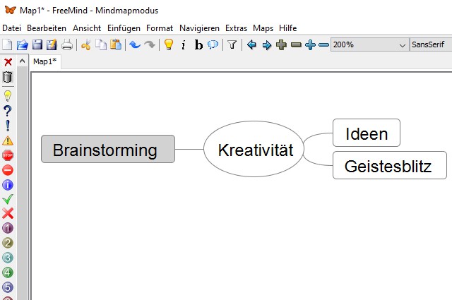
Besides classic mind mapping using a flipchart or a pinboard, there is a free software called FreeMind, which you can use to create mind maps quickly. It allows you to connect keywords and create large mind maps with little effort. While you can run out of space on a flipchart or pinboard, this problem doesn’t occur in mind mapping applications.

More Creativity by Role Playing

Another way of gaining new ideas and thoughts is to switch roles or points of view. When you are a very rational person, for example, try to think from the position of a very emotional person.

Fearing the Blank Page: Ignite Your Creativity

Of course, changing your attitude or stance needs practice. But it allows you to discover new perspectives on problems and challenges and helps find different solutions.

Avoiding Negativity is Key to More Creativity

Fearing the Blank Page: Ignite Your Creativity

The techniques we presented are just a rough overview of ways to increase creativity. Based on these and other essential techniques, there are plenty other approaches that are much more precise in preparation and operation.

But no matter what method you decide to go for: Your general mood has to be positive. Especially when working on a team, criticism and possible risks need to be brought up carefully. Only when you are open to new ideas that are off the path of existing conventions, you will be able to find great ideas.

(dpe)

Categories: Others Tags:

Animating Clipped Elements In SVG

December 16th, 2015 No comments

Scalable vector graphics (or SVG) lend developers an incredible ability to display crisp, beautiful graphics at any size or resolution. SVG can also be animated using various techniques. In combination with clipping paths, interesting effects can be achieved.

Animating Clipped Elements In SVG

This article explains the difference between an SVG clipPath and a CSS clip-path, including examples to guide and inform you through this journey. Finally, I’ll share a few demos both personal and in the wild to help you better understand clipPath animation and inspire your visions.

The post Animating Clipped Elements In SVG appeared first on Smashing Magazine.

Categories: Others Tags: