Archive

Archive for December, 2015

Apple Unveils A New Battery Case For iPhone 6S

December 15th, 2015 No comments
apple-battery-1

Some days back, Apple released a new battery case for iPhone 6S. Currently priced at $99, this new battery case offers up to 25 hours of talk time, and 18 hours of internet browsing, or video playback of up to 20 hours.

In terms of performance, there is not much to complain about the new Smart Battery Case by Apple. The price tag of $99 does seem a bit on the higher side, but it is not extremely overpriced either.

However, users of iPhone 6S have not been impressed by Apple’s Smart Battery Case. Since a good number of iPhone’s users tend to prefer appearance over performance, the new battery case is getting a good deal of criticism: it has a bulge, or “hump” on the back, and this is why it is being termed as ugly.

Take a look at it for yourself, here is how it looks on Charcoal Gray, as seen on Apple’s own website:

apple-battery-2

Very clearly, the new Smart Battery Case for iPhone 6S does not live up to the design standards that one has come to expect from Apple. However, it is not entirely “ugly” either. It is surely not sleek or innovative, and probably not something that one would describe as aesthetically impressive. But all said and done, the new battery case serves its purpose, and does the job well. It is not meant for the everyday user who has access to a charger and a power outlet. Instead, this battery case is something you might consider using when going hiking, or overnight trips. In such cases, aesthetics do not matter much, and the Smart Battery Case delivers well on the performance front.

Also, the hump on the back of the battery case makes it easier to take on and off — another added advantage when you are on the go.

What do you think of the new battery case for iPhone 6S? Love it or hate it? Share your views in the comments below!

Read More at Apple Unveils A New Battery Case For iPhone 6S

Categories: Designing, Others Tags:

ShopTalk 2015 Holiday Gift Guide

December 15th, 2015 No comments

There are some things Dave and I talk about regularly on ShopTalk. Certain hardware we use. Software we like. Books we recommend. Services that make life easier. We rounded them up into a little list for the holidays. Enjoy!

Direct Link to ArticlePermalink


ShopTalk 2015 Holiday Gift Guide is a post from CSS-Tricks

Categories: Designing, Others Tags:

Apple Now Has A Secret Lab in Taiwan

December 15th, 2015 No comments
apple-bloomberg

Apple is well-known for its sleek and thin devices, and the quest does not seem to be stopping anytime soon. Apple has recently opened a new and secret lab in Taiwan, wherein a team of nearly 50 engineers has been deployed to come up with a solution that will allow Apple’s devices to be lighter, thinner and consume less energy.

The team consists of engineers from the likes of AU Optronics and Qualcomm, and the sole goal behind the secret lab is to invent new ways to make iPhones and iPads even slimmer than they currently are.

To quote Bloomberg, which first broke the news about the secret Apple lab at Taiwan:

Apple began operating the lab this year as it aims to make products thinner, lighter, brighter and more energy-efficient. Engineers are developing more-advanced versions of the liquid-crystal displays currently used in iPhones, iPads and Mac personal computers. Apple also is keen to move to organic light-emitting diodes, which are even thinner and don’t require a backlight.

apple-iphone

Another noteworthy point from the above quote is that Apple is focusing on OLED as the display of choice for its devices. While OLED might not be a possibility right away, many suppliers, such as LG, Sony and Toshiba, have already started production of OLED displays, and it is expected that the production will gain momentum by 2018 — exactly the year when iPhone 8 is expected to arrive.

OLED displays are currently more expensive, but they are also thin, lightweight and consume way less energy than other displays — obviously the characteristics that Apple is looking for in its devices.

Whether or not Apple’s innovation lab in Taiwan will be a successful experiment remains to be seen, but judging from the recent trends, we can expect iPhones and iPads to become even thinner in the times to come.

What do you think of this measure by Apple? Share your views in the comments below!

Read More at Apple Now Has A Secret Lab in Taiwan

Categories: Designing, Others Tags:

Why Passphrases Are More User-Friendly Than Passwords

December 15th, 2015 No comments

A user’s account on a website is like a house. The password is the key, and logging in is like walking through the front door. When a user can’t remember their password, it’s like losing their keys. When a user’s account is hacked, it’s like their house is getting broken into.

Why Passphrases Are More User-Friendly Than Passwords

Nearly half of Americans (47%) have had their account hacked in the last year alone. Are web designers and developers taking enough measures to prevent these problems? Or do we need to rethink passwords?

The post Why Passphrases Are More User-Friendly Than Passwords appeared first on Smashing Magazine.

Categories: Others Tags:

Smaller, Faster Websites

December 15th, 2015 No comments

Mat Marquis’ talk from TXJS 2015 is a rallying cry for performance, responsive images and trying to build websites in the most conscientious way possible:

We, as an industry, have nearly decided that we’re doing a great job as long as we don’t count the cases where we’re doing a terrible job. We want the user to think about The Website—to sympathize with us—over their reason for being there. We’re making them sit through a lecture about furniture design every time they try to sit down in a chair.

Direct Link to ArticlePermalink


Smaller, Faster Websites is a post from CSS-Tricks

Categories: Designing, Others Tags:

Taking “Let’s Encrypt” for a Spin

December 15th, 2015 No comments

Let’s Encrypt is an open Certificate Authority, an entity that issues certificates to get your site up and running with HTTPS, a process that has been notoriously difficult. Tim Kadlec gives it a shot.

Direct Link to ArticlePermalink


Taking “Let’s Encrypt” for a Spin is a post from CSS-Tricks

Categories: Designing, Others Tags:

How to write with your brand’s voice

December 15th, 2015 No comments

Businesses obsess over their visual brands. They spend days debating the typeface selection, but give no thought to the words.

In most cases, a company will assign the first wave of written communication to someone internal who’s “good at writing.” This is usually an English major, who knows a lot about spelling and grammar, but knows nothing about how to bring a brand’s voice to life. This means the company’s first website, press release and product guide are a collage of this poor staffer’s voice, what they think the company is, and arbitrary edits made during the revision process.

Writing using your brand’s voice needs to be done correctly from the very start. Otherwise, it’s impossible to know if your brand is effective. Too often, a company’s brand image is on point, but it’s being dragged down by mindless copy, with no clear voice. This leads the company to assume the whole brand is ineffective, so they throw the whole thing out, and start over. Such a shame.

So how do you get your brand’s voice to resonate from text?

Listen to your customers

Your brand’s voice needs to match your target market.

Branding experts at Larsen recommend that:

Before you write, make sure you listen. How do your customers communicate? Are they formal and precise? Or casual and conversational.

You don’t want to sound like Brahms when your audience is listening to Beck. Paying close attention to your brand voice can help you get it right. Your goal is to build brand affinity by using the diction and sentence structure that’s appealing to your audience and authentic to your offering.

You need to tell your customer what they want to hear, in a way that reaches them. When speaking to your customers:

Do:

  • use the terms they would use in describing their wants or pain-points;
  • write to match their level of education and tech savvy;
  • use wit or humor to deal with boring subjects, when appropriate.

Don’t:

  • use too many big words or jargon to sound professional (it’s tedious);
  • use too much slang to reach a young audience (it’s transparent);
  • try to be funny if you’re not funny, or act cool if you’re not cool (it’s desperate).

Define your voice

You know what the brand looks like. But what does it sound like?

Figuring out your tone isn’t easy and even once you have it, the work isn’t over. You still have to determine how your new tone of voice gets translated into your writing style — Dr. Andrew Bredenkamp, Content Strategist.

He added, it’s important to decide how your brand’s voice would use the following elements.

  1. Word length
  2. Sentence length
  3. Tempo
  4. Pronouns
  5. Conciseness
  6. Jargon
  7. Buzzwords
  8. Clichés
  9. Contractions
  10. Colloquialisms
  11. Obscure words
  12. Mistakes and rule-breaking

Personify your brand

Imagine your brand as a person—more specifically, as a celebrity. When a customer reads your web copy or brochure, whose voice do you want them to hear?

Look what Apple did in their “Hi, I’m a Mac” ads. They chose Justin Long to personify their brand. He was young, handsome in a nebbish kind of way, and smart, yet simple. At the same time, they chose how they wanted you to see their competitor with the PC guy (John Hodgman). He was older, geek minus the chic, and constantly looking absurd while trying to copy the Mac guy. They gave themselves the perfect voice, and gave their competition an unflattering one.

So ask yourself, if my brand were a celebrity, who would it be? When you read the copy, whose voice do you want to hear in your head? Who’s voice do you want the customer to hear.

Here are some examples of celebrity voices and what they personify.

  • Patrick Stewart or Judi Dench: portrays age, wisdom and experience. A good fit for a law firm, or financial institution.
  • Jon Stewart or Tina Fey: funny, witty, and smarter than you. Perfect for any tech start-up that wants to come off as clever and cool.
  • Dennis Haysbert; he’s already the voice of Allstate. Portrays a no-nonsense type of strength and reliability, so insurance is a perfect fit. This would also work for a data security center.
  • Catherine Zeta-Jones: portrays beauty and sophistication. A strong voice for any spa or beauty line.

Of course, you don’t have the budget to get these celebrities to voice your commercials. But you can still render their characteristics in the way you write.

Differentiate from competitors

Your voice needs to stand out from the competition. You may be saying many of the same things, but you need to find a better way to say them.

When you write like everyone else and sound like everyone else and act like everyone else, you’re saying, ‘Our products are like everyone else’s, too.’ Or think of it this way: Would you go to a dinner party and just repeat what the person to the right of you is saying all night long, would that be interesting to anybody? So why are so many businesses saying the same things at the biggest party on the planet—the marketplace? — Jason Fried, Co-founder of 37signals

Under Armor didn’t gained ground on Nike by saying, “Just do it.” Their tagline is “Protect This House.” They’re not deifying athletes like Michael Jordan or Tiger Woods. They’re humanizing Jordan Spieth and Steph Curry by showing them sweating and practicing. Their marketing is completely different and they use a different voice.

None of these things are easy to do. If they were, everyone would be doing it perfectly. But you need to always stay mindful of your brand’s voice in your writing.

As you measure how your marketing materials are performing, you need consistency in your voice. The same way you use the same typeface and colors in everything.

It’s the only way to really learn what’s working, and what you can improve on.

Featured image, brand voice image via Shutterstock.

750+ Unique and Creative Lightroom Presets from Contrastly – only $27!

Source

Categories: Designing, Others Tags:

7 hacks to get your invoices paid lightning fast

December 15th, 2015 No comments
freshbooks-paid-faster

freshbooks-paid-faster

Earlier in the Billing Like a Boss series we covered how to talk about money that isn’t awkward and the inner workings of what goes in an invoice to look professional and become the biggest boss on the block. The problem is that even if you send boss-level invoices, there’s no guarantee you’ll get paid in a timely manner – or even paid at all. In this post, we’ll share 7 hacks to help get your invoices paid lightning fast.

If you’re not paying any attention to your outstanding invoices, you may find yourself wondering why there’s no money in the bank when you’re working so hard.

The Struggle is REAL
struggle-is-real-freshbooks

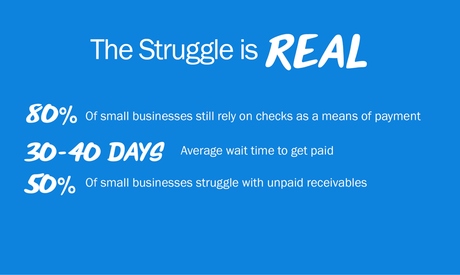
At FreshBooks, a cloud accounting software for freelancers and service-based small businesses, we looked at our data to see if we could extract some insights and find ways to help our customers get paid faster. And boy, the struggle is real:

  • 30-40 days average wait time to get paid after an invoice it sent
  • 50% of small businesses struggle with outstanding invoices
  • 80% of small business rely on checks as a means of payment

The waiting game to get paid is tough when there are expenses that can’t wait any longer. Although there’s no silver bullet, we’ve found that even small changes to your invoicing can add up to make a world of difference. So here’s our roundup of seven tips to help get paid faster and bill like a boss.

1. Make Billing a Priority

Make-billing-a-priority-freshbooks

Send your invoices as soon as possible, preferably right when the job is complete. That way the job is fresh and you know the work and hours spent on the project.

If you’re like many creatives, you wait until the end of the month (or a couple months) to do your invoicing. This results in one or two painful days drafting them. Will you remember all the hours spent by task? Contractors’ hours? Other expenses incurred used and receipts to back them up? If you make invoicing part of your workflow at the end of a project, the details are fresh in your mind and your happy client’s mind (who just benefited from your awesome work).

If you can get in the habit to send the invoice as soon as the job is complete, it’s less daunting because you’re only sending one invoice at a time. Plus, you’ll get paid faster since you sent it faster.

2. Be Polite
Be-polite-freshbooks

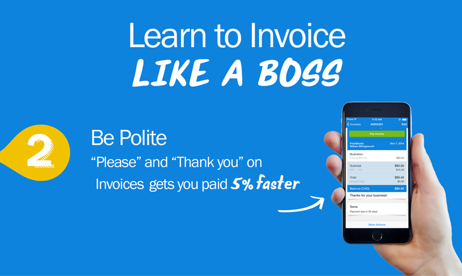
As a child your parents probably urged you to say “please” and “thank you.” As it turns out, our data shows manners are also important if you want to increase your chances of getting paid on time.

In addition to containing the basic invoice components to get paid, we’ve found that customers who use “please” and “thank you” on their invoice get paid 5% faster. It doesn’t hurt to thank your client again, so why not include it on your invoice?

3. Keep It Simple: Be Specific On Your Payment Timeline
Keep-it-simple-freshbooks

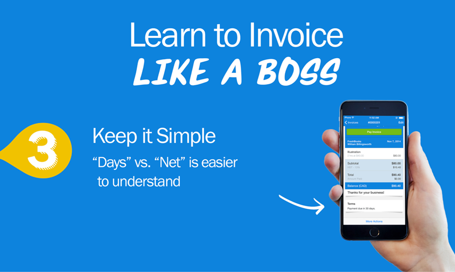
Be very clear on due dates by including the specifics on your invoice. This creates a sense of urgency and gets everyone on the same page.

For example, if a bill needs to be paid within 15 days, be sure to write this on your invoice. You can also include a late fee penalty (usually a 3-5%) for late payment on the invoice. You may never actually enforce that fee, but it will create a sense of urgency to get paid on time.

Also, avoid using “big company” trade language – like the phrase “NET” on your invoice – to reference payment timeframe. While many clients may understand this, it may not be as clear to less business-savvy clients. “Total due by [date]” is much clearer than “NET”.

Another point we found is that many interpret “due upon receipt” as “whenever you feel like it”. Without a specific deadline, it’s as if they don’t find it urgent and immediately dump it in the “whenever” pile. Using specific terms such as “21 days” or “Due by [date]” focuses the client’s mind around a specific timeframe to actually pay you.

4. Go Electronic
Go-electronic-freshbooks

Writing a check adds extra steps to the payment process and puts more time between your invoice and getting paid. Although 80% of small businesses still rely on checks in some way for their business, many are now accepting online payments, like the ability to pay by credit card. We’ve found that accepting online payments on average gets you paid 8 days faster than payments using more traditional methods.

5. Be Professional
Be-professional-freshbooks

Any touchpoint between you and your customer is an experience with your brand – Your invoice is no exception. After your invoice gets sent to your client, it may travel across multiple departments and multiple contacts within the company before it gets paid. At minimum, your logo should be included on your invoice. Our data shows that branded invoices have 10% higher rate of being paid on time.

6. Be Transparent

Many delayed payments happen because of confusion with the invoice terminology. Using generic only descriptions such as “website design” or “consulting” without details on the work completed may cause questions as to what you actually did.

Remember, it’s not just your direct client who may see the invoice; it could be their manager, team members or accounting department who may be reviewing the invoice before it’s processed.

We’ve found that invoices with detailed descriptions are 15% more likely to be paid on time.

Give your clients as much information as humanly possible, so you’re all on the same page and understand the services rendered.

7. Avoid sending at month end
Avoid-month-end-freshbooks

Did you know that sending invoices on the 30th and 31st of the month take 10-20% longer to be paid? Many suppliers wait until the end of month and send out all their invoices. This puts a load on clients to process everything at month end, creating a backlog of payables that can last a few days (or even weeks).

Try sending an invoice at another time when things are less busy. It’ll help out your client and help you get paid even faster!

All The Little Things… Add Up

Individually each of these tips may seem small, but everything adds up and can make a world of difference.

For any creative business billing is a necessary evil, but it doesn’t have to kill your productivity. By being polite, professional and following these tips, you can get paid faster and focus on your creative work, not your paperwork. Our next post of this series will talk about how get paid for the value you provide your clients, not your hourly rate. Get ready because a free e-book will come along with it!

What are some things you’ve done to get paid faster? Please comment below and let us know.

Read More at 7 hacks to get your invoices paid lightning fast

Categories: Designing, Others Tags:

Post Snippets for WordPress: You Need This Plugin

December 15th, 2015 No comments
Post Snippets for WordPress: You Need This Plugin

Sometimes, you find some real gems in the depths of the internet. I just wanted to look up how to add a button for placing my own shortcodes in the text editor when I stumbled upon the plugin »Post Snippets”. Post Snippets is basically the swiss army knife of plugins. It tightens the working process a lot when you are juggling with HTML snippets or shortcodes for which there is no button in the text editor. Using Post Snippets, you will never have to go back to the text view of your editor to enter the HTML.

Post Snippets for WordPress – The Metrics

Looking at its description, you could come to the conclusion that this plugin is nothing more than a collecting point for text, HTML and PHP snippets. This impression is far off, however, as this plugin is so much more than that. I admit that I can’t imagine working without it anymore, as I am doing a lot of HTML formatting which, until now, had to be done manually in the text view of the editor. With this plugin the process will become much easier.

After Installation: Create Your First Post Snippet

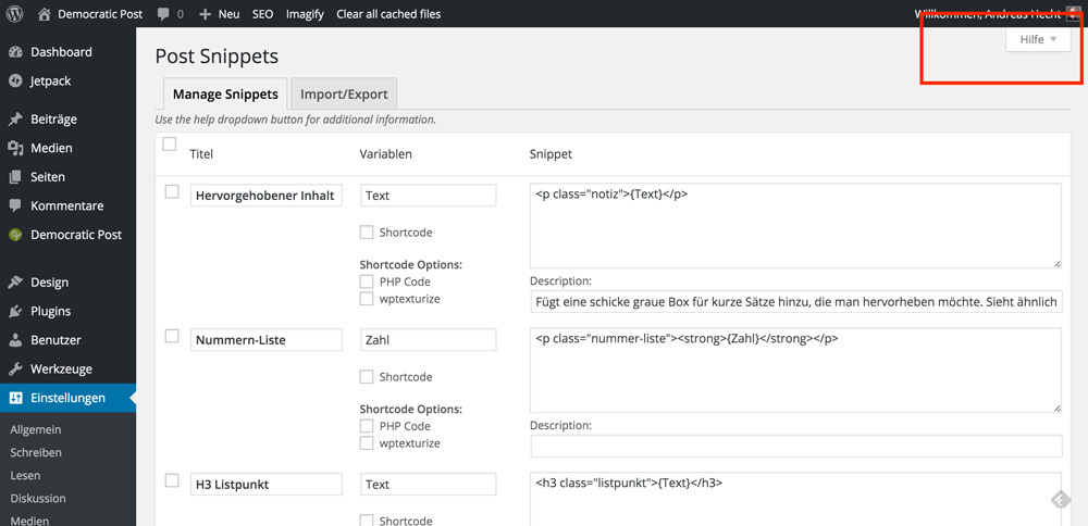
After the installation and activation of the plugin, you can find the settings page under “Settings => Post Snippets”. There, you easily create your first code snippet. The help page that unfolds at the top right border of the administration surface really deserves its name.

Post Snippets for WordPress: You Need This Plugin

On the screenshot, there are three HTML snippets already. The setup is really easy. In the “title” field, you enter a name. In the field “variable”, you define – well – the variable (text, for example) and then you enter the snippet in the right box. Below the snippet field, there is another input field for a detailed description. This is handy for websites with multiple authors.

Ein Post Snippet Schnipsel

If you want to use custom variables, that’s not a problem.

An HTML snippet is always created this way:

{Text}

Important to know: you can use multiple variables in one snippet. This allows you e.g. to create custom buttons of any size, color or kind.

Ein Snippet für einen verlinkten Button

Using the Created Snippets in the Text Editor

Post Snippets for WordPress: You Need This Plugin

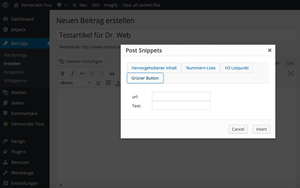
In the WordPress text editor, a new button to add the created snippets to the text area will appear. Choose a snippet, enter the variables and click “insert”. Done.

Post Snippets for WordPress: You Need This Plugin

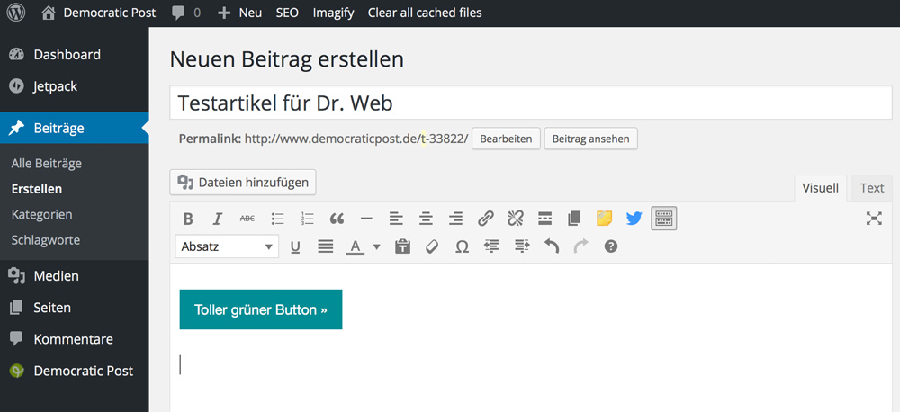
Endergebnis

Personally, I’m a friend of a well implemented CSS already in the editor, which is why my editor looks almost the same way the final result on the website will do. This way, I can always instantly make sure that the formatting is adapted properly.

What Else Does Post Snippets Do?

Creating PHP Shortcodes

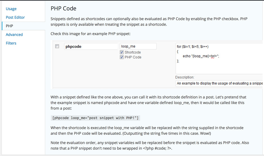
The same way you create HTML snippets, you also create executable PHP Shortcodes.

PHP-Code als Snippet

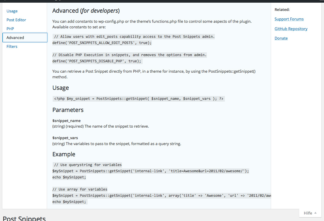
Developer Features

Additionally, the plugin offers developer features. For example, you can decide that non-administrators have access to the settings of the plugin. This can be done in the wp-config.php. In the same way you might want to prohibit the execution of PHP snippets.

Developer Features

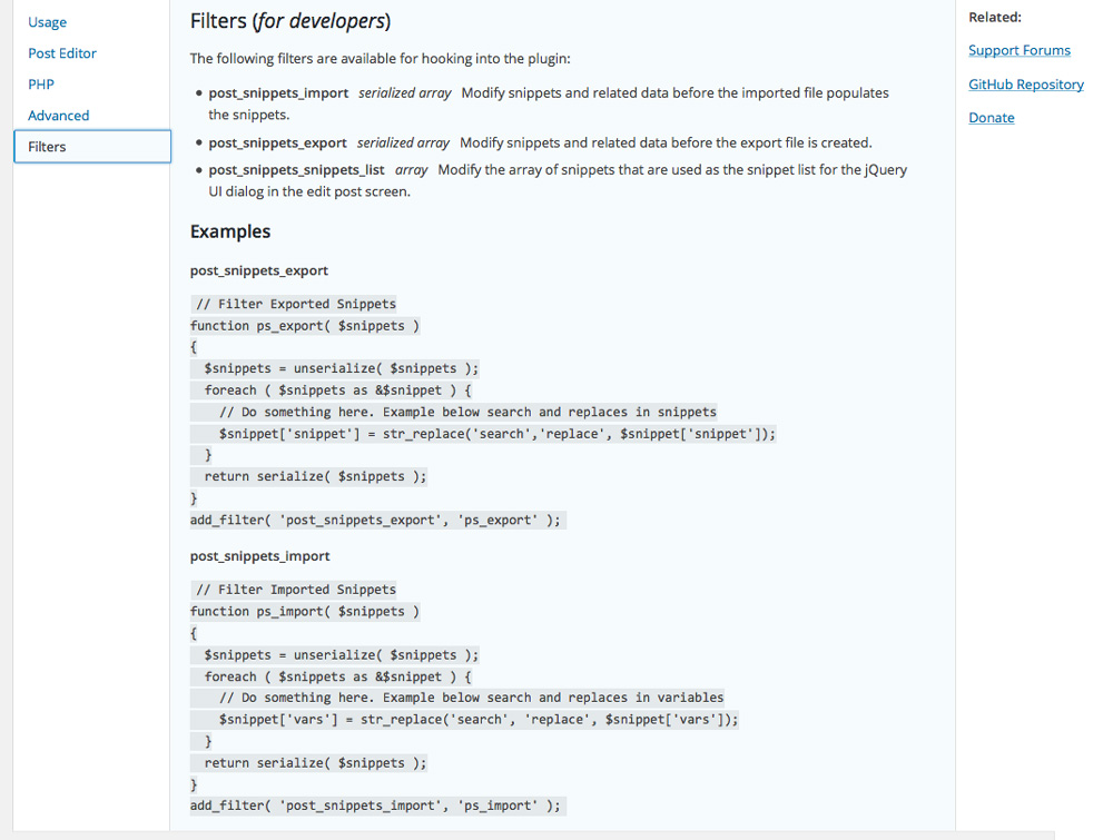
Filter for Developers

Post Snippets for WordPress: You Need This Plugin

Although the Post Snippet plugin comes with the option to import and export the snippets created, it also gives developers the option to hook into these functions using filters.

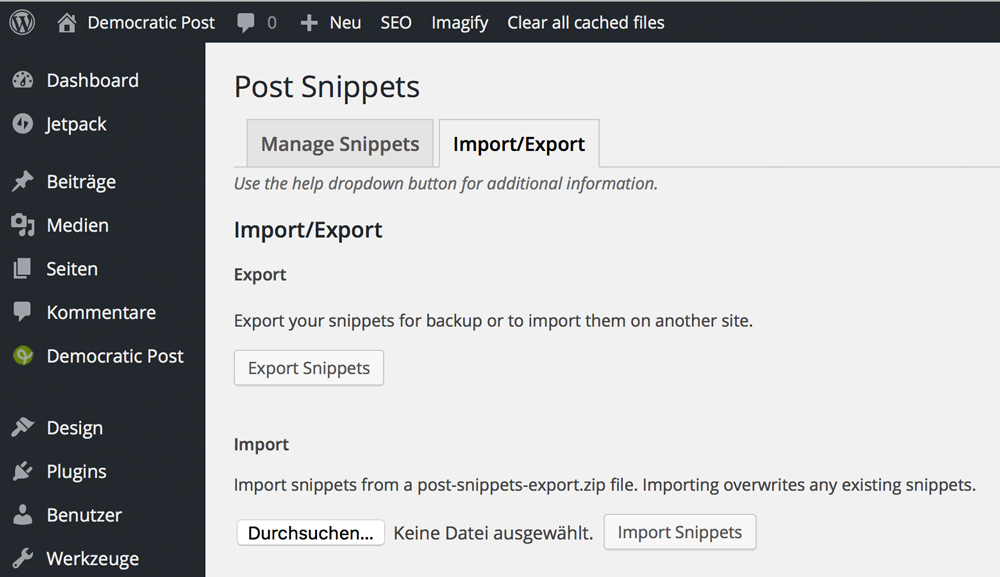
The Export and Import Feature

Export- und Importfunktion von Post Snippets

The option to export existing snippets to import them in another WordPress installation is very useful. It saves a lot of work if you want to use your snippets on multiple WordPress websites.

Conclusion:

In my opinion, this is one of the most interesting plugins on the market right now. It accelerates my whole working process and is also prepared for the future as I can quickly create and use new design elements for my website.

What do you say? Are there better choices?

(dpe)

Categories: Others Tags:

Deal of the Week: A Lifetime of Adobe Training

December 15th, 2015 No comments
improveyourskills

Adobe puts out some of the most popular Web Design and Development tools around. Incredibly robust, it can take some serious practice and help to fully master some of them. So why not let some of the top Adobe Instructor’s around teach you the ropes? With our Deal of the Week, provided by Mighty Deals, you can get unlimited access to over 7,000 professional video tutorials covering Adobe’s popular software from Photoshop to Illustrator to InDesign and everything in between, and all updated for CC 2015. This is Adobe training at its max.

You’ll also have access to course files for each lesson, and the ability to watch the high-quality videos anywhere you go thanks to their mobile apps. All in all, you can expect top-notch instructors, thousands of lessons, and a wide range of topics. This is all good, but the best thing is the price. Our Deal of the Week comes at a 97 percent rebate. Besides that the program is not run by some newbie in the field but by the well-known and acclaimed folks from Train Simple.

Highlights:

  • 7,000+ Video Tutorials
    Your access to Train Simple’s online library gives you more than 7,000 high-quality video tutorials to help you master Adobe’s popular software titles and even Web technology itself.
  • Learn Everything from Photoshop to HTML5
    Train Simple’s tutorials give you the training you need to completely learn Adobe’s design and Web development software including Acrobat, Photoshop, Illustrator, InDesign, Flash, Fireworks, Dreamweaver, Edge Animate, Muse, Fireworks, CC Mobile Apps and more! You can even take lessons on Web technology like HTML5, CSS3, JavaScript, WordPress and more!
  • New Courses Added Frequently
    Train Simple’s continually updating their courses. They regular add new courses for the following subjects:

    • Graphic Design
    • Photography
    • Web Design
    • Web Development
    • Illustration and Art
    • and more!
  • Interactive Course Files
    Every video tutorial offers some course related files, so you can easily follow along with your instructor as he or she runs down the various lessons.
  • Become Certified
    These aren’t just average, run-of-the-mill video tutorials, by the way. These are official lessons from Adobe about using its popular products. If you decide to follow a very specific Technology Track with Train Simple, you can actually become certified in a specific area of study! You just need to follow the pre-set tracks, watch a number of courses in order and pass the various quizzes and final exam to earn your certification.
  • Learn Anywhere
    Thanks to mobile apps, you’re not just bound to your laptop or desktop computer. Now you can learn on the go by soaking up lessons on your mobile devices including tablets and iPads.
  • Top-Notch Instructors
    Train Simple is an official Adobe Authorized Training Center! That means you’ll be learning valuable lessons from some of the industry’s leading Adobe experts.
  • Used by Major Companies
    Train Simple is used by some of the biggest companies around. Companies such as Google, Disney, Nike, Verizon, The Home Depot, USA Today and more use Train Simple in their organizations.

Testimonials:

“This is the best course [JavaScript] I’ve found to help me understand the way syntax is written. Other courses like [competitor] assume it is already understood from how it is shown. I wish I would have found this a year ago.”

“An excellent introduction to Adobe Illustrator. The instructor takes the time to explain the functions of the application in enough detail sufficient to get you up and running, without overwhelming you with too much technical detail. I primarily took this course to gain a better understanding of how I could create graphics for web applications.”

“I decided to change my career and knew that there were many more skills I needed to have. Train Simple gave me those skills and gave me credentials I could add to my resume.”

Here is the Deal

Lifetime membership to Train Simple normally costs $2,500, but for a limited time only, you can get UNLIMITED LIFETIME ACCESS for just $79! That’s a massive saving of 97% off the regular price!

A whole life of learning for the price of a dinner for two? Should be a no-brainer, shouldn’t it! Click here and we’ll transfer you to Mighty Deals, where you will want to press the prominent button calling for you to “BUY NOW”.

This article is sponsored by Mighty Deals and as such an advertisement. Noupe does not participate from sales on an affiliate basis, however. Our new ads format “Deal of the Week” is run once a week at max. So if you want to book a deal for your product, get in touch with the friendly staff over at Commindo Media.

Categories: Others Tags: