Archive

Archive for December, 2015

Reviewing an Emerging Top Seller: Uncode Creative Multiuse WordPress Theme

December 14th, 2015 No comments
featwebdl

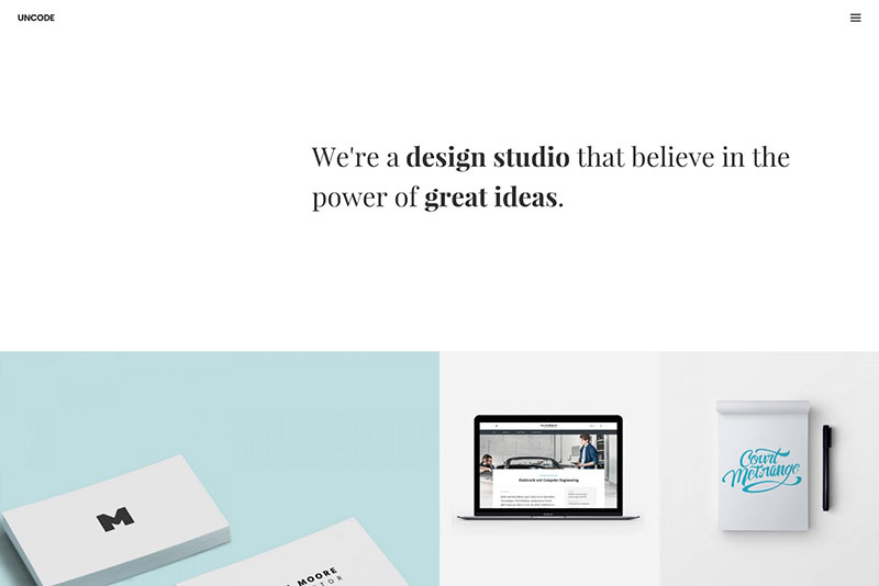
Uncode is a premium ThemeForest multipurpose theme. Introduced in November 2015, it is has already gained a large following of satisfied users who find it highly innovative in its approach to website building.

Like many premium WordPress themes, Uncode features several powerful plugins, including Visual Composer, WooCommerce, and Revolution Slider.

This however, is where any commonality with a majority of the other themes ends. Instead of relying on multiple modular features, Uncode combines modules and has built on them. The result is a theme consisting of fewer modules (28), yet a theme emphasizing a multiplicity of options. This approach has led to a WordPress theme that offers far more flexibility than most, which is an excellent reason for buying it.

Examples of Uncode Layouts that Come With the Theme

Creative Agency

Portfolio Metro

2

Blog Metro

3

Portfolio Agency

4

Creative Artist

5

Advanced Adaptive Grid System, Hierarchical options and many more

Uncode main features might be summed up with an equation: A Host of Options plus Innovative Functionality equals Extreme Flexibility.

This is what the Elite Authors had in mind; besides a few other things:

  • Uncode’s Advanced Adaptive Grid System is unparalleled in its flexibility as compared to other WordPress themes. This multiplicity of grid options enables designers to create any layout they desire, and to any level of detail when it comes to spacing, margins, gap settings, and design element and content positioning.

6

  • The Advanced Masonry/Isotope options are especially useful for portfolio and shop pages. Isotope builds on Masonry to create advanced layout modes that Masonry alone cannot accomplish. When coupled with a large number of design options, including animation, hovering, item spacing, scrolling, and more, these options allow the user to create any masonry, metro, or carousel format.
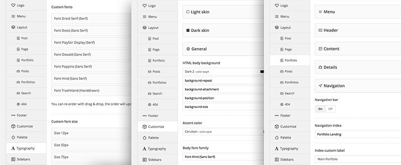
  • Uncode’s system of hierarchical options allows the user to group a number of options in a certain way, to serve a certain purpose, such as building a blog post page or a portfolio page. This approach gives the user tremendous control over a layout and its content.
  • The Native Header Solution makes using Revolution Slider or Layer Slider unnecessary for most applications, although both are included in the Uncode package. Instead, a full set of options are available to define header layouts and design elements, including font control, element alignment, parallax effects, and video. The Uncode Content Block works with Visual Composer when building a header.
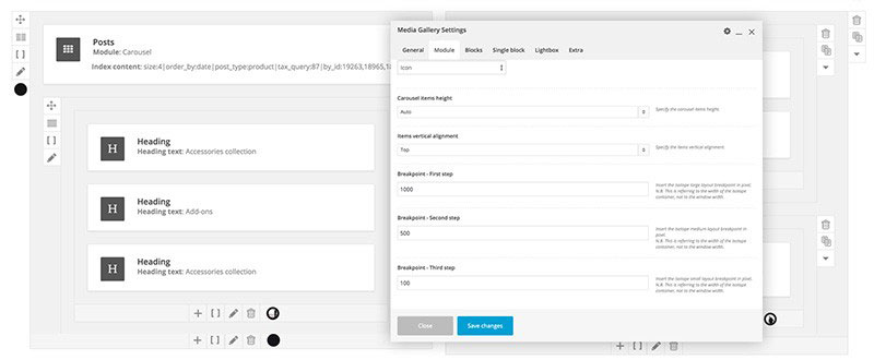
  • Uncode as could be described as being a responsive theme, but that is not entirely accurate. One of the features of this theme is its Adaptive Images System. A web designer can either allow the system to automatically match the screen size of a device or define custom adaptive breakpoints to fit the screen size for a specific device.
  • Demos are easy to install, since they can be imported with a single click. More importantly, the user can decide which pages of a demo to use, and disregard the others. Any pre-built page can be imported at any time without having to import data (pages) that are not needed.
  • Other features include 16+ portfolio layouts, 1000+ handpicked items, 6 menu types, iLightbox, SEO optimization, and more.

What makes Uncode Stand Out from the Crowd

7

Instead of packaging together a large selection of module-based features, the Theme’s developers took a more innovative approach, and focused on user options instead. This approach involved combining modules and building on them; Visual Composer being but one example. The result was a theme with fewer modules, but many more options and hierarchical combinations of options.

Another difference would be the strict attention to detail the Elite Authors pursued. This surfaces in many places, but particularly in the clean and modern pre-built layouts. Uncode is a theme for which the term “pixel perfect” takes on real meaning, and is not simply a catchphrase.

The streamlined layouts perfectly match their intended purposes – photography, agency, blog, portfolio, etc. The overall performance is clean, powerful, sexy, and sweet. Everything is in its place, and functions as it was designed to do.

In meeting their goal of creating a theme emphasizing user options and precision in form and function, Uncode’s creators produced a product that differs from most due to the greater amount of design flexibility it gives to website builders. It also gives them complete control over the use of multiple options as they proceed with their work.

The Uncode Team

8

The Elite ThemeForest Author Team that is credited with creating Uncode consists of two devs who labored for 18 months to make this premium WordPress theme a reality. One of the team members is located in Sweden, and the other one works out of Italy. Nevertheless, they were able to transform their vision into reality.

The team’s strength does not lie in its numbers, but in its flair for innovation, their exceptional level of technical competency, and their ability to focus on attention to detail.

The product this two-man team developed is rich in innovative website-building techniques. Its focus is more on options than on features, giving the user with an unprecedented amount of design flexibility.

Since it is different in many ways from the more typical WordPress themes there is a learning curve, but there is nothing about this theme that a novice cannot handle.

Uncode is highly recommend for beginners and advanced users alike.

cta-v2-2

Read More at Reviewing an Emerging Top Seller: Uncode Creative Multiuse WordPress Theme

Categories: Designing, Others Tags:

SMIL is dead! Long live SMIL! A Guide to Alternatives to SMIL Features

December 14th, 2015 No comments

SMIL, SVG’s native animation specification, has been highly regarded because it offers so many bells and whistles for performant SVG animation rendering. Unfortunately, support for SMIL is waning in WebKit, and has never (nor will likely ever) exist for Microsoft’s IE or Edge browsers. Have no fear! We’ve got you covered. This article explores some of those SMIL-specific features and delves into the alternatives to achieve the same effects with a longer tail of support.

SMIL Feature: Motion Along a Path

One of the most compelling things that SMIL offers for realistic motion in SVG is motion along a path. Very few things in real life move along a straight line, so motion along a path allows us to mimic what we see in everyday life. Previously, you would pass an SVG path into animateMotion, with path and define the path data. You pick the element to animate by designating it with xlink:href=”#thingtoanimate”.

<animateMotion 
  xlink:href="#lil-guy" 
  dur="3s" 
  repeatCount="indefinite" 
  fill="freeze" 
  path="M 25,50 C 37.5,25 37.5,25 50,0 75,50 75,50 100,100 50,100 50,100 0,100 12.5,75 12.5,75 25,50 Z" />

See the Pen SMIL motion path by Sarah Drasner (@sdras) on CodePen.

An Alternative: CSS

Luckily for us, the motion along a path module is now moving into CSS. The support thus far is slim (Chrome, Opera, and Android only):, but Sara Soueidan has proposed adoption in Edge, and it has strong support thus far, with around 420+ votes at the time of the article’s publication. Please add your voice to ensure that this feature will be shipped. The voting for Firefox is here.
Voting for support in Safari, as far as I can gather, is a little more individual. I registered to fill out a bug report and requested motion path module in CSS as a feature.

In order to use motion along a path in CSS, you pass the path data into the motion-path property like so:

.move-me {
  motion-path: path('M3.9,74.8c0,0,0-106.4,75.5-42.6S271.8,184,252.9,106.9s-47.4-130.9-58.2-92s59.8,111.2-32.9,126.1 S5.9,138.6,3.9,74.8z');
}

See the Pen SMIL motion path by Sarah Drasner (@sdras) on CodePen.

I get path data from an SVG I make in Illustrator and then optimize in SVGOMG.

In this instance, I want to ensure that it follows the path from the starting point all the way to the end of the path, and you can see that it is a closed path by the small z at the end. This means this path is in a loop, so the weird little creature will end up at the same place he started from. I set these parameters in my keyframes values, only specifying the 100% value because the default is set at zero:

@keyframes motionpathguy {
  100% {
    motion-offset: 100%;
  }
}

and then call the animation on the element:

.move-me {
  animation: motionpathguy 10s linear infinite both;
}

An Alternative: GreenSock’s Motion Along a Path

If you want the widest current support and the most flexible implementation, you should be using GreenSock. GSAP’s Bezier-Plugin (packaged in by default with TweenMax) offers support back to IE7 for non-SVG elements, and back to IE9 for SVG (the broadest SVG animation support available). It works like gangbusters on mobile. I’ve written about this before on the David Walsh Blog, but here’s a small recap, plus a few extra new features that have come out since then:

Originally you would pass in an array of values:

bezier: {
  type: "soft",
  values:[{x:10, y:30}, {x:-30, y:20}, {x:-40, y:10}, {x:30, y:20}, {x:10, y:30}],
  autoRotate: true
}

But as you can see here, you can also have the option of autorotating (or not) just like SMIL’s rotate. If you’re missing SMIL’s ability to specify auto-reverse or auto:n parameter for initial position of rotation or degrees of rotation, GSAP allows you to use rotation:90 to change the number of degrees, or more finite control should you need it:

autorotate: [
  first position property, like "x",
  second position property, like "y",
  rotation property, typically "rotation" but can be “rotationY”,
  integer for radians/degrees the rotation starts from like 10,
  boolean for radians or degrees- radians is true
]

In SMIL, you can transform the path or group to change that orientation on the object while it’s moving. In GSAP, you can achieve this easily with autoRotate: false, and initializing the rotation with set. You can also transform the element on the SVG attribute itself like you would with SMIL, although that’s a little less elegant and harder to keep track of while you’re working.

TweenMax.set("#foo" {
  rotation: 90 // or whatever number
});

You can also set the type to thru, soft, quadratic, or cubic. More documentation on each of these are in the GreenSock API docs. A nice value of thru is being able to affect the amount of curviness on an element. If you think about the points as coordinates to bounce to and from, the curviness would control how direct a path to take between those points. 0 would be a direct path, 1 is a little looser, with 2 making a nice curve, and values of 3 and higher begin winding on itself.

See the Pen Demo for Curviness in GreenSock Bezier by Sarah Drasner (@sdras) on CodePen.

More recently, GreenSock has also exposed the ability to pass in path data like the CSS and SMIL modules, as you would with native SMIL. This comes as an extension to their MorphSVG plugin, so you would add the plugin, and use it like this:

TweenMax.to("#lil-guy", 3, {
  bezier: {
    MorphSVGPlugin.pathDataToBezier("#path", {align: "#lil-guy" }), 
    type: "cubic"
  },
  ease: Linear.easeNone,
  repeat: -1
});
<path id="path" d="M 25,50 C 37.5,25 37.5,25 50,0 75,50 75,50 100,100 50,100 50,100 0,100 12.5,75 12.5,75 25,50 Z" fill="none" />

See the Pen SMIL motion path by Sarah Drasner (@sdras) on CodePen.

The default would have set the upper left corner of the group I’m animating, in this case, #lil-guy, to the path trajectory. This would have made it visually look misaligned. So I set #lil-guy to use the centerpoint instead using TweenLite.set:

TweenLite.set("#lil-guy", {xPercent:-50, yPercent:-50}); 

You can also offset these paths by passing an object as the second parameter to that method and define an offsetX and offsetY within pathDataToBezier– beware that you might need to expand the viewBox so that the group or attribute you’re animating doesn’t get cropped out. Formatting nerds: I’m placing the objects on new lines for legibility reasons.

// offset the path coordinates by 125px on the x-axis, and 50px on the y-axis:
TweenMax.to("#lil-guy", 3, {
  bezier: {
    values: MorphSVGPlugin.pathDataToBezier("#path", {
      offsetX: 125, 
      offsetY: 50, 
      align: "#lil-guy"
    }),
    type: "cubic"
  },
  ease: Linear.easeNone,
  repeat: -1
});

See the Pen SMIL motion path by Sarah Drasner (@sdras) on CodePen.

You can even define a matrix coordinate for this positioning.

// scale the path coordinates up by 1.25 
// and shift it over 120px on the x-axis 
// and up 30px on the y-axis:
TweenMax.to("#lil-guy", 3, {
  bezier: {
    values: MorphSVGPlugin.pathDataToBezier("#path", {
      matrix:[1.5,0,0,1.5,120,-30], 
      align:"lil-guy"}),
    type: "cubic"
  },
  ease: Linear.easeNone,
  repeat: -1
});

See the Pen SMIL motion path by Sarah Drasner (@sdras) on CodePen.

Another option is to set the align member to "relative". This keeps it from jumping by keeping the position of each coordinate relative to x:0, y:0. In the previous pens, I used align to pair the movement with the #lil-guy group itself.

For more information on this new (as in new the day of this post!) feature in GreenSocks’s Bezier Plugin API, check out their docs, and this great explanatory video.

SMIL Feature: Shape Morphing

Previously, you would be able to pass path data as values into animate attribute in order to morph a shape. Noah Blon has a great example:

See the Pen Sitepoint Challenge #1 in SVG and SMIL by Noah Blon (@noahblon) on CodePen.

An Alternative: Snap.svg or SVG Morpheus

Some libraries offer morphing path or shape values, such as Snap.svg and SVG Morpheus, but the caveat (even in SMIL) is that the shape has to have the same number of points or the morphing looks terrible or fails entirely. This is disappointing on the pre-processing end, because it means that you have to keep good track of what you’re making, or collaborate well with your designer to make sure you’re being fed this (sometimes arbitrary) midpoint data. The extra points also unnecessarily bloat your code.

An Alternative: GreenSock MorphSVG

I would highly recommend GSAP’s MorphSVG plugin, as it beautifully morphs shapes and paths with different amounts of points. See the toggle on the logo of this very website for a demo of the morph in action. Here’s another example:

See the Pen Interchangable Hipster by Sarah Drasner (@sdras) on CodePen.

Because MorphSVG plugin tweens path data, if you need to convert a shape, you would use their convertToPath option:

MorphSVGPlugin.convertToPath("ellipse"); 
// or circle, rect, etc

This allows us to do really complex shape tweening, and is a game-changer for all of motion on the web.

There are a few extra features that this plugin offers that really knocks it out of the park. The first is the utility plugin findShapeIndex. Let’s say you are unhappy with the way that the shape is morphing (though 9 times out 10, the auto preset will work just fine). You load up the plugin (don’t worry, you won’t add extra weight because it’s not needed in production), and you pass in two values: the ID of the first shape to tween and the ID of the second. A GUI will pop up where you can toggle between values, and it will also automatically use a repeat: -1, so that it will continually loop between the shapes.

findShapeIndex("#hex", "#star");
// you can comment out above line to automatically disable findShapeIndex() UI

See the Pen SMIL motion path by Sarah Drasner (@sdras) on CodePen.

Once you have that additional value, you would pass the shapeIndex within the morphSVG object:

TweenLite.to("#hex", 1, {morphSVG: { shape: "#star", shapeIndex: 1 }});

The second of these extra features is the plugin’s ability to parse cut-out-paths, which no other library offers. Finally, you can also reuse the first starting ID (rather than having to store that path data for reuse). It’s worth mentioning that when the plugin was first released, these features were not available, but GreenSock recognized the need for support, and so, included it.

Now that we aren’t tied down to a specified number of points, we’ve widened the possibility for different kinds of effects. Below, I made some smoke:

See the Pen Where There’s Smoke by Sarah Drasner (@sdras) on CodePen.

SMIL Feature: DOM events

Things like hover, and click were nicely baked into SMIL. In order to kick things off, it was possible to specify begin="click" or begin="hover".

<animate 
    xlink:href="#rectblue"
    attributeName="x"
    from="0"
    to="300" 
    dur="1s"
    begin="click"
    values="20; 50"
    keyTimes="0; 1"
    fill="freeze" />

See the Pen SMIL motion path by Sarah Drasner (@sdras) on CodePen.

An Alternative: JavaScript

There are the native DOM events like onmouseenter and onmouseleave for hover and click for, ya know, clicks. You could use them to change to trigger your JavaScript-based animations.

An Alternative: JavaScript + CSS

You could use JavaScript to change a class name or directly change CSS styles. Here’s on possibility: change the animation-play-state to start the animation from an event trigger.

.st0 {
  animation: moveAcross 1s linear both;
  animation-play-state: paused;
}
@keyframes moveAcross {
  to {
    transform: translateX(100px);
  }
}
document.getElementById("rectblue").addEventListener("click", function() {
  event.target.style.animationPlayState = "running";
});

or in jQuery:

$(".st0").on("click", function() {
  $(this).css("animation-play-state", "running");
});

See the Pen SMIL motion path by Sarah Drasner (@sdras) on CodePen.

This implementation would not immediately set this animation back to the beginning again as in the SMIL example. If you wanted to accomplish that, a previous article on CSS-Tricks details a few good ways of doing so.

An Alternative: Greensock

In GSAP, the restart is more simple. We could add the animations to a timeline, set it to paused, and then on click restart it. This implementation is a little closer to what you’d expect of SMIL, because we don’t have to do anything hacky like clone/reinsert a DOM node or change any properties set on the element.

// instantiate a TimelineLite    
var tl = new TimelineLite();

// add a tween to the timeline
tl.to(foo, 0.5, { left: 100 });

$(".st0").on("click", function() {
  tl.restart();
});

SMIL Feature: Run “X” after “Y” is completed

SMIL also allowed for more complicated timed events such as begin="circ-anim.begin + 1s". This is particularly useful when chaining animations.

An Alternative: CSS

In CSS, we could chain the animations by setting a delay on the second value:

.foo {
  animation: foo-move 2s ease both;
}
.bar {
  animation: bar-move 4s 2s ease both; 
  /* the 2 second value corresponds with the length of the iteration of the first. */
}

This way of working a bit of a bummer because you have to make sure you remember to change the first interval as well as the delay.

An Alternative: CSS Preprocessing

Maintaining and managing those intervals can get a little easier if we use a variable in (for example) Sass:

$secs: 2s;
.foo {
  animation: foo-move $secs ease both;
}
.bar {
  animation: bar-move 4s $secs ease both; 
}

Now we know that if we update the one value, they’ll stay in sync.

But if we want to always detect when the animation is complete, JavaScript offers some nice native functionality for this with animationEnd:

$("#rectblue").on("animationend", function() {   
  $(this).closest("svg").find("#rectblue2").css("animation-play-state", "running");     
});
#rectblue2 {
  animation: moveAcross 2s 1s ease both;
  animation-play-state: paused;
}

You may need to hit replay to see the animation below:

See the Pen SMIL motion path by Sarah Drasner (@sdras) on CodePen.

For the delay, we would bake it into the animation-delay property of CSS of the element itself, like above, or we could express this with a setTimeout:

setTimeout(function timeoutHandler() {
  // animation goes here, with any language
}, 1000); // wait for a second

An Alternative: Greensock

My favorite option is to add finite control of the animation timeline. We can use GreenSock’s TimelineLite for this, which can be expressed a few different ways:
Simple Timeline:

// instantiate a TimelineLite    
var tl = new TimelineLite();

// add a tween at the beginning of the timeline
tl.to(foo, 0.5, { left: 100 });

// use the position parameter "+=1" to schedule next tween 1 second after the previous tweens end
tl.to(foo, 0.5, { left: 200 }, "+=1");

Timeline with a relative label:

// add a label 0.5 seconds later to mark the placement of the next tween
tl.add("myRelativeLabel")
// use the label to specify an animation a second after the 
tl.to(foo, 0.5, { scale: 0 }, "myRelativeLabel+=1");

// or to use to this label for things like interaction 
tl.play("myRelativeLabel");

I prefer relative labels, because you can choose a point in time that a lot of things fire, or are delayed by, and even if that point in time adjusts, you don’t have to do any recalculation as you would have to in CSS.

The nice thing about the timeline is that you then have fine control over many different objects in just one place, and can offer things like repeatDelay (delays in between multiple repeats).

SMIL offers repeatDur, which lets you say how long the repeat iteration would be, if you don’t want it to be the default such as repeatDur="01:30". In GreenSock, you can speed up or slow down the timeline, thereby adjusting the repeat length with timeScale(n), or set a repeat: -1 for times that you would otherwise set repeatDur="indefinite".

Handy Dandy Replacement Reference Chart

Now that we’ve done a deep-dive into some of the most useful SMIL-specific features, it’s worth noting that here are many more replacements for SMIL functionality that you might already know about. We’ve made the small table below for quick reference of these simpler implementations.

SMIL Code Replacement Code Replacement Technology
keyTimes @keyframes CSS
keySplines cubic-bezier CSS
restart restart(); GSAP
calcMode=”discrete” steps() CSS
remove kill();
clear();
clearProps: “all”
GSAP
freeze animation-play-state: paused CSS
freeze pause(); GSAP
fill animation-fill-mode CSS
repeatCount=”indefinite” animation-iteration-count: infinite; CSS
repeatCount=”indefinite” repeat: -1 GSAP
whenNotActive detect animation-play-state in JS CSS, vanilla JavaScript or jQuery
animateMotion path motion-path CSS
animateMotion path bezier GSAP
animate values (path morphing) MorphSVG GSAP
begin=”hover” mouseover, mouseenter/
mouseout, mouseleave
jQuery, vanilla JS
begin=”click” click jQuery, vanilla JS
begin=”circ-anim.begin + 1s” animation-delay: $vars; SASS
begin=”circ-anim.begin + 1s” timeline, position parameter ex “+=1” GSAP

SMIL is dead! Long live SMIL! A Guide to Alternatives to SMIL Features is a post from CSS-Tricks

Categories: Designing, Others Tags:

Simunity Icon Maker: Create Awesome Pictograms in Seconds

December 14th, 2015 No comments

Based on the Font Awesome Icons used for Bootstrap, the developers of the homepage builder Simbla came up with an icon maker that allows you to create custom pictograms in a matter of seconds. Two colour selectors, a few sliders and two collections of shadows and frames are all it takes.

Good Choice: Based on Font Awesome

The creators of Simbla chose Font Awesome for their project, as it is distributed under the very liberal Open Font License, does not require attribution and is very extensive. These are good preconditions for high usability.

The generator is ready for uncomplicated use over there at Simunity.net. No registration or login is required. You just choose the pictogram to edit from the Font Awesome stock and alter it in the blink of an eye. Of course, the scope of features can not be compared to Illustrator. However, the results are achieved much faster.

Simunity Icon Maker

Simunity Icon Maker: Few Steps Until Success

The Simunity Icon Maker puts the choice of the icon you want to edit at the beginning of the process. It shows a grid of all pictograms included in Font Awesome. This grid can be limited using a list placed above it. This allows you to restrict the grid to icons of a certain topic so that you don’t have to scroll through all the available symbols.

Simunity Icon Maker

The chosen icon is displayed in a preview frame below the list. On the left, you’ll find the editing tools. They allow you to set the size of icon and background in pixels using a slider or by manually entering the values. The colour of the pictogram, as well as the colour of the background, can be defined as hex codes separately. Those that don’t know the code can choose the desired colour from a palette.

iconmakerwerkzeugefarbe

The biggest changes, however, are achieved by changing frame and shadow. 20 different frames and eight types of shadows allow you to make the pictogram your own. Among the shadow styles, you’ll also find the famous long shadows, which are a crucial part of today’s flat design. However, contour blur and sharp contours are also available.

iconmakerschatten

When you are satisfied with the result, copy the HTML code displayed below the editing area into your web project. The Simunity Icon Maker is free to use for private as well as commercial purposes. You can even use it for customer work. It is prohibited to provide the tool as such, for example by integrating it into your own project or. But on a serious note, who’d come up with that?

Simunity Icon Maker: What to Use it For

The Icon Maker becomes a little inconvenient when you want to create multiple icons in the same style. You need to do so one by one. All the changes made have to be done step by step on each icon again. It is also not possible to change the original shapes and paths of the pictograms. That’s why this tool can only be used to emphasize certain aspects and is not suitable for the development of an icon concept for an entire project, besides prototyping.

That said I can only recommend checking out Simunity’s Icon Maker for yourself.
Here it is.

Categories: Others Tags:

Website Layout Tools Compared: Flexbox Vs. Susy

December 14th, 2015 No comments

Flexbox has become one of the most popular tools for creating website layouts. Susy is another layout tool that has gained popularity with the Sass community over the last few years.

Website Layout Tools Compared: Flexbox Vs. Susy

Many developers I’ve spoken with are unsure which tool is best for creating layouts for their websites. Some feel that flexbox is powerful enough to handle all of their layout problems. However, they are unsure whether to learn it because of its confusing syntax. Others feel that Susy is much simpler and prefer its simplicity to flexbox.

The post Website Layout Tools Compared: Flexbox Vs. Susy appeared first on Smashing Magazine.

Categories: Others Tags:

The best new portfolio sites, December 2015

December 14th, 2015 No comments

Nothing sells design work quite like a good portfolio. Whether you contact your clients in person, over the Internet, pitch to them, or what-have-you, they’ll want to see your existing work.

We’ve gone hunting for the latest portfolios to hit the Web. Here you’ll find some of the most exciting designers working away in studios around the world, all of whom have published or updated their portfolio in recent weeks.

Andrea Pilutti

Andrea Pilutti is a designer based out of Italy and Switzerland. On top of his apparent ability to teleport, his portfolio makes use of HTML5 background video, and smooth animations.

That slows down the smooth scrolling a bit, but it’s pretty enough that I don’t care too much.

Mikha Makhoul

Mikha Makhoul’s portfolio conforms to the now-classic full-screen-section format, but his typography is beautiful. Each project is presented elegantly, so flip through all his work.

Julien Renvoyé

Stepping away from the pseudo-PowerPoint style we see all the time, Julien Renvoyé shows off his work with a simple single column full of screenshots. It’s all spiced up with excellent typography and the sensible use of animation.

Bryn Taylor

Bryn Taylor made a bold choice by using daring, and dare I say, glaring colors all over his site. If you’re not immediately blinded, there’s a certain genius to his method. I certainly won’t be forgetting his portfolio anytime soon. And neither will my retinas.

I should also mention that this is actually a great way to cater to visually impaired users.

StudioBrave

I’ll never be a fan of sites that need pre-loaders. That said, StudioBrave has implemented an excellent asymmetrical design. Plus, they use a monospace typeface, and they make it look good. That’s not easy.

Co Partnership

Co Partnership is a great argument for simplicity. No gimmicks, no tricks. They just put their branding work in front of you, and let you form your own opinions. It doesn’t hurt that their work is pretty great.

Big Fan

Striking a balance between tasteful white space and using all available space, Big Fan shows us how to take advantage of huge monitors. I mean sure, it looks just as great on my phone, but I love how they didn’t shy away from the higher resolutions with the typical centered column.

No Divide

It’s not often that I get to say that a website’s layout is what made it stand out to me, but the guys at No Divide have accomplished that. Sure, the basic layout concepts and patterns aren’t new, but the execution is flawless.

Garbett Design

Bold colors, a big layout, a lot of dots, a weird eye thing that blinks at you, Garbett Design has it all! And despite the inherent oddness of its modern art-inspired design, it’s a usable, smooth experience.

Pillar Studio

Pillar Studio is what happens when you take classic layout patterns and design conventions and just do everything right. It’s a website that should be boring, but isn’t because because they made classic elements look good.

Plus, they made default-link-blue look good as a color scheme. How many people can say that?

Sam Dallyn

Sam Dallyn’s portfolio is an example of minimalism taken to great lengths, if not to the extreme. Potential navigation issues aside, it’s just plain pretty.

Jordan Egstad

Jordan Egstad’s one-page portfolio site is an oddity in that it looks both professional and oddly personal. That personal touch mostly comes from the huge hero shot of Jordan working at home alone, and yet it just seems to fit.

Viljami Salminen

Viljami Salminen takes an odd approach to the portfolio but throwing you head-first into his blog. Mind you, if you take the time to read what he has to say, this quickly proves to be a good idea. The man knows what he’s talking about, and he says it with exquisite typography.

Actually clicking your way over to the portfolio section of the site is just icing on the cake by that point.

Julien Bailly

Julien Bailly’s “PopUpFolio” is unique in that it only shows his latest project. However, that latest project is featured in detail, telling the story of how it came to be. It’s a rather extreme definition of quality over quantity, but it seems to work for him.

Kyle Mac

Kyle Mac keeps it simple by just giving you the relevant information right off the bat (including contact info). Wanna see his work? Scroll down. Wanna see more of it? Keep scrolling. It’s as simple an experience as anyone could ask for.

Clarqa Tudela

Okay, let’s be honest with ourselves. Few people will be able to pull off a portfolio like Clara Tudela’s. There’s little information about each project. Just screenshots (or illustrations from the project), the title, and an external link. But then, she works at Google. She can get away with that.

Important Looking Pirates

Being a visual effects and animation studio, video is important to the Important Looking Pirates. Projects are showcased with a combination of background videos, and manually animated thumbnails.

Manually animated? By that I mean that all the frames for a couple seconds of video are loaded into the thumbnail space, then each is shown and hidden in turn with JavaScript.

This is more bandwidth-efficient for mobile users, because on a phone, nothing’s animated. One might assume that they just load in one frame for the thumbnail on mobile devices, making this an interesting and bandwidth-efficient technique.

Deux Huit Huit

Deux Huit Huit would be a well-designed, though generally unremarkable website except for their creative application of performance-friendly animations.

Listen closely, because I’ll probably never say anything like this again: they have a four-second splash animation (which probably serves as a very short preloader) that I don’t hate, and they actually managed to make a text marquee look good.

Yeah, never saying that again, probably.

Tundra

Nothing too special to say about Tundra. They hid their navigation away unnecessarily, and haven’t gone too far outside the box. Still, it’s very pretty, and the animations work smoothly on my first-generation Moto G smartphone.

A lot could be learned from their technical proficiency, if nothing else.

Fanny Myon

I’m generally a fan of static, minimally-animated interfaces for websites because of potential performance and UX issues. It’s websites like Fanny Myon’s that give me hope for the future of more dynamic interfaces.

See? They don’t have to be slow. Still wouldn’t want this kind of interface for a blog or knowledge base though.

By Association Only

Good concept, excellent execution, pretty, and fast. By Association Only pretty much has it all. It sometimes feels more like an old Flash presentation than a website, but they’ve done it without sacrificing usability. I can get behind that.

Ariel Beninca

Ariel Beninca went all out with minimalism, excellent typography, asymmetrical design, and animation. The whole thing just screams “fancy”, and it works.

Admir Hadzic

Admir is an award-winning designer with brands like Google and Apple in his resumé. (He should hit up Microsoft and get the trifecta). As you might expect, his website is beautiful, often looking more like a magazine layout, or a work of art than a simple portfolio. Even so, it’s easy to find your way around, and that’s what counts.

Fantasy

Background animations, dead-simple copy, case studies that read (and look) like presentations. It’s hard to get that right, but Fantasy does it well.

Derek Boateng

Derek Boateng’s website is interesting in that all of his work projects are represented with illustrations, rather than screenshots. He’s an art director, so relying on symbolism to convey each project’s purpose is just one more way to showcase his talent.

Massive Discounts on Stock Photos – 90% off!

Source

Categories: Designing, Others Tags:

Popular design news of the week: December 7, 2015 – December 13, 2015

December 13th, 2015 No comments

Every week users submit a lot of interesting stuff on our sister site Webdesigner News, highlighting great content from around the web that can be of interest to web designers.

The best way to keep track of all the great stories and news being posted is simply to check out the Webdesigner News site, however, in case you missed some here’s a quick and useful compilation of the most popular designer news that we curated from the past week.

Note that this is only a very small selection of the links that were posted, so don’t miss out and subscribe to our newsletter and follow the site daily for all the news.

12 Good, Bad, and Ugly Web Design Trends for 2016

Why You Shouldn’t Design your own Website (unless You’re a Designer)

9 Differences Between Men and Women Learning to Code

Design Better Landing Pages

The Future of the CMS

Teens Can’t Tell the Difference Between Google Ads and Search Results

How to Save Time and Money with Modular Design

Traditional Homepages are Obsolete, Says Quartz. Here’s What They Built Instead.

Should Designers Code? – The Final Word!

How a Logo’s Color Shapes Consumers’ Opinion of a Brand

Don’t Bother Creating a Mobile App

Hillary Logo Fail

Stop Building Features, Start Building Brands

If Brands were Bottles of Wine

How to Create an Authentic Brand Story

Indian Government Caught with a Photoshop Fail

Website Design: Spotify Year in Music 2015

The Right Way to End an Email to a Client

The United States Postal Service will Now Email You your Mail

What Killed the Infographic?

Lightroom Mobile for Android is Now 100% Free

Star Wars: The Force Awakens – Countdown Timer

Museum of Feelings – Take a Selfie that Changes with your Feelings

24 Ways (2015) — an Advent Calendar for Web Folks

Yahoo to Spin Off its Core Businesses

Want more? No problem! Keep track of top design news from around the web with Webdesigner News.

LAST DAY: Winter Collection of 100+ Graphic Elements – only $7.50!

Source

Categories: Designing, Others Tags:

Cartoon: BUY NOW

December 13th, 2015 No comments

Believe it or not, I have just had that type of client. My drafts were impressive to say the least. My design concept was worth much more than I will ever get paid for it. I had forethought each and every possibility, even error handling was already cared for. I was just that little bit proud of myself, and I expected the client to be at least satisfied if not even profoundly thankful. I didn’t expect some kind of reverence. No. But what I also did not expect was this:

By the way, we have more cartoons for you here.

Categories: Others Tags:

TremulaJS: This Animated Modern Image Gallery Will Impress You

December 12th, 2015 No comments

When it comes to polishing images or other visual data, there are plenty of JavaScript libraries to turn a loose image collection into appealingly designed and functional galleries with ease. A very popular choice is the Image Carousel where images are swapped via mouse movement or swipe gesture. TremulaJS also provides a very extensive framework that allows you to create animated galleries and adjust their look in really unique ways.

TremulaJS: Displaying Images as „Mountain“, „Turntable“ or in the Pinterest Look

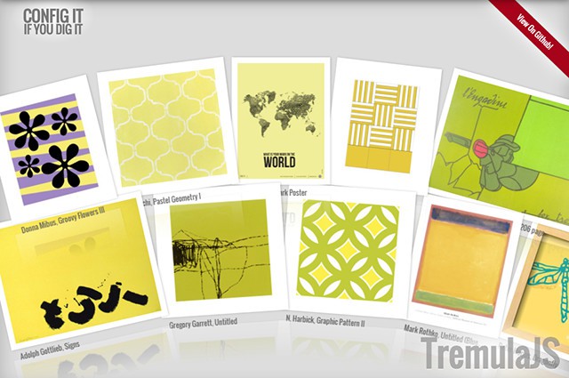
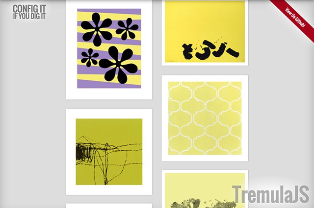
The framework provides different ways in which you can have your images displayed. For instance, there is the „Mountain“ view, where images are arranged in a circular shape. However, only a section of the circle is displayed. This means that the pictures are arranged in an arc shape that is just labeled as „Mountain.“ Another form of presentation is the „Turntable“ format. Here, images are folded in from either left or right. A classic multi-column arrangement, as known from Pinterest, is also possible.

TremulaJS als Bildergalerie
„Mountain“ Depiction

In total, there are six different ways to shape your images. The different ways are presented very nicely on a demo page.

TremulaJS als Bildergalerie
„Turntable“ Depiction

Also, there are a plethora of other settings that can be used to make further adjustments to your gallery. This way, you can customize the presentation size of the images, as well as the number of lines and columns. The „Mountain“ format can consist of multiple images arranged below instead of only next to each other. It allows you to create format filling galleries that are responsive.

TremulaJS als Bildergalerie
Pinterest Depiction

Animations with an Impulse

Besides the different ways of presentation, TremulaJS also knows to impress with its animation effects. Via mouse movement or swipe gestures the gallery is set in motion. Depending on the way of depiction, the images are either rotating in a circle („Mountain“), folded into the viewport („Turntable“), or only moved horizontally or vertically.

In a lot of cases, the mouse movement or gesture is exactly translated when it comes to these animations. TremulaJS, however, simulates physical impulse forces to create a natural-seeming movement. This means that when the gallery is set in motion with a lot of momentum, it will start moving at an equal speed, and it will take the according amount of time. It will then slowly stop moving.

The „Mountain“ view creates a similar effect that kicks in when the wheel starts spinning. Because of the animation trying to resemble physical forces, the navigation through the gallery is very intuitive and the animations are very pleasant.

Load Infinite Images Thanks to JSON

The single images of a TremulaJS gallery are not individually set in the HTML source, but loaded by the framework via a JSON object. Only a „

“ element has to be put in the HTML body. This serves as a placeholder for the gallery.

This approach allows you to use the Flickr API to load images via JSON and display them in a separate gallery. As the pictures are not anchored in the source, not all images of the gallery need to be loaded at once. That’s why there is the option to lazy-load pictures. Thus, galleries with hundreds of images are no problem.

In the TremulaJS demo, you can see how fluent and clean the movement is displayed even with many pictures loading.

TremulaJS: Complex JavaScript Structure and Some Dependencies

In contrast to many other gallery libraries, using TremulaJS is not done by just adding a few lines of JavaScript. It definitely requires a little more effort.

First, the HTML element you want the gallery to be placed in has to be defined. The many configuration parameters are handled by an object literal. TremulaJS als Bildergalerie
Workable Source in CodePen

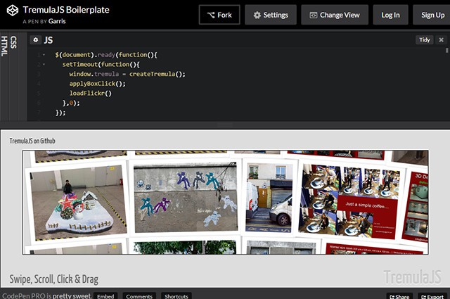
The loading of the images is done through custom features that are programmed individually. That’s why I don’t present any code snippets here. However, there is a relatively comprehensible demo on CodePen, which shows the loading of Flickr images. Here, you can get used to the framework and try out a bunch of different things.

You can also download a well-documented example of an HTML, CSS, and JavaScript representation.

The complexity of TremulaJS is also reflected in its dependencies to other libraries. It requires the framework jQuery, and the plugins Hammer.JS and jsBezier. While Hammer.js is responsible for the implementation of swipe gestures on mobile devices, jsBezier is needed to make the animation work on curves like on the circle of the „Mountain“ view.

Conclusion

TremulaJS allows for the creation of format filling galleries that are fun to use due to neat and efficient animations. While bringing it to work requires a bit of an effort to be put in, it is certainly worth it if you desire more than a classic image carousel or something similar everyone already has.

TremulaJS is taken care of by Garris Shipon and Art.com Labs. It is provided on Github under the liberal MIT license and may be used for both private and commercial projects as well as customer work.

(dpe)

Categories: Others Tags:

Comics of the week #317

December 12th, 2015 No comments

Every week we feature a set of comics created exclusively for WDD.

The content revolves around web design, blogging and funny situations that we encounter in our daily lives as designers.

These great cartoons are created by Jerry King, an award-winning cartoonist who’s one of the most published, prolific and versatile cartoonists in the world today.

So for a few moments, take a break from your daily routine, have a laugh and enjoy these funny cartoons.

Feel free to leave your comments and suggestions below as well as any related stories of your own…

That’s not my job

It’s not the updated version

The good old days

Can you relate to these situations? Please share your funny stories and comments below…

Watercolor Christmas Designer’s Toolkit of 450 Elements – only $15!

Source

Categories: Designing, Others Tags:

Sketch 3.4.4 is Now Available for Download

December 11th, 2015 No comments
sketch-main-1

Sketch, the popular design app for Mac, has released a new version — Sketch 3.4.4

Sketch 3.4.4 comes with several new bug fixes and enhancements. For instance, it now offers an updated iOS App Icon Template, and has also improved compatibility with corporate installers and their code signature. Furthermore, the SketchTool has been improved, and now you can export content by means of ID as well.

But that is not all. Sketch 3.4.4 also comes with several minor improvements — for instance, you can now open large documents created by an older version even faster than before.

sketch-main-1

For quite a while, Sketch has been rising in popularity, and even though the app is available only for Mac users, it has become a standard name in its niche, and seems to have a growing community and user base to its credit. The popularity of Sketch is also marked by the fact that it is light-weight, operates without much bloat, and gets the job done with ease. Ever since Adobe decided to pull the plug on Fireworks, Sketch has won many new converts and the trend continues even to this day.

That said, Sketch 3.4.4 has not re-invented the wheel per se, and the enhancements and bug fixes are routine. However, it is a steady and stable release, and definitely one that you should consider upgrading to, if you are an active user of the Sketch app.

Visit the updates page on the Sketch app’s website to learn more about Sketch 3.4.4

What do you think of this latest version of Sketch? Share your views in the comments below!

Read More at Sketch 3.4.4 is Now Available for Download

Categories: Designing, Others Tags: