The Brand-new Logo Design Trends for 2016 [Infographic]

Sometimes, small changes return significant results. A complete redesign of your website is not always necessary. Even small details, like a new logo, can make your internet presence look refreshed. That’s why we’ll take a look at the logo design trends for the year 2016. This way, you get the chance to follow the trend with a new logo and become the coolest hipster of the new year.
The New Logo Design Trends in Logo Design 2016
When it comes to creating a new brand identity, every designer will tell you that there’s no recipe for a perfect logo. On one side, the design will be influenced by the company and its already existing identity and on the other side, it will be influenced by the design trends bound to change every year. Last year, a lot of big companies had already revamped their logo, but where will the trend go this year?
The logo designs of 2016 originate from design studies that represent the trends for the following day. This is supposed to help graphic designers to stay on top of the game when it comes to creating brand identities and allows for the creation of unique elements in logo design.
Overview of Logo Design Trends for 2016
1 – Monoline
Minimalism is dominating. The focus is on simple and clear structures. Logo graphics are displayed in a simple combination of black lines on a white background. Simplistic fonts in different strengths are added. Focusing on the essentials is what creates the effect. The logo of the Queensland Government website serves as an example.

2 – Negative Space
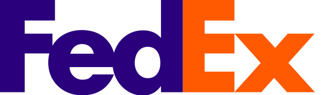
Experiments with white space will be another growing trend in 2016. More and more logos, like the FedEx logo, will forgo white space between the letters. The single letters will basically stick together. This creates a distinctive design and – if done well – will stick in mind.
3 – Calligraphy – Handwriting
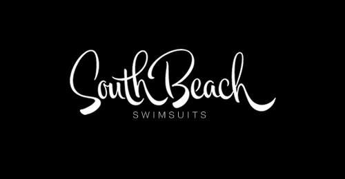
Logos that were created with a handwriting font are also trending. This style gives the viewer a fresh and appealing impression and conveys a brand identity that might or might not have existed for years already. South Beach Swimsuits is a good example here.
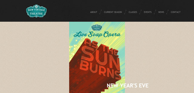
4 – Vintage
Logos in a retro design will be very popular in 2016. Logos that are made to look old look, just like handwritten logos, are very decorative and work great for bars, restaurants, music clubs, and other industries that convey rather nostalgic values.
![]()
5 – Shaded
Shaded logos also evoke nostalgic emotions and can be created in many different ways, ranging from modern to minimalistic. They work for companies that want to put across a particular style and want to be especially modern.
![]()
![]()
6 – Dramatic Typography
No matter if small or large, logos are always used to create an individual dramatic art. Many brands reduce their logos to the plain signature, but this concept can also work well with a supporting graphic.
![]()
![]()
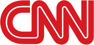
7 – Focus on Wordmarks
This year, designers will especially focus on the so-called wordmarks. The aim of wordmarks is to design the company’s name as minimalistic and unique as possible so that the brand instantly gains a high recall value. CNN can be a great example here, as the business has a really appealing wordmark logo.
The Following Infographic Stitches it All Together in a Handy Roundup
![]()
Infographic Source: ThinkDesign
(dpe)
 Logo Design According to Zeitgeist: Not Only the Times are Changing
 20 Awesome Logo Inspirations of Today
 Happy New Year and All the Best for 2016
 These Are Special Times: Win A Logo Design Bundle by LogoBee.com
 Enjoy Inspiration: Best Design Practices Daily
 Hosting, Polling, Logos: And The Winner Is…
