Win Over Your Audience Using Video Backgrounds
One of the biggest challenges a web designer faces is capturing and holding the attention of its audience. In a world with seemingly endless options, people are all too quick to move onto bigger and better, unless you can give them a compelling reason to stick around. Video, (when done right,) is an excellent way to pique the curiosity of your audience and keep them engaged.
Having just redesigned the website for my own web design studio, The Deep End, I opted to use video backgrounds for this very reason. It took a bit of trial and error, but once we figured out some of the technical difficulties, the end result is exactly what we were hoping for.
Benefits of Using Background Video
Online video isn’t exactly new, but it is still surprisingly under-utilized. I always try to talk my clients into using video on their sites for many reasons. Video can:
- Tell a story.
- Offer a “peek behind the curtain” of your business.
- Allow potential customers to connect with your business on a more personal level.
- Increase conversions.
All of these benefits can be derived from more traditional “messaging” videos, but background video can accomplish many of the same things. Essentially, these types of videos evoke a mood, and help to break down the barriers that exist when dealing with an online business. In other words, video makes a web-based business seem more real. That realness translates to trust, which leads to increased conversions.
This is great news for any website that is focused on conversions, (and they should all be!) But video backgrounds have a few other benefits as well, including:
- The ability to convey a complex idea visually.
- Grabbing your users’ attention.
- Video is looked at as very current, so your website will seem current as well.
Given all the benefits, why wouldn’t every website be taking advantage of the power of video? This brings us to:
The Drawbacks
While video backgrounds have serious potential to draw users in and keep them on your site, there are some things to consider:
- Page load speed: By now we know that users won’t stick around a page while waiting for it to load. You have about two to three seconds before you lose them, so you have to be very careful about the file size, particularly since you can’t control their internet speed.
- Potentially distracting: A properly executed video can enhance the user experience, while one that is too colorful, or with too much going on can distract users from what they are there to do.
- Not ideal for mobile: When your audience is on-the-go, you can’t expect them to have access to wifi, and we all know how wildly unpredictable mobile data speeds can be.
The good news is, there are some ways around these potential pitfalls.
Tips for Excellent Background Videos
Now that we understand why video backgrounds are beneficial, as well as what can go wrong, let’s take a look at what you can do to make the most of your site’s videos.
File Size / Length
We played around with this quite a bit for the header videos on The Deep End’s website. We started with a clip that ran about 30 seconds, with a file size of 28 MB. On desktop with a good internet connection, this was perfectly fine. But I wondered if it wasn’t too large for users who might have a slower connection speed.
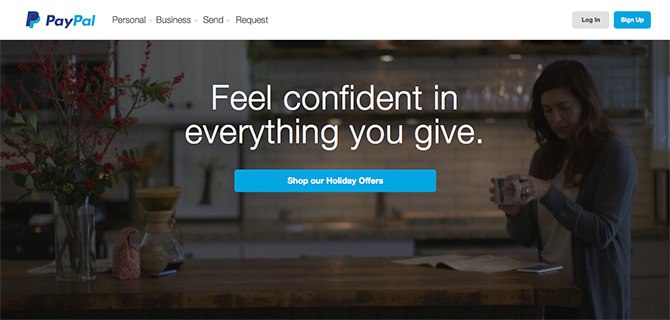
I ended up doing some research, and I used PayPal’s homepage video as a guide. (Being such a large company, I know they did their homework.) They are currently using a video that runs 10 seconds, which seems more reasonable. So we trimmed ours down to that length as well.

The next part of the equation is file size. The new shorter clip was around 8 MB, and some quick research turned up an online tool which compresses video called Clip Champ. Running it through their filter produced a new 2 MB file which loads extremely fast.
Hosting Options
At first, I was scared off by the idea of hosting the videos on my own server. I thought it would be a strain on load speeds, so we originally opted for them to be hosted on YouTube. This didn’t go so well.
First of all, there was a pretty serious lag while our site was calling up the video from YouTube. The other, more serious problem was that my developer was having problems covering YouTube’s user interface elements. So as the video played, the title displayed along the top for a few seconds, and after the video was finished, rather than looping, it stopped, and displayed other related videos. I think that given more time, we may have been able to come up with some kind of work-around, but it didn’t seem worth the trouble.
As small as our video files ended up being, we decided to host them locally, and it is working out absolutely fine.
Keep it Subtle
Video backgrounds work best when they offer a glimpse of what a website offers, or of the personality behind it. But be careful not to overdo it with crazy colors, movement and cuts.
It works best if you can use a somewhat muted, monochromatic color scheme. Sometimes it’s difficult to control, for instance if the workspace being filmed is colorful or cluttered. Luckily there is an easy fix you can apply in editing, or with CSS. Simply layer a semi-opaque mask on top of the video to make it a bit more subdued.

Alternatively, (or additionally,) you may use a subtle pattern overlay on top of the video. It can subdue the overall color palette, as well as mask any undesirable pixelation which may result from a compressed video.
During filming, make sure movement is controlled and minimal. Also, remember you’re not making a blockbuster summer hit; Jump cuts aren’t necessary, and can be distracting. Having said that, sometimes a single cut is okay, so the video ends up being composed of two shots. This can actually be helpful to disguise the video loop during playback.
Design for Multiple Devices
Since you never know how good or bad a mobile browser’s internet connection may be, I strongly suggest providing a still image for mobile browsing.
Final Thoughts
Using video on your website can be incredibly powerful. You can tell your story, create a mood, and build trust with your audience. It’s one of the most enduring web design trends for good reason. But as with any trend, the benefits are only as good as the execution.
By doing things right, and producing a high-quality video that strikes a subtle tone, you not only get the attention of your users, but you let them get a glimpse of what drives your business. And that connection, more than anything, is what will make the difference between a user and a customer.
Read More at Win Over Your Audience Using Video Backgrounds
