Archive

Archive for January, 2016

Designing A Product Page Layout with Flexbox

January 15th, 2016 No comments

The following is a guest post by Levin Mejia, a Designer Advocate at Shopify. Shopify uses flexbox in a new theme they developed and they wanted to share some of the techniques they used to do it here. To that I say: yes please.

Every day at Shopify I speak with Partners who are constantly pushing the boundaries of what’s possible in ecommerce design. Recently, I’ve noticed a number of designers are experimenting with Flexbox in their stores. As web designers and developers, one of our primary goals is to bring focus to content and make it easy for our visitors to navigate that content. To accomplish this goal, we need a functioning layout where technology gets out of the way and the content becomes the hero.

Flexbox can help us create flexible layouts that are optimized for the web and mobile devices. But are we using it? Many of us are still using floats and inline-block for layout. Of course, you know your audience best, so if you if you have a ton of users on, for example, IE 9 and down, and aren’t prepared to create an acceptable fallback experience, you might be stuck in float-land. But there is an awful lot of green (support) in flexbox-land these days.

I believe in the power of learning by doing. This article will take you through a recent release of a free Shopify theme called Venture and the steps to recreate the following product layout using Flexbox.

If you would like to follow up with the example in this post, check out the complete Pen.

In this tutorial article, I will demonstrate how to create a flexible and responsive product layout with Flexbox that will bring focus to products in unique ways depending on the viewport width. Also, we will do all of this in under 100 lines of CSS.

This is based on the “Venture” theme

Shopify’s Theme Design Team recently released a pretty sweet template for Shopify Merchants called Venture. The layout is optimized for the best shopping experience and provides clear focus on the products. While the layout was developed to accommodate several business cases, for this tutorial example we will focus on the core of the layout and recreate it with flexbox. In the following steps, we’ll learn how to center align elements, set perfect sticky footers, provide priority to certain products dependent on viewport and device, target flexbox elements with media queries, and learn the basics about Flexbox so you can start implementing flexbox layouts in your next web project.

If you would like to use the code sample from this post on a Shopify Store with real products, sign up as a Shopify Partner and set up a free development store. A development store provides you with access to all of the paid features of a Shopify store, so you can use it as a sandbox environment to experiment or work on a theme for a client.

The Header Layout

The first thing we want to do is set up our filter navigation which contains our heading and two filter elements (dropdowns) with labels.

Let’s start with setting up a flexbox container with its content:

<nav class="product-filter">

  <h1>Jackets</h1>

  <div class="sort">

    <div class="collection-sort">
      <label>Filter by:</label>
      <select>
        <option value="/">All Jackets</option>
      </select>
    </div>

    <div class="collection-sort">
      <label>Sort by:</label>
      <select>
        <option value="/">Featured</option>
      </select>
    </div>

  </div>

</nav>

Our .product-filter will be our flex container, so we can align the flex item child elements accordingly. We declare the flex container as follows:

.product-filter {
  display: flex;
}

Our

element is given a flex-grow value of 1 so that it both expands the flex container to full width and expands itself to full the remaining space (which right-aligns the sorting dropdowns).

.product-filter h1 {
  flex-grow: 1;
}

To horizontally align the child elements of our .sort container, we we’ll make it a flex container too. You can nest flex containers!

.sort {
  display: flex;
}

The sorting containers, being

s, will stack on top of each other by default:

By default, display: flex; will align child elements horizontally. We’ll use that on the sorting container to align the side-by-side. We’ll make each individual sorting container a flex container too (a third nested flex container!) and also use flex-direction: column; for the filters so they align vertically:

.collection-sort {
  display: flex;
  flex-direction: column;
}

In a few lines of CSS our heading and filters are designed the way we want. Now with our current knowledge of flexbox, we’ll work on our grid layout for our products.

The Products Layout

We’ll use the following HTML for our Flexbox Layout:

<section class="products">

  <div class="product-card">
    <div class="product-image">
      <img src="assets/img/coat-01.jpeg">
    </div>
    <div class="product-info">
      <h5>Winter Jacket</h5>
      <h6>$99.99</h6>
    </div>
  </div>

  <!-- more products -->

</section>

Like before, we need a flex container. In this scenario we will use .products as our flex container. We’re going to add two new properties which will allow the flex children to align horizontally and wrap into new rows as the viewport width expands and shrinks:

.products {
  display: flex;
  flex-wrap: wrap;
}

By default, display: flex; will lay out children horizontally starting to the left, but we’ve added flex-wrap: wrap; to wrap the children to a new row once there is not enough space to fit the elements on the same row depending on viewport width.

To start exerting control over the width for our flex items, we will add flex: 1; so that all of our flex items take equal space in the row. In our example we have 10 jacket products, and adding flex: 1; will place all products on one row.

For our design, we want 5 items per row and to wrap the rest to new rows as needed. To get five per row, they’ll need to have a width of 20% (5 * 20 = 100). Settings flex-basis: 20% would do the trick, but when we factor in padding, it exceeds 100% and we’ll only get 4 per row. With 2% padding on either side and 16% flex-basis, it’ll be just right.

.products {
  display: flex;
  flex-wrap: wrap;
}

.product-card {
  padding: 2%;
  flex-grow: 1;
  flex-basis: 16%;
}

We can also do this in shorthand as follows:

.product-card {
  flex: 1 16%;
}

Having flex-grow at 1 for the products will ensure that the row of products always fills the entire space.

To make sure the images within fit nicely:

.product-image img {
  max-width: 100%;
}

Bottom-Aligning the Product Footers

It can sometimes be tricky to set a fixed footer or set content to the bottom of a container. Flexbox can help us there as well. If you have been following along with the code bit by bit, you’ll see that the label for our jackets are not perfectly aligned underneath the jacket images.


A step ladder effect generated by the variable height of the jacket images.

This type of scenario is common: we can’t control the height or length of content, but would like to have another element perfectly set to the bottom of the container. Flexbox is already helping us keep the containers themselves of equal-height-per-row, but the images are still of variable height.

Popular methods to align the bottoms may require using absolute positioning or even JavaScript. Fortunately, with flexbox this complex task can be accomplished by simply adding the following CSS to our .product-info container:

.product-info {
  margin-top: auto;
}

That’s it! Flexbox is smart enough to then place the element to the bottom of the Flex container. With a couple of lines of styles we get the following result:


Nicely aligned bottoms.

Responsive Flexboxing

As we have less horizontal space to work with, we’d like to reduce the number of products per row. For example, if the max viewport is 920px, we would like the number of items per row to be limited to four which we can accomplish with the following:

@media (max-width: 920px) {
  .product-card {
    flex: 1 21%;
  }
}

(Remember it’s not 25% (100% / 4) because we have to compensate for the padding that I added earlier. We could avoid this with box-sizing: border-box, but that’s your call.)

The previous lines of CSS almost give us the desired result we want because we get four items per row. But, the last row has two large items.

Flexbox is smart enough to fill any available space, something that we don’t have to worry about with other layout methods. To improve the layout for this viewport, we would prefer to have larger images of the jackets at the top versus the bottom to better highlight the products.

One of the ways we can enlarge the first to instead of the last two is to select them and change their size directly:

/* Select the first two */
.products .product-card:first-child, 
.products .product-card:nth-child(2) {
  flex: 2 46%;
}

Now with our CSS applied we get a really great layout that is optimized for smaller viewports like iPads in Portrait mode.

For even smaller viewports we would prefer a two column layout for the jackets. We can accomplish this layout with the following media query:

@media (max-width: 600px) {
  .product-card {
    flex: 1 46%;
  }
}

If we now view our page on a smaller viewport like an iPhone 6, we will see that our filter nav bar is overlapping our heading.

This is happening because our .product-filter is set to contain all our flex items in a horizontal line, no matter how many items it contains (no wrapping). With the following code, we can easily change this with a media query so that our content is set vertically:

@media (max-width: 480px) {
  .product-filter {
    flex-direction: column;
  }
}

Our header and filters no longer overlap, but we can still improve the layout by floating the filters to the left. Previously, we floated the elements to the right with the align-self: flex-end; property. Now, we’ll want to add align-self: flex-start;

@media (max-width: 480px) {
  .product-filter {
    flex-direction: column;
  }
  .sort {
    align-self: flex-start;
  }
}

And just like that, we now have a flexible and responsive layout for our products.

Compatibility

The biggest pushback with flexbox is always browser support. But as we mentioned earlier in this article, support is pretty good these days. Older IE that doesn’t support flexbox isn’t even supported by Microsoft anymore.

Like every web project you work on, you should always perform thorough testing to make sure that your visitors’ experience is optimized and that your layout meets your project’s requirements.

Conclusion

In the above tutorial, we built a powerful responsive layout for displaying a set of products using flexbox. Unlike other CSS methods not intended for building layouts, flexbox is a powerful tool focused on this goal, and you should take advantage of it. Flexbox layouts can make our sites and apps more flexible and resilient.

There is lots to know about flexbox, so make sure to use The Complete Guide to Flexbox for reference.


Designing A Product Page Layout with Flexbox is a post from CSS-Tricks

Categories: Designing, Others Tags:

Microsoft’s Bing Has A New Logo

January 15th, 2016 No comments
bing-featured

The world’s second most popular search engine has a new logo. Yes, Microsoft recently unveiled a new logo for Bing.

The new logo has abandoned the erstwhile yellow and is now green in color. This is the second change in logo of Bing ever since its birth in 2009 — the first change came in 2013.

Bing currently holds roughly 21% of the search engine market share which, though an impressive number, is nowhere near Google’s 64% market share. As such, while Bing does have a lot to be happy about — such as the fact that all AOL searches are powered by Bing — it is still way behind Google in terms of market share and number of users.

bing-logo

Bing logo down the years, left to right

Internet search has been a crucial market, and with billions pouring in as revenue every year, both Bing and Google realize the importance of gaining new users. Last year, Google too introduced a new logo, and underwent certain significant changes, so it might just be possible that Bing follows suit this year.

Bing also powers Apple’s Siri, as well as Amazon’s Alexa, and is the default search engine on Microsoft Windows devices and smartphones.

What do think of the new Bing logo? Share your views in the comments below.

Read More at Microsoft’s Bing Has A New Logo

Categories: Designing, Others Tags:

Perfecting navigation for the mobile web

January 15th, 2016 No comments

As the number of mobile users continues to outpace the number of desktop users, it should go without saying that designers, now more than ever, have to design with a mobile-first mentality. With so many folks buying products or services, reading the news, and communicating with each other away from the confines of their desks, the design focus has to switch to the mobile user experience.

What’s the one, impactful way you can ensure a high-quality user experience for your users? Focus on mobile navigation. When users enjoy seamless navigation that makes whatever they’re looking for easy to find, their user experience takes a dramatic turn for the better. And when their user experience is top-notch, you can bet that your clients will enjoy more people visiting their sites, and significantly more conversions.

Great mobile navigation comes down to what you decide to include in the menu, and you don’t even need many elements to facilitate great experience! Remember that screen space always comes at a premium on mobile, so it’s wise to be choosy with what you include in the menu.

Search

Including a search feature with the very familiar affordance of the looking glass goes straight to the point of giving mobile users a way to find what they’re looking for…fast. On mobile screens, you’re not going to be able to cram in as many of your elements on the homepage, as you would on a desktop site. That’s why what would otherwise be obvious right from the start may not be so on mobile screens.

For anyone who can’t find what they’re looking for right from the moment they visit your site—whether that’s a particular news article, product page or contact info—it’s imperative that a search feature is available and easy to spot.

The best practice is to put the search feature right at the top of the screen, whether it’s a mobile website or a mobile app. With this placement, you can be assured that your users will easily find it and then use it.

Wikipedia’s mobile site features the search bar right in the top, main navigation of the screen where it can’t be missed, but LinkedIn’s mobile app features it at the bottom of the screen in its navigation menu, illustrating two different approaches to the same goal.

Home

Another menu-option design convention that survives the transition from desktop to mobile, the home icon is so familiar to anyone browsing a website on either mobile or desktop that it’d be absurd to exclude one. The home icon operates as a symbolic affordance, as the average user will easily know what to do and expect when they see the icon of a house in the menu.

The home icon is essential for mobile users because it gives them an efficient and direct overview of the most important content on your site. As such, it also grants them easy access to more content on your site, rather than having to solely rely on in-site links within a webpage or in a column next to an article.

It’s also a functional way for users to reorient themselves with what your site’s about since they can easily get distracted while browsing on their mobile devices. Anything from a phone call to an incoming text message to any of the seemingly unending badges and alerts for installed apps can interrupt them from continuing to absorb your site content.

When this occurs and after they’ve returned their attention, it’s convenient for them to just hit the home button to get more info from your site and determine if it’s still relevant to them.

Grocery chain Albertson’s mobile site is an ideal example of using this home icon in its hamburger menu. Even mobile apps like Twitter use the symbolic home icon in the navigation menu in the footer of the app.

The share icon

The share icon is another essential part of your mobile navigation menu that you simply can’t omit. This is a recommendation based on user data. Not only is social sharing instrumental to social proof and persuading people that your article, product or site is popular and so should be further read or bought, but it’s also a habit that many mobile users partake in.

It turns out that sharing content on mobile is even more popular than doing so on desktop! This makes sense when you look at it in the context of the broader reality that more people are using mobile, so more people will be sharing on mobile as well.

That’s exactly why your navigation menu should include the very unique share icon, as the CBC does in its mobile site.

After all, with so many users absorbing your mobile site’s content, it’s a pity not to take advantage of all that potential social-sharing power.

Relevant categories

If you’re an e-commerce store, sometimes, you can’t shorten your navigation menu too much, but that’s acceptable if you’re offering your mobile customers what they’re looking for: easy and direct access to different purchase categories.

Instead of having menu options that you’d typically expect on most mobile sites—like home, about us and contact us—online stores don’t really need to do much more than making it easy for shoppers to find precisely what they want to buy.

In the case of both JC Penney’s and EB Games’ mobile navigation, their respective hamburger menus open up to reveal a list of category choices, thus helping shoppers to get where they want to go on their mobile sites all the more efficiently.

Only a few choices for menu options

As designers, sometimes you’re tempted to do too much for your clients. This can sometimes manifest in your design as including too many choices in your navigation menu. When it comes to mobile, less is assuredly better each time. The last thing you want is for your mobile users to face a sort of choice paralysis as they navigate all the different options you’ve included.

This goes double for mobile, where people are already impatient, want instant gratification, and don’t have all day to find what they’re searching for on your client’s site. Remember that, if your website fails to give them what they want, there are literally hundreds of other mobile sites and apps in the same space as your client that can give them a better experience. Don’t send leads and site visitors to your client’s competitors due to poorly thought-out design!

Mobile is big, and it’s super-important now. Design with purpose and precision for the tasks your clients’ users want to accomplish. As you design with a mobile-first mentality going forward, keep in mind that putting minimalism into your design will work wonders. The fewer options in your navigation menu, the fewer distractions and elements that will paralyze your users. In turn, this will lead to a better user experience, as people are better able to find what they want more efficiently.

Featured image, mobile image via Shutterstock.

Learn Web Design and Start Your Freelance Business – only $19!

Source

Categories: Designing, Others Tags:

Web Development Reading List #120: Safari 9.1, Chakra Core Open Sourced, ES6 Object Shorthand Syntax

January 15th, 2016 No comments

What’s going on in the industry? What new techniques have emerged recently? What insights, tools, tips and tricks is the web design community talking about? Anselm Hannemann is collecting everything that popped up over the last week in his web development reading list so that you don’t miss out on anything. The result is a carefully curated list of articles and resources that are worth taking a closer look at. — Ed.

Can you make the switch to another data center within minutes?

One thing we should learn to embrace more this year is to enjoy the good things and focus more on the positive news than on the negative. I started to learn more ES6 this year and have scheduled 1 to 2 small learning modules of ES6 and 1 to 2 accessibility features I don’t know yet to study each week. Currently, this works out great.

The post Web Development Reading List #120: Safari 9.1, Chakra Core Open Sourced, ES6 Object Shorthand Syntax appeared first on Smashing Magazine.

Categories: Others Tags:

How to Setup Your First Website Within Minutes

January 15th, 2016 No comments

Since every major business nowadays is going online, it is only a smart choice to create an online presence for yourself as well. No matter what the nature of your work is — you might be an artist or a photographer, or maybe a writer, or a small local bakery, or, of course, a big agency with a long list of clients. Irrespective of your business or work, the internet is big enough to help you discover new audiences and reach a new set of customers. So, are you planning to setup a website? How do you get started? Do you have to build your website all by yourself? This post will help you setup your first or second or third or … website within minutes, and get started with an online presence for you or your business.

Setup Your First Website Within Minutes

Proper website setup requires a bit of work, but if done in the correct manner, you can accomplish all of this with ease. First up, before you can proceed any further, you need to register an identity and a home for your website.

Domain Names

Before going any further, you will need a domain name for your website. There are a lot of extensions to choose from, and you should pick the one that best suits you or your business. The most common and widely accepted ones are .com .net and .org, wherein .org is generally used by non-profits, and .com has become the standard domain name extension on the internet.

It might so happen that the domain name you want is already taken, especially if you need a .com extension. In such cases, you might opt for another extension, for instance:

  • .io is a good pick for technical websites, such as design blogs, computer news sites, etc.
  • .me is widely used for personal sites or online portfolios, etc.

You can also opt for a country-specific domain name extension if your business caters only or mostly to a particular country. For example, if you are a German language publication dealing with the Bundesliga, the German soccer league, you might be fine with a .de extension. Similarly, you can go for a .ca domain name if your primary audience resides in Canada, and so on.

A good domain name should, of course, be easy to remember, and easier to spell. Try to avoid words that confuse people in terms of spelling, and more importantly, try not to have a domain name that is too long. Once again, make it easy to recall, and easy to type.

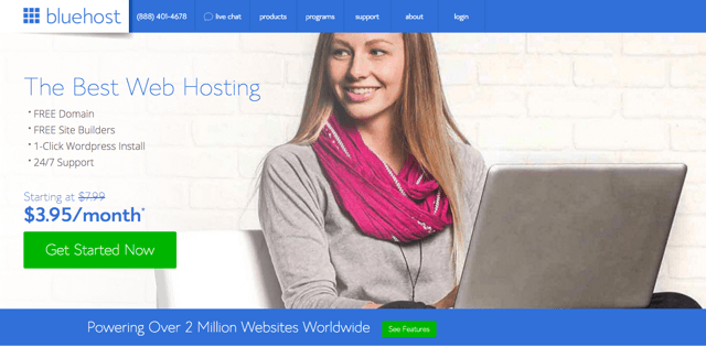
bluehost-main

Web Hosting

Now that you have figured out the domain name part, you need to purchase your web hosting.

Haven’t heard of web hosting? Well, in the simplest of words, much like you use a hard drive on your computer to store your files and data, web hosting provides you with space on an online server, wherein you can store the files and other data of your website. However, unlike your personal computer, web hosting means the server your account is on has a public folder, wherein whatever files you place, are publicly viewable by people on the internet, using the domain name of your given website.

When selecting a suitable web host, there are a lot many things that you should bear in mind. Relying on a great web host with an established reputation is definitely a good idea. Here are certain points to help you get started:

Go with a web host that has a proven record of uptime and excellent service. Your website needs solid uptime, and should be accessible at all times to your visitors.

Look for reviews of your host online, and more importantly, check with them about their pricing and terms of service.

Lastly, make sure you have a quick word with your potential web host, and also ask them about their support policy. Problems happen, and certain issues can never be avoided. However, what matters is that your web host seems to be able to provide you excellent support and help if and when such issues do arise.

You will need to figure out a web hosting plan for your website. Basically, it depends on the nature of the site you are running, and if you are just getting started, shared hosting plans will suffice.

Well, now you know about domain names and web hosting. But the big question is, where do you purchase it from? Allow us to help you. (By the way: We pointed out more important points about how to choose the right web host

(By the way: We pointed out more important points about how to choose the right web host in this article.)

Bluehost Landing Page

Web Hosting — Special Discount For Noupe’s Readers by BlueHost!

Looking for web hosting and a place to register your new domain name? Look no further. Noupe has partnered with BlueHost, pioneers in web hosting, to bring to its readers a deal that you won’t find elsewhere!

BlueHost has been in the business for decades, and if you are looking for web hosting, BlueHost is a name you can count on!

That said, meant only for Noupe’s readers, BlueHost are offering a whopping 42% discount. Yes, you read that right. You can get your hostimng package for just $3.49 per month.

Need more? We talked about domain names, didn’t we? Well, how about a free domain name? Yes, with the above deal, in addition to 42% discount on web hosting, you also get a shiny new domain name, free of cost.

Sounds too good to be true? Well, this is true. Head over to BlueHost, and get started with your new website.

What Next?

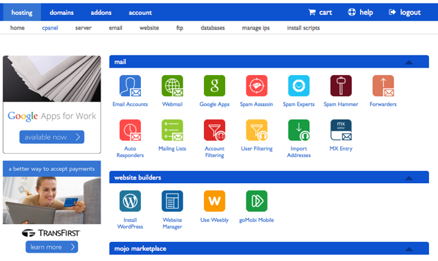
Once done with web hosting and domain name, how do you get started with your website? BlueHost makes administering your site a snap. They use one of the most popular admin interfaces for web hosts, namely cPanel.

6-cpanel

If you are planning to build an eCommerce store or a blog, WordPress will be sufficient for your needs. After all, it is the world’s largest Content Management System, and powers as much as 25% of the internet!

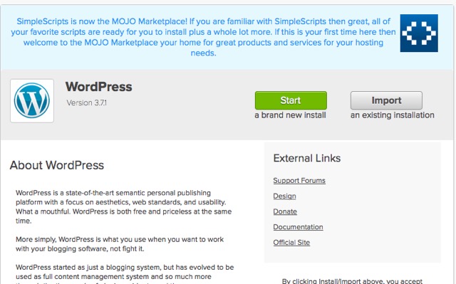
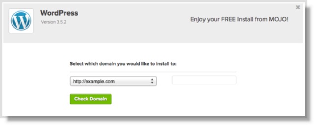
Once again, BlueHost can help you out here: they have an automated installer for WordPress, and you can get started with it shortly after you purchase your web hosting account.

7-WordPress8-Install WP10-Installation

After that, if you need themes and plugins to spice up your WordPress site, why not check out our WordPress section for awesome resources and handy advice? Head this way.

Conclusion

Setting up a new website can be a daunting task. However, with the right tools and services, it can be pretty easy to accomplish. By taking care of web hosting and domain names via BlueHost, you can easily save not only a lot of money but also get quality service and stay aloof from hosting-related headaches and issues.

Following that, you can get started with the setup and creation of your website, and have an online identity for your business.

What do you think of this deal by BlueHost? Got any questions related to website setup? Share them in the comments below!

(dpe)

Disclaimer: This article is sponsored by BlueHost.

Categories: Others Tags:

WordPress For Android Now Supports Fingerprint Scanner

January 14th, 2016 No comments
wordpress-app

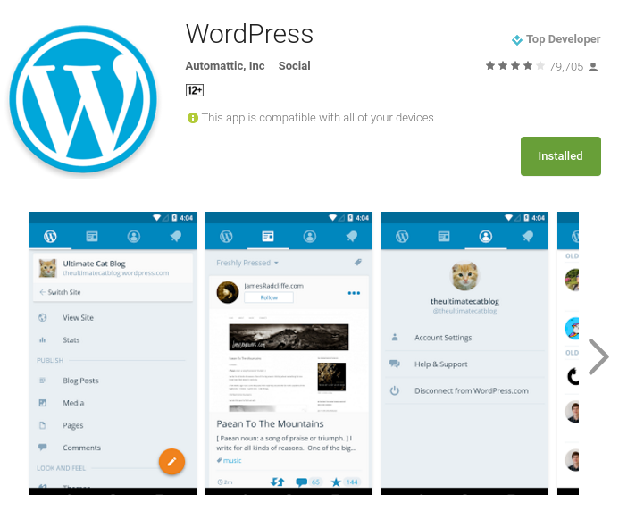
The latest version of the official WordPress app for Android devices is now available.

WordPress for Android 4.9 comes with many new features, the most noteworthy among them being the fingerprint scanner.

So far, the WordPress app offered a pin lock feature for users, that allowed you to lock the app and gain access only after entering the correct pin. This feature has been really crucial, simply because the WordPress app can access virtually all you connected websites, and in case of malicious usage, the results can be disastrous.

The fingerprint scanner is now an alternative to the pin lock feature, meant to serve as a more secure and much faster method of authentication.

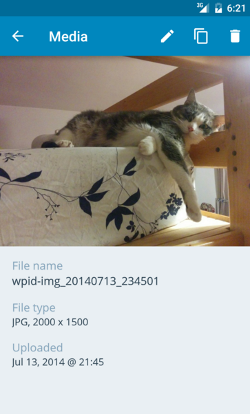
The Media Library in the app too has been revised, with a new layout and design, as well as support for handling multiple photo and video uploads. Other than that, WordPress for Android 4.9 also addresses several bugs and other updates.

wordpress-media-library

You can learn more about the latest version of the WordPress for Android app on the official blog post. Also, you can download the app from the Play Store.

Read More at WordPress For Android Now Supports Fingerprint Scanner

Categories: Designing, Others Tags:

Google Wants Developers to Inline Small CSS

January 14th, 2016 No comments
google-inline-css

It is no secret that Google loves fast websites, and considers page speed as a factor when deciding page rank.

While Google has a very detailed guide related to page speed and how to optimize your website, it has also recently added that small CSS should, preferably, be inlined.

What exactly is “inlining”? Ideally, if the external CSS resources are small, you should insert those directly into your HTML document, and this is known as inlined small CSS. This will, obviously, help with faster rendering of the page in the web browser and therefore, yield a better result in terms of PageSpeed Insights.

google-inline-css

However, a word of caution is advised for web developers who are looking to inline small CSS in their code. Larger CSS resources and stylesheets should preferably not be inlined. In other words, inlining should be reserved for just small CSS resources.

More importantly, you should also avoid inlining CSS attributes within HTML documents, simply because it might lead to code duplication.

To learn more about how to inline small CSS, check out the CSS optimization guide by Google.

What do you think of this practice? Share your views in the comments below.

Read More at Google Wants Developers to Inline Small CSS

Categories: Designing, Others Tags:

The best new portfolio sites, January 2016

January 14th, 2016 No comments

Hello all! And welcome to January’s portfolio roundup. There will be a lot to appreciate about each portfolio listed here, so why not grab a coffee and browse through some of the best new sites to showcase design work. You’ll find some of the most exciting designers working away in studios around the world, all of who have published or updated their portfolio in recent weeks.

If you’re launching a new, or updated portfolio this month and you’d like to be considered for our next roundup, email ezequiel@webdesignerdepot.com.

Andrea D. Labarile

This one is all in Italian, but don’t let that scare you off. Heck, the fact that it’s easily navigable in a language that I don’t speak is a testament to the usability of the site. It’s simple, stylish, memorable, and it has great UX.

I can’t ask for much more.

Umwelt

Things that look simple often aren’t. In Umwelt’s case, what looks like a simple, if stunning, series of images is actually subtle portfolio navigation. It is not, however, subtle enough to be confusing.

The vertically-centered text that changes based on which project you’re viewing was a fantastic touch, in my opinion. That animated text provides some of the guidance a user needs to navigate the desktop version of the site, and it looks great.

Colin Grist

There are quite a few superb examples of extreme minimalism, and just how pretty it can look on the web. Colin Grist’s portfolio should definitely be added to that list. Its rigidly grid-based layout, combined with lots of white space, lets the designer’s work do all the talking.

Maria De La Guardia

Maria De La Guardia’s site looks good, works good, a lot like most of the other sites on this list. What made it stand out is the way she mixes blog entries into the portfolio with her visual work.

And why shouldn’t she? If you’ve written something you’re proud of (and it’s design-related), maybe you should add it to your portfolio. After all, your portfolio is supposed to demonstrate what you know. There’s no reason not to do that with the written word, as well as imagery.

The Charles NYC

The Charles NYC features fantastic typography, a mostly monochromatic theme (their work provides the only color on any given page), smooth animation, and unmistakable style. This one is here just because it’s pretty to look at.

Still not a fan of pre-loaders, though.

Ostmodern

Ostmodern A lot of people have complained about how flat design always looks “the same”. One reason for that sentiment, I think, is the proliferation of common color schemes.

While Ostmodern’s design does use some of the desaturated tones we’ve come to know and love/hate, they’re mixed with the bolder, brighter colors of TV. Ostmodern does a lot of work for TV, so that fits, thematically speaking.

Swallows and Damsons

Swallows and Damsons is the portfolio of a floral arrangement company. I didn’t count, but I doubt there are thirty words in the whole UI and content put together. I don’t see this as a problem. What are you gonna say about flower arrangements? “Uhhh… they’re really, REALLY pretty, so please buy them?”

This is one place where letting photos do all the sales work is a great idea, and the designer’s made it work.

Studio Rodrigo

Studio Rodrigo’s site is one of those that adapts extremely well to large screen sizes as well as small. If you want to learn how to make relatively small amounts of text and information look good on an HD screen, look to these guys for an example.

Centered columns are so three years ago… apparently.

Molamil

Molamil is an interesting case, aesthetically. It combines “fancy” typography with illustrations and photography to create a design that feels both professional, and deeply personal.

It gives the sense that members of the agency are smart and social. Their work with the Generous Store and Pass It On would seem to support that idea.

James Tupper

I am always impressed by people who seem to put their personality into a page’s design. After seeing James Tupper’s personal portfolio, I feel like I have some small idea of what it would be like to work with him. And now I wish I had the money/a reason to do just that.

SFCD

SFCD is an agency that specializes in making apps. Instead of relying on a screenshot in a photo of an iPhone (they do have a few of those), they put a ton of effort into their site, and it shows. Take, for example, the smooth, fancy animations that don’t overly distract from the content, great typography, and great work.

Fable & Co.

Honestly, you should go check out Fable & Co. for the typography alone. Don’t get me wrong, the rest of the design is great too, but the way they designed that text makes me want to read it just because it’s pretty.

Richards Partners

Richards Partners is another great site for anyone who loves a full-screen layout. Get ready for a lot more of them in the future, because Flexbox is making that sort of thing a lot easier.

OrangeYouGlad

OrangeYouGlad is exactly as bright and colorful as the name might suggest. A lot of great illustration and digital painting is mixed into the design. Plus, the hamburger-based (the kind with buns, not three lines) layout for the portfolio section is kind of inspired.

Pat Kay

Pat Kay’s portfolio is a fantastic example of how screen-height page sections can be done. It’s sad that it makes the mistake of hijacking my scroll wheel, like so many other layouts of its kind, but other wise, it’s actually pretty great.

Atulesh Kumar

Atulesh Kumar has taken what would be an otherwise fairly standard layout, and made it look fantastic with careful attention to detail. It’s just plain nice to look at, and that is a quality that otherwise serviceable sites often lack.

R Style

Something about the aesthetics of this site remind me of the old days, in a good way. Like, this is what we were trying to accomplish with our Photoshop-sliced table layouts, but we didn’t know how, yet.

The site uses a variety of modern techniques, like background animation, and yet still retains a sort of old-school futurist feel with the typography, color choices, and that cut-out photo of the designer. It’s like an old website done right, inspiring an odd sense delight in me.

Bakken & Baeck

I suppose it’s official, Monospace fonts are back in fashion, at least to some degree. I’m not complaining. It’s a nice bit of variety. It still takes some work to pull it off without looking like you’re trying too hard, but that’s all just part of the challenge.

Bakken & Baeck manages quite well, using monospace fonts for all the text in their portfolio of startups. Yeah. A portfolio… of companies they built or helped to build.

My only complaint about this aesthetic is that sometimes it’s too minimal. I mean, there’s an input field on the page, but I had to read some in-page instructions to figure out where it was.

Fakepaper

Those lovely monochromatic, grid-centric designs from the early days of online minimalism haven’t gone anywhere. They’ve just gotten responsive. And prettier. Fakepaper uses this aesthetic beautifully, while keeping it usable. White backgrounds and black lines for everyone!

Carl Kleiner

Carl Kleiner, sadly, hides all of his navigation behind a button (like a few other sites on the list). What I like, though, is the approach he took with his portfolio. One image per section, and each image gets its own background color. Since a lot of portfolios don’t even demonstrate that much art direction, it makes this portfolio something of an anomaly.

Armand Biteau

Armand Biteau’s site is simple, modern, aesthetically pleasing. There is the small issue of the fact that, when you land on the home page, you might lose a second or two of time looking for his portfolio. Then you don’t feel so smart when you realize that you’re looking right at it.

Still, once you figure out the somewhat brok… ahem unconventional navigation of this site, there’s a lot about its construction to appreciate. It’s reminiscent of a sci-fi computer interface (or game interface) while still looking elegant, and performing well.

This Also

This Also can be slightly confusing at first, because they’ve put project names right in the main navigation. That’s the only adjustment to make. The rest of the site is pure, Google-inspired minimalism. I feel pretty secure in saying that they’re inspired by Google, because they’ve done a couple of projects for the tech giant.

We Are Fellows

We Are Fellows Takes the idea of putting their work on their home page rather seriously. They put it all there. With a lot of relatively small thumbnails.

I wouldn’t advocate this approach for everyone, but in their case, it makes a rather striking image. They’ve obviously done a lot of great work, and you can see any of it up close with a click.

LAST DAY: 195 Breathtaking Watercolor & Vintage Floral Elements – only $27!

Source

Categories: Designing, Others Tags:

Nobody Wants To Use Your Product

January 14th, 2016 No comments

Every morning, designers wake up to happily work on their products, be they digital or physical, with an inner belief that people will want to use their products and will have a blast doing so.

Nobody Wants To Use Your Product

Perhaps that is a slight generalization; however, as designers, we tend to have a natural desire for each project we work on to be the best it can be, to be innovative and, most importantly, to make a difference.

The post Nobody Wants To Use Your Product appeared first on Smashing Magazine.

Categories: Others Tags:

LightCMS: A Hosted Solution For Creating Websites

January 14th, 2016 No comments

There is no dearth of tools and Content Management Systems out there to help you build your websites. And speaking of Content Management Systems, web-based CMSs hold a particular place, only because they offer a set of features and services that are unique to their niche. In this post, we will be taking a look at one such web CMS: LightCMS.

LightCMS: A Hosted Solution For Creating Websites

What is LightCMS?

LightCMS is a Content Management Software that you can use to build websites in a simple and intuitive interface. It can be used to power any type of site, be it a blog, an eCommerce store, or an online portfolio.

However, just because LightCMS focuses on ease of use, it doesn’t mean it lacks in features or does not allow you to customize your design properly. Everything you build with LightCMS is fully responsive and mobile-friendly.

lightcms-main

But that is not all. LightCMS offers a full set of custom templates that you can choose and configure to suit your needs. And if that does not work for you, for advanced users, LightCMS also offers the ability to tweak the code in HTML, CSS or JavaScript, thereby allowing you to truly customize your website as per your requirements. For that purpose, LightCMS has an inbuilt code editor.

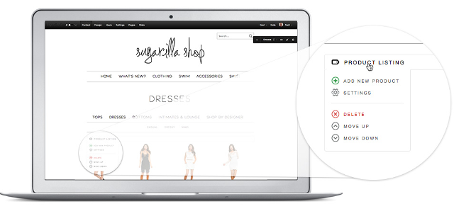
Regarding working, you can add content and elements to your pages within minutes using the point-and-click interface of LightCMS. It offers drag and drop, so you can edit directly on the front-end, and also preview your changes as you go along. LightCMS supports all that you might need to display on your site: images, media, blog posts, photo galleries, custom forms, and a lot more!

lightcms-store

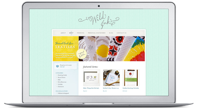
If you are looking to set up an eCommerce store, LightCMS has specialized tools and features to help you out. You can quickly add products to your eCommerce store, and sell any combination of physical or digital goods right from your store. LightCMS also offers a secure shopping cart and checkout workflow, in addition to handling payments and letting you communicate with your customers from within the CMS interface.

And before you ask, LightCMS comes with fantastic SEO features. It offers automated XML sitemaps, Open Graph metadata and tags, keyword-rich URLs, 301 redirects, robots.txt files as well as analytics and statistics for your website. You can integrate Google Analytics to help you assess the growth and performance of your site.

As LightCMS is a hosted CMS, it takes away the hassle and tension of web hosting from you. Your content is stored on secure and redundant cloud servers, with guaranteed uptime and scalable performance. You need not worry about any such thing as installation, upgrades or troubleshooting, as all of that is taken care of by LightCMS. Plus, irrespective of the amount of traffic you receive, you will not be charged extra, nor will your website be penalized if you get a sudden spike in traffic. So yes, you can relax and stay away from worries related to web hosting, and focus on the creation and management of your website.

lightcms-ecomm

Pricing

LightCMS offers two broad payment plans.

First up, you have the Personal Plan, which costs $19 per month. In this, you can create maximum ten pages on your website, or add 100 products to your store. Plus, you also get a storage of 1 GB.

There is also an Unlimited Plan that costs $25 per month. In this, there are no limits on the number of pages you can create or products you can add, and you also get unlimited storage.

Both the plans offer all the standard features such as galleries, blogs, form builders, calendars, etc. Also, you get SEO features, premium hosting, ability to use custom domains, and all the other offerings of LightCMS.

Note that if you are creating a blog, your blog posts will not count against the page limits.

Conclusion

LightCMS is a versatile tool that can be used to put together websites within minutes. While the trend of late is for self-hosted CMSs such as WordPress; hosted Content Management Systems have a market and target audience of their own, and this is where LightCMS fits in.

If, for example, you are looking to quickly get online, and setup your online store or website within minutes, without having to deal with the hassles of web hosting or website maintenance such as software updates and security issues, LightCMS is very easily your best bet for this purpose! It takes care of web hosting, software maintenance, and updates as well as all other tasks, and allows you to focus on the creation of your website.

On the other hand, what if you are a web developer? Is LightCMS meant for you? Should you not go for something that gives you absolute freedom, and can be run on your own server?

LightCMS has a particular plan meant exclusively for developers. You sign up for LightCMS and are given the ability to resell LightCMS to create websites for your clients. You can set up your own pricing model, and among other things, LightCMS grants you SFTP access to get going quickly. More importantly, you do not have to deal with annoying tasks such as upgrades, server issues, etc. All of that is taken care of by LightCMS.

As a developer, you can work with HTML and CSS in LightCMS, and even modify the source code if you have a custom design in mind. LightCMS also handles automated client billing for you, leaving you with more time to focus on actual web development.

As such, LightCMS is an ideal pick if you are looking for a hosted solution that does not cost a fortune, and at the same time, gives you ample features and tools to build websites without having to worry about upgrades and web hosting. More importantly, LightCMS does not lock you down to any proprietary code or language either — everything is in HTML or CSS, and you can play with the source code as well. So you have the freedom of doing things your way when working with LightCMS.

What do you think of LightCMS? Will you be giving it a spin anytime soon? Share your views in the comments below!

Links

Categories: Others Tags: