Archive

Archive for January, 2016

Matching site design to your target demographic

January 7th, 2016 No comments

When creating a website project, it’s always important to think about the end users of the site. Frequently it’s the case, however, that many designers focus too much on creating a site that will impress their clients, forgetting that it’s the audience who really matter.

What you need to do as a designer, is talk with your client and keep the focus on the intended audience and make sure the client is thinking the right way. You want to keep pushing the point that whatever features you are including in the design are features that are going to greatly improve the user experience and that the audience will love these features.

This is necessary because clients have an even greater tendency to forget the purpose of creating the website than designers do.

First identify the audience

Are they kids? Geeks? Geeky kids? Justin Bieber fans? Well you need to be thinking about that from the start. If you already have a clearly defined audience then you have a great starting point, otherwise you should revert to the time-tested method of creating personas and working out a target audience based on the personas you created. If you don’t know what I’m talking about, you need to hire a marketing consultant right now!

Tailor the interface to suit the primary audience

Now you’ve got the fundamental concept of who you’re designing for (remember, it’s not the client), the next step is to make UI decisions based on the definition of that audience. So for example, if we’re designing for young kids, then the decisions we’d make would be something like this:

  • Simple layout with no advanced navigation techniques, site search etc.
  • Large, rounded sans-serif fonts (consider cartoon styles).
  • More use of bold typeface than normal
  • Maximal use of images, particularly illustrations
  • Minimal text, lots of white space
  • More use of primary colors than normal
  • More animations than normal

If we’re designing for geeks, then the choices would be very different:

  • Complex layouts with sophisticated navigation system
  • More emphasis on text, using highly relevant images only to enhance the text
  • Use photo-realistic images whenever possible
  • Use charts, graphs, and tables for data presentation
  • Smaller fonts, consider serif when it’s important that text is highly readable
  • Minimal use of bright colors, avoidance of pure primary colors unless they’re relevant
  • Avoid animations unless essential

So you can see how designing for two very different audiences creates entirely different criteria. If you were designing a site for sports fans in their 20s, then you’d have quite different criteria again (more use of images, tendency towards bright non-primary colors, sans-serif fonts, big images and headings, more use of bullet points, etc).

Don’t let your clients sabotage themselves

Clients often destroy all the good work you do for them by making suggestions and recommendations based on what they like to see in a website. You need to remind them that the site is not for them, it’s for their audience. If you don’t, then you’re letting your client down, and more importantly you’re creating one more site that can’t go in your portfolio because it misses the mark.

Featured image, audience image via Shutterstock.

LAST DAY: Award-Winning Adriane Text Font Family – only $15!

Source

Categories: Designing, Others Tags:

Write Your Next Web App With Ember CLI

January 7th, 2016 No comments

When you start a fresh web project or start digging into an existing code base, chances are you’re trying to create or enhance a feature for your users. The last thing you want to do is spend time customizing build tools and creating infrastructure to develop your application. If you land a new client, you want to show them features today, not in a week after you’ve cobbled together a build pipeline.

Write Your Next Web App With Ember CLI

As you might already know, Ember is an “opinionated” JavaScript web framework focused on building ambitious, rich client web applications. Technologically, Ember has positioned itself as the antidote to hype fatigue. It’s a framework that just won’t die, but keeps pressing on with each innovation and with a commitment to backwards-compatibility.

The post Write Your Next Web App With Ember CLI appeared first on Smashing Magazine.

Categories: Others Tags:

Save $726 on this Incredible Font Bundle (Plus Freebies)

January 6th, 2016 No comments
image

Who wants a new amazingly refreshing and seriously reduced font bundle?

It’s a New Year and what better way to celebrate than by saving a ridiculous amount of money on some fabulous fonts. In fact there are 50 reasons to celebrate with 50 fantastic, well designed and elaborate fonts included for a fraction of the original price.

The New Year New Fonts Bundle is only available for a limit amount of time, and although FontBundles.net offer a range of different bundles at different times of the month, it would be wise to grab this bundle whilst there is still time as this is a complete bargain with $726 off.

Take a look at some of the beautiful fonts in included below

font design 1
font design 2
font design 3
font design 4
font design 5
font design 6

As well as this fantastic font bundle you can also grab yourself regular freebies by signing up to their website. It takes a minute to register and they offer a regular premium free font each week to their website visitors, which to me just makes it all the more worthwhile to have a look.

Right now you can also save an additional 10% with this exclusive discount voucher only available on Web Design Ledger. Enter discount code: WDL10 at the checkout to make this an even more amazing font bundle deal.

I’ll also let you into a little secret…..

If you are in the market for new fonts, add an additional bundle to your basket at the checkout to get an even bigger discount (but shush not everyone knows about this)

Don’t forget to take a quick look at their Facebook page also for the latest deals and competitions.

Read More at Save $726 on this Incredible Font Bundle (Plus Freebies)

Categories: Designing, Others Tags:

910 New Free WordPress Themes in 2015!

January 6th, 2016 No comments
wordpress-themes-2015

2015 was a good year for WordPress development, as we saw not just the first looks of REST API in WordPress, but also two major versions being released.

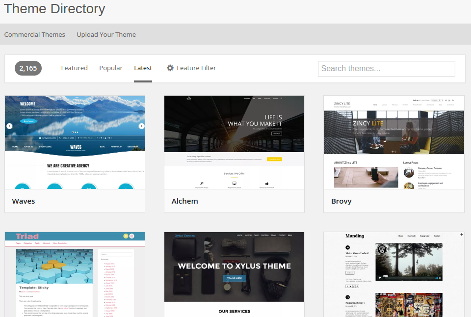
However, it was also a great year as far as WordPress themes are concerned: in 2015, the WP.org theme review team added and approved the inclusion of 910 themes to the WordPress theme repository.

Considering the voluminous number of WordPress themes that are submitted to the repository, 910 might seem like a smaller number to many people. However, add to it the fact that many theme developers submit WordPress themes with poor code or without following the coding standards, and 910 new WordPress themes within a year is definitely a milestone by all accounts.

wp-themes

In fact, there were discussions wherein theme makers complained that they had to wait for as long as 2-3 months for a theme to be approved. The process has since been accelerated, but the backlog still exists, as more and more new WordPress themes are submitted for inclusion in the official repository, and theme reviewers have a big task ahead.

There have been talks of automating the theme review process, and for the preliminary stage, it might just be that this year, we see automated approvals of theme updates. The code for automation is still not in place, so it might be a while before we see it working in full swing.

That said, 2015 surely was a good year for WordPress themes. To learn more about how it went as far as the official WordPress theme repository is concerned, check out the ticket here.

What do you think of the fact that 910 new themes were to the repository this year? Share your views in the comments below!

Read More at 910 New Free WordPress Themes in 2015!

Categories: Designing, Others Tags:

Swiss in CSS

January 6th, 2016 No comments

Swiss in CSS is a delightful project by Jon Yablonski that recreates posters made in the International Typographic Style, a visual design movement that began in the 1940s.

Open the examples in CodePen to take a look at how each of them work under the hood.

Direct Link to ArticlePermalink


Swiss in CSS is a post from CSS-Tricks

Categories: Designing, Others Tags:

mo.js: JavaScript Framework for Complex Animations

January 6th, 2016 No comments

The basics for demanding animations within the browser are set thanks to CSS3 and JavaScript. But the CSS characteristics and JavaScript methods only allow general movement. The framework mo.js, however, allows much more complex animations using unique but quick to set up easing features.

Easy Entry, but no Documentation Yet

As mo.js works without jQuery or other libraries, all you need to do is implement the framework’s JavaScript file. In the download package, there is a demo HTML document in which the JavaScript file as well as a „

“ element are set already. That means you can instantly start and take a look at all of mo.js’ options.

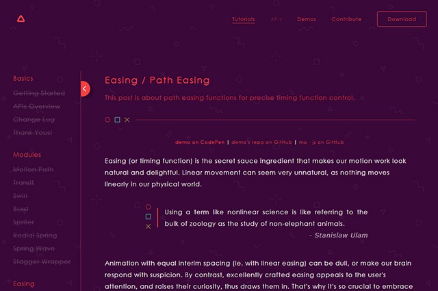
You can find several tutorials on the website, explaining what mo.js does and how to use it with the help of code examples and a demo. Unfortunately, there are only tutorials for the easing options so far. There are no tutorials available for the different modules and tweening features. A documentation is missing as well. But mo.js is already without that a fascinating animation tool for its unique way of creating complex easing features.

mojs_tutorials
Tutorial Page

Easy Syntax for Easy Animations

Using mo.js is very straightforward. You can create new animations and assign them to any desired element via „mojs.Tween()“. The amount of repeats and the duration of the animations will be set via parameters. An event handler allows you to control the actual animation.

new mojs.Tween({
  repeat: 2,
  duration: 3000,
  delay: 1000,
  onUpdate: function (progress) {
    document.getElementsByTagName("div")[0].style.transform = "translateY(" + 200 * progress + "px)";
 }
}).run();

In the example, a three-second animation that starts after one second and is repeated twice is created. Via „onUpdate()“, a feature that is responsible for the actual animation is accessed. The progress of the animation is handed over via „progress“. It’s a value that counts from 0 to 1 during the animation.

In the example, the value is used to calculate the animation. To do so, „progress“ is multiplied by the target value of the animation – 200 in the example. The „

“ element moves up by 200 pixels on the y-axis via „translateY()“.

Creating Easings with Paths

Several easing features for animations were entered using CSS3. In total, there are just five different, simple options available: „linear“, „ease“, „ease-in“, „ease-out“ and „ease-in-out“. „cubic-bezier()“ also allows you to create an individual easing with a bezier curve.

mojs_easing
Paths Lay the Groundwork for Easings

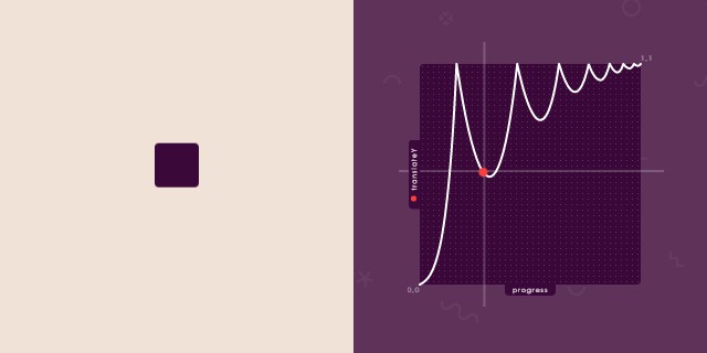
You can develop an entirely custom easing with many accelerations and brakes using mo.js as well. These are defined by a path based on the SVG element „“. For example, you draw a path in Illustrator and save it in the SVG format. The values of the paths marked in the „d“-attributes will be used as the base for your easing.

var bouncyEasing = mojs.easing.path("M0,100 C6.50461245,96.8525391 …");

In the example, an SVG path is handed over as an easing path using „mojs.easing.path()“; a feature that converts the easing of an element with the CSS attribute „transform“.

new mojs.Tween({
  onUpdate: function (progress) {
    var bounceProgress = bouncyEasing(progress);
    document.getElementsByTagName("div")[0].style.transform = "translateY(" + 200 * bounceProgress + "px)";
  }
}).run();

In this example, an „

“ element with a custom easing on the y-axis is animated thanks to „translateY()“. Instead of a linear movement, as seen in the first example, you can now integrate as many brakes and accelerations as you want. This way, you are also able to revert the movement’s direction with an accordingly drawn path. An animation made with classic CSS3 easing features only works in one direction.

With mo.js, you can not only move an element, but also change its shape. „scaleX()“ or „scaleY()“ can be used to make an element change its size while being animated.

Extensive Animation Options

Some examples on the mo.js website show the extensive animation options of mo.js. We can only hope that the documentation will be released soon and that more tutorials will be published. Currently, mo.js’ usability is restricted. If you want to, you can also get to know the framework on your own, using the examples.mojs_beispiel
Complex Animations Using mo.js

Although not all features are documented, mo.js is worth keeping an eye on. The framework is available for private and commercial use under the liberal MIT license.

(dpe)

Categories: Others Tags:

8 ways to optimize your site for mobile

January 6th, 2016 No comments

When the world shifted from desktop computers to mobile devices, designers became even more focused on UX. Although the user interface plays an important role in creating mobile-friendly designs, the user experience has now become equally important, especially since we now have more devices to focus on and user experience differs with the type of device.

UX is something that spans beyond the boundaries of graphics and aesthetics. Just like Rahul Varshney, the co-creator of foster.fm, says:

A UI without UX is like a painter slapping paint onto canvas without thought.

Rahul was right on with this analogy. You may have the most appealing, user-friendly, unique, and functional desktop version of your website, but if you’re not taking the mobile experience into consideration, you are just painting without any thought.

So, what separates a good mobile experience from a bad one? It’s not too difficult to separate the key components that make up a highly effective, optimized, and user-focused design. But here are a few best practices that should guide you along the way:

1) Don’t dismiss mobile-first

If your website is aimed at mobile UX, you might want to break the tradition by following the “mobile first” strategy. There is no harm in embracing this technique when you are positive that most of your users will access your website through a mobile device. Just as codemyviews suggests that mobile web design isn’t a niche, there are in fact, “1.2 billion mobile web users worldwide” and the number doesn’t seem to be dropping any time soon (it is likely to increase in the near future). This may be a bit challenging at first; but if you’re willing to put your user first, it’s worth a shot.

Just because you’ve aimed at designing a simple, clean, or mobile-focused website doesn’t mean it shouldn’t be sophisticated. Karimrashid.com is a perfect example of how simplicity and sophistication can be blended into creating a clean and responsive, yet classy design.

2) Create fluid layouts

There are simply far too many possible screen sizes out there to pick and choose which ones you’ll design for. You’ll need to create a layout that adapts as seamlessly as possible to all of them. Luckily, fluid layouts are here to save the day!

Based on percentages rather than definite measurements like pixels, fluid layouts have become the standard among web professionals. They can be tricky, but making sure that as many people as possible can actually use your site is well worth the effort.

3) Aim for functionality

What is functionality? It’s what you offer your visitors to get things done, and done fast. Based on the purpose of your website, all tools such as nearest store locations, product search, product reviews, or currency converters, should help users perform intended “functions” and achieve goals much faster.

Purina, a pet food provider, is a perfect example of how to make “functions” easier on a web page. The home page has a search box where you can search the thing that you’re looking for. Below are two separate columns for the kind of animal food they specialize in. The whole website is easy to navigate with column, buttons, tools, and design elements that make deciding on the best kind of pet food — and then buying — a breeze.

4) Identify your users

Don’t try to become a jack of all trades, because it may cost you a typical user, and no one wants that. First find out who your users are. Then figure out their typical web browsing behavior. Once that’s set aside, find out what makes them tick. Modern users are of two major types: those who are browsing without a goal in mind, and those who are looking to perform a task. Each of these groups would require different “functions” based on their needs.

It’s not difficult to guess the demographics of The Body Shop website’s users since it leaves hints all over the page. Since The Body Shop is highly focused on “natural ingredients” and social activism, the monochromatic green variations, a slider of natural ingredients, “green” choice of images, as well reports on fair trades, pledges, and other social events is an understandably well-developed design concept.

5) Always look up the developer’s libraries and guidelines

Based on the platform you will be using, it is essential to give the UI guidelines a close look. Some platforms allow more flexibility than others. Whichever the case, some key components of brand or “signatures” should remain.

An Apple app developer should have a look at iOS Human Interface Guidelines and follow Apple standards when it comes to designing basics, design strategies, UI elements, Icon/image design, etc. The Android developer, on the other hand, should learn all about the components, style, usability, and layout of typical Android applications with the help of the Android developers guide.

6) Make all content available to all users

Some designers, instead of making all their content work in fluid layouts, will simply opt to hide some of it from mobile users. Sometimes it’s because the layout is tricky, or they feel like there’s just too much content for a mobile layout. This is the wrong approach.

Giving users a “stripped-down” version of your site or app is not only unfair to mobile users, but can seriously backfire, and lose you customers. You might have to simplify the layout to the extreme, move some content to other screens to reduce clutter, or just try to organize it all better; but it needs to be there.

Compare the desktop version of the BBC site to the mobile version. While simpler than it used to be, it still puts all sorts of information all over the screen. The mobile version, by contrast, drops some of the images (which are still available in the articles themselves), but keeps all of the headlines, dramatically simplifying the experience on a phone-sized screen.

7) Design for touch

It is also useful to have in mind the fact that a mobile-device user will be using fingers instead of precision-friendly mouse pointers. Your design should be easy to navigate with fingers of all sizes and shapes, considering all mobile devices are now touch-screen. A user shouldn’t have to pinch too much or zoom in to tap on something or fill out a form or tap on a button. Inaccurate taps are also very common on small devices which should be accounted for in the design with large enough touch inputs or gestures to get the job done.

Here’s a touch table by Peter-Paul Koch that might help. Notice how touch events (and other actions) may vary depending on browser compatibility and device.

8) Use compression tools

The amount of tools available today for making a designer’s work less burdensome is unfathomable. You’ll find script compressors such as HTML compressor or Gzip compression that will automatically remove unnecessary comments, white space, or code. CSS minifier and CSS compressor and some more tools that will allow you to concatenate CSS code and improve performance. Image compression is also equally important; some that will reduce the size of your .jpeg and .png files while still keeping the quality intact include EWWW Image Optimizer, smush.it, optiPNG, and jpegtran.

Here’s an example of a highly responsive portfolio design by RyJohnson. The website is full of spectacular images no different from the desktop version. The secret to fast loading here is, without a doubt, image optimization.

1500+ Abstract Photos and Backgrounds only $19!

Source

Categories: Designing, Others Tags:

Upcoming Web Design Conferences (January–June 2016)

January 6th, 2016 No comments

2016 will introduce new conferences and be host to most of your favorite conferences from the past years. IoT will probably be as prominent as wearables. And the budding virtual reality topic may very well become a hot topic with the release of two major VR headsets in the last quarter of 2015 and the first of 2016.

JS Remote Conf

Conferences are about gathering information and knowledge, but also opportunities to get to know other like-minded folks in the web design community. Keep in mind that there’s always a benefit to attending any event, and a strong chance that you’ll be exposed to a large amount of new information, so be prepared to absorb the latest techniques brought to you by distinguished authors and speakers!

The post Upcoming Web Design Conferences (January–June 2016) appeared first on Smashing Magazine.

Categories: Others Tags:

The Vital Guide to Bootstrap Interviewing

January 5th, 2016 No comments
toptal-blog-image-1433928598741-5cf296404c94603bda14e0b5c8f87f3b.jpg

As with any technology, and especially with frameworks, there’s a difference between knowing Bootstrap and really knowing Bootstrap. As the framework gained more popularity, the population of developers that are using Bootstrap has grown significantly in the last few years. But true Bootstrap experts know more than simply how to create a webpage with default Bootstrap settings. They know hidden gems of the framework, they understand all the caveats, and they know how to work around limitations. The end result of a true expert is a website that nobody would ever expect to run Bootstrap underneath the hood. This article offers a sampling of questions that are focused on identifying those kinds of developers who understand Bootstrap in its core.

The Challenge

From a recruiting standpoint, the growth in Bootstrap popularity is both good and the bad news. While on one hand it makes Bootstrap developers easier to find, it also makes finding the jewels among them that much more elusive. Also, Bootstrap is a collection of HTML, CSS, and JavaScript tools; which means that finding a good Bootstrap developer often involves finding a good front-end developer that has a strong knowledge of HTML5 and its specification, understands responsive design, knows how to create desktop and mobile webpage variations, and is proficient in client-side scripting and JavaScript frameworks (including jQuery) to be able to use Bootstrap to its full power.

Toward that goal, this article offers a sampling of questions that are key to evaluating the breadth and depth of a candidate’s mastery of the Bootstrap framework. It is important to bear in mind that these sample questions are intended merely as a guide, as described in our post In Search of the Elite Few. Not every “A” candidate worth hiring will be able to properly answer them all, nor does answering them all guarantee an “A” candidate. At the end of the day, hiring remains as much of an art as it does a science.

Covering the Basics

Knowing the basics is important. I can’t stress this enough, read the documentation, play and experiment with provided samples, and get the basics right.

Q: Discuss the differences between available Bootstrap variations.

Bootstrap is available in two forms: as a precompiled version and as a source code version. Each one is appealing to different skill levels and a different use case.

The source code version comes with styles source code written in Less, with all the JavaScript and accompanying documentation. This allows more ambitious designers and developers to change and customize all the provided styles at their will, and to build their own version of Bootstrap. For developers not familiar with Less, there is an official Sass port of Bootstrap also available. The source code version requires a Node.js, Grunt for building and compiling, and a Sass or Less compiler depending on your preprocessors preferences.

The precompiled version on the other hand comes with compiled and minified CSS, JavaScript, and fonts. Neither documentation nor original source files are included, and since all the files are precompiled, no special setup is needed. You download an archive and you are ready to go.

Q: Explain how can you include precompiled Bootstrap files inside your existing project, and what you need to change if you break the initial folder structure.

As mentioned in previous question, since precompiled comes with all compiled and minified files, and no additional special setup is needed. Basically, it doesn’t matter much where you place provided Bootstrap files. You can easily place the files inside your existing folder structure. The only important thing to take care of is that the Glyphicons fonts folder is on the same level as the CSS folder. In case you want to move or rename font files, you need to update the CSS in one of three ways: * Change the @icon-font-path and/or @icon-font-name variables in the source Less files. * Utilize the relative URLs option provided by the Less compiler. * Change the url() paths in the compiled CSS.

Q: Describe which CSS reset rules are set, and how Bootstrap changes default browser’s ‘user agent’ stylesheet.

Every browser has its own default user agent style sheet that is applied to the HTML. To overcome the differences between the browsers, Bootstrap comes with normalize.css, an HTML5-ready alternative to CSS resets. Then are defined some default style settings; to name a few, global default font-size is set to 14px, line-height to 1.428, default font is changed to Helvetica with Arial and sans-serif fallback. All these styles are applied to the and all paragraphs, with the addition that

(paragraphs) receive a bottom margin of half their computed line-height of 10px. Besides these defaults, there are also customizable styles for standard HTML tags that bring more consistency to the text, such as highlighted text (), deleted text ( and ), underlined text (), small text (), and bold text (). Alignment classes help to arrange content on the page more easily by using .text-left, .text-center, .text-right, .text-justify and .text-nowrap classes. There are also predefined styles for block quotes, and unordered and ordered list with inline options, just to name a few.

Q: Describe what Bootstrap offers in terms of components and plugins, and how can they be used.

Bootstrap comes with a lot of UI components, HTML and CSS design templates, and JavaScript plugins. Some of them are: Typography, Tables, Forms, Buttons, Glyphicons, Dropdowns, Buttons and Input Groups, Navigation, Pagination, Labels and Badges, Alerts, Progress Bars, Modals, Tabs, Accordions, Carousels, and more. Templates are made available as well-factored CSS classes that can be applied to HTML elements to achieve different effects. CSS classes have semantic names (descriptive names that have a meaning), like .success, .warning, and .info, so these components are reusable and extensible and they aren’t specific about implementation details. Plugins are JavaScript extensions, and they rely on the jQuery dependency.

Q: Explain in which ways Bootstrap can be extended and adapted to a specific project’s needs.

All the default Bootstrap styles that are bundled initially can be changed and overridden by using custom styles. You can overwrite in your own stylesheet default bootstrap colors, styles, margins, paddings, everything, and most importantly there is no need to touch the bootstrap.css stylesheet at all. Ever.

In case of source code version, creating your own versions of LESS or SASS stylesheets can do it. In case of precompiled version, you can create your own CSS file and overwrite whichever style you want from the original bootstrap.css stylesheet. Create your new CSS selector, use it in the HTML, and as long you declare your CSS classes after Bootstrap styles your definitions will overwrite Bootstrap defaults.

If you aren’t using any of Bootstrap’s interactive features, you can omit bootstrap.js and jQuery.js files from the HTML source. There is also an option to customize Bootstrap’s components, Less variables, and jQuery plugins to get your very own version, which will result in a much smaller file size and will include only components that are actually used on the webpage.

Responsiveness

Today, having a webpage with desktop version only is intolerable. When choosing the right developer, you need to be sure that the candidate understands what a responsive design is, how it can be achieved, and how Bootstrap can help and ease development.

Q: What is Bootstrap’s mobile first approach?

In Bootstrap 2 there was a separated stylesheet with mobile friendly styles for key aspects of the framework. With version 3, Bootstrap introduced a mobile-first design philosophy, which resulted in Bootstrap being responsive by design. This way Bootstrap easily and efficiently scales with a single code base from phones to tablets to desktops. Mobile first styles can be found throughout the entire framework, instead of in one separate file, and now the default styles are for small devices, with media queries added after for larger screens:

/* Extra small devices (phones, less than 768px) */
/* No media query since this is the default in Bootstrap */

/* Small devices (tablets, 768px and up) */
@media (min-width: @screen-sm-min) { ... }

/* Medium devices (desktops, 992px and up) */
@media (min-width: @screen-md-min) { ... }

/* Large devices (large desktops, 1200px and up) */
@media (min-width: @screen-lg-min) { ... }

To be sure that we will get proper rendering on all devices, and especially that the touch zooming will work, we need to add the viewport meta tag to :

<span class="hljs-tag"><<span class="hljs-title">meta</span> <span class="hljs-attribute">name</span>=<span class="hljs-value">'viewport'</span> <span class="hljs-attribute">content</span>=<span class="hljs-value">'width=device-width, initial-scale=1'</span>></span>

Q: Explain how responsiveness is achieved and which rules should be followed.

The responsiveness in Bootstrap is achieved using a fluid grid system that can be applied to appropriately scale up to 12 columns, according to the size of the device or viewport. Grids provide structure to the layout, defining the horizontal and vertical guidelines for arranging content and enforcing margins.

To use the Bootstrap grid system, a few rules need to be followed. Grid column elements need to be placed inside row elements, which create horizontal groups of columns. You can have as many rows as you want on the page, but columns must be immediate children of rows. In a full row, the column widths will be any combination that adds up to 12, but it is not mandatory to use all 12 available columns. Rows need to be placed either in a fixed-width layout wrapper, which has a .container class and a width of 1170px, or in full-width layout wrapper, which has a .container-fluid class, and enables the responsive behavior in that row. The Bootstrap grid system has four tiers of classes: xs for phones (<768px), sm for tablets (?768px), md for desktops (?992px), and lg for larger desktops (?1200px). These basically define the sizes at which the columns will collapse or spread horizontally. The class tiers can be used in any combination to get dynamic and flexible layouts.

Q: Explain how a large table can best be shown on mobile devices.

Dealing with large datasets that are in a table with many columns on large screens is a no brainer. Using a standard Bootstrap .table class on large screens will render a nice looking table, but on a small device cell text will break and wrap into the next line, possibly into many new lines and stretching the table vertically. Not to mention that a table this way is unreadable and shown data is unusable. The solution is to wrap a .tablein the .table-responsive parent element, which will result in a table on phones (or any devices with less than 768px) will have full width with the possibility to scroll horizontally.

I know JavaScript too!

As mentioned before, Bootstrap ships with plugins that are in its core JavaScript extensions. This means that the candidate must be proficient in client-side scripting and JavaScript frameworks also, namely jQuery. We will focus here more on the JavaScript caveats related to Bootstrap, and will not test candidates’ knowledge of jQuery.

Q: Discuss possible ways to use Bootstrap Plugin dependency JavaScript files that are needed for plugins to work properly.

First and most importantly, all plugins depend on jQuery, and jQuery must be included before the plugin files. At the moment, Bootstrap v3.3.4 requires jQuery v1.9.1 or later. Second, you need to include either individual Plugin JavaScript files (that can be found in the source code version of the Bootstrap), or all together in one file (using bootstrap.js or the minified bootstrap.min.js). Both bootstrap.js and bootstrap.min.jscontain all plugins in a single file, and it is needed to include only one of them, preferably for production minified one.

If you decide that you want to include only specific JavaScript files for a dedicated plugin, it is important to keep in mind that some plugins and even some CSS components depend on other plugins. If you include plugins individually, you need to make sure to check for these dependencies in the documentation, and include all needed JavaScript files.

Q: Discuss possible ways to use Bootstrap plugins without JavaScript, and related caveats.

All Bootstrap plugins can be used purely through the markup API without writing a single line of JavaScript. This is Bootstrap’s first-class API, and it is the recommended way of using a plugin. For example, you can activate a modal dialog without writing any JavaScript just by setting data-toggle='modal' on a controller element like a button or anchor, and pass additional parameters using data-attributes. In the code below, we are targeting HTML code with the ID #modalID. We have specified that the modal won’t close when user clicks outside the modal by using the data-backdrop option, and we have disabled escape key event that close a modal with data-keyboard option. All in one HTML line of code:

<span class="hljs-tag"><<span class="hljs-title">button</span> <span class="hljs-attribute">type</span>=<span class="hljs-value">'button'</span> <span class="hljs-attribute">data-toggle</span>=<span class="hljs-value">'modal'</span> <span class="hljs-attribute">data-target</span>=<span class="hljs-value">'#modalID'</span> <span class="hljs-attribute">data-backdrop</span>=<span class="hljs-value">'static'</span> <span class="hljs-attribute">data-keyboard</span>=<span class="hljs-value">'false'</span>></span>Launch modal with ID #modalID<span class="hljs-tag"></<span class="hljs-title">button</span>></span>

There are few caveats that we need to be aware of. First is that there can be only one plugin per element when data attributes are used. This means that, for example, a button cannot in the same time have a tooltip and toggle a modal, a wrapping element must be used that will take on the functionality. And second, Bootstrap’s Tooltip and Popover plugins are not CSS-only like other plugins are. For performance reasons, they are opt-in, and to use them they must be initialized first using JavaScript with the following example code:

$(<span class="hljs-function"><span class="hljs-keyword">function</span> <span class="hljs-params">()</span> {</span>
  $(<span class="hljs-string">'[data-toggle='</span>tooltip<span class="hljs-string">']'</span>).tooltip();
  $(<span class="hljs-string">'[data-toggle='</span>popover<span class="hljs-string">']'</span>).popover();
}); 

Wrap Up

The end result of a true expert is a website that nobody would ever expect that is run with Bootstrap

Bootstrap looks very simple and easy to use, and many developers are rushing into the framework claiming that they are excellent Bootstrap developers. This article referenced topics that every Bootstrap developer should master and provided questions that offer an effective basis for identifying those who possess a sound and principled foundation in the Bootstrap framework, from basics to responsiveness, and working with JavaScript. Finding a web developer can be relatively easy, but finding an excellent Bootstrap developer is a formidable challenge. Just make sure to cover these topics when you are looking for a great Bootstrap developer, and you will be one step closer to identifying the best of the best.

Read More at The Vital Guide to Bootstrap Interviewing

Categories: Designing, Others Tags:

Consider User Experience in Your Website Redesign

January 5th, 2016 No comments
User-Experience

There’s been an interesting shift in website design and online marketing over the last few years. Specifically, website design is moving from content-heavy keyword stuffed sites to visual, simple, user-focused experiences.

Consumers are in the driver’s seat because they have more choices than ever before. They’re visiting sites that are easy to navigate and buying from businesses that give them the kind of user experience they expect and, in some cases, demand.

According to McKinsey Research, 70% of buying experiences are based on how the customer feels they are being treated. If you’re redesigning your website, make sure you’re measuring the user experience by considering user experience goals, elements of the website, and mobile friendliness.

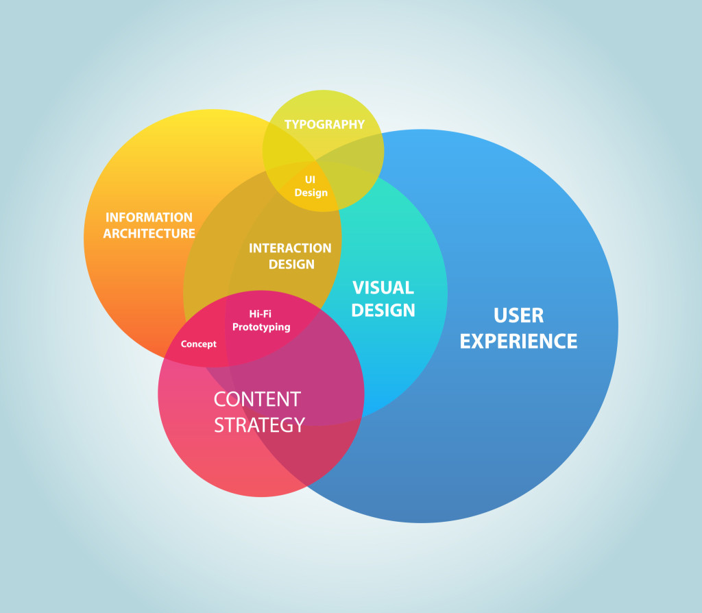
user experience venn diagram

Consider User Experience Goals

What’s the purpose of your website? For many businesses, a website is a platform that legitimizes the business, builds trust and authority. There’s no need to go into great detail about your product or service as long as the visitor understands what you’re selling and how they can connect with you to learn more.

  • Actions: Calls to action like subscribe to our newsletter, call us, follow us on social media and schedule an appointment need to be visible on every page of the website.
  • Social media: Links to social media should drive to a site that you’re frequently updating with valuable information. Never drive traffic to a social media site that you don’t update. You’ll lose credibility and customers will wonder if you’re still in business.
  • Contact: Forget the contact us page. It’s no longer part of the user experience. Consumers want answers immediately. Provide a mechanism for support like a phone number, email address or chat messaging functionality.

Where to Spend Time on Design

All too often we see clients spending too much time and effort on the design of the home page. The reality is that most visitors won’t enter your site through the homepage. It’s likely that your marketing and social media campaigns will lead them to your blog or specific landing pages on your site. Review website analytics to find out how people enter your website and focus on those pages during the website redesign. It is also important to track page Bounce Rate, Avg. Session Duration, and Pages per Session. A good goal is to reduce Bounce Rate, increase Average Sessions Duration and increase Pages per Session.
Fyresite Website Analytics

Importance of Mobile Design

Google recently released the mobile-friendly update. If your site isn’t mobile-friendly, you’ll need to make sure it is after the redesign. Sites that aren’t mobile-friendly appear lower in search engine results compared to their mobile-friendly counterparts.

More importantly, having a mobile-friendly website is important to user experience. At least one-quarter of web searches are performed on mobile devices. This number continues to grow year over year. If your target audience is younger (18-34 years old), they are likely using a mobile device.

User experience is key to convert visitors into customers. As you review your website, make sure you’re considering the user experience in addition to other elements of design. If you are in the market for a website redesign, make sure you hire professionals that understand the effects of user experience on the success of your website. If you need help or guidance, contact the team at Fyresite to find out how you can improve your website UX.

Read More at Consider User Experience in Your Website Redesign

Categories: Designing, Others Tags: