Archive

Archive for January, 2016

“You’ll be surprised how much you will do in a day if you sit and do it.”

January 5th, 2016 No comments

There is a documentary that I love love love called Home Movie. It follows five super weird homes and the (super weird) people that live in them. They are all interesting, but I especially enjoyed Bill Tregle, this southern “alligator rancher” living on a houseboat in Louisiana.

Some scenes make him seem like a kinda modern folksy cajun philosopher with quotes like:

I’m figuring on living to be about 150. When I was a young kid I can remember seem like people only lived to be about 60 or 70. 80 was old. Today you got people living over 100. So by the time I get close to 100 people will be living to 150 I figure.

and

Houseboat no deck like pancakes no syrup.

Another of my favorites from the film is the title of this post, from Bill’s dad:

You’ll be surprised how much you will do in a day if you sit and do it.

It’s a little hard to find copies of this movie (or to stream it), so I’ve attempted to rip a little chunk of it myself. This is the bit that has that quote:

It stuck with me because of how commonly I find people ask about productivity advice. “How do they do it all?” people unceasingly want to know. The answer is never satisfying. Nobody actually has any magic tricks. Nobody slows down time. They do work and work gets done, whether it’s marinating alligator heads or building websites. You’ll be surprised how much you will do in a day if you sit and do it.


“You’ll be surprised how much you will do in a day if you sit and do it.” is a post from CSS-Tricks

Categories: Designing, Others Tags:

Two Fresh Solutions for Code Display in WordPress

January 5th, 2016 No comments
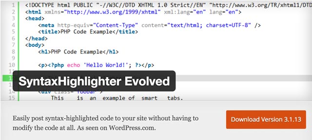
SyntaxHighlighter-Evolved

When you’re running a WordPress blog that deals with the development of software, web design or WordPress, you’ve probably felt the need to integrate code snippets into your articles. But, WordPress doesn’t come with an option to display code correctly. For safety purposes, the content management system filters source code that is implemented into articles and widgets. Every entered code needs to be masked with HTML entities. That’s inconvenient and unpleasant, which is why today we’ll show you two good solutions for code display in WordPress.

Code Display No. 1: The SyntaxHighlighter Evolved Plugin

SyntaxHighlighter Evolved is one of the best plugins when it comes to displaying code in WordPress. It’s very easy to use and offers code highlighting for many different programming and markup languages. The result in the article looks professional, and the plugin loads the code relatively fast.

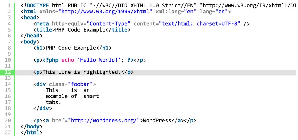
SyntaxHighlighter-Evolved-Beispiel

As shown, single code lines can be highlighted as well. The plugin is used via shortcodes.

Examples:

Enter the following shortcodes into the WordPress editor and the plugin automatically turns the code into an appealing layout.

PHP:

Beispiel 1 - PHP

PHP Darstellung

CSS:

Beispiel 2: CSS

CSS Darstellung

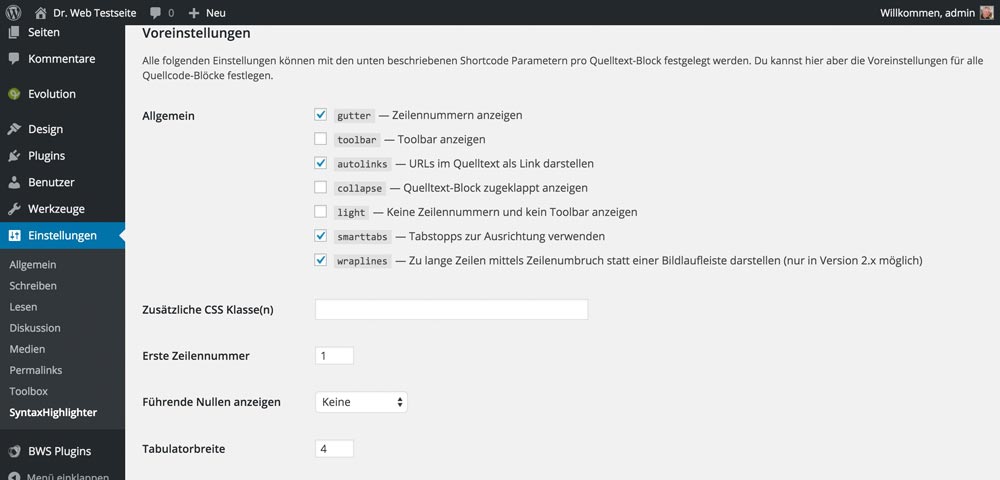
An extract of the variety of settings of this plugin:

SyntaxHighlighter-Einstellungen

Advantages and Disadvantages

The display of code on the website can be altered by using pre-defined themes, which is a nice toy. It’s not really necessary, however. The advantages of the plugin are the excellent visual presentation of the code blocks and also the fact that the required CSS and JavaScript files are only loaded into the document when there actually is a code snippet in the article. When there’s no snippet, the data will not be loaded, which is beneficial to the website’s performance.

However, there’s the disadvantage that the plugin only shows code, but doesn’t let you manage it. This is very inconvenient for developers that often work with many code snippets.

Code Display No. 2: Integrate Gists from GitHub

Github’s Gists are very popular, as you can outsource all of your code snippets and collect them in one place. This way, you always have access to the code fragments, and you can also share them with other developers. The code display is appealing and depends on the used programming or markup language. So what could be more obvious then implementing the Gists into WordPress? But just that doesn’t work as smoothly as you’d want it to. A plugin is needed for this as well.

A GitHub Account is not Necessary, But it Makes Sense

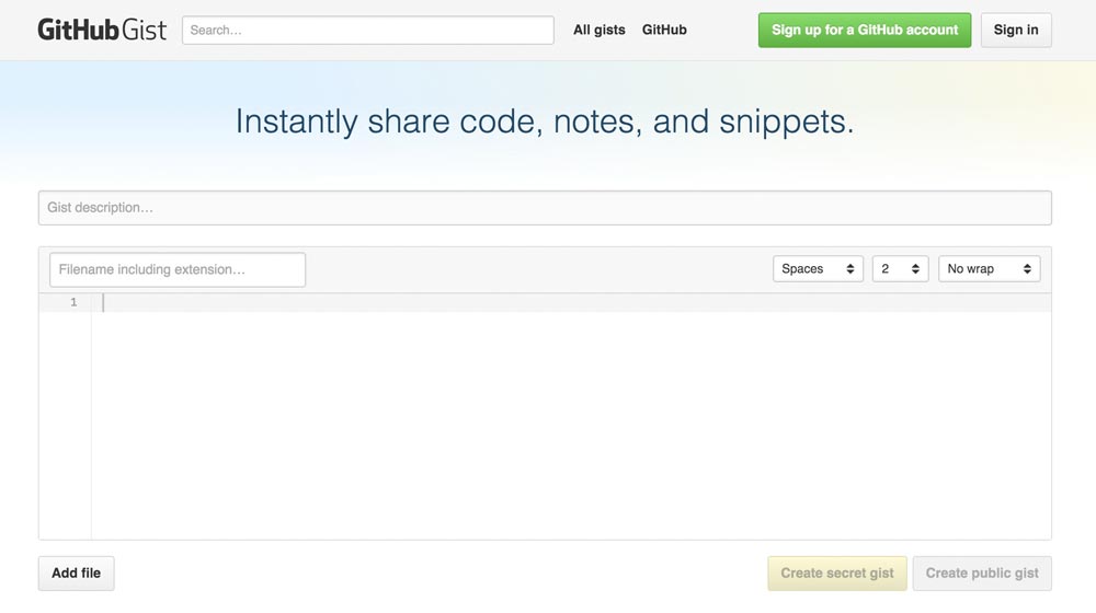
GitHub Gist

A GitHub account is not needed to create Gists and to use them in WordPress articles. You can also create Gists anonymously. But that doesn’t make sense, as the big advantage that GitHub has, being the central management for all snippets, would be gone then. The creation of an account, to benefit from all the advantages, is free.

Creating an Anonymous Gist | Creating a GitHub Account

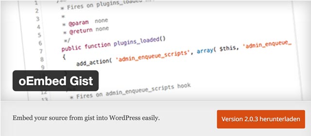
The oEmbed Gist Plugin

oEmbedGist

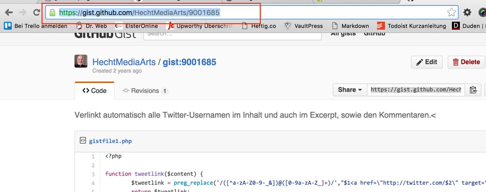
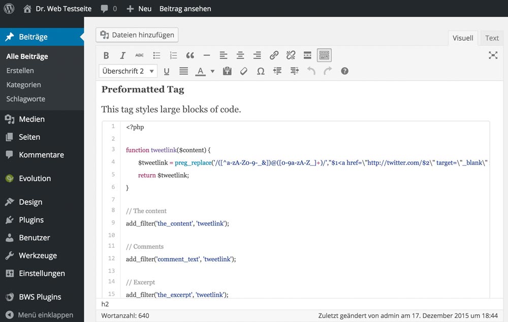
This small plugin is responsible for an easy embedding of Gists into WordPress articles. Once activated, the operation is very simple: copy the link to the Gist and paste it into the editor. Done!

Copying the Link to the Gist

link-zum-gist-kopieren

Pasting the Link into the Visual WordPress Editor

Den Link zum Gist in den Editor einfügen

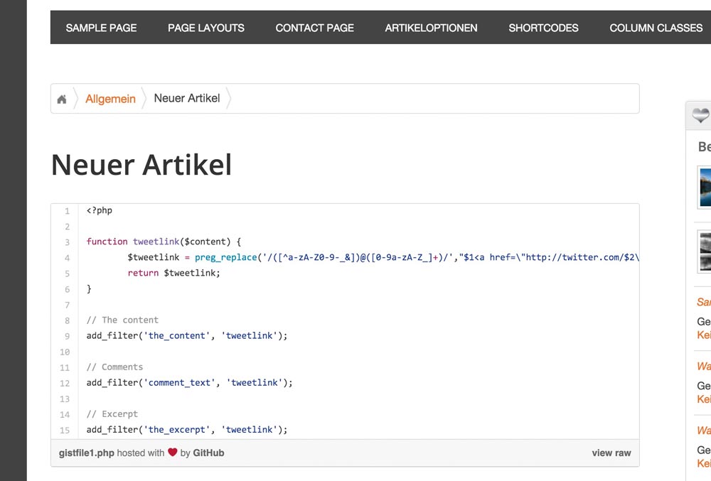
The Final Result on the Website

Die Darstellung auf der Website

  • Developer: Takayuki Miyauchi
  • Work in progress: Yes
  • Latest Version From: 11.17.2015
  • Costs: free on WordPress.org
  • License: GNU GENERAL PUBLIC LICENSE
  • Incompatibilities to Other Plugins: not yet heard of
  • Developer Homepage: Not available
  • Download on WordPress.org

Advantages and Disadvantages

In my opinion there are no drawbacks, as the files used to display the snippets are only integrated when needed; just like the above plugin does. The big advantage is the central management of all your code snippets once you created a GitHub account. All code blocks sitting in one place allow you to quickly share files with others. Not only does a free account allow you to manage your code snippets, but also entire projects to which you can invite other developers and co-workers.

Conclusion

We’ve presented two fresh and functional solutions for the integration of code into blog posts. SyntaxHighlighter is definitely good when you don’t want to display a lot of code blocks or need no management for them. When working with many snippets, however, you should set up a free GitHub account and choose the solution using the embedded Gists. There’s a reason all popular WordPress developers have a GitHub account.

Looking for more recent plugins? Look here…

(dpe)

Categories: Others Tags:

Applying application design to websites

January 5th, 2016 No comments

Generally speaking, application design and web design are very different things. The key difference is that typically applications are designed to do something, while websites merely show something. In recent times, however, the line between websites and applications has become increasingly blurred and there’s a lot of overlap, with many websites behaving like applications or even incorporating entire application suites into their interfaces.

For traditional website designers with no prior experience in application design, this can be confusing and may lead to highly questionable results in the end product. It’s important to understand that when I talk about application design, I’m not talking about “apps”. Apps are generally single-purpose interfaces that let phones do things that phones are not normally supposed to do. They’re a class of application, but they can’t really be considered true applications which is why they’re called just “apps”.

In the notes that follow, I’ll talk about how designing website applications is different from designing ordinary information websites, and how you can handle the cross-over and create workable hybrid pages that incorporate application elements properly.

True responsive design won’t usually work well for applications

Traditional software applications work in finite screen-space (scrolling is not normal, and you can’t usually span multiple screen lengths as you can with web pages). The application interface itself may incorporate scrolling, but it requires its own dedicated fixed space.

This means if you use responsive design, you need to think extremely carefully about how your application elements are going to fit in the space provided, and in most cases responsive designs are not going to work very well. You may need to go old-school and create separate versions of the site designed to be viewed on different platforms, or even exclude the application elements from being shown on mobile devices.

Design inline help that can be displayed without leaving the application interface

Testing is important for any website or application, but when it comes to web applications, the workload for testing increases dramatically, because you have so many more ways for your application to not work correctly under different circumstances.

Whereas with traditional applications you have the luxury of a user manual that users can consult when there’s a problem, web applications usually have to provide all the help as part of the site (and normally do a poor job of it!). Try to use tool-tips, pop-ups, modals, and if you must branch out to external pages for help info, at least use the target=”_blank” method.

Use strong error handling

Your application needs to be smart enough to know when it’s not working correctly and to be able to crash gracefully when it needs to. Nothing is more annoying to any user than when their system slows to a crawl and they can’t close your application simply because you were too lazy to use error handling and provide a way to terminate the application.

When assembling a team to develop web applications, it’s a good idea to hire people who also have experience building traditional desktop applications. Those who have such experience may help you avoid mistakes and obtain a more efficient development process.

Featured image, UI design image via Shutterstock.

Latinotype Happy Bundle of 6 Terrific Desktop Fonts – only $27!

Source

Categories: Designing, Others Tags:

Useful Tips To Get Started With WordPress Hooks

January 5th, 2016 No comments

Even though hooks in WordPress are amazing and everyone uses them knowingly or unknowingly, I get the impression that some advanced users and especially front-end developers still seem to avoid them. If you feel like you’ve been holding back on hooks, too, then this article will get you started. I am also going to reveal some interesting details to anyone who thinks they are familiar enough with hooks.

Hooks in WordPress

You’ll want to read this article especially if you’d like to: understand code snippets with hooks such as those found in forums, extend WordPress, plugins and themes without breaking updates, learn how to avoid common problems, allow others to extend your code.

The post Useful Tips To Get Started With WordPress Hooks appeared first on Smashing Magazine.

Categories: Others Tags:

Thank You (2015 Edition)

January 4th, 2016 No comments

GOSH! Don’t the years roll by fast? It’s that time of year to say “Thank you!” I am grateful for the CSS-Tricks community: you read, help me, and help each other be better at our craft. It is each of you that has made this site what it is today. We get mushy on you every year, if you’re keeping track.

Statistics

72 million pageviews this year, definitely a record-breaking traffic year! I’m not sure that number has ever been particularly useful, but I have a lot of historical data on it and haven’t fundamentally changed how the site loads pages since the beginning, so it’s interesting to watch. In 2014 pageviews did go up over 2013, but only by a very little. This year’s jump from 67 to 72 is a stronger rate of growth, which is ?. Perhaps slightly more interesting than pageviews are Google Analytics Sessions (up to 51,295,017 from 40,669,356 last year) and Users (up to 21,006,594 from 17,052,187 last year).

I guess we kinda earned it, as we posted 378 posts this year, which is exactly 100 more than last year. Nice little bump in publishing volume. Of course, we are not aiming toward a high quantity of posts; but, more on that later.

The source of traffic is 86% from search. 5% direct, 5% referral, and 4% social media. StackOverflow leads the referrals with about a 1/4 of them. Ironically, despite exerting a decent amount of time and energy on social media, and it’s the smallest source of traffic to CSS-Tricks. That said, we like the social media communities and their conversations are fun and fundamentally useful.

Commenting activity is down. 5,864 comments on blog posts this year (for a total of for a total of 79,836) down from 8,920 last year and 11,000 the year before that. Even forum activity is down with 2,440 new topics posted compared to 4,020 last year and 9,420 replies to those topics down from 20,120. These statistics seems to align with other digital publications like ours. There still is plenty of discussion here, but a bit less of it. Conversations happen all over the place these days and, it seems to me, more privately.

Generally, conversations are happening on social media sites. @Real_CSS_Tricks on Twitter gained 90,000 followers, up to 250,000 this year from 160,000 last year. That’s such a huge boost that I think some Twitter algorithm somewhere heavily suggests it, as we don’t do much promotion to support that account. Facebook says 59k Likes. I don’t have a number for last year, so we’ll have to track that growth next year.

Most of our traffic comes from within the United States, but it’s less than a quarter of the pie at 24%. The next largest source is traffic from India at 11%, then the UK at 7%, then Germany and Canada at 4% each. Then the list goes on and on at 2% and less countries. CSS-Tricks is a very international site!

Our mobile traffic numbers are so strange on CSS-Tricks. We were at 6% in 2013, then 3% in 2014, and 4% in 2015. Apparently we are just not a site that sees a heck of a lot of mobile action.

We received 1,621 messages from the contact form.

I recorded 8 (free) video screencasts, an amount up from the 5 that I made last year.

I didn’t manage to get a new course done for The Lodge this year. Instead, we launched Office Hours (a new part of The Lodge) which is like live videos (that you can watch in real time and ask questions and stuff, more on that later). We did 59 sessions with 7 different teachers. There are 42 Lodge Members who have joined our Slack channel which has been a source of good conversation and resources.

Five Most Popular Popular Pages

  1. A Complete Guide to Flexbox
  2. Perfect Full Page Background Images
  3. Media Queries for Standard Devices
  4. Using SVG
  5. Smooth Scrolling

Milestones

A few:

  1. Staffing up! This is the first year CSS-Tricks has been a full team including part-time writers. Huge thanks is also in order for Sara Cope, Dee Gill, Sarah Drasner, Geoff Graham, Rob MacKay, Marie Mosley, Robin Rendle, Lara Schenck, Rob Wierzbowski. We even have our first alumni now: Andy Adams.
  2. Office Hours! As I mentioned above, this is a new area of The Lodge. Ultimately, the idea is to create more opportunities for our community to find help. We should note, we are still developing and evolving the formatting of Office Hours. In the coming year, we plan to do more code-pairing-style videos where one person actively teaches another. I imagine that we’ll release some of them free and most of them as a members-only perk of The Lodge.
  3. A minor one: We consolidated the Shop. We got it running on WooCommerce and made it the store for CodePen and ShopTalk too, simplifying things on our end.

Goal Review

Invest a lot more back into the site.

Did it. There is a legit payroll at this site now. And as a result, more output and more traffic. This allows me to keep focused on CodePen while this site is in good hands.

Business is business.

Did it. 90%+ of the income of this site is through advertising. I think we’ve struck a nice balance of having advertising and being honest and tasteful about it. At least that’s how I feel, you’re the real judge. We do three things:

  • A primary sponsor. This year it will be Media Temple, which is fantastic because I really do both use and recommend them for web hosting.
  • Sponsored posts. Sold through Syndicate Ads, They happen at most once a week and only for companies that I personally approve and do an audio endorsement for.
  • Display ads. The handful of which are sold through BuySellAds.

From my perspective: nothing dishonest, no “tracking” or other bogus JavaScript, nothing overwhelming, yet enough to sustain the site.

Travel should be fun.

Mostly did it. I’m still feeling a little over-traveled and even though I’m trying to scale back on conference speaking, traveling for CodePen-related stuff is going to increase. I’ll probably just need to come to terms with travel rather than fight it.

New Goals

  • Develop new and strong reference material for the CSS=Tricks community. It’s obvious from analytics and feedback that the posts developed to be deeply focused on a subject that is immediately relevant and a directly important subject in our field, your attention to them makes our efforts worth the time. So, more of that.
  • More focus on the developing “the voice” of CSS-Tricks. While the pageview volume of our site has increased significantly, and there are many more individual voices publishing to it, I want to make sure the overall tone and voice of CSS-Tricks maintains the the traits that we value: kindness, thoughtfulness, always be helpful, understanding, and have the we’re all in this thing together consistent feel.

To Infinity

I’m a lucky guy.

It makes me feel so good when you all take the time to tell me how useful this site has been to you, that you refer to its content often, that you found a career for yourself, that some of you have changed the trajectory of your professional lives: your sentiments contain some pretty powerful stuff.

I say the same back to you: this site, through you, has given me everything. Cheers and happy new year.


Thank You (2015 Edition) is a post from CSS-Tricks

Categories: Designing, Others Tags:

UX in email design

January 4th, 2016 No comments

You spend weeks, months, maybe years, creating a product with an amazing UX. Doesn’t matter if it’s an app, a website, a client project, or something else. You’ve put all this time and effort into creating something awesome.

So why aren’t you giving any thought to the UX of the emails you’re sending about that product? You just throw some copy into an email and send it out. Sure, maybe you hired a copywriter to write the perfect copy, but content alone does not make a good user experience.

Facets of user experience

Peter Morville’s famous user experience honeycomb can be applied to email as well as anything else on the web (though the importance of some facets shifts). Each facet of the honeycomb fits with the others to guide you in creating a fantastic user experience.

Useful

Every email you send should be useful. And that doesn’t just mean useful to you, the sender. It should be useful to the recipient, first and foremost. If it doesn’t have a real purpose (beyond “buy me! buy me!”), then it shouldn’t be sent.

Usable

I get it. Email usability can be tricky. Not every email client renders HTML emails in the same way. Some of them make a general mess of things. Your images may not show up until your recipient instructs them to.

Basically, email can quickly become a hot mess sometimes. That means testing and cross-testing and testing some more is a vital part of creating a usable email. Make sure that even if none of your images load and your layout ends up upside down, your user can figure out what it is you wanted them to do.

Desirable

This one goes hand in hand with Useful. Is your email giving something desirable to the recipient?

That could be an offer, it could be information, it could be a free product, or anything else you can think of that the recipient would want to receive.

Findable

“Findable” doesn’t really mean the same thing within the context of email. Instead, consider “findable” to be the equivalent of “not ending up in the spam folder”.

There are tools out there (like Mail-Tester, IsNotSpam and Lyris ContentChecker for Email) that can check how likely your email is to end up in someone’s spam folder. Use them.

Accessible

Accessibility can be a greatly overlooked area of email design. But there are simple things you can do to improve accessibility for a large number of disabled users.

Creating a plain-text version of your email is one, as it gives the recipient the option of just reading the content of the email without any design elements if that’s easier for them.

Paying attention to the colors and contrast on the page, making sure clickable links and CTAs are actually easy to click (not piled in with a bunch of other links), and making sure that there’s a clear hierarchy of information are other great ways to make your email more accessible while improving your user experience in general.

Credible

Credibility in email is one of the most important facets. It’s also fairly easy to execute. There are a few basic rules:

  • comply with spam rules;
  • don’t send from misleading senders;
  • don’t use misleading subject lines;
  • don’t use misleading copy;
  • make it clear where links will lead.

Valuable

The most important facet of user experience design, regardless of medium, is value. Whatever you create needs to be valuable for your user. That means it needs to provide them with something. That something could be information. It could be a special offer or a free product. It could be something more intangible.

The other key to value is that it’s directly tied to return on investment. The investment, in this case, is their time and effort. If the recipient has to work for something, because your email is poorly designed or ends up broken in their inbox, then the value of what they’re getting needs to be higher. The amount of effort they put into getting it has to be a lot less than the value they get from it.

In other words, if you’re offering someone a free ebook (that’s always free), then their effort has to be pretty low to get it. One broken link could be enough to deter them.

However, if you’re offering them something that’s worth, say, $500 for free, then they’ll put a lot more effort into getting it.

Of course, the less effort they have to put in regardless of value, the better their user experience will be. The goal here is “effortless”.

Optimize for mobile

One of the most important things you can do is optimize email for mobile screens. People don’t send a ton of emails from their phone. But what they do is read a ton of emails on their phone. Or, more accurately, they skim a ton of emails on their phone.

If your email is mobile-friendly, then that means it’s less likely to get trashed before they’ve opened it on their regular computer to take action. It means they’ve filed it away to look at later, and are more likely to take action at that point.

Just because your mobile conversion rate isn’t great doesn’t mean that you can ignore mobile. Don’t discount the number of people who open on their phone first, but then later follow-through from their desktop.

Test, test, and test some more

One of the greatest things about email marketing and email design is that you can do a ton of testing really easily using pretty much any modern email marketing platform. A/B testing is vital to creating the most user-friendly emails you can.

You can start with testing subject lines. Test different formats and types to see which ones get you the most open rates. Track progress and results as you send, so you can keep building on what you’ve learned.

Then move to the inside. Test copy, layout, images, CTAs, and anything else you can think of. Keep refining with every email you send, and keep tracking and analyzing the results. Pay close attention to unsubscribe rates in addition to click-throughs and conversions.

Test compatibility, too

There are tools out there like Litmus that let you check compatibility across platforms and email clients. Make use of them to verify that your emails are readable regardless of how your recipient is viewing them, and pay particular attention to the most popular clients.

Conclusion

Just because email happens outside of your main product doesn’t mean you can ignore the user’s experience with it. This is the first and sometimes primary touchpoint a person has with your product. And remember, they’ve opted-in to getting email from you. They’ve basically asked you to promote to them! Don’t screw it up with poor user experience.

Featired image by Negative Space, via Unsplash

Fully Customizable Infinity Color T-Shirt Mockups – only $9!

Source

Categories: Designing, Others Tags:

The Brand-new Logo Design Trends for 2016 [Infographic]

January 4th, 2016 No comments
Queensland-Government

Sometimes, small changes return significant results. A complete redesign of your website is not always necessary. Even small details, like a new logo, can make your internet presence look refreshed. That’s why we’ll take a look at the logo design trends for the year 2016. This way, you get the chance to follow the trend with a new logo and become the coolest hipster of the new year.

The New Logo Design Trends in Logo Design 2016

When it comes to creating a new brand identity, every designer will tell you that there’s no recipe for a perfect logo. On one side, the design will be influenced by the company and its already existing identity and on the other side, it will be influenced by the design trends bound to change every year. Last year, a lot of big companies had already revamped their logo, but where will the trend go this year?

The logo designs of 2016 originate from design studies that represent the trends for the following day. This is supposed to help graphic designers to stay on top of the game when it comes to creating brand identities and allows for the creation of unique elements in logo design.

Overview of Logo Design Trends for 2016

1 – Monoline

Minimalism is dominating. The focus is on simple and clear structures. Logo graphics are displayed in a simple combination of black lines on a white background. Simplistic fonts in different strengths are added. Focusing on the essentials is what creates the effect. The logo of the Queensland Government website serves as an example.

Logo von Queensland Government

2 – Negative Space

Experiments with white space will be another growing trend in 2016. More and more logos, like the FedEx logo, will forgo white space between the letters. The single letters will basically stick together. This creates a distinctive design and – if done well – will stick in mind.

FedEx Express

FedEx Express

3 – Calligraphy – Handwriting

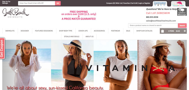
Logos that were created with a handwriting font are also trending. This style gives the viewer a fresh and appealing impression and conveys a brand identity that might or might not have existed for years already. South Beach Swimsuits is a good example here.

South Beach Logo

South-Beach-Swimsuits

4 – Vintage

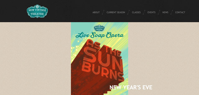
Logos in a retro design will be very popular in 2016. Logos that are made to look old look, just like handwritten logos, are very decorative and work great for bars, restaurants, music clubs, and other industries that convey rather nostalgic values.

NVT-Logo

New-Vintage-Theatre

5 – Shaded

Shaded logos also evoke nostalgic emotions and can be created in many different ways, ranging from modern to minimalistic. They work for companies that want to put across a particular style and want to be especially modern.

Logo Beispiel

Logo Beispiel

6 – Dramatic Typography

No matter if small or large, logos are always used to create an individual dramatic art. Many brands reduce their logos to the plain signature, but this concept can also work well with a supporting graphic.

aerosmith-logo

metallica-logo

7 – Focus on Wordmarks

This year, designers will especially focus on the so-called wordmarks. The aim of wordmarks is to design the company’s name as minimalistic and unique as possible so that the brand instantly gains a high recall value. CNN can be a great example here, as the business has a really appealing wordmark logo.

CNN

Nixon watches

The Following Infographic Stitches it All Together in a Handy Roundup

Logo Design Trends 2016

Infographic Source: ThinkDesign

(dpe)

Categories: Others Tags:

Designing The Most Desirable Product: Exploration of Banknotes Design

January 4th, 2016 No comments

As digital technologies are implanted deeper in the world, making more and more aspects of life intangible, it’s hard to imagine the world without any kind of banknotes, or paper money. In the dramatic history of our world, money became not just generic objects of payment, but also symbols of societies.

Designing The Most Desirable Product Of All Time: Paper Money

Combining utility and exclusivity, money is one of the challenging objects to design. And as with any complex task, currency design holds some valuable lessons for us, web designers. This article is an attempt to formulate some of these lessons and, therefore, draw your attention to the inspirational nature of paper money.

The post Designing The Most Desirable Product: Exploration of Banknotes Design appeared first on Smashing Magazine.

Categories: Others Tags: