Archive

Archive for January, 2016

JavaScript Frameworks: To Use or Not To Use?

January 26th, 2016 No comments

JavaScript has been rising in popularity, and more and more web developers are turning towards JavaScript for their projects. In fact, even WordPress, the world’s most popular Content Management System, is leaning towards JavaScript after the advent of the REST API. As such, the importance and big role of JavaScript frameworks is understandable. Such frameworks can provide you with a stable code base and a good set of features to begin with, thereby helping you build your JavaScript projects on top of them. In this article, I will be discussing the major pros and cons of a JavaScript framework.

JavaScript Frameworks: To Use or Not To Use?

The Advantages of Using JavaScript Frameworks

Quite obviously, the biggest and most visible plus point that you can associate with a JavaScript framework is the fact that it can provide you with a stable code structure and a robust list of features. As such, half of your work is already done when you decide to build your apps and projects with the help of frameworks: you need not bother about cross-browser compatibility, security flaws in code, namespaces and core functions, etc. All of that is taken care of by the framework itself, and you can just get started with building stuff that you wish to.

More importantly, you also get an easier learning curve with frameworks. An excellent framework has a well-established community as well as support documentation in order, thereby allowing you to refer to the docs or seek help from members of the community if you run into a problem or encounter a bug. If you are staying aloof from frameworks, you are basically trying to fight a solo battle. In fact, every decent JavaScript framework that is worth its salt, such as AngularJS or React, has the backing of giants such as Google or Facebook, and by choosing such frameworks, you are basically getting yourself a free coupon to the great stuff that Google and other such giants might have to offer for developers working with the framework of their choice.

javascript-noupe

On a more practical level, the quality of code matters a lot. If you opt for a popular JavaScript framework, you are ensuring that the quality of code is good and acceptable in all aspects. Of course, this does not imply that you cannot write proper code all by yourself from scratch — but if starting from the ground, your code is only as good as your coding skills, and if you do not have exemplary skills, you probably might not be able to replicate the quality of a sound framework.

Similarly, security issues, bug fixes, version updates and other things are handled better when using JavaScript frameworks, simply because such frameworks have a bigger team of contributors working on the code, and issues and problems are sorted out relatively quickly.

The Disadvantages of Using JavaScript Frameworks

Owing to the advantages as mentioned above, many developers just blindly go with a JavaScript framework, even if they may not need to do so.

The biggest drawback that you can associate with JavaScript frameworks is almost the same as their most significant plus point: owing to a large set of powerful features, most frameworks tend to be bulky regarding functions and code base. If your projects is a lightweight entity, you might just not even use the majority of the features and functions provided by the framework in question. As such, opting for a framework in such cases is not a sensible choice.

javascript-noupe-2

Even more so, Vanilla JavaScript is generally lightweight and quicker to operate as compared to frameworks, because the extra bloatware is absent. Furthermore, since each framework in JavaScript has its own way of getting stuff done, you might find yourself traveling one learning curve too many if you wish to experiment with multiple frameworks.

Writing your code in raw JavaScript also ensures that you are independent of the updates and actions of the framework; in some cases, it might be a good thing for your project as you can plan out your roadmap and work accordingly.

Verdict

In simple words, using a framework is a good idea, but if your project does not require the services and features of a framework, relying on Vanilla JavaScript will simplify things and lessen your burden.

In the real world, it all boils down to the type of project and the timeline associated with it. If the project in question needs to be accomplished quickly, a framework will help you get the job done by offering you a solid code base to begin with. Similarly, if the project in question is a large and complex application, a framework will offer you the bug fixes and helpful documentation that you might be in need of.

On the other hand, for everything that is simple concerning usage and operation, staying away from popular frameworks is a wiser choice. Also, if you wish to set up your own workspace, raw JavaScript offers you more liberties to experiment with.

Alternatively, if you are stuck somewhere in the middle of the battle, wherein you wish to get rid of frameworks because you do not need all the complex features and functions, but cannot or do not want to code everything from scratch, choosing a nimble and lightweight framework might be of use for it. Options such as Sammy and Min.js are worthy choices that you should look at.

Are you a JavaScript developer? Do you use a framework or prefer to go with Vanilla JS? Share your views in the comments below!

(dpe)

Categories: Others Tags:

OS X Window Manager Apps

January 25th, 2016 No comments

There is no shortage of apps to help you arrange windows. I find them tremendously useful. Most Windows (the operating system) users I know quite like the built-in abilities it has to position windows, but there isn’t as much of that built into OS X. OS X El Capitan (10.11) brought some split screen stuff, but it has quite a few limitations and certainly isn’t fulfilling all the needs of the discerning nerd.

So let’s look at the options! Fair warning: this page has a bunch of super-huge GIF files on it, as I thought that would be a useful way to show off these apps features.

SizeUp

SizeUp ($12.99) calls itself “The missing window manager”.

My favorite part: smart defaults. For me, 95% of my use of these tools is “YOU! Left Side! You! Right Side!”, so the very simple default built-in commands for this are great. If you’re more into menu controls, that’s nicely designed with good defaults as well:

Cinch

Cinch ($6.99) is by the same company as SizeUp (Irradiated Software). Rather than keyboard commands for resizing windows, it works by having hot zones along the edges of the screen. When you drag the screen against an edge, it will snap to cover that side of the screen.

Things to know: They say it works best with single-monitor setups. You can use it in conjunction with a keyboard-shortcut-based window manager together, although you may end up preferring one or the other.

Spectacle

Spectacle (free, donation requested) is pretty similar to SizeUp.

It has great defaults for immediately whooshing windows to halves, thirds, or quarters of the screen. The default key commands use the Option key (instead of without, like SizeUp), but you may prefer that. The key commands are also customizable in the preferences.

Better Snap Tool

Better Snap Tool ($2.99) is a lot like Cinch, what with the “hot zones” for resizing windows into position:

Better Snap Tool is highly configurable. You can create totally arbitrary area to snap windows to. You can control the spacing of window snapping pixel-by-pixel. You can disable it with a customizable keyboard shortcut. You can style the look of it. You can add custom menus to buttons for custom click-types. If customizing is your thing, this is probably for you:

Better Touch Tool can do window snapping as well. I think it’s everything Better Snap Tool can do, only way more, like customizing trackpad gestures and tons of other inputs types to do custom things.

Divvy

Divvy ($13.99) takes a novel approach to window resizing. It gives you a little grid where you quickly draw where you want the window to go. This allows for custom layouts quickly without custom configuration ahead of time.

You activate it either by pressing the icon in the menu bar, or setting a global shortcut key command. You can customize how fine-grained you want the grid to be, as well as set custom keyboard shortcuts for pre-defined placements of windows.

HyperDock

HyperDock ($6.95) offers a bunch of features to enhance how the Dock works. For example, showing bubble windows of all that applications windows when you hover over an app icon, as well as special control windows for certain apps.

It also has window management tools, including key commands to snap windows into place, and edge snapping.

One cool little feature is that scrolling in the title bar can do actions, like snapping up and down and even changing what space the window is in.

Moom

Moom ($10) is quite powerful in that it can do any feature we’ve already covered, and more. One of it’s unique features is that it shows a menu as you hover over the maximize button on a window:

Those actions can be fired on the active window from customizable keyboard commands as well, or from the menu bar menu if you choose to run that app that way. You can choose to run the app as a normal app (dock), menu bar app, or without any non-keyboard access at all.

You can also enable window-edge snapping (like Cinch/Better Snap Tool) if you like. If you use multiple screens, you can have it ignore the edges that border others. If you don’t like the position it snapped to, slightly moving it away will reset it’s size.

You can set multi-application window “snapshots” in Moom, meaning with a single action you can tell windows from several apps to move into place.

The real power in Moom comes from building your own custom actions. Every custom action is available in the menu bar menu as well as a secondary shortcut after you’ve activated the global Moom hot key (which is also customizable). These actions can be snapping to a grid (you can draw out grids like Divvy), nudging windows around, centering… whatever.

My favorite: you can have Moom kick in a custom action when you plug in X screens. So if you sometimes work with just a laptop, and sometimes work with a monitor, Moom can snap the windows into place when you plug in that monitor.

Breeze

Breeze ($3.99) is all about “saved states” for windows. You place windows where you want them, the save/name/apply shortcut to it so you can snap back to it whenever you want.

It’s only for single windows though… fairly limited compared to what most of these other apps do.

Magnet

Magnet ($1.99) is beautifully designed and, likely, intentionally limited in what it can do. It does edge-snapping to halfs or quarters, and can do the same through the menu bar menu.

Looks like a few bonus features there, like maximizing and shooting the window to the next display over.

Zooom/2

Zooom/2 ($19.95) has yet-another slightly different approach:

The principal idea is simple: hold a key combination – then move the mouse. … you only need to know two key combinations and you’re fully trained!

And it has other unique features, like “raising windows” to the top as you mouse over them.

OS X (El Capitan)

As I said at the top of this article, Windows users enjoy some window management functionality built right into the OS. As of OS X 10.11 El Capitan, Mac users do too. The trick to use it is the hold down the full screen button on the window and it’ll let you drag the window to the side you want, then select another of the open windows to be the other side.

AppleScript

AppleScript is built into OS X and is certainly capable of resizing and repositioning windows. Here’s Arley McBlain with a script he wrote for repositioning things to his liking. It’s even attached to an Alfred workflow.

@chriscoyier Screenshot of the AppleScript layout workflow: pic.twitter.com/g9kFi5fak6

— Arley McBlain (@ArleyM) January 2, 2016

Honorable Mentions: For The Hardcore

There is a whole variety of lower-levels tools for doing window management, but also more “productivity” related things. For example, Mjolnir is “Lightweight automation and productivity app for OS X”. It allows you do install modules which allow you control/API access to certain things. Then you can write you own code to do stuff.

Presumably this (from the docs) nudges windows 10px to the right?

local application = require "mjolnir.application"
local hotkey = require "mjolnir.hotkey"
local window = require "mjolnir.window"
local fnutils = require "mjolnir.fnutils"

hotkey.bind({"cmd", "alt", "ctrl"}, "D", function()
  local win = window.focusedwindow()
  local f = win:frame()
  f.x = f.x + 10
  win:setframe(f)
end)

Hammerspoon looks extremely similar, execpt maybe it comes with pre-packaged modules? I dunno this stuff is over my head.

Hammerspoon is a desktop automation tool for OS X. It bridges various system level APIs into a Lua scripting engine, allowing you to have powerful effects on your system by writing Lua scripts.


Phoenix is “A lightweight OS X window and app manager scriptable with JavaScript”

You can also easily use languages which compile to JavaScript such as CoffeeScript. Phoenix aims for efficiency and a very small footprint. If you like the idea of scripting your own window or app management toolkit with JavaScript, Phoenix is probably going to give you the things you want. With Phoenix you can bind keyboard shortcuts and system events, and use these to interact with OS X.


Slate, “A window management application” looks like it it was trying to be a native app competitor:

Slate is a window management application similar to Divvy and SizeUp (except better and free!). Originally written to replace them due to some limitations in how each work, it attempts to overcome them by simply being extremely configurable.

It looks like it both still has fans but hasn’t been touched in a while and requires some dedicated nerdery.

ShiftIt looks like it’s in the same boat. Updated slightly more recently, but you still need to kinda know what you’re doing. Even downloading the build warns you about it being created from an untrusted source so you have to do the dance to get around that.

Just Drag Things Around With Your Dang Ol’ Mouse

@chriscoyier I drag them from monitor to monitor as needed?

— Norcross ?? (@norcross) January 1, 2016

Thanks!

For all the suggestions. Let us know what you use and how in the comments.

Personally, I’ve been on SizeUp for a long time. But I’m kinda thinking of trying a switch to Moom.


OS X Window Manager Apps is a post from CSS-Tricks

Categories: Designing, Others Tags:

Amazon Web Services Now Offers Free SSL/TLS

January 25th, 2016 No comments
aws-2

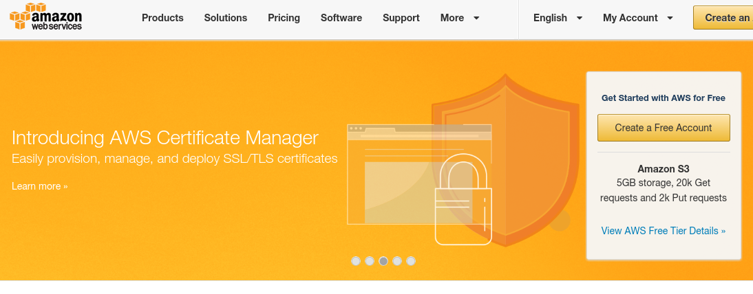
Amazon Web Services, the popular public cloud infrastructure provider, recently announced the launch of AWS Certificate Manager — a service that you can use to obtain TLS and SSL certificates for your websites for free.

Yes, you read that right. Keeping in mind the rise in popularity of SSL certificates, especially after Google announced that it is viewing SSL as a metric when deciding the pagerank of websites, the AWS Certificate Manager is indeed a very helpful service that has come at the perfect time.

To quote the AWS blog:

The new AWS Certificate Manager (ACM) is designed to simplify and automate many of the tasks traditionally associated with management of SSL/TLS certificates. ACM takes care of the complexity surrounding the provisioning, deployment, and renewal of digital certificates! Certificates provided by ACM are verified by Amazon’s certificate authority (CA), Amazon Trust Services (ATS).

Even better, you can do all of this at no extra cost. SSL/TLS certificates provisioned through AWS Certificate Manager are free!

aws-certif

As can be seen, AWS Certificate Manager lets you acquire and attach SSL and TLS services to your websites for no extra penny. Furthermore, it will also take care of periodic renewals, thereby allowing you to rest free and have no concerns whatsoever about the certificates installed on your websites.

As of now, the AWS Certificate Manager is available only in the US East (Northern Virginia) region. However, other regions are also in the pipeline, so you can expect it to arrive soon.

For more info, visit the AWS Certificate Manager website.

If you are an AWS user, are you excited about this news? Share your thoughts in the comments below!

Read More at Amazon Web Services Now Offers Free SSL/TLS

Categories: Designing, Others Tags:

Photography Trends That Will Rock 2016

January 25th, 2016 No comments

Much like web design, photography too has its share of trends and techniques that keep coming in vogue or falling out of favor. With the role of photography rising, not just in a real-life capture of memories but as a viable medium for creating images for the web, certain photography trends seem to be dominating the scene.

What are the major photography trends that will be extremely popular in 2016? In this article, we attempt to find an answer to this question.

Black and White

Ok, black and white is not a recent innovation in the world of photography. In fact, photographers have been using black and white as a medium to enhance and amplify their photos for decades now. So why are we listing it as a recent trend?

Well, the trend is not “black and white” in itself, but the approach that black and white photography has adopted and is adopting of late. To begin with, black and white photography seems to have evolved the “absence” of color concept to showcase a varied list of things: solitude and sadness to even compassion and mercy.

black-white-photo

Similarly, black and white photography is now being used more and more to exhibit modern lifestyle: possibly the busy lives that we lead and the concrete jungles that we build.

The Role of Animals

Wildlife photography has been a popular genre in the past few years. In 2016, there is one trend that seems to be ever on the rise: animal photography, which may or may not have to deal with wildlife.

Domesticated and pet animals are now becoming a mainstay of photography, with more and more photographers clicking images of animals — most particularly, cats, dogs, and horses.

animal-photo

You might also attribute this to the ever-increasing number of semi-professional and amateur photographers, who find it easy to click photos of pets that they have in their nearby locations, as opposed to professional photographers who might shoot images in a wildlife safari.

Design Patterns

Minimalism has gained many adherents in followers in web design. However, in the past few months and heading strong into 2016, photography trends seem to be speaking a different story: the rise of patterns in photographs!

Multiple layers of patterns and bright colors are gaining popularity as a photography trend; this is in stark contrast to the world of web design or other forms of art, wherein minimalism is still prominent.

patterns-photo

What can be the reason behind this trend? Refer to the first point above; in the world of photography, whatever scope minimalism seems to have, has been captured by black and white photography. More often than not, whitespace either finds itself in a black and white photo or is replaced by vivid colors in a brightly colored photograph. Thus, minimalist photography seems to be becoming a sub-genre of black and white photography; whereas design patterns and bright colors are creating a niche of their own.

Inanimate Objects in Still Life Photography

Generally restricted to artwork, still life is now an extremely prominent genre of photography, and in 2016, this is probably going to be the most prevailing photography trend.

But unlike art on canvas, still life photography seems to be steering towards inanimate objects: portraits and human or animal forms are diminishing regarding popularity, but still life photos of non-living objects: furniture, gadgets and table-tops — is ever on the rise.

patterns-photo

One extremely popular trend is the photography of gadgets, generally mobile phones or tablets and laptops, and you can find such photography samples on virtually every major photography website or outlet out there.

Neon Landscapes

If the past few years were the years of Bokeh Photography, 2016 is surely going to be the year of neon landscapes in photography.

neon-landscape

Thanks to the easy availability of photo editing tools and applications, neon landscapes have become a very popular trend in photography, and you will not have a hard time finding it in good use. Furthermore, add to it the fact that such landscape images do very well on Instagram or Pinterest, and you will easily understand why many young photographers are leaning towards neon-colored landscape photography, be it the sunset, beach or the night sky.

Conclusion

Photography is an ever-evolving form of art, and what is popular today might fall out of favor tomorrow. That said, certain trends just refuse to die out, as we can see from the manner in which photographers keep experimenting with and modifying black and white photography.

Thanks to better quality camera phones and the cheaper availability of DSLRs, more and more folks are turning towards photography. Of course, a good camera phone can transform you into someone who takes good selfies, but not necessarily into a good photographer. But the evolution of photography trends of late surely has been influenced by the easy access to cameras and photo editing apps.

What do you think of these photography trends for 2016? Share your views in the comments below!

Photos: Unsplash | Zazzle | Jarmoluk | Tookapic | Favim

Categories: Others Tags:

Essential navigation patterns in 2016

January 25th, 2016 No comments

Your navigation menu makes or breaks your website’s UX, which is what you should be primarily designing for at all times. There’s no better service you can provide your clients as a designer than to ensure that the sites you build for them boast a stunning and highly functional user experience.

A splendid UX guarantees that your clients’ sites get more leads, visitors and readers, not to mention retain regular visitors. It is the most important part of creating a site, and you have great control over it based on how you design your site’s navigation menu.

Unfortunately, not all designers place a high priority on designing for excellent navigation, which does a disservice to clients, and visitors.

To create a very credible reputation as a designer—and to be an in-demand designer—you have to master one of the most basic aspects of web design. That’s creating stellar navigation for your clients’ sites.

Here’s how.

Sticky navigation

Sticky navigation is an essential component of navigation since it empowers your users to instantly access the menu and easily find what they want on your site. Sticky navigation stays locked in place as users scroll down a page. There’s nothing more frustrating—especially in the case of long-scrolling pages—than to have to scroll all the way up again to navigate to another page on the site.

Remember that, on the Web, speed is everything (loading pages, finding desired content, etc.) so allowing users to access the navigation menu more quickly is a best practice.

By including a sticky navigation bar, you’re also helping to reduce cognitive load on your users by constantly putting their navigation choices right in front of them.

Alternative Press features a good example of how to incorporate sticky navigation into your pages. Note how all the most important sections are easily accessible and identifiable, by effective color contrast, in the navigation bar, no matter how far you scroll down the page.

Obvious hypertext

Hypertext is any text reference on your pages that users can click on to get additional info, usually on another page, whether it’s on the same site or off-site. Hyperlinks are probably the most identifiable example of hypertext.

Since hypertext contains information that’s going to help the user experience by providing more information, it only stands to reason that such helpful references are made very noticeable. Overall, this adds to the navigability of the site you build.

I recommend making hypertext blatant by two, simple, design features:

  • Underlining
  • Changing the color

When you underline any word on your page content—let’s say it’s a hyperlink to your client’s about page—it immediately draws the attention of site visitors, which helps them navigate to important information with greater ease.

Similarly, when you make the color of hyperlinks different than the text and background of your pages, you again, make it stand out on the page, so users can easily identify and click on it.

Marketing site The Daily Egg uses both underlining and different colors for its hypertext, making it very easy for users to identify links.

Mega menus

Mega menus are a great idea for navigation, especially if the site you’re designing for your client has a lot of content and categories. eCommerce stores come to mind. These are essentially huge, drop-down panels that open up additional layers of navigation to help your users find specifically what they want more quickly.

Such menus improve the user experience by including benefits like:

  • elimination of scrolling;
  • tooltips;
  • orderly structuring of content by icons, layout or typography.

All told, these features make it a lot easier to use the navigation menu.

For a solid example of a mega menu, head to Food Network‘s site. Notice how the flyout menu displays one of the most sought-after pieces of content of the site—the recipes—in an easy-to-see format that lets users immediately choose where they want to go instead of scrolling or pagination for more options.

Pattern and language affordances

A pattern affordance is using a conventional symbol that the majority of site visitors will understand immediately, such as a house icon to represent the homepage of your site. A language affordance is the explicit use of a word, like “home”, to clarify that clicking on that tab will bring users to the homepage of the site.

Affordances communicate to users how they can interact with the elements in your design. While this is certainly Design Basics 101, it’s still as important to practice today as it was in the very early days of the Internet.

A functional navigation menu should have the house symbol or the word “home” positioned on the very first navigation tab on the left. While some designers may instead opt to include a company logo as the “home” icon or button, that still leaves too much room for user error.

eTailer Frame Warehouse demonstrates this design principle to a tee, with its use of “home” to leave no doubt where that tab will take site visitors.

Fast load time

Speed = great user experience. Designers of all stripes should jot that down as one of the most crucial design rules that they simply can’t and shouldn’t relegate. According to Wired Magazine, almost 50% of shoppers want the average page to load in two seconds or less! Put another way, if the pages you design for your clients take longer than two seconds to load…there’s a really good chance that they’ll leave your clients’ sites and never return, thus causing severe conversion nightmares.

This is a worrisome statistic, to be sure, but there’s something designers can do about it to ensure they’re providing high-quality page performance to their clients. Simply test the page speed of pages you design. There are a number of reliable tools to help you determine page load times:

For an example of a very fast page load time, we go to Enchanted Learning’s What Is a Whale? page. The design could use some work, but the page loads in just over one second, according to the Alexa analytics toolbar.

Great navigation is great UX

A huge part of a great user experience is your site’s navigation. It is the foundation on which the entire user experience rests, if you really think about it. When your users can’t find their way around your client’s site with ease, then it becomes frustrating for them, causing them to leave in a hurry. Thus, excellent navigation should make it easy for people to use any site you create; that’s the benchmark of a fine user experience.

While it can be tempting to give the navigation the short shrift in the design stages—because of new design trends popping up all the time—it’s not advisable. Your users will notice, as will your clients. To please your clients, you must please their users. You can only do that when you design for a great user experience first and foremost, with a primary emphasis on getting the navigation right from the get go.

eBook + extras: My Designers is Driving Me Crazy! – up to 66% off!

Source

Categories: Designing, Others Tags:

Revisiting the Float Label Pattern with CSS

January 25th, 2016 No comments

The “floating label” is a common design pattern where the label of a form is displayed on top of an input until someone taps it. It’ll then transition out of the way to reveal the placeholder text beneath, but the label will still be visible above or below.

Emil Björklund walks us through an interesting demo that replicates this pattern but without the need for any JavaScript and with the :placeholder-shown pseudo selector.

Note there are other CSS-only methods for this (check out a ton of different methods in this big ol’ Collection), but :placeholder-shown is the perfect selector for this, other than it’s current level of support.

Direct Link to ArticlePermalink


Revisiting the Float Label Pattern with CSS is a post from CSS-Tricks

Categories: Designing, Others Tags:

InMotion Hosting Review – Another Hype, or a Host You Can Trust?

January 25th, 2016 No comments
inmotion-hosting

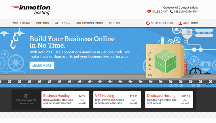
“A Host You Can Trust,” InMotion Hosting boldly states on their website. The real question, though, is how much of a role should trust play when choosing a web host? A lot, apparently! Research shows that 41% of hacked WordPress sites were hacked due to security vulnerabilities on their hosting platform; this is much higher than hacks through a security issue in a theme or plugin, or even due to weak passwords. Your host plays more of a role than you can imagine in the security of your site, which is why the selection process is important.

InMotion Hosting is one of the major players in the web hosting space, with a range of plans that include Business Hosting, VPS Hosting, Dedicated Servers, Enterprise Hosting, WordPress Hosting, and Reseller Hosting.

This review will give you an unbiased look into InMotion Hosting, so that can decide for yourself if they are right for you:

Pros of InMotion Hosting

Here are some of the advantages to using InMotion Hosting:

Flexibility: Very few web hosts provide the kind of flexibility you can get from InMotion Hosting. They have a host of plans ranging from their shared hosting to dedicated hosting, and they support every major CMS available.

InMotion Hosting also offers support for major ecommerce and shopping cart systems like Prestashop and OpenCart, making it easy to create your online store with little effort on your part.

Price: When it comes to choosing a web host, price is a major deterrent for most people. InMotion isn’t the cheapest host in town, but it isn’t expensive either. Their shared hosting starts at $4.89/mo, their VPS hosting starts at $29.99/mo, and their managed dedicated hosting starts at $119.99/mo. Their WordPress Hosting starts at $4.89/mo, which is a pittance compared to the cost of other WordPress hosting services in the market.

Uptime: InMotion Hosting promises an uptime of 99.9%, and many sources report them to be reliable. InMotion Hosting uptime has been widely reported to be in the range of 99.8% – 100%, and averagely at 99.9% as promised by them.

Customer Support: InMotion Hosting is very reliable when it comes to support, and it’s one of the things they are most renowned for. Their support agents are reliable, and they answer and resolve user queries in record time compared to other hosts. They offer support via phone, live chat, email, and an online community. Support is available 24/7.

Security: InMotion Hosting is very secure, and their WordPress hosting comes with a free Sucuri Security plugin that scans sites for malware, exploits, and other security risks. They offer anti-spam and anti-virus protection for a nominal fee, and they offer regular remote backups to ensure that you’re back online in no time should anything happen to your site.

Ease of Use: InMotion Hosting plans come with cPanel and options for quick integrations with, and installation of, popular apps, so it is rated very high when it comes to ease of us. They also offer free website transfers from other hosts, so this can ease some of your problems and allay your fears if you already have your site hosted somewhere else.

Email Support: Shared hosting plans come with unlimited email support, and there’s a 3-step option to automatically configure your site to work with Google Apps if that’s your preference for email.

Money-Back Guarantee: With the exception of their dedicated hosting plans, which come with a 30-day, 100% money back guarantee, all InMotion Hosting plans come with a 90-day money back guarantee.

Bonuses: InMotion Hosting plans come with free SSD drives, a free domain name (transfer or registration), and Google Apps Integration. Their dedicated hosting plans come with free cPanel and WHM. They also offer advertising credits depending on the plan you choose.

Cons of InMotion Hosting

Here are some of the major problems you might have with InMotion Hosting:

Price: While InMotion Hosting is affordable, you’ll need to make a large upfront investment to benefit from the huge price savings advertised. For example, while the Pro plan of their shared hosting is advertised at $10.49/mo, you need to pay for twelve months to get that savings. It actually costs $13.29/mo if you want to pay for just one month. For smaller plans, you need to pay for twelve or twenty-four months in advance. There’s no option to pay for one or a few months. They offer a 90-day money-back guarantee, so maybe this isn’t much of a problem.

Verification Process: InMotion Hosting is renowned for the security measures they put in place, but this can also be a pain at times. For example, they require phone verification for all new customers; while customers in the U.S. might find this okay, it can often be a problem for customers outside the U.S.

Limits: InMotion Hosting has some of the most generous shared hosting plans, but their limits can be a problem if you are on a budget. For example, they allow a maximum of two websites and two MySQL databases on their basic (“Launch”) shared hosting plan, and a maximum of 6 websites on their “Power” plan. If you want more, you might need to go “Pro.”

Also, while they offer free regular backups, it’s worth noting that you can only restore your files for free once in four months. If you need more restores, you have to pay.

InMotion is offering our readers 38% off

Read More at InMotion Hosting Review – Another Hype, or a Host You Can Trust?

Categories: Designing, Others Tags:

Combining UX Design And Psychology To Change User Behavior

January 25th, 2016 No comments

Have you ever wondered why your users do not interact with your product the way you hope? Persuading people to perform a particular action, like signing up or buying a product, is a challenge in most industries, especially when you want that action to be performed repeatedly.

Combining UX Design And Psychology To Change User Behavior

As UX practitioners, we try to create the best conditions for users to complete their tasks, and yet even the most usable interface is sometimes not enough to engage users. Why is that? To understand the reasons behind what drives users to certain behaviors, we need to look at the psychology that underlies the process of initiating and performing a behavior.

The post Combining UX Design And Psychology To Change User Behavior appeared first on Smashing Magazine.

Categories: Others Tags:

Cartoon: New Framework

January 24th, 2016 No comments

I am part of this industry since the early nineties. I have seen many tools come and go, and I know that we have always had a couple of choices to achieve the same task. Without continually improving on the toolset we would not have been able to push the web forward. But the growing trend of the last about three years is something not even die-hard tool lovers can appreciate. You know what I’m talking about? No? Look here:

For a more detailed rant read this Medium post 😉

By the way, we have numerous cartoons for you here.

Categories: Others Tags:

Popular design news of the week: January 18, 2016 – January 24, 2016

January 24th, 2016 No comments

Every week users submit a lot of interesting stuff on our sister site Webdesigner News, highlighting great content from around the web that can be of interest to web designers.

The best way to keep track of all the great stories and news being posted is simply to check out the Webdesigner News site, however, in case you missed some here’s a quick and useful compilation of the most popular designer news that we curated from the past week.

Note that this is only a very small selection of the links that were posted, so don’t miss out and subscribe to our newsletter and follow the site daily for all the news.

How to Use Tints and Shades in your Designs

Login/Sign up Inspiration for Mobile Apps

Google’s Creepy Plan to Kill the Password

3 Typography Trends for 2016

What is the Most Common Web Design Mistake You See?

Why Designers Should Reconsider ‘Minimalistic’ Websites

Website Grader – How Strong is your Website?

Advice for Becoming a UX Designer

Tips on How to Design a Great Logo

Creo: A Design Tool for Mac Which Combines Design and Development

Is Apple is Working on the Next Major Computing Platform?

What Makes a Great Front-End Developer

Most Clients are Dead

Variables: The Backbone of CSS Architecture

Adobe Stock Predicts Visual Trends for 2016

4 Ways to Prevent Image Theft in WordPress

Merchant Dashboard – Edit Item Animation

WhatsApp is Now Free and Promises to Stay Ad-free

Google’s Free Deep Learning Course

The New York Times Web Site is 20 Years Old Today

What Apple and Starbucks Taught Me About Building a Brand

IBM’s Got a Plan to Bring Design Thinking to Big Business

2016 will Be the Year of Conversational Commerce

How to Avoid Making Products no One Wants

Japan’s Arcane Pictogram System Gets a Much-Needed Update

Want more? No problem! Keep track of top design news from around the web with Webdesigner News.

LAST DAY: Carrig Compleat Font Family of 9 Desktop Fonts & Webfonts – only $17!

Source

Categories: Designing, Others Tags: