Archive

Archive for January, 2016

Google Chrome is About to Get Faster Than Before!

January 21st, 2016 No comments
chrome-speed

If you are a Google Chrome user, there is good news for you. Your web browser is about to get faster and better than ever, all thanks to a new data compression algorithm that Google is planning to roll out soon.

Google employee Ilya Grigorik took to Google+ to describe the advent of Brotli compression algorithm.

This new algorithm will replace the existing one, which is called Zopfli. Brotli was announced last year in September, and according to Google’s internal benchmarks, it works faster than all existing data compression algorithms, and can compress data by 17-25% extra, as compared to Zopfli. Furthermore, its compression ratio is almost 25% better than all other data compression algorithms. (Source, PDF)

google-chrome-2

Owing to better compression ratio, Brotli can speed up the performance of web browsers, and can also save the battery of your device by consuming less memory.

Google has plans of rolling out Brotli for Google Chrome. However, Google also wishes that other web browsers, in general, will adopt Brotli as a standard data compression algorithm. Brotli is fully open source, and you can check out the code on GitHub.

Existing Chrome users can expect to see Brotli in action pretty soon.

Are you a Google Chrome user? Excited about the advent of Brotli? Share your views in the comments below.

Read More at Google Chrome is About to Get Faster Than Before!

Categories: Designing, Others Tags:

Brave: A Web Browser That Blocks Ads

January 21st, 2016 No comments
brave-main

Brendan Eich, one of the founders of Mozilla, has recently announced the launch of a new startup, and much like Mozilla, this venture too has a lot to do with web browsing.

Meet Brave, a new web browser that will block all advertisements by default.

Sounds interesting? According to Eich, the internet has become bloated due to unnecessary advertisements, and web browsers have chosen to do nothing about it. Sure you can block ads, but only if you install “extensions”, not with the help of the browser itself.

As such, Eich intends to block all adverts, and offer you a cleaner and better web browsing experience. In essence, it will help users who are concerned about their privacy, since modern advertising is intrusive and relies heavily on re-targeting by means of cookies, etc. Also, the absence of ads means a page will load faster and without any annoying popups or banners.

However, that is not all. Brave will have an advertising channel of its own: it will block ads, and then replace those ads with its own ads, wherein publishers, Brave and content channels share the revenue. So yeah, your dreams of an ad-free web browsing experience will have to still rely upon AdBlock and other extensions.

Brave is expected to be launched sometime later this year. It will be open source, just like Firefox, and will be available for all major desktop and mobile platforms.

What do you think of Brave? Share your views in the comments below!

Read More at Brave: A Web Browser That Blocks Ads

Categories: Designing, Others Tags:

Sponsor: Media Temple

January 21st, 2016 No comments

I’m pretty excited to welcome Media Temple as a the brand-spankin’ new primary site sponsor around here. I pitched the idea to them, actually. While sponsors are vital for the site, I’m selective about the companies we work with. I personally approve and endorse every one. I’m particularly selective about the primary sponsor. I want it to be a company that I not only use and endorse, but that I select as a good fit. Media Temple was at the top of that list.

Media Temple will be sponsoring the site all of 2016. You’ll see them right in the header of the site, reminding you they are the web host we use and recommend.

Thoughout the year, I’ll be doing some posts like this to let you know about some of the interesting things they do and services they offer. You’ll hear about them from time to time on ShopTalk and CodePen Radio. I’ll even be writing a bit over on their blog.

Direct Link to ArticlePermalink


Sponsor: Media Temple is a post from CSS-Tricks

Categories: Designing, Others Tags:

20 Business Consulting WordPress Themes for 2016

January 21st, 2016 No comments
1 business wordpress theme

The beginning of the New Year is the best time for new achievements. That’s why we have decided to share a handpicked compilation of 20 ready-made WordPress themes for consulting companies, businesses and financial organizations, which will make it so much easier to get your project live on the Internet. All running on a fully responsive framework, these premium and free solutions can adapt flawlessly to any screen size and resolution on which they are being viewed. Gone are the times when you need to create a separate mobile version of your website. Now all this and much more can be done thanks to the implementation of smart web technologies, most of which were integrated into the following 20 themes.

So, please welcome the compilation of free and premium Business Consulting WordPress Themes and enjoy your read!

Premium Consulting WordPress Themes

1. FAA

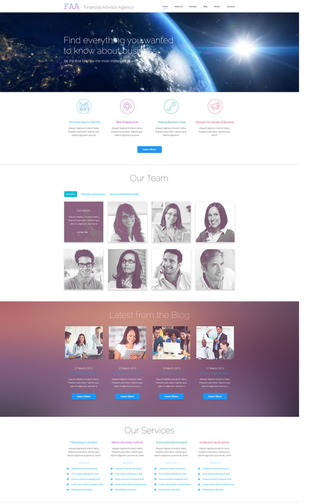
FAA is one of the most popular and frequently downloaded WordPress themes for consulting and financial agencies from TemplateMonster. The template comes loaded with everything that you will need to make your business look professional. The header was made more appealing and captivating with the help of the full-width video featuring parallax scrolling effect. In order to let your audience focus primarily on the content, the design was made simple and minimalist. In terms of the content positioning, the theme’s developers made use of a grid-based structure. Cherry Framework 3.1.5, which is at the core of the theme, makes it a pleasure to install and customize.
Demo | More info

2.Financial Bureau


Financial Bureau looks sleek and stylish. Its layout is all focused on the effective presentation of your offerings to the online audience. Just like the previous theme, the header of this template was enhanced with the parallax scrolling effect. To make your site more functional and interactive, banners and thumbnails have been enhanced with the hover effect. Lazy load effect was integrated in order to ensure fast loading speeds of any content heavy web resources. Neat icons and featured content were organized in a grid-based list.
Demo | More info

3. Financial Advisor

3 business wp theme
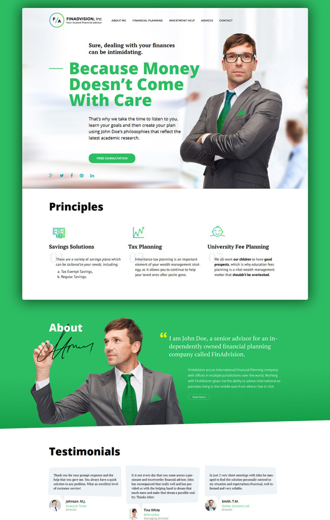
Financial Advisor was developed specifically for business related websites. Running on the latest Cherry Framework 4, the theme is proud to have a fully responsive, customizable layout, which looks sharp on any screen size. MotoPress Content Editor was also included in the pack in order to guarantee quick and seamless modification of the layout. The theme comes with audio and video integration. Video background support will make your official web page more captivating.
Demo | More info

4. PROvise

4 business wordpress template
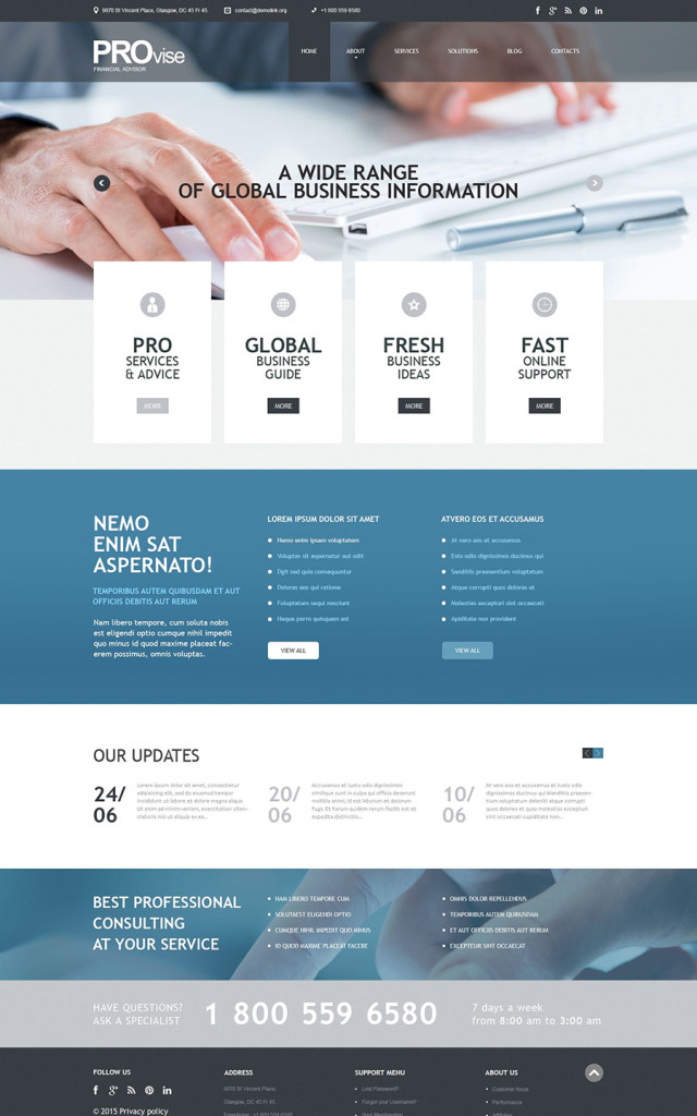
PROvise is SEO-friendly and a fully responsive template running on Cherry Framework 3. The layout features a neutral color scheme of light blue and white colors, which are known as the best choice for business websites that want to appeal to a wide audience. The clean design of the template has been enhanced with the parallax scrolling effect, which is intended to add the feeling of depth to the page. For quicker and seamless modification, the pack includes several pre-designed pages, a detailed documentation folder, sliced PSD files, widgets support, and so much more.
Demo | More info

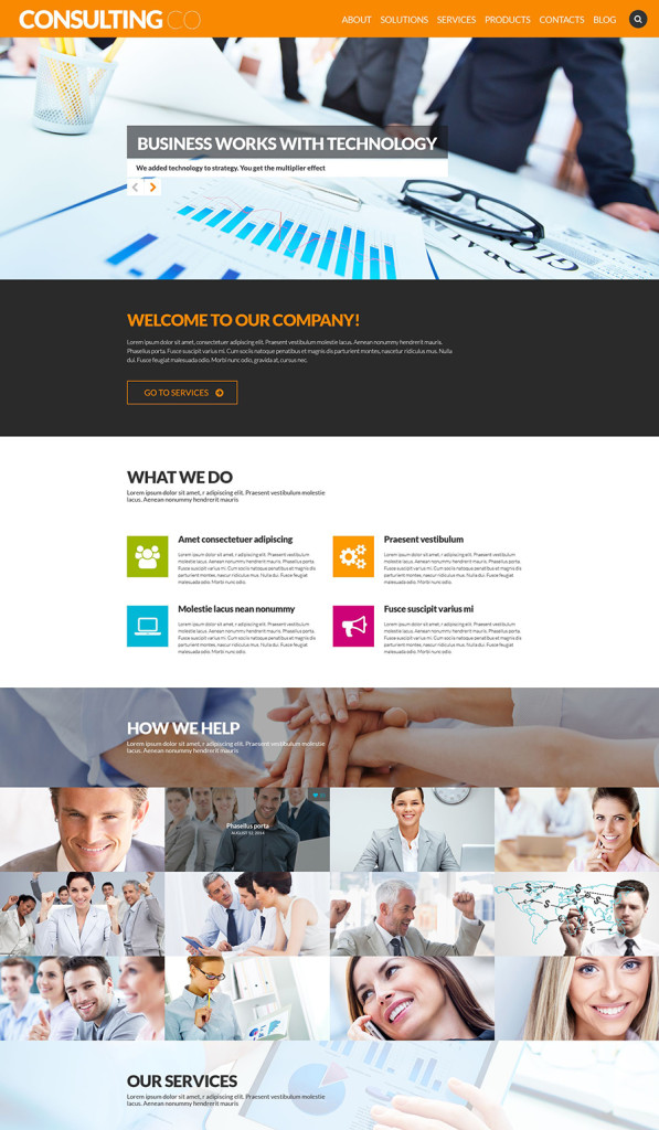
5.Consulting Co

5 wp theme
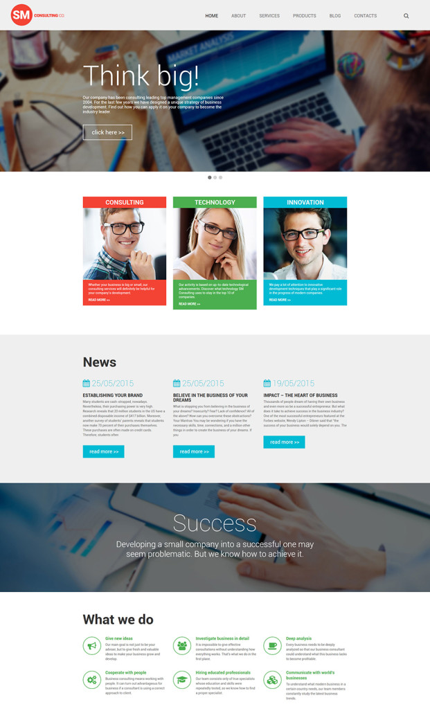
Consulting Co was made information heavy, yet functional. When visiting the front page of a site built with its help, the users will be introduced to the whole array of services that your company offers, a quick but detailed overview of your company’s biggest priorities, a list of your staff, and so much more. In order to make it easier for your visitors to reach your physical location, the theme has been integrated with Google map. In order to look more trustworthy in the eyes of your online audience, a list of partners was added to the front page of the template. If you wish to tweak the design or content positioning, this can easily be achieved via the fully featured admin panel.
Demo | More info

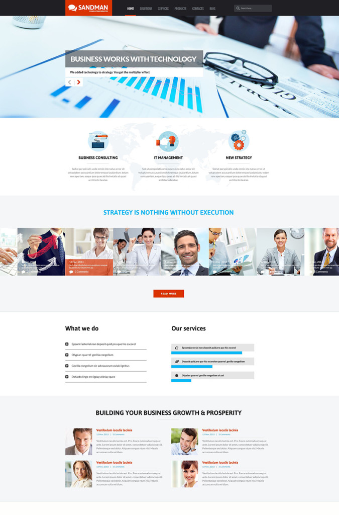
6. Sandman

6 business wp template
Sandman is a user-friendly and easy to navigate WordPress theme. Best suited for consulting companies, it will work well for business and financial organizations. Featuring a design that is classic for such web projects, the template looks trustworthy and inspiring. Its navigation bar is fixed to the top of the page, which allows your site’s visitors to access the rest of the pages with a click. HTML plus JS animation give you the freedom to manage the look and feel of the template just the way you wish. The parallax scrolling and lazy load effects not only provide for better visual appeal, but also enhance the usability of the theme.
Demo | More info

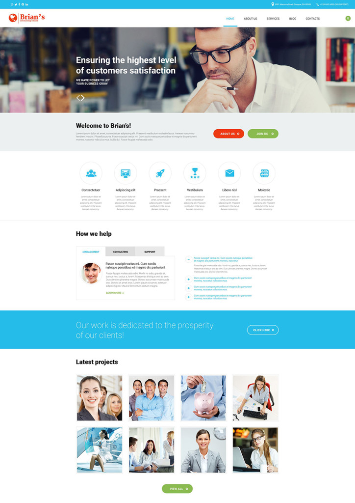
7.Brian’s

7 business and consulting wp theme

Brian’s is a clean theme that will work well for consulting, business and financial websites. It features a full-width header slider, which is intended to draw users’ eyes to your hottest offers, products or services in a breathtaking manner. The theme features elements of metro style and lots of white space, which makes content more readable. Different pieces of information have been divided by means of over-sized headings written on the colored backgrounds.
Demo | More info

8. Consulting Company

8 business and consulting wp template

Consulting Company WordPress template captivates with its minimalist, yet functional, layout. In addition to the traditional list of company news, services and the latest blog updates, the theme includes a stunning photo gallery and several usable sliders, which will let you appeal to every reader. Content blocks are separated by means of the full-width photo backgrounds featuring the parallax scrolling effect. Thanks to full social integration, people will appreciate the ease with which they can spread the word about their preferred services on the web.
Demo | More info

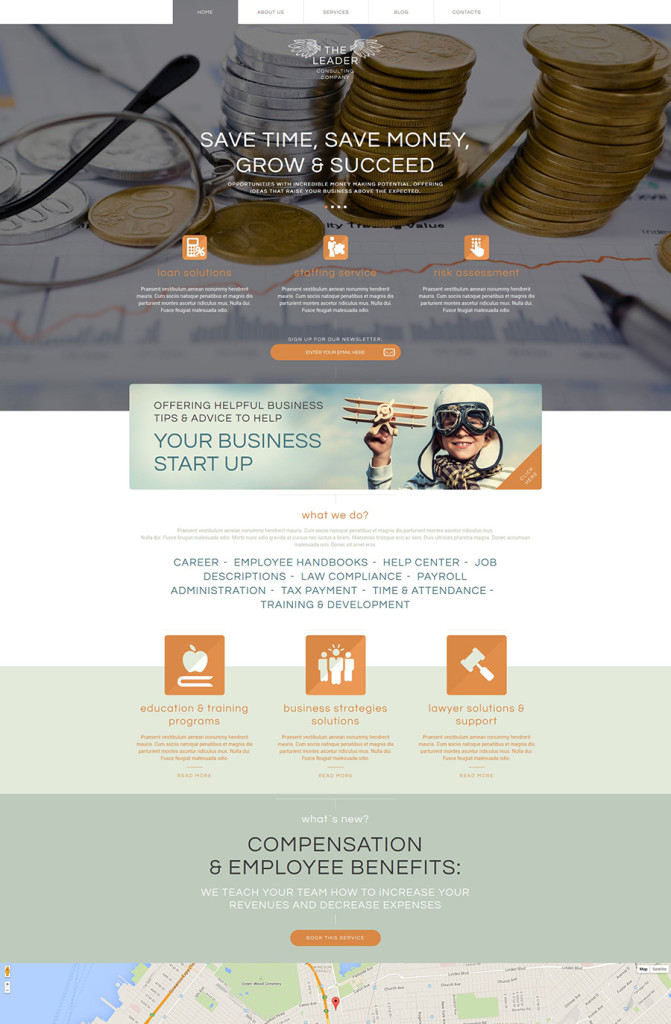
9. The Leader

9 business consulting wp theme

The Leader is a professionally built business WordPress template that comes loaded with an array of options to create a rock-solid online presentation of your project. The header of the theme has been enhanced with a parallax scrolling large hero image. In order to make your site more usable, the horizontal navigation panel remains in a fixed position at the top of the page as a user navigates through your content. Icons and images with the hover effect, add more interactivity to the design. Grid-based content positioning provide for a seamless scanning of the page, which makes it easier for your audience to come across the desired information in an instant.
Demo | More info

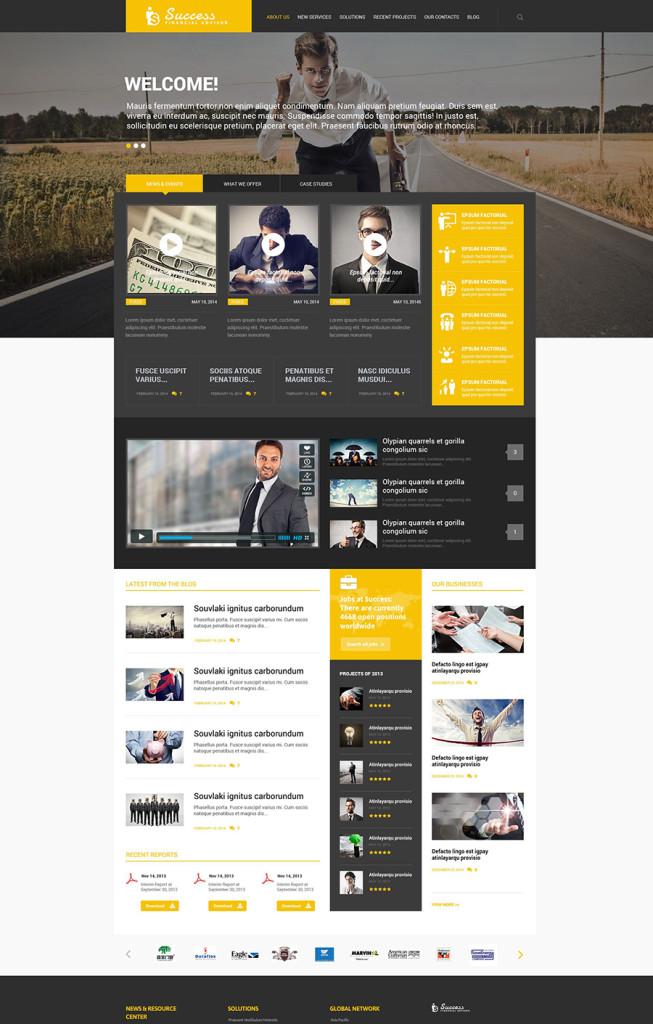
10. Success

10 business and consulting wordpress theme

Success looks different from the rest of the templates in this collection. While the aforementioned designs are best suited for official company pages, this WordPress theme will work well for business blogs and news portals. The layout was built in an interactive yet easy to browse manner, which allows you to share loads of different types of content on the page. Filter, portfolio page, galleries and sliders were all integrated with the purpose of enhancing the visual appeal and functionality of your web resource.
Demo |More info

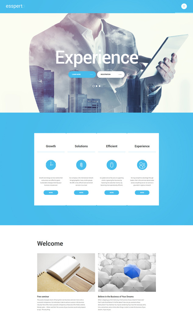
11. Essperto

11 business wordpress template

Essperto is a fully featured business WordPress template running on Cherry Framework 4. The latter is known for its ease of installation and customization. By default, the theme comes loaded with an array of shortcodes, which make post editing a breeze. In addition, the theme includes a Shortcode Template Editor, a feature from which all developers can benefit. With its help you can create and manage custom shortcodes that will work on your site specifically. In addition, the pack includes several premium plugins (like MotoPress Editor and MotoPress Slider) which the theme’s owners can use for free.
Demo | More info

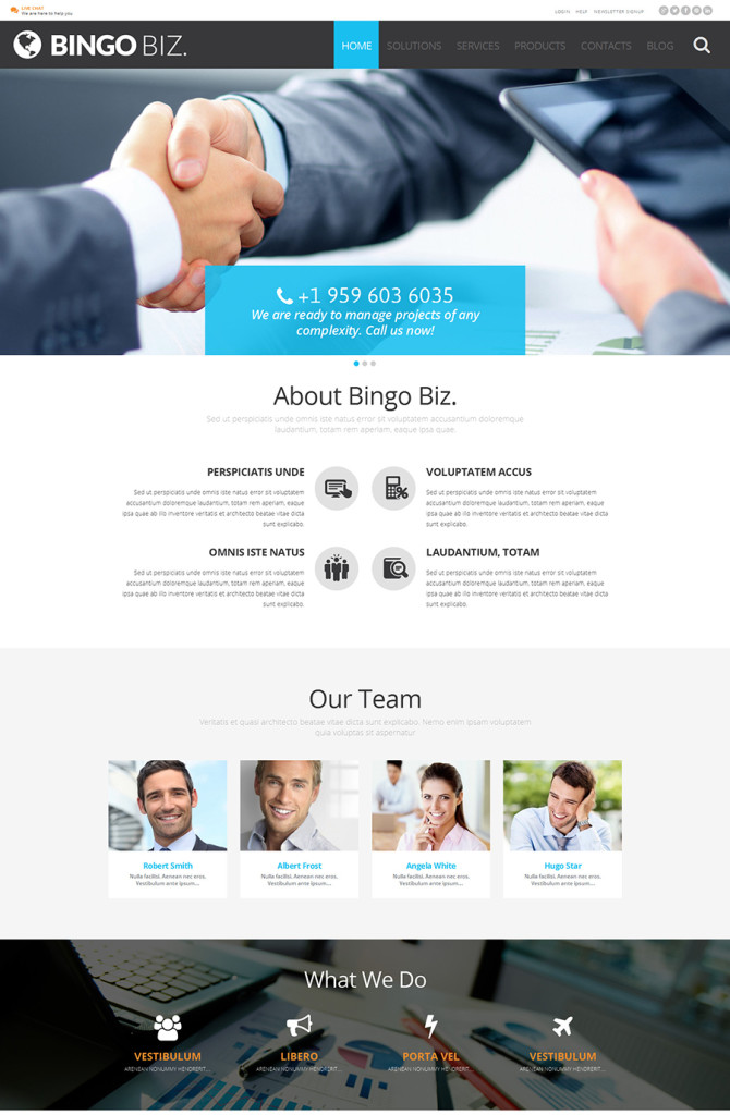
12. Bingo Biz

12 corporate wp theme

Bingo Biz. was specifically developed in order to attract more clients to your business and turn accidental visitors into loyal customers. The home page features enough space to share different types of content about your business. Here you will find clearly defined blocks for representing your services and staff, company story, a filterable portfolio with case studies, user testimonials, etc. Best suited for content heavy web resources, the theme includes the lazy load effect. With its help you will have no problem with the page loading speeds. What’s more, the theme is enhanced with advanced Bootstrap functionality, which ensures seamless page adaptation to any screen size.
Demo |More info

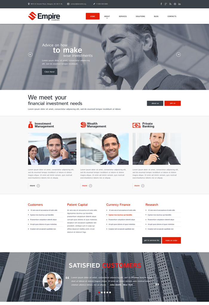
13. Empire Investment

13 corporate wordpress theme

Empire Investment was designed in a clean style with the purpose of drawing the user’s attention to your site’s content. Vivid red calls-to-action placed on the light background also serve as great attention-grabbers. Just like the rest of the templates on this list, Empire Investment was made responsive and cross-browser compatible. Coming with WPML support, the theme is ready to be translated into as many languages as you wish. In terms of navigation, everything was made simple and intuitive. A sticky dropdown menu, grid-based content positioning and back-to-top functionality were all integrated into the theme.
Demo | More info

14. Gitex

14 business wordpress theme

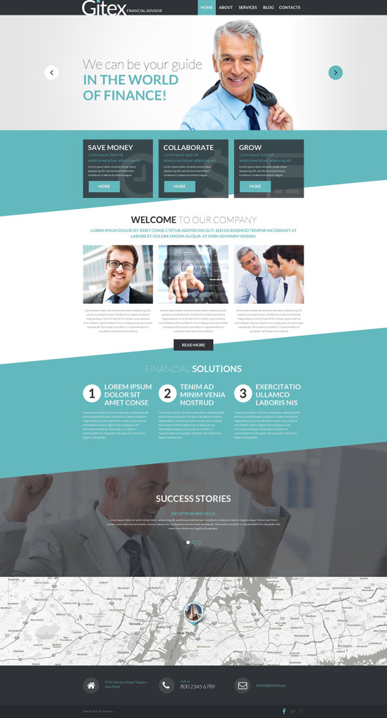
Gitex is a financial advisor WordPress template, which was designed to look sharp on the latest-generation devices, both desktop and handheld. Running on the latest Cherry Framework 4, the theme includes all the benefits of the latter and much more. The parallax scrolling effect was added to the background images of the theme. The clear and easy on the eyes color scheme provides for seamless and more enjoyable site browsing. When reaching a website powered by such a template, the users won’t be irritated by the heavy design elements. Traditionally, the template is fully customizable, so you can apply any changes via the advanced admin panel or use the MotoPress Content Editor in order to speed up the process.
Demo | More info

15. Human Rights

15 wp theme for a cnsulting company

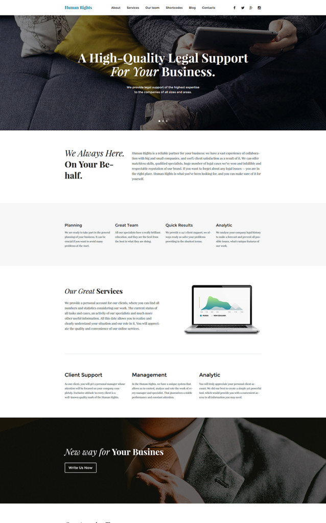
Human Rights is a business WordPress template that is powered by Cherry Framework 4 and is compatible with the latest WordPress versions. The functionality, with which the theme comes loaded, can be managed by both beginner and pro developers. Such options as Cherry Installation Wizard, a pack of shortcodes for multiple purposes, MotoPress Content Editor, Shortcode Template Editor, and a host of other smart features will make it possible to tweak the template just the way you wish.
Demo | More info

16. Smartex

16 wp consulting theme

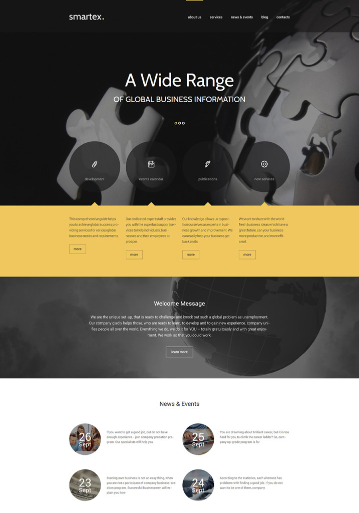
Smartex can adapt to any given role. Intended to suit business and corporate sites, it will work well for consulting, investment, software, communication, transportation or almost any other kind of web project. Cherry Framework 4 has brought advanced functionality to the theme’s dashboard, making it possible even for the novice user to apply changes to the design. Customization requires no risk. You can return to the default theme settings at any step of its modification.
Demo | More info

Free Consulting WordPress Themes

1. New Group

17 wp theme

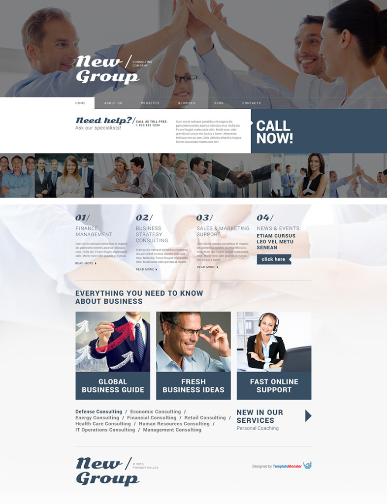
Even though New Group is a free WordPress theme, in terms of design and functionality it doesn’t lag behind the premium solutions. Its visual presentation will be a perfect fit for any business project. The users will experience the feeling of depth when navigating the site’s pages, which feature parallax scrolling background images. The lazy load effect has also been integrated into the theme. This option will be of special use to the content heavy web resources. Image hover effect was added just to bring more interactivity to the template, and give users an opportunity to discover more data about your services without the need to leave for a different page.
Demo | Download

2. Globaly

18 consulting wordpress theme

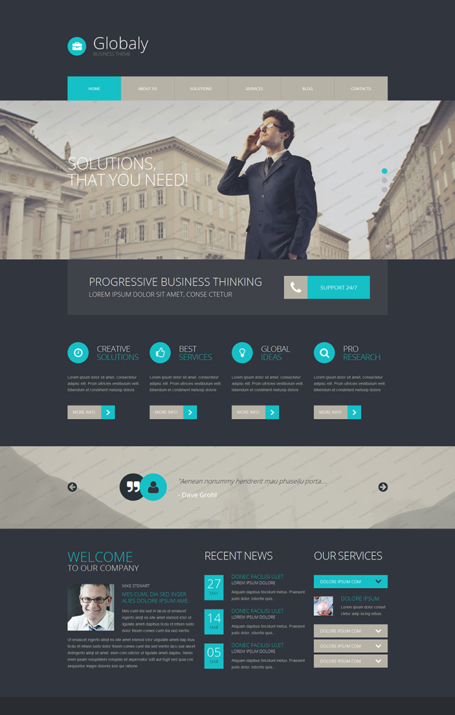
Globaly was developed in the best traditions of clean design style. The layout doesn’t feature anything extra or anything that would distract the user’s attention from understanding your business, its objectives and services. Built with valid HTML and CSS practices in mind, the theme features HTML plus JS animation, and will run properly on any device that your audience prefers. In addition, the theme is compatible with all the latest WordPress versions, so you may be certain that your site will remain competitive in the market for a long time.
Demo | Download

3. Business

19. Business WordPress theme

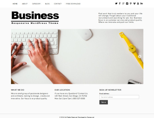
The next freebie was developed by dessign.net. As the name implies, Business WordPress theme is best suited for any kind of business that you run. Both small-to-large-sized projects can benefit from its design. Created in the minimalist style, it brings the site’s content to the forefront perfectly. The main page of the theme looks uncluttered. All that you will find here is a carousel slider placed at the center of the page, accompanied by a couple of words about the company, contact details and the navigation bar, of course.
Demo | Download

4. Lawyeria Lite

20 Lawyeria Lite

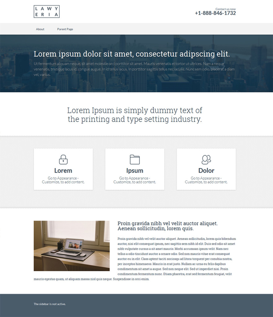
Lawyeria Lite was designed and developed by Codeinwp. The theme is best suited for a small business site or a personal blog. The layout looks rather simple yet easy to navigate. The pack doesn’t include loads of pre-designed pages. All that the Lite version includes are the Home, About, Parent and Sub-parent pages. One of the greatest advantages of the theme is its fully responsive layout, which will run smoothly across all the modern devices.
Demo | Download

These were 20 of our most preferred premium and free Consulting WordPress themes. Why do we recommend trying them? Well, most of these solutions can be managed by both novice and pro developers. Freebies will become a great starting point on your way to discovering all the latest trends and achievements in the world of web design, whereas premium designs will help you to design like a pro.

By the way, if you are new to the field of web design or you are only planning to start your first online project, the following resource will be of great value to you. Startup Hub is an online library with an array of useful recommendations by skilled web design pros who will introduce you to specific terminology and provide answers to the most discussed questions.

That’s it for today. As ever, you are welcome to share your thoughts about the aforementioned designs and provide suggestions on the other themes that you think are worthy of being mentioned here.

Read More at 20 Business Consulting WordPress Themes for 2016

Categories: Designing, Others Tags:

Case Study: Confessions from a risky redesign

January 21st, 2016 No comments

They say nothing is harder, or more stressful than to design for yourself. Not to be a one-upper, but I can think of something worse: Re-designing.

A redesign for yourself or your business can be quite intimidating. You have a lot of history to both honor and improve upon, all while walking on eggshells so you don’t disturb anything good you’ve got going on. It’s a delicate dance for sure, but sometimes there’s just no way around it.

The Deep End is my design agency. I started it in 2011 before I really knew anything about running one. Over the past four years, we’ve grown a lot, and the corners that were originally cut were starting to show. So a redesign of the website was desperately needed. But before proceeding, there were some concerns.

without a magic 8 ball, these efforts all come with their own risks. Hell, they might even blow up in our faces

First of all, our existing SEO was doing really well. The idea of changing anything and risking our search rankings going down the drain was nerve-wracking, to say the least. There are so many moving parts when it comes to SEO done right (including page load speed, bounce rates, and copy) so we knew we had to be careful to improve upon (or at least not to wreck) those elements.

Secondly, we knew going in that we wanted to change some things around in the navigation, structure and content to make for a better user experience, and to increase conversions. But without a magic 8 ball, these efforts all come with their own risks. Hell, they might even blow up in our faces.

It should be said right off the bat, that while I don’t always have a hand in the design of every project we take on, I wanted to drive the creative on our redesign; I wireframed it, and planned out the site structure and overall look and feel myself; so if anything goes wrong from a user experience perspective, guess what? It’s all on me.

In this article, I want to get into the specifics of what we did, why we did it, and an honest assessment of how it’s working.

Let’s get right into it…

Problem 1: The old site wasn’t even responsive

It’s true, and I was pretty embarrassed about it. When the site was first designed in 2011, responsive websites were already in full swing. But bootstrapped as we were, it seemed more like a “nice to have.” The past few years of user data have shown us this was no longer the case. While I would still say that most businesses looking for a web design company are probably not doing it from a mobile device, that’s no excuse.

The truth is, as a web design agency who firmly advocates for responsive (even a mobile-first approach in some cases) the fact that we missed this boat was unacceptable. To compound the problem, we actually have a blog and podcast aimed at the design community. Even if our clients aren’t accessing the site on mobile, our designer audience most likely is.

The responsive issue was what originally spurred the redesign in the first place. Then we figured as long as we’re under the hood, we might as well fix a few other issues, and make some more improvements.

Problem 2: No user flow

One thing I’ve really come to understand over the past few years is the concept of landing pages that convert. So I naturally wanted to bring that knowledge to the new site.

when given too many options, people are 10x as likely to take no action at all

As it stood, our site had no real ‘plan’. No clear goal, and no pre-set funnel for our potential clients to be lead through. We had a traditional navigation bar in the header, allowing people to click around to view our portfolio, testimonials, about us, etc. The problem with that is people only have so much patience, and very short attention spans. Studies have also shown that when given too many options, people are 10x as likely to take no action at all. In other words, without a clear path, our prospects were being lost.

So we came up with a plan. We would treat the site much more like a funnel, with the following elements:

Prioritized navigation

In a fairly risky move, we decided to tuck away all secondary navigation links in a hidden drawer menu, accessible by clicking a hamburger icon.

Deciding to use the hamburger icon with a hidden menu is quite risky from a user experience perspective, and we knew this going in. Any time you intentionally hide content from users, you should have a very good reason for doing so; better than “because it looks cleaner.” Hidden menus are generally frowned upon for a few reasons:

  1. It makes users go through an extra step; by having to click an icon just to be able to see the menu, you are essentially creating a barrier.
  2. It inhibits discoverability; let’s say your site’s conversion rates rely on some page or piece of content that people might not even be thinking to look for. For this example, let’s say it’s a testimonials page. If it’s out in the open, people are likely to find it, and those testimonials might just be what pushes them over the top into a conversion. Take that same page, and hide it away, site visitors are unlikely to ever find it. And you lose out on a phone call.

Indeed, we did have a plan, and a reason to go this route. The idea behind this move is that we would be able to direct users through contextual buttons and links within the body of the pages. Remember that statistic about people being 10x as likely to take no action when presented too many options? That is exactly what we are trying to combat with this tactic. By de-emphasizing the more ‘secondary’ pages on the site, we can draw attention to:

A clear, singular call-to-action

We would place this button on key landing pages within the page body, as well as in a sticky header, so it is always accessible.

Self-contained landing pages

In order to combat clients wandering aimlessly around the site, and due to the fact that navigation was now somewhat hidden, we would convert our portfolio pages into persuasive, conversion-driven landing pages. Each of these pages follow the same template, but there are multiple versions for our different city locations, and services. Each contains portfolio projects, an ‘about us’ video, a video testimonial, and sales copy designed to convince clients to click through to ‘Get a No-Strings Consultation.’

Since the redesign is fairly recent, we have limited analytics to go off of, but it looks like a few things are happening so far:

  • Bounce rates are higher; this makes complete sense, because without the need for people to click around to a bunch of different pages, they tend to spend their time on the landing page. If they don’t convert, they bounce.
  • Conversions are higher; for our site, we consider a filled-out form to be a conversion. With our CTA on our landing pages in several key areas, we have managed to increase those click-throughs by about 20%.

So while it seems that things are going as we expected, it really is too soon to tell for sure, especially since the holiday period has slowed things down considerably. We will continue to monitor our analytics to make sure our funnel is working as well as it can, tweaking copy here and there as needed.

Problem 3: Service offerings in flux

In the design business, there’s a lot of talk about niches. Sometimes you go after a niche, and sometimes a niche just works itself out naturally. In our case, we began as a full-service design agency, offering web, logo and print design. Over the last four years, what we were actually hired for was mostly web design, followed by logo design, with print as a distant third. Subsequently, we got good and streamlined with our web process. Our logo process was fairly worked out, and our print process became non-existent.

So when it came time to redesign, we decided to phase out our print offering altogether, eliminating that portfolio page. We just 301-redirected it back to our homepage in order to salvage any link juice that may be pointing toward it. We also eliminated ‘print’ as an option in our consultation request form.

We are still offering logo design and branding as a secondary service, so we wanted to treat it that way in the navigation. Our homepage goal is to entice prospects to click-through to our web design landing page, and the logo option is styled as a secondary option, with a plain text link.

Problem 4: Unqualified leads

One problem design businesses of all sizes suffer from is having to spend time qualifying the leads who contact them. It’s no secret that the population at large devalues design services. We would regularly get leads from our ‘get a quote’ form, saying they need a website, and their budget is under $1000.

This may not sound like a huge time-waster, but it can be when you spend face-time with a prospect only to find out mid-meeting that their budget is seriously out-of-whack with your pricing. In order to attract bigger fish, we needed better bait. Here is what we did:

  • We tweaked our copy; talking about delivering “websites,” and going into the technologies required for such projects made us sound like a commodity business, rather than a high-value consultancy. So we replaced certain sections of copy, to drive the point that we don’t just hand over websites. We research and develop web-based strategies that will actually make our clients money.
  • We changed our CTA; prior to the redesign, or call-to-action was “Get a Quote.” So essentially we were emphasizing price as a motivating factor. We replaced that with “Get a No-Strings Consultation.” This allows us to schedule a call with a prospect in order to qualify them, and see if there is an opportunity for us to actually make them more money.
  • We eliminated the “Budget” form field on the lead-gen form; again, we are trying to de-emphasize price from the equation. We changed the field to a dropdown of different company types, (small, medium, large, startup, etc,) which will give us a good idea of if they are a big enough company to afford our services.

So far, it seems that we are still attracting our fair share of startups, and smaller clients, but knowing each company’s size going in helps us prioritize who we can actually meet with. We will continue to A/B test different CTAs and copy until we achieve the desired outcome.

In order to make this as streamlined as possible, we built our site to have a single CTA text input field on the backend, so we can easily swap out the text sitewide for A/B testing.

Going forward

While it may have been a risk to redesign, it would have been far riskier to stick with the status quo

While it may have been a risk to redesign, it would have been far riskier to stick with the status quo. No site (even well designed ones) can stay stagnant forever. New research, functionality and even trends will dictate how a website changes over time to accommodate its audience and goals. In the case of The Deep End, something as basic as a responsive conversion opened a whole can of worms, prompting us to think a little bigger. There are always ways to improve a website and make it work better for your business. We preach it to our clients, so it was about time we put it into effect for ourselves.

As with any website, the real work is never done. While the results so far aren’t perfect, it’s a definite improvement, and we will continue to monitor the analytics to make sure we keep pushing it in the right direction until we hit a sweet spot.

LAST DAY: Lifetime Certified Training in Adobe Software from Train Simple – only $79!

Source

Categories: Designing, Others Tags:

How To Create And Customize A WordPress Child Theme

January 21st, 2016 No comments

The WordPress platform is a magnet for those who want to take matters into their own hands, who want complete control over their websites and want to be independent in running them. WordPress does make it really easily to completely customize a website. If you have a bit of knowledge of HTMl, CSS and/or PHP, there is nothing you can’t change.

How To Create And Customize A WordPress Child Theme

I mean, just compare the default themes, Twenty Fifteen and Twenty Fourteen. Hard to believe they are running on the same platform, isn’t it? Therefore, it is only natural for you to want to adapt the look of your website to fit your vision. I doubt there are many WordPress users out there who don’t constantly think about what to implement next. However, a problem arises.

The post How To Create And Customize A WordPress Child Theme appeared first on Smashing Magazine.

Categories: Others Tags:

14 WordPress Themes For Designing Stunning Websites in 2016

January 21st, 2016 No comments
2

Finding just the right theme to suit your needs takes time and effort. We’ve done most of the hard work for you by narrowing the field down to 14 top-quality themes; themes that could make 2016 a winning year for you. Our list features multipurpose themes, eCommerce oriented themes, a couple of specialty themes, and one free theme.

Each of these themes is worth looking into. Rather than spending your time looking at dozens of possible candidates, you can spend it exploring themes guaranteed to bring surefire results.

Enfold WordPress Theme

Enfold is a premium multipurpose WordPress theme. It is also a ThemeForest best-rated top seller. It features everything needed to create top-quality websites. It doesn’t matter if you are a novice or a longtime pro at website building. Enfold is an excellent choice, no matter what your level of experience may be.

Enfold’s demos will get you off to a quick start, and its user-friendly editor will help you move along at a rapid pace until your website is finished. Its many powerful features make website-building a straightforward task, and a fun one at that.

A demo takes but a single click to install after which you can immediately begin the editing and page-building process. You can even combine different elements from different demos. If you prefer, you can start from scratch and create your own layout. Whichever route you take, Enfold makes creating a website a quick and easy task, and the result will be a website you can take great pride in.

BeTheme

2

Be Theme is another premium multipurpose WordPress theme that is an excellent choice for beginners and experienced users alike. Be justifiably claims to be the biggest WordPress theme ever. Its claim to fame resides it its collection of over 160 pre-built websites, more than 100 of which are multiple-page websites. Coupled with Be’s 40 powerful core features, these pre-built websites can get your website building projects off to a lightning-fast start. You’ll find yourself turning out finished websites, whether they are simple or complex, in record times.

Users love the Muffin Builder 3 page builder, and Visual Composer fans like the fact that they can continue using their favorite page builder on Be if they so desire. Visit Be’s website to find out more about this popular theme. Browse through the pre-built websites, and view a demo.

X Theme

3

X Theme has been ThemeForest’s fastest selling product for some time, which suggests its authors must be doing something right. They have in fact been doing a lot of things right, which is why we’ve added this multipurpose WordPress theme to our list. The reasons for this theme’s popularity are many, but two have to do with recent X Theme releases. Version 3.0 incorporated an excellent selection of valuable plugins, and the highlight of Version 4.0 was the introduction of Cornerstone, a modern, innovative, and intuitive frontend page builder/editor.

With X Theme, you can create any type of website you want. It is also an excellent choice for creating blogs, eCommerce sites, portfolios, and one page websites. We suggest you pay a visit to the X Theme website to see what this excellent product can do for you.

Shopkeeper
4

As its name implies, Shopkeeper was created with eCommerce functionality in mind. It has all of the features needed to open an online store. While many themes advertise WooCommerce compatibility, Shopkeeper was specifically designed to operate with the WooCommerce plug in; and that makes a significant difference.

Shopkeeper is pixel-perfect, fully responsive, and has sold over 5,000 copies during the past year. It is one of three themes produced by Get Bowtied to create eCommerce websites. Consequently, you can expect nothing less than excellent support as you go about building your own eCommerce site.

Uncode –Creative Multiuse WordPress Theme
5

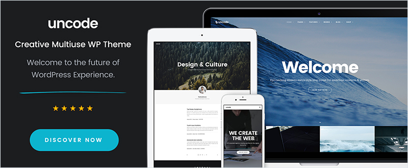
Uncode is another WordPress theme newcomer. While it might seem unusual to have a such new arrival on a list of best themes, Uncode is already a ThemeForest best seller, and it enjoys a near 5-star rating.

The authors paid strict attention to detail when designing Uncode. Its design is clean, modern, and innovative. The package includes Visual Composer, WooCommerce, Layer and Revolution Slider, iLightbox, and other valuable features.

The Core
6

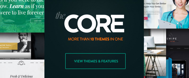
The Core is a 10-themes-in-one multipurpose WordPress theme, with more themes to come. It is primarily aimed at the corporate crowd. This WooCommerce ready theme with its Advanced Visual Builder enables a user to create highly complex pages with minimum effort.

In addition to the sliders, shortcodes, and “shop ‘til you drop” WooCommerce options, The Core’s SEO module will help you build a website that will generate traffic and bring crowds of visitors to the door of your business, store, or shop.

Kallyas WordPress Theme
7

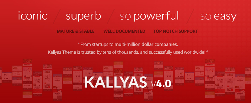
This eCommerce-oriented WordPress theme is well suited for both large companies and small businesses, and for entrepreneurs as well. Kallyas is featured on ThemeForest, it is the work of an Elite Author, and it has sold over 15,000 copies to users all over the world. The recently released Version 4.0 is actually more of a reload than an update.

New features include the frontend LIVE Builder, a selection of sliders and Hero Scenes, customized home pages, and a selection of blog and portfolio layouts. Kallyas is a great choice if you’re looking for a solid eCommerce theme with a great reputation.

SEOWP – SEO, Online Marketing, Social Media Agency WordPress Theme
8

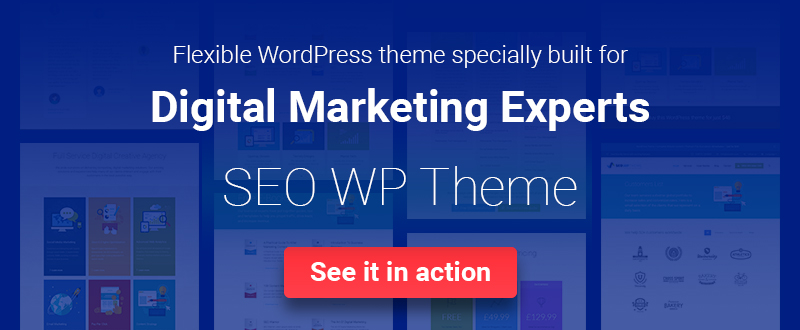
It’s only natural to assume that any eCommerce theme will be SEO ready. Most are. SEO WP is as well, but this premium WordPress theme has more to offer. Its design specifically addresses the needs of the digital marketplace, and a need for websites that serve that marketplace by generating large volumes of customer traffic.

Consequently, ready-to-edit SEO content and SEO images are included in the package. Customize either or both, and you can sit back and wait for customers to gather at the door of your online shop. Check SEO WP out. It’s different from most eCommerce themes.

Despacho Theme
9

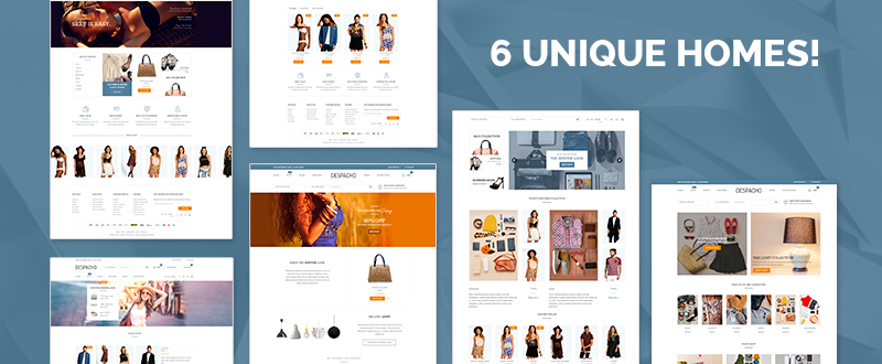
Despacho is a cutting-edge WordPress theme for building eCommerce sites. The powerful premium edition includes all of the high-quality features for shops – with a twist. The premium version, which happens to be the only version, is 100% free, and with no strings attached. Since the full-featured, customizable Despacho template is totally responsive, users can access your website on any device at any time.

Try the demo of this WooCommerce theme, or download the theme itself. Quality often comes at a price, but there are exceptions, and this is one of them. Check it out!

Mr. Tailor

10

Almost 4,000 Mr. Tailor copies have been sold. Version 2.0 has now been released. The effort that went into this version was greatly influenced by feedback from users and online store owners. Consequently, this eCommerce WordPress theme is destined to become more popular than ever.

Mr. Tailor brings to the table powerful eCommerce functionality, WooCommerce compatibility, the Visual Page Builder, and a Theme Options Panel that will help to emphasize your brand – all without coding.

Lecco One Page WordPress Theme
11

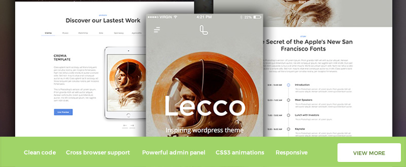
While many multipurpose WordPress themes have one page website building capabilities, a theme that specializes in one page websites will almost always provide you with extra options and give better results. Lecco is such a theme. It is an excellent choice whether you intend to build a single one page website or hundreds.

One page sites can be especially effective for displaying portfolios, publishing blogs, or showcasing products. Lecco is extremely versatile in this respect. Visit the website; where you will find a link to view the demo.

Kleo Community Theme

12

Kleo’s unique BuddyPress design gives it the versatility you need to create engaging community, membership, company presentation, or mobile websites. Kleo has the distinction of being called the #1 BuddyPress theme of 2015. Among the many pre-made demo pages to choose from you will find the most requested feature of this theme – the impressive News Magazine Demo.

If you plan to create an online community, publish a professional blog, or showcase a portfolio, Kleo deserves your attention.

Royal – Multi-Purpose WordPress Theme
13

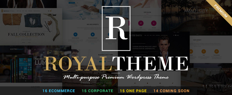
Royal Theme is 60+ themes in one. What makes this WordPress theme special is how these themes are categorized. Royal is a multipurpose theme, but it is within its eCommerce, Corporate and Agency, and One Page categories where it really shines. The eCommerce category for example features 16 variants.

The other categories feature similar variants. If you need to inform customers or potential customers of product pre-release information or services coming soon, Royal has a fine selection of Landing Page variants. This theme is a valuable one to own for many different purposes.

Hipsta – Minimal Creative WP Theme

14

A theme named Hipsta should be a cool one indeed, and that’s the case with this minimal creative WordPress theme. You can build an entire website with Hipsta. It’s at its best however if you want to build an awesome filterable portfolio or a masonry portfolio with 2, 3, or 4 columns. You can also add slideshows or video to your portfolio pages.

Use its pre-made demo to get your project off to a fast start. Hipsta comes with illustrated documentation and videos to help you along the way. The authors suggest viewing this documentation before you buy.

Summing up

We hope your search for just the right theme to fit your needs has been successful. You can’t go wrong with any of the selections from this list of premium themes.

We are always interested in our reader’s selections, and in the success they experience from making their selections. If you feel something is missing, let us know that as well.

Read More at 14 WordPress Themes For Designing Stunning Websites in 2016

Categories: Designing, Others Tags:

14 WordPress Themes For Designing Stunning Websites in 2016

January 21st, 2016 No comments
1

Finding just the right theme to suit your needs takes time and effort. We’ve done most of the hard work for you by narrowing the field down to 14 top-quality themes; themes that could make 2016 a winning year for you. Our list features multipurpose themes, eCommerce oriented themes, a couple of specialty themes, and one free theme.

Each of these themes is worth looking into. Rather than spending your time looking at dozens of possible candidates, you can spend it exploring themes guaranteed to bring surefire results.

Enfold WordPress Theme

Enfold is a premium multipurpose WordPress theme. It is also a ThemeForest best-rated top seller. It features everything needed to create top-quality websites. It doesn’t matter if you are a novice or a longtime pro at website building. Enfold is an excellent choice, no matter what your level of experience may be.

Enfold’s demos will get you off to a quick start, and its user-friendly editor will help you move along at a rapid pace until your website is finished. Its many powerful features make website-building a straightforward task, and a fun one at that.

A demo takes but a single click to install after which you can immediately begin the editing and page-building process. You can even combine different elements from different demos. If you prefer, you can start from scratch and create your own layout. Whichever route you take, Enfold makes creating a website a quick and easy task, and the result will be a website you can take great pride in.

BeTheme

Be Theme is another premium multipurpose WordPress theme that is an excellent choice for beginners and experienced users alike. Be justifiably claims to be the biggest WordPress theme ever. Its claim to fame resides it its collection of over 160 pre-built websites, more than 100 of which are multiple-page websites. Coupled with Be’s 40 powerful core features, these pre-built websites can get your website building projects off to a lightning-fast start. You’ll find yourself turning out finished websites, whether they are simple or complex, in record times.

Users love the Muffin Builder 3 page builder, and Visual Composer fans like the fact that they can continue using their favorite page builder on Be if they so desire. Visit Be’s website to find out more about this popular theme. Browse through the pre-built websites, and view a demo.

X Theme

3

X Theme has been ThemeForest’s fastest selling product for some time, which suggests its authors must be doing something right. They have in fact been doing a lot of things right, which is why we’ve added this multipurpose WordPress theme to our list. The reasons for this theme’s popularity are many, but two have to do with recent X Theme releases. Version 3.0 incorporated an excellent selection of valuable plugins, and the highlight of Version 4.0 was the introduction of Cornerstone, a modern, innovative, and intuitive frontend page builder/editor.

With X Theme, you can create any type of website you want. It is also an excellent choice for creating blogs, eCommerce sites, portfolios, and one page websites. We suggest you pay a visit to the X Theme website to see what this excellent product can do for you.

Shopkeeper

4

As its name implies, Shopkeeper was created with eCommerce functionality in mind. It has all of the features needed to open an online store. While many themes advertise WooCommerce compatibility, Shopkeeper was specifically designed to operate with the WooCommerce plug in; and that makes a significant difference.

Shopkeeper is pixel-perfect, fully responsive, and has sold over 5,000 copies during the past year. It is one of three themes produced by Get Bowtied to create eCommerce websites. Consequently, you can expect nothing less than excellent support as you go about building your own eCommerce site.

Uncode –Creative Multiuse WordPress Theme

5

Uncode is another WordPress theme newcomer. While it might seem unusual to have a such new arrival on a list of best themes, Uncode is already a ThemeForest best seller, and it enjoys a near 5-star rating.

The authors paid strict attention to detail when designing Uncode. Its design is clean, modern, and innovative. The package includes Visual Composer, WooCommerce, Layer and Revolution Slider, iLightbox, and other valuable features.

The Core

6

The Core is a 10-themes-in-one multipurpose WordPress theme, with more themes to come. It is primarily aimed at the corporate crowd. This WooCommerce ready theme with its Advanced Visual Builder enables a user to create highly complex pages with minimum effort.

In addition to the sliders, shortcodes, and “shop ‘til you drop” WooCommerce options, The Core’s SEO module will help you build a website that will generate traffic and bring crowds of visitors to the door of your business, store, or shop.

Kallyas WordPress Theme

7

This eCommerce-oriented WordPress theme is well suited for both large companies and small businesses, and for entrepreneurs as well. Kallyas is featured on ThemeForest, it is the work of an Elite Author, and it has sold over 15,000 copies to users all over the world. The recently released Version 4.0 is actually more of a reload than an update.

New features include the frontend LIVE Builder, a selection of sliders and Hero Scenes, customized home pages, and a selection of blog and portfolio layouts. Kallyas is a great choice if you’re looking for a solid eCommerce theme with a great reputation.

SEOWP – SEO, Online Marketing, Social Media Agency WordPress Theme

8

It’s only natural to assume that any eCommerce theme will be SEO ready. Most are. SEO WP is as well, but this premium WordPress theme has more to offer. Its design specifically addresses the needs of the digital marketplace, and a need for websites that serve that marketplace by generating large volumes of customer traffic.

Consequently, ready-to-edit SEO content and SEO images are included in the package. Customize either or both, and you can sit back and wait for customers to gather at the door of your online shop. Check SEO WP out. It’s different from most eCommerce themes.

Despacho Theme

9

Despacho is a cutting-edge WordPress theme for building eCommerce sites. The powerful premium edition includes all of the high-quality features for shops – with a twist. The premium version, which happens to be the only version, is 100% free, and with no strings attached. Since the full-featured, customizable Despacho template is totally responsive, users can access your website on any device at any time.

Try the demo of this WooCommerce theme, or download the theme itself. Quality often comes at a price, but there are exceptions, and this is one of them. Check it out!

Mr. Tailor

10

Almost 4,000 Mr. Tailor copies have been sold. Version 2.0 has now been released. The effort that went into this version was greatly influenced by feedback from users and online store owners. Consequently, this eCommerce WordPress theme is destined to become more popular than ever.

Mr. Tailor brings to the table powerful eCommerce functionality, WooCommerce compatibility, the Visual Page Builder, and a Theme Options Panel that will help to emphasize your brand – all without coding.

Lecco One Page WordPress Theme

11

While many multipurpose WordPress themes have one page website building capabilities, a theme that specializes in one page websites will almost always provide you with extra options and give better results. Lecco is such a theme. It is an excellent choice whether you intend to build a single one page website or hundreds.

One page sites can be especially effective for displaying portfolios, publishing blogs, or showcasing products. Lecco is extremely versatile in this respect. Visit the website; where you will find a link to view the demo.

Kleo Community Theme

12

Kleo’s unique BuddyPress design gives it the versatility you need to create engaging community, membership, company presentation, or mobile websites. Kleo has the distinction of being called the #1 BuddyPress theme of 2015. Among the many pre-made demo pages to choose from you will find the most requested feature of this theme – the impressive News Magazine Demo.

If you plan to create an online community, publish a professional blog, or showcase a portfolio, Kleo deserves your attention.

Royal – Multi-Purpose WordPress Theme

13

Royal Theme is 60+ themes in one. What makes this WordPress theme special is how these themes are categorized. Royal is a multipurpose theme, but it is within its eCommerce, Corporate and Agency, and One Page categories where it really shines. The eCommerce category for example features 16 variants.

The other categories feature similar variants. If you need to inform customers or potential customers of product pre-release information or services coming soon, Royal has a fine selection of Landing Page variants. This theme is a valuable one to own for many different purposes.

Hipsta – Minimal Creative WP Theme

14

A theme named Hipsta should be a cool one indeed, and that’s the case with this minimal creative WordPress theme. You can build an entire website with Hipsta. It’s at its best however if you want to build an awesome filterable portfolio or a masonry portfolio with 2, 3, or 4 columns. You can also add slideshows or video to your portfolio pages.

Use its pre-made demo to get your project off to a fast start. Hipsta comes with illustrated documentation and videos to help you along the way. The authors suggest viewing this documentation before you buy.

Summing up

We hope your search for just the right theme to fit your needs has been successful. You can’t go wrong with any of the selections from this list of premium themes.

We are always interested in our reader’s selections, and in the success they experience from making their selections. If you feel something is missing, let us know that as well.

Read More at 14 WordPress Themes For Designing Stunning Websites in 2016

Categories: Designing, Others Tags:

fullPage.js: Creating Multipage OnePagers Fast and Easily

January 21st, 2016 No comments

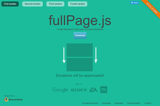
OnePagers are very popular, especially for small web projects. Their sophisticated and generous design often attracts maximum attention. The jQuery plugin fullPage.js allows you to create multipage onepagers in an easy way. The plugin causes the defined areas of an HTML document to be displayed in full page and makes it possible to switch between them in an animated way via navigation and scrolling.

Implementing the Plugin and Creating Pages

fullPage.js consists of one JavaScript and one stylesheet file each, both of which need to be integrated together with jQuery. There’s also the option to integrate the jQuery UI easing plugin for additional animation effects during the transitions between pages.

fullpagejs1

Afterward, you markup an HTML document containing your pages. For this, fullPage.js requires a container with an ID, “fullpage” for example. Within this, you define a container with the class “section” for every page. The plugin displays all containers in full page size below each other. By default, the first page is visible when acessing the website.

<div id="fullpage">
  <div class="section">page 1</div>
  <div class="section">page 2</div>
  <div class="section">Spage 3</div>
</div>

Subsequently, the plugin needs to be called via JavaScript and the ID has to be transferred.

$(document).ready(function() {
  $("#fullpage").fullpage();
});

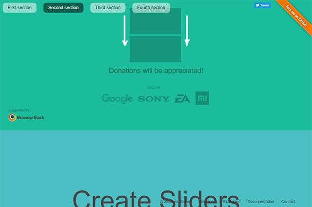
Per default, when scrolling, the first page is faded out with a simple slide animation and the next is faded in from below.

Controlling Appearance and Functionality

fullpagejs2
Animated Transition to the Next Page

This plugin provides a plethora of options that allow you to adjust appearance and functionality of the plugin. Using the plugin gives you the opportunity to define the background colors of the individual pages as well as the width of the side borders.

$(document).ready(function() {
  $("#fullpage").fullpage({
    sectionsColor: ["#ccc", "#fff", "#333"],
    paddingTop: "10px",
    paddingBottom: "20px"
  });
});

With the option “sectionsColor”, you can define the background color for all paragraphs or pages via an object literal. Using “paddingTop” and “paddingBottom” you determine the gaps on top and on the bottom.

Controlling Navigation

If you don’t want the first page, but another page to be displayed when accessing the website, you can mark any area using the additional class “active”. Then, this area will always be displayed when the URL is called. It is set as kind of a homepage. From that point onwards, you can access the other pages as usual.

<div id="fullpage">
  <div class="section">page 1</div>
  <div class="section active">page 2</div>
  <div class="section">page 3</div>
</div>

You can also create a navigation that allows you to directly access every page. The navigation is created manually within its own container. The attribute “data-menuanchor” has to be assigned to each menu anchor that is supposed to be linked to an area with a specific value. The actual link also contains the anchor name as a page-internal referral.

<div id="menu">
  <ul>
  <li data-menuanchor="page1"><a href="#seite1">page 1</a></li>
  </il>
</div>

Within the plugin’s options, you also distribute anchor designations using the parameter “anchors”. Additionally, the parameter “menu” allows you to define the menu’s ID.

$(document).ready(function() {
  $("#fullpage").fullpage({
    menu: "#menu",
    anchor: ["page1", "page2", "page3"]
  );
});

After that, you can navigate through the pages not only by scrolling, but also by using the “normal” navigation. Of course, the animated transitions remain.

Adding an Additional Horizontal Side Layer

fullpagejs3
Second Layer for Additional Content

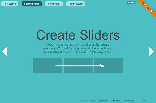
If the straightforward page structure is not enough, you can add a second layer with content. While the first layer is constructed vertically, the second one is arranged horizontally as so-called slides. This means that you scroll down to go through the pages on the first layer and to the right to access the slides. In the source code, you can markup these additional pages with their own container and the class “slide”.

<div id="fullpage">
  <div class="section">page 1</div>
  <div class="section">
    <div class="slide">page 2.1</div>
    <div class="slide">page 2.2</div>
  </div>
  <div class="section">Seite 3</div>
</div>

In the example, you’re scrolling down from page 1 to page 2.1. Here, the plugin provides control arrows which allow you to switch to page 2.2 on the right or back to page 2.1 on the left.

Conclusion

fullPage.js is a very simple, yet impressive tool that allows you to structure and present the content of a onepager in full-page size. The additional second layer enables you to integrate complex content in an appealing way. That’s why the plugin is very useful to keep presentations in the browser.

The settings are very diverse. An extensive documentation gives you a detailed overview of what’s possible. Contemporarily, the animations are based on CSS3. fullPage.js runs in all modern browsers and even in Internet Explorer from version 8 and up. It also works for mobile devices like tablets.

The plugin is available under the MIT license which allows you to use it in many ways, including commercial purposes. The download package also includes several examples which you can use to try it.

(dpe)

Categories: Others Tags: