Archive

Archive for February, 2016

Chromantics: Do You Know the Psychology of Colors?

February 10th, 2016 No comments

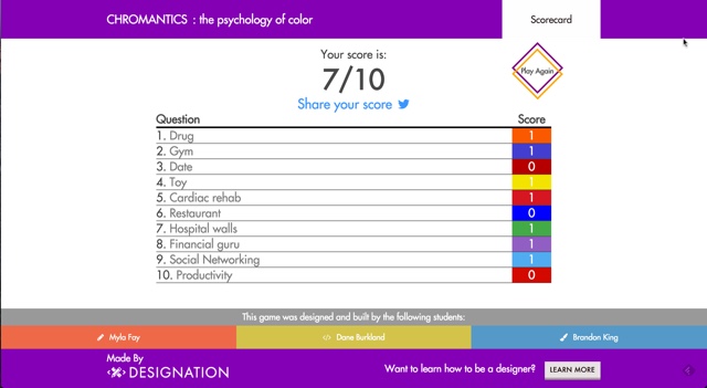
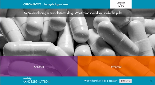
The small but really neat browser quiz Chromantics asks ten questions touching ten different design environments. You need to choose the right one of two color options for each design task from a color-psychological point of view. I wasn’t always right.

Chromantics: Who is the Best Color Psychologist?

Fortunately, Chromantics always explains the correct choice with background information which was able to restore plausibility even when I would’ve made a different choice. You’ll surely learn one or two things from the results.

Chromantics: Do You Know the Psychology of Colors?

For one, you’ll learn things about color psychology which you probably didn’t know before. This even happened to me after over 20 years of design experience. On the other hand, you’ll also learn that there’s not always one definite answer. In some cases, my opinion was generally different from the one the makers of Chromantics declared as right, and I can back it of just as well as they back up their color choice.

Chromantics: Do You Know the Psychology of Colors?

In any case, Chromantics is an interesting piece of knowledge for in between. It looks beautiful, does not only offer plain fare, and just takes up one or two minutes of your time. So, visit it and click through the quiz…

Chromantics: Thought Up and Made by Designation

Chromantics was created by students of the education company Designation. Designation offers 12-week intensive workshops, so-called boot camps, in Chicago. There they hammer all the knowledge you need to become a UX/UI designer or frontend developer into you.

The boot camps have an ambitious schedule with 70 hours a week. Including an additional six weeks of virtual training, you are almost trained intravenously with over 900 hours of education.

Designation works with real commissions for real clients. This secures that the practical relevance is given throughout the whole schedule in contrast to other educational facilities.

Categories: Others Tags:

Building a Jekyll Site – Part 2 of 3: Adding a Jekyll CMS with CloudCannon

February 10th, 2016 No comments

The following is a sponsored guest post by Mike Neumegen from CloudCannon. This series is all about not only building a Jekyll site but then adding simple editability through CloudCannon.

In this series, we are building a site for a fictional cafe called Coffee Cafe. In the last tutorial, we converted their existing static site to use Jekyll.

This tutorial adds a content management system to the site with CloudCannon. We will host the Coffee Cafe site, define editable areas and share it with a non-developer staff member.

CloudCannon is a content management system for Jekyll and static sites. It allows your team/clients to update content inline and keep the advantages of a static site.

Setup

Start by signing up for a (free) CloudCannon account.

The first screen you see is the dashboard, where you create and access your sites in CloudCannon. Create a site and call it Coffee Cafe.

To add files to the site, upload the site we created from the previous tutorial by dragging the source files into the browser. CloudCannon also supports syncing files with GitHub, Bitbucket and Dropbox.

To configure the Jekyll site and tell CloudCannon to use Jekyll for our site, we need a configuration file. Create an empty file from the Add Files menu in the top right corner and name it `_config.yml`.

When a file changes, CloudCannon builds the site and pushes it live to a *.cloudvent.net address. Click the link at the top to view your live Coffee Cafe site.

Editing the Content

Non-developers update content in CloudCannon with editable regions defined by developers. Editable regions are HTML elements with the editable class. To add this, open the code editor by clicking on the `index.html` file.

Add the editable class to HTML elements you want non-developers to update. This example makes an entire div editable:

<div class="column third editable">
  <div class="center-text"><img src="//d1qmdf3vop2l07.cloudfront.net/grape-giraffe1.cloudvent.net/compressed/8a0c8c4e90d8ac7681629b333225fc86.svg" alt="search" width="100" data-cms-original-src="/images/search.svg" /></div>
  <h3>Improve</h3>
  <p>Our customers rank up to 20% higher on their targeted keywords</p>
</div>

This example restricts editing to some elements inside the div:

<div class="column third">
  <div class="center-text"><img src="//d1qmdf3vop2l07.cloudfront.net/grape-giraffe1.cloudvent.net/compressed/8a0c8c4e90d8ac7681629b333225fc86.svg" alt="search" width="100" data-cms-original-src="/images/search.svg" /></div>
  <h3 class="editable">Improve</h3>
  <p class="editable">Our customers rank up to 20% higher on their targeted keywords</p>
</div>

Save your changes and open the visual editor in the top right corner to see the editable regions in action. In the visual editor, content inside a yellow box can be updated inline.

Sharing with Non-Developers

Sharing the site with other staff members allows them to collaborate on the content. Go to Site Settings -> Sharing, enter the email address of a colleague, set permission level to Non-Developer and press Add Share.

CloudCannon sends an email inviting them to edit the site.

The non-developers log in, open the Coffee Cafe site to the visual editor and update the editable regions.

They can update the page title and other metadata in the settings panel, accessed from the settings button in the top right corner. The CloudCannon documentation has detailed options to control the front matter interface.

Blogging

Blogging is available by going to Collections -> Posts on the left sidebar.

To create a new draft post, use the Add Files menu in the top right corner. New drafts and existing blog posts open in an easy to use editor. There are options for saving changes and publishing drafts.

Status

There are suggestions, status and a history of changes made to the site on the Status page.

Workflows

Working locally is great for developers as you can use your existing tools. Keep this workflow by syncing your site from GitHub or Bitbucket with CloudCannon, and git push to publish changes. CloudCannon picks up the changes, builds the site and publishes it live. When non-developers update content in CloudCannon, the changes are published live and committed to the repository.

You can have multiple environments (e.g. staging and production) with Git branches. Set up a Git branch for each environment and create a CloudCannon site for each branch. Work in staging then merge changes to production, all within CloudCannon.

Our Editable Site

The Coffee Cafe site is now live and editable with CloudCannon. The fictional staff update content themselves without code. Developers work locally with their favourite code editors and push changes with Git.

For the final tutorial, we will build our own commenting system using Firebase.


Building a Jekyll Site – Part 2 of 3: Adding a Jekyll CMS with CloudCannon is a post from CSS-Tricks

Categories: Designing, Others Tags:

Don’t design for mobile, design for mobility

February 10th, 2016 No comments

Just when we were starting to get used to the tools, frameworks and methodologies needed to design good mobile apps, we find the device landscape is changing again: smartwatches and other connected wearables, sensors and everything under the “Internet of Things” umbrella are bringing new complexity to our field, and makes it very difficult to tell where “mobile” or an “app” really starts and ends.

And we designers are having a hard time getting used to it. Given that many of us first approached mobile design through responsive web design, it’s been much easier to approach mobile design as if it were some kind of “smaller web with touch support and camera access”.

But the upcoming products and services are meant to live fluidly across a range of devices, sensors and network connections. So I believe that mobility, rather than mobile, defines much better the kind of environment we will have to design for.

Rather than a focus on a specific device, designing for mobility is a broader approach to design; one that delivers value because it can be transmitted by any combination of devices. Mobility forces us to think broadly and zoom out from specific devices to look at the ecosystem in which we will be designing.

Mobility is about the context, not the device

Technology has been gaining awareness of what we do, where we go and who we relate to. For a while, it seemed like mobile phones would be the single point of contact for technology to learn about our context, for they were the only “smart” device we were carrying with us. This, of course, is no longer true; smartwatches, fitness wristbands and other wearables possess sensors (like heart-rate monitors and pedometers) that wouldn’t make sense for a mobile phone.

So in reality, how much of our context an app or platform can capture doesn’t depend on a single device, but rather a combination of several touchpoints—think about how Facebook determines if you are logging in from an “unusual” location. We need to consider how much we can know about a user’s environment given all the devices that they might have available at a given time.

Context-awareness also implies designing for cases when the amount of information available is limited or non-existent. This is true even if we are designing for a single, known device: under certain conditions, data access or location services can be unreliable or cease to function entirely. This is, for instance, what happens when location services can only rely on GPS.

Let’s redefine “responsive”

We want to know better the context of our users in order to better satisfy their needs (or get more money from them, depending on our motivation). In that sense, obtaining information from them is just the first half of a transaction: users give us information in exchange for value obtained from that information. The way we give back said value to users is by responding.

The meaning of “responsive” has been badly spoiled. It’s reduced to no more than being able to adapt to different screen sizes. We need to bring back the concept of “responsive” to its fullest meaning: being able to respond, and thus establishing a communication with the user.

A truly responsive interface is actively listening to an unpredictable environment

A truly responsive interface is actively listening to an unpredictable environment. This may involve everything from being aware of a lost Internet connection, to responding to a sudden heart rate change, and everything in between. Waze, for instance, automatically switches their color scheme from light to dark based on sunset time. This is good, because it avoids blinding the user at night, but it could be improved, for instance, by detecting the environment brightness using the phone cameras. This way, the UI would adapt in real time if the car enters a tunnel, or if it’s going out of a dark parking lot to a bright street.

We are heavily underusing what we are already able to know about our users’ context. Analytics, for instance, tells us a lot about who is visiting our site or using our app, but we mostly use that information in a passive, post-mortem way, just analyzing what’s happened. What if we leveraged Analytics data to respond in real time to our users?

Embracing mobility forces us to think much harder about our users’ environment and try to serve them better by establishing a richer, smarter communication.

Screens are slowly reducing their presence

It’s no news that screens are getting both smaller and more capable. But the notion of a screen itself is being put into question by new technology: is an Oculus Rift a proper “screen”? What about the projected interface in car windshields? Or what a Holo Lens does to our room’s wall?

For one side, visual interfaces are no longer tied to glowing glass rectangles; for the other, the availability of auditive and haptic feedback gives us more options to communicate with our users and reinforce messages. In this context, mobility equals unobtrusiveness; our systems should adapt to users, not the other way around.

Smartwatches, for instance, aim to reduce the amount of time we stare at screens, in order to consume only the bits of information we really need right now. In most cases, this is done through notifications.

Design notification-first

The variety and unpredictability of media through which our information can be delivered forces our communications to be reduced to their lowest common denominator: notifications.

There are three key things about notifications: one, they are simple and brief; two, their ability to be designed is quite limited, because they have to fit radically different form factors; and three, they actively interrupt the user (push) rather than waiting for them to request something (pull).

So, the true value of most apps reside in the content that it’s able to provide in a given moment. The UX of what happens inside the full-sized app is secondary to the notification (the prime example being chat apps). Indeed, for many use cases, a good notification doesn’t even require you to access the full app — this is specially true in Android, where notifications are much richer, better designed and actionable.

The app-centric paradigm that is the center of our current mobile experience is slowly starting to give way to a stream of timely content and information delivered by the providers of your choosing— something like what Google Now is starting to become. Who is able to offer the best restaurant recommendations? The best weather data? The best traffic info?

This puts a strong emphasis on the value delivered to users by service and content providers, rather than how beautifully designed an app is.

Does that mean that apps are going to dissapear or become utterly irrelevant? For valuable service providers, of course not. Apps, for one, are the user endpoints through which data is input; for Yelp to be the best review provider, you still need to leave a review using the app. Secondly, apps offer detailed views (you wouldn’t use Instagram only through notifications) and immersive experiences that are best suited for several use cases.

But bear in mind that notifications, cards and other bite-sized units of content will drive user engagement and interaction for many, if not most, apps. Designing “notification-first” enables your app’s value to be delivered through a much wider range of media and forces you to think on valuable information first and transitions, layouts and color palettes second.

Design around bits of value tied to context

The above can easily be read as an invitation to throw more notifications, but we probably need less notifications these days, not more. Notifications are abused by most apps, which selfishly consider appropriate to interrupt the user to deliver content that they haven’t requested or even expect (an example of this that never ceases to annoy me is Twitter’s “tailored for you” notifications, enabled by default and mostly a poor guess on what content might interest me).

Technology provides us with data from which we can infer context, but we still need to understand the context to make sense of it

Notifications should be a way of delivering value rather than an opportunity to constantly buzz users into coming back to our apps.

Which brings us back to the need to be context-aware. Designers need to be connected with our users’ environment from the conceptualization phase. So techniques like contextual inquiry, shadowing and field research are more important than ever, as increased mobility means that the environment is less and less predictable. If the environment for a web user in the 90’s was a desk, a chair and a room, now it can be anywhere, anytime.

Technology provides us with data from which we can infer context, but we still need to understand the context to make sense of it; if not, we end up with random, useless raw data obtained from sensors. Proper user research, then, is more important than ever, both to conceptualize better products and services and to infer properly the context to which we will respond.

It’s a bad time for lazy designers

UX design just got a lot more complex. Well, “just” is misleading; we are “just” noticing it. More than ever, UX designers need to be broad-minded, collaborative, thorough and careful about who they are designing for. We need to deepen our knowledge of available technology just as much as we need to ensure our users aren’t stunned by it.

Featured image, mobile image via Shutterstock.

Create Slick AJAX Forms in Minutes – only $13!

Source

Categories: Designing, Others Tags:

Deal of the Week: Exclusive Discount for Noupe Readers on the Level Up Bundle

February 10th, 2016 No comments

Welcome to our Deal of the Week. This time the deal is powered by our friends over at Inky Deals. You already know that the folks there are totally crazy and always come up with the most radical deals you can find around the web. This time is no exception. Their Level Up Bundle comes with elements valued at more than 6,300 USD for a bargain price of 59 USD. Is that crazy or is that crazy?

Deal of the Week: This Bundle Contains:

  • Inky’s Decorations Toolkit, worth $4,300
  • 8 Amazing Fonts from Queen Type Fonts and Bonjour Type Script, worth $690
  • Massive Bundle with 576 Logos from Design District, worth $15
  • Corporate Identity & Design Mock-ups from Limedot, worth $250
  • 6 Power Point Presentations from Zacomic, worth $900
  • 4 Best-Selling WordPress Themes from Template Monster, worth $212

The kind folks at Inky offer our valued readers an exclusive discount coupon. Simply use NOUPE50 on checkout and can grab this deal with an extra 50% discount!

Not to mention that this entire collection comes with an extended license, allowing you to use it in unlimited commercial purposes and even in merchandise – without any additional fees!

You’ll receive $6,367 worth of professionally crafted resources.

And the price? Only $59, meaning a whopping 99.07% off!

So, what are you waiting for? Get this deal now!!

Did you know you can get any of Inky’s deals for Valentine’s Day at a 40% discount now? Check them all out here and grab your favorite ones, because the offer is available until Sunday the 14th! Just choose your favourites and use the coupon code LOVE2016 at checkout.

Categories: Others Tags:

Building A First-Class App That Leverages Your Website: A Case Study

February 10th, 2016 No comments

Mark Zuckerberg once said, “The biggest mistake that we made, as a company, is betting too much on HTML5 as opposed to native… because it just wasn’t there. And it’s not that HTML5 is bad. I’m actually, long term, really excited about it.” And who wouldn’t be excited by the prospect of a single code base that works across multiple platforms?

The app as a mix of native and web interfaces

Unfortunately, Facebook felt that HTML5 didn’t offer the experience it was looking to build, and that’s what it’s really about: the experience. I believe what Mark was really trying to say was that their biggest mistake was making a technology-driven decision instead of a user experience-driven decision. At the end of the day, we should be making decisions that deliver value to our customers, and sticking to a particular technology is generally not the best way to achieve that.

The post Building A First-Class App That Leverages Your Website: A Case Study appeared first on Smashing Magazine.

Categories: Others Tags:

GitHub Enterprise 2.5 is Now Available

February 10th, 2016 No comments

Some days back, we reported that GitHub is contemplating offering better and more focused services for Enterprise users. While the direction of GitHub in relation to the target audience that it wishes to focus on is still unclear, GitHub Enterprise 2.5 is now available.

GitHub Enterprise 2.5 focuses on scalability and easier workflow management for development teams of any size. Now, even if your development team is over 10,000 strong, GitHub Enterprise can be used to collaborate easily and work on larger projects.

Among other things, GitHub Enterprise 2.5 now comes with:

  • Clustering framework, that lets you add users and coders to larger installations within minutes.
  • An easier way to cache intensive operations, so as to optimize performance and resource allocation even when working on larger applications.
  • A “preview mode” for the Protected Branches API, which allows administrators to keep track of the project’s scalability.
  • Authentication process has been improved and simplified, and SVN support has also been enhanced.
  • GitHub Enterprise 2.5 also comes with some minor design tweaks, especially in terms of navigation and page layout.

With the latest release of GitHub Enterprise, focus has been placed on pretty larger teams, as the concept of clustering works mostly for very large development teams and relies more on administrative resources for workflow management. Beyond that, developers cannot force push or delete protected branches anymore, which further is useful if you have multiple instances running and a large development team with hierarchical setup.

If you have enabled automatic updates, your instance of GitHub Enterprise will automatically be updated to the new release. Also, you can read the release notes on this page, or learn more about GitHub Enterprise 2.5 here.

Categories: Others Tags:

Adobe releases updates to Bridge CC

February 9th, 2016 No comments

Adobe has updated significant features in Bridge CC with the release of its latest version. Bridge CC is Adobe’s digital asset management app or DAM. Providing designers with centralized access to files and assets that are essential to any creative project or task, it streamlines workflows and helps designers stay organized during any project.

Here’s a quick look at all that’s new in this update to the app.

Automated cache deletion

Bridge CC’s central cache is where thumbnails, metadata info and previews live inside of a database. When designers browse or search for files, the centralized access of this database increases their workflow’s efficiency.

In past versions, bigger caches meant more disk space used, but Adobe has improved the app’s purging cache capability. As a result, designers now don’t have to worry about their caches ballooning in size because stale cache items get automatically deleted when the app is idle.

There’s also a new cache compaction option that establishes cache clean-up when designers exit the app, just in case the database size swells to excessive levels.

These two features make the app run smoother and increase the user experience, as both cache and database stay clean over longer periods of time.

On-demand thumbnail extraction

Designers browsing through big sets of digital assets sometimes feel bogged down if the app slows down. One thing Adobe’s done differently in this update is improving the manner in which thumbnails, metadata info and previews get generated. As a result, Bridge CC’s responsiveness increases.

The thumbnails, metadata info and previews are extracted on a priority basis just for the on-screen assets, when users pick a folder. Any thumbnails, metadata info and previews for the remaining files will be generated when the app’s idle or on-demand.

Here’s what this means in practical terms for designers: They get to work with bulkier folders without the bother of unresponsive states and hangs. As a result, there will be a completely updated Filter panel available prior to any of the thumbnails being generated.

Import from device option (Mac)

In past versions of Mac operating systems, Bridge CC failed to recognize these devices:

  • iOS mobile devices
  • Android mobile devices as well as digital cameras connected in MTP or PTP modes

In version 6.2, an alternative to importing media from said devices is a possibility. Designers can select File > Import From Device to import media from the devices.

This only applies to Macs and starts Apple Image Capture to bring files into Bridge CC from the devices.

Additional improvements

The Autostack Panorama/HDR feature has been reinstated. Adobe’s focus was on Bridge CC’s performance and stability, which means noteworthy updates to the app’s core technical components. This is the first step in what will be the basis of a tech platform that’s going to allow for continuous, future improvements and development of Bridge CC.

Adobe has provided designers with a number of video tutorials and guides for those who want to learn from the company’s experts. Eager designers can find these resource materials right here.

500+ Hi-Res Photos & Textures from DreamyPixel – only $19!

Source

Categories: Designing, Others Tags:

#FreshStart Giveaway: Become 1 of 10 Happy Freelancers with 1 Free Year of FreshBooks

February 9th, 2016 No comments
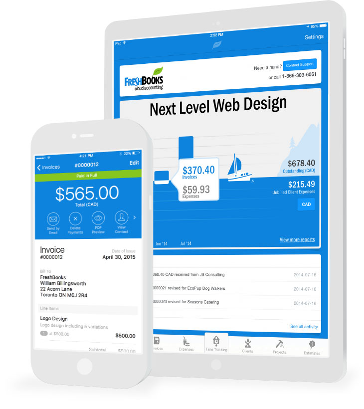
freshbooks-devices-mobile

We’ve talked a lot of how web designers can start billing like a boss.

Now is your chance to get your invoicing off to a fresh start this year by winning 1 year of FreshBooks!

A Few Words about the Prize

FreshBooks is an award-winning cloud accounting software designed for service-based small business owners. FreshBooks makes creating and sending invoices, organizing your expenses and tracking your hours the easiest part of your day. If you’re a freelancer or run a small agency, FreshBooks is built for you.

By winning this prize, you’ll have unlimited access to all features in the product. Here are some of the key features:

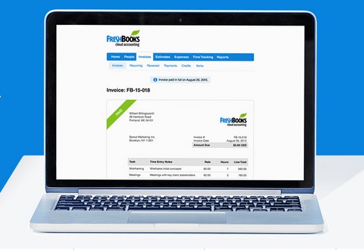
1) Simple and Fast Invoice Software

Invoice-software

You’ll be able to create professional looking invoices in seconds. Easily create professional looking invoices that you can e-mail your clients, download as PDF, or print with a single click.

  • Logo Customization – Add your own logo and color scheme so that your invoice reflects your brand
  • Get Paid Online – Offer credit card payments using a variety of gateways including PayPal, Stripe and FreshBooks Online Payments
  • Invoice Autobiography – You can see exactly when your clients open the invoice
  • Automatic Late Payment Reminders – Automatically notify clients who haven’t paid their invoice, saving you time and the hassle sending
  • Deposits – Help your cashflow by getting paid (partially or in full) up front when your kicking off a project
  • Bill Anytime, Anywhere – From coffee shop to mountain top, with the FreshBooks companion app for iOS and Android, you can send an invoice from anywhere.

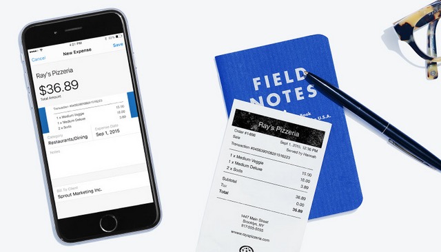
2) Organize Expenses and Capture Receipts with Ease

organize-expenses-freshbooks

You can now toss that shoebox away! Now stay organized and remove clutter by storing expenses in one tidy place.

  • Mobile Expense Capture – Never lose another receipt with the FreshBooks mobile app. Snap a picture of your receipt and log an expense right from your phone.
  • Automatic Bank Import – Auto-magically import and categorize expenses from bank accounts and credit cards
  • Recoup Expenses – Assign expenses to clients and add them to invoices for quick reimbursement. Know instantly which receipts are unbilled and which have been recouped.

3) Reporting and Time Tracking for your Projects

time-tracking

Never miss a billable minute. You’ll be able to create detailed invoices from your billable hours. Simply review, send, and get paid faster.

  • Log Hours Anywhere – Record billable time from anywhere with the FreshBooks companion app for iOS and Android
  • Team Time Tracking – Multiple team members can log time spent on projects into an easy to read calendar and progress at a glance with handy team timesheet reports
  • Know Your Numbers at a Glance – Create Profit and Loss statements, see who’s slow to pay, and send reports to your accountant to make tax time a breeze

Ready to Enter?

Click here to enter the contest!

Important Notes:

  • The giveaway starts on Feb 9, 2016 and will be running through Feb 21, 2016.
  • We will pick 10 winners randomly. If you’re selected, FreshBooks will contact you by email to set you up for your free account

Good luck!

Read More at #FreshStart Giveaway: Become 1 of 10 Happy Freelancers with 1 Free Year of FreshBooks

Categories: Designing, Others Tags:

The Vital Guide To Interaction Designer (IxD) Interviewing

February 9th, 2016 No comments
toptal-blog-image-1446454970324-e6e8d9f636b7e36ee88feb3a1b172fcd.jpg

In today’s technology-filled world, it will not surprise anyone if we said that pretty much every Web or mobile application is based on interactive visual elements. It’s no longer enough to simply hire a graphic designer to provide necessary visual graphics.

More often than not, you will find yourself in a need of a professional interaction designer (IxD) to add that extra layer of “good to great” to your project.

Before we jump into the hiring guide itself, let us explain what an interaction designer is not.

UI, UX, IxD: Lots of overlap and loads of differences.

UI, UX, IxD: Lots of overlap and loads of differences.

Many times IxDs are mistakenly called user-experience designers, user interface-designers or even simply graphic designers or illustrators.

This confusion arises because the field of interaction design only started a few decades ago.

The Challenge

Unfortunately an IxD’s main goals are very similar to those of a user experience (UX) designer; they both facilitate the interactions between people and their environment.

The main difference in their goals being that, unlike UX designers, who are responsible for all user-facing aspects of a software or system, interaction designers generally only look after the interaction between users and computers, frequently known as “human-computer interaction.”

This confusion makes it more difficult to decide which IxD would be right for you and your company. Note that there are important foundation concepts, principles and methodologies that are constantly used in interaction design.

Ten Interaction Design (IxD) Principles

These are the principles we will be looking at in order to help you understand the foundation and methodology behind IxD, and to help you decide whom to hire.
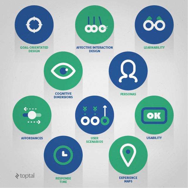
Meet the ten commandments of good interaction design

Meet the ten commandments of good interaction design.
  1. Goal-orientated design
  2. Personas
  3. Affective interaction design
  4. Cognitive dimensions
  5. Learnability
  6. Usability
  7. Affordances
  8. User scenarios
  9. Experience maps
  10. Response time

Now, let’s dive into the details of these principles to better understand how they add value to an interaction designer’s workflow and why they are crucial.

1. Goal-Oriented Design

Any end user interacting with an application or platform has certain goals, and an interaction designer’s job is to help the user reach said goals in the most efficient way possible. These goals consist of desired outcomes, such as accessing a bank statement, sending a file, uploading a photo, and so on.

The way to discover these goals is by conducting a user research. While it isn’t an interaction designer’s job to conduct this research, s/he has to be fully knowledgeable of the research results.

Whether s/he does the research, or if the User Experience (UX) designer provides it, knowing exactly what users expect by interacting with your product will allow your Interaction Designer (IxD) create the best possible Goal-Orientated Design.

2. Personas

“Personas” are fictional characters developed from cognitive psychology and human behavior research; they resemble your targeted end-user.

Personas are used when explaining design decisions along the process.

For example: “Peter, who is Chief Marketing Officer, would more likely use our app while commuting by train. How short would his attention span more likely be in that scenario?”

The answer to this question should help to decide, for example, how many steps should a marketing proposal application’s submission take.

3. Affective Interaction Design

This principle is allows interfaces to be designed in such way that they convey positive, expressive, enjoyable, happy and inspiring emotions when interacting with technology. Needless to say, this should be in every Interaction Designer’s interests.

Certain elements, and key aspects, of design influence the emotional response of the targeted end-user. Affective Interaction Design is used to avoid:

  • Giving users too little information to make a decision
  • Error messages that make users feel patronized
  • Bright, flashing design elements
  • Chaotic and confusing layouts

Instead, using Affective Interaction Design the following steps can be taken to change the negative emotions in the end-user:

  • Give clear, detailed instructions how to solve the problem
  • Make additional helpful resources accessible
  • Create dynamic, animated design elements to keep users informed about the current actions being taken

4. Cognitive Dimensions

To analyse and evaluate design quality and its usability, the cognitive dimensions framework is used as a lighter approach, sometimes referred to as “cognitive dimensions of notations.” Here are the 14 cognitive dimensions that Thomas Green originally defined and that are used to analyse design quality and usability:

  • Abstraction gradient
  • Closeness of mapping
  • Consistency
  • Diffuseness / terseness
  • Error-proneness
  • Hard mental operations
  • Hidden dependencies
  • Juxtaposability
  • Premature commitment
  • Progressive evaluation
  • Role-expressiveness
  • Secondary notation
  • Viscosity
  • Visibility

5. Learnability

The best, and most professional, interaction designers don’t use their creativity solely to reinvent the wheel every time a new design challenge comes their way. Instead, they use proven ways to make users feel as familiar with the interface as possible.

This is achieved by using familiar design components. For example, If a user is used to uploading a document by clicking on a green link, he would only have to overcome a learning curve if he sees an orange button instead of green.

Even though all new products and their platforms require unique design solutions and unique interfaces, every good interaction designer will use these familiar components, sometimes called “interface idiom” or “pattern.”

6. Usability

This dimension is similar to “Learnability”. The main difference is that while learnability is about making users feel familiar with the product’s interface, even the first time using it, “usability” is about making the product’s interface easy to use.

In many cases, a usability analyst might be added to the workflow for the initial usability study; this provides an understanding of the level of ease, use and learnability of the product.

Further, there are five usability characteristics, and the product must be:

  • Effective
  • Efficient
  • Engaging
  • Error tolerant
  • Easy to learn

7. Affordances

As the old saying goes, “form follows function”, the same principle applies to anything that your IxD will design. Every product should “invite” the end-user to take a specific action, based on the way it was designed.

For example, when you look at a hammer, you shouldn’t have to think too long to understand which end is for holding and which end to use to hit that nail into the wall.

Any good IxD knows that just as hammers have to look like hammers, scissors have to look like scissors and screwdrivers have to look like screwdrivers, buttons have to look like buttons, links have to look like links, input fields have to look like input fields, and so on.

By designing specific components using affordances, the end user immediately understands the underlying function of those elements.

8. User Scenarios

“User scenarios” answer two important questions:

  • What users do on the website with the product or the application
  • What is the reason behind that action

You can think of user scenarios as short stories that illustrate end users’ goals, how they achieve those goals, and what the motivation is for those actions; what made them think that those steps will help them achieve their goals?

Good user scenarios should be short, relevant and to the point, yet they should be sufficiently detailed about possible actions, motives and goals of the end user.

Here are a few questions that interaction designers should keep in mind:

  • Who is the user I’m designing for?
  • What does this user want on my site?
  • How is this user going to achieve his or hers goals?
  • Why does this user come to my site and not somewhere else?

9. Experience Maps

This could be referred to as visual representation of the user’s journey over time. To start creating experience maps your interaction designer must be fully aware of your target audience.
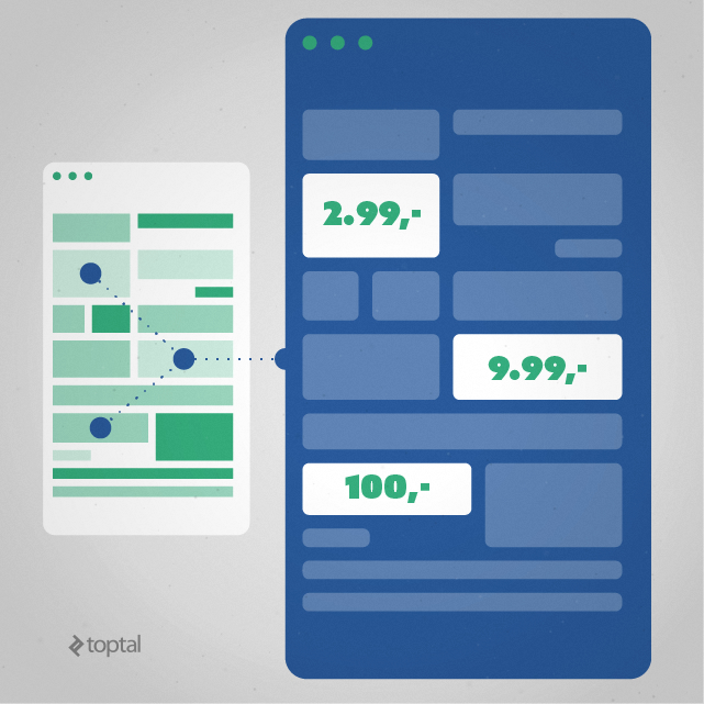
User scenarios and experience maps are a vital part of any interaction design process

User scenarios and experience maps are a vital part of any interaction design process.

After that comes the clear articulation of usage, opportunities, needs, goals and wants. Then come the engagement scenarios that will influence the product’s success with the end user:

  • Determine the ease-of-use at touch points and fluctuations are satisfactory, which could also become opportunities for improvement.
  • What are some of the issues and challenges that could occur when using the product and how could they impact the use and adoption of the product?
  • Spot opportunities that arise out of user-experience gaps that prevent users meeting end goals.
  • How would different devices influence users’ experience with the product’s interface?

10. Response Time

Finally, when designing and optimizing any web or mobile product’s experience, it’s the response time that becomes an important strength. It consists of the three significant time limits, which have been determined by human perceptual abilities.

In 1993, Jakob Nielsen, Ph.D., a user advocate and principal of the Nielsen Norman Group, published a book titled Usability Engineering. In Chapter 5, he describes in detail why response time is important. Here is an excerpt:
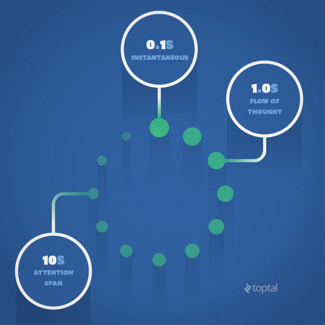
Response time can make or break an IxD solution. Design and optimize for speed.

Response time can make or break an IxD solution. Design and optimize for speed.

The basic advice regarding response times has been about the same for thirty years [Miller 1968; Card et al. 1991]:

  • 0.1 second is about the limit for having the user feel that the system is reacting instantaneously, meaning that no special feedback is necessary except to display the result.
  • 1.0 second is about the limit for the user’s flow of thought to stay uninterrupted, even though the user will notice the delay. Normally, no special feedback is necessary during delays of more than 0.1 but less than 1.0 second, but the user does lose the feeling of operating directly on the data.
  • 10 seconds is about the limit for keeping the user’s attention focused on the dialogue. For longer delays, users will want to perform other tasks while waiting for the computer to finish, so they should be given feedback indicating when the computer expects to be done. Feedback during the delay is especially important if the response time is likely to be highly variable, since users will then not know what to expect.

From Principles To Practice

There are a number of ways of applying the outlined IxD principles to actual projects. Because implementation may vary depending on the type and scope of a project, it is important to tailor interview questions in such a way as to prompt the designer to discuss general principles. Execution should be covered only after establishing the candidate has a good grasp of them.

Q: Why is contrast important for Interaction Design (IxD) and how would you use it?

This is a basic design concept. It helps set apart and differentiate what’s important on the page from the elements that serve a secondary or supportive purpose.

Contrast can make content easily readable, scannable and even sharable. I also use it to make sure the CTA (Call To Action) elements, and any other purpose-driven elements on the site, do not blend together with other background elements.

Q: How would you make sure your interaction design is not only aesthetically pleasing, but also functional?

To ensure design serves its functional purpose, it is necessary to know what the main functional priorities each interface or element have to serve. Then the next step is to think about the range of actions this interface and elements can perform.

The range of possible actions should never overwhelm or confuse the end-user . To achieve this “functional minimalism,” avoid unnecessary functions and features; break complex functions and tasks into smaller sub-task steps without limiting the user experience, instead cut down on functions.

Q: What are the most important and fundamental elements of any interaction design system?

The following three elements are fundamental to all systems, especially when it comes to interaction design: control, trust and explorability.

Control is the most important; when users feel in control of the interface they feel more comfortable using it. When end-users feel comfortable in control, they will start to trust it.

They trust that the interface will prevent them from creating errors or make them uncomfortable, which might happen if the user didn’t have full control of it.

Lastly, confidence is gained by having full control of the interface and trusting it. And with confidence, users feel free to apply their own abilities to explore the interface by themselves.

Q: How would you effectively use consistency for your interaction design (UxD) work?

Good interaction design must be consistent. End-users will quickly learn patterns, repetitive actions and consistent functions. Therefore, not sticking with consistency will only confuse your end-users, making them feel uncomfortable with the interface.

As an example, if your “Buy It Now” button, “Subscribe” link or a clickable “Add To Basket” element is orange, then every one of these elements should be orange. These are your CTA (Call To Action) elements, and orange would therefore become what the industry calls an “Action Color;” it should remain consistent across all your CTA elements.

Q: How would you ensure your interaction design (IxD) system always tracks the state?

As a result of the popularity of browser-based products, which exist in a stateless environment, interaction designers should ensure our systems track, as a minimum, the following interactions:

  • Whether this is the user’s first time of using the system / application.
  • If not, at what stage was the user when the last session was finished?
  • What gained the user’s interest in the system?
  • What are the stages or steps has the user taken during the current session?
  • And finally, what step is the user taking now in the current session?

Read More at The Vital Guide To Interaction Designer (IxD) Interviewing
Categories: Designing, Others Tags:

Building a Jekyll Site – Part 1 of 3: Converting a Static Website To Jekyll

February 9th, 2016 No comments

The following is a guest post by Mike Neumegen from CloudCannon. Mike and I talked about doing a little series on building Jekyll sites, which of course I was into because Jekyll is great and more education around static site generators is a good thing. Full disclosure, Mike’s company CloudCannon is a CMS on top of Jekyll. As part of this series he’s going to show you how to use that, so I requested it be a sponsored post.

Static site generators are no longer just a tool for developers’ personal blogs. Many companies are turning to static technology for public facing websites, including Netflix, GitHub and Atlassian.

Jekyll is the most popular static site generator. It takes source files and generates a website of static pages upfront, ready to serve to users directly. This is different from how a traditional CMS works, such as WordPress. WordPress uses a server side language and database to generate a page when requested by a user.

In this series, we’ll cover the basics of developing sites with Jekyll. Starting by converting a static site to Jekyll, adding a CMS for non-developers using CloudCannon, then building a commenting system using Firebase.

This tutorial creates a site for a fictional Cafe called Coffee Cafe. Here’s a demo.

The site we’re about to Jekylize.

Installing Jekyll

Jekyll is a command line tool which needs to be installed before use.

OS X

$ gem install jekyll -v 2.4.0

Ubuntu

$ apt-get install ruby ruby-dev make gcc nodejs
$ gem install jekyll -v 2.4.0

Windows

Windows is not officially supported but there is a workaround.

Setup

Download the source files for Coffee Cafe if you want to follow along.

Run Jekyll to build and serve the site. Navigate to the directory in your terminal and run:

$ cd path/to/site/files
$ jekyll serve

jekyll serve builds the static site to the _site directory within the same folder and starts a web server locally. Navigate to http://localhost:4000 in your browser to view Coffee Cafe.

Jekyll layouts

Repeating content is the biggest hassle of a purely static site. Jekyll layouts solve this issue. A layout is an HTML file in the `_layouts` folder with placeholders for content.

Creating a layout

In Coffee Cafe, div.content and title are the only elements that change per page. The easiest way to create a layout is by copying an existing HTML file. Copy `index.html` to `_layouts/default.html` and replace the contents of div.content with {{ content }}.

</header>

<div class="content">
    {{ content }}
</div>

<footer>

{{ content }} is a Liquid tag which is part of Jekyll’s templating language.

Setting a layout

To set `index.html` to use the default layout, we use front matter, a snippet of YAML at the top of the file between lines of three dashes.

To set the layout of `index.html`:

  1. Update the contents of the file to contain only the contents of div.content
  2. Add layout: default to the front matter
---
layout: default
---
<section class="hero">...</section>
<div class="container">...</div>
<section class="cta">...</section>

The index page is generated with the default layout and has the file contents in place of {{ content }}. The website should look the same as before. Repeat the same process for all other HTML files.

Using page variables

To customize the title of each page, we set a front matter variable on each page and use it in the layout. Add the title variable to `index.html`:

---
layout: default
title: Home
---
...

Output the variable in _layout/default.html with Liquid:

...
<title>{{ page.title }}</title>
...

The title tag now changes between pages. This reduces the unnecessary duplication in the site, so you make future changes in one place.

Blogging

Adding posts is almost the same process as adding a page. Posts are Markdown or HTML files within the `_posts` folder with a filename formatted with :year-:month-:day-:title.:extension.


Blog post file format

Writing posts

The contents of a post is the same as a page, a front matter header and the contents of the file. Create a file called `_posts/2016-01-01-what-is-coffee.md`, then add the front matter followed by the content of the post.

---
layout: post
title: What is Coffee?
category: Information
---
Coffee is a brewed drink prepared from roasted coffee beans, which are the seeds of berries from the Coffea plant. The Coffea plant is native to subtropical Africa and some islands in southern Asia. The plant was exported from Africa to countries around the world and coffee plants are now cultivated in over 70 countries, primarily in the equatorial regions of the Americas, Southeast Asia, India, and Africa. The two most commonly grown are the highly regarded arabica, and the less sophisticated but stronger and more hardy robusta. Once ripe, coffee beans are picked, processed, and dried. Green (unroasted) coffee beans are one of the most traded agricultural commodities in the world. Once traded, the coffee beans are roasted to varying degrees, depending on the desired flavor. Roasted beans are ground and brewed to produce coffee as a beverage.

Source / Read more [Wikipedia](https://en.wikipedia.org/wiki/Coffee).

This separation of markup and data is core to the Jekyll philosophy. This allows for reuse of the content anywhere in the site.

Creating the post layout

The example above used a new layout called post. This layout will extend the default layout and add post specific elements, such as the publish date and category. To achieve this in Jekyll, we specify a layout inside a layout. Copy the following into `_layouts/post.html`:

---
layout: default
---
<div class="container">
  <h2 class="spacing">{{ page.title }}</h2>

  <div class="blog-post spacing">
    <p class="summary">{{ page.category }}<span class="date">{{ page.date | date: '%B %d, %Y' }}</span></p>
    {{ content }}
  </div>
</div>

Using Liquid, we output each variable from the front matter, just as we output title above. The date variable is formatted with a Liquid filter.

Listing posts

The final step is listing the blog posts in blog.html. Using a Liquid for loop, create an element for each post in site.posts:

---
layout: default
title: Blog
---
<div class="container">
  <h2 class="spacing">Blog</h2>

  <div class="blog-posts">
    {% for post in site.posts %}
      <div class="blog-post spacing">
        <h3><a href="{{ post.url }}">{{ post.title }}</a></h3>
        <p class="summary">
          {{ post.category }}
          <span class="date">
            {{ post.date | date: '%B %d, %Y' }}
          </span>
        </p>
        {{ post.excerpt }}
      </div>
    {% endfor %}
  </div>
</div>

Jekyll provides built in variables used here which are not defined in the front matter:

  • url is the generated URL for the post which is usually /:categories/:year/:month/:day/:title.html but there are many configuration options
  • excerpt is a snippet taken from the start of post content
  • content is unused here but it displays the entire content of the post, exactly like {{ content }} in the layouts

All done

In minutes we’ve gone from a static site to a Jekyll site with a blog. Here’s a download link for the final Jekyll Coffee Cafe site.

Stay tuned the next few days as we level up this site with some powerful editing abilities and features.


Building a Jekyll Site – Part 1 of 3: Converting a Static Website To Jekyll is a post from CSS-Tricks

Categories: Designing, Others Tags: