Archive

Archive for February, 2016

DocSend’s Dave Koslow

February 26th, 2016 No comments
dkoslow_portrait
dkoslow_portrait

DocSend Co-Founder and Chief Product Officer, Mobile Visionary

In June of 2007, the iPhone was released by Apple, creating a technological revolution that would change the direction technology was in. A year earlier, in June of 2006, David Koslow was a Stanford Computer Science Intern at Palm, working on the Palm OS browser, Blazer. When completing his Masters with a focus in Human-Computer Interaction, Dave worked as an intern at Google, working as part of the Google Alerts team, where he worked on back-end database optimization.

When Dave finished his studies Stanford in 2008, Apple had changed the world with their mobile device, and Dave already had his finger on the pulse of the industry. Dave dedicated himself for the next four years at Greystripe, a rich media ad network, where he flew through the ranks and led their engineering team in pursuit of success. Dave found success there, and even authored Greystripe’s native advertising SDK for iOS as well their cross-platform mobile video ad format. He would leave GreyStripe after four of incredible success to reach out into the world for himself.

In March of 2013, Dave co-founded DocSend, a sales acceleration platform that makes salespeople more effective by enabling them to track, control, send, and present sales materials with real-time document analytics. Since then he has continued to operate with DocSend as the Chief Product Officer, delineating high-level product vision and tirelessly need-finding with customers to surface opportunities. Here Dave continues to define his legacy as one of the true innovators in the industry of product design.

What’s your opinion on the current trends?

“You know I think when we, and by we I mean we collectively in the product design community, saw when there was that shift broadly to flat design, there were definitely things that were lost along the way. I think it felt like a kind of knee jerk reaction. And the fact is that we lost gradients, and the affordances of certain things being interactive. It’s been nice to see trends like material design more recently moving past that and making things like buttons once again appear interactive. And so I think that it was kind of interesting that history has us going back and forth, oscillating from things that are very skeuomorphic, like having a notebook look like a notebook, or having a desktop look like a desktop, and then moving to something more abstract, and then responding with ‘Well now we’ve tipped the scales too far in one direction’, and then we go back and forth.

And I’d like to think that over time, we’re kind of getting closer to something that strikes that perfect balance, between being visually compelling but also having those affordances so that you have an expectation of how to interact with it. One of the things I think is interesting, and I don’t know maybe this comes across as a nitpick, but we’ve been able to benefit for so many years on the desktop web, that having things like hover states and we haven’t quite gotten there yet on mobile.”

Why has it taken so long for mobile optimization to become an important factor, and push for more than just integration? With mobile technology growing every year, when will we see a unified design “language”?

“I think that we’re making good strides, and of course there is the favorite buzzword of ‘responsive design’. The fact of the matter is, there are just so few things you can code in mobile, and just have it work on desktop. So even with something like Bootstrap, you still have to go into your browser, open the inspectors, set up all the different screen sizes, have a look at how things actually will work, not to mention the fact, do the actual interaction patterns continue to make sense, even in a layout that looks good on mobile? And to be perfectly honest, I’m cautiously optimistic, but I do believe there is a sort of art to designing anything. I think that there needs to be a necessary manual process that actually goes in and patches up the design after the fact. But even with that way, whether you’re on mobile first or you’re on desktop first, you’re going to have to make a decision where you’re going to spend your energy, especially when you look at it from the view of an early stage start up, where you can only afford to focus on one, and I think for a while mobile was kind of the thing that came second. And I think that we had a bit of a knee jerk reaction to that. A lot of companies came out of the gates that are mobile-first. And so what we end up with is all sorts of services that are out there on the market that are mobile-first, and I think there were more companies that were on the market mobile-first then there was a need. I think we’re starting to see what happens when things go one way and not the other, and we’re seeing a rubber band effect where it’s starting to come back from that, and is making us ask some fundamental questions, ‘What about this application would requires that it be a mobile-first app?’”

DocSend has innovated the way people do business.

Where do you see the industry’s direction going towards?

“I’m very optimistic. I think that the way that software has advanced over the past twenty years, and additionally the way that infrastructure and cloud computing has advanced, in the past ten years, has made it so software can be written so that getting from zero to an MVP has never been faster. All of these off-the-shelf components are already there at your disposal and it’s up to you to kind of put the pieces together and create a novel application. The beauty of that is you don’t have to spend a ton of time coming up with your own real-time messaging framework, for example. You don’t have to spend all this time developing your own error reporting service. All of that stuff is available right now through a variety of best-in-class services that really allow you to get off the ground quickly. And from a design standpoint, we’re maybe about ten or fifteen years behind. It’s still the early days, and I think that Bootstrap has been a wonderful tool for so many people. Starting DocSend, for example, we had bootstrap in place from the start, as well as these icon sets at our disposal. We could go and integrate it into our application, that actually is pretty darn good looking, really quickly. There’s just this stuff that wasn’t possible before, and I think what we’ll continue to see in the next handful of years is just further and further elaboration on that, that will develop into having more creative spirits get involved, and help establish a feedback loop that will lead to designs off-the-shelf that you can then use to go from zero to MVP incredibly quickly.”

What would you like to tell someone who is just starting, or have a desire to start getting into design?

“You know Ira Glass said something about his early days broadcasting. And I’m totally going to misquote him but, he basically said something to the extent of, Whenever you’re getting started in something, the best thing you could possibly do is to produce a high volume of work. And you’re going to look at it, and think, I suck at it, and you’re going to think it’s not good enough, and you’re going to keep at it, and you’re going to suck a little bit less. It will continue to get better, and that frustration will drive you forward. And so long as you can embrace the frustration, and make it a positive force in your feedback loop, it will drive you to continue creating and get back up and continue to produce a high volume of work. That’s going to be your way forward. Just do it, over and over, and over again.”

What one Sci-Fi technology would you want to have right now, and what would you do with it?

“Okay I’m going to answer this without sounding too cheesy, but I would say the lifeblood of what I do is rooted in understanding the customer. Getting inside their head, asking them questions, understanding what keeps them up at night. What’s the first thing they do when they come into the office, the first thing you do in the morning? What are the challenges? If I could have some way of doing a bit more than swapping shoes with them, to really for a moment experience life from their perspective, that would be incredible. An empathy machine.”

If you could give the person you were when you began on your career one piece of advice, what would you tell yourself?

“I think you’re never going to know everything. So you might as well just go ahead and get started, and give it your best shot. Because we can be preparing for the future our entire lives and never get to that point where we take the plunge and move forward from preparing to actually doing it. I think, especially when I was going to school at Stanford, ‘Wow, I’m just so far behind.’ I remember one summer in college I actually read the O’Reilly book on HTML from cover to cover. And like, who does that? Why would you do that? That’s how deeply I felt I had all this ground to cover, that I had to catch up. And you can really get into your head, that feeling of inadequacy, that you have all this stuff you have to cover until you know those things. That you’re not ready to get started. The fact of the matter is you are never going to know all the things. You’re never going to check all the checkboxes. And the best thing, the best way is to get out there, give it your all, and learn from your mistakes. And get back up, get back in there, and keep going.”

Read More at DocSend’s Dave Koslow

Categories: Designing, Others Tags:

An Interview with Una Kravets

February 26th, 2016 No comments

I had the pleasure of talking to Una Karvets one Sunny Sunday, and was super excited to do so because I’m a huge fan of her work. If you’re not that familiar with what she does, here are some pretty cool links to check out:

http://alistapart.com/article/finessing-fecolormatrix
http://una.im/CSSgram
http://una.im/svg-icons
http://una.im/classy-css
http://una.im/bokeh
http://una.im/3d-effect
http://una.im/bokeh
https://github.com/una/personal-goals

The following is a transcript of my interview with Una. I learned a lot from her and wanted to share that wisdom here.


Sarah Drasner: When I think of you, I think of somebody who has been a breath of fresh air in the CSS community. You seem to ask, with good data to support your inquiries, “Wait, did we throw the baby out with the bath water?” You post a range of materials—from creative implementations for things like CSS filters, to “Hey, let’s be really reasonable about what this is and how to use it.” That’s really great.

Una Kravets: I’m glad that you picked up on that. In my heart, I want to just say “Whatever, let’s just be creative and art the web. Let’s push it forward and just worry about the rest later.” But in my head, I’ve learned to reign that in and be a bit more pragmatic.

At work, I’ve been working on component libraries (for Watson and Bluemix), for what has amounted to over a year now. Aside from just worrying about browser compatibility, component libraries pose a really big problem to solve. On one hand, you can create a system that’s perfectly semantic, using mixins and extends, which produces the smallest file size, and beautiful code, but that also comes with a lot of assumptions. So, you can’t say, “Well, everyone is going to use Sass,” since not everyone may be familiar with it yet. We learned that we needed to take a step back and think about the user—provide CSS for those who might not have experience with Sass, and for those who do, we need to think about how to build a system that is easy to get started with.

SD: Yeah, there are a lot of really brilliant server-side engineers that use these kind of component libraries, but then there’s also the maintenance of a code library. Those are different roles but, at some point, you have to decide if a Junior Engineer just won’t be able to work on the maintenance part. If you’re going to write mixins and extends in a certain way, you silo the work a bit towards Sass experts and people who feel more comfortable working with the markup.

UK: I think that’s important to realize. Also, a lot of time people hear these new terms in the dev world and they get kind of worried because the more people are talking about them the more it seems like everybody is using them and you’re just behind. But really, people are just talking about new things because they’re new. Making that distinction is kind of freeing because you realize that it’s okay to not have all the answers immediately and take a second to understand why people are using something instead of jumping in because it’s “the new hotness.”

SD: Yeah, I know that’s a really great thing to do. There’s a certain amount of anxiety when you see all the new things coming out. You have to have time to review technology before you take the plunge of putting it in production and maintaining it indefinitely.

You’re doing a lot of engineering work lately, but seems like you used to do a lot of design. Have you moved away from design?

UK: I always have difficulty answering this question—I do still design, though not as much and not in the traditional sense of visual design. I pretty much only design via code because I find it a lot faster to design in the browser and don’t like spending time on an extra step if I don’t have to. Sometimes I’ll do a sketch, and then figure the rest out on the screen.

SD: Personally, I love when you post calligraphic drawings on Twitter. What was the one you had done just recently that was really good? It was when you were learning React.

Sharing methods & their scope in React#codecalligraphy #reactjs pic.twitter.com/dt9A8xK5Di

— Una Kravets (@Una) December 27, 2015

UK: Oh, I did a React one about props and how they’re passed between items, and recently did one on ES2015 string templating and then another on default parameters. I really wanted to learn calligraphy a little over a year ago, so I ended up taking a calligraphy class at a local art gallery which turned out to be a Roman calligraphy class. I thought that was cool, but it’s not really what I wanted to learn so I learned the rest on SkillShare and YouTube.

? #CodeCalligraphy: ES2015 Default Params ?https://t.co/PAuqgZb98L

Another handy feature I recognize from Sass ? pic.twitter.com/2bl88Y7Xv2

— Una Kravets (@Una) February 13, 2016

SD: It’s nice to put the two together because some of the concepts can be dry. Doing technical diagrams are difficult because finding the best way to visualize concepts is tough. Once you do, I think it makes things clearer not just for you, but also other people trying to follow along. Do you find the process clarifying?

UK: Definitely. It’s so hard to find posts that explain complex subjects in a high level way.

SD: One of my favorite of your articles was the one about Sass extends.

UK: You liked it? I knew posting it would get some people angry at me because a lot of developers have opinions on extends and how to architect CSS. I remember posting it on a Friday and thinking, “Hmm, this is definitely the best time to post the article,” [laughs] and I got ready to go out while waiting for the angry comments to roll in.

SD: I thought that was great because there were some previous articles that were particularly damning against using extends and, as a result, a lot of people threw them out entirely.

UK: Oh yes.

SD: So, when you defended them, it revisited that premise and, to be honest, it was something I was thinking all along, too.

UK: Extends are there for a reason. In an article I have coming up I talk about ES2015 classes and how they’re akin to Sass @extend when using super() in class constructors to pull in the JavaScript methods of the parent class. And then go on to talk about 5 more concepts that transfer over pretty well.

Editor’s note: Una has since published the article.

SD: That sounds like an awesome article. I’m going to read it for sure.

UK: Yay!

SD: Yeah, I mean, that’s a really good point.

Are you still working at IBM?

UK: Yep! It’s been really cool to see how the company culture has transformed since I’ve started there. It’s been really, really exciting to watch the front-end development community in particular grow so much and find its place within a design studio.

SD: Do you feel like you’ve been part of a group that has pushed that idea forward?

“I think, especially in this community, being passionate is 9/10 of the law”

UK: Yeah. I used to work at a company called Viget that I absolutely loved and the front-end developers had these knowledge-share sessions where they would watch tech conference videos together over lunch. It was a way to catch up and learn new things. I really missed that kind of knowledge-sharing when I started at IBM so I figured why not make it happen? From October 2014 until now, almost every week we’ve had either a speaker or a video that we watched. There have been over 40 unique talks from different coworkers, most of whom had never given talks before. It gives people a chance to practice speaking and making slides and teaching while giving other people a chance to learn.

SD: Well, that’s really cool. That seems like fostering some growth as well for people who might casually be interested in some of these things and not have a way of learning more.

UK: It opens people’s eyes to things they might not even realize exist yet and also who to turn to for more information on a topic. We’ve had talks about React, Ember, performance monitoring, the web audio API and SVG animation. We’ve had talks about everything! It’s a place where people have an excuse to dive deep into a topic they’re interested in and, as an aside, they now have prepared presentations for meet-ups in town!

SD: Oh, that’s awesome. Does this mean mentorship is a part of what you’re doing now?

UK: In the office, I’ve always been a go-to Sass person. That’s continued and I’ve always helped different teams with front-end questions and getting designers started with GitHub. Outside of work though, I get emails now. People will ask me for advice and I honestly try my best to answer them pretty quickly because I know I used to be that girl sending emails to people who inspired me online. I would say, “I really love your work on this, this, and this. I’m a student. Is there any advice you can give me or books I should read or things like videos I should watch?” I think the people who are sending these emails and making the effort to reach out are the people who are going to be really successful in the future because they’re putting that extra time in and putting themselves out there.

SD: Yeah, I don’t know if you heard there’s a recent Shop Talk Show episode where Chris [Coyier] and Dave [Rupert] were going through old questions and one of them was, “How do I get involved and how do I learn more about the web community?” It was from somebody who is like now part of the web community.

UK: I heard him reading it. They’re like, “I think he’s fine now.” [Both laugh.]

SD: I remember even when they said the name I thought, wait, I know that name. So, yes, I think that’s true. I think especially in this community being passionate is 9/10 of the law.

And now, with you so active, people probably ask you to speak a lot. You shot up like a rocket.

UK: That’s exactly what it’s like. It’s like a roller coaster and I don’t want to stop because I have so many ideas and people actually listen to them, which has allowed me to rationalize spending my weekends toying around on the Internet with random thoughts on how to make designing in the browser better.

SD: Absolutely! And that leads into my next question: how do you find time to balance your work life, your passionate web life and all of the conferences. You travel a lot for conferences. How does that work with your job and balance in general.

UK: Oh girl [laughs], you’ve got to make time is what I learned. It’s hard. It’s not easy.

I think last year I spent a lot more time being focused on my career and making sure I was doing good work, and then going home and making sure I was doing good work outside of work. It sounds bad, but I can’t hate on it too much because I think everyone needs that experience of buckling down and focusing on building things until they hit a point where they realize, “OK you need to maybe take a step back now.”

I use lists a lot to make sure I’m doing all the things I want to do. If I don’t write something down, then I’ll probably forget. I actually keep them pretty public on a GitHub repo.

SD: Yeah, yeah, I’ve poked around there and looked. I do a very similar thing, but mine’s analog and not public. It’s pretty special that you use GitHub as a tool this way.

UK: Exactly. I mean, whatever is most accessible for you. For me the terminal is where I live. I just organize everything in the terminal and then I post to the web, but it’s so important to write things down and that’s how I make sure I’m making the time for things. This year I’ve spent more time focusing on a balance: if I am spending X amount of time working, I have to balance that out with X amount of time hanging out in Austin, which is a really cool city, or doing things that aren’t code-focused. I get a lot of inspiration for the talks I give outside of my computer screen, so it’s nice to prioritize getting some time away from it.

SD: That’s awesome. When you say you’re solely designing in the browser now, I assume you’re still looking at things that inspire you in the same way and then just changing output.

How do you find inspiration? Do you find that your inspirational tools are he same for that kind of output? Are you still looking at Dribbble and CodePen? What are you doing in order to get cracking on those things?

UK: I like to find inspiration outside of the Internet and the computer screen. When it comes to art, I really like things to have a raw edge to them and less of a Web-2.0-everything-is-perfect-and-flat aesthetic, which I think is still running the Internet. What I try to do is make things have a little more texture and that’s sort of what you see in nature.

It’s organic. There’s nothing perfect in nature. There’s nothing flat in nature. So, I guess that’s really where I see my inspiration coming from more recently.

SD: That probably lends really heavily into your work with the bokeh filters and your other Sass experiments.

“Browsers are getting even better with graphic rendering. I think we’ll see a shift back to unique textures and expressive layouts, which is why I like to say #ArtTheWeb”

UK: Yeah, those things are just like making sketches. I throw them into a browser and see how they work there. I did this travel site. It’s at travels.surge.sh and it’s a mix of my travel writing with images I took on location and CSS experiments. I literally designed every layout on there by throwing them together in the browser and applying filters and blend modes on them.

SD: I didn’t even know about this site! How do you make the time to do all this?

UK: Well, I built this site as a tester for some concepts that I was giving at a talk. It was my example site. One of my favorites is the Berlin one. If you resize it you can see how the different blend notes interact. That’s what I really like about them. You never really know what you’re going to get when user interaction comes into play.

I understand that every different art movement is a reaction to the previous one$mdash;flat design is a reaction to CSS3 and the capabilities that the browser allowed us. Browsers are getting even better with graphic rendering, so I think we’ll see a shift back to unique textures and expressive layouts, which is why I like to say #ArtTheWeb.

SD: That’s a nice rallying call and projection for the future. It’s nice to push that boundary and see how far you can go and then come back a little.

UK: I definitely agree with you. I think the browsers will get there and you have to push the boundary to get them there. One of the best examples that I love is how Lea Verou has been pushing for conic gradients, and that’s something she talks about at conferences. She gives the audience a call to action to let browser vendors know this feature is in demand. Browser vendors want to implement features that you’ll use, so you have to be playing around with them and give examples of use cases to get that feature implemented.

SD: Yeah and I think Sara Soueidan did the same thing with clip-path. She had a rallying cry and it brought a ton of votes to MS Edge and now they’re going to ship that feature. I do think we do have more control over these things than we might think we do.

So, one last question about something that really interested me. I saw your post about 3D glasses. Can you tell us a little bit about that whole process and how that went?

UK: I haven’t done that in a talk yet! I’m planning on showing it at an upcoming conference. What you’re referring to is a blog post I wrote about this anaglyph, or 3D red-and-blue effect. Basically, you can use a mix of darken and lighten blend modes to color a duplicated image, then layer them to cancel out and create red-toned and blue-toned shadows on either side of the image. Then you use the transforms to push images back with perspective in a way that would mimic eye distance, the way you would to help with the 3D image effect. It definitely depends on the screen, so keep that in mind, but if you put 3D glasses on (the traditional red and blue plastic ones) you can see a 3D image. Then, with CSS animation, you can animate in your browser with Dev Tools if you wanted to. This is why I love designing in the browser$mdash;it’s such a good sandbox medium. I just started working on this haphazardly, but it looked pretty cool so we’ll see how it goes. I wrote an entire blog post series on a few different effects.

SD: I saw some of them and it’s really impressive work. It was so exciting. I was kind of sad that I wasn’t at the talk so maybe I’ll get to see it! Looking forward to that, along with the other articles you have cooking! Thanks for taking the time to talk me.

UK: Absolutely! My pleasure.


An Interview with Una Kravets is a post from CSS-Tricks

Categories: Designing, Others Tags:

Mega bundle: 92% off 57 hand-crafted fonts

February 26th, 2016 No comments

When it comes to fonts, you simply can’t have too many. Each typeface comes with its own distinct personality, and each one can be used to highlight different aspects of the business you’re designing for.

If you’re stuck in a Proxima Nova/Open Sans/Helvetica slump, then it’s seriously time to diversify. So we’re delighted that our sister-site, MightyDeals.com, is offering this incredible deal for 57 hand-drawn fonts from Tom Chalky.

Tom’s work is not only professional, refined and skilled, but he can cover a range of styles – classic, whimsical, and more.—Geena Matuson

For just $29—that’s a saving of $350!—you’ll bag 57 handcrafted fonts, plus 230 textures and Photoshop brushes, and on top of that, we’re even throwing in 100s of juicy extras. It’s a mega-bundle that you won’t want to miss.

Largely based on the super-trendy chalk-lettering craze, the typefaces included are packed full of character. Every typeface is multilingual, so unlike many of the free fonts out there, they’re usable on professional sites.

Working as a professional graphic designer, it is a perfect all-round collection of textures, brushes and fonts I need day by day—Suzanne, SL Grafik

Highlights include the Jimmy Script family, featuring light, regular and bold weights; also featuring a complimentary sans-serif that works perfectly with the script.

The Jovial font family is a fun and friendly typeface with 3 weights of serif and 3 weights of sans-serif to choose from. Jovial comes with a ton of bonus design elements all carefully crafted to compliment the letterforms.

If you prefer brush faces to chalk lettering, then you’ll love Petal. Hand-crafted with a brush pen and then digitized, it is full of character and offers the chance to introduce a really personal feel to your designs.

The Rivina Font Collection gives you 9 individually hand-crafted fonts that can be layered to produce stunning graphic effects.

Of course that’s not all, you’ll also get the Avery Sans font-family, the Tallow font family, the Brixton font family, Handly Script, Rock Out Script, Rough Brush Script, Scribbling Tom, the Tall Abbey font family, the Truesketch family and its accompanying ornaments. And then there’s all those incredible textures, from watercolor brushes to print roller textures.

the watercolor brush pack is very high quality, brushes are large and hi-res with a wide variety of textures. His fonts across the board are beautifully done and unique—Robbi, Bobbledy Books

The normal cost of buying this mega-bundle is $379, but for a brief time you can get the entire collection for just $29—an unbelievable 92% discount! If you want the desktop and webfont versions, it’s just $43!

Head over to MightyDeals today to grab this sensational offer while you can.

The Ultimate Guide to Build Modern Flexbox Layouts in CSS – only $14!

Source

Categories: Designing, Others Tags:

StickyStack, Colofilter, Heisenberg and More: 5 Interesting Design Helpers

February 26th, 2016 No comments

On my daily deep dives into the web of webs, it’s natural that I come across countless corals, sea creatures, particles, and everything else that dwells down there. I thought you might be interested in what I keep in my virtual trawl. As I’m a selective fisherman, the bycatch is rather small. These design assistants fell into my trap.

Tools for Design and Development: More Chaff Than Wheat

Separating the chaff from the wheat is becoming increasingly more challenging. At least, that’s how I feel after all these years with Noupe and my other endeavors. Maybe I’m just growing old. But don’t you also feel like the amount of tools is always growing and the time periods between them evolving become shorter? You might be able to keep an overview, but separating the useful from the useless, or, at least, the interesting from the boring is becoming more difficult.

In my opinion, the following five, rather fresh, contributions from the sea of the design and development branch are worth mentioning:

StickyStack.js: OnePager as a Card Stack

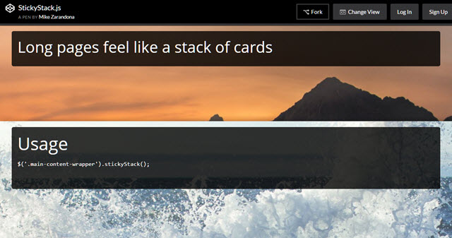
StickyStack by Mike Zarandona is a jQuery plugin that helps you make your website seem like a slideshow. Don’t worry, I’m not talking about the powerpoint style of the 90s, but rather about the effect that’s also used on parallax websites which causes the content that scrolls in to overlay the previous content, like moving a card above another. When using StickyStack.js, a new card will always slide in when the previous one has reached the upper border of the viewpoint. Simple, but clever.

StickyStack, Colofilter, Heisenberg and More: 5 Interesting Design Helpers

Demo | Github

Colofilter.css: Colorful Filters in Duotones

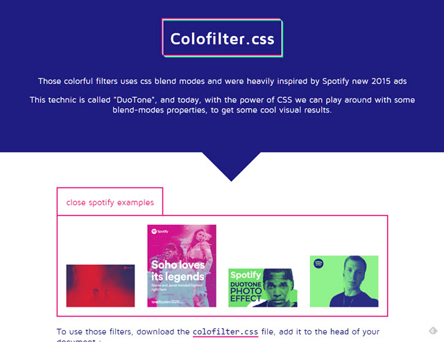
Lucas Bonomi from Paris brought us a stylesheet which you can use to lay awesome color filters on photos, and make them change dynamically. To do that he uses CSS filters and the mixblendmode, which is why users of Microsoft browsers, Opera Mini, and Safari are excluded. A polyfill is in the works, until then, these users only see unfiltered images.

StickyStack, Colofilter, Heisenberg and More: 5 Interesting Design Helpers

Demo | Github

Heisenberg Ipsum: Dummy Texts for Fans of Breaking Bad

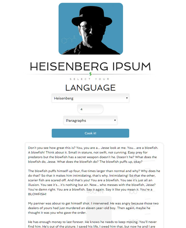
The classic Lorem Ipsum is still the most used dummy text around the web. It doesn’t get much more boring than that. It’s no surprise that plenty of developers have thought of alternatives. One of them is called Heisenberg Ipsum, an Ipsum generator for fans of Breaking Bad. Choose your favorite character, set a length for the Ipsum, and instantly receive a hefty text passage.

StickyStack, Colofilter, Heisenberg and More: 5 Interesting Design Helpers

Heisenberg Ipsum

Feature.js: Browser Feature Recognition Fast and Safely

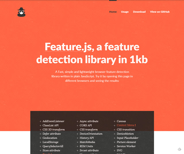
Feature detection is the safest way of only serving the users the functionality that they actually have, and using a fallback for the features that aren’t supported. Feature.js offers rather reliable services and weighs only 1kb. The developer Viljami Salminen from Menlo Park in California provides working solutions, as well as a proper documentation with plenty of examples alongside his small JavaScript, which doesn’t have any other dependencies. That’s a rare sight these days…

StickyStack, Colofilter, Heisenberg and More: 5 Interesting Design Helpers

Demo | Github

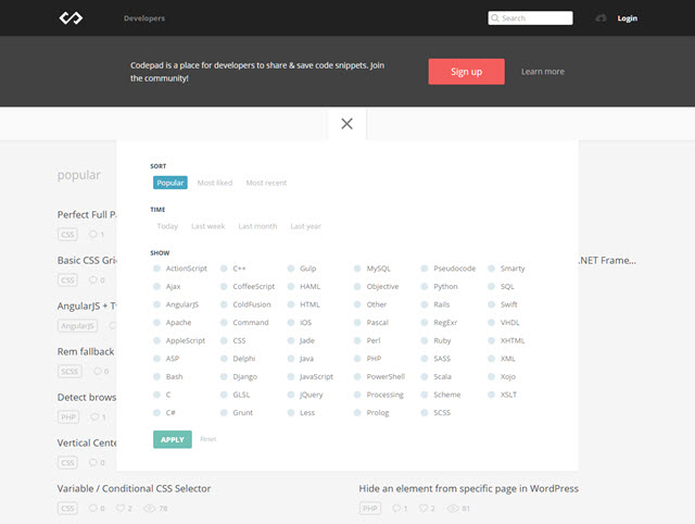
Codepad: Helper for Stuck Developers

Codepad is a new venue for developers and designers. Here, you can share code snippets, and request comments on them. Maybe your solution isn’t the best one after all. Other users help you, and you help them. Codepad is about giving and taking. Just like back then, during the good old BBS days. Codepad deals with all common, and less common (hello there, ColdFusion) languages.

StickyStack, Colofilter, Heisenberg and More: 5 Interesting Design Helpers

Codepad.co

(dpe)

Categories: Others Tags:

Preload: What is it good for?

February 26th, 2016 No comments

Preload is a new web standard aimed at improving performance and providing more granular loading control to web developers. It gives developers the ability to define custom loading logic without suffering the performance penalty that script-based resource loaders incur.

Preload: What is it good for?

A few weeks ago, I shipped preload support in Chrome Canary, and barring unexpected bugs it will hit Chrome stable in mid-April. But what is that preload thing? What does it do? And how can it help you?

The post Preload: What is it good for? appeared first on Smashing Magazine.

Categories: Others Tags:

Web Development Reading List #126: Clever Interfaces, An Open AMP Alternative And The Art Of Slow Growth

February 26th, 2016 No comments

It’s interesting to see how user experience design advances now that we managed to understand what it means. I think artificial intelligence will become a huge part of user experience over time and that we will spend more time on developing clever integrations to third parties than developing our own “dumb” interfaces. That’s why I find it interesting to see research on how services can use unified interfaces like text messaging apps to become more intelligent. Enjoy your weekend!

Apps and services integrated into text messages. Is this the future of text?

Why reinvent everything and ship your own application when you could use a messaging app as input and output of your API instead? For example, a schedule for the next bus could be delivered to the user via a text, WhatsApp or Telegram message.

The post Web Development Reading List #126: Clever Interfaces, An Open AMP Alternative And The Art Of Slow Growth appeared first on Smashing Magazine.

Categories: Others Tags:

Unsplash Adds A New API, Like Buttons

February 26th, 2016 No comments

Unsplash, the popular free photos site with no restrictions on image usage, recently unveiled a new set of features and tools for its users.

To begin with, much like Facebook and other social networking sites, Unsplash too has a “like” feature now. This option, presented in the form of a heart, is what you can use to “like” or “heart” a photo on the site. On your profile page, you will be able to see all the images that you have ever “liked”.

Furthermore, Unsplash now has a curated search option too, based on tags. You can enter keywords to search for the image of your choice.

Thirdly, Unsplash has a new API that lets developers populate their projects, such as websites and applications, with images pulled directly from the Unsplash database. Thus, you can make use of Unsplash photos in your sites and apps without having to visit Unsplash or redirecting your users to their site.

Unsplash now also lets you create your own collections and add photos to them. You can add photos to your collections and organize them, much as you would organize images in an album.

Unsplash has grown manifolds and is one of the most popular websites in its league. For instance, consider this summary regarding the growth of Unsplash:

Today, Unsplash’s community is 40,000 photographers large, and their photos are viewed more than 600 million times every month. The Unsplash diaspora is even bigger.

With the new features and options, Unsplash is expecting further surge in its popularity, especially because half of these features are modelled towards giving Unsplash a mini-social network look.

Read more about the new changes at Unsplash here.

If you are a regular visitor of Unsplash, what do you think of these new features? Share your views in the comments below.

Categories: Others Tags:

Floating Mac browser Fluid makes its debut

February 25th, 2016 No comments

Billed as “the multitasking browser for everyone,” Fluid is the Mac’s new browser that takes great strides to improve productivity and multitasking on your desktop. Mac users can now enjoy a browser that features picture-in-picture capability, which lets them position the window wherever they choose. Even with the biggest, 27-inch Macs, screen space can still feel limited, making this browser serve a real need.

Apple users will note that using iOS 9 to multitask has never been easier today, thanks to the new picture-in-picture feature on the iPad. This has allowed people to watch Netflix in the foreground while they browse in the background, for instance.

At last, OSX users now have the same opportunity on their desktops. Called a multi-tasker’s dream, Fluid “floats” on top of all of the other windows that you have open during your work flow. Here’s an unexpected-though-remarkable bonus: It also has a transparency feature that, when activated, lets you actually see the content behind Fluid.

Let’s say you want to go to another site when using Fluid. You simply go back to the app via the icon in the dock at the bottom of the screen or the menu bar icon at the top.

Working much the same as browsers you’re already used to operating, Fluid gives you control over your site navigation. You’re able to manipulate the transparency settings, look at your history and favorites, and access file-uploading options. All of these features mean that you can do much of what you can do with standard browsers—including multitasking by watching videos and surfing the web simultaneously.

Images and PDFs are currently browser-supported; in the near future, movie files will be supported, too, allowing users to see them right in the Fluid browser window. MP4 support is right around the corner as well: The developer says MP4 support is in the version that’s still waiting to be approved by the App Store.

With so many users consuming video these days, it’s no surprise that Fluid has taken into consideration Hulu, YouTube, Vimeo and Netflix videos in particular. Users who browse any of these sites will see them automatically transition to embedded video links that enable edge-to-edge viewing.

There’s also Chrome compatibility included in the features. Here is a Chrome extension that lets users open up all Chrome URLs right inside of Fluid. URLs can be anything from videos to basic articles and written content.

(It’s interesting to note that there’s also already another floating Mac browser. It’s called Helium. However, the huge difference between it and Fluid is that Fluid operates more like a conventional browser with ease of access to basic browser controls, which helps the user experience.)

Since the developer behind Fluid is bootstrapping the new browser, it’ll current cost you $2.99.

Here is a very detailed explainer video taking new users through the basic features of Fluid and how to get the most out of it.

LAST DAY: Filmora – Robust, High-Quality Video Editor – only $24!

Source

Categories: Designing, Others Tags:

How to Get a Logo Accepted: Eight Steps for a Better Design Workflow

February 25th, 2016 No comments

Being a brand designer requires much more than just having creative ideas and technical skills?—?it compels us to be a marketer, strategist, psychologist, salesperson, showman and project manager at the same time. It’s difficult, but it’s also exciting and challenging!

A Logo Design Workflow

The goal of my article is helping you to rethink your workflow. Some of these tips are mine, others are borrowed from world-famous designers. All those tips and tricks are tested and proven and are tailored to improve your workflow for (re-)branding projects.

The post How to Get a Logo Accepted: Eight Steps for a Better Design Workflow appeared first on Smashing Magazine.

Categories: Others Tags:

Should you have defaults styles for `table`?

February 25th, 2016 No comments

Luke Underwood wrote in with an interesting question:

What are the best practices for default

styling?

I guess there are three possibilities:

  • Have default styles
  • Don’t
  • Somewhere in between

Luke elaborates:

Our office is split on the idea. In our base templates we currently have no styles being applied to tables by default. You need a class to get it looking pretty (with borders, background colors etc). We use this class primarily on tables used in main content areas.

We front-end devs decided this is best because it means we can easily style custom tables without having to override any default styling. This includes having to override media queries that reduce padding on smaller screens, which would be annoying. We also think it would be important to have a selector on these content tables in case we need to implement JavaScript solutions like responsive table plugins.

The back-end programmers are continually frustrated that they can’t just “dump a table on a page” without it looking good and insist that default table styles are the way to go. Apparently adding a simple class to every table can be difficult, and they think we should have to deal with writing extra css to get around it.

To summarize:

Benefits to having default styles

  • You can just “dump a table” in the HTML and have it look good

Benefits to requiring a class

  • You can have multiple table styles without having to fight against the defaults
  • You may need the selector to find these certain tables

I would add a few other considerations.

What’s the context?

One is to think about the context. Are these tables being stored and displayed as content? Like in articles, documentation, etc. I like staying as class-free inside content as I can. I find classes don’t last as long as content does. Someday, perhaps your .striped-table { } isn’t a thing anymore and a tables revert to some style-less state unintentionally. Default styles would save you from that.

Perhaps your content is stored in Markdown, which I highly recommend for long-lasting content. Markdown doesn’t even give you a great way to apply a class to a table, so that’s a consideration.

Is scoping a possibility?

Another consideration is scoping. Perhaps globally you could avoid default styles, but styles that are obviously inside content output areas do have them.

/* Scoped styles to articles */
article,
.this-is-content-or-whatever {
  table {

  }
  th, td {

  }
}

Kinda like opt-in typography.

Are light default styles a possibility?

In addition to the typical user-agent stylesheet, these go a long way in making a table look presentable:

table {
  border-collapse: collapse;
}
tr {
  border-bottom: 1px solid #ccc;
}
th, td {
  text-align: left;
  padding: 4px;
}

That’s not much to fight against in the case of custom table classes.

What do other sites do?

Luke did some research! Thanks Luke.

Website Default table styles?
Mozilla No
MDN No
CSS Tricks Yes
Wikipedia No
Google No
eEbay No
Smashing Magazine No
Awwwards No
Twitter No
jQuery Yes
Modernizr No
GitHub No
W3C No
CodePen No
InvisionApp No
Apple No
Yahoo No
Amazon No
PayPal No
NetFlix No
DropBox No
StackOverflow No
CNN No
Microsoft No
Gumtree No
LinkedIn No
News.com.au No
Bureau of Meteorology No
ABC No
RealEstate.com.au No
Tumblr No
IMDB No
Seek No
Commonwealth bank No
ANZ Yes
The Verge No
BBC No
SA gov No
MailChimp No
Adobe Yes
Telstra No
Target Yes
JB Hi-fi No

Seems like it’s popular not to use default table styles.

What about resets?

The most popular reset does:

table, caption, tbody, tfoot, thead, tr, th, td {
  margin: 0;
  padding: 0;
  border: 0;
  font-size: 100%;
  font: inherit;
  vertical-align: baseline;
}
table {
  border-collapse: collapse;
  border-spacing: 0;
}

That feels a little heavy handed to me.

Normalize doesn’t touch them, which is telling. It means that there isn’t very significant differences (none?) in how default tables are rendered cross-browser, so not much to worry about.

What about the big frameworks?

  • Bootstrap hardly touches default styles for tables, but offers .table, .table-striped, and a handful of others you can opt-in to.
  • Foundation does style default tables right off the bat.

50/50 split.

Thoughts

Personally, I lean toward having default styles for tables, at least in a scoped-to-content-areas way. I don’t use tables for anything but tabular data, and I don’t tend to need a ton of variations on how that tabular data is presented. Even if I did, creating some variations classes wouldn’t be a particularly difficult task.


Should you have defaults styles for `table`? is a post from CSS-Tricks

Categories: Designing, Others Tags: