Archive

Archive for February, 2016

Gutenberg: Web Typography for Everyone

February 25th, 2016 No comments
Gutenberg

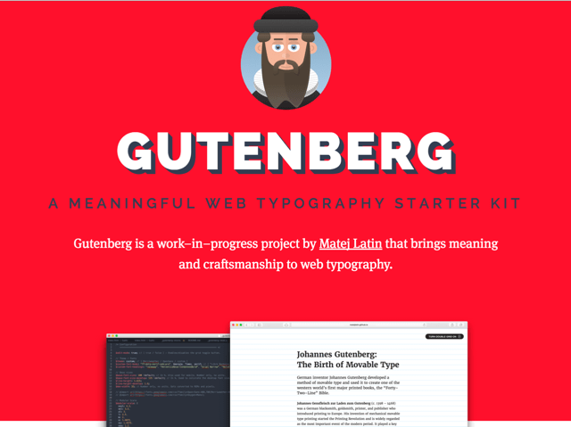
Gutenberg is a starter kit for better web typography. Its developer Matej Latin provides an easy way of creating prettier content that is easier to read. This is mainly achieved by a consequent orientation of all contents towards a baseline which is defined depending on the text size.

Gutenberg’s Web Typography is Handsome

Good typography is a rare sight on the web. Of course, if you see an accordingly designed website, you’ll be able to see the thought put into placement, equal gaps, overall the thought put into the entire project. But even websites that were not created considering the typographic aspect generally work. Thus, I can understand when a designer decides not to put in that extra work.

The new typography starter kit Gutenberg by Matej Latin is designed to follow basic typographic rules without requiring additional effort. At the time, Gutenberg only offers the absolute basics for one-column layouts. However, Matej is working on extensions for a table layout and side comments already.

Gutenberg

Gutenberg was made based on Sass. This allows you to work with Mixins and thus create flexibility for your designs which wouldn’t be possible without using variables.

Gutenberg is distributed under Creative Commons 3.0. That means you have to mention the originator if you use it. Additionally, altered or extended versions of the project have to be provided under the same conditions. Basically, you’re not allowed to take Gutenberg and create a product that you want to sell on this base. You can still use Gutenberg in commercial, and customer websites, however.

Gutenberg: How to

Gutenberg “calculates” how to set the page elements according to the two base values of text size and line gap. The multiplication of both values determines the so-called $leading which is the actual base for the grid in which the content is fitted.

$base-font-size: 100; // Converts to 16px
$line-height: 1.6;
$leading: $base-font-size * $line-height;

Thanks to Sass being used, you can further calculate with the value for $leading, and determine other automatically fitting values, for example for h2:

h2 {
  margin-top: #{2.5 * $leading + 'px'};
  line-height: #{1.5 * $leading + 'px'};
}

To get you going quickly, Matej gives out two “themes” that work on the base of the Google fonts Merriweather and Open Sans and thus lead to the right results. You can, however, also choose the option custom to realize your own ideas.

If you want to get an impression of the looks of the themes first, Matej has prepared two articles for that. Click on the respective image to access the according article:

Gutenberg

In the top right of the project site, but also in the two examples, you’ll find a switch that makes the grid visible.

By the way: A while ago, we’ve presented a project called Baseline JS, which aims in a similar direction, but uses JavaScript instead. If you never dealt with this topic before, you’ll surely be interested in our typography crash course.

(dpe)

Categories: Others Tags:

PayPal Sans: The New Exclusive Font For PayPal

February 25th, 2016 No comments

PayPal has recently got a new custom typeface: PayPal Sans.

Designed exclusively for PayPal by the Klim Type Foundry, PayPal Sans comprises of two sub-families: PayPal Sans Big and PayPal Sans Small, as well as 14 styles. As a custom font, PayPal Sans is something you will see in use exclusively on PayPal website and mobile apps.

This font has taken several months in the making, and PayPal’s logic behind a custom sans serif typeface was to find a font that is:

  • mobile-first and numeral-centric
  • performs well across different devices and resolutions
  • space-efficient, and renders well even on smartphones in portrait mode
  • relies on humanist design principles

Naturally, PayPal Sans is more of a minimal and functional font design, and not decorative or flamboyant. The lettering in PayPal Sans is horizontally economical without sacrificing legibility or readability, especially considering the fact that PayPal’s audience involves users who rely a lot on the mobile app.

The two sub-families of the font, PayPal Sans Big and PaPal Sans Small, have a very subtle difference between them — a 13px size difference in terms of styles.

You can see PayPal Sans in action on the PayPal website or mobile apps, and read more about the design ideology behind this custom font on this page.

What do you think of Paypal Sans as a font? Share your views in the comments below!

Categories: Others Tags:

Simple Augmented Reality With OpenCV and Three.js

February 25th, 2016 No comments

Augmented reality is generally considered to be very hard to create. However, it’s possible to make visually impressive projects using just open source libraries. In this tutorial we’ll make use of OpenCV in Python to detect circle-shaped objects in a webcam stream and replace them with 3D Earth in Three.js in a browser window while using WebSockets to join this all together.

Simple Augmented Reality With OpenCV and Three.js

We want to strictly separate front-end and back-end in order to make it reusable. In a real-world application we could write the front-end in Unity, Unreal Engine or Blender, for example, to make it look really nice. The browser front-end is the easiest to implement and should work on nearly every possible configuration.

The post Simple Augmented Reality With OpenCV and Three.js appeared first on Smashing Magazine.

Categories: Others Tags:

The web reacts to Facebook’s Reactions

February 25th, 2016 No comments

It’s inappropriate to ‘Like’ someone’s firing, breakup, fashion disaster, or untimely demise. That’s the conundrum Facebook has been struggling with since it introduced its ‘Like’ button seven years ago.

Today, after announcing the move last year, Facebook has rolled out its new ‘Reactions’ to all users. The six buttons—Like, Love, Wow, Sad, Bashful, and Sneezy—are intended to convey the full spectrum of human emotion, or at least give users more options to express themselves than they previous had.

Facebook’s ‘Like’ feature has been so fundamental to the definitive social network that it’s part of its branding; as recognizable, if not more so (especially after last year’s rebrand) than the company logotype itself.

It’s a modern-classic problem for a startup that has outgrown its original use-case: the UI that users are accustomed to, no longer reflects the tasks users are trying to accomplish. Twitter faced a similar issue in 2015 when it rebranded its star icon as a heart. It’s a problem LinkedIn would bite your hand off to be troubled by.

In a Medium post on the design process, Product Design Director at Facebook, Geoff Teehan acknowledged the potential teething problems:

We needed to thoughtfully curate any change so it felt like a natural evolution, taking care not to feel abrupt or disrupt everyone on our platform

Strangely, given how important this update is to Facebook, the icons are both visually, and semantically inconsistent: only the ‘Like’ and ‘Love’ buttons are icons, the other four reactions are emoticons; ‘Like’ is a mild version of ‘Love’, but there’s no ‘Mild Distain’ reaction to partner ‘Hate’; ‘Wow’ could be both positive, or negative. Do you send someone ‘Love’ when they’re bereaved?

Showcase Font Family (7 Friendly Fonts + 1 Ornament Set) – only $15!

Source

Categories: Designing, Others Tags:

Image Compression and Web Performance

February 24th, 2016 No comments
5

Images compression and web performance

The performance of your website is very important; a fast website have readers which sticks around, online seller which sells more and it’s a major criterion in SEO ranking. The website speed enhancement is not about a button to press and voila! It’s a bit more complex but main speed monitoring tools like Dareboost or GTMetrix agreed on the fact that the heavy resource to load are usually images.

Here’s a shortlist that you should keep in mind about image optimization when you’re building a website.

To begin with images

Adapt the image size to fit your content

Display image at its natural size, do not use HTML resize. A scaled image is an image that has been scaled to match its displayed size. It happens usually when you’re using handles to resize an image in a WYSIWYG editor.

Seems basic but it can generate a lot of impact regarding loading time. Experienced webdesigner knows this fact, but nothing could be less certain in the case of final clients that update content every day.

Image size and screen resolution

“Pixel dimensions measure the total number of pixels along an image’s width and height. Resolution is the fineness of detail in a bitmap image and is measured in pixels per inch (ppi). The more pixels per inch, the greater the resolution. Generally, an image with a higher resolution produces a better printed image quality.” Reference: https://helpx.adobe.com/photoshop/using/image-size-resolution.html

On a web display environment, the resolution has no effect on the image visual quality but it has on image weight. If you load two images, same size, let’s say 250px x 250px on a webpage @72dpi and @300dpi, the final screen display will be visually similar but not the weight. Higher resolution will be interesting only for the print or if you resize the image. For example, to print it on an A4 paper support.

Avoid loading massive image amount on the same page

Regarding image gallery or blog views, there’s also something you can do. Don’t load thousands of images on the same page, even little thumbnails. Consider using a progressive loading script, Facebook, Flickr and all social media are using it. A web page witch uses those scripts will defer the media loading until you scroll down and call the display of those media.

Image specifications and screen

Raster and vector images

A raster image is made of pixels; a vector image is made of basic geometric shapes.

Commons usage of vector images on the web is for:

– Logo design

– Icons

So a raster image will be dependent on resolution, if you to enlarge or reduce a raster image, you’ll shrink pixels. Vector images do retain appearance regardless of size.

Types of compression algorithms: lossy and lossless

This is also something you can find in the recommendation of Google and in speed testing tools. There’s several scripts to do image compression on the web. We can distinguish:

  • Lossy compression
  • Lossless compression

Lossless and Lossy image compression terms determine, in a file compression, if all original data can be recovered when the file is uncompressed. With lossless compression, all of the information can be completely restored after uncompressing. With a Lossy compression some data can be lost because, for example, on a .png image, quantization of color reduces the color number.

OK, but why would I take the risk to make Lossy compression, even if I can save a lot of loading time?

Lossy and lossless choice

The point is that the image Lossy compression is far effective than the Lossless one, especially for a web usage. Check the landscape images bellow before and after a Lossy compression. Quality is similar and images weight goes from 254KB to 39KB. At the opposite, a Lossless compression goes from 254KB to 180KB. For a final usage of an image, Lossy compression seems really better.

Cropping and resizing images in Photoshop

When you’re building a website from a Photoshop design, one big part of your job is to find the best format and compression to apply on images. Finding the best export ratio between weight and quality is the key. As Photoshop is applying a global compression on all the image area, it’s quite complex to have both light and high quality images.

Considering 30 images per page creation that includes the content and theme design images, how much time do you spend on image export? The process is quite long and include several tries at compression levels.

Considering that, you can use a tool to compress final image during the creation process or let a CMS extension doing the job automatically.

Image compression tools

There’s some image compression services on the market.

ImageRecycle is offering the largest range of CMS integrations (WordPress, Joomla, Shopify, Magento) and both Lossy and Lossless image compression + resizing. The compression tool can also be used on a custom project using an API. ImageRecycle got unique features comparing to competitors like PDF compression, website audit report, 1-month image backup/restore: https://www.imagerecycle.com

A free trial of 100MB of content optimization is available, then prices start from $7 for 1GB of content with unlimited and free sub accounts.

Kraken provides a WordPress plugin and an API to compresses images + make resizing. A free trial of 50MB of content optimization is available.

TinyPNG: provides an API plus a WordPress and Magento plugin.

ImageRecycle online optimizer preview

To compress you images/PDF you can drag’n drop content in the uploader or use the URL of the page and get a zip file of all the images.

PDF report

Paste your website URL, get a PDF report in your mailbox with the detail of the images that can be compressed, pretty useful for clients.

In conclusion

Images usually represent 50-70% of your website content, then the first time a page is loaded is mainly determined by the image weight. This is even more important on mobile because connection is usually slower.

Keep a nice looking and fast website, optimize images!

Read More at Image Compression and Web Performance

Categories: Designing, Others Tags:

Fabric: Twitter’s New App For Developers

February 24th, 2016 No comments
fabric-app

Twitter has recently released a new app meant exclusively for developers, named Fabric. This app also happens to be the first one that Twitter has developed from scratch; other apps such as Vine and Periscope are basically acquisitions.

Strictly speaking, Fabric is a collection of tools and resources meant for developers who wish to check up on the status and progress of their apps. In other words, Fabric lets you monitor the performance of your mobile applications keep track of error logs and debugging records, among other things.

To quote Twitter’s description of Fabric:

The Fabric mobile app makes it easy for you to know what’s going on with your app. We sift through millions of events every day to intelligently give you the most important information. And starting today, our real-time alerting system will send you a push notification when something critical is affecting your app.

This application offers you real time updates and push notifications related to the performance of your apps. As such, you can stay updated about the performance of your applications even when you are on the go and not at your desk.

fabric-app

When dealing with bug reports, Fabric offers you details such as user behaviour, real-time performance metrics, crash logs and other things, such as detailed breakdown of devices and mobile platforms.

Fabric is available both in the Apple App Store and Google Play. To learn more about Fabric, visit the official website.

What do you think of the new Fabric app by Twitter meant exclusively for developers? Share your views in the comments below!

Read More at Fabric: Twitter’s New App For Developers

Categories: Designing, Others Tags:

Nominate your works to The A’ Design Competition – Entries Due Soon

February 24th, 2016 No comments
1596eb63264116c37544a1815a46036c74822359-t710

A’ Design Award is the World’s leading international design competition. The A’ Design Awards are organized in all creative fields to highlight the greatest designs from all countries in all disciplines. Entries to the A’ Design Awards are peer-reviewed and anonymously judged by an influential jury panel of leading scholars, prominent press members and experienced professionals. The A’ Design Award is an opportunity for popularity, prestige, promotion and international recognition to The A’ Design Award Winners through the A’ Design Prize which is granted to the awarded designs.

The “A’ Design Prize” includes everything a designer needs “A’ Design Prize” is made of : design excellence certificate, invitation to the exclusive gala-night in Italy, both online and physical exhibition of awarded works, poster of awarded projects, hardcover printed best projects’ yearbook publication, 3D printed metal award trophy, international press campaign, interview with the award winning designer, press kit preparation and distribution, Award-winning design mark, pitching award winning designs to press members worldwide, media appearances through design award press partners, inclusion in World Design Rankings, inclusion in design business network and more.

A’ Design Award has been established to promote and recognize the best design works in all countries and in all creative disciplines. The main objective of the A’ Design Award is to create a global awareness and understanding for good design practices and principles by recognizing the best designs in all countries and in all creative fields. The ultimate aim of the Award & Competition is to push designers, companies and institutions worldwide to create superior products and projects that advance society.

Every year, original design work that focus on innovation, design and creativity from across the globe are awarded with the A’ Design Award. Entries to A’ Design Award are accepted in categories such as Architectural Design, Graphics Design, Product Design, and more. The complete list of competition categories are available here.

Submissions are accepted every year until the design award deadline of February 28th and results are announced every year on April 15, at the end of World Design Days. Designers from across the globe are invited to join the accolades by signing-up their greatest design works, projects and products. Learn more about The A’ Design Competition and see past winners at Awarded Designs listing which is a showcase of good design work worldwide.

Enter Your Works today to The A’ Design Competition : Enter Your Best Design Work.

Below we have selected some award winning designs that you might like:

Tsingtao 1903 by Wangtao – Platinum A’ Interior Space, Retail and Exhibition Design Award in 2015

85e7ac38b43e28829b7f292c53373899966ae376-t710

Ane by Troy Backhouse – Platinum A’ Furniture, Decorative Items and Homeware Design Award in 2015

bf68c7016810734bb2ac309e6de4a1510bbad43e-t710

Ice Krakow by Ingarden & Ewý Architects – Platinum A’ Architecture, Building and Structure Design Award in 2015

7099f867b1cfb0ffe8d07ae50c759720f5a84334-t710

Calendar 2015 “town” by Katsumi Tamura – Platinum A’ Graphics and Visual Communication Design Award in 2015

1311985296438cb43389399eda3957d0d181b4ef-t710

Santander World by Jose Angel Cicero – Platinum A’ Arts, Crafts and Ready-Made Design Award in 2015

1b84b6226b0057434236db1167191c2ea0d03b68-t710

Barb Perfume by Roma Lazarev – Platinum A’ Packaging Design Award in 2015

ab097409ba36095e9017641eadef3e50899f9c15-t710

Pepsi Metlife Stadium by PepsiCo Design and Innovation – Platinum A’ Advertising, Marketing and Communication Design Award in 2015

81a27077db17f21ac8129851b3f4595c6d096147-t710

Air Touch by LKK Innovation Design Group – Platinum A’ Home Appliances Design Award in 2015

b964495b0a494c846fced270bd68598800d0e6b8-t710

Sony Semiconductor Branding by Katsumi Tamura – Golden A’ Advertising, Marketing and Communication Design Award in 2015

b8a37cd2d921523a26f90771a2db3a419020b4f9-t710Stumbras Premium Organic by Edvardas Kavarskas – Golden A’ Packaging Design Award in 2015

0356324a38e09ace60ff8548e50eb390454458fd-t710

Sarp 46m by SARP YACHT – Golden A’ Yacht and Marine Vessels Design Award in 2015

34dfe525585368cdec8f8a768058fcf69e5b641f-t710

Torchia by Hakan Gürsu – Golden A’ Energy Products and Devices Design Award in 2015

bb3088bff81859f184a6864290d58b3ec745f13a-t710

Tetris by studiomk27 – Golden A’ Architecture, Building and Structure Design Award in 2015

55979178351c2f67f3180323a5fc6f7947597d6c-t710

Robo Ming by LKK Innovation Design Group – Golden A’ Digital and Electronic Devices Design Award in 2015

cee03615de31f4db38767d12b3dd8c0c8f0b98ff-t710

Lenovo A740 by Johnson Li – Golden A’ Digital and Electronic Devices Design Award in 2015

b95b94ab1022672e39e0f2cf6e8b95dff399fed8-t710

Cobra by Stefania Vola – Golden A’ Lighting Products and Projects Design Award in 2013

4ded84e67a128c269e5ae31fde3bf3ff49044350-t710

Patakukkonen Rye Pie by Packlab – Platinum A’ Packaging Design Award in 2014

c5443f04cb261d1ae42fbe35f7bc0f3191a35e45-t710

Switch by Native Union Design Lab – Golden A’ Digital and Electronic Devices Design Award in 2013

c585ab2365a46eda9cb52d1185b0120fc8d19506-t710

Calendar 2013 “farm” by Katsumi Tamura – Platinum A’ Graphics and Visual Communication Design Award in 2013

c541c650e14dc6a6a0ca9c11d6cf93a11a44959c-t710

Illusion by Adriana de Barros – Platinum A’ Digital and Broadcasting Media Design Award in 2014

Hope, you liked the designs above. We will be publishing a selection of award winning projects on April 15. To have an opportunity to get your work published, featured and promoted, remember to nominate it before the deadline. Present Your Works today to The A’ Design Award : Enter Your Best Design Work.

Read More at Nominate your works to The A’ Design Competition – Entries Due Soon

Categories: Designing, Others Tags:

Seven Valuable Website and Portfolio Building Tools

February 24th, 2016 No comments
7

The purpose of this article is to help you find the best website builder for your particular situation. Given the number of web design tools on the market, finding just the right one can be a challenge. We’ve used the following criteria to greatly simplify your search effort and make your purchasing decisions less complicated.

These satisfy the following criteria:

  • Ease of Use – The learning curve of a tool used to create a website does not have to be a steep one. The opposite should be true, as is the case with those tools listed here.
  • Customization – More and more features do not always lead to easier customization. Fewer, but totally adequate features, is often better.
  • Portability – Why hire a developer to make changes to your site, or find you have to work from a new platform, when the tools you have will do the job?
  • Cost – Free is always nice; but these extremely affordable premium tools will give you a generous ROI.

Several of these drag and drop tools are especially useful for creating portfolios, although each one is up to the task.

Cornerstone

Cornerstone set a newer, higher page-builder standard with its 100% front-end editing capability. It demonstrated that it was possible to create quality websites more quickly, and with greater ease, and that web designers could have fun while doing so.

When it was first introduced as a powerful new feature included a major update of X Theme, a best-selling WordPress theme, Cornerstone made such an impact that Themeco will soon sell it as a standalone tool. Many website designers, even those who were happy with the tools they had, were not yet aware of how much easier and more efficient page building could be.

Cornerstone’s interactive preview and edit displays let you see the impact of your edits and changes in real time. Make changes on the fly, and you will immediately see the results, without having to resort to the edit, save, review, and change cycle – over and over again. There is much more to Cornerstone, but its front end page builder is enough to make this one of the best site-building tools you are apt to come across for a long time to come.

SnapPages

2

Simple and powerful. That’s SnapPages in a nutshell. This drag and drop page builder does what needs to be done, while meeting our customization criterion – an absence of extraneous bells and whistles.

The HTML5 page builder makes website building a snap. The HTML5 designation simply means that this modern page builder was developed using clean, crisp code. There is no need for coding on your part when using SnapPages. You are given professionally designed, responsive pre-built websites to work with, along with templates and layouts that have been designed to get any project of to a quick start.

Better yet, SnapPages touchscreen functionality means you can do page building and editing from your tablet or touchscreen laptop should the occasion dictate, and cloud hosting ensures this tool will load quickly and respond to your commands instantaneously.

XPRS

3

XPRS by IMCreator can certainly claim to be one of the most innovative page builders in this list. Like the others, it works with layouts or themes, but what it does differently is it divides the themes into stripes. You can mix, match, and customize these stripes to produce attention-getting websites that will tempt visitors to stay a while.

Working with XPRS is a little like working with Lego blocks. You build what you want to, and you have fun doing it. The site creation process is super-fast.

You can build an eCommerce site that is completely free, and always responsive. Free is nice, but XPRS also has a paid-for plan that has grown in popularity by leaps and bounds. It’s their white label plan, and it’s for real. For a $250 fee you can build unlimited websites. If you are serving many different clients, here is an excellent way to get a great ROI. The commercial plan costs $7.95/month.

AllYou.net

4

Well-structured, professional-looking portfolios can take a great deal of time and effort to put together. AllYou.net offers the perfect solution for creatives who are good at design, but tend to struggle when having to deal with difficult interfaces. This portfolio builder takes care of the structure and mechanics, allowing you to focus on presentation – it can help you there as well.

This drag and drop tool features a nice selection of customizable templates. Best of all, you’re invited to sign up for a free trial to find out how it will work for you.

Divi Builder

5

Divi Builder was originally a highlighted feature of Divi, a highly popular WordPress theme. When this page builder was added as a new feature, Divi’s popularity soared. Elegant Themes made the decision to market this tool as a portable, standalone page builder.

Divi Builder can be used with any WordPress theme. This highly innovative tool is not easy to describe in a few sentences. The best way to see what it offers is to visit the Elegant Themes Divi Builder website. The home page demo tells you everything you want to know. You will be impressed!

Themify Builder

6

Themify Builder may be the most powerful and easy-to-use page builder for WordPress. There are no limits to the different layouts you can design with this time-saving tool. Building a magnificent website will involve little more than following its drag, drop, and select process. You can watch your creation evolve without the necessity of adding code.

Themify Builder provides 40 pre-designed layouts to work with. Features especially useful for creating portfolios include animations, video, and parallax scrolling.

Portfoliobox

7

Portfoliobox’s creators must have been thinking outside the box. Unlike many other page building tools, this page builder does not have a preset theme. By using different layouts, templates, and your own imagination, you can create thousands of different websites. No coding is required.

You can build blogs, portfolios, and any type of website including eCommerce websites. Open a free account to get started. You can think about signing up for a paid plan later.

You may have discovered that selecting among seven different website and portfolio tools can still be a bit difficult, especially when each tool is in its own way superior to anything else on the market.

Hopefully however, you have found a website and portfolio-building tool that suits your needs, or you have elected to use more than one of these products. Note that the portfolio-oriented tools can be used to create any website, and the other, general-purpose tools, are just fine for creating professional looking portfolios.

Read More at Seven Valuable Website and Portfolio Building Tools
Categories: Designing, Others Tags:

The New Newsletter

February 24th, 2016 No comments

We’ve long had a way to subscribe to CSS-Tricks via email. You probably couldn’t really call it a “newsletter” though, as it just consumed the RSS feed and sent out newly published articles each week. Nothing wrong with that, but it isn’t nearly as fun a custom-written one.

So, the new newsletter is here! It still links to everything we’ve published, so you won’t missing anything there, it’s just more elegantly summarized.

I’ll drop a signup form for it right here:

Here’s some reasons why it’s better now and you should sign up:

  • We hand write it each issue
  • There is content in there we don’t publish anywhere else
  • There are links in there we don’t share anywhere else
  • It’s an easy way to stay up-to-date on front end web design action

We’re just getting started on this little journey as well, so surely we’ll be tweaking the design and the style and the vibe and whatnot.


The New Newsletter is a post from CSS-Tricks

Categories: Designing, Others Tags:

Free Icon Sets: E-Commerce, Food, Science, Avatars And Summer

February 24th, 2016 No comments

Free icons are a great way to spice up your work with small effort. While some of them are plain useful, others give a project a fun twist.

Summer icons set

The following collection of free icon sets offers both — payment provider icons just like summer goodness to help you over a rainy day. All icons can be downloaded and used for free.

The post Free Icon Sets: E-Commerce, Food, Science, Avatars And Summer appeared first on Smashing Magazine.

Categories: Others Tags: