Archive

Archive for February, 2016

Foodshot: Free Images of – well – Food

February 24th, 2016 No comments

Recently, a new service for free grocery images named Foodshot has launched. The array of photos is still rather negligible; the quality is already high. Let’s take a closer look, shall we?

Many Photo Platforms, Few Food Images

This undoubtedly took a while. When I created a platform for free grocery pictures in 2008 as a reaction to the wave of problems a popular cookbook website caused, I didn’t set a trend with that. And even when a growing amount of providers brought free images to the web, there were no dedicated food photo providers among them.

Now, finally, there’s Foodshot, a website with Tumblr looks in the style of Unsplash. The site collects high-quality photos, with the only thing they have in common being them displaying victuals.

Foodshot: Free Images of - well - Food

Foodshot: Free Images Under Creative Commons Zero

All photos are distributed under the license Creative Commons Zero, which is about the same as Public Domain. The result is that the pictures can be used for any legal purpose, and in any way without restrictions. It doesn’t even require you to name the photographer or provide a backlink.

Foodshot is rather basic at the moment. There is no classification system. Neither categories, nor tags, nor search features are available. Photos are displayed in a timeline as a double grid. In contrast to other providers, there is no detail page for the images. Instead, a click on the photo in the grid causes the instant download of it. When hovering over a picture, the only information shown in an overlay is for how long the image is available already. You won’t find information on the photographer, camera, or geo data.

Two Examples of Foodshot’s Quality

Foodshot: Free Images of - well - Food

Foodshot is very straightforward. While this can work in the current, limited array, it will become quite confusing as soon as Foodshot keeps up the promised growth. Perspectively, the only way of keeping a proper overview is subscribing to their newsletter.

If you prefer a clear array of grocery photos, I can confidently recommend my own project 😉 The provided photos are also under Creative Commons Zero and can be used for any legal purpose without restrictions.

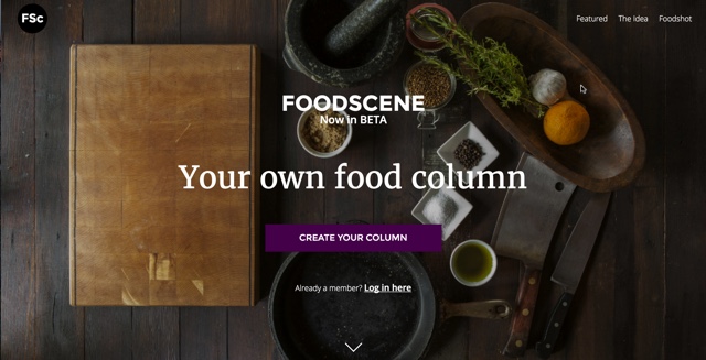
Foodscene, the Creators of Foodshot

Foodshot is presented to you by the creators of Foodscene. Foodscene wants to be some sort of Medium for food topics. I can’t explain what that is supposed to accomplish, but I definitely wish them a lot of success with that. Once again, thanks for Foodshot…
Foodshot: Free Images of - well - Food

Foodshot is Open for Collaborations

If you want to, you can also submit your own photos to Foodshot. Should their editorial staff like your material, you’ll be able to find it on the platform. However, you need to accept that you won’t receive any attribution by the users, as well as no attribution by the platform that presents them. For me, that would be less of an incentive.

Where do you get grocery photos from when you need them?

(dpe)

Categories: Others Tags:

WordPress is Alignable’s Most Trusted Brand for SMBs

February 24th, 2016 No comments

Alignable have published the reports of their recently SMB Trust Index Survey, and WordPress tops the list.

Among 25 of the most trusted brands or companies by small to medium business owners, WordPress has been enlisted as the first choice. To quote:

For small business owners, WordPress is a well-trusted company, Yelp is a brand in trouble, and Facebook is on a downward path.

The survey sample included over 6000 small business owners across North America. Interestingly enough, WordPress has been ranked above the likes of Google, Shopify and GoDaddy. Here is how the data has been assessed and analyzed:

Data represents running, cumulative report of SMB sentiment of vendors and providers from more than 6,000 ratings. Relative position changes from this quarter to the prior quarter were generated from the 25% net new ratings added to the database in the quarter. Alignable members rated these brands on a sliding scale from 0-10. NPS values calculated by subtracting percentage of detractors (brands rated 0-6) from percentage of promoters (brands rated 9-10).

Of course, the above ranking views WordPress as a “company”, which it apparently is not. The WordPress community views itself as anything but a company, so the term surely is not the best fit for describing WordPress. However, the fact that WordPress is ranked one among a list of 25 most trusted brands by SMBs is what is important — WordPress’ dominance does not seem to be fading anytime soon.

You can view the Alignable SMB Trust Index Survey results here (PDF).

Categories: Others Tags:

Noah’s Transition To Mobile Usability Testing

February 24th, 2016 No comments

Noah was concerned. He was the “UX guy” for the corporate office of a regional Quick Service Restaurant (a fast food chain) that was in the process of creating a mobile app to allow patrons to customize their meals, place orders and earn rewards.

Mobile Usability Testing

Note: This is an experiment in a slightly different format for Smashing Magazine – using a storytelling approach to convey the same lessons learned that a traditional article would have provided.

The post Noah’s Transition To Mobile Usability Testing appeared first on Smashing Magazine.

Categories: Others Tags:

The moment I realized I wasn’t an “artist”…

February 23rd, 2016 No comments

…and how it transformed my design career forever.

I’m going to share with you one of the most profound moments in my professional career. My hope is that this little piece will help not just creatives but anyone who is still trying to figure out what their passion in life is.

As a designer, I consider myself remarkably fortunate to be able to work hard and to do what I love every day

As a designer, I consider myself remarkably fortunate to be able to work hard and to do what I love every day for the last 10 years. Now with that being said… I’ve never really considered myself an “artist”.

“What?!”

Wait let me explain, I mean an artist in the traditional sense. If you ever find me sketching the landscape from my front porch wearing a french barrette, play the lottery my friend. Don’t get me wrong, though, I love being creative, building things and giving something new life.

Like many visual designers, I started at traditional art school from elementary on up. That period of time was a huge moment of growth for me as a designer and even more so as a human being; I still never felt exactly “at home” in the art community. Maybe it was the thought of being in a classroom and having an exact assignment, but I never felt like there was enough freedom for me.

You will hear that word from me a lot.

Freedom, freedom of creativity, the beautiful process of allowing something that is already free to be out of its own cage and allowing it to traverse a new terrain. I wasn’t the kid walking around with a portfolio half his size nor covered in gesso, acrylic paint, or charcoal (most of the time). Unfortunately, for a long time, I thought that’s what a real artist was. That if I didn’t act or feel that way, then I wasn’t a true artist.

I didn’t have that visceral connection that my peers seemed to have

As you can imagine that train of thought started a long road of searching. I began to enter every extracurricular art program that came my way. Painting, sculpting, photography?—?you name it I did it or was around it. I still do many of those things every blue moon. The problem was that I soon found out that I didn’t really enjoy them as much as I thought I should. Although I feel as if all of the work over the years helped me move from medium to medium as my career progressed, at that point in time I just couldn’t connect.

I was always more intrigued by scientists, mathematicians, and philosophers than I was with the Van Goghs, Jackson Pollocks, and Edgar Degas. This is not to say that I didn’t enjoy painting and art history! Quite the opposite actually, but I didn’t have that visceral connection that my peers seemed to have. I just knew that I wanted to create. Simple.

I did not realize my true passion in design until I began working in experiential design, UX, and programming around the age of 21–22 at an ad agency. This new way of creative thinking truly opened my eyes and seemed incredibly more meaningful to me than the mediums I had worked in. I was affecting people and solving their problems by combining technology and creativity.

As I grew in my field it finally dawned on me that what I was really attracted to was problem-solving and using creative solutions to address problems and to achieve an emotional response from the user or audience.

What an awesome realization that was.

Freeing myself from those societal boxes opened up an infinite world of creativity and technology to experiment with. All of a sudden there were no rules and that freedom spilled over into my contracted work as well as my passion projects. Inspiration began to come from everywhere and my experiences expanded. I was now working on films, projection mapping stunts, web design, and many other projects.

Freeing myself from those societal boxes opened up an infinite world of creativity and technology to experiment with

This also allowed me to meet and learn from many incredibly brilliant creatives. These chance meetings would never have happened if I just remained within the “artist” box that creatives are too often placed into. Everything became a beautiful challenge.

To this day still I love problem-solving and art with all my heart. I‘ve written all of this to say that it’s okay if you don’t feel like an artist in the traditional sense at the beginning of your career, or ever. It’s okay if you don’t fit the pre-existing mold for your specific career. Break it. Create outside of your comfort zone. As humans (and especially creatives) we are not meant to be categorized and put into a one size fits all box.

We are all living a unique human experience which should be expressed in different ways. Focus more on what you truly enjoy. Absorb as much knowledge as you possibly can, practice every day for several hours?—?no matter what your discipline is, the medium and the answer, will eventually find you.

[– This article was originally published on Medium –]

57 Handcrafted Fonts, 230 Textures & 100s of Design Extras – only $29!

Source

Categories: Designing, Others Tags:

The Flexbox Reading List

February 23rd, 2016 No comments

Flexbox gives us a new kind of control over our layouts, making coding challenges that were hard or impossible to solve with CSS alone simple and intuitive. It provides us with the means to build grids that are flexible and aware of dynamic content, and thus, give us the freedom to focus on the creation process instead of hacking our way towards a layout.

A sketch of a dynamic grid layout

To give you a head start into Flexbox and provide you with ideas on how to use it to master common coding challenges, we have collected tips, tricks, and tools that help you get the most out of its power already today. The list is by no means complete but includes the resources which we found helpful and useful.

The post The Flexbox Reading List appeared first on Smashing Magazine.

Categories: Others Tags:

The Current State of Telephone Links

February 23rd, 2016 No comments

Telephone links are a thing. Like an anchor link you tap to (probably) go to another page, these are links you tap to call a number on a phone-capable device. They’ve been around for quite some time. Yet, they cause me a lot of confusion. For example, many devices will automagically recognize phone numbers and do the linking for us, but not always.

There is enough web traffic on mobile devices and plenty of desktops apps that are capable of making calls, that it’s worth knowing more about phone links.

Default Usage

We have a snippet for phone links on this site that’s been hanging around since 2011:

<a href="tel:1-562-867-5309">1-562-867-5309</a>

This also works on text links:

<a href="tel:1-562-867-5309">Click to Call!</a>

tel: is not so much a feature as it is a protocol, much in the same way that http: and mailto: are protocols for the tag feature. The spec itself has nothing to say about it, though HMTL5 did provide support for custom protocol handlers, which allow such a protocol to be used.

You’re probably wondering why tel: can be considered default usage in the absence of an official spec on it. You can credit this to the fact that it was a proposed standard as far back as 2000 and later adopted by iOS, making it the de facto way to go by roughly 2007. There are other phone-based protocols (which we’ll get to later), but we’ll be focusing on tel: given its relative prominence.

Browser Support

We see tel: pop up as a protocol handler for links with no official documentation; and where there is no documentation, we often see differences in browser support and behavior. That’s not to say that browsers fail to recognize the tag itself. Instead, browsers might make different decisions on what to do when that link is clicked. For example, a browser may assume another app needs to open and will trigger a dialog asking which app to use. In other cases, the link might be ignored altogether.

Browser Does it link? When clicked it…
Android Yes Launches phone app
BlackBerry 9900 Yes Initiates phone call
Chrome Yes Triggers dialog confirming the use of another app
Edge Yes Triggers dialog confirming the use of another app
Internet Explorer 11 Yes Triggers dialog confirming the use of another app
Internet Explorer 11 Mobile Yes Initiates phone call
iOS Yes Triggers options to call, message, copy or add the number to the Contacts app
Opera (OSX) Yes Triggers dialog confirming the use of another app
Opera (Windows) Yes Triggers an error dialog that does not recognize the protocol
Safari Yes Launches FaceTime

Styling Phone Links

Styling telephone numbers is like any other link. In fact, it will inherit the default styling for anchors:

a {
  color: orange;
  text-decoration: none;
}

Let’s say we only styles to apply to telephone links. We can do that with a pseudo selector that searches out the tel: text in a given URL:

a[href^="tel:"] {
  color: orange;
  text-decoration: none;
}

Tuts+ has a nice trick using the ::before pseudo selector to add the unicode phone character before the number is displayed:

a[href^="tel:"]:before {
  content: "260e";
  margin-right: 0.5em;
}

Alternative Phone-Related Links

Believe or not, tel: is not the only way to initiate a phone call with a link. Here are a few other custom phone-based protocol handlers at our disposal.

  • callto: Exactly like tel: but used to initiate calls via the Skype app.
  • auto-detected: Many browsers will automatically detect a phone number in the HTML and link it up for you—no need to change the markup. iOS, for example, will totally do this, though it did not seem to be the case for Chrome on Android.
  • sms: Skip the call and go straight to text message. This seems to be a lot less supported than tel: is among browsers, including mobile.
  • fax: Go back to the future with fax machines. Again, spotty reliability.

Best Practices

It’s kinda funny talking about best practices when it comes to something without specifications. The spec does give a brief opinion on the “click to call” idea, but here are a few things to bear in mind when working with telephone numbers and links.

Consider the Context

A telephone link can make for an excellent call-to-action, especially on mobile phones where it reduces the friction between the content and the call. At the same time, telephone links could be considered a hindrance on a desktop experience where a phone call wouldn’t be possible if the device lacks an app that supports it.

One idea would be to create a class specifically for telephone links and attempt to show or hide them based on what we know about the browser. Modernizr and media queries are handy here, though totally imprecise.

Use Country Codes

A country code is not required but could be a nice touch for sites with international traffic. Country codes can be preceded by a + but that too is not required.

<a href="tel:+01-562-867-5309">1-562-867-5309</a>

Search Engine Optimization

SEO experts might have more to add on this than I do, but Google offers a structured data format for local businesses and using it will make telephone links more recognizable to crawlers, formatting them on search results pages in a way that makes the number much more actionable. Dudley Storey provides an excellent overview with the following example:

<div itemscope itemtype="http://schema.org/LocalBusiness">
  <h1 itemprop="name">Beach Bunny Swimwear</h1>
  Phone: 
    <span itemprop="telephone">
      <a href="tel:+18506484200">
         850-648-4200
      </a>
    </span>
</div>

On the flip side of wanting search engines to follow phone links, you can add rel="nofollow" to discourage links from being followed and indexed. This might be a good idea for any link not being designated as a call to action since web crawlers would be inclined to try to follow it to nowhere.

<a href="tel:+01-562-867-5309" rel="nofollow">1-562-867-5309</a>

Turning off Number Detection in iOS

If you plan to add phone links to your markup, then you may also want to consider disabling iOS from auto-detecting phone numbers and overriding your styles. Add the following the the document to turn that off:

<meta name="format-detection" content="telephone=no">

Further Reading


The Current State of Telephone Links is a post from CSS-Tricks

Categories: Designing, Others Tags:

Draft.js

February 23rd, 2016 No comments

Facebook (looks like mostly Isaac Salier-Hellendag) released what looks like a pretty sweet rich text editor written in React.

In the same vein:

  • TinyMCE is the one that’s been around forever.
  • ProseMirror is the fairly new one from Marijn Haverbeke
  • ZenPen is a super minimal one from Tim Holman
  • There’s been a bunch of attempts to replicate the Medium editor, like this.

If you don’t care about visual as-you-type formatting very much (i.e. you just want a simple Markdown editor) there are plenty of other simpler options you can search around for. And if you don’t need little helper buttons either, there is always